
Todd Klein's Blog, page 354
February 20, 2011
Podworthy: JONI MITCHELL
Images © Joni Mitchell.
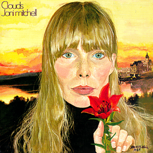
I'm not sure when I first heard Joni Mitchell's songs, at least knowingly. By the end of the 1960s I was listening to WNEW-FM radio out of New York City, and I'm sure they played her music there, but I probably heard her songs "Both Sides Now" and "Urge for Going" performed first by Judy Collins and Tom Rush respectively. I think "Clouds" was the first Mitchell album I bought, and I loved it, so soon after bought her first album, "Song To A Seagull," and loved that as well.
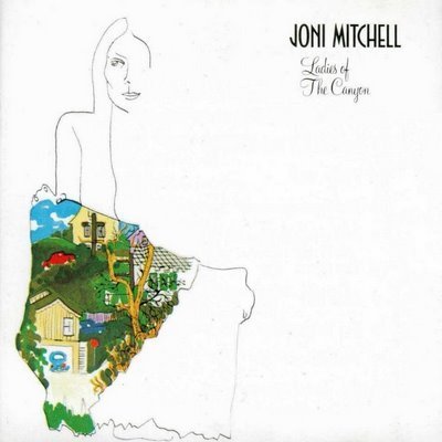
By the time her third album, "Ladies of the Canyon" came out in 1970, I have to admit I had a bit of a crush on Joni. Her voice was so clear and pure, almost piercing at times, but always with an emotional edge that moved me. I played her first three albums constantly in the early seventies, and I still love them, though maybe not quite as much. Back then the thread of sadness and melancholy that runs through her work appealed to me more than it does now (though there's plenty of other aspects to it that I still like). More than a singer, Joni is an amazingly talented songwriter, and as I was trying to do that too, I was drawn to her poetic words and phrases as much as her tunes. All the songs from Joni's first three are on my iPod.
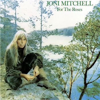
In Joni's fourth album, "Blue," the dark, sad thread was stronger, and I didn't like it as much, but still played it a lot, and it's grown on me over time. "For the Roses," her fifth album put Joni back in my favorite female singer/songwriter spot. Lots of great songs, including some rockers like "You Turn Me On, I'm a Radio," and "Electricity." Still some melancholy, but not as much as "Blue." I have all the tracks from those albums on my iPod as well.
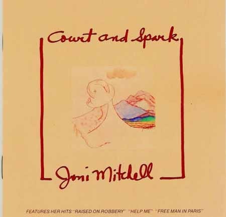
The sixth album, "Court and Spark" was another winner, with lots of great songs, in a variety of styles, including rock, folk and jazz. Joni was continuing to grow as a performer and a writer. All these are on my iPod, too.
After that, Joni and I began to part ways. I continued to buy her albums (still do) but found less on them that I loved. "The Hissing of Summer Lawns," for instance, has not one song I wanted on my iPod, nor does "Hejira." While I appreciate the art in those albums, the songs just don't appeal to me that much. The dark thread is deeper, and the move further and further into jazz, and away from folk left me behind somewhat, not being a huge jazz fan myself.
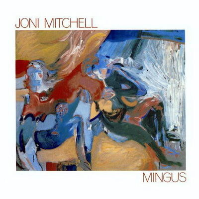
Perhaps my least favorite album is "Mingus," but I also have a reason to like it. Thanks to a radio contest, I won two tickets to see Joni live in Forest Hills, NY while on tour supporting this album, and she was wonderful. Even some of the songs from "Mingus" were much better live than on the album, and she did many of her past hits too.
Of Joni's later work, I have four tracks from "Night Ride Home" and two from "Chalk Mark in a Rain Storm" on my iPod, and that's all for now. I may reconsider some of the others and put them on later, but that brings the total to 72 tracks on my iPod. Joni's earliest work is still my favorite, even some of the darker ones. If I'm not feeling too good myself, I tend to skip past those, though.


February 19, 2011
Watching RISE
Ellen wanted to see this film, shown in selected theaters around the country one time only this past Thursday evening. The format and venues are similar to the opera broadcasts from New York seen in the same theaters, and it began and ended with a live broadcast from New York hosted by skating commentator Peter Carruthers, and NBC's Matt Lauer, among others. Between was the approximately one hour documentary film about the 1961 tragic air crash that took the lives of the entire US figure skating team on the way to the world competition for that year, along with the top coaches of the time, and many family members.
This is a story that has been covered briefly many times in figure skating broadcasts, so I was aware of it in general, but the documentary does a great job of bringing the people involved to life through period footage, remembrances of survivors and family members, and commentary from contemporary and current figure skating champions, including Peggy Fleming, Scott Hamilton, Brian Boitano and Evan Lysacek. Very well done, and well worth seeing.
The entire experience was interesting, and the live broadcast generally entertaining, though not a lot was said about the tragedy that wasn't already in the film. The skating champs did talk about their own lives and families some, which was interesting. I'm guessing this venue was chosen for the film because it isn't long enough for a theatrical release (and perhaps didn't have a distribution deal), and the filmmakers couldn't find a home for it on TV. Sales at theaters around the country must have been good enough, because a second showing has been scheduled for March 7th. Check theaters near you or online for tickets. Recommended if you're a skating fan, or know one.
February 18, 2011
Logo Study: STRANGE ADVENTURES Part 4

Images © DC Comics, Inc.
By the end of it's run, STRANGE ADVENTURES was a design mess. The Gaspar Saladino logo, fine in itself, was placed below an ugly barbell topline that did not go with it well at all, while the cover art was in a separate square box below all that. The art is reprinted from an issue edited by Julius Schwartz in the magazine's best period, and I'd guess the stories are all reprints as well. This trade dress (all the type and logo material at the top) was typical for most DC titles at the time, which I call the dark days of design at DC.

After the book had been cancelled, the title made one last appearance…sort of…on the cover of this issue of SUPER DC GIANT. The logo, by Gaspar Saladino, inserts FLYING SAUCERS into the title in a visually entertaining way, at least to me, and the letterforms are classic Gaspar with lots of energy and style, even if the shape doesn't really look all that much like a flying saucer. Clearly the stories were all reprints from the Julie Schwartz era of the magazine. And that was it for STRANGE ADVENTURES for quite a while, though the stories did sometimes show up in reprints here and there.

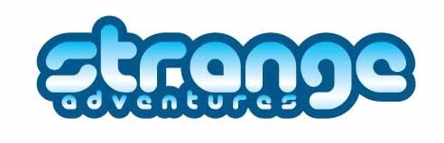
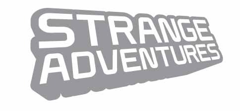
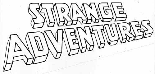
In 1999 DC's Vertigo imprint brought back the title for a four-issue miniseries with a new logo by Comicraft's JG Roshell. The word STRANGE seems based on an Ira Schnapp design we saw in part 3 of this study, here it is again:

There are some style differences, but the relationship seems clear to me. JG told me when he was assigned the logo design DC sent him reference from past logos, which he no longer has, and I bet this was one of them. I'm happy to say, JG's design is much better than Schnapp's in this case, with letterforms that are more consistent, and joined in an attractive way on STRANGE, and a nice multilayered dropshadow. the word ADVENTURES is also attractive and stylish, and also joined in ways I like. There's even some shading on the narrow telescoped dropshadow of the word that look like the ones on the original SA logo from 1950, a cool touch. The larger S and A drop down to frame the word ADVENTURES nicely, and each word is in a different two-point perspective, as if on two walls meeting at a corner, an arrangement you rarely see, and one that works well here. It's a fine logo, and looks great on this cover art by Brian Bolland.

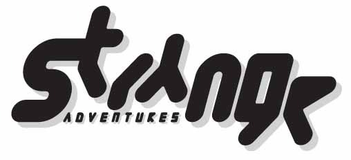
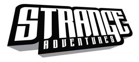
In 2009 DC brought the title back again for an eight-issue series, featuring some of the science fiction characters from the original run of the title, among others. The logo design is by John J. Hill, and it takes a very modern science fictional approach, with great emphasis on STRANGE, and ADVENTURES a small subtitle. The letterforms employ strong, wide verticals (though slanted to the right to add interest) and narrower horizontals, a combination I think usually works well, and the stroke ends combine squared, curved and serif points in a nice mixture. A very heavy outline ties it all together, while a very thin black drop shadow behind the inner letterforms helps give the logo some depth. Nice job.
John has been kind enough to share some other versions he worked up when designing the logo. He wrote: The direction was light…basically just to do an updated logo for an old title, and that it was a sci-fi story. I sketched out some ideas focusing on "Strange" and using some nontraditional-looking characters, but everyone thought it was better to pull it back and use a more traditional typeface. The one with some dimensionality was almost used (which I preferred).
This first version is really out there, with letterforms that verge on unreadable, so I can see why DC didn't go this route, but it's a fascinating design.
More readable, but still pretty radical, I like this version a lot. My only knock on it would be that the very round shapes, while suggesting science fiction and the future, don't really reflect the kind of super-hero story the cover art shows. This would be a great approach for an SF movie logo, though!
This version takes a more traditional type approach; still with futuristic forms, but more familiar ones, and using perspective and a telescoping drop shadow that relates to the original logo for the book. Again, perhaps a bit too rounded.

Here's a rather sedate type treatment with only the reversed letters signalling weirdness afoot. I'm afraid this one doesn't work for me as a comics logo, and the placement of ADVENTURES extending out to the left would be problematic on a cover, too.
Here are the final letterforms in a three-dimensional treatment that John said he preferred to the final choice. I like it a lot, too, though I have to say the rightward slant on the final one works best. Slant this version, and it might have been the winner. Or perhaps DC was just resistant to the three-dimensional approach altogether, feeling it was outdated. Thanks for sharing those, John!
Hope you've enjoyed this logo study. Other chapters and lots more logo studies can be found on the LOGO LINKS page of my blog.
February 17, 2011
Logo Study: STRANGE ADVENTURES Part 3

Images © DC Comics, Inc.
Issue 204, cover dated Sept. 1967, saw another version of the logo, also designed by Ira Schnapp. This one dropped the enclosing box, making the word ADVENTURES hard to see against the dark background, and the word STRANGE is relettered.
Here's the original from the DC files, and you can see that the word ADVENTURES is a photostat from the previous version pasted onto this one. This logo is another example, to my eye, of the failing abilities of Schnapp. In 1967 he would have been 75 or so, about a year away from his retirement, and two years away from his death in 1969. And, once again, scary lettering was never his strong suit. The letters of STRANGE are very inconsistent and poorly shaped, almost amateurish in appearance (the R is particularly awkward), while the top and bottom lines show a much surer hand, in styles Ira was more comfortable with. The main advantage to this version is to allow the cover art to go behind the logo, making for a stronger overall cover design, though as mentioned, ADVENTURES tends to disappear.

Issue 205 of STRANGE ADVENTURES, cover dated Oct. 1967, saw the introduction of what I'd say is the most popular and lasting character of the entire run, Deadman, though a case could be made for Animal Man. Unlike the latter, Deadman was quite popular right away, thanks to some terrific art by Neal Adams on his stories here after the first one by Carmine Infantino. The book was now being edited by Jack Miller, who also took on the writing of Deadman after the first two stories by Arnold Drake.
Another first in this book is for a character to have a specially-designed logo for his initial appearance. The Deadman logo at lower right is also the work of Ira Schnapp, with a head drawing in the opening of the D by Infantino I expect. Even though I think Schnapp was not very comfortable with scary lettering, this one is pretty good, better than the main logo!

Here it is larger, and taking an equal role to STRANGE ADVENTURES, showing the impact the popularity of the character was having. Schnapp's wavy and drippy letters are somewhat inconsistent, but generally the logo looks pretty good, and having the head incorporated in it was a nice tie-in.
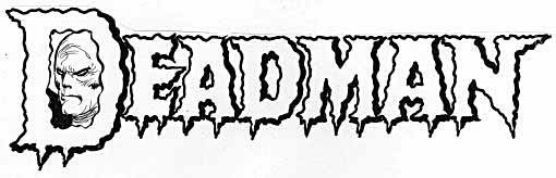 Here's a better look on an old photostat from the DC files. This time Schnapp was able to incorporate his classic letterforms in a more attractive way as a foundation under the wavy border, and the drips or icicles add even more points to the already extended serifs on the letterforms. As I've said elsewhere, pointy things on comics logos often add to its appeal. I'd say Ira still had it for this one! Deadman deserves his own logo study at some point, so I'll leave him here and move on.

With issue 217, the book became ADAM STRANGE ADVENTURES, an idea which seems obvious now, but it took DC a while to think of it! Adam Strange was another popular science fiction hero created under the editorship of Julius Schwartz, first appearing in SHOWCASE in 1958 (in fact I showed one of those covers in the first part of this study), then moving to MYSTERY IN SPACE—the companion title to STRANGE ADVENTURES—for a very long and popular run. The good news about him moving to this title was it returned the book to science fictional stories. The bad news was that the Adam Strange tales were nearly all reprints from MYSTERY IN SPACE.
The logo is by the man who took over most of DC's cover logo designing from Ira Schnapp, Gaspar Saladino, and the rest of the cover lettering is by him as well. He'd already taken over the cover lettering on this and many titles, the previous cover above also has his lettering. Gaspar brought a new energy and style to DC's covers, a more modern approach with lots of variety and artistry. That said, this logo is not one of his better efforts. The word STRANGE is very large and very readable, and the curve adds some interest (and works well with the art), but the shapes of the letters, particularly the S, are not as well-crafted as other work by him, and the widths of the open areas are somewhat inconsistent. Notice the way the right leg of the R is sort of attached below the loop, a defining style element that identifies this absolutely as a Gaspar logo. The words ADAM in a box and ADVENTURES look fine to me.

In the next issue, when the logo outline was in black with a yellow fill, you can see how uneven the shape of the S is, and R and A are not much better. This is great example of why, when designing open letters, the inner shapes of the openings are even more important than the outline shape, because in color, that's what usually stands out.
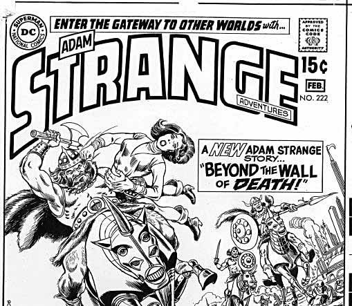
A slight change came on issue 222, as seen in this black and white cover photostat from the DC files, with ADVENTURES now also in a box and inside the G and E. Note the cover blurb touting a NEW Adam Strange story, perhaps the only one in this run.

With issue 226 in 1970, the title gained pages and a new logo by Gaspar, this one with much more accomplished letterforms and an open telescoping drop shadow in two point perspective. GIGANTIC now heads the logo, a bit of bombast, and from the artfully lettered sidebar (by Gaspar), it looks like most of the stories other than the featured one are reprinted from the Julie Schwartz era. The word ADVENTURES is set in headline type, not hand-lettered, but otherwise this is a fine logo and quite attractive. The perspective may be faked, not accurately worked out to a single vanishing point, something Gaspar often did, but if so, it still looks fine.
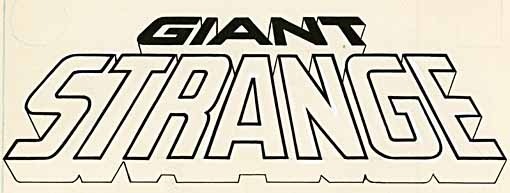
Here's the original Gaspar logo from the DC files, and as you can see, the title began as GIANT, and was probably changed to GIGANTIC later, perhaps in the cover-lettering stage. The perspective on GIANT is clearly a mismatch to STRANGE, the one on GIGANTIC is better. Notice again the way the right leg of the R attaches below the loop.

With issue 232 the topline was dropped, leaving more room for cover copy, here all in type rather than hand-lettered, and the cover is poorer for that. Perhaps Gaspar wasn't available to letter this one.
Next time we'll see one last gasp for the venerable anthology title, and two much newer revamps. Other chapters and many more logo studies can be found on the LOGO LINKS page of my blog.
February 16, 2011
Logo Study: STRANGE ADVENTURES Part 2

Images © DC Comics, Inc.
With issue 104 in 1959, editor Julius Schwartz began some new continued series, which would eventually rotate, one per issue. While it says nothing about it on this cover, the story it features was the first of the "Space Museum" stories.

There wasn't much of a logo for the series, just a small banner with the words A SPACE MUSEUM STORY in a comet configuration with a star at the end. Not much to say about it, either. The stories often featured great art by Carmine Infantino, and appeared every few issues.

Following the same model, issue 114 introduced another new series, "Star Hawkins," featuring a science-fictional detective with a robot assistant, Ilda, and once again with no cover mention. One has to wonder about the logic of that.

Here's a splash page from the series, showing another small banner logo, not much better than the Space Museum one, though at least it does have a star shape to give it a little visual interest. But these small banner logos were merely intended to let readers know it was part of a series, and didn't function as typical comics logos in my view. Star Hawkins also appeared every few issues.

Issue 117 cover dated June 1960 saw the introduction of a third series, the best known and most successful: "The Atomic Knights." Once again, Schwartz did not think this was worth mentioning on the cover…

…but inside, the story had a real comics logo, one that I'm sure was designed by Ira Schnapp. Schnapp was on staff, so it would have been a simple thing for Julie to walk from his office down to the bullpen and ask Schnapp to draw up this logo between his other assignments. Why he didn't do it for the other features, I don't know. Perhaps artist Murphy Anderson pushed for this one. Murphy often sat beside Schnapp in the bullpen finishing up work, as he used to tell me, and they traded stories and got on well. I bet Murphy was involved in getting this great logo on the series.
While the letterforms show off Ira's classic style, especially in the words THE and KNIGHTS, using Old English letterforms, you can see that he didn't know what what to do with the word ATOMIC, and he simply added small glow lines around it to suggest radioactivity. I loved this logo as a young reader, and it added polish to the fine stories by John Broome and Anderson, making the armor-clad characters seem almost like super-heroes in their own way. Nice lettering by Gaspar Saladino on the rest of the page, too! Could the logo be one reason why this particular series was so popular? I think so.

Beginning with their second story in issue 120, the Knights rated a topline on the cover, finally getting out the news that there was a series going on in this anthology title.

And for issue 144 the Atomic Knights made it to the cover, and about time! Sadly, they only appeared this once. I can't understand why, who wouldn't want to read about knights riding giant dalmations?

By issue 180 in 1965, Schwartz had handed over the editing of STRANGE ADVENTURES to Jack Schiff, who gradually pushed it away from science fiction and toward the kind of mystery and horror adventures usually seen in other DC anthologies like HOUSE OF MYSTERY. For this one he did introduce a character with staying power, though, Buddy Baker, later known as Animal Man, the man with animal powers. While his stories ran through a number of issues, he was a minor character at best until relaunched in his own series written by Grant Morrison beginning in 1988, which became a hit and a fan favorite. As you can see above, he didn't have a logo or even a manageable name at first.
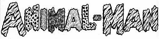
At some point Ira Schnapp did this rather creepy and unheroic logo for the character. I don't see it on any of these covers, so I don't know where it appeared, perhaps on the splash pages of his stories here. I can't imagine Ira came up with this idea, to use different animal skin/fur patterns on the letters, but he seems to have run out of ideas at the end. I have to say, this is one of my least favorite Schnapp logos!

By issue 190 he had a costume and a shorter name at least, if not a real logo. And he was joined by another super-hero wannabe who I believe went nowhere, as did a few other Schiff series attempts. Let's leave them behind now, and get back to cover logos for a bit.

Editor Jack Schiff must have wanted a new logo reflecting his direction for the series, and on issue 202 in 1967 this one first appeared. It's again by Ira Schnapp, now nearing the end of his staff time at DC, and this effort is not as successful as his first one in 1950.

Here's the original logo from the DC files. I think the further Schnapp got from his classic letterform roots, the less comfortable he became, and this logo shows that. Beginning with top-heavy letters that are inconsistent, then giving them a heavy and shaky outline, Schnapp tried to tie them together with an open telescoped drop shadow, but the result is not very good. The word ADVENTURES actually looks much better, even though it's small and a minor part of the total. The emphasis is on STRANGE, and if Schiff wanted a strange logo, he sure got one! the rectangular box allowed the small, thin ADVENTURES to show up on the cover, but did nothing to help the logo as a whole.
Next time we'll continue with the introduction of another long-lasting character, Deadman. Other chapters of this logo study, and many more, can be found on the LOGO LINKS page of my blog.
February 15, 2011
Logo Study: STRANGE ADVENTURES Part 1
Images © DC Comics, Inc.
At the end of the 1940s super-hero comics sales were falling, and publishers like DC were looking to branch out into other areas to bolster their line. One of those areas was science fiction, and an SF anthology book was planned. Apparently several titles were considered seriously enough for logos to be drawn up by staff logo designer Ira Schnapp. Here's one that went no further, using the same kind of layout and telescoped lettering made famous on the SUPERMAN logo that was originally conceived by Superman creator Joe Shuster, and then developed with professional polish by a logo designer believed to be Schnapp. Clearly SPACE was the important word in this title. The lower case IN is an interesting departure from the usual classic block letters Schnapp liked to use on many of his logos. One thing about this design is it's very tall. It would have taken up lots of room on the cover, not always a good thing. Notice the black border and the word in type on the right, "PROPRIETOR"? This was apparently a preprinted art board intended for logos that could then be photocopied, have the company name and information typed in ahead of or above the printed word, and sent off to the copyright office in Washington. Ira must have been given a supply of them to work on, though I've only seen examples on a handful of logos in the DC files.
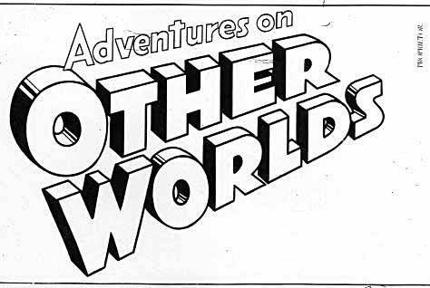
Here's another that I think is from the same time, the clue being the word ADVENTURES, and the similar approach to the logo design, though this one is not curved. You can see that Ira liked to shade the telescoping on his large block letters to give them more weight and depth, thereby using black as a color. This one is also pretty tall, and likewise went no further, though a different design for these same words was used on two issues of SHOWCASE in 1958, designed by Schnapp:

But I digress, the final title decided on for DC's first science fiction anthology was this one:
This is another Ira Schnapp design which again uses block letters, once more in three point perspective with the left point of the A in ADVENTURES closest to us and a telescoping drop shadow. This is a photocopy from the DC files, but not the original Schnapp art, which is no longer there. I'm guessing the original would have had one part of the telescoping, either the bottom faces or the sides, filled in with black, as on the other logos above, and this version was modified to open those up for color. The use of multiple shade lines on each U indicates that, and the heavier connecting lines on the bottom facets suggests they were once up against solid black and then cut open.
As a design this is attractive, though not as interesting as many of the super-hero logos Schnapp worked on. Editor Julius Schwartz was handling the title, an appropriate choice since he was an SF fan and former SF writers' agent, and if Julie had any input, I'd guess he would have suggested making the logo look somewhat like the SF pulp magazines it was hoping to draw an audience from, as well as comics fans. Thus, a more conservative look, nothing too flashy or "comic bookish." The three-dimensional feel was equally appropriate for the SF pulps and movies of the time as well as comics.

DC's commitment to this title choice is shown further in this ashcan edition, made up with any art on hand (obviously from a Western title) and also sent to the copyright office in Washington to secure the rights to the title. And sure enough, there's the original version by Schnapp with the solid black areas! The one very odd thing here is the angle of the logo, aligning the bottom edge to horizontal, but since this was not for publication it didn't really matter.

Here's the first issue, dated Aug.-Sept. 1950, and showing editor Schwartz pushing the science fiction connection for all he was worth, with a cover showcasing a heavily retouched photo from the upcoming SF film "Destination Moon." Interestingly, this was the first film adapted from the work of SF writer Robert Heinlein, a friend and I think occasional client of Schwartz in his agenting days. Heinlein was involved in the production of the film I believe, so perhaps Schwartz got the still and permission to use it from him.
The logo is again the one with black in the telescoping, now aligned correctly with the top edge horizontal, and looking quite nice and SF pulpish. Inside this generous package of 52 pages for 10¢ were five stories and a two-page text filler. The "Destination Moon" 8-pager was an early work by writer Gardner Fox and artist Curt Swan, both with long careers at DC. One story was a reprint from REAL FACT #3, two others were the first of many about recurring characters Darwin Jones and Chris KL99, respectively. I mention this because, since the logo did not change for many years, I'm also going to look at logos for series within the title.

While Darwin Jones never had even a story title with his name in it for some reason, Chris KL99 usually did. Not really a logo, just an open-letter title, and one that's not particularly well drawn. I think this is about as close as we can come to a logo for him, though. Created by Schwartz friend and former client veteran SF writer Edmond Hamilton, Chris KL99 reappeared in many subsequent issues.

Here's his first cover mention on issue 3, still not a logo, but more artfully lettered by Ira Schnapp at least. Very much in the mode of other Hamilton characters, he was a heroic space explorer with no super powers, just some interesting alien friends.

On issue 9 we can see the alternate version of the logo with open areas where the black had been, and used in an interesting way, a negative version making all the black lines white, and then having solid color filled into the fronts and sides of the letters. A surprisingly effective use of red, yellow and blue against the starry background. This issue also introduced a new recurring series character, Captain Comet.

And this time he got an actual logo, making good use of the name visually in a curved comet shape speeding from right to left, allowing the curve of the C's to emphasize the shape. Nothing else very memorable about the letterforms, they're standard block letters with small speed lines supplying a sort of drop shadow, but it's a good visual idea. And the character is also much more super-heroic in appearance at least, indicating an attempt to get more super-hero fans reading the book. The listed author, Edgar Ray Merritt, was a pen name for John Broome, another Schwartz regular, with the pen name probably lifted from three SF authors: Edgar Rice Burroughs, Ray Bradbury and A.A. Merritt.
The SA logo remained unchanged for all of Julie's editorship, about 16 years. Next time we'll look at another popular series within the pages, and then other logos under other editors.
Lots more logo studies, and other chapters of this one when posted, can be found on my LOGO LINKS page.
February 14, 2011
Begins tomorrow…
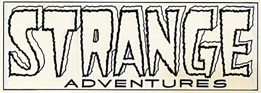
Image © DC Comics, Inc.
And Then I Read: BRIGHTEST DAY 10 – 12

Images © DC Comics, Inc.
I'm not sure if it's because I read these three issues together or not, but I found the story easier to follow here, and more involving for the most part. They follow: Firestorm, in revelations about his true power of destruction, and the birth of a negative version of Firestorm, Deathstorm; a new Aqualad, apparently the son of longtime Aquaman villain Black Manta, as his powers are unveiled in a confrontation with his father; the apparent birth of a whole new group of Black Lanterns (not a good thing, I was hoping we'd seen the end of them); and finally, on Mars, J'onn J'onnz's confrontation with the other green Martian that has been tormenting him, a truly creepy character in every way, both physically and mentally.

The art continues to be by several teams of pencillers and inkers, though again the styles meld seamlessly, and I can't see any real differences from one page to another. This continues to impress me, it's been a long time since DC was able to pull off the house-style trick.
Well done, though still occasionally confusing, probably because of the large cast and plotting that goes beyond this book into others. Still, recommended.
February 13, 2011
Pop-up Cats

It's been a while since I posted about our cats Tigger and Leo, but then it's been a while since they did anything particularly new and amusing, at least when I had the camera ready. Last night they did. I've shown this toy before, the Cat Cube, made out of fabric on a plastic rod frame, with holes in three sides. Leo loves to sit in it and play in it, but I usually don't get it out until after our evening play time, which usually involves me teasing them with one of the many toys on a string we've accumulated. This time, the cube was already out when I started dangling a feather on a string for them. Leo was in the cube, so I started dangling it over the top opening…

…and Leo would leap straight up after the feather like a jack-in-the-box, very funny! This is the best shot I could take of that, he got much higher. Before long Tigger got involved…

…and as usual tried to outsmart me by standing on the cube instead.
It worked for him! Ellen and I had some good laughs at the "pop-up cats," until they got tired of the new game, which didn't take long.
February 12, 2011
Podworthy: RALPH VAUGHAN WILLIAMS
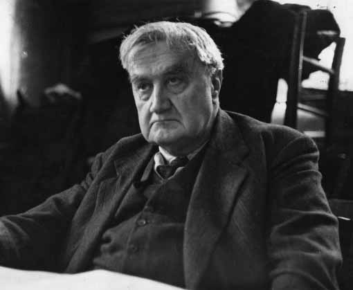
In addition to pop music of various kinds, I'm putting selected classical works on my iPod, and my first choice for this was some of the work of my favorite composer Ralph Vaughan Williams. Incidentally, his first name is pronounced the old English way as "Rafe," and both Vaughan and Williams are last names, he has two.
I'm not sure when I first became aware of the work of this quintessentially British composer, actively composing and presenting works from about 1900 to 1958. My high school choir did a few of his choral pieces, so that was probably it. I wasn't in the choir in high school (something I now regret), but had several close friends who were, so I went to all their concerts and that fostered a lifelong love of choral music in general. RVW, as I'll call him from now on, composed some fine choral music, but is better known for his orchestral works, including nine symphonies, and many concertos, songs, operas, and so on. His work is not often performed live, since it's still copyrighted and requires royalty payments, but it's well-recorded. I think I began exploring that in the early 70s, via library albums and purchases. My favorite versions of many of his works are the ones conducted by Sir Adrian Boult with English orchestras, though many other versions are also quite good.
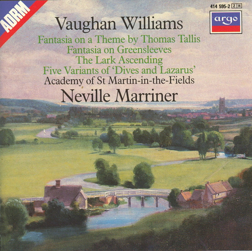
Here's a fine recording you can sample on iTunes or Amazon which includes two of his best shorter orchestral works: the Fantasia on a Theme by Thomas Tallis, and The Lark Ascending. Both are well worth a listen, I've linked to mp3s below. RVW's music is lush, romantic, and often mystical. He drew inspiration from English hymns, from whence the Tallis comes, and English folk songs, many of which he heard personally sung by traditional singers in the countryside when he and his friends would go out with early recording devices to capture them, saving some songs from being lost forever, as those traditional songs were being replaced by the pop music of the time. "Dives and Lazarus" above is one of those, but they turn up throughout his work. Some of his works are more harsh and dissonant, inspired by the two world wars he lived through, but those are the minority.
So, while I own nearly everything RVW wrote that's been recorded, these are the works I've put on my iPod for now, creating a solid body of eight hours of great listening:

This Chandos 2-disc set has lots of fine music, including favorite Flos Campi. I've used all of it.

Another Chandos 2-disc set contains many of his concertos, including great ones for string orchestra, for oboe, and for tuba. I've used all of it as well.
For the symphonies, I've used #2 "London," #5 (no nickname) and #7 "Antarctica." Those are my favorites, with #5 probably at the top.
For vocal/choral I'll probably add more later, but for now I've loaded On Wenlock Edge, a song cycle and Five Mystical Songs for soloist and chorus. Then a few other short orchestral works: In The Fen Country, and Norfolk Rhapsody #1.
RVW's music is perhaps an acquired taste, but if you have any interest in classical music and are not familiar with his work, give it a try. Especially if you're an Anglophile like me. I once put together a slide show of my favorite photos taken in England, and the "Tallis" was the perfect soundtrack.
Here are some Amazon links:
Todd Klein's Blog

- Todd Klein's profile
- 28 followers

