
Todd Klein's Blog, page 356
February 1, 2011
And Then I Read: ADVENTURE 518 – 520

Images © DC Comics, Inc.
I enjoyed these three issues more than the last ones I read, perhaps because writer Paul Levitz is mixing things up nicely with a variety of storytelling techniques. ADVENTURE focuses on early Legion tales, and I'm sure they're woven skillfully into existing continuity, I'm just not up on that enough to tell. 518 focuses mainly on the pursuit of a smuggler with grand ambitions and apparently plenty of resources. Paul marshals and deploys his forces with chess-like precision that's fun to read. The future Dream Girl (I think) has a premonition about a Legionnaire death, and Superboy confronts his doom and a ghost. 519 has some of the Legion visiting Superboy in Smallville to experience his life and times, and along the way defeat a villain that Brainiac-5 knows a lot about. It's a cute setup and another fun read. 520 is an abrupt change of pace, beginning with a Legionnaire funeral, then working back through the story to explain how that came to be. Reminds me a bit of the structure of "Citizen Kane," though I'm not saying it's in that class of storytelling. Not bad, though telling the story backwards does rob it of some of the drama and emotion that might have come from doing it the obvious way. And, of course, we can be pretty sure that the death shown here will not be a permanent one.

Either the art by Sharpe and Alquiza is improving, or I'm just getting more used to their style, but I thought it mostly worked better than the last issues I read. Here's a nice closeup that conveys emotion convincingly, and the storytelling is good throughout.
Still not motivated to read the Atom backups, sorry.
Recommended.


January 31, 2011
And Then I Read: AMERICAN VAMPIRE 5 – 7

Images © Scott Snyder and DC Comics.
Issue 5 wraps up the first arc of this series, both the main story about Pearl Jones, the newly created vampire, and Skinner Sweet, the experienced older one. Both stories provide enough satisfying closure while of course leaving room for more. Pearl has gone through the various stages of "death," and emerges here intent on revenge, while Sweet gets his own kind of revenge both back in the 19th century and in Pearl's era of the roaring twenties.
Issues 6 and 7 introduce a new location and era, Las Vegas in 1936, when it was a small corrupt, vice-ridden town, as opposed to a large one. Skinner Sweet is there, and as you can imagine, wreaking havoc on some old enemies, while on his trail are a pair of vampire hunters. Pearl just shows up briefly at the end of 7, no doubt to play a bigger part soon. The storyline, now all by Snyder, is interesting and well-paced so far. I like the fact that he focuses on the vampire hunters and Sweet's victims, leaving Sweet himself mostly in the shadows. Makes for a nice change. I do have to wonder who's going to emerge as a sympathetic character in this one, as everyone seems to have a dark side in this series.

The art by Rafael Albuquerque is generally fine, though issue 7 seems more rushed, with the faces losing consistency and definition, not a good thing for his style, which is already kind of loose and cartoony at heart. I'd rather see him inked by someone with talent than have the art go this direction myself. Don't know if that's possible, he may do some of his drawing at the inking stage.
Recommended if you're a vampire fan.
January 30, 2011
Podworthy: DONOVAN
While my first entry in this series, The Beatles, is probably an easy sell, Donovan Leitch may well not be. I've always liked his voice, and many of his own songs, following his career through several distinct periods from the 60s to now, an enthusiastic fan through the 60s and 70s, less so after that, though finding some tracks I liked on most of his releases. I saw him live twice, once at Madison Square Garden around 1970 in front of a massive audience, once a few years later at a rock concert theater venue on his way down in popularity, but still putting on a fine show. He largely disappeared in the 80s, but had a pretty good comeback release in 1996, "Sutras." Since then he's mainly redone some older tracks.
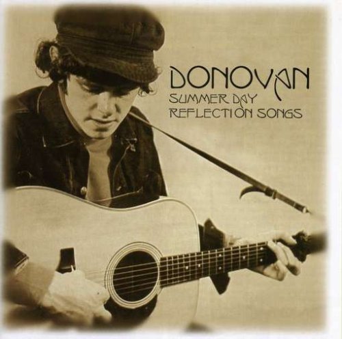
The first part of Donovan's career he was a folksinger in small British venues, heavily influenced by Woody Guthrie and his peers, who also influence Bob Dylan, and Donovan was often called a Dylan clone, though he never actually performed any Dylan songs. His vocal style was similar at times, though Donovan's vocal abilities were stronger and had much more range than Dylan. This period was captured in his early records for the Pye label in the U.K., released in the U.S. in a very annoying way on the Hickory label and later others. Each release had some of the same songs, usually the hits "Catch the Wind" and "Colours" with a few new tracks, so finding all the tracks became an expensive project that I gave up on after a few albums. When I was getting Donovan material together to put on my iPod, I found the "Summer Day Reflection Songs" collection online, which has all the Pye tracks plus about a dozen unreleased or alternate ones. I bought it as downloads, and loaded all but a few tracks on my iPod. Some favorites from this period, in addition to the hits, are "To Try For The Sun," "Circus of Sour," "Belated Forgiveness Plea," the title track, and "Sunny Goodge Street." The last one marked a transition to Donovan's next period, with a smooth jazz arrangement.
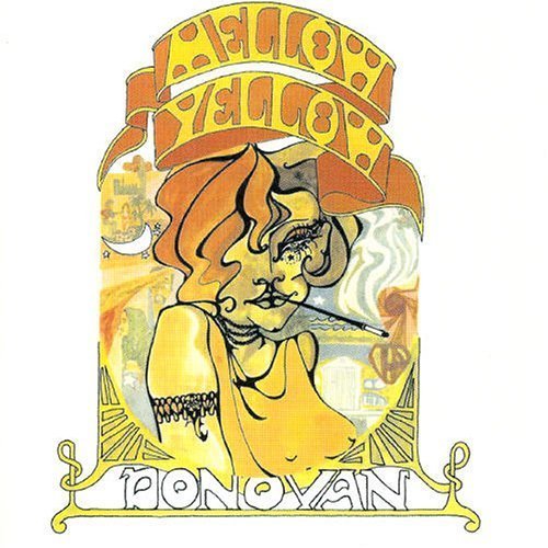
Donovan next teamed with producer Mickie Most and arranger John Cameron to create some of my favorite tracks of his career. The arrangements were full of variety, some very jazz influenced, some more folky, a few rockers like "Season of the Witch," with clever lyrics and great melodies. Donovan's vocal style matured, often going for a breathy sound that some people don't like but I do, while showing on other tracks that he had the pipes to rock out when needed, or the craft to make other styles work well for him too. The first album in this period was "Mellow Yellow," then "Sunshine Superman," the poorly titled "A Gift From a Flower to a Garden" (two discs, one aimed at children), "Hurdy Gurdy Man" and "Barabajagal." Of these, the first two are my favorites, but I like all of them, and wanted nearly all the tracks on my iPod. Online I found that newly remastered versions of all but "Gift" were released a few years ago, and I decided to splurge and ordered the four CDs. I already had "Gift" on CD. All those original tracks went on the iPod, and some of the bonus tracks, which include singles not on the albums like "Lalena" and "Poor Cow," and demos, some good some not.
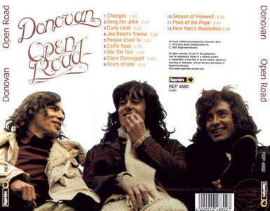
Donovan's first album after splitting with Mickie Most was "Open Road," released around 1970, and at the time it became my favorite album. Some of the songs are a bit silly and self-indulgent, but I like them all, especially "Celtic Rock." In fact, this was an attempt to create a Celtic Rock band, but it didn't last long.
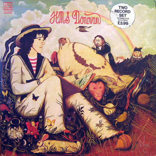
Donovan's next effort was "HMS Donovan," released only in the U.K., and because of that I didn't find out about it until a few years ago, though I heard some of the songs on it from time to time, not knowing where they were from, like "Celia of the Seals" and "Lord of the Reedy River." It's a bit of an odd mixture of mostly children's poems and songs with some originals, and I can't say I love it, but I like it well enough to put most of the tracks on my iPod.
Donovan continued to record through the 70s, and I liked what he did then less and less as time went on. Donovan had embraced the flower child image in the 60s, and when that seemed no longer relevant he tried to become a more mainstream pop star, but it never worked well for me. Despite that, there are twelve tracks on the album "7-Tease" I like well enough to include, and eight on "Slow Down World," with a few on each of the others that I picked up from the anthologies "Try for the Sun" and "Troubador" along with some unreleased tracks that are good.
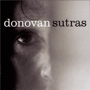
"Sutras" from 1996, produced by Rick Rubin, was a new phase for Donovan, going back to his folk roots with very simple arrangements and sparse close-miked vocals. It's kind of melancholy in parts, but in general I like it a lot, and included all the tracks. Some later releases I haven't yet heard, but plan to listen to them online eventually.
So, 194 Donovan tracks on my iPod. Haven't gotten tired of any of them yet!
January 29, 2011
A few chips here, a few there…
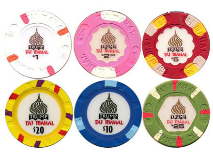
Saturday I went back to Atlantic City to play poker at the Taj Mahal casino for the first time this year. I sat down at about 10 AM at a cash game and played for an hour, winning $86, largely from one player who I thought was making a lot of loose calls. Every time I bet he raised me, and finally he went all in for $40. I had a pair of sevens, so I called and beat his ace-high hand.
At 11:15 I entered the small morning no-limit hold-em tournament for $65. I did well in the first hour, doubling my chips, then coasted for a while, winning one large pot in the second hour. I had pocket queens, the flop was jack-ten-five, the turn was another jack, giving me two pair. One other player kept raising, and I thought it was likely he had me beat with at least three of a kind, maybe a full house, but his raises were low enough to keep me in the game. Finally the river turned another queen, giving me a full house, queens over jacks. I went all in, and he called with a lower full house, so I doubled up. That kept me going well into the third hour, where I won a few small pots. The field of 50 dwindled, and by the time it was down to 11 players in the fourth hour, my stack was getting short. I managed to stay around into the money, though, going out in seventh place with a win of $109.
So, the cash game win of $86 plus the tournament win of $109 makes $195, minus the $65 entry fee on the tournament is $130. I contributed $5 to the bubble boy loser, finishing just out of the money, as did the other 9 players remaining, and spent $8 on lunch and $5 on parking, so my real win for the day was $112, which is just fine. I enjoyed playing, though my legs do get sore from the cramped position they're in at the table. I don't know how older guys can sit at big tournaments for days on end! It was a fun day overall despite that, and I wish I had time to play more often.
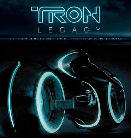
Watching TRON: LEGACY
© Walt Disney.
So, Ellen and I were trying to think of something a little different to do for my birthday yesterday, and she suggested going to the IMAX theater in Atlantic City. I checked the listings and only "Tron: Legacy" was playing, which I thought I might enjoy, since I liked the first one from many years ago. It's definitely not Ellen's sort of film, but she agreed and we went.
Essentially it's two hours of eye candy. Impressive special effects, but very out-front ones for the most part, just about what you'd expect. I liked that aspect of the first film, but computer animation was newer, and I was a much younger geek then. Now I have to say I prefer special effects and CGI to be more integrated into an interesting story, like "Avatar," for instance. The only somewhat subtle touch was the CGI young Jeff Bridges head on the character Clue. Well done, but once the aging Bridges shows up, the young one becomes less convincing and more of a gimmick. Other actors are mainly present as more eye candy: attractive, fit bodies in skin-tight costumes and heavy makeup performing athletic acrobatic fights and races. Nothing wrong with that, but while it entertained me visually, it did not involve me in the story, which was pretty thin stuff in any case, more like a video game than anything, moving one along from one level to another and out.
Mildly recommended for anyone my age (!), probably more appealing to young guys.
January 27, 2011
Hulk Logo Study Update

Image © Marvel Characters, Inc.
Back in September I received an email from writer/artist Erik Larsen about my Hulk Logo Study part 2. He wrote:
You missed a HULK logo–and one of my favorites–based on Walt Simonson's design from a panel in #1–RAMPAGING HULK sported THIS for a short while. The ™is placed in an awkward, ham-fisted and intrusive manner here but but the logo itself is otherwise powerful and readable.
It took me a while to get to it, but recently I contacted Walter. He found the page of his art Erik mentioned, and it is indeed the source idea for this logo. I've just updated that part of the logo study, you can read more there. Thanks, Erik and Walter!
January 26, 2011
And Then I Read: LEGION OF SUPER-HEROES 5 & 6

Images © DC Comics, Inc.
Repercussions from the destruction of Titan, the moon of Jupiter, continue, as a Titan refugee camp on Earth is under attack from Earthers who don't want them here. Among the Legionnaires sent to help is Earthman, formerly as much an alien-hater as any of the attackers, but now coming to a different point of view. Not all the Legionnaires trust his change of mind, but one in particular seems to…clues on the cover above.
Paul Levitz continues to keep me entertained on this book, with other storylines including a search for a new last Green Lantern, Brainiac-5's continuing time travel research, and an election for the next Legion leader. I've read at least one comment that called the current storylines "very 1980s." If so, they suit me just fine. The interplay between the team members seems perceptive, and the moral quandaries are well-portrayed. I like it.

The art team on the main stories is doing a good job, led by penciller Francis Portela, and there's a good backup story by Phil Jimenez in issue 6. I can't say the art is particularly outstanding, but it all works well for me. With such a large cast of characters and complex settings, it can't be an easy task drawing this book, and the team handles it all quite well. Recommended.
January 25, 2011
Incoming: BACK ISSUE 46

© Mike Grell and TwoMorrows Publishing.
For some time now, John Morrow has been sending me, gratis, the digital edition of his magazine about comics of the 1970s and 80s, edited by Michael Eury. While I appreciate it, I have to admit I often don't have time to do more than skim through them. Problem is, my reading time is in the evening, after I'm off the computer. While I'm on it, I rarely have a chance to read lengthy articles, no matter how well-written, and they usually are. This time I'm going to make an effort to read more, as issue 46 focuses on comics and series that were written and at least partially drawn (sometimes completely finished) but never published for one reason or another. A great subject, and one that interests me. Both the digital and print versions should be available on the TwoMorrows website. If this sort of thing interests you, too, give it a look.
January 24, 2011
Toth, Saladino, Schwartz

Images © DC Comics and the estate of Alex Toth.
Recently when discussing 1950s-60s lettering with artist/inker Steve Leialoha he mentioned he had an original unused Alex Toth page from an early issue of Strange Adventures, one with a note on it to letterer Gaspar Saladino. I was intrigued and asked if he could scan it for me. He was kind enough to do so and agreed to let me use it here. There are a number of things about this page I find quite interesting.
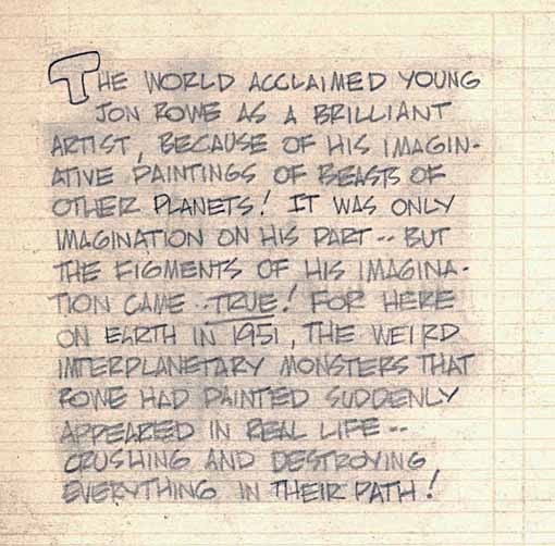
First, focusing on the caption at upper left as pencilled in by Toth. Alex Toth is an artist revered by other artists, and appreciated by many comics fans as well. In addition to lots of great art, he often did the lettering on his strips, though not on this one, but you can see his blocky lettering style inherent in this pencilled caption with the open initial capital T. Another interesting feature of this page is the preprinted lettering guides, which Steve says are in very light gray. They cover the entire "live art" area of the piece, in other words, the area where art was to be drawn, allowing white margins on all sides. Bleed art, which runs out to the edges of the paper when printed, was not permitted on interior pages, only covers. I've never seen art boards with these lettering guides on DC pages, though Steve has another from a Wonder Woman story. It must have saved letterers a lot of time. I've seen similar ones made much more recently with pale blue lettering guides, but none from the 1950s like this one.

Here's an example of Toth's own lettering on a how-to piece from the 1970s when he was working on the Super Friends cartoon show. Very similar in style to his penciled caption above, but more carefully done, of course.
Here's the block at lower right closer. This is very appealing lettering, having a nice bounce and attractive letterforms. I love the very angular S, a style which I think John Workman picked up in his lettering. Notice how he adds variety with bold words and lower case. Some of the letters tend to run together making it a little hard to read in places (for example the word MORE at lower right), but it's nice work. So, the fact that Toth wasn't lettering his own pages at DC in 1951, the time the art was probably produced, is interesting. Perhaps he didn't have the option.

Here's the note to Gaspar Saladino at lower right, asking him to use "legit type" in the sign. Gaspar was, himself, new to lettering comics then, with his first known credit being issue 9 of the western title JIMMY WAKELY published late in 1950. The artist on the lead story there, one of several credited to Gaspar? Alex Toth! Alex must have liked working with Gaspar, knew what to expect from him, and that he'd be lettering this story. As described in THIS chapter of a series of articles about Gaspar on the "Dial B for Blog" website, they went to an art-training high school together, though Toth was in the grade below, but they must have known each other for a while.
Another possibility is that this 10-pager could be a very early story in Gaspar's lettering career. There's no issue number indicated by Toth on the pencils, so it may not have been assigned when when he started it, and editor Julie Schwartz always liked working well ahead of deadlines. The story might have been drawn some time in 1950 when Gaspar was just starting to letter comics.
Despite the note, Gaspar would have hand-lettered the sign, trying to make it look as much as possible like a sign with real type. The option of dropping in actual typeset fonts wasn't easily available then, as it is now with computer lettering. This may have been somewhat daunting to the newbie letterer, but as we'll see, the redrawn version of this page didn't have the sign, and I don't know if it appeared on any later pages. If anyone has the complete story, I'd be interested to find that out. If not, Gaspar dodged the problem entirely, and probably never saw the note on this unused page!

Here's the revised page as printed, also courtesy of Steve Leialoha, and now the input of editor Julius Schwartz comes into play. The first, uninked version of the page is a close side view of the monsters emerging from the pictures, but it's pretty hard to tell that, aside from the clues in the sign. The storytelling is unclear, there's no human reference for scale, and the paintings are only suggested, not seen. All these problems are solved in the revised version, very likely at the direction of editor Schwartz, who always said he didn't know much about art but knew what he liked. Obviously he like things to be made clear! The result is infinitely better in every way.
This story appeared in issue 13 of STRANGE ADVENTURES, cover dated Oct. 1951, with only writer Edmond Hamilton credited. Julie brought in writers he knew from his science fiction fandom and agenting days to write for both STRANGE ADVENTURES and MYSTERY IN SPACE, the two science fiction anthologies he handled in the 50s and 60s, and while credits were often missing on other DC titles, the writer at least usually got one on these. I imagine the writers were used to being credited elsewhere, and demanded it. Hamilton was a long-time pulp writer, well known in that arena, and the creator of Captain Future, who was popular enough to headline his own pulp magazine.
Toth, on the other hand, was still fairly new to comics, having started at DC in 1947, and with his best-known work ahead of him. The story was inked by Sy Barry, another regular in the Schwartz stable, and brother of Dan Barry, the "Flash Gordon" strip artist. I know this not only from the Grand Comics Database, but from a list of credits I made for STRANGE ADVENTURES in the early 1980s, when Julie gave me access to his payment records. At the time I was reading through the entire series in the DC library, and taking notes, hoping to write an article for DC's in-house fanzine THE AMAZING WORLD OF DC COMICS, but that was discontinued before I had the chance. My note for this tale was: A psychological story with excellent plot and no obvious outdating.
Gaspar did lots of work for Julie, including many of the Silver Age superhero relaunches such as THE FLASH, GREEN LANTERN and JUSTICE LEAGUE OF AMERICA. He soon became one of the best letterers of all time in my opinion, but that was later. This early example of his work shows him doing a fine, competent job on the caption, perhaps following Toth's layout exactly (though it differs from the unused one a bit). The letterforms look very much like early Gaspar to me.
I don't have a larger image of the printed caption, but here's one from a story in STRANGE ADVENTURES #7, cover dated April 1951, which I believe is the first Gaspar lettering to appear in the title. It has Gaspar's distinctive S shapes, which are not too far from Toth's, with a wide horizontal center stroke, though the other sections are more rounded. In fact, a lot of Gaspar's letterforms are similar to Toth's now that I consider them, and Gaspar may well have looked at Toth's lettering as something to emulate, much as I looked at Gaspar's letterforms myself when I was learning to letter comics in 1977-78. Certainly Gaspar's style has always been more angular than most of his contemporaries.
The story title, however, is not well drawn or designed. It comes across as almost amateurish, in fact. If I didn't have the evidence of the note on the earlier page, I'd almost say he couldn't have lettered the story title, but it seems he must have. The chance of Gaspar lettering only the caption and not the title is pretty slim. All we can surmise is that he was still finding his way with display lettering.
The top line in script shows the influence of Ira Schnapp, who would have been working on staff at DC then, lettering mostly covers, logos like the one above, and house ads. Gaspar would surely have been studying Schnapp's work and perhaps was trying to do something similar here, but not succeeding very well. The style for OTHER WORLDS is quite atypical for comics of the time, I'm not sure where that idea came from, but it doesn't work for me, and has all kinds of design problems and inconsistencies. Luckily, Gaspar got much, much better at title lettering soon. Even the story title in the other example above from STRANGE ADVENTURES 7 is infinitely better. Could it be that someone else lettered the "Artist of Other Worlds" title, perhaps someone in DC's production department? I can't think of a good reason why that might happen, but it's always possible.
There you have it, a lot to say about one page of a comic!
January 23, 2011
And Then I Read: IRREDEEMABLE VOL. 4

Images © Boom Entertainment, Inc.
After some brief flashback stories, one with memorable art by Howard Chaykin, Mark Waid continues his saga of The Plutonian, a godlike superhero turned destructive menace, and his former friends and enemies in an uneasy alliance, desperately trying to bring him down. This time, as they actually confront Plutonian in a combined effort, more personal agendas come to light that lead to betrayals and dissension. Clearly the stress of the situation is bringing out the worst in everyone.

The artist on the main storyline is Diego Barreto, son of artist Eduardo Barreto, and his style is clearly similar to his father's. Both artists have a fine command of anatomy, storytelling and technique, making their work a pleasure to see, and helping the stories immensely.
Despite the somewhat depressing inability of anyone to stop The Plutonian in this series, I find it compelling reading, and recommended!
Todd Klein's Blog

- Todd Klein's profile
- 28 followers

