Brian Clegg's Blog, page 64
October 26, 2015
Bin the PPI calls
 'Hello, I'm not selling anything, I just
want to ask you a few questions...'I'm sure I'm not alone in having been pestered with calls on my mobile, telling me that I ought to get compensation for my PPI (something that, as a self-employed person I couldn't have sensibly taken out) - and just as that fad is fading, we will no doubt be hit by loads of calls for the next banking miss-selling scandal: probably Sentinel card protection insurance.
I never get calls like this on my home phone, because I'm registered with the Telephone Preference Scheme. This is a brilliant service (UK-only, but there may be equivalents elsewhere, particularly in other EU countries) where you register you number and all legitimate call centres should take you off their calling lists. It's not 100 per cent perfect. It can't stop those calls from the Indian subcontinent claiming to be from 'Windows' and telling you your PC is compromised. And the occasional legitimate call slips through where the lists haven't been updated - though they then apologise and hang up if you tell them you are TPS registered. But on the whole, it's wonderful. We never get those irritating teatime cold calls about double glazing or whatever the sales push du jour happens to be.
However, I was increasingly getting those mobile nasties. It had never occurred to me to check whether mobile phones can also be listed - but apparently they can. So I will be running, not walking to the TPS website to register. It's quick and easy. You can register your landline, mobile and even business number if you have one (the only proviso is that the business version has to be renewed each year, while the personal version is self-renewing). There is also a mail equivalent, though most people are less fussy about junk mail, which, after all, is less intrusive.
Have you registered for TPS? If not, why not?
Published on October 26, 2015 03:07
October 23, 2015
No more passwords
 Reflecting the exaggerated claim syndrome I mentioned a few days ago, New Scientist recently carried a quote on quantum key distribution (QKD*), where an encryption key is randomly generated when needed from a quantum source. Apparently John Rarity of the University of Bristol told the magazine that you will soon be able to pick up a batch of keys on a credit card sized device, perhaps from an ATM, and use them to login to an account, such as your bank.
'You would never need to remember a password or pin again, QKD does all the work for you.' Was the dramatic pull quote.
Leaving aside the fact that most of us are less likely to use ATMs these days than we once did, what isn't all that obvious is why this is any better than, say, storing a very strong password on your phone. In either case all someone needs do is steal the device and they're in. Which means the the device needs to be protected by either biometrics or, duh, a password or PIN. So how does this improve security?
I've contacted Dr Rarity asking if he could explain, but as yet have not had a reply.
* Not to be confused with WKD, which I believe is an alcoholic drink.
Published on October 23, 2015 01:35
October 22, 2015
Sexy statistics
 I am totally baffled by some statistics that are are frequently used on the average numbers of sexual partners for males and females. It has been in most of the newspapers, and I most recently saw it in New Scientist, where the common numbers of males having 12 partners and females having 8 partners came up. This seems strangely asymmetrical when there are approximately similar sized populations of male and female. And yet, bizarrely none of the articles question this oddity. Neither do the main sources the papers used: the Lancet and the Wellcome Trust.
Let's see if we can make sense of these numbers using a mini model. As always with scientific models we need to be clear what assumptions are being made. Initially I am only looking at heterosexual partnerships - which may be an issue, so I will come back to this later. As we have a ratio of 3 to 2 between the numbers of partners, I'm going to try to set up my model with each male having three partners and each female two. I have a population with six males (A...F) and six females: (1...6).
Let's set up the males with three partners each a couple of different ways, starting with a simple, systematic allocation:
A: 1,2,3
B: 4,5,6
C: 1,2,3
D: 4,5,6
E: 1,2,3
F:4,5,6
Here females 1,2 and 3 have partners A,C,E and 4, 5 and 6 have B,D,F. Not surprisingly, females have the same number of partners as males.
Let's try a more scrambled set:
A: 1,2,3
B: 5,1,2
C:2,3,4
D:1,6,2
E:1,2,4
F:4.5.6
Now how have we done? Here are the females:
1:A,B,D,E
2:A,B,C,D,E
3: A,C
4:C,E,F
5:B,F
6:D,F
Aha, it's no longer symmetrical. But take the mean and once more the females have an average of 3 partners. So without homosexual partners it's difficult to make the maths work. Here's an arrangement that does produce the right ratio:
A: 1, 2, 3, B, C
B: A, C
C: A, B
D: 1, 2, 3
E: 4, 5, 6
F: 4, 5, 6
Yet this too looks dubious. According to the same studies that produce these figures, the percentage of men reporting homosexual relationships is 4.8%, where I needed 50%. With 4.8% of males having homosexual partners and no females having them, we would need those males to have vast numbers of extra partners - and this ignores the reported female homosexual partnerships, where the percentage was 7.9% - more than the males. Result? Total confusion.
Unless someone can clarify where I've gone horribly wrong here, I think all those newspapers (and New Scientist), the Lancet and the Wellcome Trust) announcing that on average males have 12 sexual partners and females 8 are simply getting the facts wrong. Admittedly the original press release said that for instance 'males reported 12 partners', but this quickly became 'on average men have had 12 partners.' However, what they really should be reporting is that people don't tell the truth about the number of partners they have and because of this, these numbers are useless, except as a study of the psychology of lying.
Published on October 22, 2015 03:36
October 20, 2015
Why psi research and ghost hunting will always struggle as science
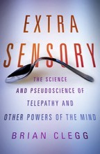 I've always been interested in the possibilities of psychic phenomena and ghosts - as a teenager, the books about the Borley Rectory hauntings were amongst my favourite reading material, and it was part of the reason I wrote Extra Sensory. There are, without doubt, those amongst the community investigating these phenomena who take a genuinely scientific approach. But it has struck me recently, while reading a book by a scientist on the effects of the moon on living creatures, that in this kind of field it will always be an uphill struggle to take a scientific view.
Here's why. Let's take the example of physics researchers attempting to detect gravitational waves. These ripples in spacetime are predicted by the general theory of relativity, but have never been directly detected. A couple of experiments have recently failed to detect these waves, in one case (BICEP2) rather dramatically, after first claiming that they had been found. But here's the thing. In physics, the null hypothesis is usually just as interesting as finding what theory predicted. If you can show that it's highly likely that gravitational waves don't exist, it's arguably even better than finding them. Yes, finding them would support the current best theory - but if you can show they don't exist you have found a hole in a major theory and have cause for celebration.
However, most reseachers in psi and ghost hunting (and for that matter in medicine, though that's a different story) have a particular outcome they want to support. They want, for instance, ghosts to exist. And finding nothing is not an exciting alternative. It's an unwanted outcome. So although some investigators will be truly scientific and publish a null result, many will put the negative outcome to one side and will only ever report an apparent positive finding. Cherry picking of results becomes endemic - because the null hypothesis 'there are no ghosts' or whatever, means that what you've been doing is pretty much a waste of time, apart from highlighting some oddities of human psychology.
So I think we should have some sympathy with anyone trying to be sceptical and scientific in these kinds of fields. They face a challenge that scientists working in more core disciplines rarely have to encounter.
Published on October 20, 2015 01:39
October 19, 2015
The evils of science exaggeration
 From the paper mentioned belowOn the whole, science journalism is reasonably good in the UK and the US. But if there is one really bad habit that science journalists have, it is removing qualifiers to turn a weak statement into a strong one. Even highly respectable sources like New Scientist have a habit of doing this with headlines, so you'll see a splash across the front cover saying something like 'Black Holes Don't Exist.' When you read the article, it is describing an alternative theory that may or may not explain some or all of the phenomena we believe may be caused by black holes, but as yet has little theoretical or observational support.
That was an imaginary example, but here are two real ones. In the last week or so we have been bombarded with articles with headlines like 'Astronomers find alien megastructure', where in reality they have found evidence for a group of smaller objects in orbit around a star, which could have many natural explanations. Yes, in principle it could also be caused by a vast structure - but this is extremely unlikely.
Even worse, a few years ago we saw the headlines 'Star Wars lightsabers finally invented,' and 'Scientists Finally Invent Real, Working Lightsabers.' I love that 'finally' - I mean, come on, scientists, get your act together, George Lucas had them nearly 40 years ago. Those are both actual headlines. But, no, scientists did not invent 'real, working lightsabers'. What they did was produce a genuinely interesting effect where two photons briefly linked together. That was it. (Admittedly in this case, a scientist involved rather foolishly used the 'lightsaber' word in a press release and started it all.)
This kind of vastly over-inflated headline to draw the reader in seems self-defeating. The result is that after a few disappointments you don't trust the headlines. You know you are going to be a let down. But at least in many cases the body text of the article makes it clear that the headline was over-the-top. However sometimes the problem extends right through the text, and that's where the reporting is not just a matter of an exaggerated title but of irresponsible representation of the facts.
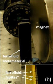
The piece that started me on this was one dating back to 2013, dramatically titled Physicists create world's first multiverse of universes in the lab . Being used to eye-catching headlines, I assumed that the statement would be an exaggeration. For instance, maybe they constructed a multiverse model in a computer program - which isn't really 'in the lab'. But, no, this was a physical experiment involving a metamaterial, an electromagnet and polarised light. And throughout the article it was clear that this was the real thing. The researchers, we are told, 'created multiple universes.' Wow, and furthermore, phew! As the article says, and who can argue, 'this is the first ever time that new universes have been created in a laboratory setting.'
I naturally wanted to find out more, and the article helpfully gives you a link to the paper. There I was confronted with this in the abstract: 'Extraordinary light rays propagating inside a hyperbolic metamaterial look similar to particle world lines' and 'thermal fluctuations in a ferrofluid look similar to creation and disappearance of individual Minkowski spacetimes (universes) in the cosmological multiverse.' Don't worry if you aren't familiar with all the terminology used here. The key words here are perfectly everyday English: 'look similar to.'
Now, I'm sorry, but those are very important words, which are simply not given the weight they should have in the article that caught my eye in the first place. After all, I've seen pictures of a cat on Facebook that looks similar to Hitler. But it would be a bit of a stretch to write an article saying 'cat owner discovers Hitler in her front room.' This is a slightly exaggerated illustration, I admit, but there is a world (nay, a multiverse) of difference between something 'looking similar' to something else and something being something else.
You might think I have no room to complain because the article did include a link to the paper, so anyone could do what I did and check the details - and that's great. I applaud that opportunity. But the vast majority of people won't do that. And so another science myth gets perpetrated. Those in the science community often bemoan the lack of understanding of science in the general public - but as long as we continue with this kind of exaggeration, then science writers and other journalists who pick up on science-based stories (and, yes, scientists and PR officers who misrepresent stories in press releases) need to shoulder a fair amount of the blame.
Published on October 19, 2015 01:41
October 16, 2015
Legalise cannabis?
 Image by J. Patrick Bedell from WikipediaAccording to an article in the i and Independent newspapers, legalising cannabis could bring in £500 million annually in tax revenues in the UK, on top of removing the expensive enforcement costs, reducing the risk of buying from dubious sources and stopping a flow of cash to organized crime.
Given all this, we really have to ask why on earth we are not legalising cannabis as soon as possible? I ought to say here that I have never smoked or otherwise consumed cannabis, and have no intention of doing so. But the case for legalisation is huge.
I know the anti- lobby will come out with arguments about cannabis being bad for you - and I'm not disputing this. But do they argue that isn't the case for tobacco and alcohol? If so, they are very confused. Legalising cannabis is not about making it more acceptable, it's about making it better controlled. We have an impressive example in the US with the alcohol prohibition experiment of how not to deal with this kind of substance. It's not generally seen as the finest hour of US history. Yet it's exactly how we deal with cannabis in the UK.
No one is suggesting that cannabis should be sold in a similar fashion to a packet of sweets, available to children over any counter. It would be sensible - and not very difficult - to give it the same protections as sales of tobacco and alcohol with no advertising or displays, age limits on purchase and clear marking with the health risks. Similarly it would be essential to make the existing legislation against driving under the influence as well-known and well checked-for as that for driving under the influence of alcohol.
In the end we need to get away from this being some kind of moral crusade, a phoney 'war on drugs'. To make a distinction between a drug like cannabis and legal drugs like tobacco and alcohol makes no sense whatsoever. This is not being 'soft on drugs' any more than we are soft on tobacco (ask any smoker if we are). But it would be taking a step that both makes far more sense than the current arbitrary distinction, and also has the win-win result of transferring revenue from criminals to HM Revenue and Customs. What's not to love?
Published on October 16, 2015 01:26
October 15, 2015
Arcadia Review
 The new novel Arcadia by Iain Pears comes as a beautiful hardback from Faber with a very effective cover design (the thing that looks like a number 7 is a cut-away door in the cover, so you see through to the illustrated world within). This book is a strange mixture of fantasy and science fiction. One of the main characters, Henry Lytten, is a member of the dregs of the Oxford Inklings, the leftovers and second-bests after Tolkein and Lewis have moved on, at the cusp of social change in Britain in 1960. Lytten is writing an epic fantasy novel, creating a world unlike his predecessors where story is the governing thread, rather than magic or royalty.
Interwoven with this storyline is one from the future involving a device that hovers vaguely between time machine and a way to enter alternative universes (the 'science bit' is very woffly). However, the alternative universes aspect seems increasingly to be the case as a girl from 1960 accidentally uses the technology to enter Lytten's fantasy world made real, after an intervention from a rogue future mathematician.
For those who want to be trendy, there is also an app version of the book. The idea is that the text is broken into a whole load of relatively short segments which can be read in any order, so that the reader creates the experience, or some such guff. As you might guess, I think this totally misses the point of a novel. As a reader, I don't want to do the author's job for him. I want to be led - that's the whole point of reading a book. If I wanted to write my own book I would, and often have.
The idea that somehow the reader is freed up by throwing away structure, just because this is a multi-threaded story just doesn't make sense. It's like the difference between listening to Ralph McTell* sing about taking us by the hand and leading us through the streets of London and just putting 'streets of London' into a search engine. The unstructured approach does not deliver a satisfactory experience. So, for me the app is a waste of time - and I suspect it will fall by the wayside as often happens with these attempts to take books into a new dimension. (Remember CD-ROM interactive books? Or ebooks with sound effects?) I could be wrong. It could be the next best thing since sliced bread, but I genuinely can't see the benefit.
We return, then, to viewing Arcadia as a straightforward novel. It takes a while to get into because of the multi-threaded storyline, and to begin with it's hard not to feel that the fantasy world concept is a touch derivative, particularly when C. S. Lewis is deliberately brought to mind, but once the author's ideas kick in on the full scale, we discover an impressive conceit, with an enjoyable interplay of fantasy and different timeline versions of reality (giving us a chance to ponder just what reality is). However, I did find my interest levels dropping at times. Like Lytten's fictional creation is an epic book as far as length is concerned - 596 pages - but it doesn't have an epic topic. In fact, the fantasy world Anterworld is explicitly designed not to be epic. The result is to sometimes make reading an uphill struggle.
Perhaps the book's greatest weakness, causing some of this lack of reading drive, is that none of the multiple protagonists is well enough drawn, or far enough from a two dimensional central casting character to strongly identify with them. Perhaps reflecting the author's idea of a fluid structure it's hard to really get behind any of these individuals. Admittedly, though, that's nothing new in fantasy and SF (think Asimov's Foundation saga - the characters are far more cardboard there), so it isn't the end of the world, and Pears has certainly come up with a genuinely interesting, original and well-detailed premise.
Arcadia is available from amazon.co.uk and amazon.com.
* Sadly Ralph uses bad logic in a false comparator, somehow feeling that seeing homeless people would make a lonely person 'change their mind'. Loneliness doesn't work like that, Ralph.
Published on October 15, 2015 00:28
October 14, 2015
Book boggles
I'm not a huge fan of infographics, the big chunks of text and imagery that are given out in exchange for showing an advertising slogan, but as an author I couldn't resist one about the consumption of books.
Just a couple of provisos: although it's labelled 'This is how we read in the UK' the Kindle statistics are for the world/US (and, of course, refer to the reader device, not to Kindle ebooks which can be read on a much wider range of tablets etc). The other point I'd make is that though the producers get a gold star for listing sources, two of those are The Stylist, which I wouldn't necessarily regard as a beacon of quantitive journalism.

Just a couple of provisos: although it's labelled 'This is how we read in the UK' the Kindle statistics are for the world/US (and, of course, refer to the reader device, not to Kindle ebooks which can be read on a much wider range of tablets etc). The other point I'd make is that though the producers get a gold star for listing sources, two of those are The Stylist, which I wouldn't necessarily regard as a beacon of quantitive journalism.

Published on October 14, 2015 00:13
October 13, 2015
Made up numbers hurt your case
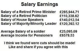 Every now and then a graphic circulates on social media, usually making a political point, displaying a set of impressive numbers to make the case. All too often people pass these on without questioning the data. But if you do that, it is entirely possible those numbers were fictional, and instead of supporting a cause, you weaken it.
The example shown here is probably the most blatantly awful such graphic I've ever seen. So much so that I wondered if it was from a comedy news site like the Daily Mash, but as far as I can tell it isn't - and it is certainly being shared as if it were serious.
I probably can't list everything wrong with this data set, but problems include:
It mixes salaries and pensions - not a meaningful comparison Even if you look at salaries, the numbers for politicians are totally fictional - the PM for instance has a salary of £142,500 and an MP of £67,000According to this report in the Guardian (hardly a government lackey paper) the average pensioner income in 2011 was over £20,000 not £6578 (of course many get less, but this was the average). The trouble is, these figures compare the state pension with an occupational pension Whether or not soldiers are paid enough is a totally separate issue, though personally I'd rather nurses, teachers, policemen etc earned more than soldiers and I would like the people who run the country paid significantly more stillThe wording is a little odd. 'House Speaker' is a US term; I wonder if this is US data with the labels changedWhenever you see numbers like check the source and do a little research before passing them on. All in all, if you use garbage numbers to support your case all you do is damage that case.
Published on October 13, 2015 01:40
October 9, 2015
GWR - style over substance or something more?
 Image from Hitachi Trains Europe via WikipediaIt's easy to be cynical when a company like First Great Western, the railway franchise serving the South West, undergoes a rebranding exercise, suggesting it's like sugar coating something inedible. But I am holding back a little before taking this view - because it can make a significant difference.
Of course there is no doubt that part of it is superficial, though even that superficial part can be important. How something looks can have a big impact on our attitude to it. It's not for nothing that supermarkets tend to put their budget own brand food in pretty awfully designed and coloured packaging. They want us to feel that we are slumming it. When I get on a train, I want to have more Orient Express than Heathrow Express about the experience, and the livery is a starting point for how that experience feels.
At the moment, First Great Western trains are painted a fairly sickening purple and magenta, colours that surely could only have appealed to a colour-blind designer. To make matters worse, as someone pointed out on Facebook recently, the trains have a series of parallel lines down the side which start to wave around and jump all over towards the end - surely a graphic representation of a train that starts off heading along steadily and firmly on the permanent way, but that ends up derailed and skewing all over the place. And that name 'First Great Western' seems unpleasantly, plastically corporate.
In its place we have the positive double whammy of the name Great Western Railway, redolent of the period when railway travel really could be exciting (and something of a religion in Swindon, where I live)
, and a subtle and impressive dark green paint job, not unlike the colours of the old GWR engines (and, frankly, a lot more attractive than the old chocolate and cream that GWR used on rolling stock, though I'm sure many enthusiasts would disagree). Even the logo, with its angular lettering, has a feeling of a past age brought into the present. And the look of the onboard signs, one of the first things to have changed on the actual trains (I'm yet to see one in the new livery) is hugely improved on the old graphic design.
A good move, then on the look. But the real opportunity of a rebranding is also to do something about the feel. The danger is in skimping at this point. If a company really wants to make a difference with such a process, they need to pour money into staff training, improving customer service, and to make some noticeable changes to the comfort and journey experience of passengers. A major rebranding exercise is always expensive. So the best thing is to bite the bullet and make sure it's not just skin deep.
So that's why I'm giving the new GWR the benefit of the doubt. I really want them to succeed with this. And the acid test will be if they are prepared to put their money where their paintbrush is and transform the customer experience.
Published on October 09, 2015 12:54


