
Jeremy Keith's Blog, page 91
February 19, 2016
Enhance! Conf!
Two weeks from now there will be an event in London. You should go to it. It���s called EnhanceConf:
EnhanceConf is a one day, single track conference covering the state of the art in progressive enhancement. We will look at the tools and techniques that allow you to extend the reach of your website/application without incurring additional costs.
As you can probably guess, this is right up my alley. Wild horses wouldn���t keep me away from it. I���ve been asked to be Master of Ceremonies for the day, which is a great honour. Luckily I have some experience in that department from three years of hosting Responsive Day Out. In fact, EnhanceConf is going to run very much in the mold of Responsive Day Out, as organiser Simon explained in an interview with Aaron.
But the reason to attend is of course the content. Check out that line-up! Now that is going to be a knowledge-packed day: design, development, accessibility, performance ���these are a few of my favourite things. Nat Buckley, Jen Simmons, Phil Hawksworth, Anna Debenham, Aaron Gustafson ���these are a few of my favourite people.
Tickets are still available. Use the discount code JEREMYK to get a whopping 15% off the ticket price.
There���s also a scholarship:
The scholarships are available to anyone not normally able to attend a conference.
I���m really looking forward to EnhanceConf. See you at RSA House on March 4th!


New edition
Six years ago I wrote a book and the brand new plucky upstart A Book Apart published it.
Six years! That’s like a geological age in internet years.
People liked the book. That’s very gratifying. I’m quite proud of it, and it always gives me a warm glow when someone tells me they enjoyed reading it.
Jeffrey asked me a while back about updating the book for a second edition���after all, six years is crazy long time for a web book to be around. I said no, because I just wouldn’t have the time, but mostly because���as the old proverb goes���you can step in the same river twice. Proud as I am of HTML5 For Web Designers, I consider it part of my past.
“What about having someone else update it?” Well, that made me nervous. I feel quite protective of my six year old.
“What about Rachel Andrew?” Ah, well, that’s a different story! Absolutely���if there’s one person I trust to bring the up to date, it’s Rachel.
She’s done a fine, fine job. The second edition of HTML5 For Web Designers is now available.
I know what you’re going to ask: how much difference is there between the two editions? Well, in the introduction to the new edition, I’m very pleased to say that Rachel has written:
I���ve been struck by how much has remained unchanged in that time.
There’s a new section on responsive images. That’s probably the biggest change. The section on video has been expanded to include captioning. There are some updates and tweaks to the semantics of some of the structural elements. So it’s not a completely different book; it’s very much an update rather than a rewrite.
If you don’t have a copy of HTML5 For Web Designers and you’ve been thinking that maybe it’s too out-of-date to bother with, rest assured that it is now bang up to date thanks to Rachel.
Jeffrey has written a lovely new foreword for the second edition:
HTML5 for Web Designers is a book about HTML like Elements of Style is a book about commas. It���s a book founded on solid design principles, and forged at the cutting edge of twenty-first century multi-device design and development.
February 10, 2016
Handling redirects with a Service Worker
When I wrote about implementing my first Service Worker, I finished with this plea:
And remember, please share your code and your gotchas: it���s early days for Service Workers so every implementation counts.
Well, I ran into a gotcha that was really frustrating but thanks to the generosity of others, I was able to sort it out.
It was all because of an issue in Chrome. Here’s the problem…
Let’s say you’ve got a Service Worker running that takes care of any requests to your site. Now on that site, you’ve got a URL that receives POST data, does something with it, and then redirects to another URL. That’s a fairly common situation���it’s how I handle webmentions here on adactio.com, and it’s how I handle most add/edit/delete actions over on The Session to help prevent duplicate form submissions.
Anyway, it turns out that Chrome’s Service Worker implementation would get confused by that. Instead of redirecting, it showed the offline page instead. The fetch wasn’t resolving.
I described the situation to Jake, but rather than just try and explain it in 140 characters, I built a test case.
There’s a Chromium issue filed on this, and it will get fixed, but it in the meantime, it was really bugging me recently when I was rolling out a new feature on The Session. Matthew pointed out that the Chromium bug report also contained a workaround that he’s been using on traintimes.org.uk. Adrian also posted his expanded workaround in there too. That turned out to be exactly what I needed.
I think the problem is that the redirect means that a body is included in the GET request, which is what’s throwing the Service Worker. So I need to create a duplicate request without the body:
request = new Request(url, {
method: 'GET',
headers: request.headers,
mode: request.mode,
credentials: request.credentials,
redirect: request.redirect
});
So here’s what I had in my Service Worker before:
// For HTML requests, try the network first, fall back to the cache, finally the offline page
if (request.headers.get('Accept').indexOf('text/html') !== -1) {
event.respondWith(
fetch(request)
.then( response => {
// NETWORK
// Stash a copy of this page in the pages cache
let copy = response.clone();
stashInCache(pagesCacheName, request, copy);
return response;
})
.catch( () => {
// CACHE or FALLBACK
return caches.match(request)
.then( response => response || caches.match('/offline') );
})
);
return;
}
// For HTML requests, try the network first, fall back to the cache, finally the offline page
if (request.headers.get('Accept').indexOf('text/html') !== -1) {
request = new Request(url, {
method: 'GET',
headers: request.headers,
mode: request.mode,
credentials: request.credentials,
redirect: request.redirect
});
event.respondWith(
fetch(request)
.then( response => {
// NETWORK
// Stash a copy of this page in the pages cache
let copy = response.clone();
stashInCache(pagesCacheName, request, copy);
return response;
})
.catch( () => {
// CACHE or FALLBACK
return caches.match(request)
.then( response => response || caches.match('/offline') );
})
);
return;
}
Now the test case is working just fine in Chrome.
On the off-chance that someone out there is struggling with the same issue, I hope that this is useful.
Share what you learn.
February 7, 2016
Enhance’n’drag’n’drop
I’ve spent the last week implementing a new feature over at The Session. I had forgotten how enjoyable it is to get completely immersed in a personal project, thinking about everything from database structures right through to CSS animations,
I won’t bore you with the details of this particular feature���which is really only of interest if you play traditional Irish music���but I thought I’d make note of one little bit of progressive enhancement.
One of the interfaces needed for this feature was a form to re-order items in a list. So I thought to myself, “what’s the simplest technology to enable this functionality?” I came up with a series of select elements within a form.
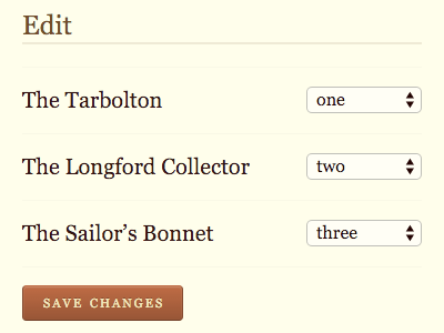
It’s not the nicest of interfaces, but it works pretty much everywhere. Once I had built that���and the back-end functionality required to make it all work���I could think about how to enhance it.
I brought it up at the weekly Clearleft front-end pow-wow (featuring special guest Jack Franklin). I figured that drag’n’drop would be the obvious enhancement, but I didn’t know if there were any “go-to” libraries for implementing it; I haven’t paid much attention to the state of drag’n’drop since the old IE implement was added to HTML5.
Nobody had any particular recommendations so I did a bit of searching. I came across Dragula, which looked pretty solid. It’s made by the super-smart Nicol��s Bevacqua, who I know shares my feelings about progressive enhancement. To my delight, I was able to get it working within minutes.
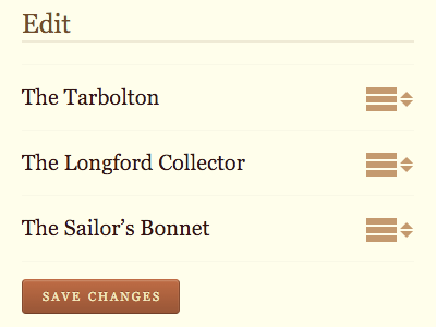
There’s a little bit of mustard-cutting going on: does the dragula object exist, and does the browser understand querySelector? If so, the select elements are hidden and the drag’n’drop is enabled. Then, whenever an item in the list is dragged and dropped, the corresponding (hidden) select element is updated …so that time I spent making the simpler non-drag’n’drop interface was time well spent: I didn’t need to do anything extra on the server to handle the data from the updated interface.
It’s a simple example but it demonstrates that the benefits of starting with the simpler universal interface before upgrading to the smoother experience.
February 4, 2016
Service Worker notes
Here’s a disconnected hodge-podge of things related to Service Workers I’ve noticed recently…
Service Workers have landed in Firefox. When it was first unveiled in a nightly build a few people spotted some weird character issues on sites like mine that are using Service Workers, but that should all be fixed in the next release.
A while back I voted up Service Workers on Microsoft’s roadmap for Edge. I got an email today to say that the roadmap priority is high:
We intend to begin development soon.
Here’s a little gotcha that had me tearing my hair out until I tracked down the culprit: don’t use Header append Vary User-Agent in your site’s Apache config file. I don’t know why it snuck in there in the first place, but once I removed it, it fixed a weird issue that Aaron T. Grogg pointed out to me whereby my offline page would get cached, but not my CSS.
I really like this proposal for:
It makes sense to me that I should be able to point to the Service Worker of a page in the same way that I point to a style sheet. It makes sense as a rel value too: “the linked resource has the relationship of ‘serviceworker’ to the current document.”
Also, I’m just generally a fan of declarative solutions. This feels like another good example of functionality that starts life in an imperative language (JavaScript) and then becomes declarative over time (see also: :hover, the required attribute, etc.).
Lyza wrote a fantastic article on Smashing Magazine that goes into all the details of her Service Worker. I must admit to feeling extremely gratified when she wrote:
First, I���m hugely indebted to Jeremy Keith for the implementation of service workers on his own website, which served as the starting point for my own code.
Going through her code, she made this remark:
Note: I use certain ECMAScript6 (or ES2015) features in the sample code for service workers because browsers that support service workers also support these features.
That’s a really good point. I haven’t messed around much with ES6 HipsterScript stuff partly because I haven’t yet set up a transpiler, so it was nice to know that my Service Worker is a “safe space” to try some stuff out in the browser. I refactored my JavaScript to use const, let, and =>.
Jake is looking for feedback on a specific part of Service Worker functionality around URLs. If I can wrap my head around what’s being described, I’ll chime in.
Finally, I had a nice little Service Worker moment earlier today. I was doing some updates on my web server that required a reboot. When I checked in Chrome to see how long adactio.com was down, I was surprised to see that the downtime appeared to be …zero. “That’s odd” I thought, “How can my site still be reachable if the server is …oh!” That’s when I realised I was seeing a cached version of my homepage. My Service Worker was doing it’s thing.
I had been thinking of Service Workers as a tool to help in situations where the user agent goes offline. But of course it’s an equally useful tool for when the server goes offline. This was a nice reminder of that.
January 27, 2016
Huffduffing for podcasters
I was pointed to this discussion thread which is talking about how to make podcast episodes findable for services like Huffduffer.
The logic behind Huffduffer’s bookmarklet goes something like this…
Find any a elements that have href values ending in “.mp3” or “.m4a”.
If there’s just one audio on the page, use that.
If there are multiple audio, offer a list to the user and have them choose.
If that doesn’t work…
Look for a link element with a rel value of “enclosure”.
Look for a meta element property value of “og:audio”.
Look for audio elements and grab either the src attribute of the element itself, or the src attribute of any source elements within the audio element.
If that doesn’t work…
Try to find a link to an RSS feed (a link that looks like “rss” or “feed” or “atom”).
If there is a feed, parse that for enclosure elements and present that list to the user.
That covers 80-90% of use cases. There are still situations where the actual audio file for a podcast episode is heavily obfuscated���either with clickjacking JavaScript “download” links, or links that point to a redirection to the actual file.
If you have a podcast and you want your episodes to be sharable and huffduffable, you have a few options:
Have a link to the audio file for the episode somewhere on the page, something like:
download
That’s the simplest option. If you’re hosting with Soundcloud, this is pretty much impossible to accomplish: they deliberately obfuscate and time-limit the audio file, even if you want it to be downloadable (that “download” link literally only allows a user to download that file in that moment).
If you don’t want a visible link on the page, you could use metadata in the head of your document. Either:
Or:
And if you want to encourage people to huffduff an episode of your podcast, you can also include a “huffduff it” link, like this:
huffduff it
You can also use ?page=referer���that misspelling has become canonised thanks to HTTP.
There you go, my podcasting friends. However you decide to do it, I hope you’ll make your episodes sharable.
January 24, 2016
Words of welcome
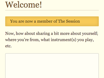
For a while now, The Session has had some little on-boarding touches to make sure that new members are eased into the culture of this traditional Irish music community.
First off, new members are encouraged to add a little bit about themselves so that there’s some context when they start making contributions.
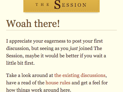
Secondly, new members can’t kick off a brand new discussion straight away.
Likewise, they can’t post a comment straight away. They need to wait an hour between signing up and posting their first comment. Instead of seeing a comment form, they see a countdown.
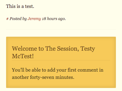
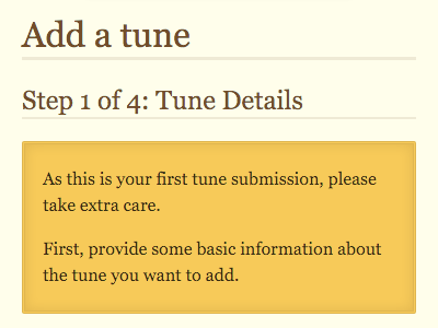
Finally, when they do make their first submission���whether it’s a discussion, an event, a session, or a tune���the interface displays a few extra messages of encouragement and care.
But I realised that all of these custom messages were very one-sided. They were always displayed to the new member. It’s equally important that existing members treat any newcomers with respect.
Now on some discussions, an extra message is displayed to existing members right before the comment form. The logic is straightforward:
If this is a discussion added by a new member,
who hasn’t yet added any comments anywhere,
and this discussion has no responses so far,
and anyone other than that member is viewing the page,
then display a message asking for help making this new member feel welcome.
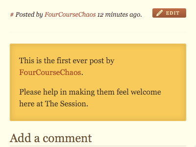
It’s a small addition, but it makes a difference.
No intricate JavaScript; no smooth animations; just some words on a screen encouraging a human connection.
January 19, 2016
Paint
I was in London again today. A team from Clearleft have their sprint playbacks every second Tuesday at the client’s offices on The Strand. I tag along for the ride, and to marvel at the quality of the work being produced in each sprint. Then I duck out when it’s time for them to plan the next sprint���I don’t want to be the extra cook that spoils that particular broth.
Usually I would just head straight back to Brighton, nice and early, avoiding the after-work rush. But today was such a beautiful, crisp, clear winter’s day that I tarried a while. Instead of hopping on the tube back to Victoria, I perambulated.
At Trafalgar Square, I marvelled at the fact that the National Gallery is right there, free to the public. I could just walk right in and admire one of the world’s finest collections of art. So I did.
One minute I was on a typical London street, complete with obligatory Pret a Manger and Costa Coffee. The next I was standing in front of a Caravaggio, marvelling once again at his use of light���like Renaissance film noir.
Turner, Van Gogh, Seurat, C��zanne; all there for everybody to enjoy. As I stood in front of the Holbein���stepping between the school children to find just the right spot for the skull’s optical illusion���I remembered a conversation I had with Alla just last week.
We were discussing responsive design. I was making the case that there should be parity between small screens and large when it came to accessing content. “But”, said Alla, “what about the emotional impact?” Is it even possible to get the same “wow” factor on a handheld screen that you can get with a wider canvas? She asked me if I had ever had an emotional response to seeing something in an art gallery. I smiled, because her question made her point perfectly. Then I told her about the first time I ever went to the Louvre.
It was my first time ever being in Paris. I wasn’t even supposed to be there. It was the early nineties and I was hitch-hiking around Europe, trying my best to avoid big cities���they’re less than ideal when you have no place to sleep. But through a series of circumstances that probably involved too much wine, I found myself taking a ride into the capital and getting dropped in the middle of the city.
It all worked out okay though. Through an astronomical coincidence, I met someone I knew who put me up for a few nights.
I was standing in Ch��telet metro station in the middle of rush hour. Whatever effect that wine had on me was wearing off, and I was beginning to realise what a terrible mistake I had made in coming to Paris. I was studying a city map on the wall, looking for areas of green where I might unroll a sleeping bag in peace, when I heard someone shout “Jeremy!” It was a girl from back home in Cork that I knew through a mutual friend in art college. She was working at Euro Disney for the summer and having finished her day’s work, she missed her metro stop and was switching trains. She just happened to be there at just the right time to take me in.
But that’s not the story I told Alla. I told Alla about what happened during that time in Paris when I busked up enough money to go the Louvre.
I walked in and saw G��ricault’s The Raft Of The Medusa. I felt like somebody had punched me in the chest. I was genuinely winded. It was one thing to see a reproduction in a book, but the sheer scale of the thing …I had no idea.
I’ve never had quite the same physical reaction to a piece of art since, but I sometimes feel echoes of it. I think that’s probably one of the reasons why I stepped into the National Gallery today. I was trying to recapture a fragment of that feeling.
Well, that and the fact that it’s free …which really is quite amazing in a city as expensive as London.
Hamburger, hamburger, hamburger
Andy���s been playing Devil���s Advocate again, defending the much-maligned hamburger button. Weirdly though, I think I���ve seen more blog posts, tweets, and presentations defending this supposed underdog than I���ve seen knocking it.
Take this presentation from Smashing Conference. It begins with a stirring call to arms. Designers of the web���cast off your old ways, dismiss your clich��s, try new things, and discard lazy solutions! ���Yes!”, I thought to myself, ���this is a fantastic message.��� But then the second half of the talk switches into a defence of the laziest, most clich��d, least thought-through old tropes of interface designs: carousels, parallax scrolling and inevitably, the hamburger icon.
But let���s not get into a binary argument of ���good” vs. ���bad” when it comes to using the hamburger icon. I think the question is more subtle than that. There are three issues that need to be addressed if we���re going to evaluate the effectiveness of using the hamburger icon:
representation,
usage, and
clarity.
Representation
An icon is a gateway to either some content or a specific action. The icon should provide a clear representation of the content or action that it leads to. Sometimes ���clear” doesn���t have to literally mean that it���s representative: we use icons all the time that don���t actually represent the associated content or action (a 3.5 inch diskette for ���save”, a house for the home page of a website, etc.). Cultural factors play a large part here. Unless the icon is a very literal pictorial representation, it���s unlikely that any icon can be considered truly universal.
If a hamburger icon is used as the gateway to a list of items, then it���s fairly representative. It���s a bit more abstract than an actual list of menu items stacked one on top of the other, but if you squint just right, you can see how ���three stacked horizontal lines��� could represent ���a number of stacked menu items.���
If, on the other hand, a hamburger icon is used as the gateway to, say, a grid of options, then it isn���t representative at all. A miniaturised grid���looking like a window���would be a more representative option.
So in trying to answer the question ���Does the hamburger icon succeed at being representative?���, the answer���as ever���is ���it depends.��� If it���s used as a scaled-down version of the thing its representing, it works. If it���s used as a catch-all icon to represent ���a bunch of stuff��� (as is all too common these days), then it works less well.
Which brings us to���
Usage
Much of the criticism of the hamburger icon isn���t actually about the icon itself, it���s about how it���s used. Too many designers are using it as an opportunity to de-clutter their interface by putting everything behind the icon. This succeeds in de-cluttering the interface in the same way that a child putting all their messy crap in the cupboard succeeds in cleaning their room.
It���s a tricky situation though. On small screens especially, there just isn���t room to display all possible actions. But the solution is not to display none instead. The solution is to prioritise. Which actions need to be visible? Which actions can afford to be squirrelled away behind an icon? A designer is supposed to answer those questions (using research, testing, good taste, experience, or whatever other tools are at their disposal).
All too often, the hamburger icon is used as an excuse to shirk that work. It���s treated as a ���get out of jail free��� card for designing small-screen interfaces.
To be clear: this usage���or misusage���has nothing to do with the actual icon itself. The fact that the icon is three stacked lines is fairly irrelevant on this point. The reason why the three stacked lines are so often used is that there���s a belief that this icon will be commonly understood.
That brings us to last and most important point:
Clarity
By far the most important factor in whether an icon���any icon���will be understood is whether or not it is labelled. A hamburger icon labelled with a word like ���menu” or ���more” or ���options” is going to be far more effective than an unlabelled icon.
@andybudd Adding the word ���menu” next to it goes a long way, and would help with teaching aspect to help it become more familiar in time.
��� Paul Annett (@PaulAnnett) January 16, 2016
Don���t believe me? Good! Do some testing.
In my experience, 80-90% of the benefit of usability testing is in the area of labelling. And one of the lowest hanging fruit is the realisation that ���Oh yeah, we should probably label that icon that we assumed would be universally understood.���
Andy mentions the ���play” and ���pause” symbols as an example of icons that are so well understood that they can stand by themselves. That���s not necessarily true.
@andybudd FWIW, I know some people in their 60s who couldn���t tell you what the two line pause icon would do on a web video player.
��� Paul Annett (@PaulAnnett) January 16, 2016
I think there are two good rules of thumb when it comes to using icons:
If in doubt, label it.
If not in doubt, you probably should be���test your assumptions.
Results
Now that we���ve established the three criteria for evaluating an icon���s effectiveness, let���s see how the hamburger icon stacks up (if you���ll pardon the pun):
Representation: It depends. Is it representing a stacked list of menu items? If so, good. If not, reconsider.
Usage: it depends. Is it being used as an excuse to throw literally all your navigation behind it? If so, reconsider. Prioritise. Decide what needs to be visible, and what can be tucked away.
Clarity: it depends. Is the icon labelled? If so, good. If not, less good.
So there you go. The answer to the question ���Is the hamburger icon good or bad?��� is a resounding and clear ���It depends.���
January 15, 2016


Jeremy Keith's Blog

- Jeremy Keith's profile
- 55 followers

