
Tony DiTerlizzi's Blog, page 7
May 23, 2013
BOOKS: The Vim & Vigor of Vogel
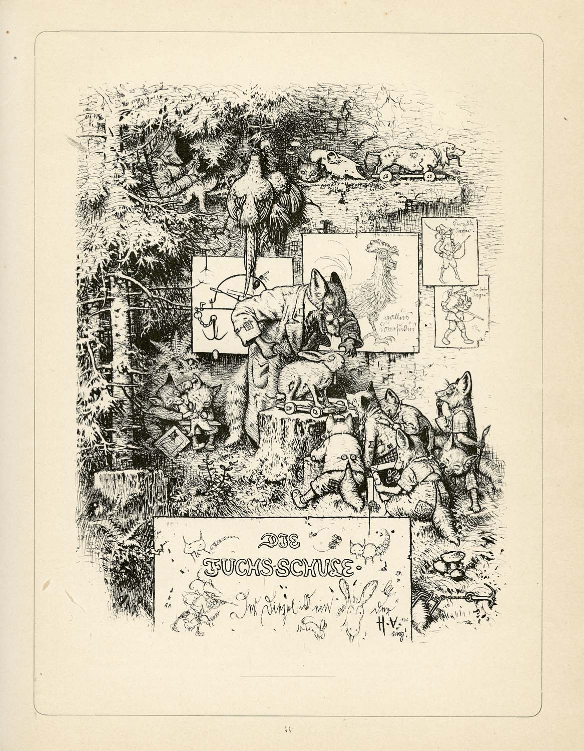
I haven’t rattled on about other artists whose books I love for some time now (Like H.J. Ford or A.B. Frost). While I’ve been at my desk for the past four months writing the first draft of WondLa III, I’ve still craved artistic inspiration. During this time, I started each day with snapshots of some of my treasured books in my collection that I shared on Facebook, Twitter and Instagram. One that received many a response was by German illustrator, Hermann Vogel.
Unlike previous posts (where I am quite educated on the artist and can show how their work directly influenced me), Vogel is simply one of those that is so grand, so in tune with the art I make, that I mostly just want to share a bunch of hi-res scans with you. Though, I must confess that part of this reasoning is because I honestly don’t know a whole lot about him.
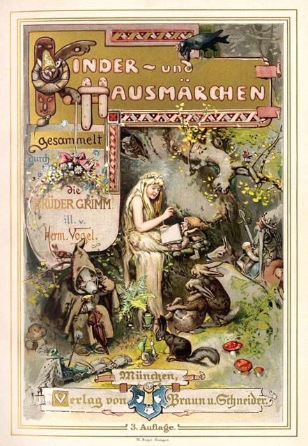
What I can tell you is that I was at San Diego Comic Con a few years back walking the floor with my wife, Angela. Out of the throngs of costumed fans, Charles Vess appears, seizes me by the sleeve, and escorts me over to a used bookseller’s booth. He points to a 1894 German edition of the Grimm Brothers’ Kinder und Hausmärchen (Children’s & Household Tales) and tells me, “This book is expensive ($100+), but you won’t regret purchasing it.”
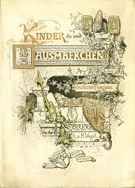
I picked the book up and leafed through the pages. In one chapter’s worth of illustrations, I closed the book and opened my wallet. Charles was right. (click on each thumbnail to have your mind blown)
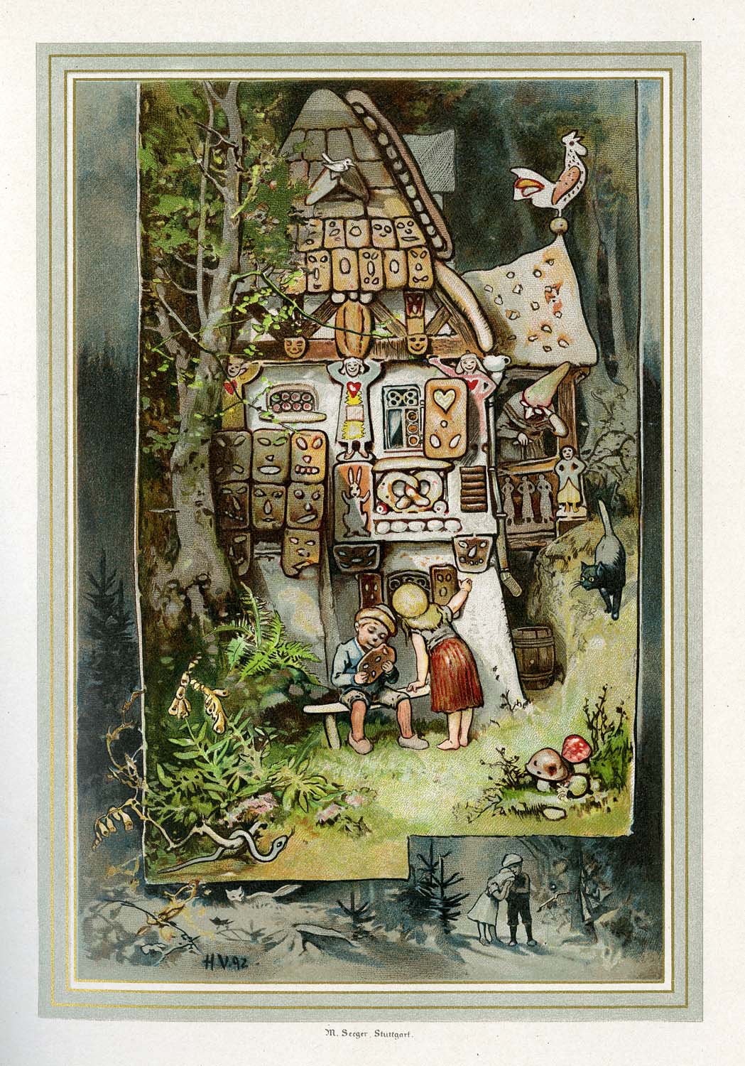
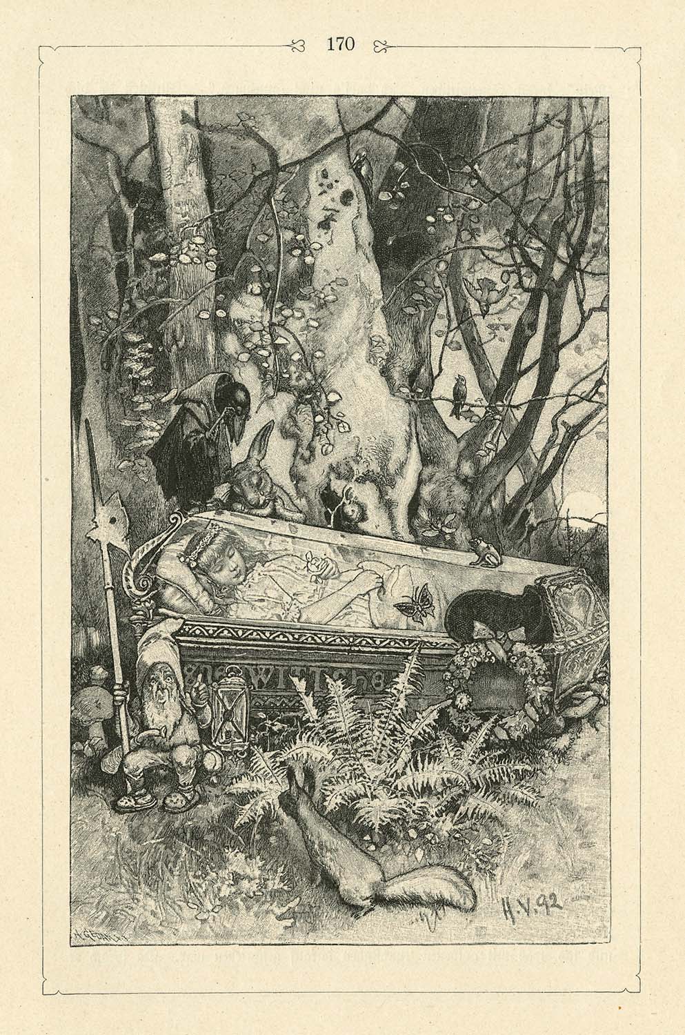
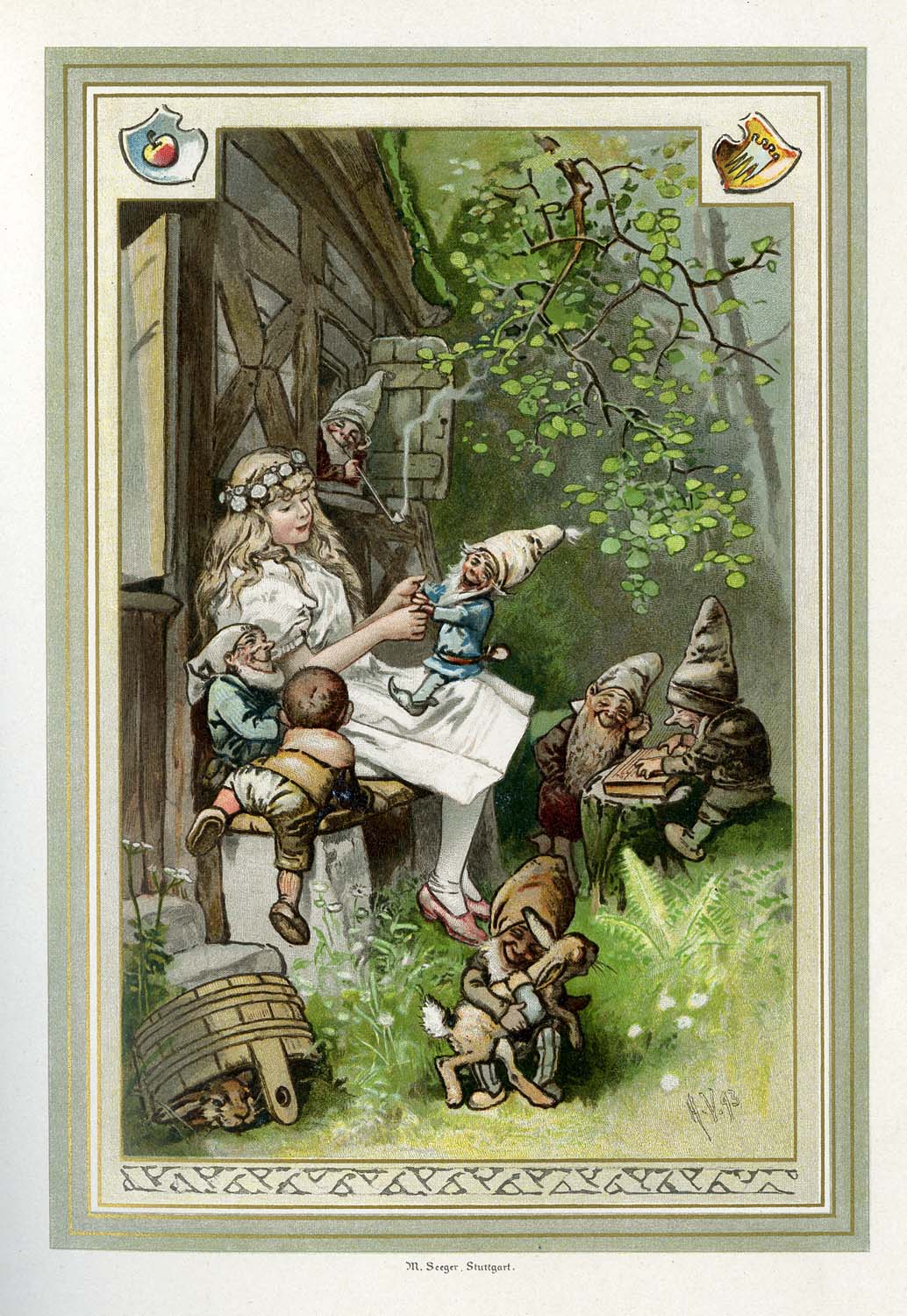
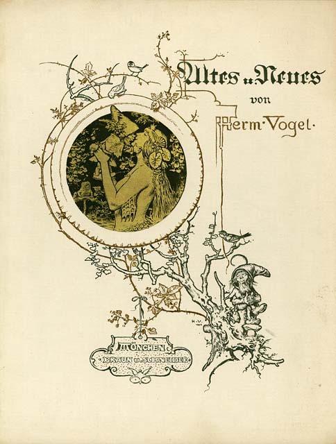
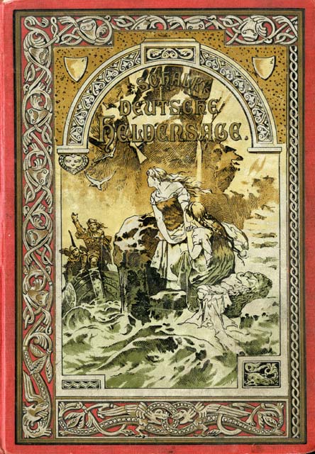
Since then, I have managed to find a few more copies of Vogel’s magnificent work. He released four albums of collected art around the turn-of-the-century. The cover alone is a triumph of design.
While I’ve been hunting for his books, more artists have mentioned their mutual love of Vogel’s work. Michael Hague, Barbara McClintock and Brian & Wendy Froud are all fans. For me, its the disciplined draftsmanship that is matched only by his epic imagination.
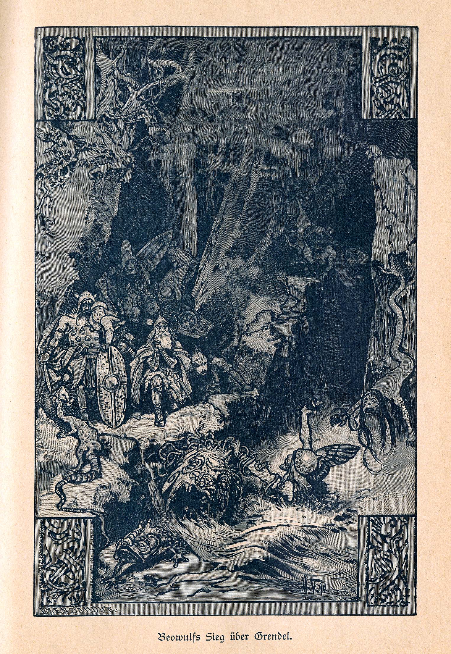
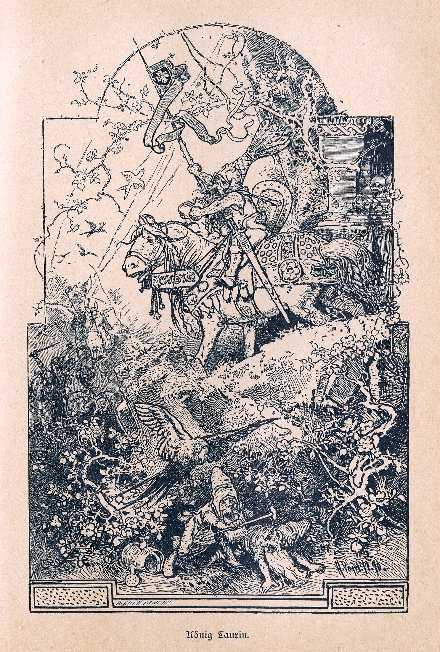
Here’s some scans from Heldensage Deutsche (German Heroic Sagas) and include illustrations from Beowulf and the Nibelung.

I wish I could tell you that Dover books offered affordable reprints for you to snag and add to your collection. However, as of this writing, none exist. In the meantime, I will scan and post more images here from time to time. If you own/find any of his books let me know, I’d love to share what everybody has and build a wishlist.


May 10, 2013
Friday Fan Art
Since I am celebrating the 10-year anniversary of The Spiderwick Chronicles this week, today’s Friday Fan Art is appropriately themed. It comes all the way from a small town in Brazil where a young artist turned to the story of Jared, Simon and Mallory for inspiration.
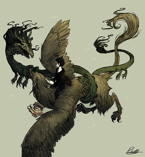
As Pedro patiently waited for his copy of Spiderwick to arrive in the mail his anticipation and enthusiasm for the fantastic grew. Upon reading the chronicles, he immediately took to the tale and was inspired to create art of his own.
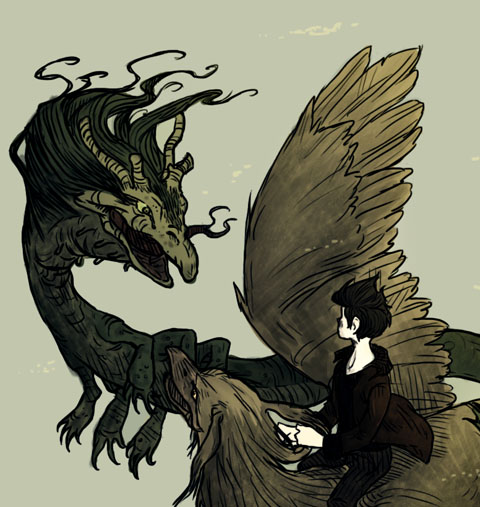
The piece above was directly inspired from Simon and Byron’s epic fight against Mulgarath’s mother Dragon. Though Pedro has been dabbling in art since he was a toddler, he has only been seriously tending to his craft for the past year. Currently he is learning how to draw with Photoshop but he also works with pencil and watercolor.
Great palette and movement, Pedro! You’re Photoshop skills are impressive. I love the hand drawn quality you have brought to this digital medium.
Keep drawing, keep dreaming.
April 30, 2013
SPIDERWICK 10th Anniversary Event
Just as we launched The Spiderwick Chronicles a decade ago, Holly Black and I are returning to a locally-owned independent bookshop to celebrate the Grace kid’s birthday.
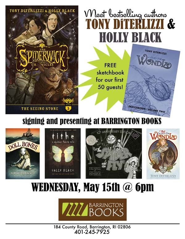
For one night only (May 15th) we will both be signing at Barrington Books, in Rhode Island. Bring your young readers, your camera and your books! (Yes, I really will be handing out FREE Wondla II sketchbooks.)

And, for you art students of Rhode Island School of Art & Design, we shall be visiting in the afternoon and holding a special presentation on creative process and answering any/all questions. I hope we see you there!
March 29, 2013
RIF’s “Where the Wild Things Are” Gala
Next month, Reading is Fundamental (RIF) will be celebrating Maurice Sendak’s controversial classic, Where the Wild Things Are.
I was asked to donate a Wild Things homage to be auctioned off with all proceeds benefiting RIF, an organization I am proud to be affiliated with. In fact, some years ago I contributed a short recollection of my mom reading young Tony House at Pooh Corner for RIF’s anniversary book, The Art of Reading.
Maurice’s legacy in words and pictures has inspired me since I first lay eyes on In the Night Kitchen and Higglety Pigglety Pop! 1980′s The Art of Maurice Sendak had a tremendous influence on my journey to become a children’s book creator. In fact, I quoted from it last year when I spoke at the SCBWI’s annual conference. Like many, I was saddened to hear of his passing last year. I honored Maurice by reading Wild Things before beginning my first event in Los Angeles for the Hero for WondLa tour.
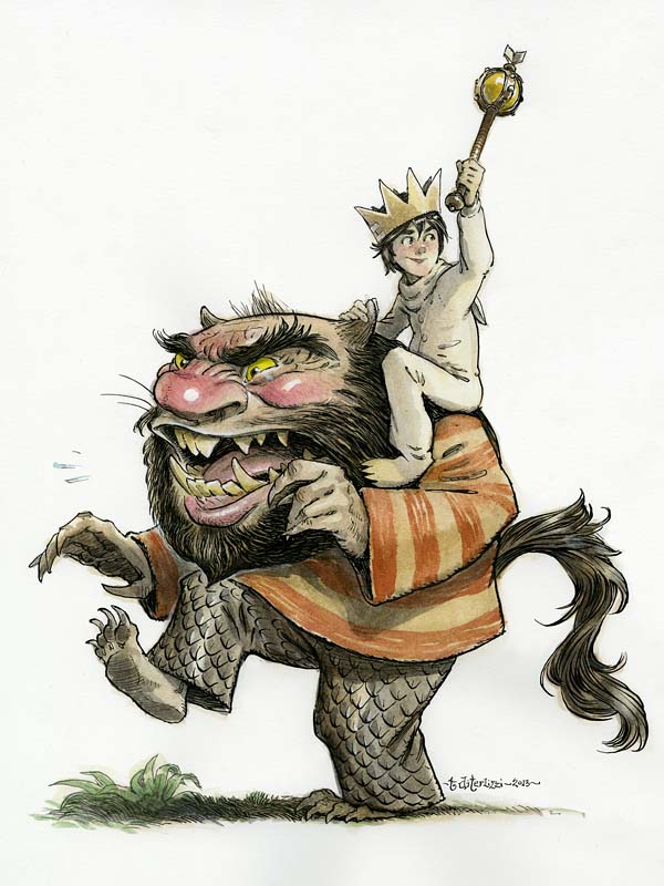
Needless to say, I was nervous and excited to “cover” Maurice’s most beloved characters. I’d seen some lovely tributes before and knew I had my work cut out for me. I came across a little drawing of Max, likely done back in 1999 or so.
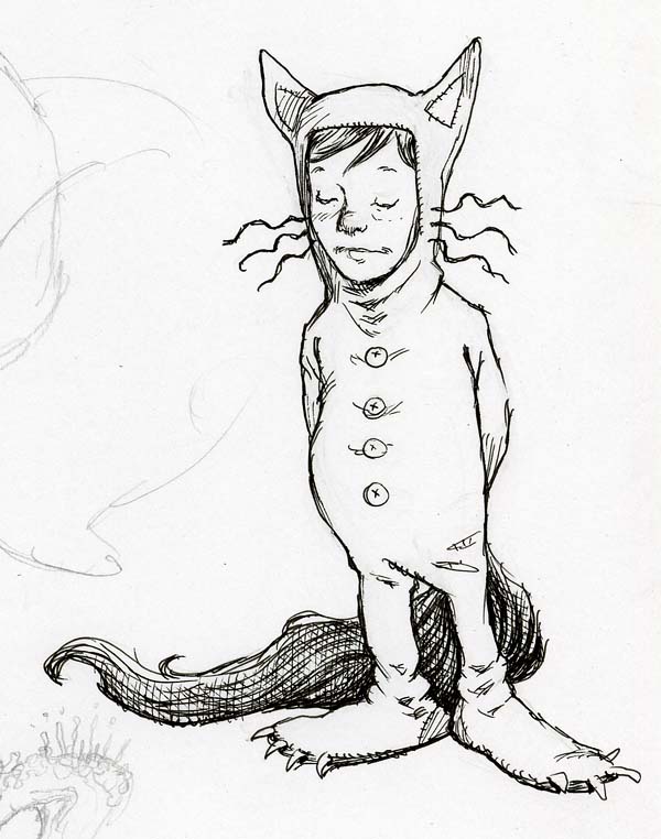
…and since Max is who I associate with most, I started with him for my new rendition.
I returned to my dog-eared (signed!) copy of the book looking for inspiration. I really liked the wild rumpus scene where Max is riding the minotaur as king; however, I worried that my version would look really minotaur-y (yes, its a word). So, I swapped out the minotaur for the bearded Wild Thing (with the striped shirt) as he seemed the most iconic of all the monsters.

In drawing the Wild Thing, I realized what an influence their design must have had on Jim Henson when he was creating his more monsterly Muppets – especially Sweetums. (In addition, I once read that Maurice’s Outside Over There was the inspiration for Labyrinth.)
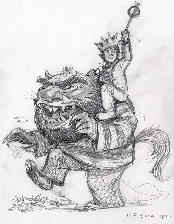
As I refined my sketch, I remembered an interview where Maurice said that the Wild Things were inspired by his aunts and uncles. With that in mind, I put a little of Maurice in the monster. (Or did I just show a little of the monster that was in Maurice?)
I’d like to think Maurice would have liked this. I sure hope you enjoy the final result. I’ll post news on the auction once it goes live.
March 22, 2013
Fabulous Folded Friday Fan Art
I’ve been a fan of paperfolding since my mom bought a copy of Robert Harbin’s Secrets of Origami back in the 70′s.
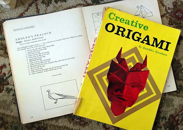
After I would wear out my paper toys of cranes and rabbits, I would pester my mom to make me new ones. Finally, she told me to read the instructions and learn to make them myself. I folded for many years throughout my childhood and found the hobby highly relaxing. I even made some of my own paper (from tissue and tin foil) in high school so that my paper models would hold their form.

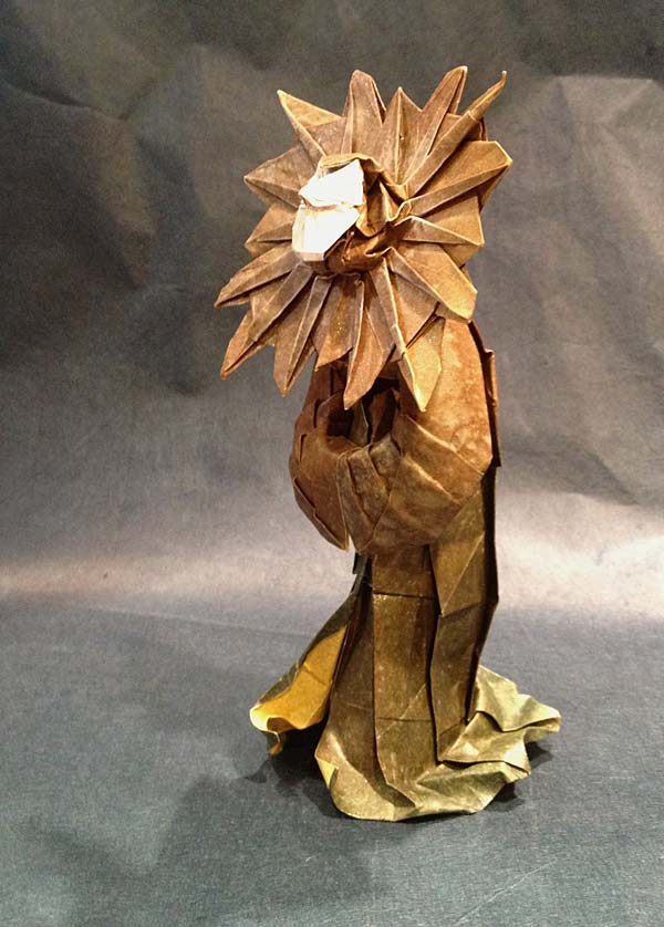
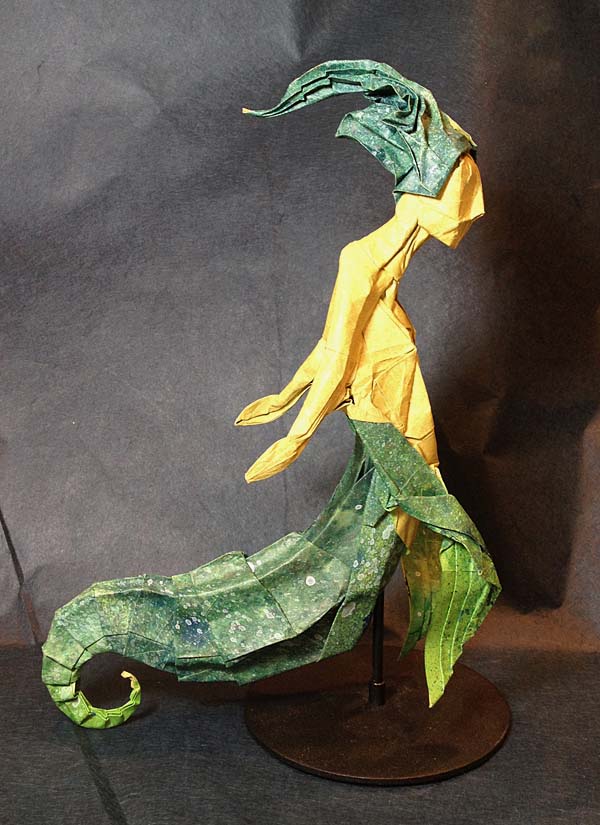
So imagine the paper-folding pleasure that greeted me when origami master, Joesph Wu, sent me a note asking about the details of of my 1994 rendition of Planescape’s Lady of Pain.
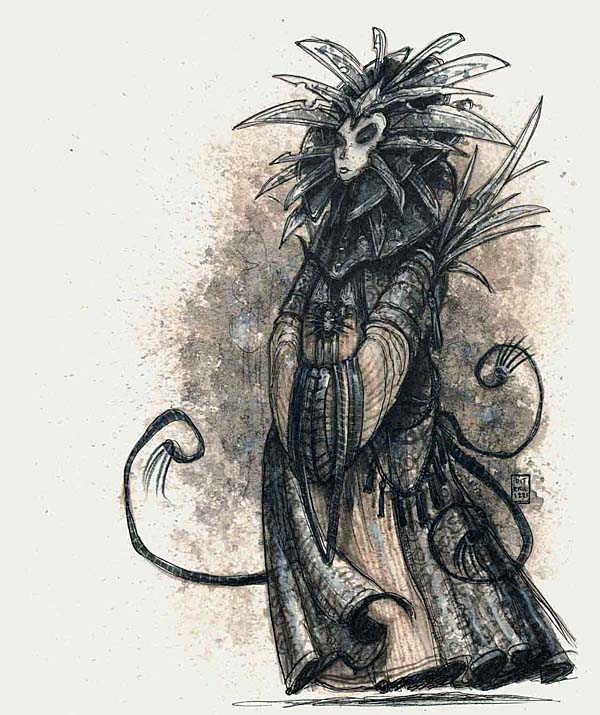
Joseph’s work is not new to me. I marveled at his manipulation of paper years ago when I saw his origami D&D denizens.

This model utilizes two squares of paper; one for the head another for the body.
On top of that, he folded the “Pacific Sea-Maid” from Arthur Spiderwick’s Field Guide!
Thank you for contacting me, Joseph, and for sharing your fantastic folding talents with us.
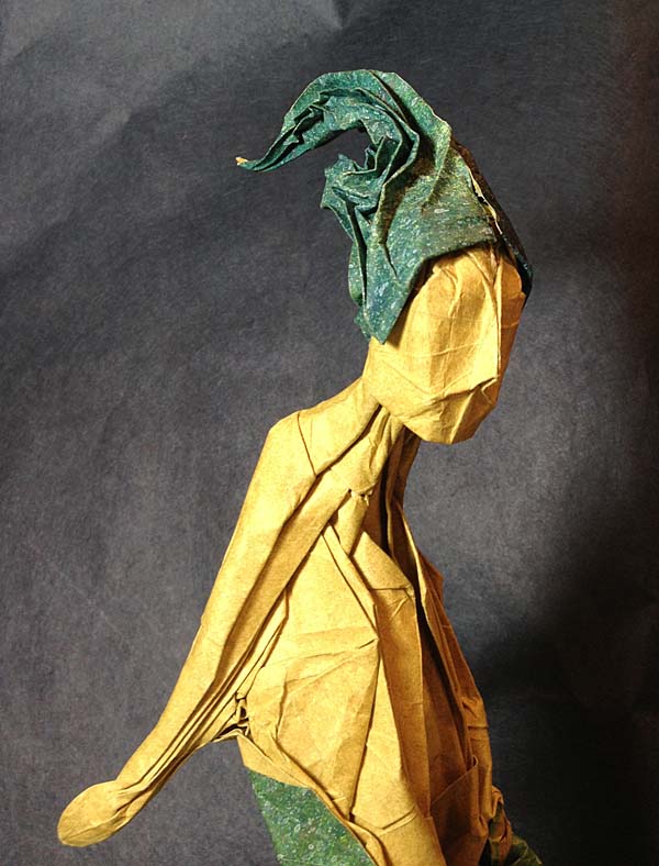
Be sure to check out Joseph’s facebook page. You can see more pics of these models in progress as well as an additional, larger version of the Lady of Pain.
Keep drawing. Keep dreaming.
February 21, 2013
The Battle for WondLa
For my loyal readers following the adventures of Eva Nine and company, I can finally reveal the title of the third and final book in the WondLa trilogy.
The Battle for WondLa plot picks up shortly after the end of the second story, A Hero for WondLa. The story has been outlined thoroughly and I am in the process of writing the first draft, which I hope to complete this spring. In all, the writing and illustrating will take most of this year putting the release date for Battle early in 2014.
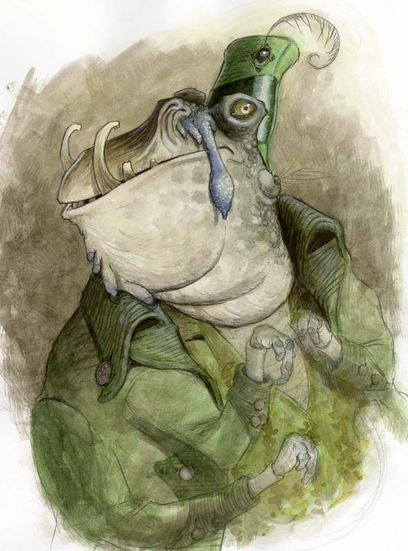
That’s a long wait, I know. But I want this finale to be exciting and deliver what has been promised in the first two installments. You will see a return of most of the main characters from both books. This includes fleshing out of smaller characters that were introduced already in the previous stories, like Caruncle from book 1:
“A grotesque, lump-faced, heavyset character strolled over to Eva. Striking cobalt blue wattles hung near its tusked snout in front of large mustard eyes. Its heavy natty jacket was worn and frayed, and it dragged on the ground, concealing most of the creature.”
–The Search for WondLa, page 361
Yes, the adjectives do go on a bit here. That is because I didn’t have time (or the page space) to add an illustration of Caruncle. I had sketched him out early on and used the sketch as my point of reference when I was writing him in.
Besides revisiting some familiar faces, there will be a new character introduced as well. And sadly, there will also be a some characters that don’t make it to the end of Eva’s story. Hopefully in the end, it will make for some entertaining and imaginative reading.
Thank you all for your kind praise, interest and words of encouragement. It keeps me going. Look for more WondLa news here soon!
February 1, 2013
Friday Fan Art
June Gallagher is a New York artist who has had an affinity for the fantastic ever since she was a child.
Like myself, she turned to other artists to fuel her creativity, spending much time in her youth getting lost in fantasy illustrations. She’s also a fan of one of my favorite and most influential artists, Arthur Rackham.
Years later, June’s love for Rackham’s enchanting illustrations led her to Arthur Spiderwick’s findings in The Spiderwick Chronicles. In fact, she even chose Thimbletack as her inspiration for an awesome polymer clay sculpture.

This wasn’t the first time June had turned to Thimbletack for artistic inspiration, she had sculpted the brownie 10 years prior but lost the original in an accidental fall. Although the sculpture’s break was a sad loss for her it turned out to be more of a motivator to test her artistic skills and take her craftsmanship to the next level.
“Recently, I had been wondering if my skills had been improving and pushing myself to do better. Out of the blue, Thimbletack for no apparent reason, fell off the bookshelf and broke irreparably. House felt empty with out him, so I sculpted a new one.” June explained.

June’s Thimbletack is a multi-media work of art consisting mainly of Sculpey’s Premo polymer clay, dressed with feathers for his hair, leather for his hat & suspenders, and a man’s dress sock for his pants, all delicately put together and mounted on a wooden base. It took June about a month to finish her final sculpt with much of that time spent finding the mixed media accents.

Excellent work, June! I’m glad you took the time to bring another Thimbletack to life. It really looks like he could walk right off that wooden mount taking Jeffrey and Lemondrop with him.
Keep sculpting. Keep dreaming. Keep creating.
January 26, 2013
Spiderwick Anniversary Covers Revealed
Entertainment Weekly has the exclusive reveal of the redesigned jackets for the first five books in The Spiderwick Chronicles.
You may remember following along in my process last fall as I returned to rendering Jared, Simon and Mallory Grace along with some favorite fairy folk. This May, the books will be re-released in a larger format hardcover edition as well as paperback for the first time.

BTW, the yellow seen in this jpeg will be printed as gold foil (as seen below). You can see all five of the new covers on Entertainment Weekly’s site, here.

And speaking of Entertainment Weekly, I did a quick editorial illustration for their new geek blog, CapeTown, celebrating a favorite director of mine who is dashing off to a galaxy far, far away. Enjoy!

December 19, 2012
1982…1992…2012
A couple of years back I wrote an article on how I got my start illustrating role-playing games for Jon Schindehette’s The Art Order. Jon is the Senior Creative Art Director for Dungeons & Dragons and an amazing mentor. His site is loaded with numerous articles and topics aimed at the aspiring fantasy illustrator. I seriously wish a resource like this was around back in 1992 when this art school student graduated. Instead, he decided to listen to the advice of some friends and chase a crazy dream…
HOW I MADE IT
(or “I ROLL A 20″)
by Tony DiTerlizzi
It’s never easy. If it were it wouldn’t be special. Magical.
Everyone has dreams – BIG dreams, little dreams, secret dreams – but we don’t always act upon them. Maybe it’s because we believe can’t change our life. Our destiny. But perhaps we can.
I’m one of those who was (and still is) proud enough and foolish enough to go after my dreams. Why not? You never know what ones might just actually come true.

In the spring of 1992, after graduating from the Art Institute of Fort Lauderdale, I found myself living back home with my parents. I had a diploma, a bunch of half-used art supplies and a vision of myself working as a professional illustrator. Though I longed to become a children’s book author and artist, none of my submissions to the big publishing houses had received a response. No response meant that dream had to wait. It also meant no big advance on a book deal, so I kept my day job.
I worked for an organization that owned a lot of real estate down in south Florida. There, I created maps and pamphlets for land parcels that would eventually be developed into shopping malls and beachfront condominiums. Not exactly the dream job for this aspiring illustrator, but at least it helped pay off my school loans.
One weekend I was having drinks with some old friends at a local Irish pub and the subject of Dungeons & Dragons came up. Everyone at the bar reminisced of epic late-night D&D adventures from a time when life’s pleasures consisted of comic books, Mountain Dew and MTV. We agreed to play the following evening. I was excited to start a new adventure.
The next day I was rummaging through a box of old books from the back of my bedroom closet. I found a faded felt Crown Royal bag full of green dice and a slim box holding painted lead miniatures. At last, I dug out my dusty dog-eared copies of the AD&D rulebooks – but quickly realized I was missing one. And it was my coveted favorite, my precious: The Advanced Dungeons & Dragons Monster Manual.
No problem, I thought as I hopped in my sun-bleached ‘83 Honda and drove off to the bookstore to purchase a new copy.
As the store clerk located the book and handed it to me, I realized something had changed in the years since I had played my totally radical version of D&D in the 80’s. The slim easy-to-sneak-to-school AD&D Monster Manual had been replaced by a bulky 3-ring Monstrous Compendium that looked like an inter-office memo on monsters…and bored flabby ink blob monsters at that.
Gone were the heavy-lined tattoo graphics of David Trampier and the drawn-on-my-notebook scrawls of David Sutherland. Sure, the one-sheet pages in the AD&D 2nd Edition Monstrous Compendium may have been easy to use, but the images of the monsters all lacked their spark, their vis vitae, that got my imagination spinning like a 20-sider when I saw them as a kid.
“I bet you could do art for these guys,” Mike said in a laid back drawl that evening as he paged through the Monstrous inter-office memo. Mike was known as The Most Powerful Dungeon Master in Palm Beach County. He had long eggplant-tinted hair like Anthony Kiedis of the Red Hot Chili Peppers. He wore black clothes and was adorned in rock-n-roll jewelry because he was the lead singer in a local rock band. And he was my good friend.
“They gonna love your stuff, boy yee!” his old schoolmate, Mike D, added in this funny sorta-rapper-speak that he would use. Mike D was ex-military. He always had a buzz cut. He always played a paladin. Always. He was training to become a police officer.
“I’d help you,” my brother, Adam, said. He was a skinny tween version of me complete with an oversized head and thick glasses. He was into the comic books artists of the day like Todd McFarlane, Arthur Adams and Jim Lee. To him, D&D was a crappy cartoon with an old guy, some bratty kids and a baby unicorn.
Back home, after recovering from our 6 PM-to-6 AM game session, my brother and I sketched some of our favorite monsters at the kitchen table.
Now, I’d gone to art school for five years. I had experimented in oils emulating Frank Frazetta, dabbled in acrylics just like Michael Whelan and sketched in watercolors like Brian Froud. I learned that I was somewhat adept at all of these mediums. And yet, I used a drugstore-bought Uni-ball pen and bond paper to render my beholders and bulettes.


I am not sure why I disregarded all of the mediums I had discovered though school in favor of a ballpoint pen. Perhaps it was simply because it was comfortable. With a pen and paper there was no pressure to create a masterpiece – just a wander back into familiar territory. I say familiar because I had drawn these subjects many times, years ago when my parents handed me a purple box with a lime-green dragon on the cover facing off with Day-Glo attired adventurers.

I was 12 when I received my copy of the Dungeons & Dragons Basic Set. Back then I would copy the ink drawings of mythical monsters by the likes of Jeff Dee and Erol Otus. Now, I was reinterpreting those classical creatures in my own style. Could I actually illustrate for the company that had inspired me way back when? It would be an amazing job. A dream job. And I would get paid to do it. But why weren’t those artists working for them any longer? Was I even good enough to take rank alongside them? Who the heck did I think I was?

Throughout the week I sketched every chance I got – during work, after work, late at night. By the time I met up again with my friends on gaming night I had a pile of drawings to show them for feedback. My friends encouraged me to continue on with my art submission. In between dice rolling, miniature painting and paying the Domino’s pizza delivery boy, they offered up their thoughts and ideas as to what I should draw next.

I felt like my life held the same possibilities as the adventure module we were playing. I had some artistic skills that I had honed over the years. I also had an excellent party of friends to support my venture. Now all I needed was a little luck.
By September, I had put together a small portfolio of my best samples. I Xeroxed pages from a module and pasted my artwork inside so the art director at TSR (fine publishers of all things D&D) could see what my work would look like in their gaming books.
When the prints slid out of the copier a weird feeling came over me.
The samples looked real, but “alternate reality” real where I was an illustrator for this game that I adored since middle school. I was proud of myself that I had stuck to this project over the summer and created The Best Submission Ever. In the back of my mind, however, was the fear of rejection. Of having to face my friends and tell them their hopes were misplaced. Whatever. I sealed up the package and sent it off to TSR’s offices in Lake Geneva, Wisconsin. (click thumbnails for a larger view)
A month rolled by. No word from the great and powerful TSR. During game night I tried to forget that I sent off the samples altogether. When my friends asked if I’d heard anything I sheepishly shrugged and hid my worry behind my player-character sheet.
Finally, in mid-October I received a letter response from Peggy Cooper, Art Director for TSR. She wrote that I had “a unique and interesting drawing style but it wasn’t enough to hire me as a freelance illustrator.” The letter closed with encouragement to submit more samples in the future for their files. It was a rejection.
I was crestfallen. I wasn’t good enough. I envisioned a very real future with me designing maps of south Florida real estate and development for the remainder of my life. But my friends saw it another way.
“Keep at it,” Mike said from behind his Dungeon Master’s screen. “You’ve got your foot in the door. Don’t blow it.”
“Dat’s right boy!” Mike D squeaked in his rapperspeak. “If you get this gig, it will be the coolest job ever!” He was rolling up a new paladin since his character had been burned to a crisp by a juvenile dragon. His new character, of course, was the brother of the slain victim. Therefore; this character knew every detail about the adventure and rushed to join our party.
“I’ll keep helping you,” my brother said. “This D&D thing is pretty cool.”
But I didn’t know what was wrong with my samples. I didn’t know what to fix or what would make my submission more successful.
The following Monday, with trembling hands, I dialed the main number for TSR. I hung up before anyone could answer.
I had several false starts with the phone throughout the day. Finally I psyched myself up, called and stayed on the line. A jovial voice, with a heavy Midwest accent, answered, “Art Department, Peggy speaking.”
I started, “Um, Hi, Peggy. This is Tony…Tony DiTerlizzi, and –“
“Oh, hi Tony! Nice to hear from you, your art samples were really nice. A few of us here in the office took a real liking to them,” she said.
“You…you did?” I stammered out. “But your letter said it wasn’t enough.”
“Well all you sent us were a bunch of drawings of monsters,” she replied with a chuckle. “We need characters. People. And we need to see them adventuring. Derring-do. Finding treasure. That sort of stuff. Think you can do that?”
“Sure. Yes.” I answered.
“Great. Try to get me samples by the end of the month if you can. I gotta go now, I’m off to a scheduling meeting. Bye!”
I shared the news with my gaming group that weekend.
“I’m not sure how I can do all this.” I was nervously tapping my pencil on the Monster Compendium. “The end of the month is in less 2 weeks.”
“You can do it, homie!” Mike D slapped my back. “It’s gonna be so sweet when you’re working for them. We are all gonna get freebies, baby!” He started dancing around the gaming table.
In the shiny plastic of a 2-liter bottle of Cherry Coke I saw my reflection. I looked a halfling cornered by a hill giant.
The other Mike sat down at the table and gazed over at me. “Dude, relax,” he said. “It’s easy: all you have to do is make the player characters as cool looking as the monsters. Really that’s what D&D is all about – the players. People. This.” He gestured dramatically at the group sitting around the gaming table. “Okay, I gotta take a whiz before we get started.”
Make the characters as cool as the monsters themselves.
My furrowed face relaxed. Mike was right. He really was The Most Powerful Dungeon Master in Palm Beach County.
I sketched out the best player characters I could dream up. I conjured them from the spirit of Arthur Rackham, Rankin & Bass’ animated version of The Hobbit and the old Dragon’s Lair video game.

I sent in my next batch of drawings at the end of the month, just as Peggy had asked. And do you know what? Rejected. Again.
Peggy said the characters were designed well, but they were not active enough. Within a couple of weeks I had new finished drawing samples sent up to her. This time, I created scenarios that were both narrative and entertaining. Instead of neat monsters and cool characters, I tried to illustrate elements and rules of the game. This was an aspect that I thought new gamers (like my brother) would like and it would remind older players of why they enjoyed D&D in the first place.

That December, Peggy offered me my first freelance job illustrating an entire boxed set adventure for TSR, titled Dragon Mountain. The following spring, I illustrated over 100 illustrations of the first ever color edition of the AD&D Monstrous Manual. After that was completed I went up and visited the folks at TSR and was invited to be the sole illustrator on a new role-playing line they were creating called Planescape…but that’s another story.
I never forgot about the support my friends gave me when I started out. In fact, when I illustrated the entire Planescape Monstrous Compendium in 1994, I acknowledged them in the front matter – a first for TSR publishing.
Like I said, it’s never easy. But sometimes all you need is a little faith from your friends and family, and especially in yourself, to make your dreams come true.

Keep drawing. Keep dreaming. Happy Holidays.
December 10, 2012
A Woodland Wonderland
Every once in awhile an artistic opportunity comes my way that I cannot pass up. Fortunately, this winter I have been presented with two unique and stellar projects that I simply had to do despite my looming WondLa 3 deadlines.
The first project was to create a window display for an eclectic gift shop, Essentials, located in nearby Northampton, Massachusetts. Angela, Sophia and I adore this locally-owned store and its shelves of European (and vintage-inspired) books, games and toys; so when the owner asked if I wanted to design their holiday window, how could I refuse?
We discussed a few ideas:
I could lend the store props to use from my antique toy collection.
I could do a “live drawing” in their window on a large piece of board (similar to what I did for the launch party for The Search for WondLa).
Or, I could design the sort of display that I would want to visit with my family to kindle that holiday spirit. Something that may have been done in the local department store many decades ago. Something hand-crafted and painted. Something not manufactured and printed. Something with artistic spirit.
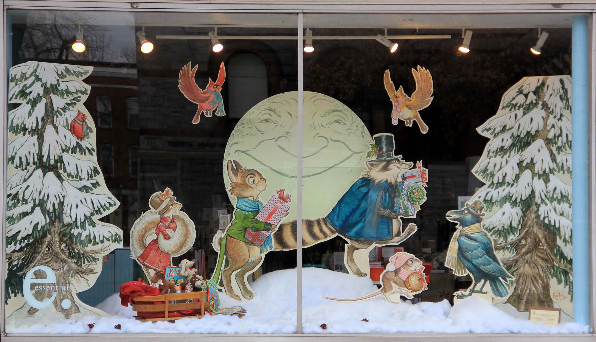
![]()
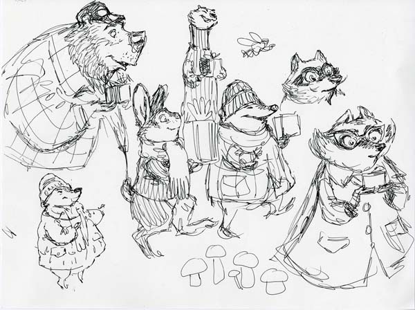
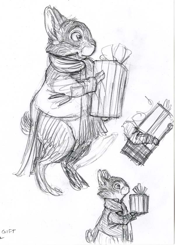
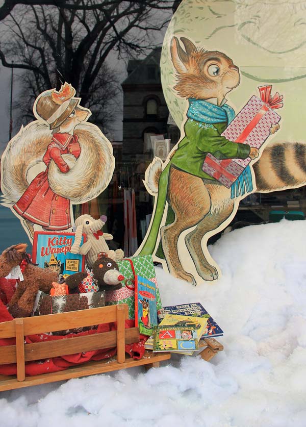
Subject-wise, there was much talk of wintry faeries and elves in an enchanted wood. Though this was a natural direction for me (especially after the new sprite studies I’d recently painted), I felt that there was a presentation I could conjure that might reach a broader audience. I liked the enchanted wood idea and it led to warm memories of Emmet Otter’s Jug-Band Christmas and even The Wind in the Willows. Obviously it reminded me of my work on Kenny & The Dragon – a world I loved creating. So, over coffee and oatmeal, I scribbled out a procession of woodland animals (all indigenous to our locale) carrying gifts to a holiday party.
The shop owner loved this idea and I was off and running.
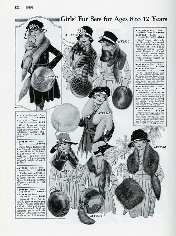
For a more timeless feel, I decided to dress the animals in less-contemporary styles. I referenced Everyday Fashions 1909-1920 As Pictured in Sears Catalogs as my go-to for woodland attire.

Of course, Charles Dickens’ A Christmas Carol is such a beloved tale that I had to dress some of the characters in Dickensian costumes. (Click the smaller images for a larger view)

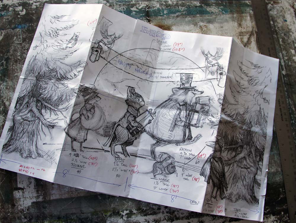
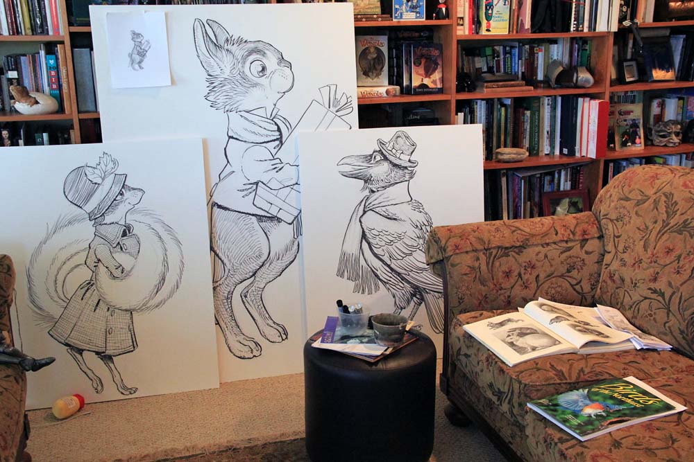
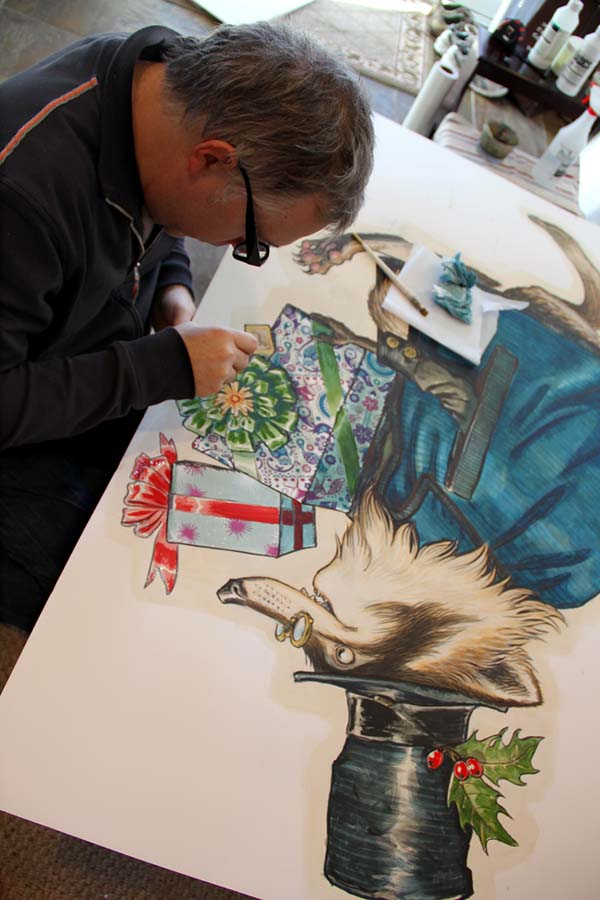
With some anthropomorphic fir trees acting as curtains, my wintry wonderland stage was set. Measurements of the store’s window were recorded and I created a sketch to scale (1 inch: 1 foot). I’d paint the characters directly onto acid-free foamcore and then loosely cut them out, sort of like the images you’d find on an old die-cut holiday card. I’d anchor the cutouts to a wooden base with slats mounted to their back side.
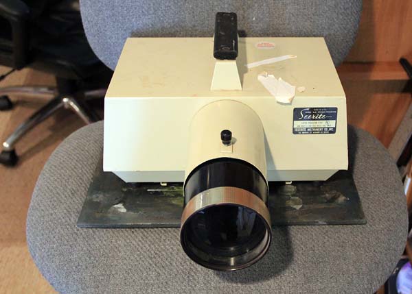
There was only one easy way to enlarge a pencil sketch to fit onto an oversized sheet of foamcore – an opaque projector. Thankfully fellow-artists Scott Fischer and his wife had one that they could loan.
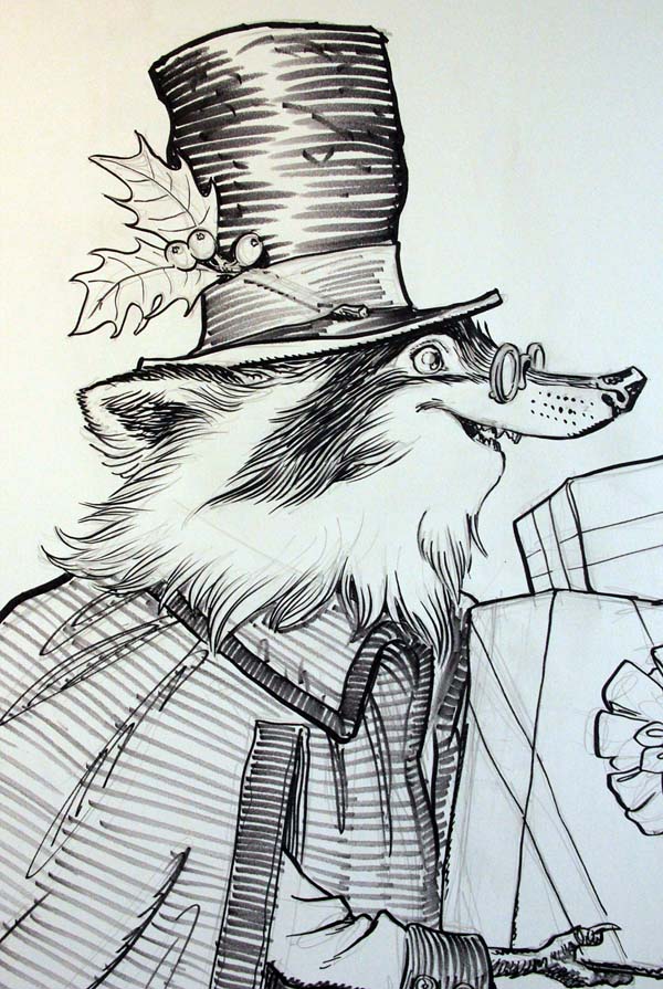
I traced my pencil sketches onto the foamcore and inked them with permanent markers. I tried out several brands before falling in love with Prismacolor’s Premier Brush Tip Markers. The brush tip allowed me to ink at a much larger scale while upholding my line style. Seriously, you’d think that this ink of the raccoon is on a standard-sized sheet of Bristol board, but he is actually 5′ tall.
As the markers dried out from all this heavy inking they produced a sketchy grey line. But this was also valuable to me. I switched back and forth between new full markers and dried ones to ink the procession of woodland creatures.
I know what you’re thinking: Why not just ink and color these on a sheet of Bristol then have color enlargements mounted to the foamcore? I suppose I could have gone that route, but there was something thrilling about working at this scale…something I hadn’t felt in a long time. Not to mention, I always like an artistic challenge.
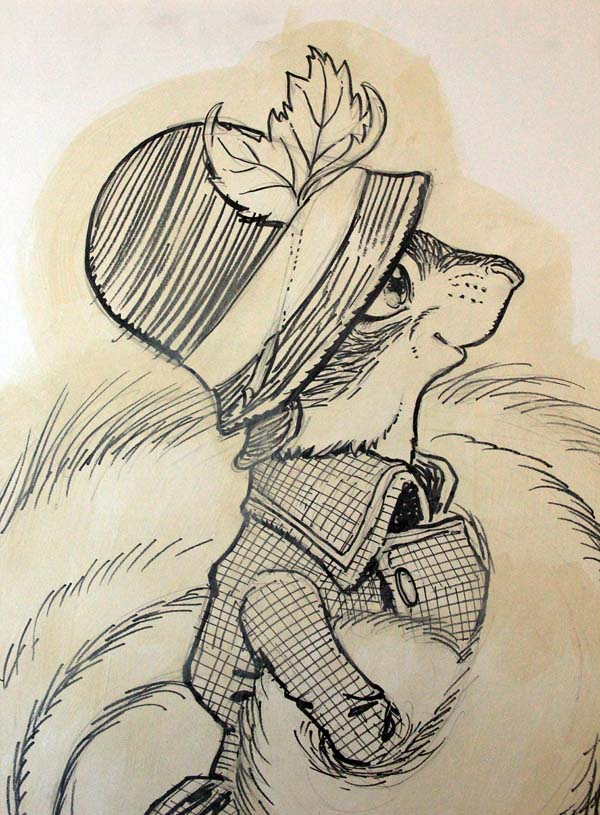
Since I had never done a project like this before, I made up the process as I went along. The black ink on white board was a bit too contrasty for my tastes, so I laid down a thin coat of Unbleached Titanium White Liquitex acrylic paint over each drawing. The paint “antiqued” the drawing and softened the contrast of the ink line. After that, it was a quick buildup of translucent layers of diluted acrylics to achieve my usual watercolor wash style.

The ink lines became more and more subdued underneath each subsequent layer of paint. This allowed me the opportunity to punch up the contrast of the finished painting by accenting the shadows with the black Prismacolor marker.

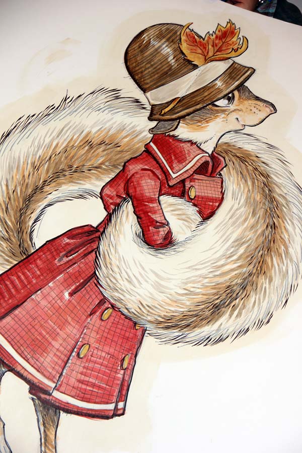
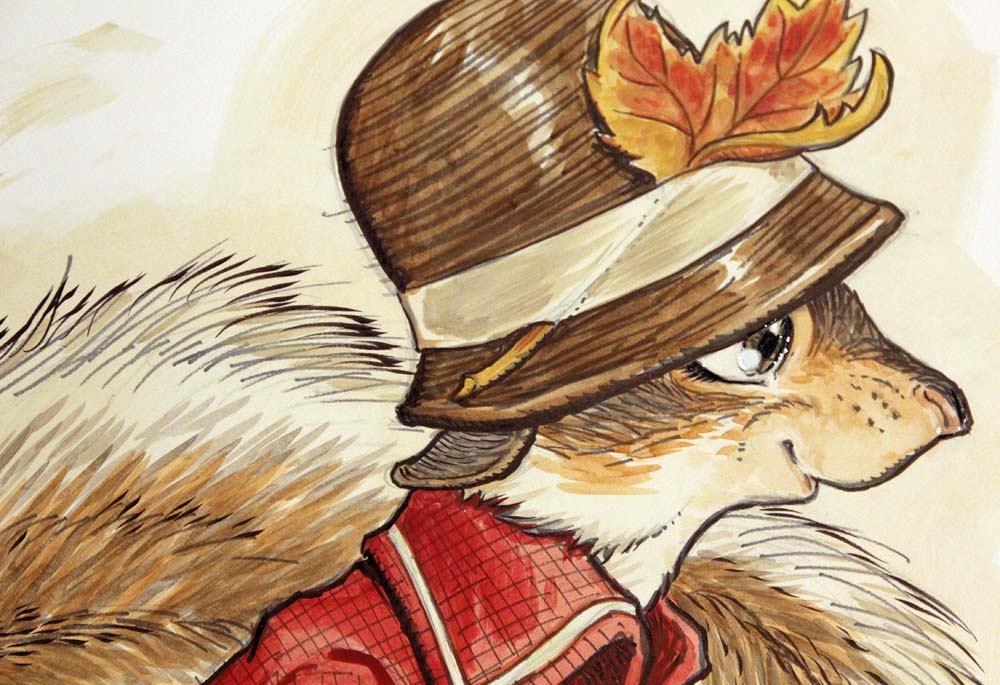
After the painting was complete, I added several coats of Liquitex Gloss Medium & Varnish to the eyes (and noses) of the characters so that they would have a wet, glossy look.
The final stage was surface effects. I raided our local Michael’s craft store in search of various glues and glitters that I could apply to each piece to achieve that vintage-holiday-card-feel. The “Recollections” brand of scrapbook supplies manufactures all sorts of decorative textures, including flocking powder. With clear craft glue (and an old paint brush) I went to work.
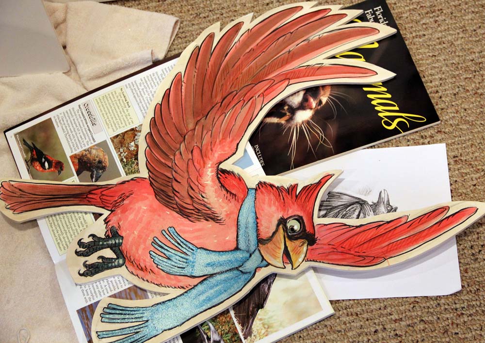
The cardinal (below) had a layer of pearlescent microbeads glued to his scarf which created quite a shimmer.

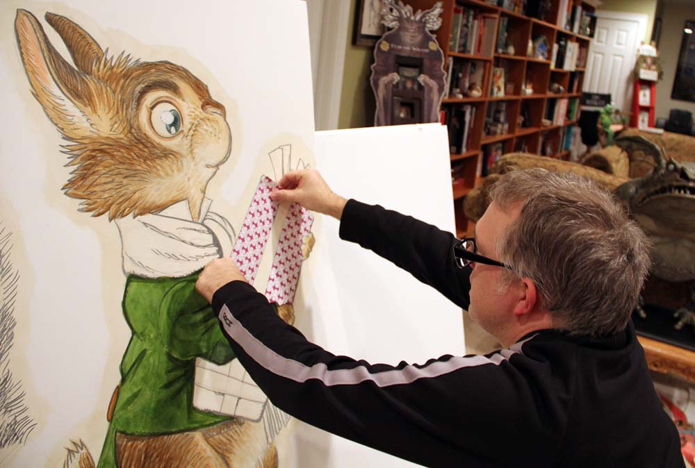
For the presents, I decoupaged actual wrapping paper sold at the store to tie the visuals into the merchandise sold within.
The woodland creatures were finished and it was time to move onto the fir trees. These would be painted on 8′ tall sheets of foamcore (I didn’t know foamcore came this large!). Here you can see my studio assistant, Ashley, transferring the sketch onto board using the opaque projector.
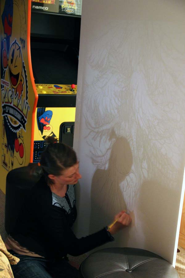
As the deadline neared, I decided to forgo the inking stage on the trees and simply draw with paint and brush. I was able to do this because my understanding and confidence in the mediums at this scale had strengthened throughout the week while I painted away.

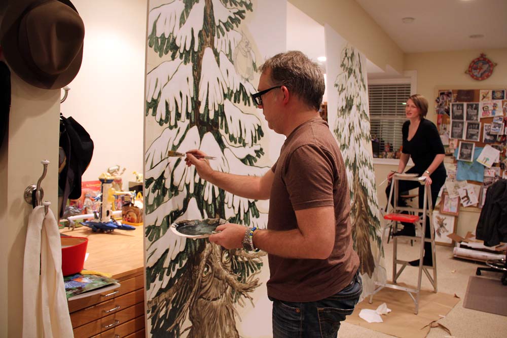
Also, I taught Ashley (and Angela) how to paint certain areas of the tree so that I could finish these giants. It also allowed me time to detail them more than I would have had I been painting solo.
After an intense week of drawing and painting (into the wee hours each night), it was time to set up the window. The store owner had a local carpenter build some wooden hill mounts to my (loose) specs and had purchased loads of cotton batting for snow.
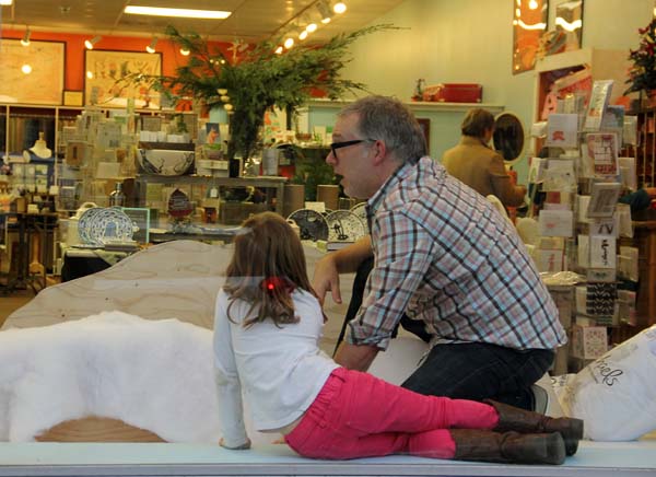
With the aid of my little sprite (and some great help from the staff) we assembled the woodland wonderland scene.

In return for doing the window I asked for a store gift certificate. Honestly, the experience of creating something at this scale (and creating with my family) for a locally-owned business was payment enough. As I worked away I posted snapshots on my Twitter, Instagram and Facebook pages. The outpouring of kind words and praise from friends, fans and family was tremendously validating and encouraged me to push further and think bigger.

The appreciation of others is what the holidays are all about for me. And so, I thank you.
Keep dreaming. Keep drawing.


