
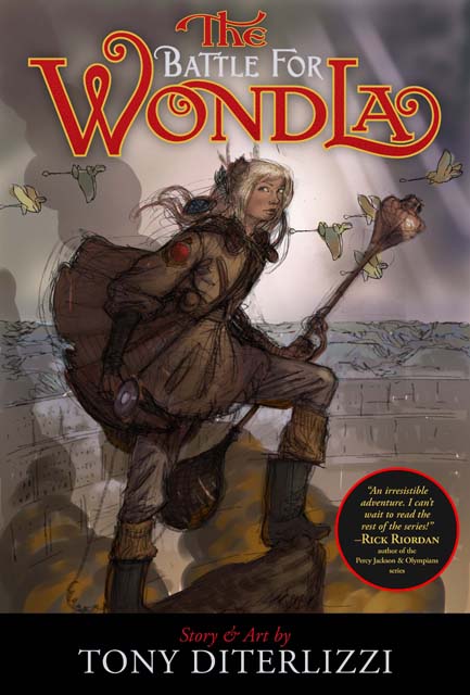
Tony DiTerlizzi's Blog, page 6
September 20, 2013
The Search for a WondLaful Cover (IV)
The final stages of creating the artwork for The Battle for WondLa dust-jacket required me to set down my pencils, pens and paper and grab a mouse, Wacom stylus and keyboard.
As proud as I am of my inking capabilities, I never create the perfect ink drawing. Cleanup is required. Nowadays I correct errors in Photoshop, but way-back-when I would “white-out” the part I wanted to fix in white acrylic paint, then redraw over it. You can see this technique here in a piece from The Spiderwick Chronicles. Look closely at Byron’s wings.
Because India ink is so vibrant, it requires A LOT of white paint in order to mask the error and provide a decent background to re-ink upon. In the end, you are drawing on a bumpy surface of blobbed on paint. I am heartened when I learn that even the most accomplished ink-masters dealt with whiting out mistakes. Here’s a close-up of an original Garth Williams drawing from Charlotte’s Web.
The yellowing of the paper has made his corrections more apparent. Charles Dana Gibson would meticulously patch in a new piece of board to fix his inking mishaps. Once the piece is photographed for reproduction the white-out (or the seams from the patch) would vanish and give the appearance of a perfect ink drawing in the final reproduction. With a home art studio housing new(ish) technology, I now scan my ink drawings and upload them directly into the art director’s ftp folder. This allows for digital cleanup and fixes with incredible freedom.
My first exercise that I run it through is the mirror flip. A common practice in art school, it simply requires looking at a reflection of your artwork. With the image in reverse, errors become more apparent. Let me show you:
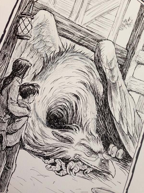
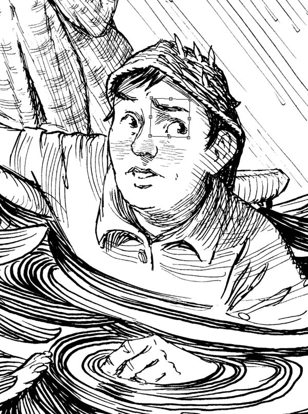
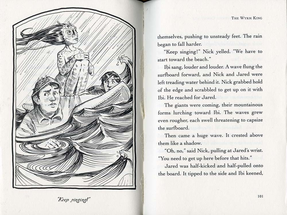
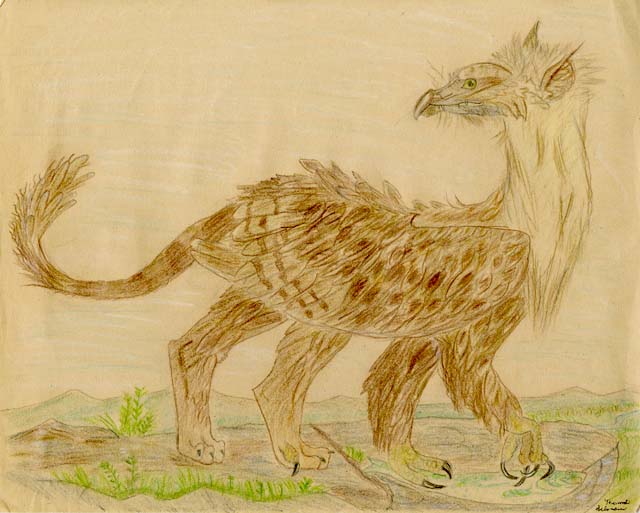
This is a scan of the finished ink drawing from Chapter 6 of The Wyrm King from Beyond The Spiderwick Chronicles. Can you see error in the drawing? I couldn’t while I was working on it, so I’ll give you a clue: It has to do with Nick, the boy in the lower left wearing the seaweed cap.

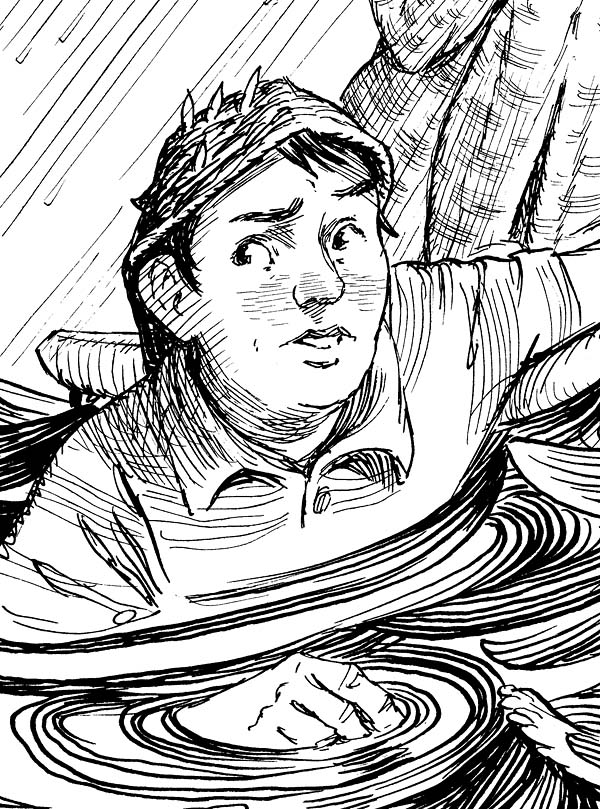
Here is a close-up of Nick scanned for print (a 600 dots per inch [dpi] bitmap).
Now I shall mirror-flip it in Photoshop. The error becomes more apparent in this reversed image – the axis of his eyes are off (among other facial features). A quick digital fix will show how subtle tweaks to line art can make a big difference.
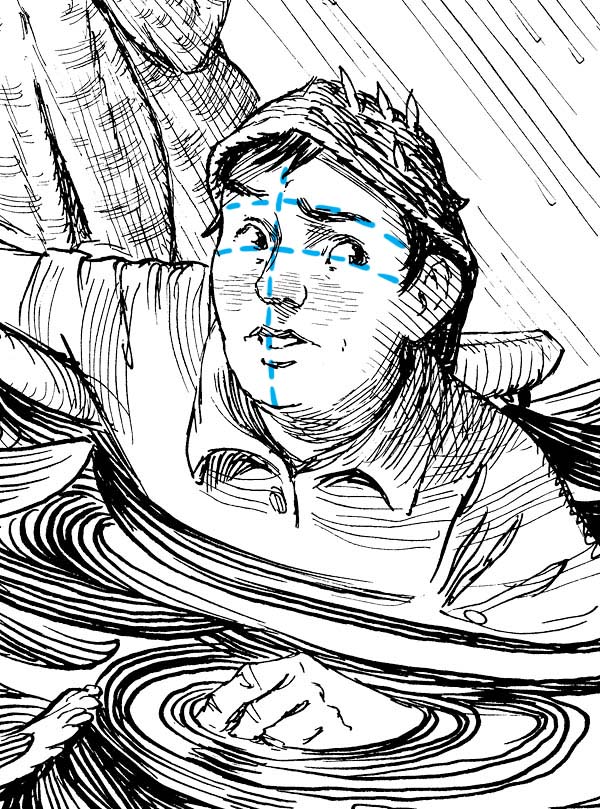
In Photoshop, not only can I erase dust, ink droplets and spatter, I can also alter the drawing itself. Here I am nudging the eye back up a bit and rotating it slightly.
I can also erase any inconsistencies in the line work and redraw whatever needs to be done. Compare the original artwork (left) with the cleaned-up version (right). (Click to see a hi-res image)
 And here is the final printed image.
Of course, this begs the question: Why not just ink the whole thing digitally? Because I like to have a physical piece of art when all is said and done. I want something that’s been held and made by human hands. And, despite these tweaks and cleanup, I want some of the ink blobs, smudges and errors created when by drawing by hand. That is part of the charm for me.
That in mind, I tend to err on the conservative end when cleaning up my ink drawings digitally. More often than not, the original drawing looks pretty close to the final printed image.

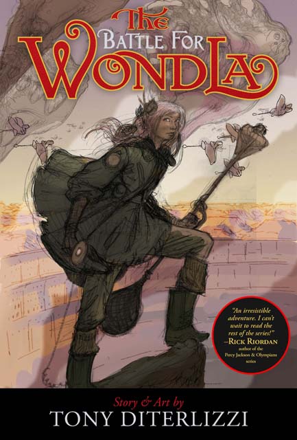
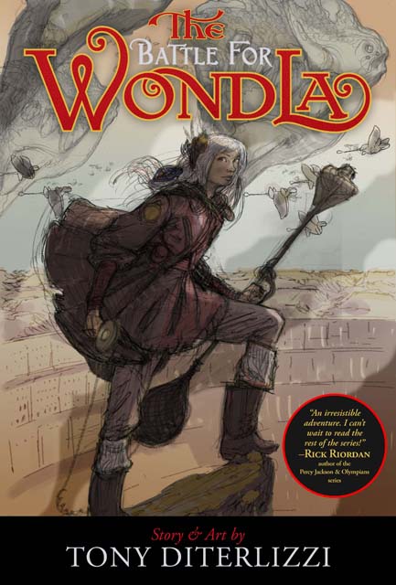
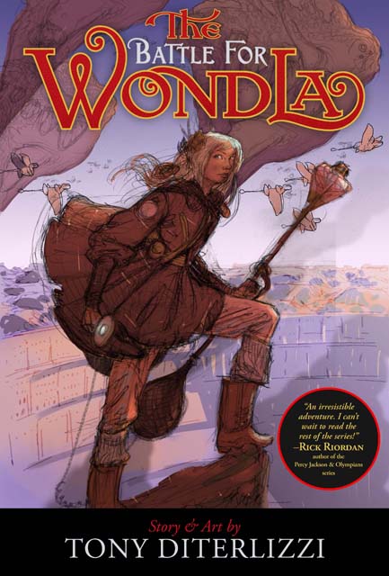
And here is the inked artwork of Eva for the cover to The Battle for WondLa. I got lucky on this one and it required little clean up (I fixed the pattern on the muzzle of the boomrod, removed strands of hair, and erased lines where her hand gripped the Omnipod). Now she is ready for color, but more on that next time…


September 8, 2013
The Style of Scribner
Early in my career in children’s publishing, I filled in the gaps between my picture book projects by illustrating jacket art for paperback books. Most were reissues of older titles like the Bernie MaGruder series and the Magic Shop books. Though I channeled classic illustrators (like Norman Rockwell and J.C. Leyendecker) I was also inspired by another great illustrator, Joanne Scribner.
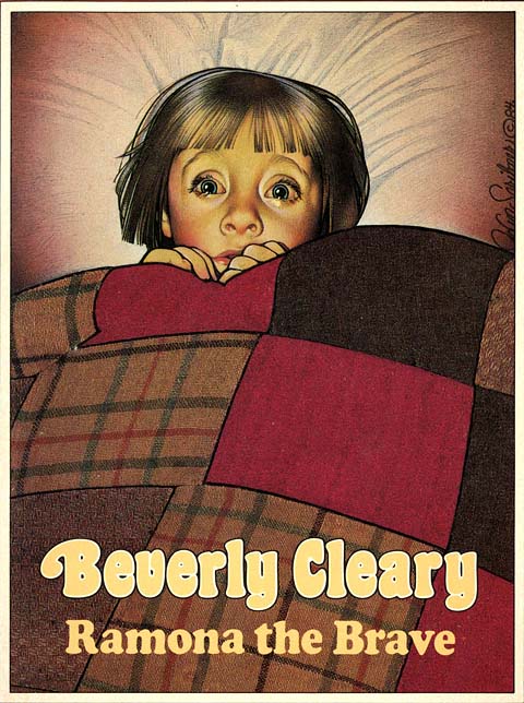
Around that time, I remember visiting a used bookshop in upstate New York with artist-pal, Scott Fischer. I was telling Scott of my ongoing jacket art assignments as we browsed through the old paperbacks. From a dusty, overloaded shelf, Scott pulled out a classic from Beverly Cleary – Ramona Quimby, Age 8.
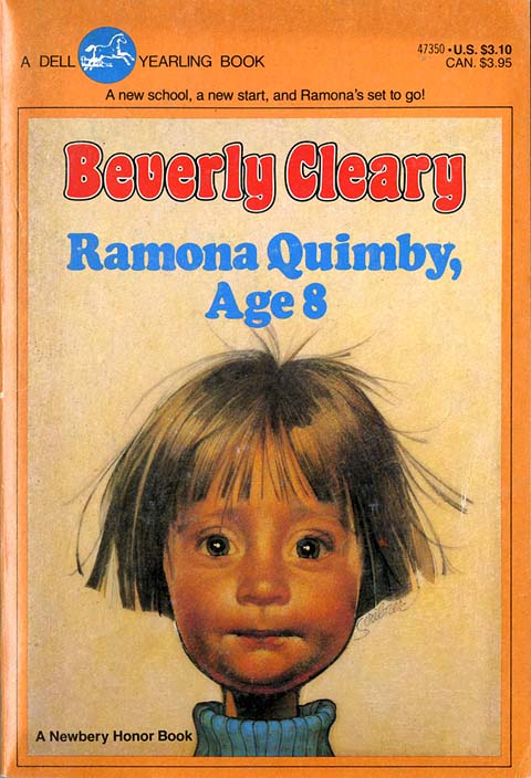
We both recognized this iconic cover from our elementary school days. As illustrators we could see the technical mastery in the simple composition. As the title suggests, you are meeting the precocious and endearing Ramona. But the exaggeration of her features (like the flyaway hair and that skinny neck) add a levity to the detailed realistic rendering.
From that day on, I began scooping up books with Scribner’s unmistakable imagery whenever I chanced upon them.
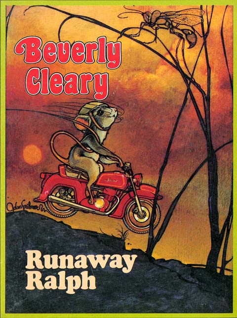
As any librarian from the baby-boomer generation will tell you, Scribner was not the first to render covers for Cleary’s classics. The Henry Huggins books, Ramona books, and even Mouse & The Motorcycle were illustrated by the late Louis Darling.
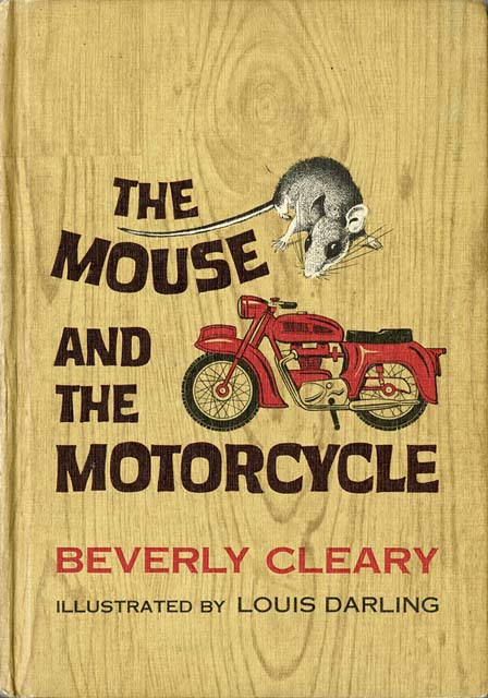
As much as I LOVE the original jacket to Mouse & The Motorcycle, it is not the version I grew up with. This is:
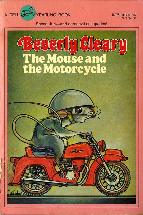
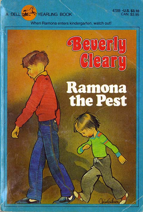
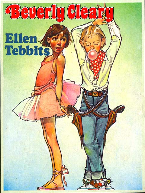
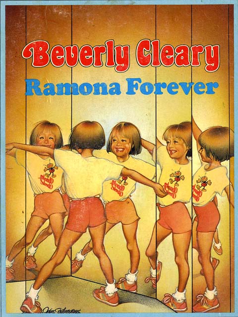
It appears that Scribner was tasked with re-imaging these beloved titles for Dell’s imprint, Yearling Books for Young Readers, in the late 1970′s. This is an illustrator’s dream, to be sure, but to maintain a high-level of artistic quality that spans over many titles with many characters is quite a feat. Joanne’s talent prevailed and an entire generation was introduced to Cleary’s classic texts.
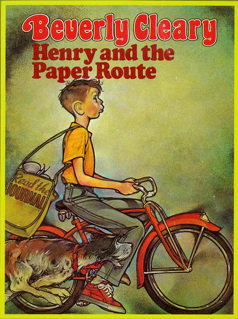
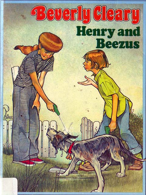
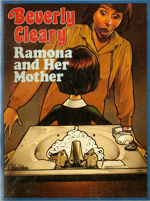
I’ve trimmed off some of the jacket design only so you can focus on her illustration more. I adore how every title is set in the Cooper font. I can’t think of any other typeface which perfectly reveals the time in which these books were designed.
In looking at her images now, I can see the influence of Rockwell (especially in the staging and acting of the models), but there is also an Art Nouveau quality to the line that is quite distinct. The colored pencil hatching brings to mind the work of Brian Selznick, who is also a fan. When I sent Brian these scans from my book collection, he responded with images from another favorite illustrator from that time – Richard Amsel.
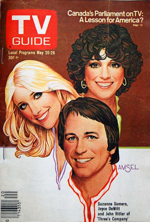
Amsel’s ubiquitous art permeated album covers, magazine covers and movie posters in the 1970′s and early 80′s. He was master of his craft, able to render a perfect likeness while maintaining his distinct pencil-sketch style. I have no idea whether or not Amsel’s work influenced Scribner’s or if that style was just part of the artistic zeitgeist back then. Regardless, Scribner did for kid’s book covers what Amsel did for movie posters and magazines.
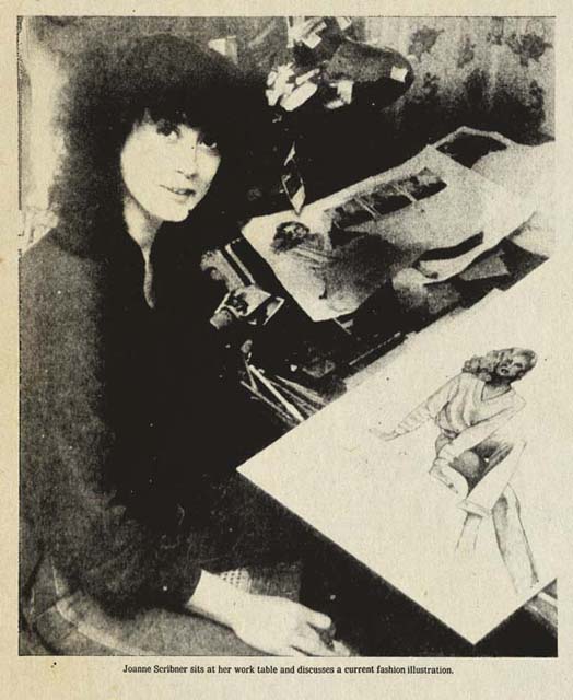
I couldn’t find an official site or page for Joanne Scribner anywhere (if anyone knows of one, please post it in the comments). I did come across an article from the Spokane Daily Chronicle in 1979 reporting her leave of New York and return to Washington, where she’d begun teaching illustration at a local community college. In the article she is quoted, “It is my job to make people want to buy that book. The cover is what grabs people when they walk into the book store.”
Thirty-plus years later that philosophy still applies. And, as far as I am concerned, Joanne Scribner’s work still does just that.
August 27, 2013
The Battle for WondLa: Third Draft Completed
71,000 words later, the final chapter of Eva Nine’s story is off to my editor at Simon & Schuster for final tweaks and copy-editing.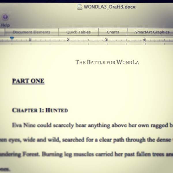
We’ve filmed a few video shorts here in the studio that will be released this fall including the cover reveal, creating the art, and writing the trilogy. I’ll keep you posted as soon as they are online.
Now, time to start the sketches for the 50+ interior illustrations.
August 23, 2013
Friday Fan Art for You Beetleheads
Throughout the year I am fortunate to receive letters, drawings, and the occasional package from fans around the world. These notes contain questions, inspired art and ideas, and conversation all sparked by my work or common thread of interest in the fantastic, art, or books. I love to read these letters and I am always so amazed to see the beautiful work that is produced. What fans do not always realize is that often times these letters and works are just as inspiring for me as my work is to them. Sculptural artist, June Gallagher’s, gift provided a mischievous masterpiece of inspiration.
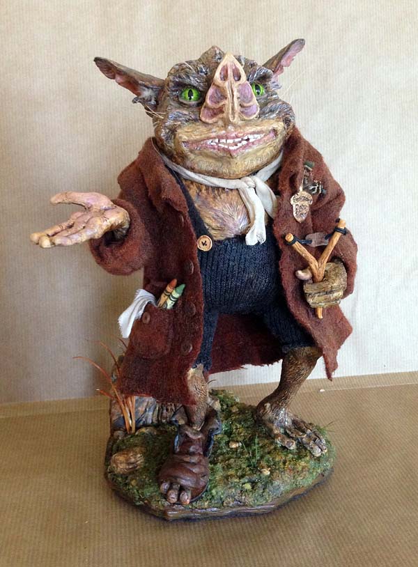
Last week I received a package from June – a New York-based artist that I had featured in a previous Friday Fan Art post showcasing her beautiful Thimbletack sculpture. Inside this package I found another Spiderwick inspired work: an absolutely stunning, talking sculpture of Hogsqueal.
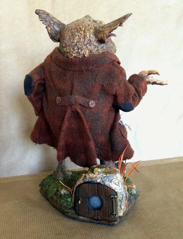
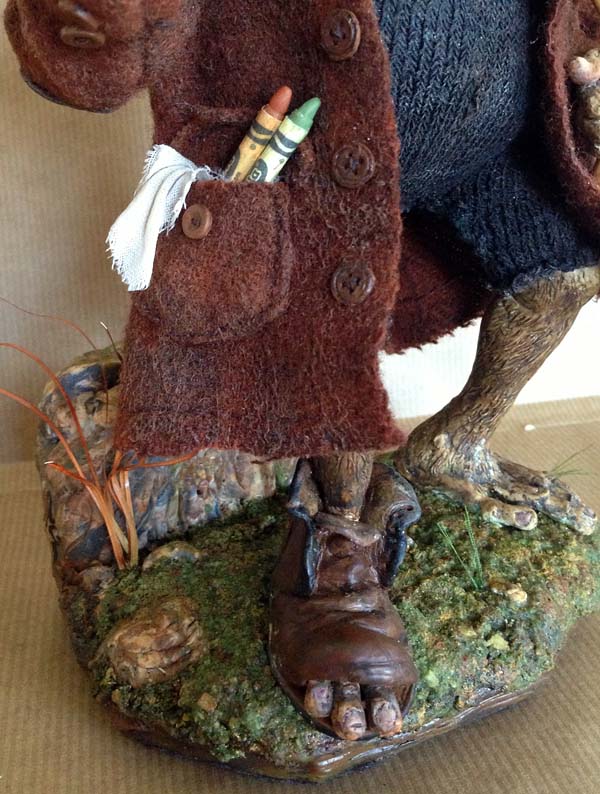
Like Thimbletack, Hogsqueal is made from Premo Polymer Clay accented with mixed media material for the details. The base of the sculpture is enforced with a aluminum wire mesh. His overalls are made from an old sock (also used for her Thimbletack sculpt) and his coat has been created from a wool fabric (found on Etsy). Both his whiskers and ear hair tufts are made from feathers. June’s eye for details included shrinking crayon wrappers to fit the polymer clay crayons in Hoggy’s jacket!
Located on the back of a rock on the mossy platform you can find a small button tactfully hidden behind a screen door. When the button is pressed you hear, “Hey Beetlehead, what are you staring at? Never seen a hobgoblin before?” The voice is a friend of June’s son and was recorded on a tiny device purchased online. All in all, after finding the right fabrics and recording device, Hogsqueal took about 2 weeks to create.
For the past year June has been on a mission to devote her time to being grateful. This decision was made after a tragic event in June’s life caused her to focus on the wonderful and inspiring things around her. I know how important art can be in moments like that and am honored that my work has been included June’s healing process (Hogsqueal is too).

You can find more of June’s work at her Etsy Shop called .
Never abandon imagination, June. Keep Sculpting, Keep Dreaming.
August 9, 2013
A Fantastic Field Guide Friday Fan Art
Patrik is a teenage artist from a small European country named Slovenia (located next to Italy, Austria, and Croatia) who has been inspired by The Spiderwick Chronicles. He read the series about four years ago, in his native language Slovene, and became inspired to create his own fantastical project, which took him three years to complete!
This commitment is nothing new for the young artist. In fact, Patrik discovered his passion for drawing when he was just five, and continued to exercise his talent through grade school. Like me, he looks to many similar sources for inspiration. “I love nature, and not just nature, but everything that is natural which has a feeling of pureness,” he explained in his email. Of course, the natural world had a great influence on me when I was creating Spiderwick. I studied and drew from museum specimens and other forms found in the wild to guide me in creating a more detailed world of the fantastic.

Patrik, saw this connection and was so inspired by the information found in Arthur Spiderwick’s Field Guide to the Fantastical World Around You that he decided to make his own rendition of the book. Above you can see the cover of the piece surrounded by objects Mr. Spiderwick would have had close at hand – spectacles, a compass, an ink dip pen, magnifying glass, and (of course) his seeing stone.
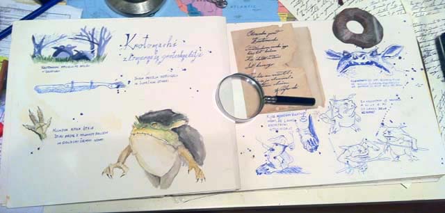
Here are only some of the beautiful pages of Patrik’s homemade field guide. Detailed renditions of goblins, ogres, sea maids, and many more familiar creatures fill the pages, providing documentation that Arthur Spiderwick would be proud to see. Note that the information included in the drawings have been translated to Slovene.
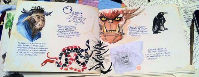

The Griffin centerfold is one of my favorites…
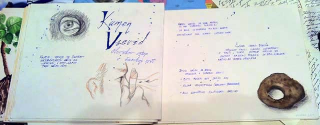
…and, of course, instructions on how to use a seeing stone. Nice work, Patrik. This field guide is splendid.
From Massachusetts to Slovenia:
Keep drawing, Keep dreaming.
August 2, 2013
The Search for a WondLaFul Cover (Part III)
After many concept sketches, refined drawings, and color studies, I was finally able to begin the execution of the final artwork for The Battle for WondLa.
A cover featuring the main character front and center is really all about the character. If the design and drawing fail, then the cover is that much weaker. In other words, I have to knock this drawing of Eva Nine out of the ballpark for this cover to be successful. To do that, I gathered real-life reference for Eva and her environment.
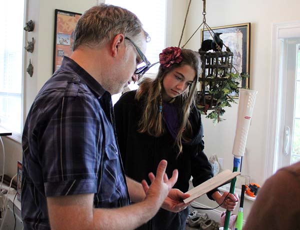
When the model arrives at the studio, Angela and I create a costume that folds and wrinkles the way I imagine Eva’s costume would. Here’s the model, in costume, posing as Eva for the paperback edition of book 1:
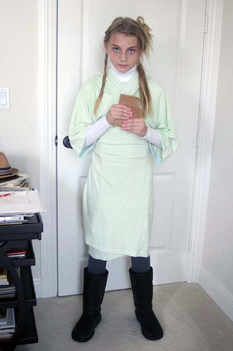
You can see its pretty close to the final. Also, the pose echoes Eva’s character in book 1 – hopeful, innocent and strong in spirit. Eva has grown to a stronger, more confident girl by the third book and so, the pose reflects that change.
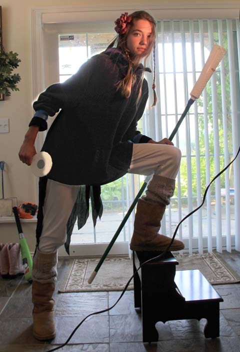
See this difference in posture and attitude? That’s key for me. On top of that, we’ve also tried to emulate the lighting for the final piece (as worked out in my color studies). There’s cool, white light behind Eva with a warm, yellow light illuminating her face. With this sort of reference handy I can create a more confident and structured drawing.
I enlarge the sketch to a size that I am comfortable with (for this one I went pretty big). There is no hard rule on the final art size for me, though I usually create it around 2x the printed size. Next, I lay a sheet of vellum over the printout and ink directly onto the vellum. I use Staedtler Pigment Liners to do the job and switch among various widths as I work. Before I start the final inking, however; I do a couple of tests and warmups.
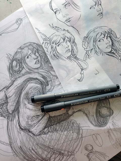
Once I feel confident I begin the final inking. If the figure is key to creating a successful cover, then the face is key to creating a successful figure. It is where your eyes go first and the face give clues to the emotion of the character, which the body language emphasizes.
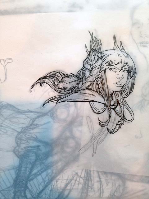
I exhale a big sigh of relief once I am past this point. There is work still to do, but its easier going for me from here on in.
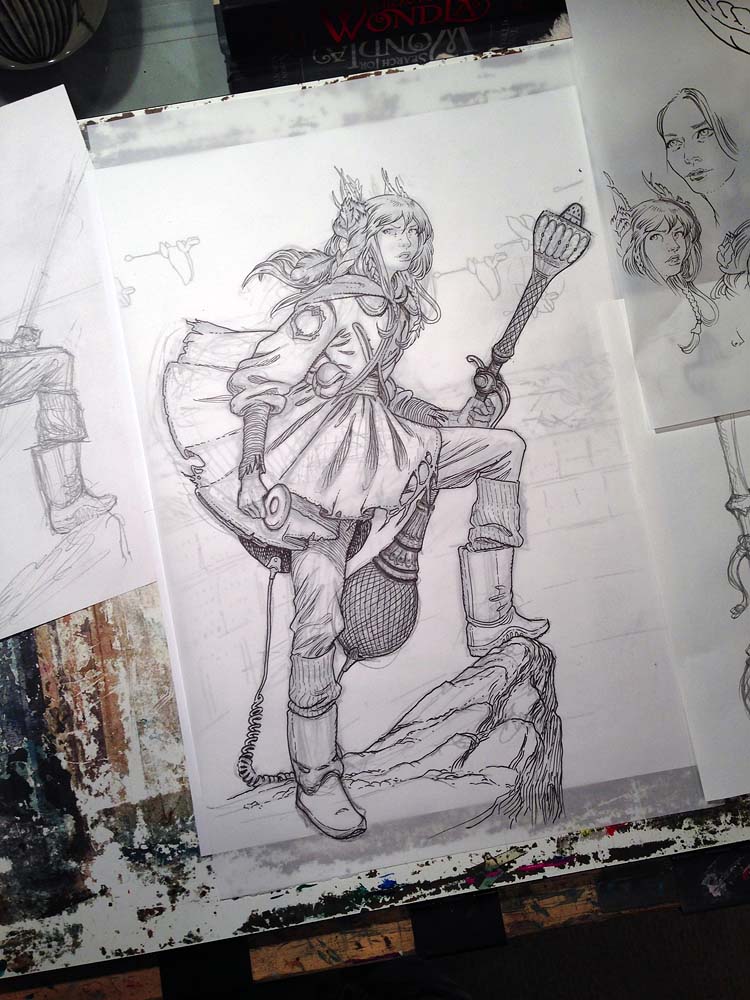
After the figure is inked, I move onto other elements of the jacket. As you may have surmised, I do not ink the art as one complete piece. I have found that book jacket art requires numerous tweaks and changes as the various components are designed. There has to be adequate space for the title, credits, and any other sales copy that may help sell the book. Since I am rendering the final art digitally, I create the elements separately so they can be nudged and moved throughout the process.
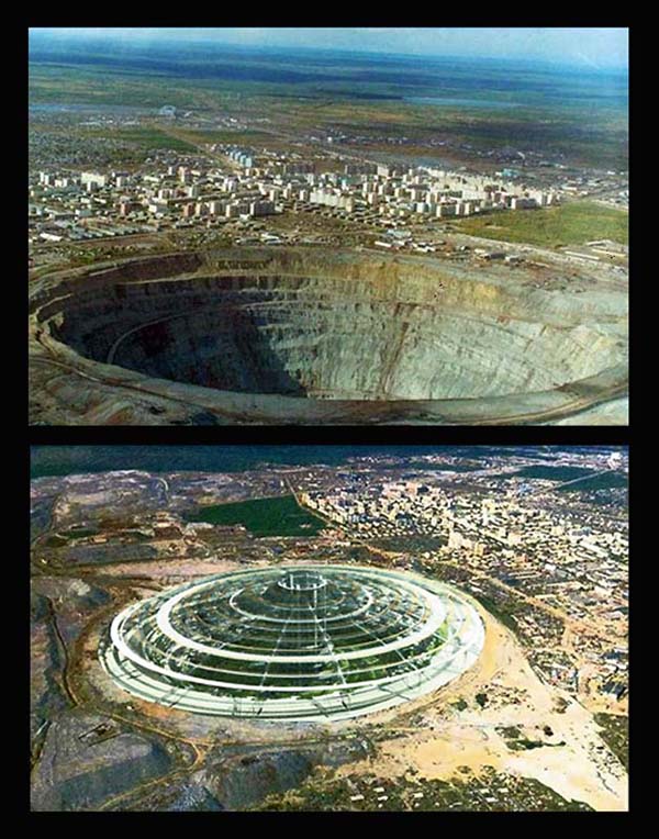
That next element for this jacket is the city. The underground cities in WondLa are inspired by real-world proposals for actual underground cities, like this enormous quarry in Siberia.
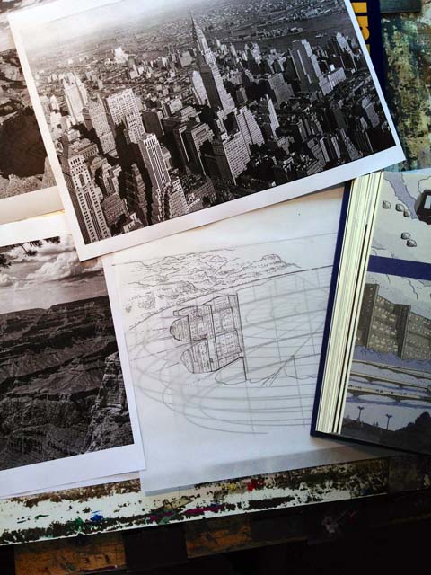
With additional reference of Manhattan and the Grand Canyon I inked the background art. Here’s a trial run of the inks on the city with much of the reference nearby:
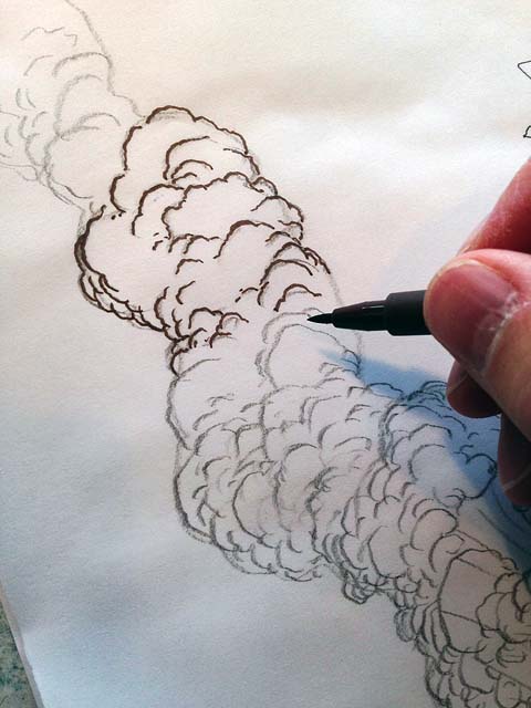
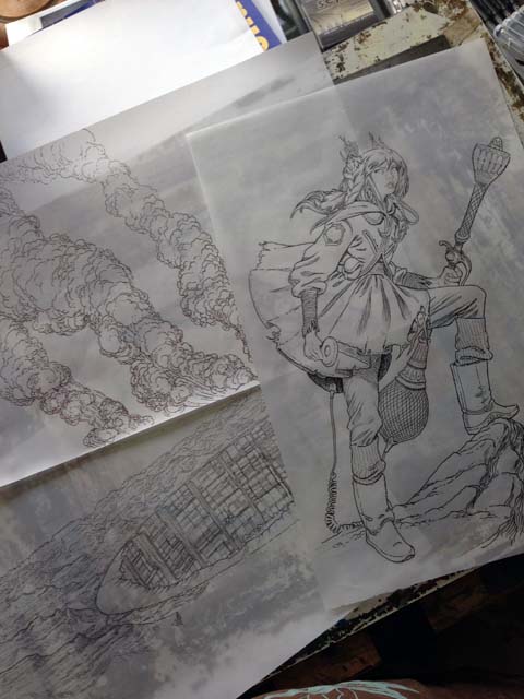
The last element that needed inking were the columns of smoke billowing from the city. I love drawing organic shapes and could render these flumes for days. Here, I switched to Faber-Castell’s PITT line of artist’s pens. I used the brush nib to add a calligraphic touch to the puffs of smoke.
Once all the elements were inked, it was time to scan and color…more on that next time.
July 12, 2013
The Search for a WondLaful Cover (Part II)
Invigorated with feedback from my readers, and my sketch approved by the team at Simon & Schuster, it was time to develop the mood of my cover concept sketch through use of color.

Confession: I am not the best with color theory.
On top of that, I am partially colorblind (especially where dark blue transitions to deep violet). To unify my color palette in a painting, I underpaint the entire image in Raw Sienna or Burnt Umber and build on top of that. So, if you really want to know color, I suggest you visit Jim Gurney’s blog – he’s a genius.
If I am not doing my usual brown-on-brown-with-a-touch-of-color painting (like I did for most of the Spiderwick illustrations) then I am looking at photographs and other paintings for palette ideas. When I come across something that could potentially be my Palette of Inspiration, I squint my eyes to blur the image and allow the colors to dictate their mood to me. So an image like this, (from American landscape painter, Albert Bierstadt):

…becomes this:

Using Photoshop, I can also index the palette to a fixed number of colors and then view that palette as a color table:
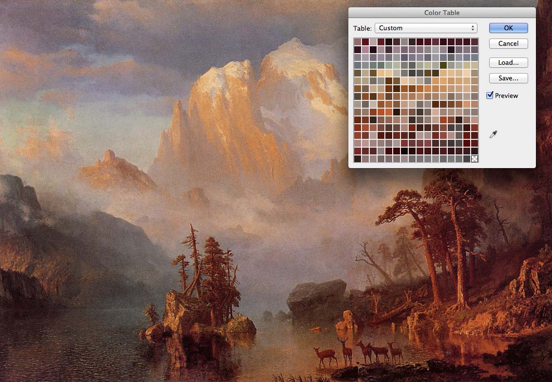
This aids greatly in digital coloring because you start off with a perfectly harmonized palette. Sure it may be limiting but I like the challenge of using a limited palette – especially to convey an emotion. For the second WondLa book, I referenced photographs of dusky sunsets to achieve the color palette. On the third book I would need to veer away from those color combinations to set the jacket apart from the others – yet keep a similar color sense so that the book felt like it fit with the previous titles in the trilogy.
I began with a palette created from Bierstadt’s western landscapes (which I love). Quickly I created a color sketch:
Here, the palette felt perhaps too similar to the color combinations in book 2 (a light, warm-tinted background against a cooler dark silhouette), so I explored more:
I pulled the saturated colors out of the landscape and pushed Eva into a cool shadow of purple hue. There was something I really liked about the green sky, (especially over an area of destruction) but the colors overall didn’t convey the majesty of the landscape beyond Eva. I tried another palette altogether:
10 points to anyone who can guess the inspiration for this palette. It is so identifiable with this artist that I am immediately put into a magical twilight trance when viewing it. If you recognized this as the colors used by Maxfield Parrish, then you understand the impact color can have. This color scheme was from his most famous painting, “Daybreak”. Though a beautiful palette, it didn’t work here – there is too much of a contradiction with these tranquil hues and a story about a war and battles.
Which led to the obvious: why not look at paintings of war? Duh.
I browsed through numerous paintings, from the civil war to Jacques-Louis David’s famous Napoleon paintings.
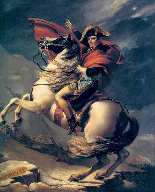
There was plenty of brown to be sure – depicting turbulent skies and smoky landscapes. I felt like I was on the right track. Then it struck me that Eva’s pose in my sketch was very similar to a pose I had seen in a very famous war painting:
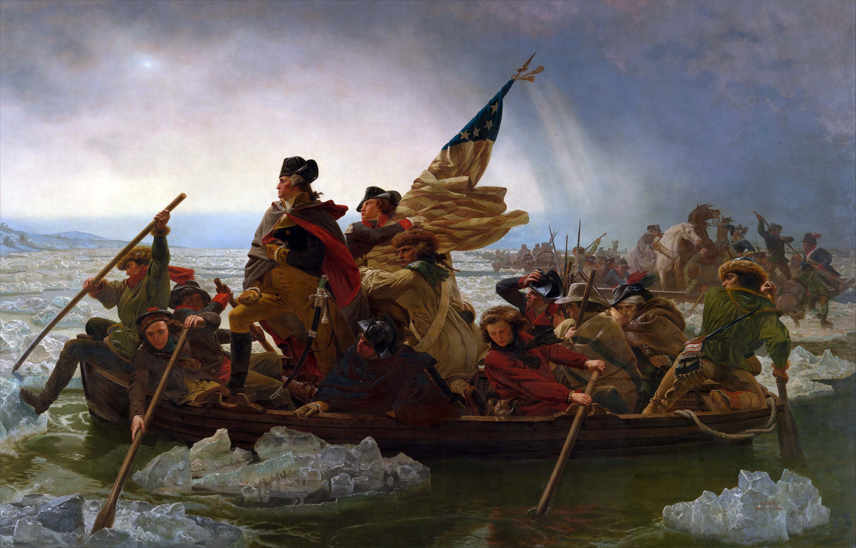
Emanual Leutze’s famous 1851 painting hangs in the Metropolitan Museum of Art in New York City. I’ve marveled at its proud epic presence for hours on end. It holds the perfect combination of light, darkness and color. It was my Palette of Inspiration for the final installment of the WondLa trilogy.
Next up, I gather reference and begin the final art.
Friday Fan Art
This week’s Friday Fan Art comes from a wonderful local bookstore called The Odyssey Bookshop, located in South Hadley, Massachusets. To help celebrate The Spiderwick Chronicles’ 10-year anniversary, the staff held a nationwide contest asking Spiderwick fans from near and far to submit a drawing of their favorite character from the series.
The first prize winner won a signed set of the Spiderwick books. The second place winner received a copy of Holly Black’s newest book, Doll Bones. When my friends from Odyssey shared the entries with me I was blown away by the quality of the submissions. Portraits of fantastic fey, the Grace children, and (of course) the star villain were submitted. All were executed with great talent and skill. Here are the winners and some of my favorite honorable mentions:
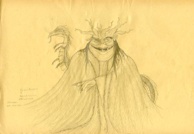
First prize went to Brenden from Beloit, Wisconson for his awesome rendition of Mulgarath. I love his attention to detail – look at all those teeth!
Second place sits with the talented Hannah all the way from Canaro, Canada. Great Griffin, Hannah!
This beautiful Mallory drawing belongs to the talented Haley. Nice work rendering the title typography by hand!
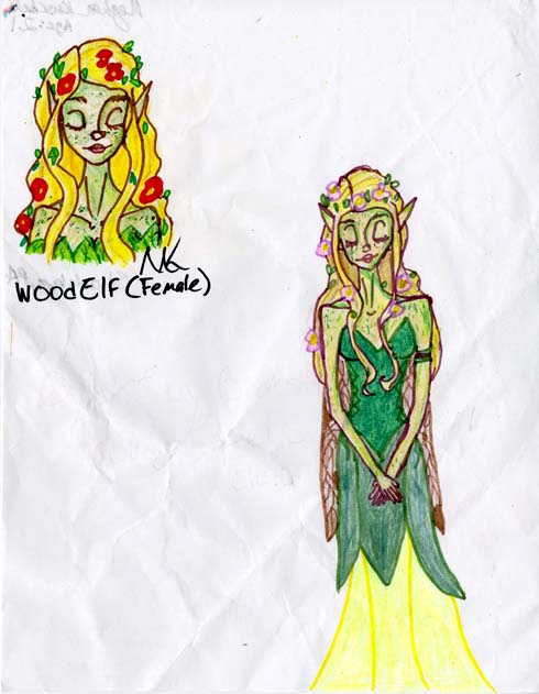
Lastly, Meghan from Stroudsburg, Pennsylvania designed this peaceful Wood Elf. I really like how you’ve included a head detail as well. I often do this when trying to capture just the right expression for a character.
I am always impressed by the fan art that arrives here in the studio. It’s the ultimate compliment to know that my work inspires aspiring artists to create masterpieces of their own. Congratulations to all the winners and to the folks at the Odyssey for supporting the arts.
Keep drawing, keep dreaming.
June 29, 2013
The Search for a WondLaful Cover (Part I)
While my first draft of The Battle for WondLa was read by my editor and trusted beta-readers, I switched my focus from writing to drawing. In particular, drawing the perfect cover image to depict the climatic conclusion of the WondLa trilogy.
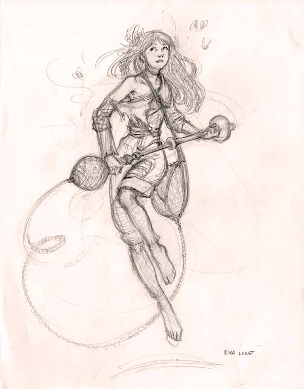
I had started with sketches of Eva, just to reacquaint myself with her visually. Some readers have noticed that I’ve explored different visual motifs with Eva in each book. In the third story she returns to the knotty braids she had in book 1, though with elements of the forest (like seedpods and feathers) woven into her colorless hair. To me, this signifies her relationship and bond with the natural world.
The juxtaposition of Eva as a “nymph of the forest” facing the reality of war was something I wanted to convey on this jacket…especially a jacket with the word “Battle” in its title.
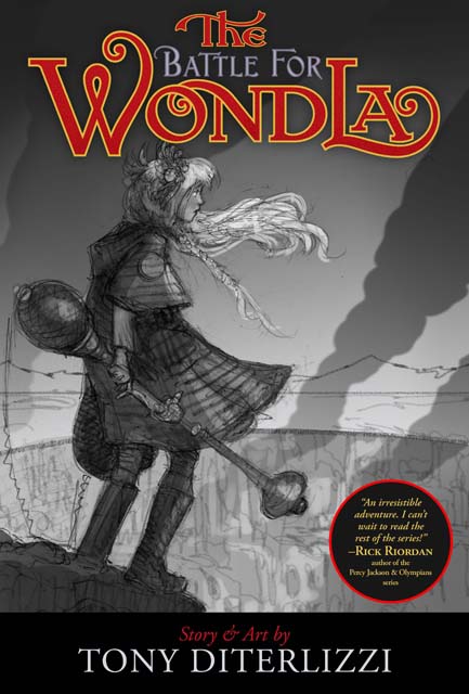
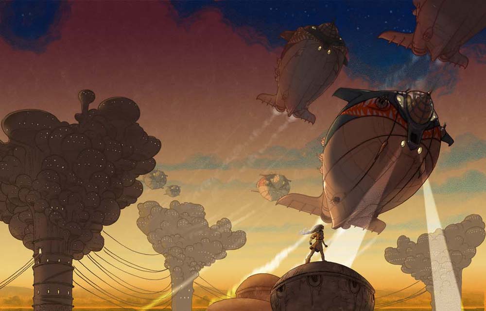
My first idea was of Eva on the precipice of a city in fiery ruin. It was Eva on the brink of war.
However, this seemed a bit of a static, posed image to me. Next, I tried for a scene with a bit more action in it. Something to draw the reader into the peril Eva faces in the story.
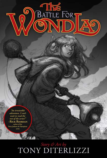
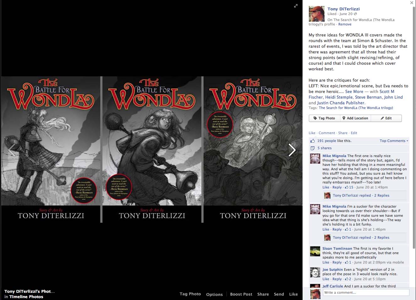
Both concepts needed refining, but I sent them off to the art director at Simon & Schuster to see how the team there would react. They preferred Eva on the rim, but suggested she be posed in a more heroic and determined stance. I returned to the sketch and tried for a more natural pose that I’d hope would suggest Eva’s confidence.
This piece didn’t have the wow-factor for me. Eva looked stiff and overall it seemed weaker than the first sketch. Also, in my attempt to make her more (super)heroic by blowing her poncho up (thus alluding to a cape), I ended up making her look as though she now had fairy wings. I shelved this sketch and tried for another concept altogether. Perhaps placing her in the chaos of the city under attack would ramp up the drama. In this setting, I could contrast the fear and panic of the crowd with the calm determination of Eva.
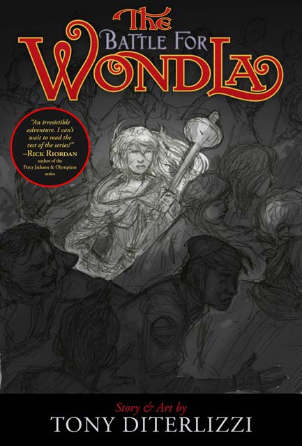
I liked where this was heading, and it looked different than anything I had seen in the bookstore. Though the crowd is running left-to-right while Eva faces the viewer, a tweak on the direction of the crowd would really bring it home. In fact, having them swirl around her – as in a vortex of humanity – could be quite powerful. I sent this sketch off to the art director at Simon & Schuster to await feedback. In the rarest of circumstances, I was informed that the team liked all three designs and that I could ultimately choose which image to use on the book’s jacket.
Wow. That never happens.
Everyone I shared my sketches with responded to different images. To get some public opinion, I conducted a little research test and posted all three on my facebook and twitter page. To my delight, I received feedback from many of my readers including the likes of Jenni Holm, Mike Mignola and even Jim Gurney. Though many picked up on my thinking of the third sketch, the first drawing (of Eva on the rim of ruined city) received the most positive responses. When I tallied up the comments, sketch #1 took it by a landslide.
Understandably, this was small group responding but the feedback was undeniable. Perhaps there was something in that original concept that was speaking to people. Perhaps it was a child facing the realities of the world while standing on the brink of adulthood? Perhaps the composition of the image itself resonated as something they’d seen before? Perhaps it was simply because Eva appeared alone, yet determined, in the wide expanse of the world – ready to take on the challenge of another day.
Invigorated, I went back to the drawing board and gave it one more shot.

Now there was something about the drawing that was intrinsic to the theme of this story. The splendor and danger of our natural world contrasted with the splendor of mankind’s capabilities and the danger we can inflict upon one another. Eva is balanced between both worlds. In the final sketch, I put the horizon right in the middle of the image to drive that point home. Eva is caught between two worlds. Will she ever find her home – her WondLa – in either of them?
After the sketch was approved it was onto color studies to find just the right palette to convey the mood of the book and the emotion of the scene. But more on that next time…
June 3, 2013
The Battle for WondLa: First Draft Completed
Fellow Orbonians, the first draft of The Battle for WondLa is completed and with my editor. While he reads it over (along with my beta-readers), I am beginning to design the third and final cover.
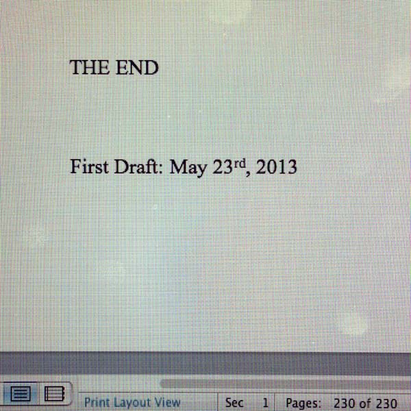
But first, some “First Draft Fun Facts”:
The Search for WondLa: 221 manuscript pages, 51,000 words
A Hero for WondLa: 237 manuscript pages, 61,000 words
The Battle for WondLa: 230 manuscript pages, 59,000 words
The first two books took about 6 months to write (with interruptions). I did this one in about 4. Final word count for the first two books is right around 70k words, so there will likely be a bit more added in the 2nd and 3rd drafts (usually its clarification of things and more description).
Now, the cover.
These covers have been somewhat tricky for me. My main goal in the image is to present an intriguing world with compelling characters – all without trying to give too much of the plot away. The design went through an overhaul from the first book’s transition from hardcover to paperback (which you can read about here). The second book had a large-scale scene also intent on enticing new readers.
Now we come to the final chapter in Eva Nine’s ascension to a true heroine and so I want to depict her teetering on the edge of two worlds: that of a passive character versus a character of action. Or it is the transition of an individual naive to the world around them to one who is cognizant of their surroundings. Essentially, a symbolic image of the child-Eva becoming a young adult.
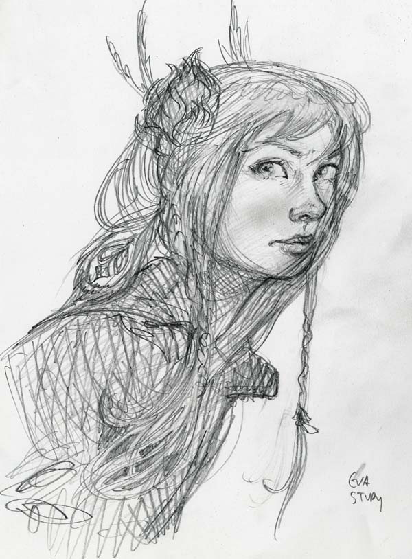
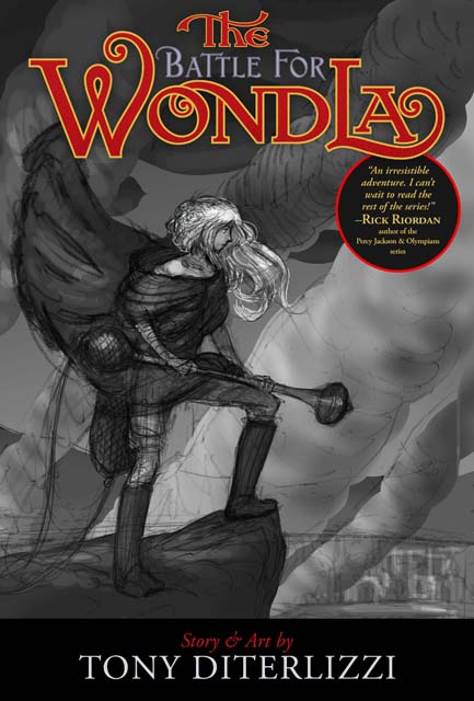
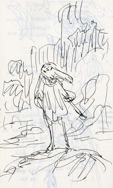
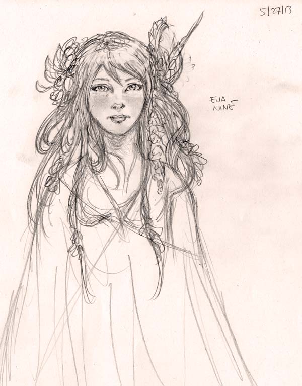
I have to start with reacquainting myself with Eva. Sure, I scribble sketches of her in scenes throughout the writing process like the sketch above done back in January in my Moleskine journal. However, I still need to draw her portrait to mark the transformation she is going through from book to book – like this image of Eva as she appears near the end of book three:
Then I am off to find inspiration. Émile Bayard‘s iconic image of Cosette sweeping from Victor Hugo’s 1862 classic, Les Misérables, gives me a despairing feeling that I hope to capture in this third cover.
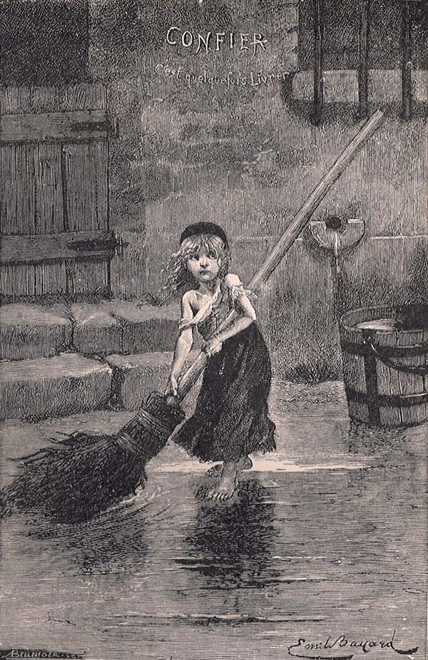
You can see Bayard’s influence on this sketch of Eva, here.
So I continue to explore and pursue the perfect cover image: one that entices readers while accurately exhibiting the mood and tone of the story and one that satisfies my artistic vision. Its a tricky act to be sure, but one I thoroughly enjoy doing.


