
Tony DiTerlizzi's Blog, page 5
March 10, 2014
WondLa May 2014 Tour Dates
I’ve finally received my May tour dates to support the fantastic finale to the WondLa trilogy.
My presentation includes drawing and discussing how the WondLa books came to be. Attendees will receive the third limited edition WondLa sketchbook for free. And, of course, I will sign just about any book (or gaming materials) that you bring – though different stores have different signing policies, so its best to check with them beforehand.

As well, Angela and I will both be attending the LA Times Festival of Books in April at the USC campus. Though The Battle of WondLa will not be available for sale then, I will be signing all my previous titles. Hopefully I’ll see you there!
PS – I am hoping to add some additional dates for our local friends in Massachusetts, so stay tuned…
MArch 31st: UPDATE: The Shreveport event with William Joyce was postponed due to a scheduling conflict, so I’ll be in the Atlanta area that weekend instead. Also, as hoped, we’ve added an event for our local friends at the Odyssey Bookshop. See you in May!


The Battle for WondLa May 2014 Tour Dates
I’ve finally received my May tour dates to support the fantastic finale to the WondLa trilogy.
My presentation includes drawing and discussing how the WondLa books came to be. Attendees will receive the third limited edition WondLa sketchbook for free. And, of course, I will sign just about any book (or gaming materials) that you bring – though different stores have different signing policies, so its best to check with them beforehand.

As well, Angela and I will both be attending the LA Times Festival of Books in April at the USC campus. Though The Battle of WondLa will not be available for sale then, I will be signing all my previous titles. Hopefully I’ll see you there!
PS – I am hoping to add some additional dates for our local friends in Massachusetts, so stay tuned…
February 14, 2014
Introducing a Remarkable Mouse
I had the honor to write the introduction for the Folio Society’s edition of E. B. White’s classic, Stuart Little, which has just been released.
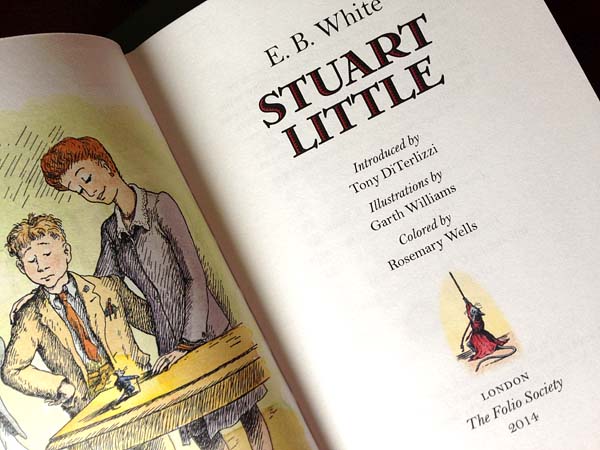
Here’s a snippet:
In the sagging top shelves of a hand-me-down bookcase in my childhood bedroom, several literary mice had made a nest. Alongside many beloved classics sat the maternal Mrs. Frisby, the reckless Ralph A. Mouse, and of course, there was the stalwart Stuart.
Stuart Little was a book of many firsts. For me, it was one of the first chapter books I read on my own. And, because of its short length, it was also my first introduction to E. B. White’s evergreen writing. Even today, his is the kind of prose that entices you to curl up in your favorite worn armchair on a rainy afternoon with book in hand. His stories speak the dialogue of a simpler bygone era. His characters talk like those from old beloved movies of my youth like Its A Wonderful Life and the Our Gang shorts. To this author, White’s words belie their simple construction and reveal a master wordsmith.
Aside from my personal nostalgia, Stuart Little is also a first for other, more prestigious reasons – for it was not only White’s first book created for young readers, but also Garth Williams’ debut as a grand picture-maker of children’s literature. Theirs is a bookmaking marriage that has endured, forged in the tradition of A.A. Milne and E. H. Shepard or even Lewis Carroll and Sir John Tenniel.
I was thrilled at the prospect of writing this, not only because I am a fan of White’s books, but because I have always felt an artistic connection with Garth Williams’ work. His scratchy ink lines, drawn from astute observations of nature, flow from my hand in a similar style. His art, like many that I have listed here before, inspired and formed me as an artist. I am proud to say that Angela and I have some of Garth’s originals hanging on the walls of our home. I pause and marvel at them almost every day.
You can check out more Folio Society editions and see details on their edition of Stuart Little at their site.
January 29, 2014
Celebrate Goblin Week!
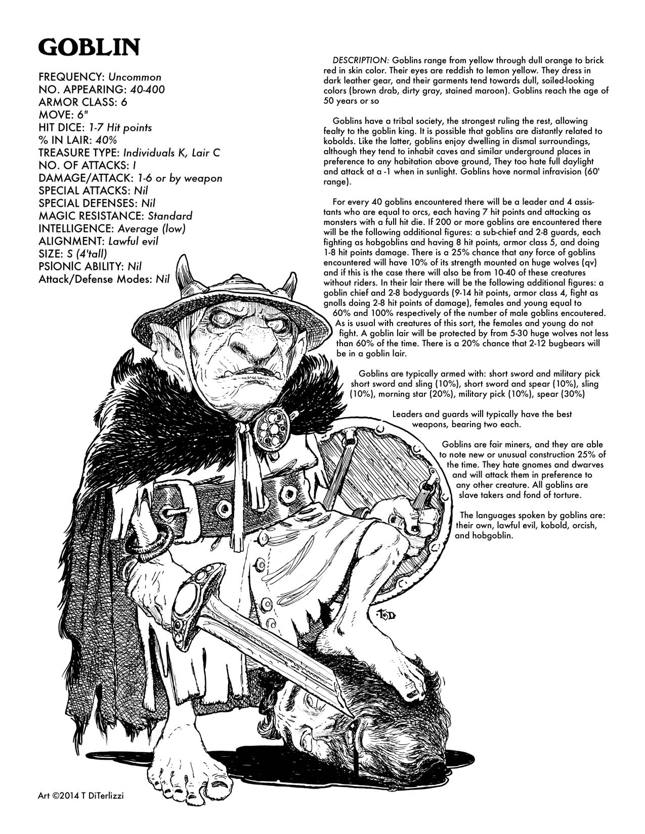
Last week was “Goblin Week”, where the mischievous monsters were celebrated by artists using all mediums and shared via Tumblr. Since I use an old-fashioned WordPress for my blog, I thought I’d share my goblin contribution here, along with some delightful dice-rolling downloads.

This feisty fella was drawn from my imagination, using minor reference where needed. Like my other re-interpretations of Dungeons & Dragons monsters, I aimed at a exaggerated, playful line style to temper the grotesque figure and gruesome image. Inking was done with Copic Fine Nib Inking Pens on Strathmore Smooth Bristol.
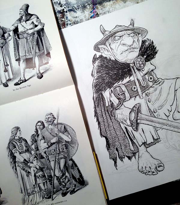
As I’ve listed before, I used Dover’s “Historic Costume in Pictures” as reference for the weapons and garb. I did some minor clean-up in Photoshop and set some classic text from the old AD&D Monster Manual around him…now I’ve only 100+ more drawings to go. (Click the thumbnail to download):
…speaking of downloads, here’s a selection of some of my old AD&D player character sheets. Download’em, print’em and play’em!
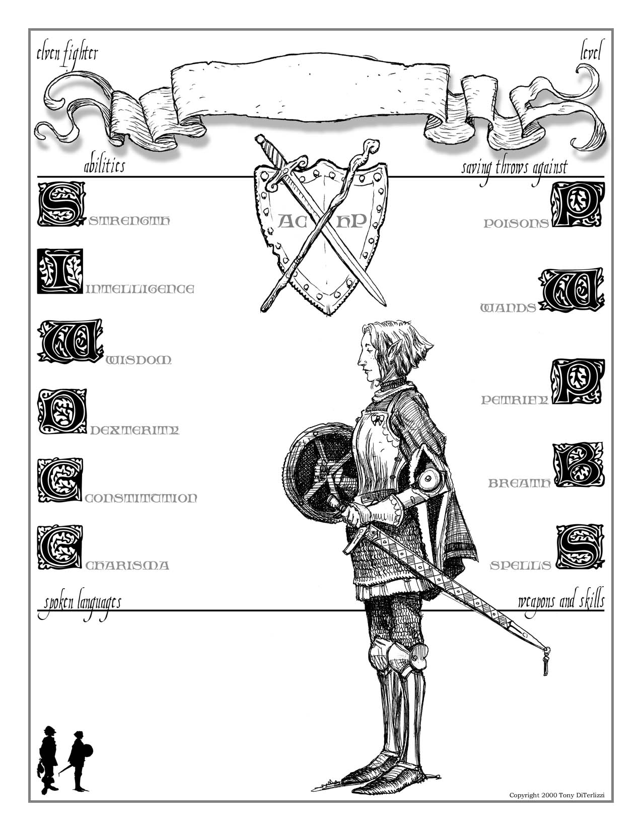
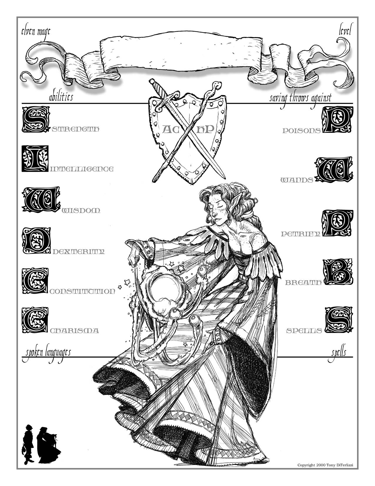
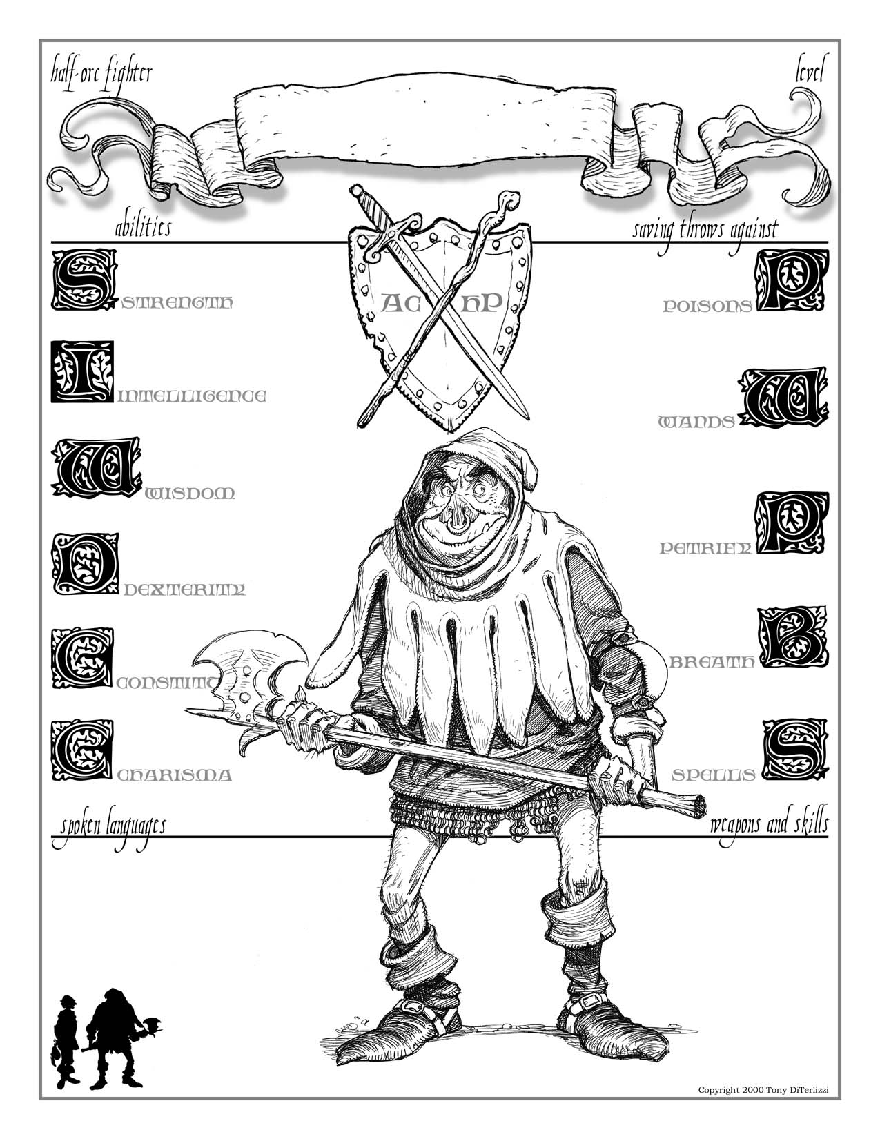
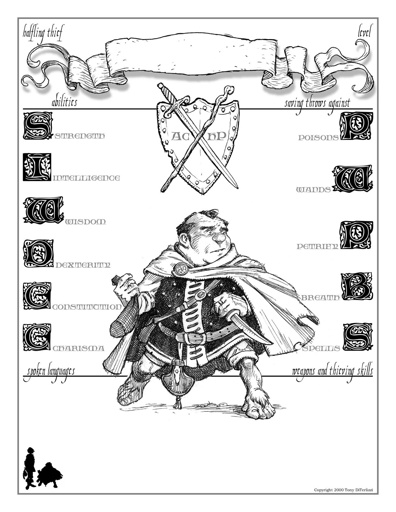
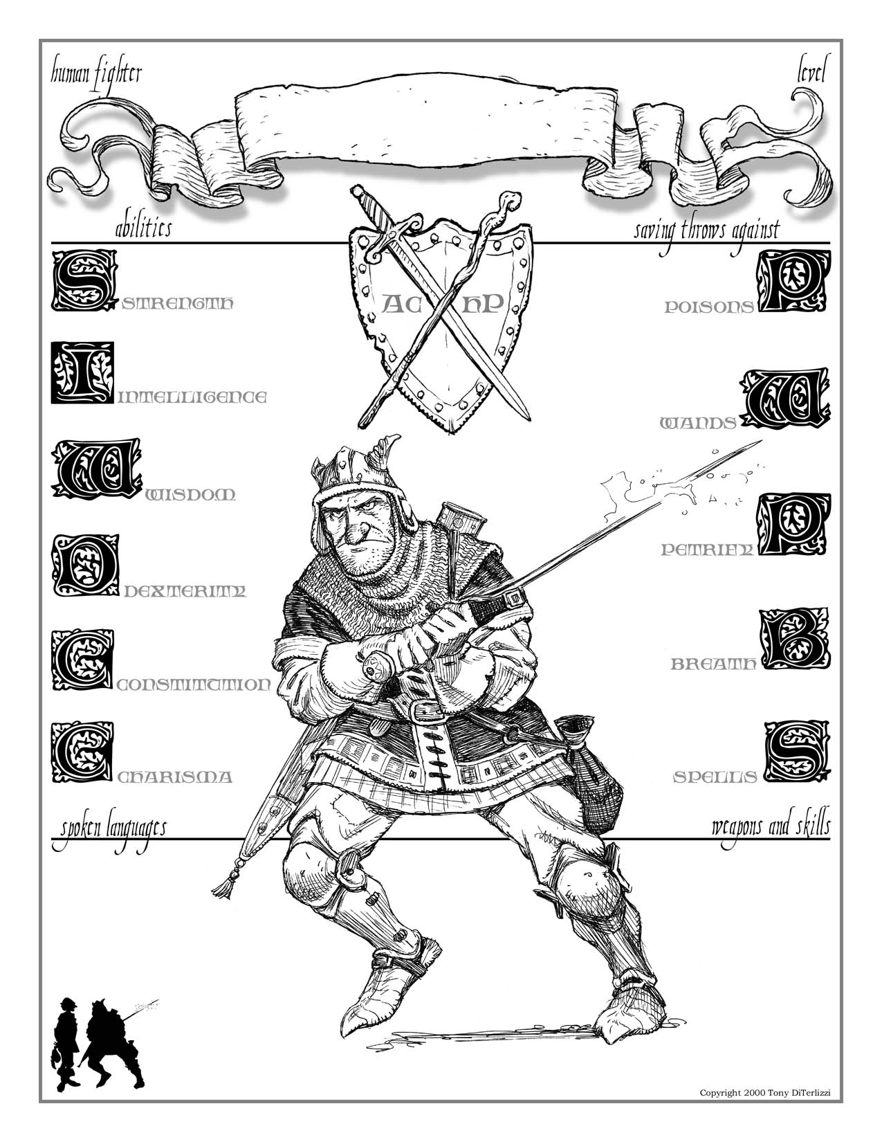
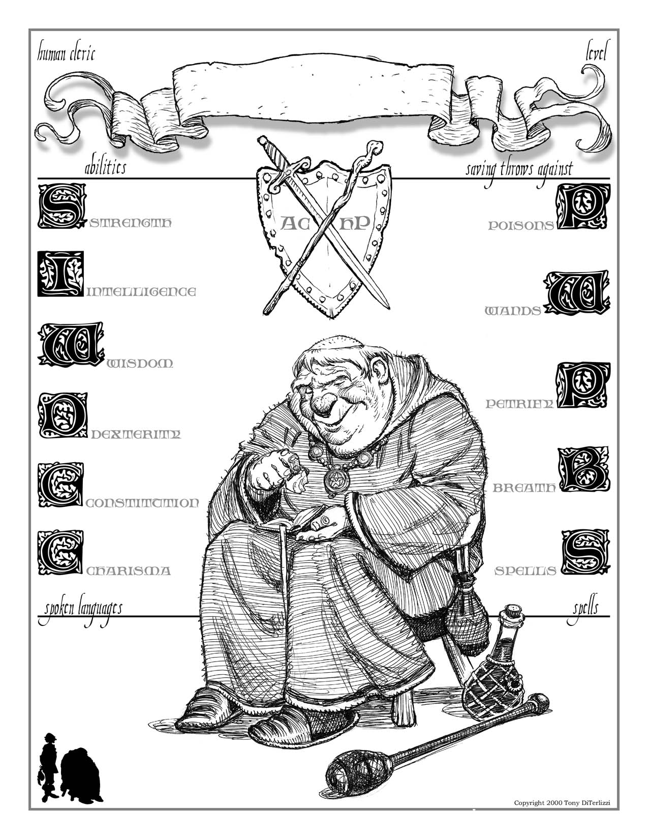
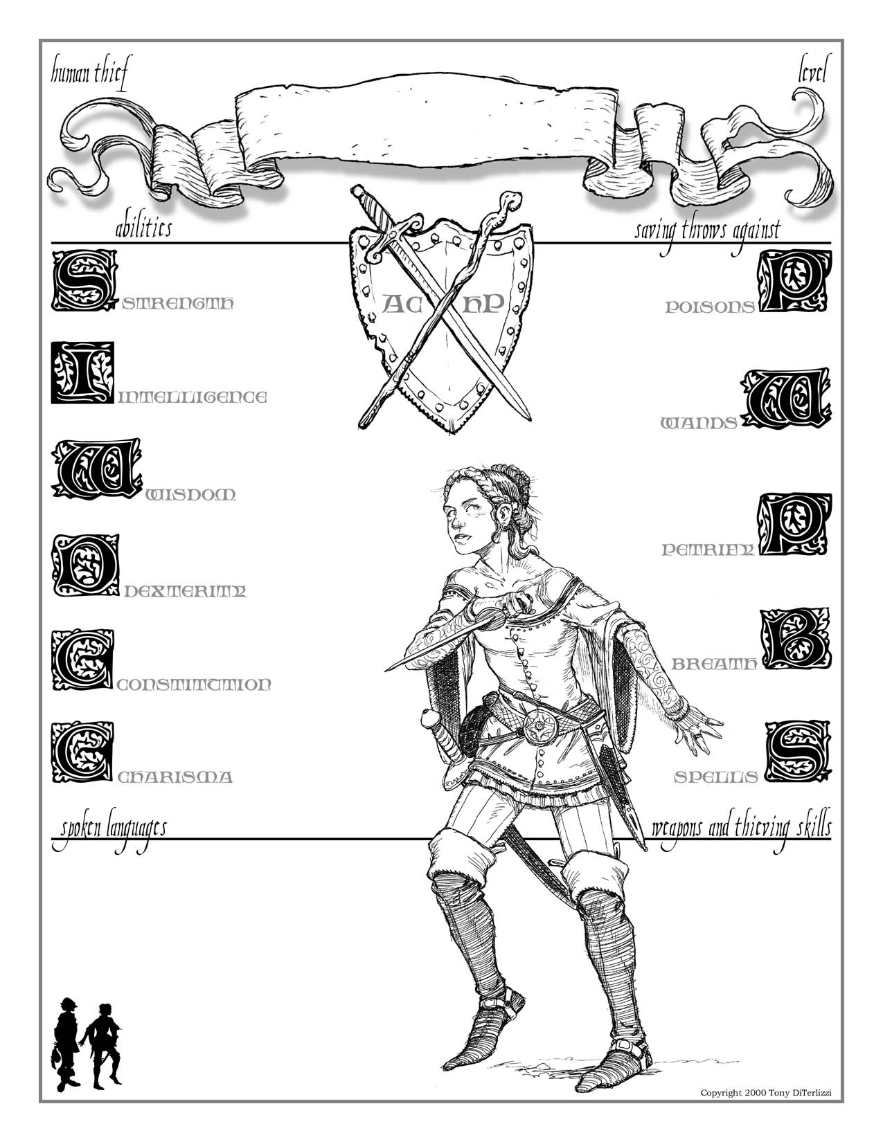
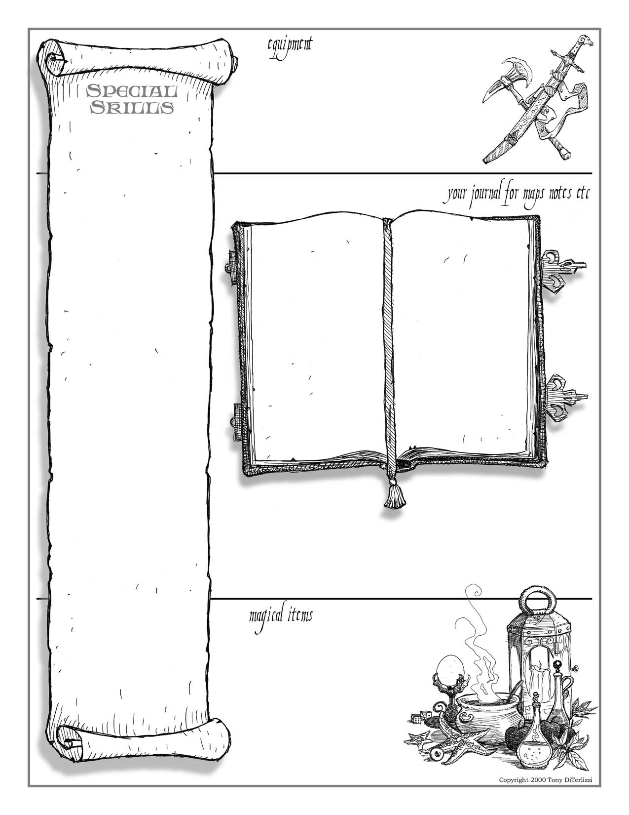
Time to grab your twenty-sider!
January 22, 2014
Sammy the Owl (Part II)
The creation of the logo for the Amherst public library was a feature article in our local paper, The Gazette.
For those interested (who are not local) here is the article:
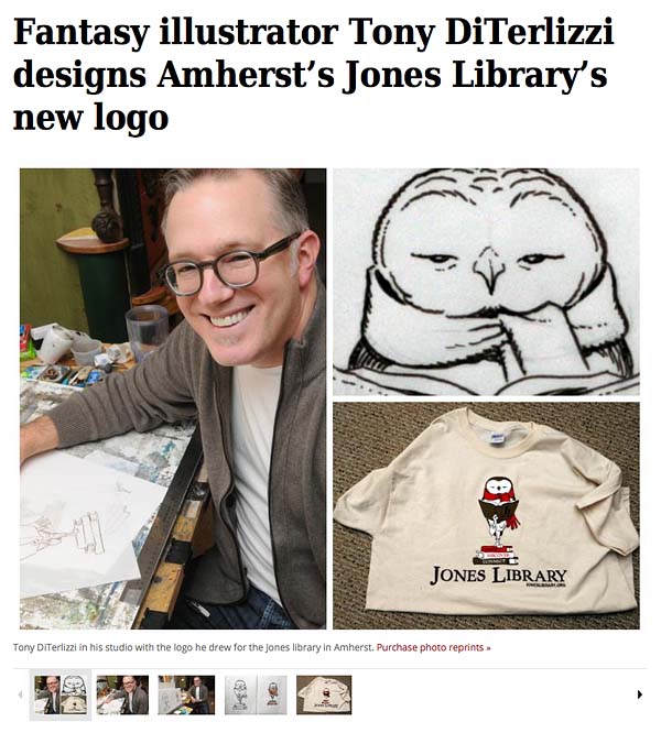
Fantasy illustrator Tony DiTerlizzi designs Amherst’s Jones Library’s new logo
By DEBRA SCHERBAN
Monday, January 20, 2014
(Published in print: Tuesday, January 21, 2014)
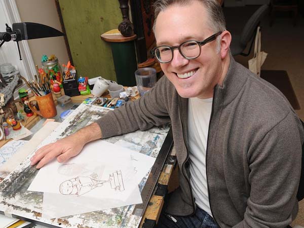
AMHERST — It took a bit of serendipity, but the Jones Library has replaced its nearly 100-year-old logo, a drawing of the building, with a sketch of an owl done by nationally known fantasy author and illustrator Tony DiTerlizzi.
“I’m so excited about it,” library director Sharon Sharry said. “Everybody is jazzed about the outcome.”
That enthusiam comes despite the fact that just a few months ago, following a yearlong search to find a modern symbol for the library, Sharry and Jones trustees had settled on one created through the website LogoArena.com. For a cost of $350 she had graphic artists from across the world competing to come up with a design that met the library’s specifications.
But that was quickly discarded after a visit from DiTerlizzi, co-creator of “The Spiderwick Chronicles” series, one October afternoon. DiTerlizzi, who lives in Amherst, went to the Jones to help with a different project — designing award statuettes for a newly established literary honor to be bestowed this spring. One of the recipients will be his friend, author Norton Juster of “The Phantom Tollbooth” fame. Juster had asked DiTerlizzi to assist with the statuettes.
“When Norton Juster beckons, you hop to,” DiTerlizzi said with a laugh during a telephone interview.
But the death blow DiTerlizzi delivered to the Jones’ chosen logo was unintentional.
He had arrived early for the meeting about the awards and as he and Sharry chatted, she showed him the logo. It was a fancy script J in a blue and green block.
DiTerlizzi cringed. “I said to her, well, the reason you guys like this is that it looks like another logo.”
Sharry was aghast. She had spend an intensive week going back and forth online with the LogoArena artists to make it just right. And that had been after months of reviewing and rejecting work of local artists.
“Just Google Holiday Inn Express,” she said in an interview last week. “Ours looked just like that and none of us had even thought of it, but as soon as he said it we thought, oh my God, that’s awful.”
DiTerlizzi said he tried to smooth it over. “It’s still a nice logo,” he recalled saying. “It’s a beautiful J.”
But sure enough, he said, it was now tainted. “It wasn’t my intention, but I’d rather be honest than not.”
AN OWL EMERGES
The logo was meant to have a modern look to it, Sharry said, to help promote a fundraising campaign to keep the library up with the 21st century.
Jones staff and trustees are trying to “rebrand” the Jones and get the word out about its role in a way the community will respond to, she said. A building renovation campaign is down the road.
The trustees hired the Financial Development Agency of Amherst to help.
The literary awards, called the Sammys, which will also honor Nat Herold and Mark Wootton, owners of Amherst Books on Main Street, are part of that. The awards are named in honor of Jones benefactor Samuel Minot Jones, whose money established the library in 1919. The ceremony will be held at the Yiddish Book Center at Hampshire College in April.
After his bombshell observation, DiTerlizzi sat down with Sharry and two other committee members and, while they talked about the awards and what they mean to the library, he began sketching a statuette.
Sharry and the others envisioned an Academy Award, he said. “They wanted something that would look really cool when the recipient was holding it.” So, DiTerlizzi was seeking something figural, yet not male or female. An animal fit the bill, but DiTerlizzi said as he drew, he pictured his friend Juster.
“He has glasses that make his eyes look very big, a big round head. He’s owlish,” DiTerlizzi said.
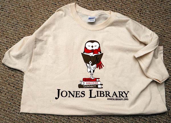
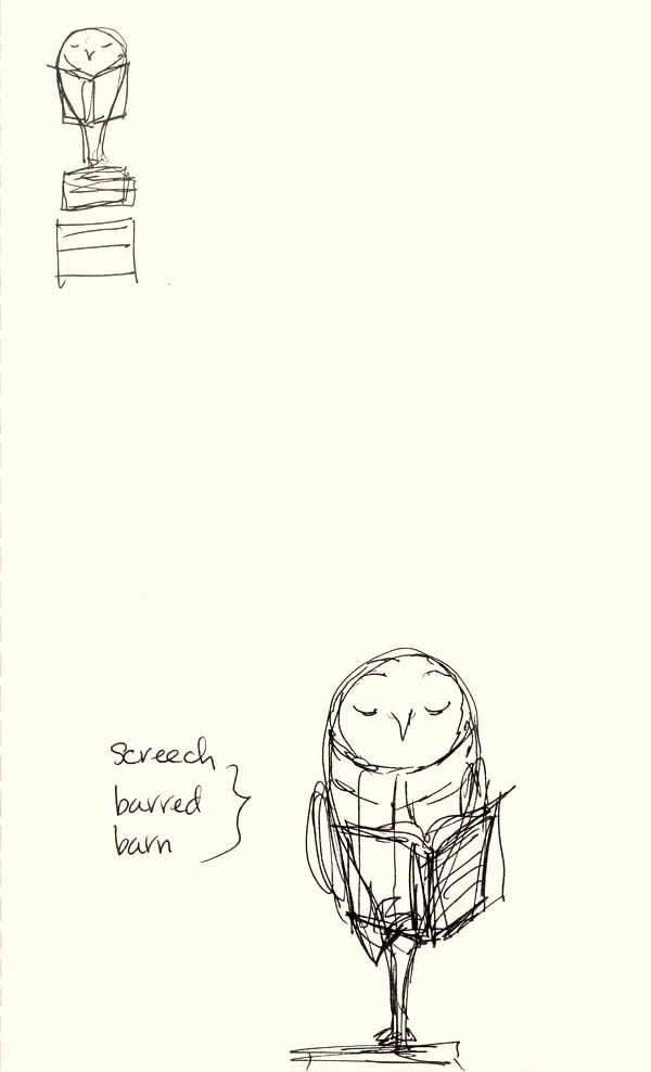
But the artist didn’t want the hackneyed image of a great horned owl with glasses. He settled instead on barn owl, which would later become a barred owl, a species common to this area. He also wanted to spiff it up with a garment, though not a hat, which might tip it toward one gender of the other. So, he chose a scarf. “It makes it look New Englandy,” he said.
Finally, he decided, the creature should be standing on a stack of three books because, after all, books are a library’s foundation. Each one’s spine bears a word the library staff wants associated with the Jones: Learn, Discover, Connect.
“It all happens quite fast,” DiTerlizzi said of his creative process. “It has taken me longer to explain it than it did to come up with it.”
But as he was drawing, he said, he was thinking, “She’s going to hate this.” He was using images that didn’t necessarily say 21st century, as Sharry had wanted. “I wanted to break away from stereotypes,” Sharry said. “I was looking for something new.”
But DiTerlizzi liked what was shaping up on his pad. “I’m an old-timey guy. I love classic literature and illustration.”
When he finished, he was pleased — and so were Sharry and the others. “She really liked it. I got lucky,” he said.
In fact, one of the women at the table suggested the sketch become the new logo, instead of the fancy J.
“It was a no-brainer,” Sharry said. “It’s unique. It’s fun without being too cartoon-like. And it’s created by this amazing local artist who is a library user and a big supporter.”
Sharry said going through a lengthy logo search helped her realize what truly was the right image. “It’s all about timing,” she said.
DiTerlizzi was happy to hand the design over — for free. And he has created files for the Jones staff to use for letterhead, envelopes and T-shirts.
DiTerlizzi, who has been writing and illustrating children’s books since 2000, moved here from New York with his wife, Angela, 11 years ago. He has just put the finishing touches on the last book in a three-part science-fiction trilogy for middle-grade readers called “The Search for Wondla,” which he began in 2008. He has a 6-year old daughter, Sophia, and the family lives just down the street from the Munson Library, the Jones’ South Amherst branch.
He is pleased that his work has been chosen to represent the library, but he’s relieved it occurred by happenstance. Being asked to come up with a replacement for the library’s 100-year-old symbol would have made him nervous.
“That would have been intense,” he said. “I could have choked. I could have given them a blue J in a box, so maybe it’s better that it unfolded the way it did.”
Debra Scherban can be reached at DScherban@gazettenet.com.
December 23, 2013
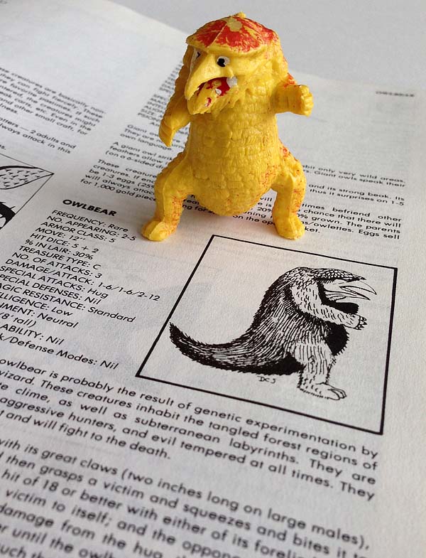
Owlbears, Rust Monsters and Bulettes, Oh My!
Chances are it won’t just be children who will find wrapped toys under their Christmas tree this week. If you’re a big kid like me, then you accept the fact that you not only still play with toys, but realize that they can be an important part of your well-being.
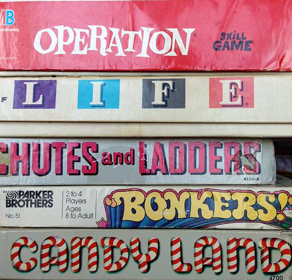
While creating my children’s books, I often find myself in a state of reflection. I return to the emotions and priorities that I had when I was young so that I can get into the mindset of my protagonist. To aid in remembering those moments in my life I use artifacts from my past. Consequently. my studio has become cluttered with play-worn toys, tattered books and other dusty relics of my halcyon days of youth. This, in turn, has grown to a fascination of the packaging (type, design, palettes, etc) that went into these icons of yesteryear. For example, I recently tracked down original versions of beloved board games so that our family could play classics like Chutes & Ladders, Candy Land and Mouse Trap as they appeared when first released. The vintage colors and graphics of these games sent my mind a whirl with book design possibilities.
But mostly, I pretend with my toys and remember the adventures that we went on in my backyard and under my bed. Many of my toys are probably still buried in my mom’s backyard, which is why the internet has become my time machine for recovering lost treasure that I so fondly remember.
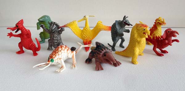
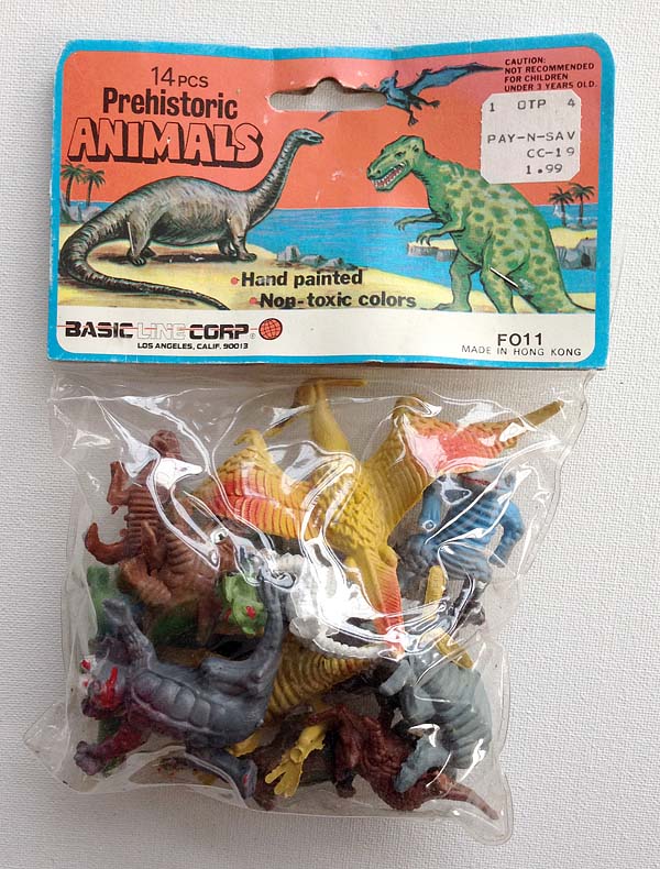
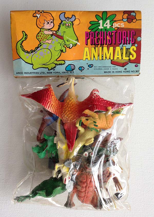
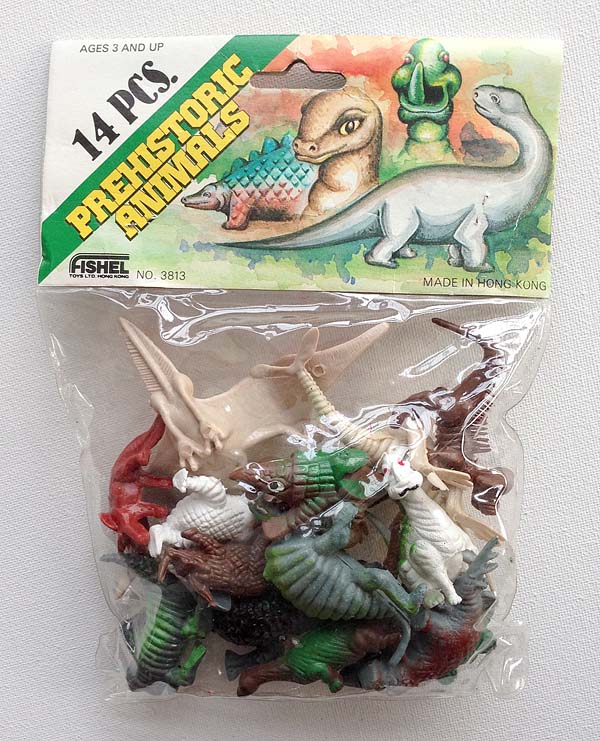
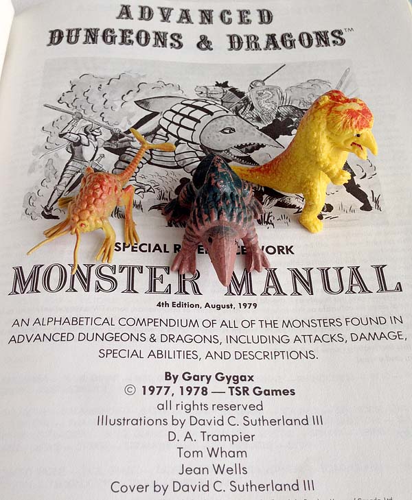
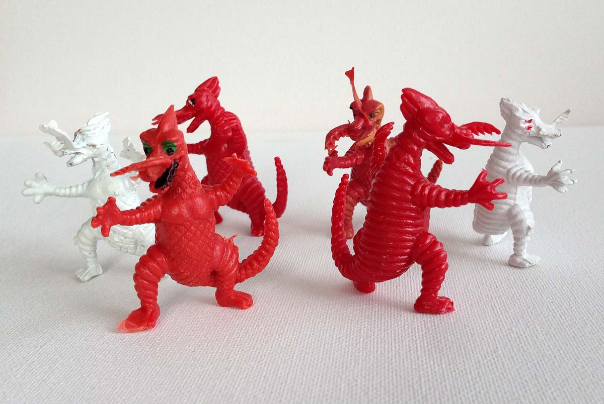
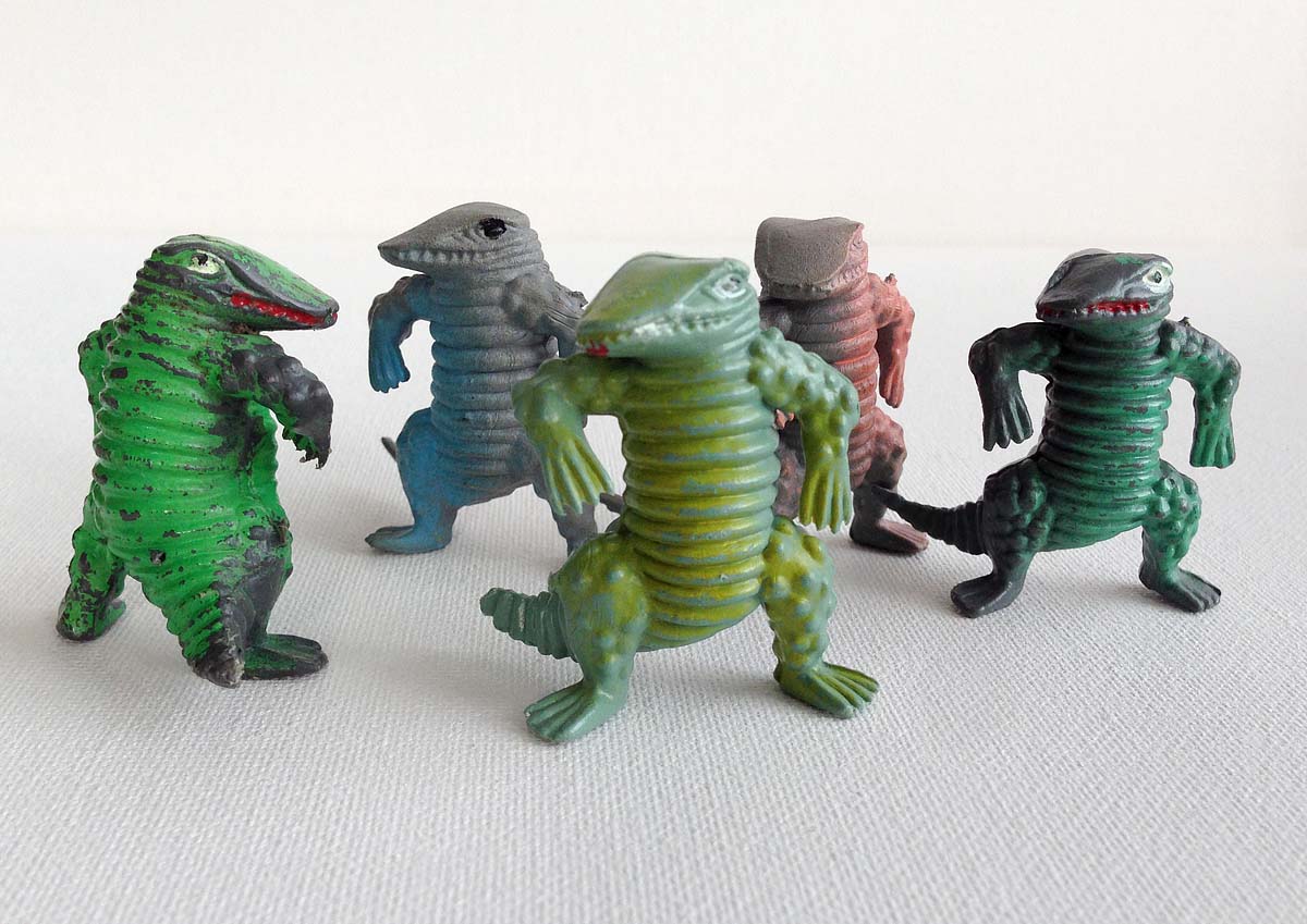
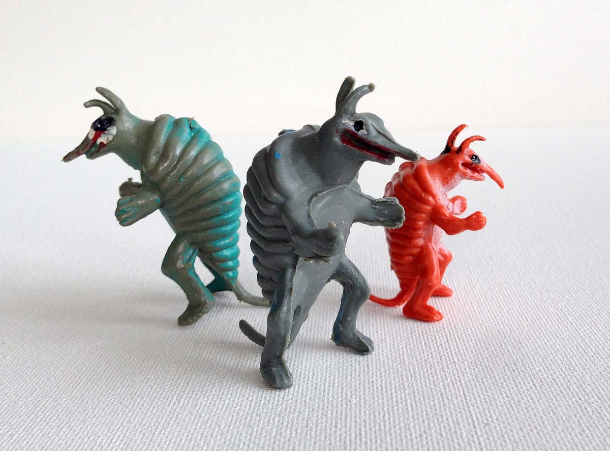
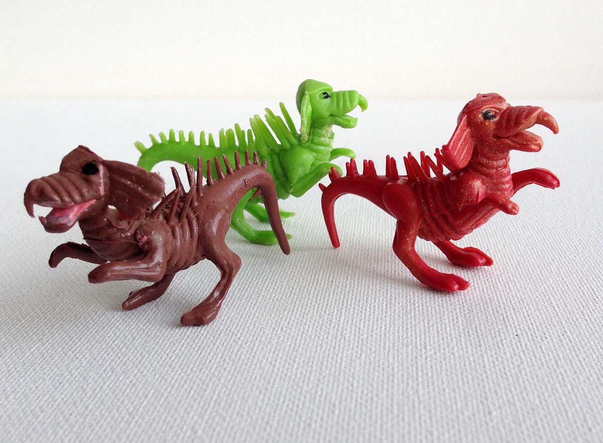
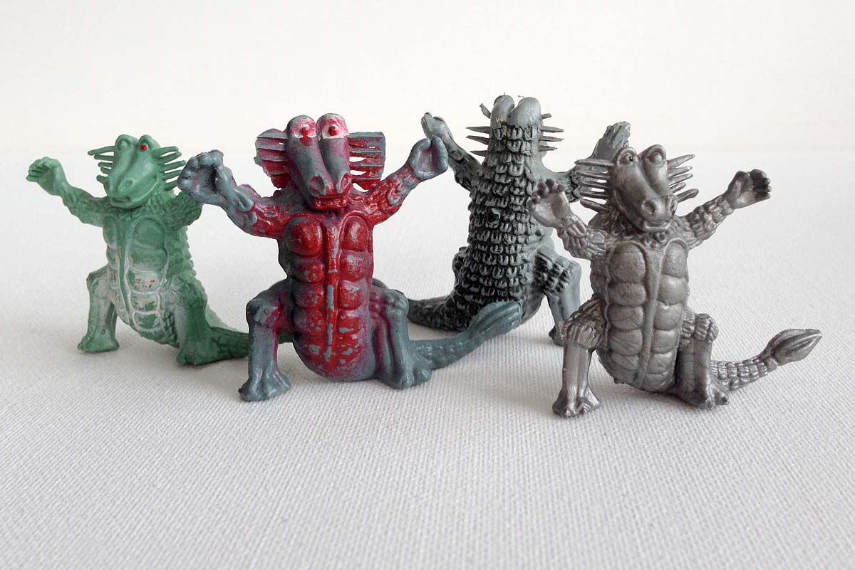
About this time last year, I recalled a set of toy dinosaurs and monsters that I had played with so much that their toes and tails broke off. These poorly molded plastic beasties were purchased at our local Variety store in the early 1970′s. They came bagged under the label “Prehistoric Animals”.
Though they were odd – even silly-looking by monster standards – there was something endearing about them. Soon, they became the perfect creatures for my Micronauts to discover or my plastic cowboys to combat. Some years after our playtime adventures had concluded, these creatures reappeared in another adventure of mine by means of paper, pencil and twenty-sided dice.
You see, during that time that I was playing with these “Prehistoric Animals”, somebody else was playing with them too – a fellow named Gary Gygax. Gary was using them for a game he was developing called Dungeons & Dragons and his book, the Monster Manual, contained pen & ink renditions of these creatures within its pages.
Tim Kask was a play-tester for D&D back in the 1970′s. He was hired by Gary and became the first editor of Dragon magazine. As Tim recalled back in 2007:
“There once was an unknown company in Hong Kong that made a bag of weird animal-things that were then sold in what once were called dime stores or variety stores for like $.99. I know of four other very early monsters based on them. Gary and I talked about how hard it was to find monster figures, and how one day he came upon this bag of weird beasts…He nearly ran home, eager as a kid to get home and open his baseball cards. Then he proceeded to invent the carrion crawler, umber hulk, rust monster and purple worm, all based on those silly plastic figures. The one that I chose was known in the Greyhawk campaign as “the bullet” (for it’s shape) but had only amorphous stats and abilities, not being developed. Gary told me to take it home, study it, and decide what it was and what it could do.”
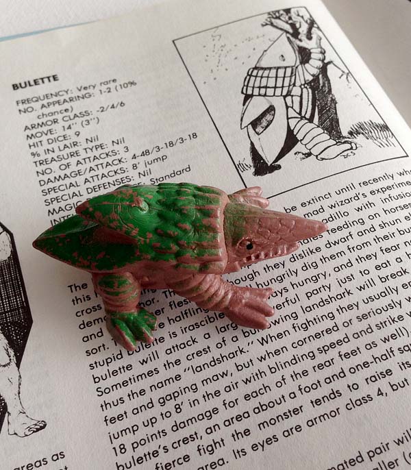
“The bullette (boo-lay), as it was first called, was the first monster I invented. Why is the more interesting part of the story. I had decided to add a feature to DRAGON that would mean a new monster every issue; problem was, I had to launch an issue early because an ad didn’t come in. I wrote it up very late at night; the nickname “landshark” was a reference to a character that the original Not Ready for Primetime Players had done on Saturday Night Live. I went to Dave Sutherland for an emergency drawing (drawings could be submitted to the printers after the copy was set) and he did a dandy job on almost no notice.”
If you don’t know the “Land shark” skit, click the video player below. Its a classic.
I love Tim’s story: Dime store toys in the hands of those with wondrous imaginations became something more – they became the geeky stuff of modern fantasy lore.
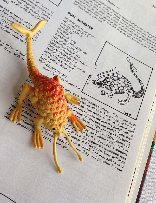
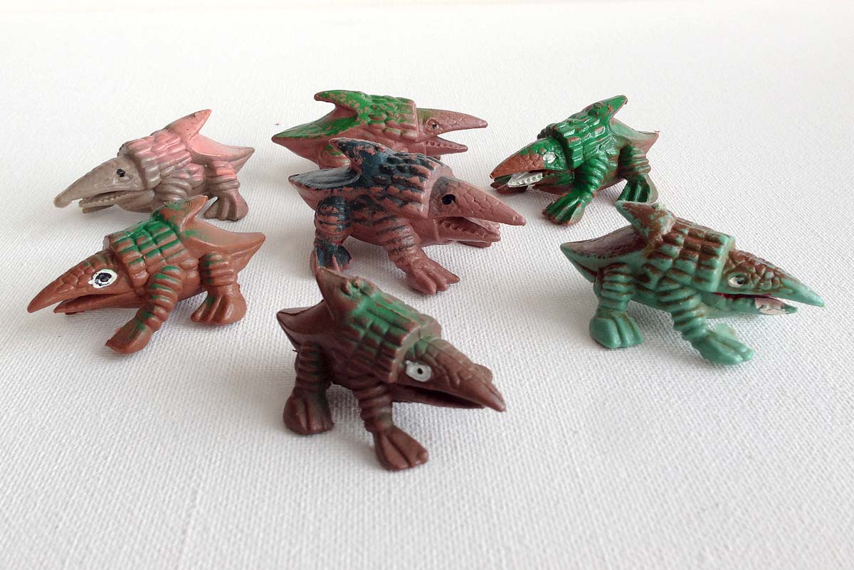
Because these toys were manufactured in Hong Kong (perhaps as Ultraman knock-offs) and sold here through various distributors, it can be a challenge to track down a full set. (Frankly, I don’t even know if I have a complete set!). Additionally, favorite monsters, like the Rust Monster and Bulette, were created in different sizes and colors.
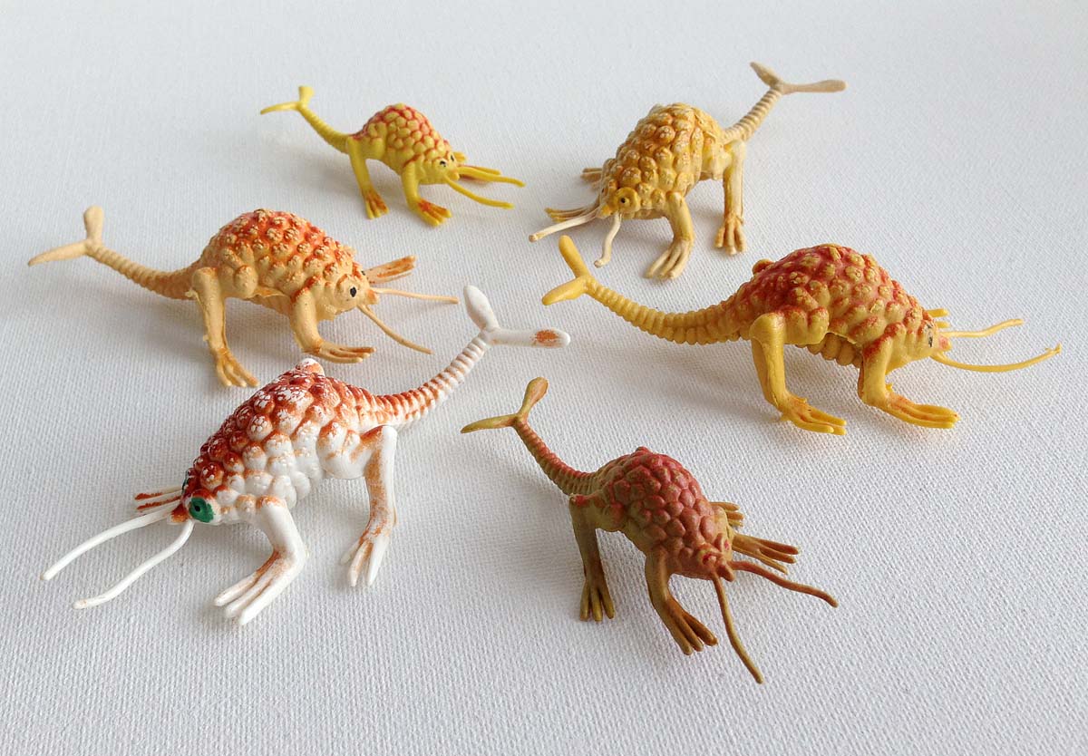
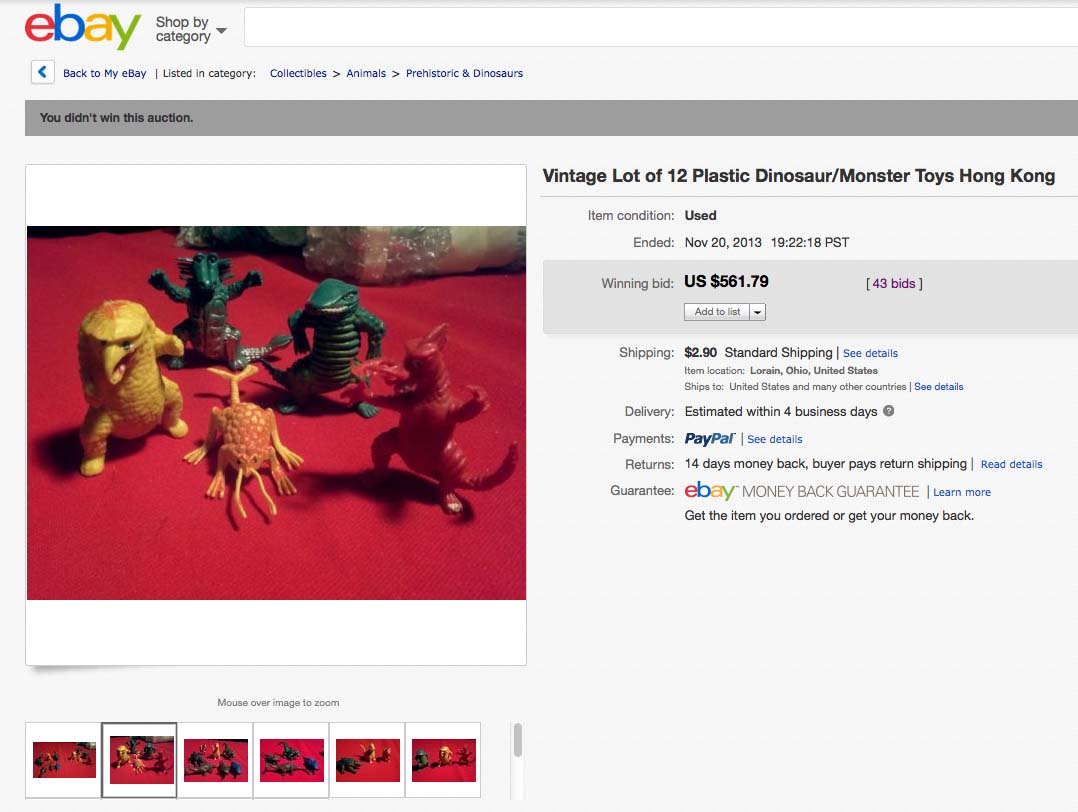
Tim does not initially list the Owlbear originating from this bag of monsters, though it was available in the set at some point (Tim later confirmed this through our correspondence). In my year of scouring the internet and watching eBay auctions I have only seen this yellow version.
…in fact, one sold recently at auction for quite a hefty price (and no, it was not purchased by me):
Tim mentions the Umber Hulk also coming from this set. Some have speculated that this mandible-snapping dragon could be the inspiration, but given how closely the other monsters are drawn from their inspirations, I am not convinced.
As far as I know, the remaining monsters never saw their day in the pages of a D&D accessory. Back in 1993, after I had the opportunity to illustrate many of the classic monsters for the AD&D Monstrous Manual (like the Owlbear, Rust Monster and Bulette), editor Tim Beach and I discussed writing up stats for some of the others…but I soon became busy with Planescape. Perhaps these fellas will claw their way into the imaginations of the next generation of game designers.

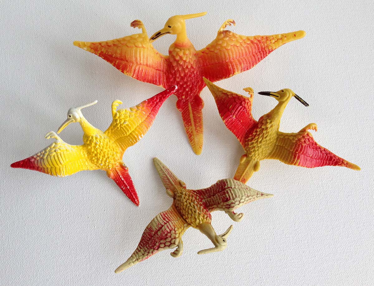
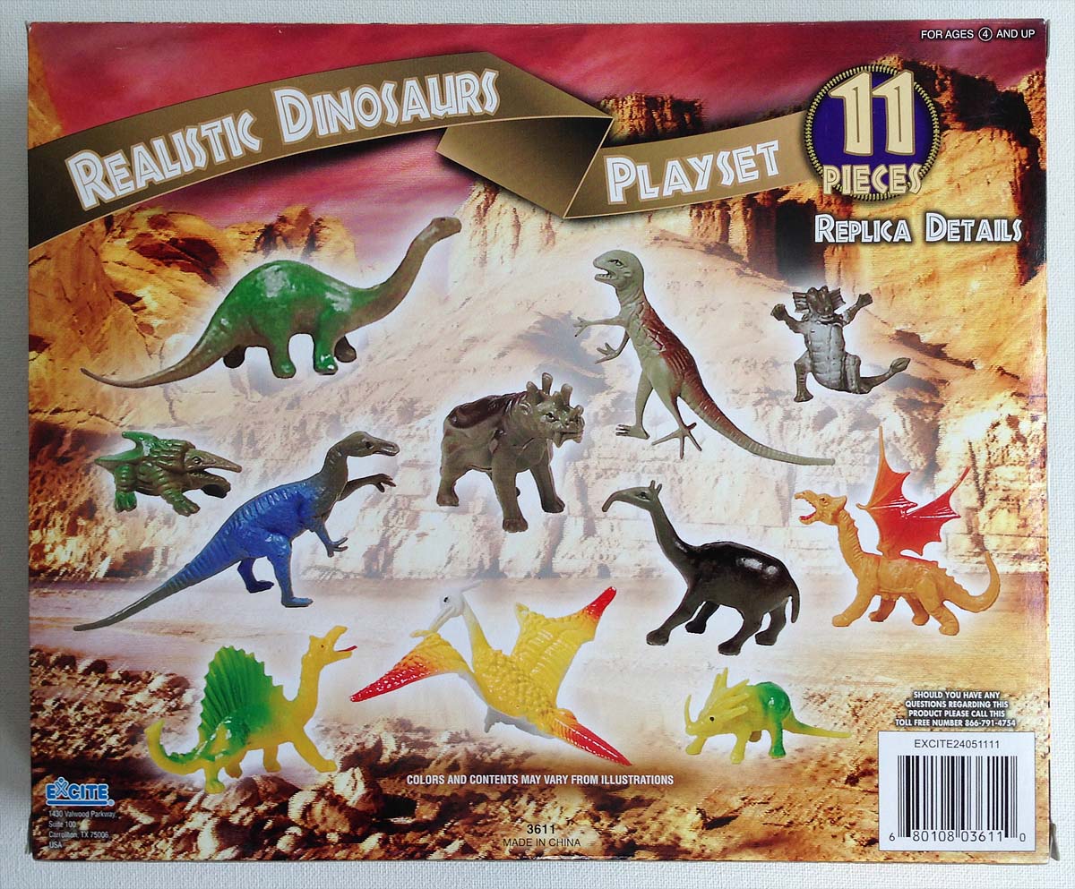
Longing for these oldies? There are toy collector discussions that share pointers (sometimes these toys are dubbed “Chinasaurs” or “Patchisaurs”). Sadly, I was convinced that these li’l monsters were no longer being manufactured…that is until I came across this set of “Realistic Dinosaurs” at my local Rite-Aid earlier this year:
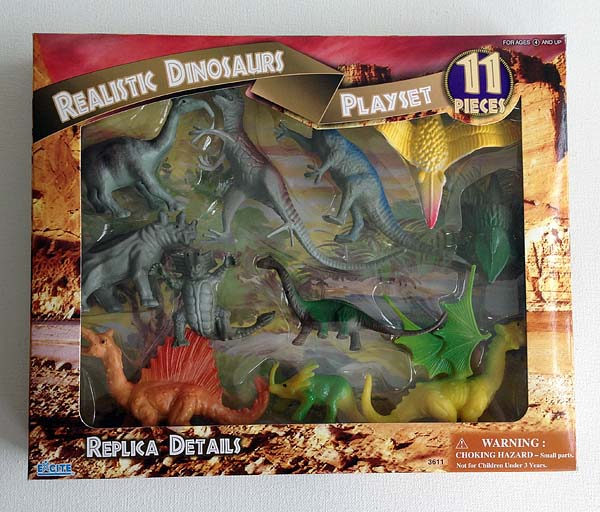
(I am glad to see the manufacturer is upholding the same tongue-in-cheek description of these toys.) Take a closer look at what’s included in this set. Turns out no one can bury a Bulette – they’ll eventually dig their way out and resurface.
Happy holidays! I’m off on a new adventure with my old toys.
November 21, 2013
Sammy the Owl
Last month I visited with Sharon Sharry, Library Director of our public library, the Jones Library. At the suggestion of author extraordinaire, Norton Juster, she’d asked if I could discuss a new award honoring the Pioneer Valley’s local literary luminaries.
The award was called “The Sammy” named after Samuel Jones, the library’s first benefactor and namesake. Since Norton would be receiving the inaugural award, he had a say in how it looked…so he said, “have Tony design it.”
Along with some of the committee members, Sharon and I chatted about what the award could look like. I soon realized it should not be gender, race or age specific. The children’s book illustrator in me thought the best solution would then be an anthropomorphic animal. The obvious choice was an owl.
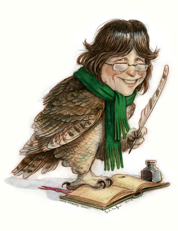
Beside being one of my favorite birds, owls symbolize wisdom, perfect for a literary award. Plus there are several species of owls indigenous to the Pioneer Valley, just ask Heidi Stemple – daughter of Jane Yolen and star of Jane’s Caldecott medal book, Owl Moon. In fact, for Jane’s 70th birthday I painted her as an owl.
I remembered how I thought the scarf was a nice transition between the owl and the human.
In a couple of quick doodles we had the beginning of the design for the award and I was off and flying. Sharon then shared with me that the library had been looking for a new logo to replace the one they had been using for the past 100 years. (Yup, you read that right.) Sharon wanted something a little more playful, fresh and identifiable. So we decided that Sammy the Award Design should also be Sammy the Library Logo.

Since the owl-reading image can be cliché, I had to design carefully. Unlike Jane’s piece, I avoided glasses but kept the scarf (perfect for New England). Though the oft-used Great Horned Owls can be found here (I’ve been hearing them at night in the field behind our house), I went with the less iconic Barred Owl, also found in our area. Instead of a tree perch I went with books. Nowadays libraries offer a variety of media outlets for gathering information, but I had to return to the original foundation of their collection as the foundation for my owl.

I was honored and thrilled to donate my time to redesign the identity of our local library (I hope this one can last another 100 years). Libraries are the repository our collected wisdom and whimsy, librarians the keepers and caretakers of our story.
October 25, 2013
A Ted-eriffic Friday Fan Art
Our friend, Stacy, and her son, Brody, just finished a school project involving 2 pumpkins, some pink paint, and my favorite picture book.
Brody had to do a book report on his favorite book, then decorate a pumpkin as the main character…and he picked Ted. Why? Because this kid has good taste.

First of all, let’s just stop for a second and consider how awesome of book report idea this is. I am totally going to make a (metamorphosed) Gregor Samsa pumpkin this weekend.

Second, are you seeing these crafting skills? It utilizes the holy trinity of craft supplies: googly eyes, felt and pompoms all in one shot. Its a shame Ted will look like an old man in about month once the pumpkins get all mushy. I’d bronze that pumpkin masterpiece and place it on my mantle.
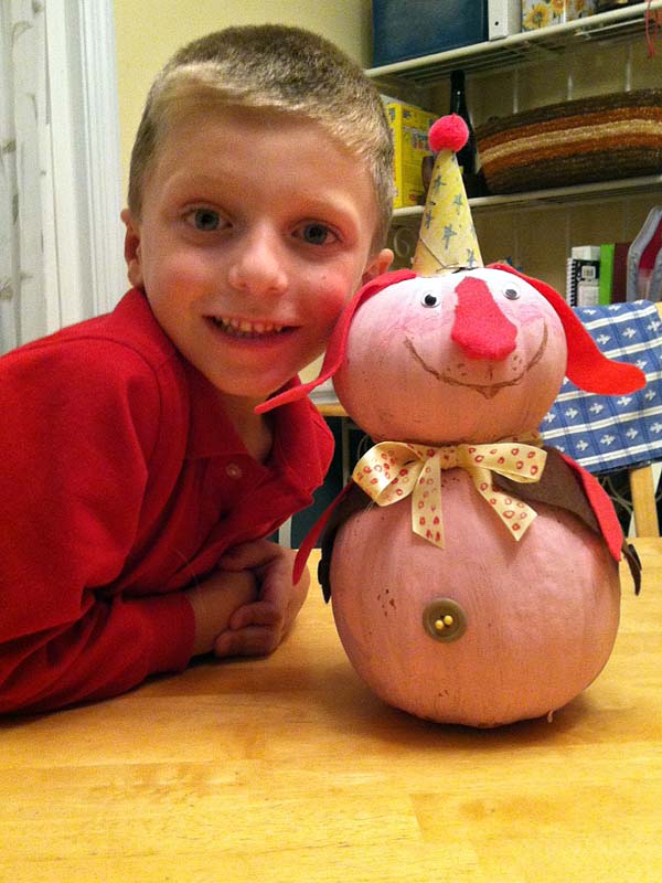
Stacy told me that Brody chose Ted as his book because he loves the imagination of that story – especially when Ted and the kid flood the house. I am expecting a diorama of that scene for next year’s book report.
Thank you, Stacy and Brody, for sending these pics over. I love them so much it hurts. (He better get an A)
October 17, 2013
Entertainment Weekly Exclusive: “The Battle for WondLa” Cover Revealed
If you’ve been following this blog for the past couple of months, you know I have been sharing much of my process for the upcoming cover to the third and final book in the Wondla trilogy, The Battle for WondLa.
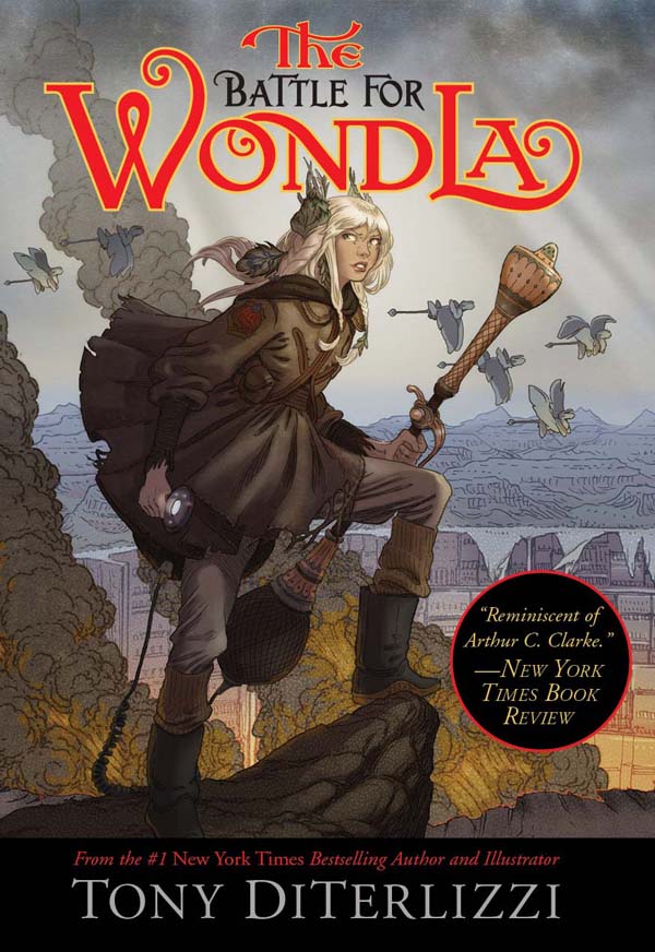
Entertainment Weekly has finally revealed the cover to the finale to WondLa, due out in stores next May. As well, we’ve shot a little video to show a bit of my process in creating the cover. Let me know what you think.
October 3, 2013
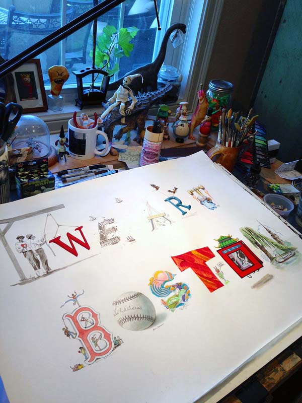
We Art Boston
A couple of weeks ago, the ubiquitous Jarrett J Krosoczka contacted me about a project he thought I should be involved in. It turns out he was right.
We Art Boston is a fundraising event for the Emergency and Trauma Fund and Boston Children’s Hospital (in honor of the victims of the Boston Marathon bombing). Over 50 fellow children’s book authors and illustrators have donated signed books and original artwork to be auctioned off. And 100% of the proceeds go to the hospital. One of the founders of the project, illustrator Joe McKendry, contacted me to participate and I donated a signed Spiderwick book and a rare limited edition print that was only given as a gift to family and friends back in 2006.
Jarrett, however, had been working with Joe on a collaborative piece in which a gang of illustrators (I think that is the proper term for a group of them…or is it “herd”?) would each render a letter to spell out “We Art Boston”. Prints would be made and the one-of-a-kind original would be the highlight of the auction. Since I’d been traveling quite a bit, I would be last to participate and would be illustrating the letter “N”.
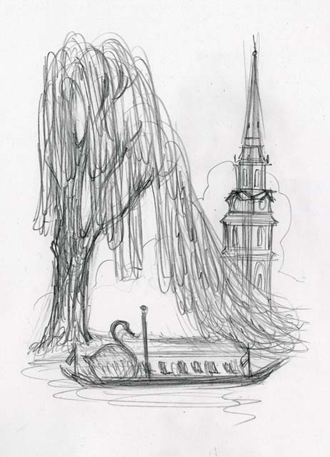
Angela helped me come up with the idea. When we visit Boston, we always try to stop at the Public Garden. I love the vista of feathery willow trees at the pond with swan boats serenely drifting by. Of course, this location is also the setting for two beloved children’s classics – Robert McCloskey’s Make Way for Ducklings and E.B. White’s The Trumpet of the Swan. I added the steeple of nearby Arlington church as a landmark to make it distinctly Boston.

Here it is on my drawing table while I was working away on it. I did fret a bit that I would be the one to spill ink on it after it hand successfully passed through so many hands. Thankfully it made it out of the studio unscathed.
I was honored and delighted to be a part of this piece. As a parent and an ambassador for the Starlight Foundation, I am all for helping children’s hospitals.
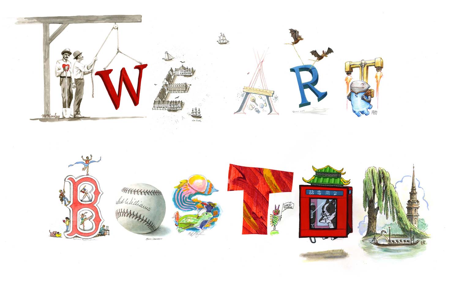
Here is the list of fellow artists involved in the “We Art Boston” one-of-a-kind original:
“W” by Joe McKendry,
“E” by Kelly Murphy,
“A” by David Macaulay,
“R” by Brian Lies,
“E” by Adam Rex,
“B” by Barbara McClintock,
“O” by Matt Taveres,
“S” by Jarrett Krosoczka,
“T” by Eric Carle,
“O” by Grace Lin,
“N” by Yours Truly.
The auction starts on October 10th and runs through the 24th, so participate if you can. There are some great pieces up on the block and it all goes to a great cause.


