Maria Yrsa Rönneus's Blog, page 4
February 7, 2022
Bookish Gremlins
Dear Reader, have you ever come across something so prone to misadventure that it seemed cursed?
A few years ago, my good friend and fellow author Zenka Wistram, wrote a fantasy novel – ‘Enchanting Daisy’. It’s a fun and emotional read, but that’s not the point. I made a cover for it and frankly, it sucked. So a week or so later, I made a new one. It was a lot better, albeit not very fantasy-esque. At the time however, I had a lot on and couldn’t spend too much time working for free. Anyway. When she tried uploading the cover and text files for the paperback to Amazon, she had all sorts of problems and, despite following Amazon’s directions, it wouldn’t accept the files. I remember having to resize and reformat the files many times over before finally the book was published. As it was my first experience with Amazon, it filled me with dread. But when I had finished my first novel and it was time to upload the files for it, I had no such troubles at all.
All this time that cover (and the matching ones for the series) have been bugging me. I think they’re ok, but I’ve always thought I could do a lot better. Fast forward to January 2022. I had forgotten about the Amazon debacle and found time and inspiration to remake those covers. This is what I came up with:
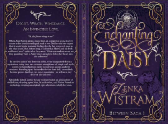
Pretty good, if I say so myself. Zenka was thrilled. As she’s been unwell for some time, I offered to upload it and so I did. No problems.
Until I checked the preview. Turns out that somehow, the text file was formatted in a different trim size than given in the book details. Zenka normally uses 6×9 inches for her books but this text file was huge. Amazon can resize it, but that returns a warped formatting. I asked Zenka for the original text file so I could reformat it myself. Shouldn’t be any problems, right?
Except that gremlins had gotten into all her devices. Nowhere could she find her text. The file was gone. Any writer can imagine the sheer horror.
It is possible to download a so called print proof from Amazon. It’s not editable, but that way, at least she had a copy of her text. That didn’t fix the problem of the paperback though. Not only is the proof file not editable, it’s protected against copy-pasting.
The book needs to be typed out again, but my friend isn’t up to doing it herself. Since I received incredible kindness from friends this year, I had a chance to pay some of it forward, and offered to do it with the caveat that it’ll take a fair amount of time as I have my own projects as well. Frankly, I enjoy formatting text files, the typing not so much perhaps, but I love making pretty chapter heads that match the cover.
Dear Reader, now you may think that I have an awful lot of projects going at the same time, and you’d be right. If you think that my laptop is clogged up with duplicate files, research, and whatnot, you’d be right again. Cue a rare but much needed harddrive purge. Dear Reader, I think you can sense what’s coming next. They say that three times is a charm, but I felt anything but lucky when I discovered that I had deleted the cover file.
There was nothing for it, I had to reconstruct it. Here’s the result:
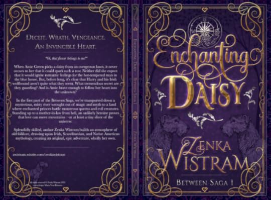
It’s not identical. A number of smaller differences aside, ‘D’is larger, ‘aisy’ is smaller, and the sheen of the title different. The flowers on the flanks are smaller as a result. The cover is still in review, aka I can’t decide which I like better and Zenka is just happy either way. What do you think, Dear Reader?
Now, you must excuse me, Dear Reader, I have to go throw pinches of salt over my shoulder, rub a rabbit’s foot, and call ghostbusters to smoke the gremlins out. Have a fantabulous start of the week!


February 6, 2022
Closet Supporter
My interest in football is a very recent one. In fact, I was for most of my life allergic to sports and football in particular.
Then last year, as I began writing House of Rose I realised that even though my characters aren’t great football supporters, in Liverpool people inevitably talk football. “Red or blue?” isn’t a question that in Merseyside refers to pills, but to whether you’re a Kopite or a Toffee – Liverpool or Everton. The rivalry between the city’s two teams dates back over a century and is part of Scouse identity. In order for my characters’ dialogue to ring at least plausible, I needed to know a little about the sport and the teams. So for the first time in my life, I sat down to voluntarily watch a game.
I was awestricken.
It was Mo Salah. Anybody who knows anything about football will nod and think “of course”. It wasn’t that he was good. That’s a given at that level. Rather, it was how easy he made it look. A goal here, an assist there, not breaking a sweat. His charisma and interaction with the audience – the man’s more than a footballer; he’s an entertainer.
Without knowing exactly why, I started following the results. Soon I was watching the games and became invested in the outcomes. Then Mo Salah left to play for Egypt in Africa Cup.
I didn’t think I’d enjoy it as much with both Salah and Sadio Mané gone (he went to play for Senegal) and I didn’t at first. Then I started seeing patterns – I started seeing the game.
Today, I watched Liverpool FC – Cardiff City FC and the Reds took my breath away. I’ve always thought of football as rough and ungainly. I was delighted to see the red players move as if choreographed across the field with elegant and seemingly effortless grace, like a well-rehearsed ballet.
I don’t know much about football, I don’t know the right terminology, and I don’t understand all the rules. It doesn’t matter. I was mesmerized, I couldn’t tear my eyes off them. The reds were dribbling and passing the ball between themselves, finding the gaps between the Cardiff players like a well-rehearsed ballet, leaving the Cardiff players awkwardly chasing after them. It was a sight of beauty.
The match ended 3–1 and I found myself cheering. It still takes me by surprise, this interest.
Tonight Egypt will face Senegal in the final of Africa Cup, Salah against Mané, Red against Red.
I can’t wait!
Jinxes & Juggernauts
Dear Reader, after thirty-seven days, 2022 has already managed to make itself memorable in a number of ways – not all positive.
The saga of troubles with the electric company and their prices continues but because of the incredible generosity of friends in January, that is now less of a worry. I’ve been meaning to make a post about that but somehow I’ve been too overwhelmed for words. Fine writer, I am, ey?
There is of course life’s never ceasing string of minor issues that needs addressing. A storm broke our greenhouse, meaning more expense. It’s looking more and more like my husband’s brother is going to make a legal debacle out of the inheritance from their mother; which isn’t going to change the outcome, just delay it and cause unnecessary aggrivation and expense.
The courses I started at uni aren’t working out; one I’m trying to get out of, but the other… The creative writing course isn’t at all what I had hoped nor what I need. We’re not getting any feedback from our teacher, only through peer reviews which is akin to the blind leading the lame. Anyway, I’ll have to see the course through but it’s a disappointment all the same. Then there is the long Drama of the Cursed Novel. More about that in another post.
All in all though, after two years of constant anxiety, I had begun feeling more balanced again and more like myself.
Then last week, we were nearly burgled. Masked men attacked our home with crowbars in the dead of night. They started breaking up a window but were scared off by my husband who bravely, but foolishly, ran out and yelled at them.
I slept right through the whole thing. In many ways, that is what’s shaken me most. Lulled into a sense of security by the fact that my hearing and scent are on par with a bloodhound’s (alright, a slight exaggeration), I have always thought that I’d wake should something happen. When the building next door caught fire some years ago, the smell woke me long before anybody else had reacted.
When I came down that morning my husband was shivering with shock. My studio window was broken but, by a miraculous stroke of luck, the inner pane was still intact.
They may not have been inside our house yet they robbed me of something. I have neither slept properly nor written since. I am scared, neither of us feel safe in our own home any longer. I jump at every little sound. I can only imagine how horrible it must be for those whose homes are actually violated.
There is of course, the additional worry of more expense. Our windows are old but large and replacing it is going to be costly, the insurance company will only cover a part of it. It would perhaps be possible to mend it but, being old, they’re draughty and not up to security standards. My husband glued on a piece of glass as a temporary fix but it seems we’ll be spending summer doing renovations.
When I think of all the possible scenarios of what could have happened, I’m immensely grateful. But I do hope that 2022 shall provide some smoother sailing ahead. *knock on wood*
Speaking of wood, here’s a haiku about birches.
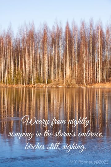 (Image: pixabay)
With that, Dear Reader, I wish you a safe and splendid Sunday!
January 18, 2022
How to (not) write a bio
Dear Reader, yesterday was my first day back at uni. The course is done entirely through online lectures on zoom, so it’s not exactly as it was, but I still love the energy that always surrounds universities. Our first assignment has three parts: to write a very short bio of 50 words, to write a longer bio of max 250 words, and to write 500 words on the view from one’s window.
So now that I have a deadline, obviously, I’ve started redesigning my websites.
Why is it so hard to write a bio anyway? I’m proud of my achievements, content with who I am, I’m extroverted and generally do well selling other people’s products. I’m not afflicted by false modesty. I’m not shy of limelight or, in fact, shy at all. Yet, everything I write about myself makes me cringe, even though it’s the truth.
Up-to-date bios are an essential part of any creative’s life, the demand for them comes from everywhere: you have to introduce yourself to your audience, to agents, publishers, editors etc. They’re required when submitting a text to a magazine, for the paperback cover, for social media, for your website, for interviews…
It’s a good idea to have at least three bios ready to go, one very short, one medium, and one longer. I have several and they all suck.
The longer presentations, I can’t keep serious; the very short ones are dull and incomplete; but it’s the 250 word one that’s giving me the most grief.
For the short one, I spruced up an old one:
“Artist, graphic designer, and self-published author of five novels Maria Yrsa Rönneus writes historical fiction, contemporary romance, and short stories. After attending art college, she studied literature, philosophy, and English at university. Her studio is located in the south of Sweden, where she and her husband cultivate their garden.”
Fifty words exactly. No, Dear Reader, the third person format isn’t a symptom of any delusions of royal grandeur. For many purposes it’s customary, e.g. at the back of a paperback, for other uses, it’s easily changed to first person. What do you think? Inputs are welcome!
As for the view outside our window, I wrote a haiku. Ten words. Only 490 to go.
Right, I’m off to write… I’ll just have a quick shower. Oh, I should vacuum, and the weather is so lovely that I have to go out to get some sun. After all, that’s healthy, and you write better when you feel good. Right?
Have a fantastic and productive Tuesday, Dear Reader, where ever you are!
January 15, 2022
Fowl Play
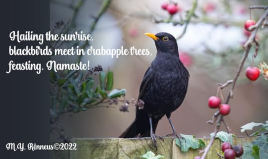
Dear Reader, my husband and I are lucky enough to have a garden. Or, rather, we get to borrow one occasionally from the feathered overlords that reign supreme over it. Who those are precisely has yet to be fought out. In the midst of this fowl game of thrones, we are Swedes – neutral. We feed great tits, blue tits, blackbirds, wood peckers, and magpies alike here and we cherish their company even when they poop on our laundry or rip our door wreaths to shreds. I enjoy watching antics and habits of all of them, but if I’m completely honest, magpies are my favourites. They’re clever, brazen, funny, and beautiful. And they inspire me to write and paint.
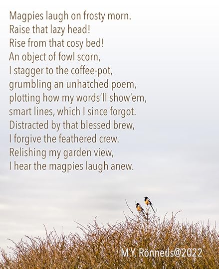 (image: pixabay.com)
I’m going to spend this cold and foggy Saturday writing, and you, Dear Reader, should have yourself a fantastic day wherever you are, whatever you do!
January 14, 2022
How To Make A Basic Book Cover
Dear Reader, having made book covers for both my own and others’ books, I find that, in many ways, it is more difficult to make a cover for my own because of the emotional investment. No surprise then that many indie authors, who are perhaps unfamiliar with graphic design, struggle to give their literary baby appealing packaging.
There are tons of blogs and articles on what makes a book cover good and I’ve made my small contribution as well. I’ve also written about the process that led me to the final cover of ‘House of Rose’.
The indie community is a vibrant and mostly supportive place and sometimes when I see a particularly bad cover I itch to reach out and offer some help. I don’t because unsolicited advice, however sincere, is both presumptuous and rude and also because I can’t afford to work for free.
There are plenty of designers out there offering their services at ludicrously low fees, which is bad (for all of us) because creatives deserve to be payed just as plumbers or lawyers. However, many indie authors, like myself, operate on a strict zero budget and have no option but making a cover themselves.
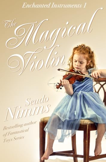
The simplest covers consist of an image with text placed on top of it. That’s done easily enough, but the results differ a great deal depending how it’s done. I’ve made a mock cover based on some common mistakes I keep seeing and I’ll share some pointers as to how to make a simple but okay cover instead. Let’s imagine that we’re doing a cover for a book about a little girl who finds a magical violin.
The don’ts:
So here is a stock image with some text slapped onto it. The photo is cute but there are a number of problems here. It’s called cover design for a reason. Text and imagery should work together as one new whole, not continue to exist and jostle each other as two separate entities.
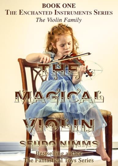
The first and most obvious problem is the title. Unless you’re a really famous best-selling author like say, Stephen King, the title should be the most prominent feature of your cover. Here the decorative font floats on top of the image creating a graphic slop that’s both ugly and hard to read.
Decorative display fonts may be pretty but they are much harder to get to work than a basic font. Picking complimentary colours are often a good idea but here it makes the text blend into the image. Adding glow to the text to make it pop more doesn’t help.
Text over image has been all the rage for a while, but for that to work the background image should be just that – background. A non-invasive image, muted by a colour overlay can create a stylish way to set off white or brightly coloured text. But we picked this image because it tells a potential reader something of the plot so obscuring it would defeat that object.
Next problem is what the text says. The… The… The… The… Enough already! Not all that text needs to go on the cover. Instead the space is better used for key words or a short description of what to expect from this book. “A musical coming-of-age story.” Or better still, a review, if you have one.
The do’s:
Don’t look solely at the main object in the image. Look at the negative space, recognize the shapes in it. Work the text in it.
The third problem is framing of the image. By placing the girl to the side more negative space is created, i.e. “empty” room for text. I also removed the skirting board behind the chair to further reduce clutter.
By losing some of the superfluous words, the series info can be kept to one line.
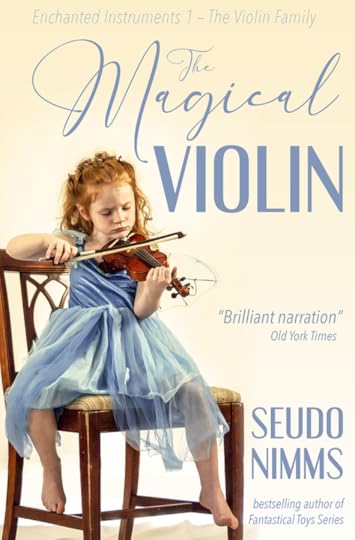
Picking up the colour from the dress contrasts nicely with the cream background and balances the image by dispersing the colour evenly over the cover. By aligning the text to the right, I make optimal use of the negative space and the text then smoothly follows the shape of the girl. The overall impression is soft and playful.
The amount of work is the same as on the first image, it’s merely a question of selecting different fonts and placing them better.
The Golden Rule of Three when it comes to graphic design is to use maximum 3 different fonts. But… but… I hear you protest. Yes, Dear Reader, designers do sometimes use more fonts than that with nice results, but generally the rule applies. In fact, more often than not, less than three fonts is even better. Sticking to the same font(s) creates a unified and thought-through design whereas too many different fonts make a messy impression. Using the same font in different styles can give the same result. Look at the the top text from the first cover version again. Here Times is used first in bold all-caps, then bold small-caps and lastly, in italics.

For the second cover version, I have used three different fonts, simply because Engebrechtre is a small caps font, i.e. there are only capital letters. It’s complimented well though by Avenir Next Condensed, which I’ve used in ultra light italic for the top line and regular italic for the rest. Both are sans serifs fonts that give a sleek and modern impression and goes well with the whimsical and light script font, England Reality.
Another rule of thumb is not to mix sans serifs with serif fonts. Serifs are the little strokes that finish off the letters’ stems. Serifs originate in antiquity and work very well on covers for historical fiction; examples are Times New Roman or my own personal favourite, Baskerville.
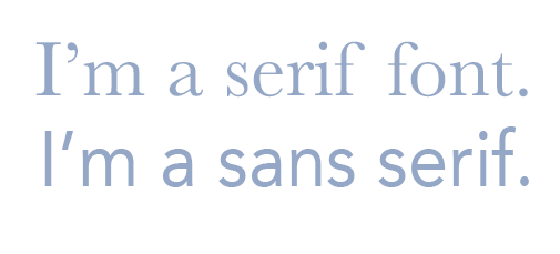
Sans means ‘without’, and sans serifs first appeared in the late 18th century but didn’t gain proper traction until the early 20th century. They work well for most purposes except perhaps for historical fiction and/or in combination with blackletter fonts or very elegant scripts. Common examples are Helvetica, Arial, and Avenir.
Perhaps the book isn’t a coming-of-age story but more of a historical romance. Well, let’s change the fonts.
Here I have used Renaissance for the title and Bodoni 72 for the other text. The white colour gives a crisp feel to the letters but to bring it out from the light background I’ve added transparent gradient, a scrim, coming down at an angle from the top left corner. I also gave the letters a brown drop shadow. It would work equally well with a blue drop shadow, but that gives a somewhat colder colour scheme. Tilting the words and arranging them around the girl’s shape is very easy but gives the cover that little extra oomph to make it look professional. The finished cover is elegant and romantic.
This version requires slightly more work but should be easy enough to do in most photo editing software. I work mainly in Photoshop and the Affinity suite myself, but there are various free or very cheap apps out there that can handle this sort of thing.
Stock images and other graphic elements free for commercial use can be found at e.g. pixabay.com, unsplash.com, pexels.com, and creativefabrica.com.
Please don’t forget that the images and fonts are the result of somebody’s hard work and, if you possibly can, donate something for their efforts.
With that, Dear Reader, I wish you happy Friday and good luck in your creative endeavours!
January 13, 2022
The Monsters We Keep
A dear friend of mine fills her fantasy novels with blood-curdling monsters committing grisly acts. I, on the other hand, try to write as realistically as possible, even my villains aren’t blood-thirsty psychopaths. Once, when we were discussing our characters my friend referred to “my monsters”, meaning my villains. I protested and pointed out that they weren’t all-evil creatures like hers. “No”, she agreed. “But yours are the kind of everyday evil that we all have to deal with and that’s much scarier.”
She’s right of course.
Although, I hope, Dear Reader, that your experience is different, I know that for many, the worst monsters are family. Sadly, they were for me. And are for my husband.
My husband and his brother have never gotten along, there’s a long backstory of envy and favouritism, abandonement and grief which all really amounts to their parents being selfish assholes. Excuse my language, but there it is. I shan’t bore you with the details. It came to ahead when Hubby and I were planning our wedding in 2016, they rowed and after that Hubby hasn’t spoken to Brother at all.
In August, their mother passed. Hubby found out through a letter from the lawyers. I feel my shoulders tense even as I type. I have carried low-grade anxiety ever since. Hubby isn’t very good with paperwork so I knew I’m the one who has to deal with it. That’s fine, I just wished I didn’t also have to deal with his family.
As it turns out that wish was granted. Everything was dealt with by Hubby’s mother’s Partner who, siding with Brother, excluded Hubby from the funeral and even from be listed as mourner in the newspaper obituary. They set the date of the funeral to Hubby’s birthday. I really don’t want to think ill of people but, I can’t imagine that it wasn’t deliberate. We couldn’t have attended the funeral anyway, because we’re still isolating from covid. But that choice wasn’t theirs to make.
Hubby isn’t one to vent his emotions, he locks them up and even I have to pry them out of him. Outwardly, he showed anger toward Brother, but I can only imagine how hurt he must have been. My inner Mama Bear wants to rip them to shreds, fight off the monsters for him, protect him.
I tried calling the lawyers to find out what was going on but, employed by Partner, they were uncommunicative and uncooperative. They were only engaged to do the initial inventory of assets and hand that in to the tax authorities. After that the inheritance is to be split between the heirs – Hubby and Brother.
Normally this is something that is really easily done without lawyers. Of course, that requires actual communication so Hubby has called, emailed, and even snail mailed Brother. Not a peep.
Last week we contacted a lawyer of our own (a different firm) and today, we’re having our first phone meeting with her. I’m not nervous about the call. I have a lot of experience dealing with legalities and I understand the law well. But, my inner penny-pincher really struggles with the frivolity of spending some ≈$1,000 on legal fees when I so easily could have done the paperwork myself. It’ll be covered by the assets in the estate, but the very thought still makes me sweat. It’s the result of always having been dirt poor and always having to count every penny. Other children might fear monsters under their beds; me, I feared that the bailiffs would come to take the bed away.
Anyway. I’m going to have to come to terms with it, because it’s the only way this will get sorted. And I could do with the responsibility off my shoulders. Lately, reality has gotten too much in the way of fiction. The monsters I write may be realistic, but often I try to defuse them by making them slightly ridiculous. Real monsters all have that in common that in the moment they seem unfunny, yet they are vanquished by our laughing at them. When we see how ridiculous the petty, the small-minded, the envious are, when we can laugh and walk away, that’s when they no longer can hurt us.
“For what do we live, but to make sport for our neighbours, and laugh at them in our turn?” – Jane Austen, Pride & Prejudice
Ultimately, what kind of mosters you write is to some extent determined by genre. It would, after all be too anti-climactic to have the monster in Alien work it’s way up to a cutting remark.
Well, I’m off to sharpen my sword and, Dear Reader, I wish you a wholly monster-free day unless you choose to spend it with fictional ones.
January 2, 2022
Don’t call us, we’ll call you.
Dear Reader, some days ago somebody on Twitter asked about descriptions of characters in books. Personally, I like to read detailed descriptions, of characters, scenery, food, dress, just about everything in fact, provided that they don’t go on forever. Being a visually oriented person, my stories are like films in my head and I want to convey the imagery to my readers but it also helps me navigate the stories and get a clearer perception of the world that I’ve immersed myself in.
When picturing my fictional characters’ physical appearance I often cast the parts with actors, models or other performers. In a fictional universe where all actors who ever lived are available at any age, choice is ample. Whilst naturally, all the A-list actors flock to audition… ahem… the really big names rarely cut it for me. Everybody swears that they never read gossip, well, Dear Reader, I actually never do. I never read the tabloid papers. I never watch interviews. I rarely read magazines. I’ve never been interested in celebrities’ personal lives, I’m interested in their work plain and simple. Yet some of the big, black headlines can’t be blocked out and, though it’s next to nothing, I still know more than I ever wanted to about “Brangelina” or Meghan.
I need people whose personal life is mostly unknown to me so that it won’t “taint” my character, a face which I can fill with fictional personality. A clean slate, a tabula rasa. I could never do real life film casting.
But I digress, Dear Reader, I thought that perhaps you would enjoy being introduced to some of the faces that I have cast in my books.
Major Arthur Hastings was born to redeem Agatha Christie’s Captain Hastings’ reputation as somewhat of a dunce. David Suchet is obviously a brilliant actor and I find his character, Poirot, unbearably smug and patronizing. He witholds information, then sniggers at Captain Hastings for not being able to make the same deductions as himself. Hugh Fraser is “a quite fetching chap” and a younger version of him is the template for my Major Hastings, who’s 26 in ‘Oaths of Affection’.
“Dark-blonde curls tumbled fashionably over a rectangular face, which despite a strong jaw, was rather ordinary. Straight eyebrows and a thin, Greek nose above thin lips, slightly upturned at the corners, created an open and amiable expression. […] Eyes, blue as a summer’s sky, met Lady Marigold’s across the room, stunning her to her very core.”
Major Hastings’ younger cousin Lord Peter Whysleigh was inspired by another classic British sleuth: Dorothy Sayer’s Lord Peter Wimsey. Edward Petheridge was 51 when he played the 24 year old Wimsey. Multitalented Petheridge is a fantastic actor and, although such an age difference might demand a bit too much of viewers’ ability to suspend disbelief on film, there are no such obstacles for my casting purposes. I simply found photos of Edward as a young man and went from there.
Lord Peter Whysleigh’s older brother, Lord Giles Whysleigh, is the male lead in ‘Orbits of Attraction’, but the actor who leant him his face to is sadly no longer with us. One of the most beautiful people in history (no, I don’t find that an exaggeration), Rutger Hauer passed in 2019.
“The man’s exceptional eyes were so pale that they seemed almost translucent, alight with warmth and confidence. […] A fourth discreet glance registered a rectangular face, a chiselled jaw, and a somewhat droopy nose. The glance lingered to a long look, greedily tracing his shapely lips, slightly upturned at the corners; she wondered how it might feel to be kissed by those lips, by such a man as he. A war hero, she thought, vividly picturing his magnificen appearance in the regiment’s silver-laced, dark blue uniform.”
Whilst my male leads tend to be inspired by various film characters, my female leads have (so far) come about in a reverse process. They show up in my head and then, perhaps even long after I finsihed the novel, I accidentally stumble across their image on the internet. This was the case with Lady Marigold and gorgeous actress and singer Laura Osnes. ‘Oaths of Affection’ took nearly a whole year to write and was published in late 2019. But it wasn’t until some time last year that I came across Laura’s image. “Ah, there you are!” was my first thought. Laura Osnes may not have Lady Marigold’s naturally golden-green eyes and strawberry blonde hair, but she certainly have her vivacious energy and beaming smile.
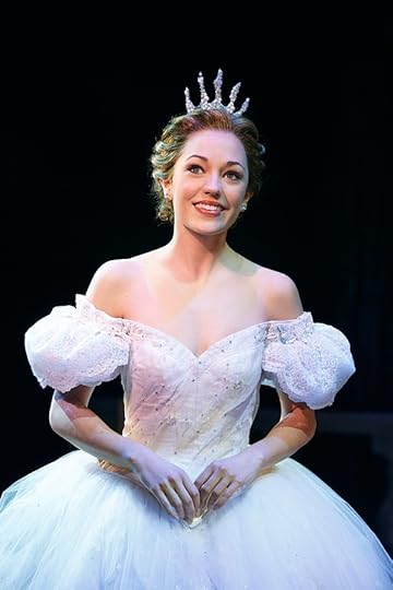 Laura Osnes as Ella in Cinderrella, Broadway. Image: broadway.com
Each to their own of course and as readers we are free to make what we like of characters, to picture them in whichever way suits our own fancies. One person’s hot is another’s not, so I hope, Dear Reader, that you shall read many delectable heros and heroines into mine and others’ stories.
With that I wish you a lovely Sunday afternoon where ever you are.
December 31, 2021
Happy New Year
…and thank you for your company in 2021, Dear Reader. It’s been a year of much death and tragedy – both for me personally and in the world. Let’s hope that perhaps 2022 will bring some changes for the better.
2021 was indeed peculiar, but for me also productive. I’m proud to have published 3 novels. 2022 will bring at least one change for me personally, as I am to start a course in creative writing at uni in a few weeks. I’m very excited about that, as it’ll improve my writing (hopefully) but will also give an opportunity to share and discuss my stories in a friendly environment. I have so missed having a soundingboard.
It’s web based so I still won’t need to wear pants.
Just kidding, Dear Reader, it’s too cold here in winter to be without pants.
I don’t “do” New Years resolutions but, on a personal level, I hope for four things for 2022:
1. that I and hubby get to stay healthy
2. that I’ll get a bit more gardening and outdoor exercise done
3. to publish at least one new book.
4. to get my sales and reviews up a bit
So fingers crossed for that and whatever you do, where ever you are tonight, Dear Reader, I hope you have a great time and that your coming year will be glorious!
December 24, 2021
Happies!
Dear Reader, tis the season for greetings and merriment and, this morning I woke to Nature celebrating by sprinkling its glistening confetti over us.
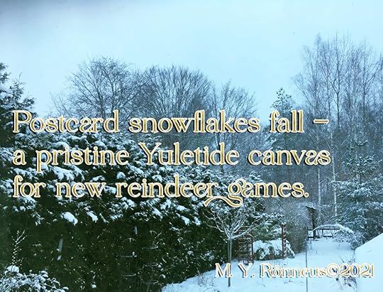
Whether you believe in Santa Claus and Rudolph or not, if you are in the vincinity of newly fallen snow, please give yourself a moment to enjoy it today!
In Scandinavia, Christmas Eve or Yule Eve is when Tomten (Father Christmas) arrives on foot to give presents to all who have been good throughout the year. It is also the day when families gather to eat way too much food, so a break between sittings to have a snowball fight or build a snowman is a great idea.
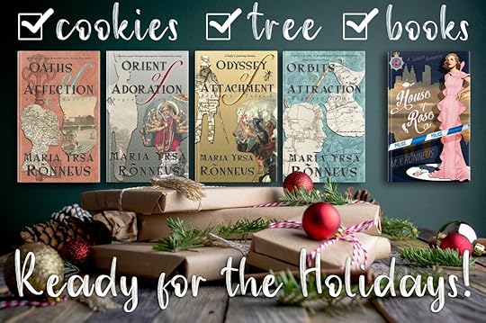
This year, all I want for Christmas is a review! So Dear Reader, if you haven’t already, check out my books over on Amazon. The first book in the Regency Tales, ‘Oaths of Affection’ is free with Kindle Unlimited.
And to all you last minute shoppers out there (you know who you are), you know that books are a great gift, right, and that ebooks ship instantly!!
The snow keeps falling and I have to go, there is a snowman out there that needs building.
Dear Reader, I wish you a glorious, fantabulous Yule/Christmas/Holiday/weekend spent in exactly whichever way you most want. Whereever you are, whatever you do, thank you for reading!