How To Make A Basic Book Cover
Dear Reader, having made book covers for both my own and others’ books, I find that, in many ways, it is more difficult to make a cover for my own because of the emotional investment. No surprise then that many indie authors, who are perhaps unfamiliar with graphic design, struggle to give their literary baby appealing packaging.
There are tons of blogs and articles on what makes a book cover good and I’ve made my small contribution as well. I’ve also written about the process that led me to the final cover of ‘House of Rose’.
The indie community is a vibrant and mostly supportive place and sometimes when I see a particularly bad cover I itch to reach out and offer some help. I don’t because unsolicited advice, however sincere, is both presumptuous and rude and also because I can’t afford to work for free.
There are plenty of designers out there offering their services at ludicrously low fees, which is bad (for all of us) because creatives deserve to be payed just as plumbers or lawyers. However, many indie authors, like myself, operate on a strict zero budget and have no option but making a cover themselves.
The simplest covers consist of an image with text placed on top of it. That’s done easily enough, but the results differ a great deal depending how it’s done. I’ve made a mock cover based on some common mistakes I keep seeing and I’ll share some pointers as to how to make a simple but okay cover instead. Let’s imagine that we’re doing a cover for a book about a little girl who finds a magical violin.
The don’ts:
So here is a stock image with some text slapped onto it. The photo is cute but there are a number of problems here. It’s called cover design for a reason. Text and imagery should work together as one new whole, not continue to exist and jostle each other as two separate entities.
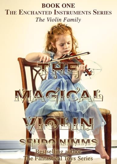
The first and most obvious problem is the title. Unless you’re a really famous best-selling author like say, Stephen King, the title should be the most prominent feature of your cover. Here the decorative font floats on top of the image creating a graphic slop that’s both ugly and hard to read.
Decorative display fonts may be pretty but they are much harder to get to work than a basic font. Picking complimentary colours are often a good idea but here it makes the text blend into the image. Adding glow to the text to make it pop more doesn’t help.
Text over image has been all the rage for a while, but for that to work the background image should be just that – background. A non-invasive image, muted by a colour overlay can create a stylish way to set off white or brightly coloured text. But we picked this image because it tells a potential reader something of the plot so obscuring it would defeat that object.
Next problem is what the text says. The… The… The… The… Enough already! Not all that text needs to go on the cover. Instead the space is better used for key words or a short description of what to expect from this book. “A musical coming-of-age story.” Or better still, a review, if you have one.
The do’s:
Don’t look solely at the main object in the image. Look at the negative space, recognize the shapes in it. Work the text in it.
The third problem is framing of the image. By placing the girl to the side more negative space is created, i.e. “empty” room for text. I also removed the skirting board behind the chair to further reduce clutter.
By losing some of the superfluous words, the series info can be kept to one line.
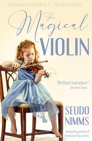
Picking up the colour from the dress contrasts nicely with the cream background and balances the image by dispersing the colour evenly over the cover. By aligning the text to the right, I make optimal use of the negative space and the text then smoothly follows the shape of the girl. The overall impression is soft and playful.
The amount of work is the same as on the first image, it’s merely a question of selecting different fonts and placing them better.
The Golden Rule of Three when it comes to graphic design is to use maximum 3 different fonts. But… but… I hear you protest. Yes, Dear Reader, designers do sometimes use more fonts than that with nice results, but generally the rule applies. In fact, more often than not, less than three fonts is even better. Sticking to the same font(s) creates a unified and thought-through design whereas too many different fonts make a messy impression. Using the same font in different styles can give the same result. Look at the the top text from the first cover version again. Here Times is used first in bold all-caps, then bold small-caps and lastly, in italics.

For the second cover version, I have used three different fonts, simply because Engebrechtre is a small caps font, i.e. there are only capital letters. It’s complimented well though by Avenir Next Condensed, which I’ve used in ultra light italic for the top line and regular italic for the rest. Both are sans serifs fonts that give a sleek and modern impression and goes well with the whimsical and light script font, England Reality.
Another rule of thumb is not to mix sans serifs with serif fonts. Serifs are the little strokes that finish off the letters’ stems. Serifs originate in antiquity and work very well on covers for historical fiction; examples are Times New Roman or my own personal favourite, Baskerville.
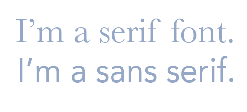
Sans means ‘without’, and sans serifs first appeared in the late 18th century but didn’t gain proper traction until the early 20th century. They work well for most purposes except perhaps for historical fiction and/or in combination with blackletter fonts or very elegant scripts. Common examples are Helvetica, Arial, and Avenir.
Perhaps the book isn’t a coming-of-age story but more of a historical romance. Well, let’s change the fonts.
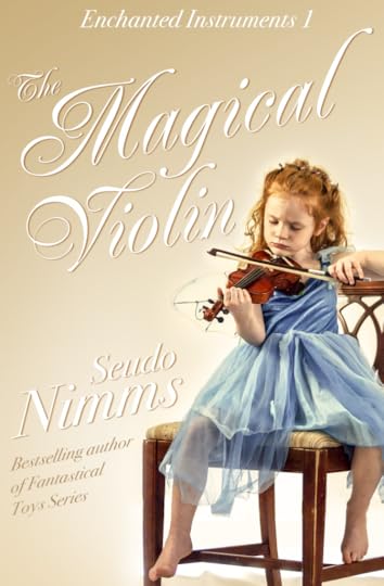
Here I have used Renaissance for the title and Bodoni 72 for the other text. The white colour gives a crisp feel to the letters but to bring it out from the light background I’ve added transparent gradient, a scrim, coming down at an angle from the top left corner. I also gave the letters a brown drop shadow. It would work equally well with a blue drop shadow, but that gives a somewhat colder colour scheme. Tilting the words and arranging them around the girl’s shape is very easy but gives the cover that little extra oomph to make it look professional. The finished cover is elegant and romantic.
This version requires slightly more work but should be easy enough to do in most photo editing software. I work mainly in Photoshop and the Affinity suite myself, but there are various free or very cheap apps out there that can handle this sort of thing.
Stock images and other graphic elements free for commercial use can be found at e.g. pixabay.com, unsplash.com, pexels.com, and creativefabrica.com.
Please don’t forget that the images and fonts are the result of somebody’s hard work and, if you possibly can, donate something for their efforts.
With that, Dear Reader, I wish you happy Friday and good luck in your creative endeavours!