
Doug Henwood's Blog, page 25
October 19, 2021
How recovered is the job market?
Between February and April 2020, the US economy lost over 22 million jobs, almost 15% of total employment. That was by far the largest job loss since the early years of the Great Depression. Between 1929 and 1932 or 1933 (depending on whose numbers you use, since there are no solid, official stats), 20–25% of jobs disappeared (again, depending on whose numbers you use). Since World War II, however, the worst contraction, the Great Recession of 2008–2009, killed just over 6% of all jobs—a big number, but well short of 15%.
Since April 2020, we’ve recovered just over three-quarters of the jobs lost early last year. That’s a healthy chunk, but it still leaves employment over 3% below February 2020’s level, a loss that that would qualify as a sharp recession in more normal times. The recovery remains highly incomplete.
I haven’t mentioned unemployment as a measure of labor market damage because it tells only a partial story. To be counted as unemployed, you have to be actively looking for work, and many people just aren’t looking, either out of discouragement or disgust with the jobs on offer. The labor force—the sum of the employed and the officially unemployed—is over 3 million, or 2%, smaller than it was before covid hit. While the unemployment rate of 4.8% in September isn’t terrible by historical standards, and is well below April 2020’s peak of 14.8%, the 3+ million who’ve withdrawn from the labor force wouldn’t be properly accounted for. In any case, we’re still a long way from February 2020’s 3.5%.
A better measure than unemployment under these circumstances is the employment/population ratio (EPOP), the share of the adult population employed for pay. It was 61.1% in February 2020, fell almost 10 points to 51.3% two months later, and has since recovered to 58.7% as of September. Again, it’s a substantial but still very incomplete recovery. That 58.7% neighborhood was around where the EPOP was in the depths of the Great Recession.
Of course, the trajectories of job loss and subsequent recovery vary by demographic. The graphs below, known as spiders in the trade, are not as familiar a form as line, bar, or pie graphs, but they’re a very useful way to depict the job loss and recovery of the last year and a half. Let’s start by indexing the level of the EPOP for each demographic group in February 2020 to 100. That number isn’t meaningful in itself—it’s just a way of comparing subsequent levels to that starting point. The outside ring, the light blue (turquoise? says it’s “downy”) represents that 100 for all demographic groups. The innermost ring, the violetish one (or “east side” according to that same site), represents the April 2020 lows. And the dark blue, or “wild blue yonder,” represents September 2021, the most recent month available.
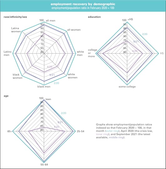
It’s no surprise that job losses were very unequally distributed. The EPOP for everyone fell from 61.1% in February 2020 to 51.3% two months later, a decline of 16%. (That’s not graphed. Note that that 16% decline refers to the change from 61.1% to 51.3%, a decline of 16%, which is different from the 9.8 percentage point decline.) For men, it went from 66.8% to 57.2%, or a decline of over 14% (again, the percent change from 66.8 to 57.2, not the 9.6 point decline derived by subtracting 57.2 from 66.8). That loss is visible on the inner ring of the graph on the upper left, where the graph along the “all men” axis hits 86. For women, the decline was steeper—almost 18%, which is graphed as 82 on the next point clockwise on the innermost ring. Hardest hit in the first grouping were Latina women, down over 23%. It’s not shocking that white men were the least hard hit, down just over 13%, but that’s still quite a blow.
Overall, the EPOP has recovered to just over 96% of its February 2020 level, though Latina women, at almost 93%, are the least recovered, and black women, at just over 93%, are the second-least. Latino men, though hit hard by the downdraft, have recovered pretty strongly, to just over 96% of the pre-pandemic high. The weaker showing for black and Latina women reflects in part their heavy representation in government employment, where the recovery has lagged the private sector’s. Overall, however, despite some talk about gender disparities, there’s little difference in the recovery rates overall between men and women.
By education, the initial damage correlates precisely with attainment. Those who didn’t complete high school saw their EPOPs fall by 24%. For those who graduated from high school, the decline was 20%; for those with some college, 15%; and for those with a bachelor’s degree or higher, the decline was just under 9%. (There’s just no basis for the notion, circulated in authoritative-seeming memes, that higher education is of no benefit in the job market.) Recoveries also correlate with the level of educational attainment, though those without high school diplomas (a small group, just 6% of employment) have done slightly better than those with. College grads have regained almost 98% of their losses. Peter Thiel aside, credentials do pay.
By age, teens got hit hardest of all, losing almost a third of their EPOP, but they’ve since recovered all their losses. So-called “prime-age” workers, those aged 25–54, got hit least hard. The oldest cohort, 65 and over—another small group, just 7% of employment—were also hit pretty hard, and are the least recovered of the four groups (no doubt many of them have just retired rather than fight their way back into employment).
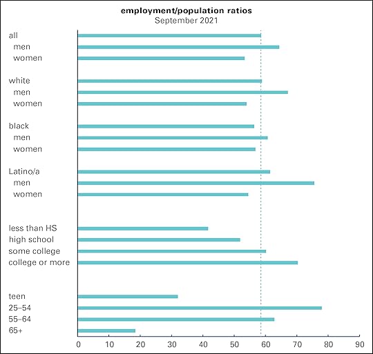
Loss and recovery rates don’t say anything about levels, and EPOPs very widely by demographic as the next graph shows. The vertical dotted line marks the overall employment rate of 58.7% in September. Men are above it and women are below. The most employed demographic in the race/gender/ethnicity grouping is Latino men, at 75.6%. White men are a distant second, at 67.2%. At 54.0%, white women are the least employed group. By education, the stairstep correlation applies again, with the EPOP rising with each level of attainment.
Why does the recovery remain so incomplete? Many employers, especially in restaurants and retail, went out of business, and workers have no place to return to as the crisis eases. People are still reluctant to go to restaurants and hotels. Hotels were at 61.6% of capacity in September, down from 67.2% in September 2019. Restaurants were operating about 9% below 2019 capacity in September. Retail foot traffic hasn’t fully recovered either. Some employers are still uncertain about the future and unwilling to commit themselves to hiring permanent staff.
And workers remain notoriously reluctant to take any crappy job that comes along. A survey by the Indeed Hiring Lab found just a third of the unemployed actively searching for work, little changed from June. You can’t blame pandemic-expanded unemployment insurance benefits for that reluctance anymore either—they’re now gone everywhere, not just in Republican-run states.
You have to wonder how people are paying the bills. Some aren’t, for sure. But the latest edition of the Federal Reserve’s distributional financial accounts, which look at the financial status of households at various levels of the wealth distribution, found that at the end of the second quarter, they had almost $3.5 trillion in checking accounts and cash, $2.4 trillion more in than they averaged in 2019. The top 1% unsurprisingly accounts for a lot of the increase, but other segments of the distribution are flush as well. Even the bottom 50% was packing some reserves, with an average of $3,744, or 78%, more than their 2019 average. The next 40% has $11,405 more, two-and-a-half times as much. Much of that is no doubt the lingering result of stimmy checks and other covid supports. That’s certainly not enough to fund a life of leisure, but it can sustain a few months’ pickiness—especially if you have an employed spouse or partner (a factor cited by a third of respondents in the Indeed survey).
It looks like the economy is experiencing something like long covid too.


October 12, 2021
Wild times in the job market
Millions of unfilled job openings, workers quitting en masse, soaring wages (at least in some sectors)—wild time in the job market. Here are some graphs to make the point.
The Bureau of Labor Statistics does a monthly Job Openings and Labor Turnover Survey (JOLTS) that queries employers on unfilled openings, hires, firings, and quits. August’s data was released this morning, October 12.
Here’s a graph of openings, expressed as a percent of current employment, in the private sector as a whole and in accommodations and food services (hotels, casinos, restaurants, and bars, hereafter AFS), the sector that’s grabbed a lot of attention as a site of worker discontent.
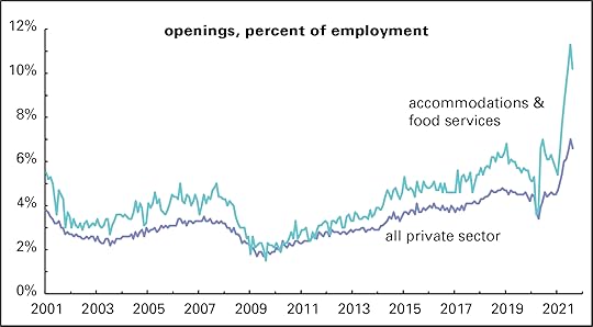
Although the openings rate came down in August from July’s all-time high, we’ve never seen anything like it since the survey began in December 2000. (The graph starts in January 2001 for appearance’s sake.) Overall private-sector openings were 6.6% of employment—and at 10.2%, the AFS sector was even more extraordinary than the overall rate.
And a lot of workers are quitting. No downturn in August here: the two graphed quit rates—3.3% overall and 6.8% in AFS—set records by a comfortable margin.
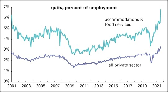
The quit rate got very low during and after the Great Recession, roughly 2008–2010; when the world is falling apart, workers are generally reluctant to leave their jobs. The quit rate is usually read as a sign of worker confidence. Bosses and financiers don’t like it when workers get too cocky—it makes them harder to push around—so central bankers often push the economy into recession in order to readjust their attitudes. The quit rate’s behavior lately, though, seems less about an economic boom making workers cocky and more about them losing patience with shitty jobs (especially in AFS) where supervisors often scream, pay stinks, covid is rampant, and customers threaten to punch you out for asking for proof of vaccination.
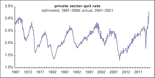
Here’s a longer-term perspective on the quit rate. Pre-2001 data are estimated from the share of job leavers among the unemployed (a figure reported every month with the employment release). As the graph shows, it looks like the August record would hold even if you take it back 54 years.
Employers look to be boosting pay in an effort to lure workers back on the job. Here’s a graph of the annual change in average hourly earnings (AHE) for all private sector workers and AFS. There are a lot of gyrations at the right end of the graph that need explanation. When the pandemic first hit, the AFS sector largely shut down, so the wage data covered a fraction of the sector’s usual employees. That strangeness is visible in the dip of the light blue (turquoise?) line into negative territory. More broadly, low wage workers were far more likely to lose their jobs than higher-wage ones. That made for a spike in AHE largely driven by this compositional effect (as economists say). As they returned, wages appeared to dip, but it was just the flip side of the compositional effect.
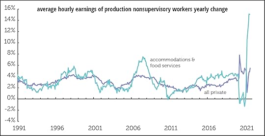
But recent behavior looks not to be driven by compositional effects, but by the elusiveness of hirable workers. For the year ending in August, hourly earnings in AFS were up over 15%—like nothing we’ve seen before. Wages for the broader workforce are up just 5.5%—high by the standards of the last 30 years, but nothing like they are in AFS.
Sadly, though, that 5.5% increase is equal to the current rate of inflation, meaning that real wages are essentially unchanged. But hotel and restaurant workers look to be booking gains well ahead of inflation, at least for now.
October 9, 2021
Cutting UI early hurt job growth
Employers, right-wing politicians, and the pundits who speak for them have been claiming that the expansion of unemployment insurance (UI) benefits to counter covid woes was hurting job growth. By making it possible to refuse crappy jobs, or maybe even not to work at all, that sort of public sector generosity was making the working class too picky. They’re a lazy lot, you know, and need a good kick in the ass to get them to perform their class duty of laboring for the boss.
Problem is there’s just no evidence that expanded UI benefits hurt job growth. They ended nationwide on September 6, and job growth last month was the weakest of the year—just 194,000, almost half a million below the average of the previous six months.
Comparing job growth in states that cut benefits before the federal deadline with those that didn’t underscores the point. State employment data isn’t released until two weeks after the national data, so we won’t have September data until October 22. But the data through August is revealing.
Graphed below are rates of job growth in August and for the previous three months for cutters (states who cut expanded benefits before the federal termination) vs. non-cutters (those that didn’t). Cutters are divided into those who cut early, before June 26, and those that cut later. The roster is at the bottom of this page.
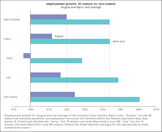
As the graph shows, non-cutters saw faster job growth than cutters for both August and the three months preceding. In August, national employment grew 0.20%. Among cutters, it grew 0.12%; among non-cutters, 0.25% (These are based on totals of each of the categories, no simple averages of state growth rates.) Within the cutters, the early birds actually saw a small loss of jobs, 0.04%. The April–July figures tell a similar story, with cutters (0.45%) lagging non-cutters (0.61%), and the early cutters (0.29%) doing worse than those later to the cruel game (0.49%).
A look at the roster of cutters below shows that many of the states were covid hotspots over the summer. And there’s a big disparity in vaccination rates: cutters have an average vaccination rate of 50% (early: 48%, late: 51%) compared with 60% among non-cutters. Maybe covid is more of a problem than generous income supports.
Also, there’s no good reason for the feds to have ended expanded benefits. They’ve helped millions cope with a still-broken job market. But it was an additional stroke of cruelty to cut them before the Washington did. I was going to call it pointless cruelty, but cruelty was the point.
Early cutters Alabama, Alaska, Idaho, Indiana, Iowa, Mississippi, Missouri, Nebraska, New Hampshire, North Dakota, West Virginia, Wyoming.
Late cutters Arizona, Arkansas, Florida, Georgia, Louisiana, Maryland, Montana, Ohio, Oklahoma, South Carolina, South Dakota, Tennessee, Texas, Utah.
October 8, 2021
Fresh audio product
Just added to my radio archive (click on date for link):
October 7, 2021 Nancy MacLean, author of this paper, on how Milton Friedman’s war on public education fit nicely with Southern massive resistance to desegregation • Klaus Jacob, a geophysicist, on how we can live with rising seas and heavier rains
October 1, 2021
Fresh audio product
Just added to my radio archive (click on date for link):
September 30, 2021 Patrick Wyman, author of this article (and this earlier Substack version) on provincial elites • Duc Hien Nguyen on queerness, social reproduction, and capitalism
September 24, 2021
Fresh audio product
Just added to my radio archive (click on date for link):
September 23, 2021 Algernon Austin on the plight of black men in the job market (with an excerpt from a 2005 BtN interview with Devah Pager on discrimination) • Susie Bright on pegging the patriarchy
September 17, 2021
Corporate tax deadbeats
Biden and Congressional Democrats are talking about raising the corporate tax rate. The latest proposal looks to be boosting it from 21.0% to 26.5%, marked down from the 28.0% level that the administration in April. While that would be a step in the right direction, it only begins to address the seven-decade erosion in what business pays.
Graphed below is the effective tax rate for nonfinancial corporations, drawn from the national income accounts. “Effective” means the rate actually paid—taxes paid divided by profits—not the rate on the books before clever lawyers and accountants do their evasive magic.
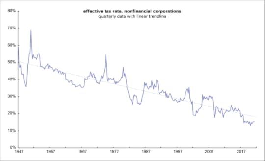
In the 1950s, firms turned over about 50% of their profits to federal, state, and local tax authorities. That fell to 40% in the 1960s and 1970s. The Reagan revolution took the rate down to near-25% in the mid-1980s. It rose a bit off those lows, but began declining again, hitting a post-World War II low of 15% following the Trump tax cuts of 2017. Yet Corporate America is whining about the possibility of taking the rate back to where it was roughly ten years ago, when capital was hardly suffering from confiscatory taxation.
Lobbyists and publicists claim that cutting corporate taxes spurs investment, and with it innovation and employment. In fact, investment has been declining at a rate similar to the tax rate. Graphed below is net private fixed investment—net, that is, of depreciation, an estimate of the effects of wear and obsolescence on the existing capital stock. If new investment is only keeping up with the rot of the old, net investment would be 0. We’ve been doing somewhat better than that, but not much.
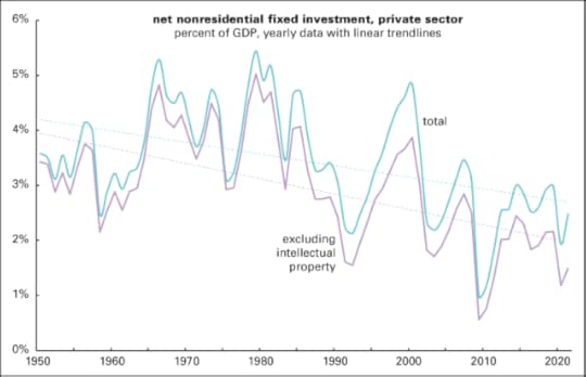
The two lines of the graph show total investment in buildings, machinery, and intellectual property (IP) as a percent of GDP, and that with IP taken out. A lot of IP consists of pointless patents designed to maximize economically pointless things like brand value and to limit competition from new entrants, so it’s not obvious how much of an economic good IP investment really is. Note that both lines have traced a steady downtrend. There were strong bursts of investment in the 1960s and late 1970s, and a less dramatic rise in the late 1990s—but it’s been mostly downhill since. Recent peaks around 2015 and 2018 are in the same neighborhood as the recession-induced lows of the mid-1970s and early 2000s. So far this year, net business investment is 1.5% of GDP, up from the pandemic-induced low of 1.2% last year, but still one of the lowest on record. It means that corporations are barely keeping ahead of decay.
It’s not like firms are short of cash; there’s no evidence of a declining rate of profit in the national income accounts. It’s just that corporate managers would rather stuff their shareholders’ pockets with cash rather than investing in buildings and machines. They’ve spent $8.6 trillion on buying their own stock to boost its price since 2000, well over half of it since 2012. Add to that $6.0 trillion in traditional dividends and we’re talking some serious money—almost $15 trillion since 2000. That’s over twice what the entire corporate sector has paid in taxes over the same period. How nice for their shareholders and their top execs, who are largely paid in stock now. It’s not so nice for the rest of us though.
September 16, 2021
Fresh audio product
Just added to my radio archive (click on date for link):
September 16, 2021 Dave Zirin, author of The Kaepernick Effect, on how taking a knee spread across the country (and why leftists shouldn’t hate sports) • Dwayne Monroe, cloud data architect and author of this piece, disassembles the hype around artificial intelligence
September 9, 2021
Fresh audio product
Just added to my radio archive (click on date for link):
September 9, 2021 Clyde Barrow on how Texas, a diverse, urbanized, sophisticated state, is run by a bunch of reactionary white would-be cowboys • Anatol Lieven, author of this article, on the US–China rivalry and the meaning of the US withdrawal from Afghanistan
September 7, 2021
Work from home: mostly for the high end
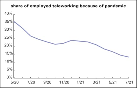
Judging from the media coverage of the work from home (WFH) phenomenon, you’d think it’s become near universal. It’s not. In July, only about one in eight workers were teleworking—the Bureau of Labor Statistics’ (BLS) preferred term—and those are heavily concentrated in a few sectors and occupations, and among the highly credentialed.
According to BLS stats, in July 2021, just 13% of workers are doing so remotely because of the pandemic, down from 35% in May 2020, the first month the numbers were collected. (See graph below.) And that initial 35% number was inflated by the fact that so many workers who couldn’t work from home, like those in retail and hospitality, had been laid off. Since that peak, the share has declined in twelve of the subsequent fourteen months.
And, as the paired bar graphs below show, WFH is heavily concentrated in a few demographics. Asians account for 15% of teleworkers, well over twice their share of the employed, no doubt reflecting their strong presence in tech; Hispanics/Latinos, just 11%, well under their share of employment. By education, workers with less high school diplomas or less barely register—but those with advanced degrees are heavily over-represented.
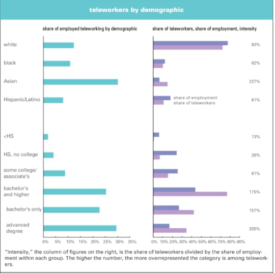
If we define the heavily teleworking segments as those with an intensity (share of teleworkers divided by share of employment) of over 150%, just eight occupations out of twenty-two (computer and mathematical, business and financial operations; legal; life, physical, and social science; architecture and engineering; arts, design, entertainment, sports, and media; management; and community and social services) accounted for 69% of teleworkers in July, over twice their share of employment (30%). The concentration by industry is even sharper: just five sectors out of twenty-three (finance and insurance, professional and technical services, information, public administration, and utilities), pass the 150% intensity test. Together, they account for 70% of teleworkers, but just 21% of employment. (These aren’t graphed because they’d be too big for a little blog post.)
Telework was somewhat more democratic in the early days of the pandemic. In May 2020, 46% of those working from home had less than a bachelor’s degree, somewhat less than their 55% share of total employment. In July, that share was down to 15%. In May 2020, 57% of those in managerial and professional occupations were working from home; in July 25% were. Over the same period, the share of those teleworking outside the professional and managerial occupations went from 17% to 5%.
On the left, you often hear its said that we should just pay people to stay home. Of course, if people can’t find work, they need generous support. It’s cruel to cut off expanded unemployment insurance benefits.
But most jobs just can’t be done remotely. Those who can work remotely have to be served by the majority of lower-status, lower-paid workers who make things and move them around. If they were paid not to work, money would quickly become worthless because there’d be nothing to buy with it—no food, no electricity, no appliances, no medical equipment, nothing.
Telework is common among high-paid, high-visibility fields, but it’s just not the “new normal” for most workers. And it’s hard to see how it could be otherwise.
Doug Henwood's Blog

- Doug Henwood's profile
- 30 followers

