
Doug Henwood's Blog, page 24
December 2, 2021
Fresh audio product
Just added to my radio archive (click on date for link):
December 2, 2021 Matt Kierkegard and David Adler of the Progressive International on the Honduran and Chilean elections • Sarah Lustbader, author of this article, on why trials are no substitute for politics


November 26, 2021
Fresh audio product
Just added to my radio archive (click on date for link):
November 25, 2021 Alex Vitale, just out with an updated edition of The End of Policing, on what cops really do and how we can get rid of them • Barry Eichengreen, co-author of In Defense of Public Debt, on the very long history of public borrowing
November 18, 2021
Fresh audio product
Just added to my radio archive (click on date for link):
November 18, 2021 Christina Gerhardt on the COP26 climate summit • Mike Lofgren on the dangers of Steve Bannon’s war on the administrative state (article here)
November 17, 2021
Americans staying put
There are certain things that people say that sound so true that others repeat them credulously without feeling the need to cite evidence. Two covid-era favorites: everybody’s working from home (WFH). And people have decamped en masse for the hinterlands, thanks to WFH. Neither is really true.
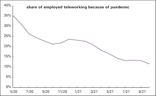
I wrote about the slim WFH numbers in September. In July, which was the most recent month available then, 13.2% of the employed were teleworking, the Bureau of Labor Statistics’ favored term. In October, that had fallen to 11.6% (graph below). Their ranks were still dominated by highly credentialed professional and managerial workers. The miserably paid couriers who brought (and still bring) them food and other essentials were most certainly not working from home, though they easily fall out of some people’s conception of “everybody.”
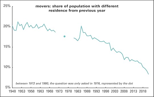
Even if “everybody” wasn’t teleworking, lots were. But there’s no support at all for the mass decampment story. Freshly released data from the Census Bureau shows just 8.4% of Americans moved between 2020 and 2021, the smallest share since the Bureau started counting in 1948. That was down almost a full percentage point from the previous pair of years, a large decline by recent historical standards. But as the graph below shows, the share has been declining steadily since 1985’s 20.2%, when high oil prices and deindustrialization drove movers south and west in search of jobs. (Unfortunately for the energy migrants, oil prices collapsed in 1986.)
Also not surviving a confrontation with Census data: the claim that, freed from the need to go to an office, covid refugees headed for the hills (and beaches) in large numbers. They didn’t, as the next graph shows.
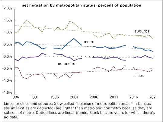
Yes, people have been moving out of cities for decades, but the net out-migration of 0.5% of the national population was smaller than the two previous years, and over a quarter less than the 1986–1999 average. (Reminder: these numbers count only in- and out-migration, not changes in population levels, which are also affected by births and deaths.) As the trendline shows, urban out-migration has been in a slowing trend since this data series began. Suburbs gained migrants, but at a rate slightly lower than the previous eight years. Metro areas—the combination of suburban areas and the “principal” cities associated with them— have seen steady, if declining, in-migration for all of the last 35 years. And nonmetro areas, supposedly the recipients of all those terrified urban refugees, lost migrants between 2020 and 2021—more, in fact, than any year since 2014.* That trendline ambles very lazily downward, though it’s hard to distinguish from the axis, because it’s so close to 0.
A larger question here, pandemic aside, is what happened to American mobility? Pulling up stakes and moving a long distance in search of fresh opportunity used to be a foundational national myth. Like many others, it needs to be retired.
* The Census Bureau reminds us that nonmetropolian areas are not the same as “rural” areas, since there are many rural-feeling regions that are nonetheless technically part of metro areas. Census has a point, but on the other hand, there are social differences between thinly populated areas that are close to major conurbations and those that aren’t. For example, parts of Westchester County, just north of New York City, may look rural, but it’s amenity-plentiful rich people’s country, and a short train ride away from the big city.
November 12, 2021
Striketober wasn’t
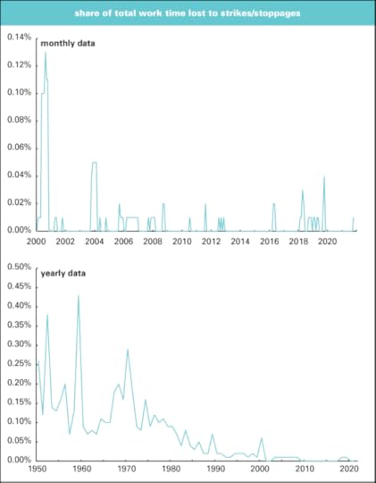
As marvelous as it would be to see a revival of labor militancy, people got a little ahead of things calling last month “Striketober.” According to Bureau of Labor Statistics (BLS) stats, it was a blip by historical standards.
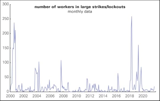
Here’s a graph of the number of workers involved in strikes or lockouts (the BLS counts them together) since 2000. There were 57 months with higher numbers of workers off the job. At the high point of this graph, May 2018, there were over fourteen times as many workers on strike as there were last month.
Here’s another measurement—what the BLS, in nice Victorian fashion, calls “days of idleness” as a percent of total days worked throughout the economy. It was 0.01% in October, a level that’s been matched in 39 other months since January 2000. And as the bottom graph shows, back in the old days when strikes were frequent, lost workdays were many times 0.01%. Before 1980, the low was 0.07%, set in 1957. From 1948 to 1979, it averaged 0.16%. In 1959, just two years after the pre-neoliberal era low, it was 0.43%, the series high.
People criticize the BLS data because it covers only large strikes, those involving over 1,000 workers or more. The government used to publish data on smaller strikes, but it looks to have disappeared from the Federal Mediation and Conciliation Service’s website after not having been updated for years (and it was always in a very user-unfriendly format). But when I looked at what data there was in 2018, it showed the same pattern of decline as the large strike data.
There’s certainly some promising labor agitation going on, like efforts to organize Amazon and Starbucks, and there’s plenty of atomized discontent floating around. But there’s no strike wave yet.
November 11, 2021
Fresh audio product
Just added to my radio archive (click on date for link):
November 11, 2021 Lisa Graves on the right-wing funding and strategy network around school protests • Natalia Mehlman Petrzela on the cultural politics around schools
November 4, 2021
Fresh audio product
Just added to my radio archive (click on date for link):
November 4, 2021 Sheryll Cashin, author of White Space, Black Hood, on the origins, mechanisms, and effects of residential segregation, mostly by race but also by class • Peter Victor and Robert Pollin debate the virtues of “degrowth” in avoiding climate catastrophe
October 29, 2021
Fresh audio product
Just added to my radio archive (click on date for link):
October 28, 2021 Samuel Moyn, co-author of this article, on the reactionary history of the Supreme Court and how to democratize it • Deepak Bhargava, one of the editors of Immigration Matters, on immigration policy, historical, current, and future
October 23, 2021
Paying the bills: a closer look
Yesterday’s post about how people were finding it harder to pay the bills didn’t get into any demographic detail. Time to do just that.
According to the Census Bureau’s biweekly Household Pulse Survey, as of the two weeks ending October 11, 47.7% of adults were having no difficulties paying their bills, down just over 2 percentage points from May, which was the best period in the covid era. The numbers bounce around some from one survey to the next, no doubt an indeterminate mix of noise and trend, so it’s a good practice to average a couple to smooth things out.
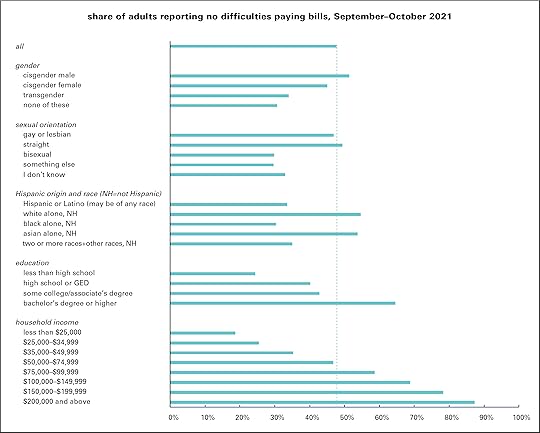
First, bill-paying capacities by demographic group—and not just by the usual categories like race, income, sex, and education. In August, the Bureau started asking questions about gender and sexual orientation in the survey, a nice increase in the richness of the data.
Averaging the two surveys covering September 13 through October 11, you get a pattern like the one graphed below. Almost 48% of all adults reported no difficulties in paying their bills. Cisgender men come in a few points above that, and cis women a few below. Transgender and “none of these” come in well below. Among cis men, almost five times as many have no trouble as report finding “very difficult.” (To keep the number and density of the graphs down, I’m only showing the no trouble figures.) Among cis women, it’s three-and-a-half times. For trans and “none of these,” the numbers are almost equal. Being gay or lesbian puts you about 3 points below average, but being bi puts you 18 below.
Results by race, education, and income hold no surprises. Whites are 7 points above average, and Asians are 6; Hispanics or Latinos, 14 points below; blacks, over 17 points below. (The classification scheme and labels are all the government’s choice, not mine.) Not finishing high school puts you 23 points below; having a bachelor’s or more, 17 points above. Gaps correlate perfectly with income ranges—though it’s striking that over 40% of those with incomes between $75,000 and $99,999 are not comfortably paying their bills—and 13% of those over $200,000.
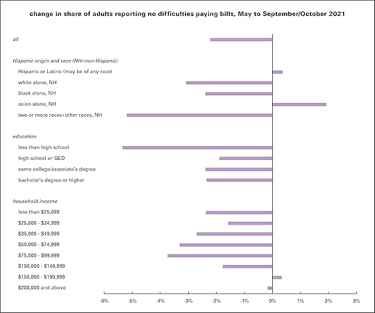
And now the changes since spring, graphed below. Most demographic groups have been finding it harder to pay bills than it was five or six months ago. From the averages of the May surveys to the September 13–October 11 average, the share of people reporting no difficulties paying their bills fell by 2.2 percentage points. Here the damage looks more widely distributed than you might expect. (Gender and sexual orientation can’t be compared because they weren’t part of the survey in May.) Hispanics or Latinos found it slightly easier, but whites had a bigger negative shift than blacks. Those who didn’t finish high school took a hit of over 5 points—but those with some college or more did a bit worse than high school grads. And changes by income class didn’t follow the usual stairstep pattern—the categories just above the median did worse than those below them (though of course their absolute levels are lower, as the graph above makes clear).
As I said in yesterday’s post, these aren’t enormous shifts, but they’re going in the wrong direction. Despite gains in employment—strong at first, now faltering some—more people look to be struggling.
This all makes you wonder about The Great Resignation—record-high quit rates and a stubborn refusal by many to take any crappy job on offer, which is getting uncommonly close coverage. Can it continue as prices rise and savings are drawn down? Or is something breaking in the governing order? It’s not every day you read a New York Times columnist—even one as good as Farhad Manjoo—interviewing anti-work scholar Kathi Weeks and writing words like these:
I’ve been reading /antiwork for months, and I’ve been surprised to find myself joining in the visceral thrill of seeing people wrest the reins of their lives from the soul-sucking, health-destroying maw of capitalism.
A problem is that capitalism usually makes it very hard to reclaim one’s life from it. Having to pay the bills is usually a work discipline without any appeal. Maybe something is happening though.
October 22, 2021
Household money supply tightens
Since April 2020, the Census Bureau, in collaboration with several other official statistical agencies. has been conducting a biweekly survey of people’s material well-being called the Household Pulse Survey. It asks questions about employment, income, food availability, mortgage and rent status, health, and the ease of paying bills, among other things. There’s a lot in these surveys, but for now I want to take a look at just a couple things: how hard people are finding it to pay their bills and where the money is coming from.
There have been several “waves” of this survey, and response rates and questions have varied between them, complicating longer-term comparisons. In most of what follows I’m going to look mainly at responses since May 2021. I will say that in the months leading up to May, households found it progressively a little easier to get by than they did last summer. For example, in August and September 2020, about 44% of households said they were having no difficulties paying their bills. That rose to around 50% in May 2021. The share describing it as “very difficult” fell from about 14% to 10%. The share drawing on savings, running up the credit cards, or borrowing from friends and family fell.
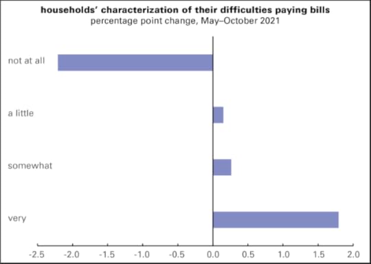
That all began turning around in May. Graphed below are the changes in households’ experience paying their bills since then. In May (averaging that month’s surveys), 49.9% of households said they had no difficulty paying their bills. In early October, that fell to 47.7%, a decline of 2.2 points. The share reporting it “a little” difficult rose slightly, and those reporting it “somewhat” difficult rose a bit more—but those reporting it “very” difficult rose from 10.4% to 12.2%. Combine “somewhat” and “very” and it rises from 26.6% to 28.6%. These are not massive changes, but they’re not what you’d expect in a period when employment rose by 2.6 million jobs.
And, as the next graph shows, there are some distressing changes in where the money’s been coming from. There’s been a rise in those reporting “regular, like pre-pandemic,” which is what you’d expect in a period of rising employment. But there’s also been an increasing reliance on borrowing, liquidating assets, and government aid (other than unemployment insurance, which has been deeply cut, and stimulus payments, which are a fading memory). It’s good the government aid is there, but given the cheesiness of the US welfare state, there’s typically not much of it.
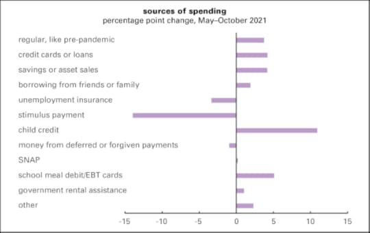
These are not enormous changes—a few percentage points (though every percentage point shift represents about 2.5 million adults). But they’re mostly in the wrong direction.
Doug Henwood's Blog

- Doug Henwood's profile
- 30 followers

