
Cameron Moll's Blog, page 9
July 23, 2012
In Defense of Flickr
The thing with Flickr isn’t that it is no longer awesome, but that it is no longer fashionable.
The web has matured a lot in recent years, to the point where websites have become brands. Brands that can advertise and market themselves, brands that work hard to influence the minds of the younger internet users. The brands want to lure people in with the promise of free stuff and social networks, in return for personal information. Which of course, having grown up with Facebook, many of today’s teens and 20-somethings are perfectly happy to give away.
I know I probably sound like a moaning old grandad at this point, but: Flickr has never been like that. It offered a service, in exchange for money. That’s a tried and tested way of doing things. It worked very well before the internet came along, and there’s no reason why it shouldn’t continue to work now.
Just renewed my Flickr Pro subscription last week, in fact.


July 18, 2012
Nexus 7

On Monday, I purchased an Asus/Google Nexus 7, mostly for testing purposes. It arrived the following day (yesterday).
I’ve had it in my hands just 12 hours, so take the remarks that follow with a grain of salt. However, because I also own a Galaxy Tab, BlackBerry PlayBook, and Amazon Kindle Fire—all of which are roughly the same size as the Nexus 7—I’ve got a pretty good handle on what works well and what doesn’t for 7” tablets.
In no particular order, my initial impressions:
Unboxing it wasn’t nearly as difficult as some have experienced. Perhaps they’ve tweaked the packaging since.
Setup was a breeze. And because I’ve already connected a previous tablet to Google Play, apps and media I’ve purchased instantly began installing on this device. (Jury is still out as to whether or not that’s really a good thing.)
I was surprised to learn Asus manufactures it. I didn’t pick up on that prior to ordering, and I didn’t even realize it until seeing the name imprinted on the back of the device. I’ve never associated Asus with a high standard of quality, but this device feels well-built.
There’s greater potential for confusion when using the Nexus 7 than with iPad. Fundamentally, this is due to the buttons flanking the bottom of the screen on most (all) Android devices, as compared to the single home button on iOS devices. At times, especially when opening modals, it takes me a couple seconds to remember if I should press the home button or the back button to exit the modal. I dislike how often this throws me off. But again, this goes for any Android device, not just Nexus 7. (It should be noted that the buttons on this device are digital, not physical. This means they can disappear in some apps, which they do.)
I love having Chrome on a tablet. The fact alone that I can use the address bar to type both URLs and searches means I never need to remember which field is which, as compared to Mobile Safari. Some claim this is a feature that works well on the desktop for advanced users but confuses novice users, which I partly agree with. But on a tablet, a single field for both just feels right. (This isn’t a feature exclusive to Chrome on tablets. Other browsers employ a single field, as well.)
I rented and watched part of a movie last night to get a feel for how it handles video, and the experience wasn’t stellar. The screen is fairly good; that wasn’t the problem. The audio and streaming were at fault. The speaker(s) were simply too weak to provide ample audibility, even at full volume. And this was in a quiet room! I eventually plugged in headphones to hear adequately. Further, the movie paused for buffering a half-dozen times within a stretch of 10 minutes. Granted, this is likely the fault of Google Play rather than Nexus 7, but I’ve yet to experience that kind of latency with iTunes and iOS.
The page-turn animation is neat. Download an e-book and you’ll see what I mean.
Typing really isn’t any better than iPad, but those who follow me on Twitter know I absolutely despise typing on tablets. Any typing. If anything, typing is easier in landscape mode with Nexus 7 than with iPad, simply because the reach between thumbs is less wide than with the current 10” iPad.
The obvious question that begs to be asked is one that involves a reference to iPad and a murderous label. As solid as the Nexus 7 is, it’s unlikely a killer. I was enamored by both the PlayBook and Kindle Fire during my initial time with each, and you might say I’m equally enamored by the Nexus 7. However, weeks later neither device stood up to iPad. Now they both gather dust when not used for testing. I worry the Nexus 7 will suffer the same fate.
And with a smaller, less-expensive iPad just around the corner, I’m willing to bet Nexus 7’s time in the spotlight will be relatively brief. But as an Android alternative to iPad, it’s the best tablet I’ve had my hands on thus far.
June 13, 2012
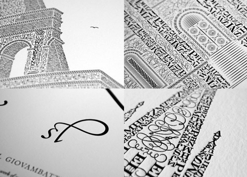
Summer Sale: 25% off all letterpress items

Now through June 20, all letterpress poster items are available for purchase at 25% off. Orders placed today (June 13) and shipped to U.S. addresses will arrive in time for Father’s Day.
“The only unit of time that matters is heartbeats.”
Paul Ford, speaking to MFA Interaction Design graduates on the value of time:
The time you spend is not your own. You are, as a class of human beings, responsible for more pure raw time, broken into more units, than almost anyone else. You spent two years learning, focusing, exploring, but that was your time; now you are about to spend whole decades, whole centuries, of cumulative moments, of other people’s time. People using your systems, playing with your toys, fiddling with your abstractions. And I want you to ask yourself when you make things, when you prototype interactions, am I thinking about my own clock, or the user’s?
If we are going to ask people, in the form of our products, in the form of the things we make, to spend their heartbeats—if we are going to ask them to spend their heartbeats on us, on our ideas, how can we be sure, far more sure than we are now, that they spend those heartbeats wisely?
Be sure to read the full transcript.
June 12, 2012
Live-Sketching a Presentation
I’ve been presenting at design and web conferences since 2005 and, as best as I can recall, I’ve been using Keynote since version 1.0, which debuted a couple years earlier.
Last month, for the first time in 7 years, the machine accompanying me on stage was running something other than Keynote. And the machine was more device than mechanism.
When I took the stage at DIBI 2012, I had an iPad in hand. After sliding to unlock, I opened Paper and began my presentation with this hand-sketched page:
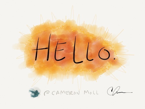
As I took the stage, I was hoping to surprise the audience with a new form of presenting, as well as shake things up a little for the speaking industry.
Rewind a few months: There I was in my office lounge chair, watching a Khan video on my iPad as I began my day. I knew I had two presentations coming up, one for DIBI and the other for Interlink 2012. So as Sal eulogized the virtues of quadratic equations, my mind wandered to a place where I imagined myself doing the same on stage. And then it hit me: Why not?
‘Paper’ for iPad had just been released a few weeks earlier, and it wasn’t long before I put two and two together. I had also been considering using mathematical equations, of all things, to describe my topic (creativity). Things were coming together nicely.
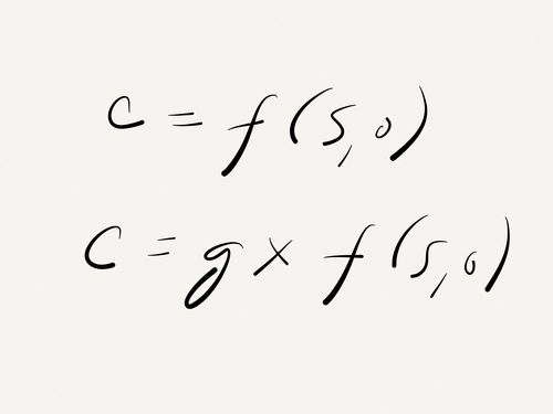
Following some informal testing with several styluses (which I hope to write about later), I began rehearsing. It quickly became apparent that the more complex sketches would require too much time on stage, especially while trying to talk at the same time. So I created a few canned sketches, such as these:
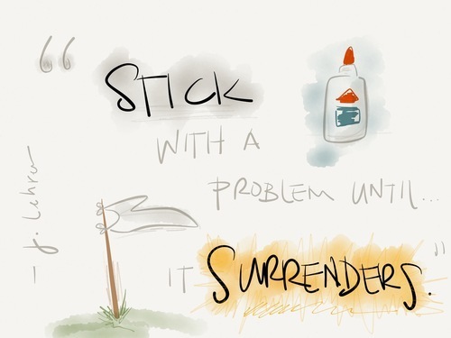
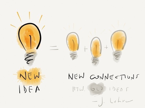
These were interspersed throughout the presentation to add a little variety. As for the on-stage sketches? My illustration skills severely lacking, they weren’t as pretty. But I wasn’t after pretty. I was after a new form of engaging the audience during a presentation, and in this case it was seeing words and equations sketched live in Khan fashion. Here are a few pages that were sketched on stage:
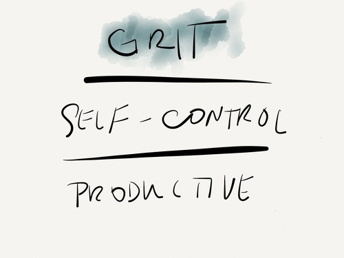
Not as sexy, but it worked.
To steal a few lines from the script for my presentation, everything we create is based on existing ideas, existing matter. Ultimately our ideas are others’ ideas—reincarnated, reimagined, and refined.
I’m banking on other speakers taking this idea—using Paper for on-stage sketching—and reincarnating, reimagining, and refining it. After all, conferences could use a little more Sal and Paper.
Update: Some of you have requested video demonstrating this style of presenting. Jina Bolton captured a brief snippet from my talk at Interlink 2012.
May 31, 2012
“Frustration ... is an essential part of the creative process.”
Jonah Lehrer, author of Imagine:
Every creative journey begins with a problem. It starts with a feeling of frustration, the dull ache of not being able to find the answer…. When we tell one another stories about creativity, we tend to leave out this phase of the creative process…. Instead, we skip straight to the breakthroughs. We tell the happy endings first. The danger of telling this narrative is that the feeling of frustration … is an essential part of the creative process.
May 30, 2012
Hierarchy Squint Test (Chrome Extension)
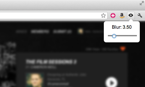
Inspired by a talk I gave at dConstruct 2007, Remy Sharp has developed a simple extension for Chrome that applies a CSS-based blur to any web page. This is helpful for conducting a quick “hierarchy squint test” on work in progress. (More about that.)
Download the Chrome extension here.
Speaking of dConstruct, tickets are nearly sold out for this year’s conference in Brighton, UK. It’s a fantastic event with a unique lineup of speakers, held in one of the most unique venues I’ve ever spoken at. Can’t recommend it enough.
May 23, 2012
Dancing on the Edge of ‘Finished’
Seth Godin on the elusiveness of getting to done:
For the marketer, the freelancer and the entrepreneur, the challenge is to level set, to be comfortable with the undone, with the cycle of never-ending. We were trained to finish our homework, our peas and our chores. Today, we’re never finished, and that’s okay.
That echoes my answer for a question I get asked frequently: “How do you balance everything, Cameron?”
I don’t.
Balance is a process, not a final resting state. I’m constantly juggling, shuffling, and re-prioritizing life’s demands. And I’m learning to be okay with that.
May 22, 2012
Upside Down or Right-Side Up?
Joe Moreno describes how Apple’s logo was originally right-side up to the onlooker, but switched to be right-side up to the user, before switching back to favor the onlooker:
[The] design group noticed that users constantly tried to open the laptop from the wrong end. Steve Jobs always focuses on providing the best possible user experience and believed that it was more important to satisfy the user than the onlooker.
Obviously, after a few years, Steve reversed his decision.
Opening a laptop from the wrong end is a self-correcting problem that only lasts for a few seconds. However, viewing the upside logo is a problem that lasts indefinitely.
Skim the comments for banter discussing whether or not Steve’s reversal was the right thing to do.
/via Hacker News
May 18, 2012
“This redesign is deliberately over the top.”
Jeffrey Zeldman, in a beautifully written piece titled, “Web Design Manifesto 2012”:
This redesign is deliberately over the top, but new ideas often exaggerate to make a point. It’s over the top but not unusable nor, in my opinion, unbeautiful….
We can’t keep designing as we used to if we want people to engage with our content. We can’t keep charging for ads that our layouts train readers to ignore. We can’t focus so much on technology that we forget the web is often, and quite gloriously, a transaction between reader and writer….
A personal site is where you don’t have to compromise. Even if you lose some readers. Even if some people hate what you’ve done. Even if others wonder why you aren’t doing what everyone else who knows what’s what is doing.
Cameron Moll's Blog

- Cameron Moll's profile
- 4 followers

