Cameron Moll's Blog, page 8
September 18, 2012
“Our creativity comes from without, not from within.”
Kirby Ferguson speaking at TED on the topic of remixing:
Our creativity comes from without, not from within. We are not self-made. We are dependent on one another, and admitting this to ourselves isn’t an embrace of mediocrity and derivativeness. It’s a liberation from our misconceptions, and it’s an incentive to not expect so much from ourselves and to simply begin.
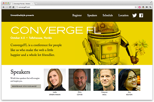
This is the same topic I’ll be speaking on — creativity and remixing existing matter — at ConvergeFL in Tallahassee, Florida (October 4–5).
September 14, 2012
“In closing. Not good.”
Brand New on the new eBay logo:
This logo is not bad. Let’s establish that. There is nothing wrong with it. The letters haven’t been mangled, the colors don’t induce puking, and the ™ is, amazingly, all lowercase to match the logo.
But this logo is not good either. Very far from good actually but unfortunately not so far that it demands the full berating it deserves. Of all the potential logos that could be done for eBay this is the absolute most boring and risk-averse logo that could have been both presented and selected.
As for what the logo might have been, even one that was visually “rooted in [their] proud history” perhaps better than the Lippincott-designed one? See Tony Gines’ 12-minute makeover.
August 20, 2012
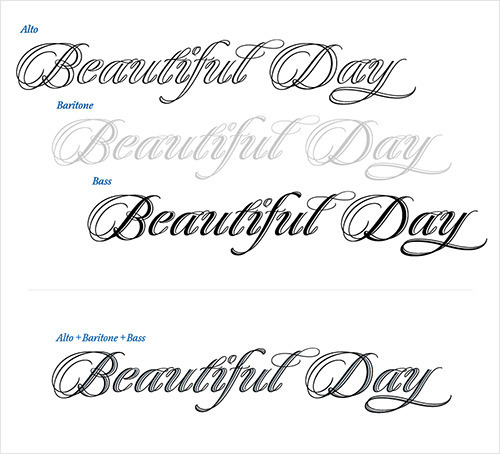
Quintet Type Family
Not available for purchase (yet), but I love the idea behind Kunihiko Okano’s Quintet type family: Weights are given choral names and can be combined as a chorus, or used individually.
August 17, 2012
“Goodbye, San Francisco.”
Noah Stokes, on moving away:
Don’t get me wrong, we left an awesome community of close friends. I left an amazing community of professionals (hello, gentlemen). I was in the heart of billion dollar, zero-revenue, businesses. Start-ups. Mash-ups. Money. Undeniably, the hub of all things web. But I gave all these things up for something more, something real. For the past three weeks I’ve been working on the web, but I’m no longer in the web. It feels awesome.
Honestly, this is a beautifully written piece. For many of the same reasons as Noah’s, I passed up a chance to work at Apple and now live in a retirement town laden with the elderly, tourists, a gorgeous beach, nearly devoid of a web community. In the end, it’s the right place for our family — not just my career.
It’s also worth noting I spent most of my youth in Antioch, northeast of San Francisco. Noah’s article hits home even harder as that comes to mind.
August 15, 2012
GRID for iOS
GRID bills itself as a “remarkable spreadsheet”. It looks nothing like a spreadsheet. It does look rather remarkable.
Reminds me of the now (somewhat) defunct Backpack and its unconventional approach to organizing data when it launched 7 years ago.
/via @unmatchedstyle
August 14, 2012
Screen-optimized fonts “look cheap on the retina MacBook Pro.”
Fonts optimized for screen rendering look cheap on the retina MacBook Pro — sometimes downright cheesy — in the same way they do when printed in a glossy magazine.
Great fonts, intricately designed for high-resolution output, aren’t just allowed, they are necessary for a design that truly sings on this display. In fact, if anything falls down on the software side, it’s Lucida Grande, Mac OS X’s system font. It was a stellar choice by Apple in 2001 and has served ably for more than a decade, primarily because it renders so crisply through Apple’s anti-aliasing algorithms. In short, Lucida Grande renders better than most fonts on pre-retina displays. But on the retina MacBook Pro, it looks like what it is: a font optimized for low-resolution displays. There’s a reason you seldom see Lucida Grande used in print.
Curious to know if this sentiment extends beyond the Lucidas and Verdanas to include webfonts, too. If it does, I worry we might see the type industry do an about-face with all the webfont optimization that’s taken place the last few years — just as it was beginning to hit critical mass.
(I don’t own a retina MBP and would love to hear your opinion over on the Twitter.)
August 9, 2012
“Never use black.”
When you put pure black next to a set of meticulously picked colors, the black overpowers everything else. It stands out because it’s not natural. All of the ‘black’ everyday objects around you have some amount of light bouncing off of them, which means they aren’t black, they’re dark gray. And that light probably has a tint to it, so they’re not even dark gray, they’re colored-dark gray….
Bottom line is: when you find #000000 in your color picker, ask yourself if you really want pure black. You’re probably better off with something more natural. And if you’re feeling adventurous, try staying away from the left edge of the color picker altogether.
This is one of those things experienced web designers do without thought, whereas newcomers tend to choose blacks at the absolute end of the spectrum. You’ll notice the type on this site, for example, isn’t #000—it’s #222. Background colors in light-on-dark designs, such as DesignersMX, are also a shade or two above pure black.
Sage advice.
July 26, 2012
Speaking: D.C., S.F., Dallas, Tallahassee
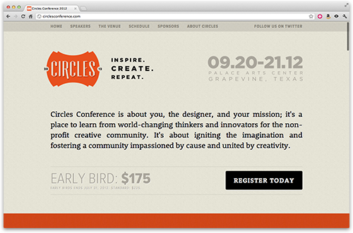
September 20–21: Circles Conference, Dallas | @circlesconf
$175 (early bird special ends July 31)
Authentic Jobs + charity: water
I’ll give an inside look at what it’s like to run a for-profit company that rallies its customers and users to support a non-profit organization, and how others can do the same.
September 27–29: HOW Interactive, Washington D.C.
October 29–31: HOW Interactive, San Francisco | @howinteractive
$995 (early bird special ends August 15)
Tools for Building Your Interactive Dream Team
Insight and advice from successful companies, and stories and observations from my 13-year career in the web industry. Come prepared to take plenty of notes.
October 4–5: Converge Florida, Tallahasse | @convergese
$200 (registration begins August 1)
The Burden of Creativity
We’ve all been endowed with the ability to create. So why is it such a challenge? I’ll answer this question with a math equation, naturally (wink). I’ll also live sketch my presentation.
July 25, 2012
“Good design is invisible.”
Oliver Reichenstein, in an interview with The Verge:
Good screen design happens in the subatomic level of microtypography (the exact definition of a typeface), the invisible grid of macrotypography (how the typeface is used), and the invisible world of interaction design and information architecture. Minimum input, maximum output, with minimal conscious thought is what screen designers focus on.
July 24, 2012
Martin Scorsese, Siri, iPhone.
Cameron Moll's Blog
- Cameron Moll's profile
- 4 followers


