
Aaron Gustafson's Blog, page 14
December 19, 2013
Looking Back on 2013
Jeez Louise, 2013 is almost over?! Time for the requisite holiday update and well-wishes. (Mom was right when she said time goes faster and faster as you age!)
Part of the reason this year went by so fast for us was that we were just plain busy. Sure, we had a ton of client work (many thanks to a good number of you for that) and lots of conferences & workshops to keep us busy, but we also had a few new developments as well:

@webcraftsman joined the Easy family
After 6 months of searching and interviews, Jeff Bridgforth joined our team in January. He came to us from Bonnier, where he built websites for Popular Science, Popular Photography, Saveur, and Parenting. He and his family relocated to Chattanooga from Orlando over the summer and they've settled in nicely.
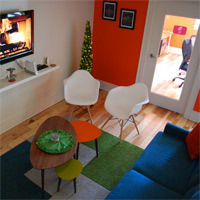
New home away from home
In March we bought an office in Chattanooga’s Southside neighborhood and the renovation of the space was a project and a half. We did the CAD drawings, lighting and electrical diagrams, interior design, and such—pretty much everything but the build-out (many thanks to Haskel Sears & team for their skills in that area). We've settled in and think the results are pretty awesome. I got to stretch her design legs on this project, picking out the colors, furniture, rugs, and flooring. I’ll be posting details chronicling the process on our blog in the coming year, so if you’re into mid-century modern design, keep an eye out for those.
AWD en français
In May, almost 2 years to the day after it’s original launch, Aaron's book Adaptive Web Design was released in France by Pearson. Incroyable!

New talk series
In August we launched a new talk series called Code & Creativity. The free, bimonthly series features two speakers, one from Chattanooga and one from elsewhere. We started the series to create a casual venue to bring Chattanooga’s diverse design and development community together, celebrate local talent, and provide access to amazing presenters. The response has been phenomenal and we are quite thankful for the amazing speakers we’ve had so far: Nicholas Zakas, Jason Griffey, Jenn Lukas, Daniel Ryan, Kate Kiefer Lee, and Nate Hill. We’ve already begun booking our 2014 dates and the line-up looks to be impressive. Check out codeandcreativity.com for more information.

New community resource
And finally, we've opened up a portion of our new office to house the Chattanooga Open Device Lab. The CHA-ODL is a community resource that is freely available to area designers and developers working on the web or developing apps. We currently house over 40 different devices ranging from feature phones and smartphones to gaming systems, laptops, and tablets. We’re very excited to be able to share the resources we have to help others in the community, and look forward to seeing how the lab grows. We're offering regular hours starting in 2014. If you're interested in booking some time in the lab, visit chadevicelab.org.
As you can see, it’s been a whirlwind of a year for us and we’re very thankful for the support of our clients and community that has helped us to grow and empowered us to continue giving back to the design & web community. We wish you and yours a wonderful holiday season, and we hope to spend some time with you in the new year!
Cheers,
Kelly & the Easy Team


September 16, 2013
Zoom Layouts v2
Some of you might find it hard to believe, but I began working with adaptive layouts way back in 2005. I was working on project for the Connecticut Department of Transportation and my primary design made heavy use of fixed positioning and white space. Sadly this is the only screenshot I have of the now-defunct project:
The layout really started to break down on smaller screens—we had quite a few 800x600 monitors to deal with back in the day—so, inspired by Joe Clark’s A List Apart article “Big, Stark & Chunky,” I created an alternate stylesheet that rearranged the page layout, enlarged the text, and improved the reading experience. Sadly, I don’t have a screenshot of what that looked like, but here’s a decent approximation (sans background images), courtesy of the Wayback Machine:

We didn’t have media queries in those days, so I relied on JavaScript to do the stylesheet switching. It was pretty good work for the time, but I see a ton of things I would do differently if I had the opportunity to revisit it.
So why am I bringing this up? Well, I remembered Joe’s article the other day and was thinking about how relevant it is in this, the age of responsive design. I think the idea of high-contrast zoom layouts is incredibly useful, but not just for mobile. When you start to think about the other end of the spectrum—giant high-definition televisions sitting 8-10 feet from your face—zoom layouts become really useful again.
To that end, I have been thinking quite a bit about the viewport-based units available to us in modern browsers and how we can use them to create automated zoom layouts by simply increasing the font size of the body element. Consider this bit of code:
1 2 3 4 5 @media screen and (min-width: 64em) { body { font-size: 1.5625vw; }} view raw zoom-layouts-v2.css hosted with ❤ by GitHub
This tiny bit of CSS can ensure that the entire layout is proportionately scaled up based on the screen size being used to access it. To figure out how this bit of code would fit best into your own work, use this formula (replace “X” with your max width size in ems):
1 2 3 4 5 @media screen and (min-width: X) { body { font-size: ( ( 1em / X ) * 100 )vw; }} view raw zoom-layouts-v2-formula.txt hosted with ❤ by GitHub
The site I developed this technique for is not live yet, so I threw together a simple demo on Codepen. Note: Chrome currently requires a forced repaint on window resize to make it shrink or enlarge the layout. Hopefully that bug will be fixed soon.
I’m still feeling my way around this technique, but I am intrigued by the possibilities it holds. What do you think?

August 20, 2013
Code & Creativity is Coming!
Chattanooga is brimming with smart (dare we say, brilliant) designers and developers. Unfortunately, we don't come together to share our knowledge and our passions as much as we could. Until now, that is!
Code & Creativity is a social talk series created to connect us with each other and our larger community. Every other month, we’ll gather at the Camp House for a few hours to listen to one local and one visiting designer/developer as they share their passions, wisdom, and war stories. We'll ask questions, talk shop, and maybe even make some new friends. Of course no gathering would be complete without something yummy in your tummy, so snacks and a tasty beverage (coffee, soft drink, or beer) are on us!
Our first speakers could only be nicer if they gave away free legos at every talk! The line-up starts with UTC’s Head of Library IT Jason Griffey, who will kick off the evening with a brief talk about the LibraryBox Project and the ups and downs of a successful Kickstarter campaign. Following Jason, Nicholas Zakas—the acclaimed author and JavaScript guru with a pedigree that includes VistaPrint, Yahoo!, and Box—will be taking the stage to deliver the headlining talk “Enough with the JavaScript Already.” (You can find their bios and full talk descriptions below. Disclaimer: Legos not included.)
We’re still working to fill in the next year’s worth of programming. You won't want to miss a single one, we promise.
Enough With The JavaScript Already!

One of the biggest performance issues facing websites today is the sheer amount of JavaScript needed to power the page. The demand for more interactive and responsive applications has driven JavaScript usage through the roof, and it’s common for large sites to end up with more than 1 MB of JavaScript per page even after minification. But do we really need that much JavaScript?
Putting several large websites under the microscope, Nicholas will work his magic and show just how little of that JavaScript is actually necessary. He’ll also discuss JavaScript library design and how some flawed patterns contribute to code bloat and unnecessary memory usage, ultimately wrestling with the dilemma: is it better to write the component yourself rather than using an off-the-shelf one?
Nicholas C. Zakas is a staff software engineer at Box in beautiful Los Altos, a well-known author, and speaker. He was the front-end tech lead for the Yahoo! homepage and a contributor to the YUI library. He’s written several books, the most recent of which is Maintainable JavaScript (O’Reilly, 2012). Nicholas is a strong advocate for development best practices including progressive enhancement, accessibility, performance, scalability, and maintainability. He blogs regularly at nczonline.net and can be found on Twitter as @slicknet.
Lessons from LibraryBox

Jason Griffey will talk about his current passion: the LibraryBox Project, an open source wifi file sharing device that recently had its v2.0 funded on Kickstarter to the tune of $33,000. He will discuss the genesis of the project, his ongoing goals for v2.0, and why receiving 1000% of his funding goals via Kickstarter keeps him up at night.
Jason Griffey is an Associate Professor and Head of Library Information Technology at the University of Tennessee at Chattanooga. His latest book, Mobile Technology and Libraries, is available as a part of the award winning Neal Schuman’s Tech Set. He was named a Library Journal Mover & Shaker in 2009, and speaks internationally on the future of libraries, mobile technology, eBooks, and other technology related issues. You can find him at jasongriffey.net and on the ALA Techsource blog. Jason spends his free time with his daughter Eliza, reading, obsessing over gadgets, and preparing for the inevitable zombie uprising.

August 12, 2013
Study: Over 90% of Newspaper Reading is in Print
A recent study in of the UK came to the conclusion that over 90% of newspaper reading is still taking place in print. Their findings are based on a survey of 12 UK newspapers during the period of 2007–2011, examining National Readership Survey data, circulation audits from the Audit Bureau of Circulations, and Neilsen data regarding web-based engagement.
In reviewing their domestic readership, comparing time spent reading online versus time spent reading print editions, the study found that 96.7% of reading time was spent with the print edition. Of course the “quality” of said publications varied greatly and that sad figure was even sadder for some online editions: Readers of “tabloid” newspapers spent, on average, a depressing 1.16% of their time reading the paper online. On the flip side, proper news outlets that are not behind a paywall saw 6.98% of their readership online. Paywalled online editions were all over the place: 4.1% for the Financial Times and only 0.83% for the Times.
I think the most interesting stat, however, was that the online reading of some of these publications actually declined over the study period. In fact, the Independent online readership went down 30.88% between 2007 and 2011.
Due to limitations of the data from the Audit Bureau of Circulations, the study was not able to include circulation data via apps and the meager data they could get was mostly self-reported and had to do mainly with page requests. They could not get data on reading time spent with the various newspapers’ apps.
Now granted, the data they used for the study is two years old at this point and some of the newspapers have redesigned their websites since this time, but the study got me wondering:
Is the reason online newspaper readership and engagement doesn’t compare to print because so many newspaper websites are cluttered and unreadable?
Is the lack of decent mobile web support a contributing factor?
How has the advent of media queries and responsive design changed the data since 2011?
Is there a correlation in the US and other newspaper markets as well? It seems all the stats we see show print declining here.
With Newsweek killing off its print version back in 2012 and many calls for Jeff Bezos to do the same with the Washington Post, is that a wise strategy?
Having come from a journalism background, I am incredibly interested in seeing where things go. I have mixed feelings about print versus digital. On one hand, I have not subscribed to a newspaper for as long as I can remember. I only read them occasionally while traveling; most of my reading takes place digitally (online or at least via online sources). On the other hand, I do see print editions as being some people’s only access to what is going on around them.
It will be interesting to see how this all shakes out.

August 1, 2013
The True Cost of Progressive Enhancement
When you’ve been evangelizing progressive enhancement for as long as we have, you invariably come across skeptics. Take this comment on Tim Kadlec’s recent (and well-argued) post about designing experiences that work without JavaScript:
This is all fine and dandy, but not very real world. A cost-benefit analysis has to happen – what does that next user/visitor cost, and more importantly earn you? This idealistic approach would leave most broke if they had to consider “every user” when building a site. That's why clothes come in small, medium, large, and extra large. Most of us have to buy them that way because not everyone can afford a tailor made suit, much less an entire wardrobe. Your approach only works for those who can see the return.
Tim’s response was dead-on:
I think that's where the difference between “support” and “optimization” comes into play. I'm certainly not saying to go out and buy every device under the sun, test on them, make sure things look and behave the same. You don't necessarily have to optimize for all these different devices and scenarios (that's where the cost-benefit analysis has to come in), but it's often not very time consuming to at least support them on some level.
Progressive enhancement can get you a long way towards accomplishing that goal. Sometimes it's as simple as doing something like “cutting the mustard” to exclude older devices and browsers that might choke on advanced JS from having to try and deal with that. The experience isn't the same, but if you've used progressive enhancement to make sure the markup is solid and not reliant on the JavaScript, it's at least something that is usable for them.
I’ve had similar conversations innumerable times in person, on conference calls, in blog comments, and (of course) on Twitter. Sometimes I can win the skeptics over with a well-reasoned philosophical argument, but often I need to start filling in numbers.
Each project is different, so I’m often reluctant to say “progressive enhancement costs X.” It’s also part-and-parcel of everything we do here at Easy, so it’s damned near impossible to say what a project would cost without progressive enhancement. That said, we’ve been doing this long enough to have a few stories worth sharing. Here are two anecdotes from real projects we’ve worked on.
Backing Off From the Bleeding Edge
Some time ago we built a Chrome app for WikiHow. As a Chrome app and a show-piece for the new app store, our client wanted it to have fancy CSS3 animations & transitions, web fonts, a WebDB “back-end”, offline support, and lots of other HTML5-y bells and whistles. And, as our target was a single browser, we relented when asked to go the single-page app route. The app was built to degrade gracefully (it blocked non-WebKit browsers), but it was not progressively enhanced.
Skip ahead about a year and our client returned to add support for Firefox and IE9+. Oh boy.
Having built the site purely for WebKit, it was a bit of the challenge. In addition to implementation differences with the experimental CSS features, we also had to deal with the DOM and JavaScript API variance among the browsers. But the single biggest issue we ran into was the lack of WebDB support in Firefox and IE. You see, in the intervening year, WebDB had been abandoned at the W3C because of pushback (primarily from Mozilla and Microsoft). It was not available in either Firefox or IE, nor would it ever be. And indexedDB, its replacement, had yet to be implemented in any production browser. So we ended up writing a wrapper on top of localStorage that looked a lot like SQL, which allowed us to avoid re-writing the bulk of the app. Coincidentally, it also made the app a lot faster.
The total cost of the new compatibility project was around 40% of the original budget required to build the app the first time around. Without access to an alternate timeline I can’t be certain, but my experience tells me it would have added less than 40% to the original project had we been given the leeway to build it using progressive enhancement. And the end result would have been even better because it would have been able to function without JavaScript.
Based on other conversations I’ve had with folks, the 40% number seems pretty accurate; possibly even a bit low. I remember a conversation I had six or seven years ago about Google Maps. When the team originally built Maps—in all of its Ajax-y glory—they didn’t make it very accessible and it required JavaScript. According to the source (who I have long forgotten), it took them almost twice as long to retrofit Maps than it would have taken had they built it following progressive enhancement from the ground up. As it’s purely anecdotal, you should take that with a grain of salt, but it’s food for thought.
Switching gears, let me share a success story around building things the right way.
Smart Code, Dumb Phones
In early 2012 we began working with a client who was struggling with the security of their mobile apps. They had numerous native apps that all followed the common convention of using a web service to authenticate users. They are a very security-concious organization and this setup was creating a bottleneck in deploying new security features. In order to roll out any new authentication method, error state, etc. they had to go through an excrutiatingly long, painful, multi-step process:
Implement the new security feature,
Expose it via the web service,
Update each app to use the new web service (which might include UI changes, etc.),
Submit each app for approval, and finally
Hope their users downloaded the new version of the app.
They brought us in to re-imagine the authentication flow as a web-based process that would launch inside of each app and handle letting the app know if and when the user had successfully logged in. This approach meant they could roll out new security features immediately because the apps and the authentication flow would be very loosely coupled. It would be a huge win for everyone involved.
Despite the fact that the project was aimed at handling authentication for mobile apps on a few particular platforms, we built the screens following progressive enhancement. The layouts were responsive from tiny screens all the way up to large ones and we implemented HTML5 and JavaScript in completely unobtrusive ways in order to take advantage of cool new things like form validation while still keeping the file sizes small and ensuring the pages would function in the absence or either technology.
A few months after completing the project, our client came back to us with interest in rolling out the authentication flow to their m-dot users. They gave us a list of nearly 1400 unique User Agent strings that had been used on the login screen over a two-day period and asked if we could handle it. We parsed the list (with the help of a little script I cooked up) and were able to put together a more manageable list of aggregate devices and device types to use in our testing. It was something like 25 devices that would cover roughly 97% of the spectrum. We were comfortable assuming that fixing issues in 97% of the devices listed would likely also cover the other 3%, but were prepared to fix any additional issues if they cropped up.
Our budget for this project was about 33% of the budget of the original project.
Much to our surprise, when all was said and done, we came in at roughly half of that budget in terms of actual hours spent and we completed the project in about half the time we expected. It was awesome for us because we saved our client money, which made us look good. It was awesome for our client too, because they were able to save serious money on a project (which rarely happens in the corporate world, at least in my experience).
It’s worth noting that this accomplishment had nothing to do with our bug-squashing prowess or our speed… progressive enhancement just works. We were dealing with some heinous old browsers too—think Blackberry 4 and OpenWave—and they really didn’t present much of a challenge. So, for a very modest sum, we were able to quickly roll out additional support for over 1000 devices (and probably thousands more that didn’t make the list) and that created a huge opportunity for our client to attract and retain new customers.
Lessons Learned
We’ve been practicing the art of progressive enhancement for a long time. It’s deeply-ingrained in our process and part of who we are as a company. That often makes it difficult for us to put hard numbers against the cost of not doing progressive enhancement and the financial savings of doing things the way we almost always do. Hopefully, these two small case studies help illuminiate things a bit for those who may still be a bit skeptical.
Do you have any case studies or anecdotes you can share? We'd love to hear them.

Should All Sites Be Responsive?
If I had a kitten for every time we've been asked “Does my site need to be responsive?” I would be that crazy cat lady that lives down the street.
But, seriously, Aaron captured our thoughts on it perfectly in a recent interview in .net:
I think all sites should be capable of adapting to whatever device is being used to access them. To me it’s about offering good customer service and not forcibly ejecting someone from your website (or making them endure a crappy experience) because they happen to be using a browser you don’t like or didn’t bother testing. That’s why we at Easy Designs follow the philosophy of progressive enhancement. And mobile-first, responsive web design is a great tool in the progressive enhancement tool chest.
You can read other musings on the subject from Aaron (as well as from our friends Brad Frost and Tim Kadlec) over on .net.
July 22, 2013
JAIL-ing images in ExpressionEngine
A while back I came across a link to Sebastiano Armeli-Battana’s jQuery Asynchronous Image Loader (JAIL) and filed it away to revisit when I had some time. I finally made some time this weekend.
JAIL’s a cool little script that takes care of lazy loading images for you in order to speed up initial page rendering. To use it, you implement the following markup pattern:
1 2 3 4 [image error] class="jail" src="http://blog.easy-designs.net/archives..." data-src="http://blog.easy-designs.net/archives..." alt=""/> [image error] src="http://blog.easy-designs.net/archives..." alt=""/> view raw jail-markup.html This Gist brought to you by GitHub.
This is pretty ingenious actually. Without JS, the actual image is served up, but with JavaScript, the blank image is displayed until JAIL lazy loads the real image path stored in the data-src attribute. You initialize JAIL like this:
1 2 3 $(function(){ $('img.jail').jail();}); view raw jail-init.js This Gist brought to you by GitHub.
Simple, right? Well, yes and no.
On a site that isn’t updated frequently and where a skilled front-end coder is involved, this is cake. That, however, is seldom the reality. Heck, even on this blog, remembering to use that pattern while authoring content in the backend is not terribly likely. I needed a way to make it easier. So I automated JAIL as an ExpressionEngine plug-in.
With this plug-in I can automatically enable (or remove) JAIL at the template level with a simple tag pair: exp:easy_jail:prep
1 2 3 {exp:easy_jail:prep} {body}{/exp:easy_jail:prep} view raw easy-jail-tag.html This Gist brought to you by GitHub.
The plugin will hunt for any image elements inside the tag pair and convert them to use the JAIL markup pattern. By default, it uses a base-64 encoded representation of a blank GIF (a.k.a. a Data URI) to reduce the number of requests, but you can override that with the path to your own image (or a different Data URI) using the blank_img property. You can also customize the class used for the blank image using the class_name property.
1 2 3 {exp:easy_jail:prep blank_img="/i/blank.gif" class_name="my_class"} {body}{/exp:easy_jail:prep} view raw easy-jail-custom-tag.html This Gist brought to you by GitHub.
Then it’s just a matter of including the JAIL JavaScript code and executing it. You can, of course, include Sebastiano’s script and your JAIL config in your own JavaScript build, but the plug-in also includes a convenience function to drop it in for you. Simply add the exp:easy_jail:js tag before the close of the body element (after jQuery of course):
1 2 3 src="http://blog.easy-designs.net//ajax.go... || document.write(''){exp:easy_jail:js} view raw easy-jail-script.html This Gist brought to you by GitHub.
As with the exp:easy_jail:prep tag, you can customize the JavaScript output using the class_name property to tell JAIL what to lazy load. You can also customize the JAIL configuraiton using the config property. Just pass in a valid JSON object describing the configuration you want. JAIL is pretty darn configurable. There are a ton of options available, but the most intriguing to me currently is offset. We’re using it here on the blog to load images when you scroll to within 300px of the top of the image. Here’s how you’d do that using the plug-in:
1 2 3 src="http://blog.easy-designs.net//ajax.go... || document.write(''){exp:easy_jail:js config="{offset:300"} view raw easy-jail-custom-script.html This Gist brought to you by GitHub.
And there you have it. Simple, lazy loaded images without having to train content editors to author the relatively complex markup pattern. If you want to have a play, feel free to grab the code from Github or you can fork it and help us to make it even more useful.

July 17, 2013
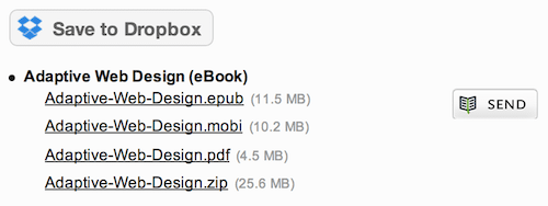
Download AWD direct to Dropbox
If you’ve ordered a digital copy of Aaron’s book, Adaptive Web Design, you can now send it directly to your Dropbox account from the download page. This should simplify loading it on your favorite mobile device, assuming you you aren’t reading it in Readmill already. (You did know we have a Send to Readmill button, right?)

July 15, 2013
Designing with Empathy at #btconf
A little over a month ago I had the pleasure of speaking at Beyond Tellerrand in Düsseldorf, Germany. It was my second time speaking (and attending) the conference and I can honestly say it’s easily one of my favorites. Marc Thiele does an amazing job organizing the event and the speaker roster was nothing short of amazing.
In an effort to continue spreading my wings beyond talking about code, I delivered a talk about empathy. Empathy is something I’ve written about here before both explicitly and as an underlying motivation for progressive enhancement and overall usability. Empathy is something I feel we need deperately in our lives and especially in our work—empathy for both our users and our co-workers.
Anyway, Marc was kind enough to record the talk. Let me know what you think.
Video of my talk “Designing with Empathy” from Beyond Tellerrand
Slides from “Designing with Empathy” as delivered at Beyond Tellerrand

July 10, 2013
Evernote for Interface Inventories
Earlier today, Brad Frost posted a great piece touting the usefulness of interface inventories. I’ll give him the floor to explain:
An interface inventory is similar to a content inventory, only instead of sifting through and categorizing content, you’re taking stock and categorizing the components making up your website, app, intranet, hoobadyboop, or whatever (it doesn’t matter). An interface inventory is a comprehensive collection of the bits and pieces that make up your interface.
Interface inventories are a great way to take stock of the design consistency (or inconsistency) of your site and are a typical first step in creating a pattern library. After all, you need to know what patterns you have before you can document them.
In his article, Brad offers a Keynote template for gathering your screenshots, but I have been living in Evernote lately, so I wanted to take a moment to show off how you might use Evernote’s tools to simplify the process of building an interface inventory. If you don’t have an Evernote account, you can get a free one here.
One method of getting screenshots into Evernote is using Skitch. Skitch was originally developed by plasq, but was acquired by Evernote in 2011. It is a general purpose screenshotting tool that supports annotations, etc.
Here’s a quick run-down on how to use Skitch to build your interface inventory:
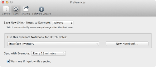
Step 1: Create a new Notebook for your interface inventory and adjust the Skitch preferences so it uses it.
Step 2: Click the “Screen Snap” button and adjust the crop tool to contain the interface object you want to capture.
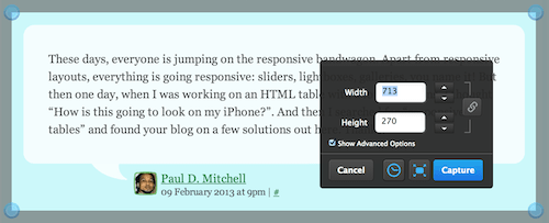 Position your crosshairs and…
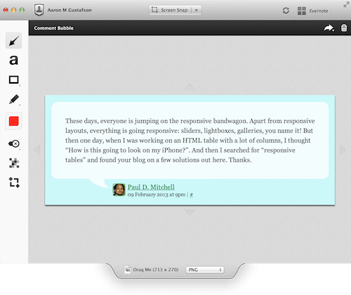 …your snap is captured in Skitch
Step 3: Rinse & repeat.
When Skitch syncs up to Evernote, your screenshots will magically appear on any device you have.
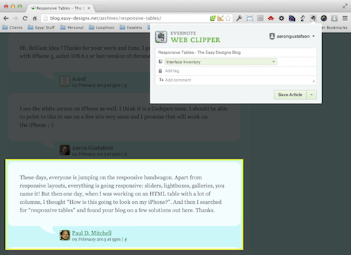
Another route to go involves the Evernote Web Clipper. This add-on is available for pretty much every browser and is available as a bookmarklet to boot.
Using the Web Clipper is every bit as simple as it is with Skitch. Possibly moreso. One bonus is that you have the benefit of being able to direct your individual clips to different notebooks within Evernote. Simply click the Web Clipper button, select the area to clip, and choose where you want the clip to go. You can even add any tags you might find useful.
Either way you go, you will eventually end up with a nice little collection of interface artifacts in Evernote which are, in turn, available on the web and on any device where you have Evernote installed.
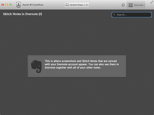
 All your interface are belong to us.
The nice thing about using a tool like Evernote for creating an interface inventory is that you can share this notebook with your colleagues to speed up the documentation. Simply divide up your interface into categories and go on a scavenger hunt. All of the snaps will sync to the same place and become a part of your interface inventory. Done and done.
Happy snapping!


