
Aaron Gustafson's Blog, page 12
November 2, 2016
Mac-like Special Characters in Windows
I am a bit of a geek for proper punctuation: Em dashes��� en dashes��� curly quotes��� ellipses��� I love them all! Prior to 2007, I was a long-time Windows user and was a master of the Alt numeric code system of entering special characters on that operating system.1 For nearly a decade, however, I���ve been writing and developing on a Mac and I absolutely love how much easier it is to use special characters. When I started setting up my new Surface Book, I began searching for a way to bring Mac-like special character entry to Windows 10.
Disclaimer: I take absolutely no credit for the code you see below. I will give full credit to the sources as I discuss each. I just wanted to bring it all into one place so it���ll save you a few hours of research to get everything working.
Step 1: Set up AutoHotKey
David Nagel���s solid article on mapping keystrokes in Windows, I introduced me to AutoHotKey. It���s an incredibly powerful program that���s like the lovechild of TextExpander and Quicksilver.
In his article, David walks through the process of getting set up with AutoHotKey:
Download & install it.
Create a new .ahk file (New > AutoHotKey Script in Windows Explorer) and name it whatever you like.2
Right-click the script, and choose Edit Script from the context menu.
Enter some keyboard shortcuts (more on that in a moment).
Save the script. I chose to save it to Dropbox to make it portable.
Double click it to run the script.
Open up your favorite writing tool and see your handiwork in action.
Step 2: Create some shortcuts
AutoHotKey is completely scriptable and adding shortcuts is relatively straightforward. There are a few reserved characters, but once you understand what they are it���s pretty easy to get going very quickly. Here���s Dave���s intro example:
!-::���
! -::���
view raw
sample.ahk
hosted with ❤ by GitHub
In AutoHotKey scripting, ���!��� stands in for Alt and ��� ��� stands in for Shift. So, to translate:
Alt - will produce an en dash (���)
Shift Alt - will produce an em dash (���)
With these two examples, I was able to jump right in and map many of the most common shortcuts I use while writing. Before I got too far, however, I realized I really needed accents, umlauts, and the like. I searched some more and eventually discovered a post in the AutoHotKey forum archive by ���Veil��� from way back in 2008.
Veil broke his solution into two parts, but I���ve combined them here to make it easier for your to copy into your AutoHotKey script file. This code has provided everything I���ve needed so far, so Veil���wherever you are���thank you!
#UseHook
!VKC0SC029::Return ; grave -> the grave ` accent gave some probs, used the virtualkey scancode instead
!e::Return ; acute
!i::Return ; circumflex
!t::Return ; tilde
!u::Return ; umlaut
; 1 2 3 4 5 6 7 8 9 1
; 0
; r g G a A c C t T u U
*a::diacritic("a","��,��,��,��,��,��,��,��,��,��")
*e::diacritic("e","��,��,��,��,��,��,e,E,��,��")
*i::diacritic("i","��,��,��,��,��,��,i,I,��,��")
*o::diacritic("o","��,��,��,��,��,��,��,��,��,��")
*u::diacritic("u","��,��,��,��,��,��,u,U,��,��")
*n::diacritic("n","n,N,n,N,n,N,��,��,n,N")
*y::diacritic("y","y,Y,y,Y,y,Y,y,Y,��,��")
diacritic(regular,accentedCharacters) {
StringSplit, char, accentedCharacters, `,
graveOption := char1
graveShiftOption := char2
acuteOption := char3
acuteShiftOption := char4
circumflexOption := char5
circumflexShiftOption := char6
tildeOption := char7
tildeShiftOption := char8
umlautOption := char9
umlautShiftOption := char10
if (A_PriorHotKey = "!VKC0SC029" && A_TimeSincePriorHotkey < 2000) {
if (GetKeyState("Shift")) {
SendInput % graveShiftOption
} else {
SendInput % graveOption
}
} else if (A_PriorHotKey = "!e" && A_TimeSincePriorHotkey < 2000) {
if (GetKeyState("Shift")) {
SendInput % acuteShiftOption
} else {
SendInput % acuteOption
}
} else if (A_PriorHotKey = "!i" && A_TimeSincePriorHotkey < 2000) {
if (GetKeyState("Shift")) {
SendInput % circumflexShiftOption
} else {
SendInput % circumflexOption
}
} else if (A_PriorHotKey = "!t" && A_TimeSincePriorHotkey < 2000) {
if (GetKeyState("Shift")) {
SendInput % tildeShiftOption
} else {
SendInput % tildeOption
}
} else if (A_PriorHotKey = "!u" && A_TimeSincePriorHotkey < 2000) {
if (GetKeyState("Shift")) {
SendInput % umlautShiftOption
} else {
SendInput % umlautOption
}
} else {
if (GetKeyState("Shift") or GetKeyState("Capslock","T")) {
SendInput % " " regular
} else {
SendInput % regular
}
}
}
;
; Alt Shift key
;
*!1::altShift("��","/")
*!2::altShift("���","���")
*!3::altShift("��","���")
*!4::altShift("��","���")
*!5::altShift("8","fi")
*!6::altShift("��","fl")
*!7::altShift("��","���")
*!8::altShift("���","��")
*!9::altShift("��","��")
*!0::altShift("��","���")
*!a::altShift("��","��")
*!b::altShift("integral","i")
*!c::altShift("��","��")
*!d::altShift("partial difference","��")
*!e::altShift("��","���")
*!f::altShift("��","��")
*!g::altShift("��","��")
*!h::altShift("overdot","��")
*!i::altShift("^","��")
*!j::altShift("delta","��")
*!k::altShift("��","Apple")
*!l::altShift("��","��")
*!m::altShift("��","��")
*!n::altShift("~","��")
*!o::altShift("��","��")
*!p::altShift("pi","Pi")
*!q::altShift("��","��")
*!r::altShift("��","��")
*!s::altShift("��","��")
;*!t::altShift("���","��")
*!u::altShift("��","��")
*!v::altShift("v","lozenge")
*!w::altShift("epsilon","���")
*!x::altShift("approximately equal","��")
*!y::altShift("��","��")
*!z::altShift("Omega","��")
*!-::altShift("���","���")
*!=::altShift("!=","��")
*![::altShift("���","���")
*!]::altShift("���","���")
*!`;::altShift("���","��")
*!'::altShift("��","��")
*!\\::altShift("��","��")
*!,::altShift("","��")
*!.::altShift(">=","breve")
*!/::altShift("��","��")
altShift(accented,accentedShift) {
if (!GetKeyState("Shift")) {
SendInput % accented
} else {
SendInput % accentedShift
}
}
view raw
osx-special-chars.ahk
hosted with ❤ by GitHub
Step 3: Run your script when Windows starts
The last thing you���ll want to do is add your .ahk file to Windows��� startup items. Dave covered that in his piece as well:
Create a shortcut to your file (Right click > Create Shortcut)
Run shell:startup (��� Win R opens the Run dialog or you can type ���Run��� in the Cortana Search Box)
Move your shortcut to the folder that opens.
Once you���ve followed those steps, you���re done. You can update your .ahk scripts needed and just double click it to replace the instance that���s currently running.
If, like me (and Dave and Jonathan and Dan), you���re using Windows after a long time in Mac land and you���re a typography nerd, hopefully you���ll find this helpful. And if you come up with any improvements to the character mapping, please share!
I actually memorized a ton of the codes, much to my amazement. I still remember a few, but I am thankful to have reclaimed a bit of that memory space over the last few years. ↩
If you shun the mouse, you can create a text file in your favorite editor and name it with the .ahk extension, but you might run into character encoding issues. I created mine in VS Code as UTF-8, but had to open the file in Notepad and re-save it again to get it to actually work. I never figured out the exact issue, but I thought I���d give you a heads-up. ↩


October 25, 2016
One Person���s Bloat���
The Web Bloat Score Calculator has been making the rounds on Twitter and I wanted to share my immediate thoughts on it.
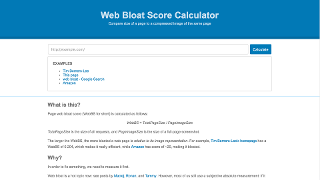
First off, I am a big fan of simple tools that provide an often much-needed reality check on a project. Based squarely on its simplicity, I���d put this tool right up there alongside WebPageTest and What Does My Site Cost?. The Web Bloat Score (or WebBS��� clever) Calculator is about as simple an interface as you can get: Enter a URL & hit the ���Calculate��� button.
When you do this, the service runs two tasks:
Load the URL and all of its assets, calculating a total page weight and chronicling the number of requests required to get there; and
Generate a static screen capture of the page and then grab its file size.
Once it has these two bits of info, it compares the real file size of the tested page against the image version to come up with your WebBS.
I ran the calculator against the 10k Apart contest homepage and here are the results:
URL
Page Size
Requests
Image Size
WebBS
https://a-k-apart.com/
200 kB
49
195 kB
1.03
Not too bad, considering the number of images on the page and the interactivity of the SVG. In the documentation about the tool, they have this to say about a high WebBS:
A high WebBS usually indicates unused stuff on the page: JavaScript, CSS, oversized images, etc. Maybe you have a valid reason for that content. But more often than not, it means you can optimize it more.
I completely agree with the sentiment here: smaller is better and if there���s a huge discrepancy between the file size of an image of your page and the page itself, there may be something not so awesome going on behind the scenes. They reference Amazon as being particularly bad, with a WebBS of 20 (I got 12.3 in my test, but Amazon frequently changes their homepage).
There���s always room for improvement when it comes to optimization, but I also worry about folks getting too hung up on numbers like this, especially striving for a score of 1 or less. Here are a few legitimate reasons your score may be more than 1:
Your page is heavily interactive. The calculator does not take into account any sort of interactivity���progressively enhanced or not���nor does it tell you how well-optimized your JavaScript code is. There���s also the possibility that you���ve consciously decided to trade verbosity for speed. For large loops, for instance, Duff���s device is much faster but a lot more verbose than a normal for loop.
Your page serves alternate file formats. The tool runs SlimerJS to collect the performance data and, for instance, it doesn���t currently support WebP images. We serve WebP with a JPG or PNG fallback on the 10k Apart site (using picture), but the file log doesn���t include the WebP images at all.
You make use of micro-optimizations. Perhaps you use loadCSS or loadJS or split your CSS into a default and advanced stylesheet (with the advanced one only loading if media queries are supported). Perhaps you lazy load images or fonts via JavaScript. Perhaps you only load certain assets or scripts based on browser capabilities. The calculator takes none of this into account.
These are just three reasons to take your WebBS with a grain of salt. It���s good for a gut-check, but I wouldn���t spend a whole lot of time worrying about getting your score at or below 1.
October 17, 2016
Progressive Misconceptions
Last week, my colleague1 Nolan Lawson wrote a lengthy post about his struggles with progressive enhancement. In it, he identified a key tension between the JavaScript community and the progressive enhancement community that has, frankly, existed since the term ���progressive enhancement��� was coined some 13 years ago. I wanted to take a few minutes to tuck into that tension and assure Nolan and other folks within the JS community that neither progressive enhancement nor the folks who advocate it (like me) is at odds with them or their work.
But first let���s take a a trip back in time to 2003. In March of that year, Steve Champion introduced a concept he called ���progressive enhancement���. It caused a bit of an upheaval at the time because it challenged the dominant philosophy of graceful degradation. Just so we���re all on the same page, I���ll compare these two philosophies.
What���s graceful degradation?
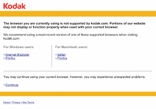
Graceful degradation assumes that an experience is going to be worse on older, less capable browsers and devices. To address potential problems, it recommends that developers take steps to avoid throwing errors���JavaScript or otherwise���for their users. Under this philosophy, egregious errors may be addressed or a developer may chose to block certain browsers from accessing the content if they are known to have problems with it. We saw this often with Flash-only sites, but it wasn���t limited to them. I used this ���roadblock��� example from Kodak.com in my book:
Overall, graceful degradation is about risk avoidance. The problem was that it created a climate on the Web where we, as developers, were actively denying access to services (e.g., people���s bank accounts) because we deemed a particular browser (or browsers) too difficult to work with. Or, in many cases, we just didn���t have the time or budget (or both) to address the broadest number of browsers. It���s kind of hard to reconcile the challenge of cross-browser development in 2003 with what we are faced with today as we were only really dealing with 2-3 browsers back then, but you need to remember that standards support was far worse at the time.
So what���s progressive enhancement?
In his talk, Steve upended the generally shared perspective that older browsers deserved a worse experience because they were less technically capable. He asked us to look beyond the browsers and the technologies in play and focus on the user experience, challenging us to design inclusive experiences that would work in the broadest of scenarios. He asked that we focus on the content and core tasks in a given interface and then enhance the experience when we could. We accomplish this by layering experiences on top of one another, hence ���progressive enhancement���.
To give a simple example, consider a form field for entering your email address. If we were to mark it up like this
I automatically create layers of experience with no extra effort:
Browsers that don���t understand ���email��� as a valid input type will treat the ���email��� text as a typo in my HTML (like when you type ���rdio��� instead of ���radio������ or maybe I���m the only one that does that). As a result, they will fall back to the default input type of ���text���, which is usable in every browser that supports HTML2 and up.
Browsers that consider ���email��� a valid input type will provide one (or more) of many potential enhanced experiences:
In a virtual keyboard context, the browser may present a keyboard that is tailored toward quickly entering email addresses.
In a browser that supports auto-completion, it may use this as a cue to suggest entering a commonly-entered email or one that has been stored in the user���s profile.
In a browser that supports HTML5 validation, the browser may validate this field for proper email formatting when the user attempts to submit the form.
In a browser that does not support HTML5 validation (or that doesn���t actively block submission on validation errors [as Safari currently doesn't](https://bugs.webkit.org/show_bug.cgi?...)), a developer-supplied JavaScript program may use the `type` attribute as a signal that it should validate the field for proper email address formatting.
That means that there are between 5 and 13 potential experiences (given all of the different possible combinations of these layers) in this one single single element��� it���s kind of mind-boggling to think about, right? And the clincher here is that any of these experiences can be a good experience. Heck for nearly 15 years of the Web, the plain-ol��� text input was the only way we had for entering an email address. Anything better than that is gravy.
Progressive enhancement embraces the idea of experience as a continuum rather than some singular ideal. It recognizes that every person is different and we all have special requirements for Web access. Some may depend on our browser, the device we���re on, and the network we are using. Others may be the result of a limitation we have dealt with since birth, are dealing with temporarily as the result of an injury or incident, or are simply a factor of our current situation. We all experience the world differently and progressive enhancement not only respects that, it embraces that variability.
How does it do this? Progressive enhancement takes advantage of the fault tolerant nature of HTML and CSS. It also uses JavaScript���s own ability to test for browser features to tailor programmatic enhancements to the given device and situation. That���s right: progressive enhancement and JavaScript go hand-in-hand.
Why are so many JavaScript folks hostile to progressive enhancement?
As a member of the JavaScript community for over a decade now, I have theory for why many JavaScript developers are so antagonistic toward progressive enhancement. Part of it has to do with history and part of it has to do with programming culture. Let���s tackle the history first.
When progressive enhancement was first proposed, the Web was getting more standardized, but things were still a bit of a mess��� especially in the JavaScript world. Many JavaScript programs were poorly-written, contained lots of browser-specific code, and were generally unfriendly to anyone who fell outside of the relatively narrow band of ���normal��� Web use��� like screen reader users, for example. It���s not surprising though: Graceful degradation was the name of the game at the time.
Because JavaScript programs were creating barriers for users who just wanted to read news articles, access public services, and check their bank accounts, many accessibility advocates recommended that these folks disable JavaScript in their browsers. By turning off JavaScript, the theory went, users would get clean and clear access to the content and tasks they were using the Web for. Of course that was in the days before Ajax, but I digress.
This recommendation served as a bit of a wake-up call for many JavaScript developers who had not considered alternate browsing experiences. Some chose to write it off and continued doing their own thing. Others, however, accepted the challenge of making JavaScript more friendly to the folks who relied on assistive technologies (AT). Many even went on to write code that actually improved the experience specifically for folks who are AT-dependent. Dojo and YUI, though sadly out of favor these days, were two massive libraries that prioritized accessibility. In fact, I���d go so far as to say they ushered in a period of alignment between JavaScript and accessibility.
Even though JavaScript and accessibility are no longer at odds (and really haven���t been for the better part of a decade), there are still some folks who believe they are. People routinely come across old articles that talk about JavaScript being inaccessible and they turn around and unfairly demonize JavaScript developers as unsympathetic toward folks who rely on screen readers or other AT. It���s no wonder that some JavaScript developers become immediately defensive when the subject of accessibility comes up��� especially if it���s not something they���re all that familiar with.
I also mentioned that programming culture plays a part in the antagonistic relationship between the progressive enhancement camp and the JavaScript community. If you���ve been a programmer for any amount of time, you���ve probably borne witness to the constant finger-pointing, belittling, and arrogance when it come to the languages we choose to program in or the tools we use to do it.
As a programmer, you receive a near constant barrage of commentary on your choices��� often unsolicited. You���re using PHP? That���s so 1996! You���re still using TextMate?! You still use jQuery? How quaint! I���m not exactly sure where this all began, but it���s unhealthy and causes a lot of programmers to get immediately defensive when anyone challenges their language of choice or their process. And this hostile/defensive environment makes it very difficult to have a constructive conversation about best practices.
Progressive enhancement should not be viewed as a challenge to JavaScript any more than concepts like namespacing, test driven development, or file concatenation & minification are; it���s just another way to improve your code. That said, progressive enhancement does introduce a wrinkle many for hardcore JavaScript programmers seem unwilling to concede: JavaScript is fragile. At least on the client side, JavaScript development requires far more diligence when it comes to error handling and fallbacks than traditional programming because, unlike with traditional software development, we don���t control the execution environment.
Douglas Crockford (in)famously declared the Web ���the most hostile software engineering environment imaginable��� and he wasn���t wrong. A lot of things have to go right for our code to reach our users precisely the way we intend. Here are just a few of these requirements:
Our code must be bug-free;
Included 3rd party code must be bug free and must not interfere with our code;
Intermediaries���ISPs, routers, etc.���must not inject code or if they do, it must be bug free and not interfere with our code;
Browser plugins must not interfere with our code;
The browser must support every language feature and API we want to use; and
The device must have enough RAM and a fast enough processor to run our code.
Some of these can be addressed by programming defensively using test-driven development, automated QA testing, feature detection, and markup detection. These aren���t guaranteed to catch everything���markup can change after a test has run but before the rest of the code executed, JavaScript objects are mutable meaning features can accidentally disappear, etc.���but they are incredibly helpful for creating robust JavaScript programs. You can also run your projects under HTTPS to avoid intermediaries manipulating your code, though that���s not fool-proof either.
The devices themselves, we have no control over. It���s not like we can send a new device to each and every user (or prospective user) we have just to ensure they have the appropriate hardware and software requirements to use our product.2 Instead, we need to write JavaScript programs that play well in a multitude of of scenarios (including resource-limited ones).
And, of course, none of this addresses network availability. In many instances, a user���s network connection has the greatest impact on their experience of our products. If the connection is slow (or the page���s resources are exceptionally large) the page load experience can be excruciatingly painful. If the connection goes down and dependencies aren���t met, the experience can feel disjointed or may be flat out broken. Using Service Worker and client-side storage ([indexedDB](https://developer.mozilla.org/docs/We...) and Web Storage) can definitely help mitigate these issues for repeat visits, but they don���t do much to help with initial load. They also don���t work at all if your JavaScript program doesn���t run. Which brings me to my last point.
When you love a language like JavaScript (as I do), it can be difficult to recognize (or even admit) it���s shortcomings, but recognizing them is part of becoming a better programmer. The Web is constantly evolving and our understanding of the languages we use to build it expands as fast as���or often faster than���their capabilities do. As such, we need to remain open to new and different ways of doing things. Change can be scary, but it can also be good. Being asked to consider a non-JavaScript experience shouldn���t be seen as an affront to JavaScript, but rather a challenge to create more robust experiences. After all, our last line of defense in providing a good user experience is providing one with the least number of dependencies. That���s what progressive enhancements asks us to do.
JavaScript & PE kissing in a tree?
All of this is to say I don���t think JavaScript and progressive enhancement are diametrically opposed and I don���t think folks who love the JavaScript language or tout the progressive enhancement philosophy should be either. Together they have the potential to making the Web the best it can possibly be.
Progressive enhancement���s focus on providing a baseline experience that makes no assumptions about browser features will provide a robust foundation for any project. It also guides us to be smarter about how we apply technologies like HTML, CSS, JavaScript and ARIA by asking us to consider what happens when those dependencies aren���t met.
JavaScript absolutely makes the user experience better for anyone who can benefit from it. It can make interfaces more accessible. It can help mitigate networking issues. It can create smoother, more seamless experiences for our users. And it can reduce the friction inherent in accomplishing most tasks on the Web. JavaScript is an indispensable part of the modern Web.
In order to come together, however, folks need to stop demonizing and dismissing one another. Instead we need to rally together to make the Web better. But before we can do that, we need to start with a common understanding of the nature of JavaScript. The progressive enhancement camp needs to concede that all JavaScript is not evil, or even bad���JavaScript can be a force for good and it���s got really solid support. The JavaScript camp needs to concede that, despite its ubiquity and near universal support, we can never be absolutely guaranteed our JavaScript programs will run.
I fully believe we can heal this rift, but it���s probably gonna take some time. I fully intend to do my part and I hope you will as well.
Full disclosure: We both work at Microsoft, but on different teams. ↩
It���s worth noting that one company, NursingJobs, actually did this. ↩
October 11, 2016
I���m Voting for Oscar

This is my son Oscar. In case you can���t see the picture, he looks nothing like me because he���s adopted. He���s also friggin��� adorable, but that���s not why I���m writing this. I���m writing this because my son is black and despite the fact that he will grow up in a family that has the means to provide him with a good education and far more opportunity than a lot of children in America���including me���the sheer fact that his skin is dark means he will grow up in a far different America than I did.
He will be suspected when he enters a store. He will be treated differently in school. He will be policed differently. If he commits a crime, he will be six times more likely to be incarcerated than his white friends in daycare; and if it���s a drug offense, he���ll be ten times more likely to serve time.
He will be feared by default. He will be suspected by default. He will be guilty by default. All because he���s black.
I don���t want him to grow up in an America where he could have his life ended during a traffic stop for a broken tail light. I listened to Diamond Reynolds��� recording of Philando Castile dying and I had to stop the car and cry; I couldn���t bear to watch the video. He was someone else���s son. Someone else���s little boy.
This is not the America I want Oscar to grow up in and we have an opportunity to change it. I fully recognize that the societal issues that underly the way we (as a nation) treat the black community and other people of color in the U.S. are not new, nor are they going to go away overnight. It���s going to take time and commitment to making it happen.
What I also know, however, is that electing a president who proposes racist policies, uses racist rhetoric, and gins up racial tensions among his supporters is not going to make America a safer place for Oscar to grow up. A man who routinely derides and demonizes immigrant populations of varying shades (despite marrying numerous immigrants himself) is not going to lead us to be a more inclusive nation. And a man who has a history of treating the black community unfairly is not going to be the champion we need to help unify our different racial and ethnic communities into that melting pot of ideas and cultures we���ve been taught is America���s greatest strength.
When I go to the polls this Fall to help my country choose its next leader, I will be thinking of my son and all of the other children in this great nation of ours. I will think about the future America they stand to inherit and I will vote against Donald Trump. I hope you will join me in taking a stand against fear, against further segregation of our society, and against racism. America is already great, and it will be much better without Trump.
August 17, 2016
What Would You Do With 10kB?
Sixteen years ago, Stewart Butterfield conceived of a contest that would test the mettle of any web designer: The 5k. The idea was that entrants would build an entire site in 5kB of code or less. Its aim was to force us to get creative by putting a bounding box on what we could do:
Between servers and bandwidth, clients and users, HTML and the DOM, browsers and platforms, our conscience and our ego, we���re left in a very small space to find highly optimal solutions. Since the space we have to explore is so small, we have to look harder, get more creative; and that���s what makes it all interesting.
The 5k contest ran from 2000 until 2002. In 2010, An Event Apart and Microsoft revived the idea with an updated limit and a new name: 10k Apart. Staying true to its roots, this new incarnation, which ran for two years, continued to push designers and developers to get creative within a pretty extreme (though slightly expanded) limit while incorporating new goodies like HTML5 and responsive design.
I���m thrilled to announce that the 10k Apart contest is back and brings with it a handful of new challenges:
Each page must be usable in 10kB or less. The 10kB limit no longer applies to the size of a ZIP archive of your entry; the 10kB limit now applies to the total initial download size of the baseline experience of each page in your project. When we say ���baseline experience,��� we���re talking small screen devices running older, less capable browsers. The 10kB limit will apply to every page and whatever assets it loads by default; that means images, CSS, JavaScript, and so on.
Progressive enhancement is the name of the game. Your project should start with a super-basic, bare-bones-but-usable experience that will work no matter what (including without JavaScript). You can use clever CSS and JavaScript techniques to enhance that experience as it makes sense to do so. For example: You might lazy load an image using JavaScript if the screen size is above a certain threshold or when certain other conditions are met. Entries that depend entirely on JavaScript to render the front-end won���t be accepted. If you need a primer on progressive enhancement, consult the pages of A List Apart.
Back ends are in this year. In previous iterations, each entry comprised client-side code submitted via ZIP file. Over time, that limitation led to an over-reliance on JavaScript for rendering. No more. This year, you can create dynamic experiences that work without front-end JavaScript using Node, PHP, Python or .Net. You will submit your entry as public GitHub repository (so we can all learn from your awesome code) and we���ll spin up a dedicated Azure instance running the appropriate stack.
Entries should be accessible. In line with the philosophy of progressive enhancement, your entry should be usable by the broadest number of users possible. Accessibility is not a checklist, but if you���re clueless about where to start, these techniques can offer some guidance.
Nothing comes for free. In previous years, we gave a pass if you wanted to use jQuery or load some fonts from Typekit. This year we decided to change it up, not because we don���t love these products (we do), but because we wanted to force every piece of code, every asset, to fight for its place in your entry. Anything you add should be added with purpose.
As with previous editions, your entry should use web standards and work in all modern browsers. You can use HTML, CSS, and JavaScript features and APIs that don���t have across-the-board support as long as you do so in keeping with the progressive enhancement philosophy. In other words, your entry can���t depend on that technology or feature in order to be usable.
All of this may sound like a tall order, but it���s entirely possible. In fact, the site we built for the contest also abides by these rules. My colleagues and I will touch on some of the techniques we used (and concessions we made) in building the site in future posts.
If you���ve read this far, you might be wondering What���s in it for me? Well, bragging rights, of course, but we���ve got some awesome prizes too! We���re giving away $10,000 to the top three entries, plus tickets to An Event Apart, complete collections of A Book Apart titles, and copies of my book too. Complete details of the prizes are over on the contest site.
We���ve lined up an amazing group to judge the entires this year too: Rachel Andrew, Lara Hogan, Mat Marquis, Heydon Pickering, Jen Simmons, and Sara Soueidan will all be putting your entry through its paces and peering under the hood at your code. There���s also a People���s Choice award which will be based on votes you cast. Voting will open October 1st and run through October 14th.
The contest opened Monday and we will accept entries until 5pm Pacific Time on September 30th. Everything you should need to know about the contest, eligibility, etc. is up on the 10k Apart site, but if you have additional questions, you can always reach out.
I can���t wait to see what you come up with! Happy coding!
July 14, 2016
The Web Is Messy and Beautiful
In two back-to-back, potentially NSFW posts discussing web development vs. native development, Eran Hammer covered a lot of the pain points encountered in each. For instance, on the Web, you���ve got rendering and user interface inconsistencies between browsers. On the other hand, retention for native apps is notoriously crappy.
Toward the end of his second piece, Eran nailed my long-time contention in this quasi-fictional war between the Web and native:
It���s never really app vs native. It���s a complicated tradeoff between multiple factors and no matter how much you read about it, how many statistics you collect, how many experts you talk to, you will still have to figure it out on your own, based on the specific properties of the experience you are building. And keep evaluating your decisions.
As with everything, the right choice often depends on a variety of factors, many of which are likely to change.
In the end, I typically fall down on the side of the Web because I find its ���messy��� nature to be one of its great strengths. The Web is malleable and capable of being different things for different people. This flexibility allows it to travel further and empower more people than native apps ever will. I guess that���s why I am so stoked about progressive web apps too. When done well, they enable useful tools to go further and reach more people while providing many of the benefits of an installed application. If they���re successful, they really could be the best of both worlds.
Anyway, both posts are well worth a read:
The Fucking Open Web
The Open Web, Fuck Yeah! (the rebuttal)
June 1, 2016
What Are Keys to Success?
The other day I got a message from someone I���ve been mentoring via email. His question was one I think a lot of folks in our industry struggle with:
Can you please tell what are keys to success and what should I do to become a successful programmer and software engineer? Anything is appreciated.
That���s a tough one. ���Success��� can be defined in so many ways. Is success making truckloads of money? Is it having 100,000 Twitter followers? Is it getting invited to speak at conferences in exotic locations? Those are very external notions of success, perhaps it���s more personal: Feeling like you���ve accomplished what you set out to do. Feeling like your life has meaning. Finding joy in both your work and your play. With so many ways to define success, there���s no magic formula for achieving it.
Unsure how to answer this perplexing question, I decided to answer by sharing what makes me feel successful���the Golden Rule. I used the Islamic version in my response:
No one of you is a believer until he desires for his brother that which he desires for himself.
That I chose the Islamic version had more to do with where my protege resides than anything else. This concept is universal, cropping up in nearly every faith and philosophy as well as in numerous cultural proverbs:
Blessed is he who preferreth his brother before himself. (Baha���i)
One should seek for others the happiness one desires for one���s self. (Buddhism)
Do unto others as you would have them do unto you. (Chrisitianity)
Try your best to treat others as you would wish to be treated yourself and you will find that this is the shortest way to benevolence. (Confucianism)
He sought for others the good he desired for himself. Let him pass on! (Egyptian)
Don���t go around hurting people, and Try to understand things. (Hopi)
Humanists acknowledge human interdependence, the need for mutual respect and the kinship of all humanity. (Humanism)
In happiness and suffering, in joy and grief, we should regard all creatures as we regard our own self. (Jainism)
One going to take a pointed stick to pinch a baby bird should first try it on himself to feel how it hurts. (Nigerian)
Do as you would be done by. (Persian)
Then there���s my personal favorite, from Judaism:
What is hateful to you, do not to your fellow man. That is the entire law; all the rest is commentary.
The Golden Rule is a wonderful tool for helping maintain balance in your life, business, and relationships. And so, I followed this recommendation proverb with a bit more detail on how I feel we can embody this philosophy:
Treat others with respect (means respecting their time, dignity, etc.).
Look for opportunities to help others accomplish their goals.
Give of yourself freely without expecting return.
My twelve years of Catholic schooling drummed the proverb ���to whomever much is given, much will be required��� into my head, which accounts for my emphasis on sharing. I know that my ���success������as I define it at least���has been made possible by the generosity of others. And so I think it���s my duty to ���pay it forward��� and I look for every opportunity to create opportunities for others.
In my experience, living life this way���or at least improving on it a bit each day���makes me feel successful. Perhaps it will work for you as well.
Note: Passing along this tiny bit of wisdom made me feel successful today :-)
April 11, 2016
The Web Should Just Work for Everyone
I had the great pleasure of delivering the following talk at the Edge Web Summit on April 4th. The talk is largely about accessibility with a push for thinking about the future of the interface and how considering accessibility now will help us prepare for a world of ���headless UIs���.
We, as an industry, tend to have a pretty myopic view of experience. Those of us who work day-to-day in accessibility probably have a broader perspective than most, but I would argue that even we all fall short now and again when it comes to seeing the Web as others do.
I���m, of course, talking about accessibility. Now if you���re like most audiences, I���m guessing when you hear the word ���accessibility��� you probably think ���screen reader���. That���s ok. Screen readers are certainly one part of the assistive technology spectrum, but my hope is, that by the end of this talk, when someone says ���accessibility��� you instead think��� ���opportunity���.

Accessibility is concerned with accommodating disabilities, but our understanding of what a disability is has changed over time. In the 1980s, the World Health Organization defined a disability as a personal attribute:
In the context of health experience, a disability is any restriction or lack of ability (resulting from an impairment) to perform an activity in the manner or within the range considered normal for a human being.
They have since updated their definition of a disability to be more context-dependent:
Disability is not just a health problem. It is a complex phenomenon, reflecting the interaction between features of a person���s body and features of the society in which he or she lives.
The points of interaction between a person and society are where disability happens. It���s our responsibility to know how our designs affect these interactions.
If we use our own abilities and biases as a starting point, we end up with products designed for people of a specific age, language ability, tech literacy, and physical ability. Plus those with specific access to money, time, and stable network connections.
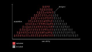
A figurative graph charting user ability against population using a bunch of different icons for people. One person is identified as a designer and she is part of a subset of the people that are in grey, signifying that they are "included" when the designer considers things from their own perspective. The vast majority of the people icons are in red, signifying they are "excluded" by this line of thinking.
When it comes to people, there���s no such thing as ���normal���. For example, the interactions we design with technology depend heavily on what we can see, hear, say, and touch. If we���re designing with ourselves as a baseline, we can overlook people with circumstances different from ours.
I love exercises that create opportunities for revelation. One of my favorites originates from John Rawls. Rawls was a philosopher who used to run a social experiment with students, church groups, and the like. In the experiment, individuals were allowed to create their ideal society. It could follow any philosophy. It could be a monarchy or democracy or anarchy. It could be capitalist or socialist. The people in this experiment had free rein to control absolutely every facet of the society��� but then he���d add the twist: They could not control what position they occupied in that society.
This twist is what John Harsanyi���an early game theorist���refers to as the ���Veil of Ignorance��� and what Rawls found, time and time again, was that individuals participating in the experiment would gravitate toward creating the most egalitarian societies.
It makes sense: what rational, self-interested human being would treat the elderly, the sick, people of a particular gender or race or creed or color, poorly if they could find themselves in that position?
We���re often told accessibility is only concerned with folks with ���special needs.��� Well news flash: we all have special needs. Some we���re born with. Some we develop. Some are temporary. Some have nothing to do with us personally, but are situational or purely dependent on the hardware we are using, the interaction methods we have available to us, or even the speed at which we can access the Internet or process data.
Sometimes disability is a temporary thing. A short-term injury and illness affect the way people interact with the world around them. Looking into bright light can cause brief visual impairment. Being sick with a cough makes it hard to speak. Wearing a cast can severely limit a person���s ability to lift an everyday object.
On the more technical side of things, small touchscreens can be awkward to interact with is you���re fat-fingered like me. Glossy screens can be difficult to read under glaring light. Low-contrast text can be difficult to read when you turn the screen brightness down to conserve battery life on your mobile device.
Recognizing that we all have special needs leads us to make better decisions as designers and developers. When we understand that disability is a universal and dynamic way of interacting with the world, it can become something else as well: a new source for creativity. Our impact can also expand, as our inclusive designs reach a greater number of people.
Designing for people with permanent disabilities can seem like a significant constraint, but the resulting designs can actually benefit a much larger number of people. For example, curb cuts in sidewalks were first created to make it safer and easier for people in wheelchairs to cross the street.
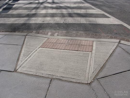
A curb cut. Photo credit: Dylan Passmore
But curb cuts also help people with a wide range of circumstances, from kids riding bicycles, to parents pushing strollers, to workers hauling heavy equipment.
Similarly, high-contrast screen settings were initially made to benefit people with vision impairments. But today, many people benefit from high-contrast settings when they use a device in bright sunlight. The same is true for remote controls, automatic door openers, voice controls, and much more. Designing with constraints in mind is simply designing well.
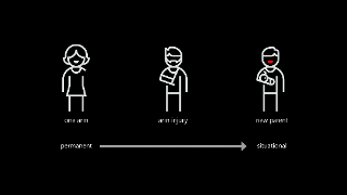
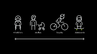
By designing for someone with a permanent disability, someone with a situational disability can also benefit. For example, a device designed for a person who has one arm could be used just as effectively by a person with a temporary wrist injury or a new parent holding an infant.
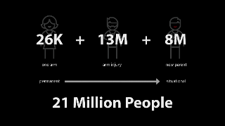
Being mindful of the continuum from permanent to situational disabilities helps us rethink how our designs can scale to more people in new ways. In the United States, 26,000 people a year suffer from loss of upper extremities.
But when we include people with temporary and situational disabilities, the number is greater than 20M.
As a web design philosophy, progressive enhancement is right in line with the egalitarian inclusive design approach. It calls for equality of opportunity, but doesn���t require equality of outcome. It���s okay for different folks to experience your products in different ways as long as everyone can accomplish the task they set out to do.
[Progressive enhancement] keeps the design open to the possibilities of sexiness in opportune contexts, rather than starting with the ���whole��� experience that must be compromised.
At its essence, progressive enhancement is about being good designers. The definition of design is ���to devise for a specific function or end��� Classically, it means ���to indicate��� and comes from the medieval Latin: designare, meaning ���to mark out���.
I���ve been amazed at how often those outside the discipline of design assume that what designers do is decoration���likely because so much bad design simply is decoration. Good design isn���t. Good design is problem solving.
As Jeff Veen so astutely observed in this quote, there is a lot of bad ���design��� out there that is more concerned with aesthetics than problem solving.
When we are concerned with the user interface, it can sometimes be at the expense of the user experience.

The Coffeepot for Masochists by Jaques Carelman famously referenced by Donald Norman in Emotional Design.
It is possible to have something both beautiful and highly functional.

A ramp embedded in staircase of Robson Square in Vancouver, BC. Photo credit: Tom Magliery
24 Ways is an advent calendar for web professionals. It���s a magazine of sorts, but it is both highly interactive and accessible. The site���s developers employ a handful of features from the ARIA spec to increase the accessibility of the site.
One such feature is ARIA landmarks, which identify key areas of a web page. Such as the primary header or ���banner��� of a site.
<header class="banner" role="banner" id="top">
<h1 class="banner_logo"><a href="https://www.aaron-gustafson.com/" rel="home">24 ways <span>to impress your friends</span></a>ma</h1>
</header>
view raw
banner.html
hosted with ❤ by GitHub
The main content.
<main role="main">
���
</main>
view raw
main.html
hosted with ❤ by GitHub
Content concerned with easing navigation of the site.
<nav class="navigation" role="navigation" id="menu">
<h1 class="hidden">Browse 24 ways</h1>
<ul class="nav nav-topics">
<li class="nav_item"><a href="https://www.aaron-gustafson.com/topic..." data-icon="♕">Business</a></li>
���
</ul>
���
</nav>
view raw
navigation.html
hosted with ❤ by GitHub
Or even information about the content, such as copyright designations.
<footer class="contentinfo" role="contentinfo">
<p class="contentinfo_copyright">
<small>© 2005-2016 24 ways and our authors. <a href="https://www.aaron-gustafson.com/about...
</p>
<p class="contentinfo_social">
<a href="http://feeds.feedburner.com/24ways" rel="alternate">Grab our RSS feed</a>
<a href="https://twitter.com/24ways" rel="me">Follow us on Twitter</a>
<a href="https://www.aaron-gustafson.com/newsl... to our newsletter</a>
</p>
</footer>
view raw
contentinfo.html
hosted with ❤ by GitHub
Users browsing with an ARIA-aware screen reader can use these landmarks to quickly navigate through a document.
Listen to this as an MP3 or as an OGG audio file.
This example hints at a simple reality: Every interface is a conversation. We engage our users directly in an effort to inform them, entertain them, or persuade them to act in a particular way. How this conversation goes directly affects the experience our users have.
Now this may sound great as a quote to share on Twitter���feel free���but it���s absolutely true. And it���s going to become even more important that we pay attention to this conversation as personal assistants���you know, ���assistive technology���, it���s right there in the name���begins to play a larger part in our users��� lives.
We need to consider the experience when our products are stripped to their essence. When there is no visual design to entice our users to overlook the fundamental flaws in the design of our interfaces. When there is no UI to help them manage the cognitive load of accomplishing a given task.
Considering this now will put you way ahead of your competition and empower your users to do more with your products. It can seem like a daunting task when we���ve spent so much time fixated on how to enable our users to accomplish key tasks on a screen, especially in a responsive context. But what is responsive design about if not accessibility? Responsive design is concerned with presenting the most appropriate visual experience given the constraints of a screen���s size.
Similarly, conversational interfaces are concerned with the way we communicate with our users, whether there is a screen or not and whether the user can see it or not. This isn���t new, it���s a challenge we���ve tackled before���
Let���s take a trip back in time to one of the earliest computer games: Zork. Zork was written between 1977 and 1979. It���s a text-based adventure game that operates a lot like a game of Dungeons & Dragons���with the program serving the role of gamemaster.
As you move from location to location throughout the game, the program describes the environment and notes objects and people you can interact with. You type what you want to do and the program tells you the results of your actions.
West of House
You are standing in an open field west of a white house, with a boarded front door.
There is a small mailbox here.
> open mailbox
As this was the early days of computer gaming, you might think Zork���s interactions would be simple noun-verb combinations������kill troll������but Zork was more sophisticated than that. Its parser was could understand far more complex commands like ���hit the troll with the Elvish sword���. This made the experience far more natural, as if you were playing a table top game with friends.
Whether Zork or a webpage, every interface is a conversation. When I create a homepage, I���m talking to visitors as if we���ve just met. I���m explaining what they can do on my site (and, in some cases, why it matters). If I���m designing a product page, the conversation is a little different. I���m explaining to my users what a particular object or service is, what it does, and how it will benefit them. I���ll skip the BS sales pitch and talk honestly about the product���s benefits. If I���m designing a contact form, I want to help my users get a message to me quickly and efficiently. I���m also going to set some expectations around how long it will take me to get back to them (and, of course, I���ll need to abide by that promise). Even the humble status update is a conversation. I���m asking a question and then stepping back and letting my users speak. The floor is theirs. (But I���m probably mining what they say for data so I can market to them later.)
Conversations consist of words, so it should come as no surprise that we should choose our words carefully. When talking to people, things generally go better when you talk to them like they talk to you. This is a lesson Facebook learned the (somewhat) hard way.
Over the 2011 holidays, Facebook users were uploading photos like crazy. In the span of a few days, Facebook processed more photo uploads than are contained in the entirety of Flickr. Seriously, that���s a lot of photos.
One unintended consequence of this deluge of photo uploads was a significant uptick in people asking Facebook to remove specific ones. Facebook received millions of these ���photo reports���, but they made no sense: Moms holding babies reported for harassment, pictures of puppies reported for hate speech, and so on. Roughly 97% of these photo reports were dramatically mis-categorized.
Facebook���s engineers reached out to some of the users who had reported these photos to get a bit more background regarding their submissions.
At the time Facebook���s photo reporting interface provided a list of reasons users could choose from if they wanted a photo removed, but, as Facebook soon discovered, many of the reports were made because users didn���t want the photo posted for reasons other than those provided.
In some cases, it was because they didn���t like how they looked in the photo. In others, it was because the photo was of an ex-partner or even a beloved pet they���d shared with an ex-boyfriend or ex-girlfriend. The existing photo reporting tool had not done a good job of accounting for these more personal reasons for wanting a photo removed, so the Facebook engineers went to work. They added a step that asked How does this photo make you feel? The options were simple:
Embarrassing
Upsetting
Saddening
Bad Photo
Other
The ���other��� option also provided a free-response text field to fill in.
With this system in place, they found that 50% of reporters who answered the new question chose one of the provided options. That was pretty helpful, but there was still a problem: 34% of the ���other��� respondents were writing ���It���s embarrassing��� in the blank rather than choosing the ���embarrassing��� option already provided.
What the Facebook team realized was that people were not identifying with the ���embarrassing��� text (or may have even thought it was referring to them, rather than assuming an implied ���It���s���). A subtle shift in language was needed, so they changed the label to Please describe the photo and they updated the options to mirror how people actually talk:
It���s embarrassing
It���s a bad photo of me
It makes me sad
With this subtle change, they were able to increase the percentage of photo reporters who chose one of the options provided to a whopping 78%.
Words matter. Even in something as simple and banal as a form, the words we choose set the tone for our users��� experiences and often have an affect on what they do��� or fail to do. The words we choose matter even more in the world of headless UIs. Without visual aids to help a user see where they are in a form or to aid them in managing the cognitive load of our interfaces, every bit of label and helper text becomes even more important.
When Luke Wroblewski coined ���mobile first���, he told us to focus on the core purpose each and every page. He was, in essence, telling us to focus on the conversation we are having with our users. This approach pays huge dividends on small screens, but when it comes to voice-based interactions, ���the page��� doesn���t really exist. Experience is the sum of each individual interaction.
As part of their Alexa Skills Kit, Amazon offers a ton of recommendations for designing for voice, many of which happen to be equally useful for sighted users.
Write for People
We don���t author content for ourselves. We write for others. If what we write frustrated or alienates our users, we���ve failed at our job. In their profoundly helpful book Nicely Said, Nicole Fenton and Kate Kiefer Lee offer numerous suggestions for how to write with the reader in mind:
Be clear.
Be concise.
Be honest.
Be considerate.
Write how you speak.
They also make the recommendation that you read your work aloud. As we head into the world of voice-based interactions, that���s beta testing!
Avoid Technical and Legal Jargon
For example, if you track error codes for issues on your site, send them to your developers, but never present them to a user. Similarly, we should avoid legalese and write in plain language. Medium has done a great job of this with their Terms of Service.
When Requesting Feedback, Make It Clear That the User Needs to Respond
In perhaps the most common form example, consider the label ���First Name���. It���s not terribly conversational and doesn���t beg for a response.
What���s your first name?
Listen to this as an MP3 or as an OGG audio file.
Similarly, when there���s an error, notify them of the error and, if possible, give them some clues on how to fix it.
What���s your first name?
Without your first name, I won���t know how to address you.
Could you please provide it?
Listen to this as an MP3 or as an OGG audio file.
When Asking a User to Choose, Clearly Present the Options
This comes into play often when dealing with forms. Ensuring radio and checkbox controls are properly associated with their labels is critical.
Yes
You can also use the fieldset and legend elements to group the related controls, but be sure to make the legend focusable or associate it with the first focusable form control in order to ensure the question is read out.
Do you agree to the terms of service for this site?
Yes
No
Listen to this as an MP3 or as an OGG audio file.
We should strive for the same sort of clarity when presenting navigation options. The HTML5 nav element enables us to semantically identify an area of the page being used for navigation. It is not, however, always identified as being navigation when encountered naturally in the flow of the document. (It is when using role-based navigation like we saw earlier.) For that reason, it can be useful to provide an textual introduction to the section, even if you choose to visibly hide it. You might even consider expanding the text of your navigation items to provide additional context like I do on my site.
Here���s what you can find on this site:
A Bit About Me
Entries in My Notebook
���
Listen to this as an MP3 or as an OGG audio file.
NPR has multiple navigation elements on the page and they use ARIA to label them without adding additional tags. Instead, they use the aria-label attribute to distinguish them.
<nav class="global-navigation" role="navigation"
aria-label="main navigation">
���
</nav>
view raw
aria-label.html
hosted with ❤ by GitHub
Prompts Should be Short, While Still Being Clear
In a 1933 lecture at Oxford, Albert Einstein famously said
It can scarcely be denied that the supreme goal of all theory is to make the irreducible basic elements as simple and as few as possible without having to surrender the adequate representation of a single datum of experience.
Or, as Roger Sessions paraphrased it
Everything should be as simple as it can be but not simpler.
Clear and concise writing is the hallmark of great content. We need to resist the urge to write for writing���s sake. We write in the service our audience, not for ourselves.
Government websites are some of the worst offenders in this area. Consider this lovely passage:
Heavy rains throughout most of the State have given an optimistic outlook for lessened fire danger for the rest of the season. However, an abundance of lightning maintains a certain amount of hazard in isolated areas that have not received an excessive amount of rain.
It could be written far more clearly as
Heavy rains throughout most of the State have lessened fire danger for the rest of the season. However, lightning threatens isolated dry areas.
In the UK, the Government Digital Service has made great strides overhauling excruciatingly painful content and making it easier to read and understand. One such example is their overhaul of the Accelerated Possession process that allows landlords to evict a tenant.
The original paper form asked for the address like this
The claimant seeks an order that the defendant(s) give possession of:
(If the premises of which you seek possession are part of a building identify the part eg. Flat 3, Rooms 6 and 7)
Before requesting the type of property concerned
(���the premises���) which is
��� a dwelling house
��� part of a dwellinghouse
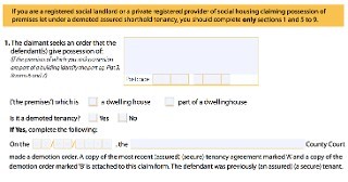
Clear and to the point, right?
The GDS went to work and streamlined the process in plain language:
What kind of property do you want to take back?
��� A self-contained house, flat or bedsit
��� Room or rooms in a property.
Tenants may share kitchen or bathroom
Then they allow you to lookup the property or manually enter the address.
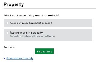
While not specifically designed for the future of headless UIs, this form is prepared for their eventuality.
Ask Only Necessary Questions
We show our users respect by respecting their time. Obviously straightforward, brief writing is one way we do that, but another is to reduce the time it takes to complete a task. Many forms are brimming with fields to be filled in. In some cases, the vast majority are purely optional. And while it may be easy to spot the required fields visually, bypassing them in an aural interface can be incredibly difficult.
User experience designers have been pushing for simplified forms since��� well, as long as I can remember. Users appreciate them, they tend to result in better data, and they also tend to convert better than long forms. And when it comes to voice-based interactions, they will become a necessity. No one is going to want to spend 15 minutes working their way through a 15 question registration form when all that���s required is their email address and for them to choose a password.
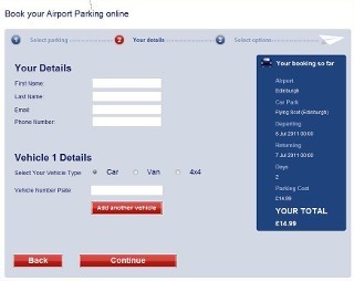
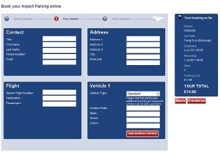
On a similar note, we should avoid slicing fields into multiple parts if at all possible. For instance, you still see fields like this one, asking for a US phone number, quite often:

When interacting with this construct via voice, a user will be required to supply three separate values. In order to do so, each field would require a label. Most developers only know how to label the first of those three boxes and users would be really confused if you asked them for their exchange code and line number.
HTML5 introduced a host of new field types that consolidate phone numbers, dates, times, and other complex data types into single fields. Use them! As an added bonus, most enforce content validation and formatting rules for you automatically.
Present Information in Consumable Pieces
Like computers, we humans have a finite amount of ���working memory���. The amount of mental resources required to operate an interface is called its ���cognitive load���. When the amount of information we need to process exceeds our capacity to handle it, we can miss important details, have trouble concentrating, and become frustrated.
We deal with cognitive load in GUI design all the time, but in voice-based interactions, there are no visuals to act as signposts and provide reminders about where we are and what we���re doing. This is why it is critical to break complicated tasks down into simpler ones and eliminate excess noise (like non-required fields). We can also reduce cognitive load by chunking search results and other list-type content into small groups, asking the user if they want more before loading and presenting them.
The top seller in the garden department is Repel Lemon Eucalyptus Natural Insect Repellent, 4-Ounce Pump Spray
Would you like to hear the rest?
As human beings, we all have special needs, but as designers and developers, it can sometimes be difficult to diagnose potential issues within our products when it comes to accessibility. Especially if we don���t typically experience that need or are unfamiliar with the tools used to address it.
To that end, my colleagues have been hard at work to make it easier to enhance the accessibility of our products. The first tool I want to discuss is the F12 developer tools in Edge.
As Andy Sterland mentioned in his talk, in a forthcoming release of F12, the inspector will surface accessibility information about each node in the DOM. Let���s take a look at an example:
F12 Accessibility Inspector
Here we have the forthcoming redesign of HTML5accessibility.com and if I inspect the section containing the test results, I can see information about that section element. On the right hand side, you���ll notice an inspector tab dedicated to accessibility information such as the node���s accessible name, it���s role, whether it���s keyboard focusable, ARIA properties assigned to it (in this case, aria-label), and so on.
Adding this functionality into F12 lifts the veil from the way Edge exposes the DOM to assistive technology and will go a long way toward helping us fine tune our experiences for AT, including screen readers and virtual assistants.
Another area where we are doing some work is within Narrator itself. When testing with screen readers, it can be quite tempting as a sighted user, to leave your screen on so you can follow along. Sadly, that action directly prohibits you from experiencing a site or application the way folks with visual impairments or in a headless UI scenario do. It can cause you to miss things or assume something makes sense when, in fact, it doesn���t.
To help address that, Narrator will soon sport a ���Developer Mode��� that enables you to blank out a single app (such as the Edge browser window) so you can experience it without any visual access to the UI. (You can also use it for installed and hosted apps.)
Narrator Developer Mode
Here we see the HTML5accessibility site again. If I flip on Developer Mode in Narrator, the Edge browser window goes black and I can see where the focus carat moves (the blue box), but I can���t see the design. For diagnostic purposes, the contents being read by Narrator are also presented as text on the screen in the position of the element (which can help with identifying where the issue was when you come back out of Developer Mode).
Microsoft is committed to improving the accessibility, not only of its own products, but of the Web as a whole. These two tools are only a few of the many ways we are doing that today.
Obviously, part of that is continuing to evolve and improve the accessibility of the Web for users browsing in Edge, whether they are using Narrator or other screen readers like Jaws or NVDA.
But, in addition to that, Microsoft���in partnership with Carnegie Mellon and Stanford, Adobe, AT&T, Dropbox, Facebook, Intuit, LinkedIn, and Yahoo���helped launch TeachAccess. This site is an effort to address the ���lack of awareness and understanding of basic accessibility issues, concepts and best practices��� in the world of CS and HCI education. If successful, which I sincerely hope it is, it will help address the dire need we have for a more accessibility-aware workforce building for the Web.
Similarly, Microsoft Design has shared their fantastic set of resources for improving the inclusiveness of design. They have created a guide as well as a set of activities you can use to get your team into the Inclusive Design mindset.
And in the not too distant future, we���ll be publishing a series of in-depth posts about accessibility on the Microsoft Edge Dev Blog. These will tackle topics like how we re-architected Edge for better ARIA support and name computation, working with HTML5 accessibility to improve the tests, and how we can enable automated testing in order to discover accessibility regressions before they make it into production.
We do this because, with accessibility in mind, we can improve the lives of billions of people. Friends, family, neighbors, and complete strangers, all of whom deserve the opportunity to access the products we create regardless of the different ways we experience the world.
Ultimately ���accessibility��� is not about disabilities or the technologies we use to address them, it���s about people. Sure, we���ll make it easier to look up movie times and purchase tickets to see the latest Transformers debacle, but we���ll also empower the nearly 900 million people globally���over 60% of whom are female���that are illiterate by enabling our sites to be used purely via voice, even translated in real-time into their native language and dialect.
We will create new opportunities for the poor and disadvantaged to participate in a world that has largely excluded them. You may not be aware, but 80% of Fortune 500 companies���think Target, Walmart���only accept job applications online or via computers.
We will enable people who have limited computer skills or who struggle with reading to apply for jobs with these companies.
We will empower immigrants to read lease agreements and postal mail in languages they haven���t fully grasped yet.
We will enable people with visual disabilities to vote, even on paper ballots, without human assistance.
We can help bridge the digital divide and the literacy gap. We can create opportunities for people to better their lives and the lives of their families. We have the power to create more equity in this world than most of us have ever dreamed.
This is an incredibly exciting time, not just for accessibility, not just for user experience, not just the Web, but for the world! I can���t wait to see how awesome you make it!
Thank you!
You can watch (or listen) to me present this talk (albeit with a bit of technical difficulty) over on the Channel 9 website.
April 6, 2016
My Top Takeaways From the 2016 Edge Web Summit
Earlier this week, my colleagues on the Microsoft Edge team put on the second of what has now become an annual event: The Edge Web Summit. The format was a little different this year, with team members from across the organization delivering quick, punchy 30-minute talks on topics ranging from standard implementations to the user experience of a browser to real-time communications. I live-tweeted quite a few of the talks, but I thought I���d provide a bit of a round-up of what was revealed, discussed, and more so you can read it all in one place.
Since launching Edge 8 months ago, the team has pushed 12 update releases, 128 new features, and 6,527 bug fixes!
The team has launched a new, highly transparent bug tracker for Edge: issues.microsoftedge.com.
The Edge team has done a ton of research into what specs are being used and how they are being used on the open Web. They are starting to share this information on data.microsoftedge.com. It currently consists of 2 parts: 1) usage data from real sites that looks at not only CSS properties in use, but values too; and 2) a catalog of available APIs and a detailed analysis of browser support, down to specific configuration and property values.
Hot on the tails of RemoteIE opening up for Linux users, RemoteEdge is coming soon! Jacob Rossi showed a screenshot of an Edge instance running on Azure, within Chrome. So cool!
Text-to-speech directly from within JavaScript!
The Fetch API!
Beacons as an alternative to blocking JavaScript requests for telemetry data: navigator.sendBeacon( uri, data ).
Web notifications!
WOFF 2 font support for better compression and faster downloads/decompression!
The team is currently prototyping and investigating Service Workers, Push Notifications, Shadow DOM, Custom Elements, Web Payments, Web Assembly, and ES Modules.
Cortana in Edge has gotten some major upgrades, such as being able to ���Ask Cortana��� about an image to get more information (like a recipe for the cookies you saw on Pinterest that did���t include a link).
Microsoft open-sourced the CSS crawler powering their data portal so other browser vendors can run it too.
FIDO-based login (like Windows Hello) is coming to the Web!
Microsoft���s Narrator screen reader now supports a ���Developer Mode��� that blanks out the current app (such as your browser window) in order to enable you to more easily debug accessibility issues.
The F12 tools in Edge now enable you to view the previously mysterious Accessibility Tree in addition to allowing you to drill more deeply into the various properties of an element that relate to its accessibility.
I didn���t take a ton of notes in the second half of the day as I was prepping for my own session on accessibility, but other highlights included building & debugging extensions for Edge (tldr; you can easily port Chrome extensions) and cool things you can do using Continuum.
Overall, the event was incredibly informative and has me really excited about the work the Edge team is doing and where the browser is going. The new stuff that���s ready for prime time will be out for the public in the Anniversary Update of Windows 10 this Summer, but some of it is has already landed in Windows Insider builds.
March 28, 2016
Offline First: Love the Idea, Hate the Name
Back in 2014, I had the great pleasure of listening to Ola Gasidlo of Hood.ie discuss the importance of offline at Beyond Tellerrand in D��sseldorf, Germany. Her excellent talk was my introduction to the ���Offline First��� movement and, while I can get behind the idea, I���ve had some serious issues with the name. And with the rise of Service Workers as a simple, usable means of making our content available offline, I thought it worth revisiting the idea of ���offline first���, if only to address its core fallacy.
First, the good stuff: The ���offline first��� movement clearly recognizes the current dilemma of our time:
We live in a disconnected & battery powered world, but our technology and best practices are a leftover from the always connected & steadily powered past.
App Cache, Web SQL, Web Storage, Indexed DB, Service Workers, and a handful of other specs and ideas were all created to address this core limitation of the Web. They also make it possible to compete with ���native��� software experiences. I am 100% on board with this move. It sucks to open Chrome on my mobile and switch to a tab that���s been tucked out of view for a while only to have the page fail to load because I happen to be traveling abroad without a data plan. If that site was made to work offline, the fact that Chrome had recycled the RAM and CPU that tab had been consuming would be less of a problem and the page would load instantly from the cache.
Tunnels��� hotel wifi��� high latency mobile networks��� expensive roaming data plans��� these are all reasons we need an offline Web. I���m incredibly thankful for all of the hard work the smart folks working on solutions like these are contributing.
Also inline with the ���offline first��� movement, I think it���s important to consider the offline experience early in a project, so it isn���t forgotten or haphazardly bolted on. We need to make deliberate choices about what content and assets we are caching. We need to plan for offline, maybe not first, but certainly early.
All of this is to say I don���t have an issue with the philosophy of ���offline first���, but I do take issue with the name. As a term, it���s a bit disingenuous. Looking at other ���firsts���������mobile first��� or (to go back little further) ���content first������these terms work on multiple levels: They remind us to keep the core purpose of a page or interface central to our planning. They also support an experience that begins and ends with that core.
A ���mobile first��� experience starts with a distraction-free central message or content, optimized for a small screen and (often) a single, narrow viewport. It can be enhanced for larger screens and more capable devices, but that core experience may be all some users get, and that���s ok. Users will have an experience (and a site that works) no matter what. The same is true with a ���content first��� approach; its experience remains available regardless of device or access mechanism. Sure, both ���mobile first��� and ���content first��� require the network, but guess what: ���Offline first��� requires network connectivity too! You don���t see many websites delivering their content on USB drives, so all of the code required to make the offline experience possible in the first place requires an initial (and stable) connection to the Web. In other words, offline can���t be first.
You may be wondering Why is that important? It���s important because, historically, a ���first��� approach (as I mentioned) sets an expectation of that experience always being available. Offline can���t provide that.
Moreover, offline has another core dependency beyond the network: JavaScript. Without JavaScript, none of your fancy offline stuff���except App Cache, which few folks are using these days���will work. And yes, I know, everyone has JavaScript support��� but the reality is that not everyone will get your JavaScript enhancements, even if that were actually the case.
Please don���t misunderstand the purpose of this post: I applaud the ideas behind the ���offline first��� movement and the amazing work that community is doing. And you should absolutely incorporate offline into projects you are building for the Web. Users with capable devices and browsers will thank you for it. Just try not to use the term ���offline first��� or at least be prepared for me to cringe a little when you do. Maybe I���m the only one who feels this way; if so, I���m okay with that. But, then again, semantics matter. Maybe we need a different rallying cry. Sadly ���Offline Too��� doesn���t have the same ring to it.


