
Aaron Gustafson's Blog, page 13
March 16, 2016
An Event Apart Nashville 2016, Day One
Unfortunately, I was unable to spend Tuesday in Nashville for An Event Apart (for reasons that will be revealed in about a month), but I did catch Monday and it was amazing.
The esteemed Jeffrey Zeldman kicked the day off with a talk entitled Designing with Web Standards in 2016. A theme he touched on repeatedly was that none of the problems we are facing in web design today are new problems. It���s a topic near and dear to my heart, something I wrote about in the closing chapter of Adaptive Web Design���s Second Edition and recently spoke about at EnhanceConf in London. He knocked this one out of the park and my head was nodding so much my neck began to hurt.
Next up was my former WaSP colleague Rachel Andrew to give us the skinny on CSS Grid Layouts. This is an amazing spec that I���ve always struggled to understand fully (despite the fact that���s i���ve written a Javascript polyfill for it). Rachel made it crystal clear and got me very excited about the future of layout on the Web.
Jen Simmons dropped some serious CSS-related design knowledge bombs that perfectly complimented Rachel���s talk. She discussed Flexbox, CSS Shapes, Multi-column layout, viewport units and more, demonstrating how they can be used right now to progressively enhance the design of your sites.
After lunch, Brad Frost took to the stage to talk about Style Guides. I only caught the last half���I���ll admit to doing some last-minute rehearsing in the hallway���but the bits I did catch were good. I���ve seen his Atomic Design talk a few times, which this one builds on. In this talk he touches on a lot of the atomic design concepts, but he also talked a lot more about workflow and the role of the front-end developer. No doubt the evolution of this talk has come in large part through writing a book on Atomic Design and in hosting a podcast with Anna Debenham on website style guides.
Next, I was given the opportunity to share some thoughts and advice on designing and building. My talk, The Features of Highly Effective Forms, evolved out of several earlier talks on building forms. With this one, I wanted to strike a little more balance between the nuts and bolts of building forms and the hows and whys of building better forms.
The deck, which I���ve posted to SlideShare, doesn���t stand on its own quite as well as some of my other forms decks simply because the talk contained a lot of storytelling I chose not to pair with slides���instead opting for an black screen so folks could focus���but I did call out the salient points. I���ve begun writing up some of the recommendations as part of my Modern Web Forms Best Practices series and will continue to do so in the future. And one of the stories I told, which I highly recommend you check out, had to do with a lesson Facebook learned in managing how users report offensive photos.
Josh Clark wrapped the day up with a discussion of the future of interface as things move from digital back to physical. He talked about a lot of really cool new tech that has me excited about the future, including the Physical Web, which Josh had running as a live demo. I wonder if anyone noticed I had a beacon running too ;-)
All in all, day one was a blast. As always, Jeffrey, Eric, Toby, and Marci do an awesome job programming their events. I���m really bummed I could not stick around to see Val, Jason, Krystal, Eric, Kristina, and Cameron rock it out though. I���m sure it was amazing.
You can check out attendees thoughts from the event by searching Twitter using the #aeansh hashtag. I���ve collected reactions to my talk on Storify for posterity as well.


March 4, 2016
Learn From the Past, Enhance for the Future
I had the great pleasure of delivering the closing keynote for the first EnhanceConf. I wanted to talk about voice and the future of ���headless��� user interfaces. Here���s what I had to say.
Early last year, a cry for help on Stack Overflow drew my attention:
I���ve been trying to make my site ��� work fully without JavaScript, however, I���ve found myself in situations where I can���t honestly think how I would do some features without it.
The submitter, JamHam, is certainly not alone in feeling this way. The ways we build websites change all the time. When I started out, it was pretty simple: you had HTML. Lots and lots of HTML. We also had Java applets, then Shockwave and Flash. Then we got some very basic stylesheet support. Then JavaScript.
As the years pressed on, the three major technologies underpinning the Web���HTML, CSS, and JavaScript���evolved and became even more powerful.
Things coalesced for a while in the early oughts before Jesse James Garrett re-christened a relatively obscure Microsoft creation, XMLHttpRequest, ���AJAX��� and set countless designers hearts aflutter with the promise of banishing the page refresh. At the heart of this revolution was JavaScript, and companies began betting their entire Web presence on its availability. Most learned that wasn���t such a good idea and began using it as an enhancement to the experience rather than a requirement.
After Ajax, there was HTML5, CSS3, and a host of new JavaScript APIs��� the JavaScript frameworks���Angular, Knockout, Backbone, Ember, React��� The ways we can create Web products just keep changing; sometimes slowly, but more often than not at such a speedy clip it leaves my head spinning.
The one thing I���ve learned however, being an ���old man��� in Web terms, is that web design is cyclical, just like everything else. The challenges we face building web products today are not new challenges. Moreover, the lessons we learned building similar products in the ���Web 1.0��� days pay dividends today and will continue to do so in the future.
When I started out on the Web, I had a 28.8 kbit/s modem, but still had to support users on 14.4 kbit/s connections. That���s half the speed I was used to running at. That may have been 20 years ago, but the lessons I learned about streamlining my HTML, optimizing images, and minimizing downloads has helped me immeasurably when dealing with high-latency mobile networks and excruciatingly slow ���broadband��� connections.
(I���m looking at you, every hotel ever.)
When I started out on the Web, I had an 800x600 monitor, but still had to support 640x480 screen resolutions. I learned the importance of prioritizing content long before media queries and flexbox enabled us to adapt our layouts on the fly. And while our computer screens keep getting bigger, mobile devices and wearables present the very same challenges I was tackling with 640x480, but in even tighter confines.

When I started out on the Web, there was no JavaScript. All calculations, data processing, and dynamic functionality had to be handled by the server. I learned how to process web forms in Perl, later trading in my CGI scripts for PHP, Ruby, and Python. And while the vast majority of our users today have JavaScript baked into their browsers, I still rely on server-side fallbacks because I recognize that we don���t control the execution environment on the open Web.
The Web is the most hostile software engineering environment imaginable.
��� Douglas Crockford
You���re a savvy bunch, so I���m sure none of this is news to you, but I wanted to set the stage for what I���m really here to talk about. There���s a new cycle about to hit us and chances are you might not be thinking about it yet: Voice.
I: The Headless UI
Science fiction has often been a strong predictor of our technological future. HAL 9000 from 2001: A Space Odyssey is probably the most (in)famous example of a computer that interacts with its users largely via voice. As a concept, the ���talking computer��� has appeared time and time again in space-age fiction���everything from Red Dwarf to Interstellar.
To function in the real world like they do on TV and in the movies, computers need two capabilities: Natural language processing (to understand what we say) and speech synthesis (to communicate, aurally, back to us).

Natural language processing has its roots in the 1950s, but many of these early speech models were limited because they were built around a series of hard-coded rules that the computers followed. In the 1980s, however, machine learning and real-time statistical analysis became possible.
As hardware capabilities continued to improve and computers became more powerful, they got better at recognizing the words we were saying to them. Eventually, and with enough processing power, they also began to assign meaning to words and could react accordingly.
As the years marched on, the overhead required to enable our projects to listen to our users has dropped significantly.
Listening is great, but true communication is bidirectional. Humans have been experimenting with speech synthesis since the late 1700s, but it wasn���t until the 1980s that we got a decent result though. By the 1990s, reasonably intelligible text-to-speech software was being rolled out alongside most operating systems as a core component of their assistive technology offerings: The ���screen reader���. At present, screen readers are probably the best indicator of what the future of voice interaction will sound like.
When combined, the ability of a computer to listen and respond gave rise to virtual personal assistants like Siri, Cortana, Alexa, and more.
Over time, our customers will become more accustomed to and reliant on voice-based interactions with their computers and the Web. Enabling them to complete critical tasks without a visual user interface will be crucial for the long-term success of our Web-based products.
So how do you design a ���headless��� UI? That���s easy: You design the conversation.
II: Interface is Conversation
Let���s take a trip back in time to one of the earliest computer games: Zork. Zork was written between 1977 and 1979. It���s a text-based adventure game that operates a lot like a game of Dungeons & Dragons���with the program serving the role of gamemaster.
West of House
You are standing in an open field west of a white house, with a boarded front door.
There is a small mailbox here.
$> open mailbox
As you move from location to location throughout the game, the program describes the environment and notes objects and people you can interact with. You type what you want to do and the program tells you the results of your actions.
As this was the early days of computer gaming, you might think Zork���s interactions would be simple noun-verb combinations������kill troll������but Zork was more sophisticated than that. Its parser was could understand far more complex commands like ���hit the troll with the Elvish sword���. This made the experience far more natural, as if you were playing a table top game with friends.
Whether Zork or a webpage, every interface is a conversation���we engage our users directly in an effort to inform them, entertain them, or persuade them to act in a particular way. How this conversation goes directly affects the experience our users have.
Let���s look at a few web page and interface component types to identify the kinds of conversations we trying to have with our users in each:
Homepage
We���ve just met and I���m explaining what you can do on my site (and, in some cases, why it matters).
Contact Form
You���re asking or telling me something. I want to help you. It���s common courtesy for me to let you know how long it may take me to get back to you with a response; and for me to abide by that.
Product Page
I���m explaining what a particular object or service is, what it does, and how it will benefit you. I should ���show��� you why something is great rather than ���tell���-ing you that it is because you���re immune to salesy BS.
Status Update
I may prompt you with a question, but I���m here to listen. The floor is yours. (But I���m probably mining what you say for data so I can market to you later.)
When we approach interfaces as conversations, we humanize our products and improve our users��� experiences. When we don���t, things can fall apart quickly���
Over the 2011 holidays, Facebook users were uploading photos like crazy. In the span of a few days, Facebook processed more photo uploads than are contained in the entirety of Flickr. Seriously, that���s a lot of photos.
One unintended consequence of this deluge of photo uploads was a significant uptick in people asking Facebook to remove specific ones. Facebook received millions of these ���photo reports���, but they made no sense: Moms holding babies reported for harassment, pictures of puppies reported for hate speech, and so on. Roughly 97% of these photo reports were dramatically mis-categorized.
Facebook���s engineers reached out to some of the users who had reported these photos to get a bit more background regarding their submissions. At the time Facebook���s photo reporting interface provided a list of reasons users could choose from if they wanted a photo removed, but, as Facebook soon discovered, many of the reports were made because users didn���t want the photo posted for reasons other than those provided. In some cases, it was because they didn���t like how they looked in the photo. In others, it was because the photo was of an ex-partner or even a beloved pet they���d shared with an ex-boyfriend or ex-girlfriend.
The existing photo reporting tool had not done a good job of accounting for these more personal reasons for wanting a photo removed, so the Facebook engineers went to work. They added a step that asked How does this photo make you feel? The options were simple:
Embarrassing
Upsetting
Saddening
Bad Photo
Other
The ���other��� option also provided a free-response text field to fill in.
With this system in place, they found that 50% of reporters who answered the new question chose one of the provided options. That was pretty helpful, but there was still a problem: 34% of the ���other��� respondents were writing ���It���s embarrassing��� in the blank rather than choosing the ���embarrassing��� option already provided.
What the Facebook team realized was that people were not identifying with the ���embarrassing��� text (or may have even thought it was referring to them, rather than assuming an implied ���It���s���). A subtle shift in language was needed, so they changed the label to Please describe the photo and they updated the options to mirror how people actually talk:
It���s embarrassing
It���s a bad photo of me
It makes me sad
With this subtle change, they were able to increase the percentage of photo reporters who chose one of the options provided to a whopping 78%.
Words matter. Even in something as simple and banal as a form, the words we choose set the tone for our users��� experiences and often have an affect on what they do��� or fail to do.
The text of our interfaces���especially form labels and responses���is just one small part of the content picture, but it���s a perfect example of how easy it can be to overlook conversation in our interfaces. There are many other types of content like product descriptions, marketing copy, legal statements, visualizations, video, audio, and more. Content is where experience begins. It���s the core that we seek to progressively enhance. It���s also the foundation upon which the voice-based experiences of the future will be based.
The more time and consideration we put into how our interfaces read, the better-positioned we will be to succeed in the future of headless UIs. Once stripped of its beautifully-crafted, responsive layout, engaging animations, and artful illustrations, does your site hold up?
Back in 2006, Dustin Diaz proposed CSS Naked Day���a day when sites could be stripped of their visual design to showcase their content, semantics, and organization.
It will be a test case to see how usable your website is to others without a ���design���.
���Dustin Diaz
���Design���, as Dustin was refering to it, is the visual design of a site, but design is not solely concerned with visual representations. Diving into etymology for a moment here, design comes from the Latin designare meaning ���to mark out or indicate���. The purpose of design is not to make something pretty, it���s to clarify.
If the words we use form the basis of the conversations we have with our users, the semantics we employ clarify that meaning. Choosing elements with semantic value enriches our content, illuminating the meaning and intent of our words in order to overcome the limitations of text and bring it up to par with spoken language. After all, they may look the same visually, but there���s a big difference between these two statements:
I really want to be your friend.
I really want to be your friend.
Beyond using markup to clarify the intent of the words we write, we can use it to spell out relationships that are often represented visually. Dustin described one way we do this as part of the impetus for CSS Naked Day (emphasis mine):
In the spirit of promoting Web Standards along with good semantic markup and proper hierarchy structures
By ���proper hierarchy���, Dustin is talking about the document outline. A document outline is created through use of heading elements (h1���h6). It provides a easy way to review the organization of our web pages and validate our source order decisions. It also helps us ensure the flow works, which is incredibly important in any conversation. It helps us get to the point, streamline our content, and remove distractions��� all of which are a sign of respect to our users.
None of this is news, of course, content strategists have been recommending that we streamline our content since the dawn of the Web. Sadly, many folks didn���t heed that advice until they were forced to confront the often infuriating world of mobile. Smaller screens required focused content.
When Luke Wroblewski coined ���mobile first���, he told us to focus on the core purpose each and every page. He was, in essence, telling us to focus on the conversation we are having with our users. This approach pays huge dividends on small screens, but when it comes to voice-based interactions, ���the page��� doesn���t really exist. Experience is the sum of each individual interaction. As part of their Alexa Skills Kit, Amazon offers a ton of recommendations for designing for voice, many of which happen to be equally useful for sighted users.
Write for People
We don���t author content for ourselves. We write for others. If what we write frustrated or alienates our users, we���ve failed at our job. In their profoundly helpful book Nicely Said, Nicole Fenton and Kate Kiefer Lee offer numerous suggestions for how to write with the reader in mind:
Be clear.
Be concise.
Be honest.
Be considerate.
Write how you speak.
They also make the recommendation that you read your work aloud. As we head into the world of voice-based interactions, that���s beta testing!
Avoid Technical and Legal Jargon
When we are writing for our readers, we need to be familiar with their level of domain knowledge so we don���t frustrate or alienate them. For example, if you track error codes for issues on your site, send them to your developers, but never present them to a user.
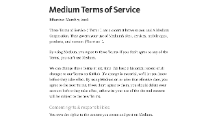
Similarly, we should avoid legalese and write in plain language. Medium has done a great job of this with their Terms of Service.
When Requesting Feedback, Make It Clear that the User Needs to Respond
In perhaps the most common form example, consider the label ���First Name���. It���s not terribly conversational and doesn���t beg for a response. Labels like ���What is your first name?��� make it clear the user should respond.
What���s your first name?
Similarly, when there���s an error, notify them of the error and, if possible, give them some clues on how to fix it.
What���s your first name?
Without your first name, I won���t know how to address you.
Could you please provide it?
When Asking a User to Choose, Clearly Present the Options
This comes into play often when dealing with forms. Ensuring radio and checkbox controls are properly associated with their labels is critical.
Yes
You can also use the fieldset and legend elements to group the related controls, but be sure to make the legend focusable or associate it with the first focusable form control in order to ensure the question is read out.
Do you agree to the terms of service for this site?
Yes
No
We should strive for the same sort of clarity when presenting navigation options. The HTML5 nav element enables us to semantically identify an area of the page being used for navigation. It does not, however, identify the nav element as being for navigation when encountered naturally in the flow of the document. For that reason, it can be useful to provide an textual introduction to the section, even if you choose to visibly hide it. You might even consider expanding the text of your navigation items to provide additional context.
Here���s what you can find on this site:
A Bit About Me
Entries in My Notebook
���
Prompts Should be Short, While Still Being Clear.
In a 1933 lecture at Oxford, Albert Einstein famously said
It can scarcely be denied that the supreme goal of all theory is to make the irreducible basic elements as simple and as few as possible without having to surrender the adequate representation of a single datum of experience.
Or, as Roger Sessions paraphrased it
Everything should be as simple as it can be but not simpler.
Clear and concise writing is the hallmark of great content. We need to resist the urge to write for writing���s sake. We write in the service our audience, not for ourselves.
Government websites are some of the worst offenders in this area. Consider this lovely passage:
Heavy rains throughout most of the State have given an optimistic outlook for lessened fire danger for the rest of the season. However, an abundance of lightning maintains a certain amount of hazard in isolated areas that have not received an excessive amount of rain.
It could be written far more clearly as
Heavy rains throughout most of the State have lessened fire danger for the rest of the season. However, lightning threatens isolated dry areas.
Here in the UK, the Government Digital Service has made great strides overhauling excruciatingly painful content and making it easier to read and understand. One such example is their overhaul of the Accelerated Possession process that allows landlords to evict a tenant.
The original paper form asked for the address like this
The claimant seeks an order that the defendant(s) give possession of:
(If the premises of which you seek possession are part of a building identify the part eg. Flat 3, Rooms 6 and 7)
Before requesting the type of property concerned
(���the premises���) which is
��� a dwelling house
��� part of a dwellinghouse
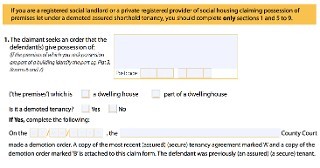
Clear and to the point, right?
The GDS went to work and streamlined the process in plain language:
What kind of property do you want to take back?
��� A self-contained house, flat or bedsit
��� Room or rooms in a property.
Tenants may share kitchen or bathroom
Then they allow you to lookup the property or manually enter the address.
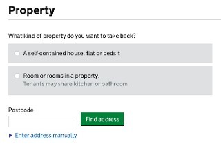
While not specifically designed for the future of headless UIs, this form is prepared for their eventuality.
Ask Only Necessary Questions
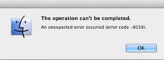
We show our users respect by respecting their time. Obviously straightforward, brief writing is one way we do that, but another is to reduce the time it takes to complete a task. Many forms are brimming with fields to be filled in. In some cases, the vast majority are purely optional. And while it may be easy to spot the required fields visually, bypassing them in an aural interface can be incredibly difficult.
[image error]
User experience designers have been pushing for simplified forms since��� well, as long as I can remember. Users appreciate them, they tend to result in better data, and they also tend to convert better than long forms. And when it comes to voice-based interactions, they will become a necessity. No one is going to want to spend 15 minutes working their way through a 15 question registration form when all that���s required is their email address and for them to choose a password.
[image error]
On a similar note, we should avoid slicing fields into multiple parts if at all possible. For instance, you still see fields like this one, asking for a US phone number, quite often:

When interacting with this construct via voice, a user will be required to supply three separate values. In order to do so, each field would require a label. Even in the States, most developers would only know how to label the first of those three boxes. (They are area code, exchange or central office code, and line number, if you���re interested.)
HTML5 introduced a host of new field types that consolidate phone numbers, dates, times, and other complex data types into single fields. Use them! As an added bonus, most enforce content validation and formatting rules for you automatically.
Present Information in Consumable Pieces
Like computers, we humans have a finite amount of ���working memory���. The amount of mental resources required to operate an interface is called its ���cognitive load���. When the amount of information we need to process exceeds our capacity to handle it, we can miss important details, have trouble concentrating, and become frustrated.
We deal with cognitive load in GUI design all the time, but in voice-based interactions, there are no visuals to act as signposts and provide reminders about where we are and what we���re doing. This is why it is critical to break complicated tasks down into simpler ones and eliminate excess noise (like non-required fields). We can also reduce cognitive load by chunking search results and other list-type content into small groups, asking the user if they want more before loading and presenting them.
The top seller in the garden department is Repel Lemon Eucalyptus Natural Insect Repellent, 4-Ounce Pump Spray
Would you like to hear the rest?
III: Future Enhancements
Paying attention to how our interfaces read is critical to success in the future of voice-based interactions. Thankfully, we already view content as the centerpiece of every progressively enhanced experience. But we can go further.
Both Microsoft and Amazon have given us the tools to voice-enable our websites beyond the HTML we present. Amazon has chosen to do this via a dedicated JSON API, through which we can ���teach��� Alexa ���skills���. Using this API, you can enable your users to access core site functionality through the Echo, FireTV, or any other device that has integrated the Alexa Voice Service.
Microsoft has taken a slightly different approach. Using a relatively simple XML format, they have enabled us to teach Cortana new commands that tie directly into our website.
All we need to do is include a meta tag pointing to an XML file that details the commands (and variations) and, when a user installs the site as a hosted app, Cortana picks up the new commands automatically. Those commands, when issued, can open a specific page or even kick off JavaScript methods in the target page.
Group Post
Group Post add note
add a note {message} using group post
[please]
add a note [that] {noteSubject}
adding {noteSubject} to Group Post
We are just starting to scratch the surface of what���s possible in voice-enabling the Web, but it���s exciting to see how some companies are addressing this opportunity. It���s always interesting when things come full circle and we see how lessons we learned early on in the Web remain applicable, not matter how much or quickly things seem to change. Seeing this pattern repeat time and time again is why I���m so drawn to the philosophy of progressive enhancement; it���s not only concerned with supporting the past��� it���s setting us up for success in the future.
February 21, 2016
Planning Adaptive Interfaces: The Workshop
For the last few years I���ve been running a workshop alternately titled ���Planning Adaptive Interfaces��� or ���Beyond Responsive���, depending on the conference. It���s been one of my favorite workshops to run for a number of reasons, but before I get into that, let me explain what it is and how it works.
I think we all recognize how much Ethan���s seminal article ���Responsive Web Design��� (and his follow-up book) shook up our industry. It changed the way we look at visual design and kindled (or in some cases re-kindled) an interest in catering an experience to mobile devices. But simply incorporating responsive design���s three core strategies���fluid grids, flexible media, media queries���is not the goal; meeting our user���s needs is. Responsive design is not an end in itself��� it���s just the beginning.
We need to embrace the heterogenous nature of the Web���myriad connected devices with vastly different screen sizes (if they even have screens), network connectivity, and capabilities in use by countless individuals, each with their own special needs���and craft experiences that will work anywhere at any time. We need to build robust systems that adapt in ways far beyond aesthetics. I designed this workshop to explore the rich variety of use cases that often get overlooked in the course of building web projects and to show how we can begin considering them as early as possible.
When I was starting out, I gave ���workshops��� that basically amounted to a half-day or (worse) a full day for folks to listen to me blather on about one topic or another. People liked them, but I wouldn���t call them fun. And, in hindsight, I question how much value people got from an extended survey of what���s possible without the opportunity to put that knowledge to use. Workshops should encourage attendees to get their hand dirty.
I kick this workshop off with a relatively brief discussion of the considerations that we should be aware of���beyond screen size and pixel density. I also provide examples of how to adapt interfaces so they rise to meet our customers��� needs. Then I throw out a list of common interface patterns���modals, tabs, etc.���and turn the floor over to the attendees, asking them to build small teams that each examine a single pattern in detail with these considerations in mind. They then spend the rest of the workshop planning out how that interface would adapt to consider factors like accessibility, screen dimensions, device capabilities, JavaScript availability, and so on. All the while, I circulate among the groups, asking and answering questions, pressing them to go a little further with each iteration. Some teams sketch, some prototype, and all spend a lot of time debating, which is awesome!
I leave the last hour or so for a group discussion of what each team���s accomplished. It gives them a chance to talk through their approach, what they learned, what their pain points were, and how they overcame them. Not does it celebrate their work, but it helps the other attendees discover novel ways to approach these common UI constructs.
It���s been a blast and I have learned so much from the teams I���ve coached. Each workshop is completely different because each group of attendees is completely different. I���ve run it with groups ranging from 12 to 120, for internal teams at large companies to mixed audiences from all over the world. Everyone who has attended one of these workshops has brought a unique perspective and helped us all get better at our jobs. That���s been one of the best parts of this experience for me.
If a workshop like this sounds up your alley, I���ll be giving it a few more times in 2016. Your next opportunity will be at EnhanceConf in London in early March. Later in the year, I���ll be giving it as part of Sparkbox���s Build Right: Maker Series. I���d love the opportunity to work with you if you can make it!
February 15, 2016
Progressive Enhancement Gets a Conference
On March 4th, I���ll be in London to give the closing talk at EnhanceConf, the first conference dedicated progressive enhancement. Over the last few months, I���ve been talking to the conference���s organizer, Simon McManus, quite a lot. He���s put a lot of thought into the conference and I thought it might be interesting to interview him so he could share his motivations and hopes for the event.
Me: As a philosophy, progressive enhancement has been around for more than a dozen years. Why do you think it needs a conference now?
Simon: I first started thinking about EnhanceConf in 2014. At the time, Tom Dale had declared progressive enhancement dead and I had just heard Henrik Joreteg telling his Single Page Story.I was hearing lots of talk about progressive enhancement being hard and expensive when my experience showed quite the opposite.
It���s been fascinating to watch how views have changed since, Tom Dale now loves progressive enhancement and Henrik likes to do as much of his rendering at build time as possible.
As the web continues to grow in weird and wonderful ways techniques like progressive enhancement just keep giving more and more value.
Me: What does progressive enhancement mean to you?
Simon: I try to build applications that provide the best possible experience to the end user. Regardless of who they are, where they are or what device they are using. For me, that means using progressive enhancement in every part of the stack.
Progressive enhancement is about so much more than whether an app work with JavaScript turned off, realising we don���t have control over the runtime environment and building applications in the most robust way possible is far more important.
Me: Do you think it���s an approach that everyone should use on every web project?
Simon: I guess that depends on what you mean by a web project. In my mind to work on the web, you have to give up that illusion of control. You need to assume as little as possible about the device or user and for me that fits very well with progressive enhancement.
Web technologies transcend the capabilities of any one device with their reach alone, it seems strange to me when people use them but don���t take full advantage.
Me: If a web designer or developer is only passingly familiar with progressive enhancement and is considering coming to the event, what should they expect to get out of it?
Simon: These are probably the people with the most to benefit from EnhanceConf.
We are going to start the day looking at why progressive enhancement is still important on the modern web, so that should provide a nice intro for anyone who is not already familiar with progressive enhancement.
Me: What about a seasoned practitioner who already applies this philosophy to their work?
Simon: Originally, EnhanceConf was a very selfish idea. I wanted to learn more about the tools and techniques being in use in industry: Over the last few years contracting I���ve seen many in use in that just weren���t surfacing at conferences.
EnhanceConf is about the state of the art in progressive enhancement, I���d like to think EnhanceConf will be the perfect event for such people to come together and learn from one another.
Me: What if the person thinks progressive enhancement is a waste of time?
Simon: I���d really like to encourage these people to come along to the event, I think it���s important their voice is a part of this discussion so that we can learn from each other and move forward together.
With an open mind I think they should have a really good time, they might hear some viewpoints they disagree with, but there will be lots of opportunities for Q&A to discuss those topics in detail.
Me: As a hyper-focused event, there���s a risk of it being a bit of an echo chamber. Have you taken steps to mitigate that possibility?
Simon: I hope by being a hyper-focused event we can move beyond the bikeshedding that so often surrounds such discussions.
But yes. I have taken a couple of steps to mitigate an echo chamber:
Duplicate content
If you take all the talks about progressive enhancement and put them all on the same day you would end up with a fair amount of similar content. There will be no generic talks about progressive enhancement at EnhanceConf. Each talk will dig into real examples to provide unique tales from the trenches.
Preaching to the choir
I���ve been reaching out to lots of different communities around London to bring as many voices into the discussions as possible. The other day I was at the Meteor London meetup talking about EnhanceConf. Tableflip (the organisers) even bought tickets for their whole company!
The event is also being recorded so anyone not at the event will be able to watch all the talks and Q&A.
Me: You���re modeling the format of the event���four acts, each comprising three twenty-minute talks and a group Q&A session���on Responsive Day Out. What was the draw of that approach?
Simon: Yes, we get to hear lots of different viewpoints and then bring the speakers together for a Q&A. This should allow new viewpoints to emerge from discussions and join related threads. It also means we get to spend each section focusing on a particular area.
Me: Can you talk a bit about your speaker selection process?
Simon: I had lots of people in mind to talk at EnhanceConf. To ensure we heard a wide range of viewpoints we also opened a call for proposals to which we received some superb submissions.
I was fortunate to have some trusted advisors who helped me out throughout the process. I���m really pleased with how the line-up turned out.
Me: When the event is done and dusted, what are you hoping will happen?
Simon: I���d quite like a holiday! :D
But seriously, I hope we can demonstrate how to maximise the benefits and minimise any costs associated with progressive enhancement.
If at the end of EnhanceConf we had a reasoned and nurturing community able to take discussions forward that would be a fine outcome. :)
Me: Do you think there will be another EnhanceConf?
Simon: EnhanceConf is the first conference I���ve organised. It���s been an unfathomable amount of work and financial risk to get this far and it���s mostly been done in my evenings and weekends. That said, it has been quite fun.
I���d like to do some traveling this year, maybe 2018?
EnhanceConf will take place March 4th at the RSA House in London. Tickets are available on the conference website. I will also be giving a one-day workshop entitled Planning Adaptive Interfaces on March 3rd as part of the conference. Seating is limited.
EnhanceConf is offering a small number of educational scholarships. For more information on the scholarships and how to apply, check out Simon���s post about the program.
January 26, 2016
Apple Support: Honeybadger
My iPhone fell clumsily out of my pocket when I was sitting down in the kitchen the other day. Thwack! It fell face-first onto the tile from my seated position a mere 18 inches up. Of course the screen cracked. Protective case be damned, the cracks spread across the screen like a spider web cast from razor blades.
I was crestfallen.
Thankfully, apart from the very finger-unfriendly hellscape the screen had become, the rest of the phone completely functional. If I was careful where and how I swiped, I could do pretty much anything I needed to. And I did exactly that for a few days while I looked into my options for fixing it.
It was an iPhone 6 I purchased right when they came out, so a warranty repair was not an option. And I don���t see the point of paying for phone insurance or Apple Care1, so I was on my own to cover the cost of the repair. No biggie; it was my fault for putting it in the loose pocket of my pajama pants anyway.
I began researching my options:
I could cover the broken phone with a rugged case and just deal with it.
I could use one of our old iPhones until the next version came out.
I could upgrade my phone with AT&T.
I could self-repair as the process is pretty straightforward, but in talking with a friend who repairs smartphones for a living, I discovered the replacement screens weren���t that great.
I could have Apple repair it.
Apple offers screen repair for $109, which isn���t too bad, but that takes a few days to ship the phone back and forth. They offer an expedited option where they just send you a new phone, but at $299, it seemed silly.
I contacted the local authorized Apple repair center to see if they could do the repair, but it turns out that they would just be sending it on to Apple anyway, so it seemed like my best bet would be to go back to the source. After all, who could know better how to replace a broken iPhone screen (and digitizer, since they���re fused) than Apple Support?
I chatted with an Apple Support rep about doing the repair and confirmed that the repair would cost $109. The rep told me, however, that they would need to authorize my card for $299���the out-of warranty replacement cost���in case they discovered other damage to the phone. I agreed (it was my only option) with the understanding that Apple would run some diagnostic utilities to determine what (if any) additional issues the phone might have.
A day or two later I got the mailer to send the phone to Apple, I shipped it to them and waited. They confirmed receipt of the phone the next day and, two days later, I got an email saying the phone was en route back to me. I was thrilled with the quick turnaround!
Then Kelly asked me why Apple had charged us $329. I said I wasn���t sure. The authorization was for $299, but the repair service was only supposed to be $109 (plus tax and shipping, naturally). Perhaps they billed the whole amount and then returned the unused portion in a separate transaction. We decided to wait and see what would happen.
The next day, a phone arrived. I say a phone because it was not my phone. Apple Support had sent me a refurbished replacement phone and charged me the full replacement cost. Why? ���After thorough diagnostic testing, it has been determined that a replacement iPhone (enclosed) is necessary.��� Vague.
I was curious what their tests had revealed. What gremlins were lurking in my heretofore fully-functional device? I decided to investigate with another support rep and was not thrilled with what I found.
Note: I spent the next few hours in a chat session with two different reps at Apple Support. Both were incredibly friendly and did everything in their power to help me get to the bottom of why my screen repair had turned into a complete replacement. Credit where credit is due.
In the conversation with the first rep, Josh, I made it clear that the phone was working perfectly before I sent it to them. It merely needed a new screen/digitizer. I offered that I was disappointed to see that they���d replaced it without explaining what would require that level of remediation and without giving me the option to have the phone returned to me as-is. From the beginning, he clearly saw where I was coming from:
Oh good grief, I���m really sorry you���ve had to deal with this. That���s not at all what we want from this process.
After a few minutes of doing some research, he came back to me:
So basically from what we���ve been discussing, the service center does run a plethora of tests on the phone once it���s sent in. That���s to be sure that it���s working properly in all ways, rather than just the screen repair itself, though trust me, I do fully understand that the only thing you wanted was the screen to be repaired, so I���m just compiling all of the data to see what happened.
A few minutes later���
[I]t���s looking like basically what ended up happening was there were tests that were run which will test the phone for a bit of additional damage than the tests that were run. From there, they look into what will give you the longest lasting phone, basically so that you don���t run into an issue with what their diagnostics tests detected down the road, and then need to pay again for it to be repaired.
I replied
[That] assumes I plan to keep the phone long enough for it to become an issue��� I appreciate them looking into potential issues, but making unilateral decisions about how to proceed is not good customer service in my opinion. Letting someone know what the issue is and how much the repair would cost is just common courtesy. Even my car dealership does me that courtesy.
Josh was right there with me:
Exactly, which I know is not always a proper assumption, and I can entirely agree. I���m even still looking into additional data for you. I really don���t like how this was handled, so I���m seeing if I can come across anything additional on the matter.
He asked if I knew of any other damage to the phone and I told him that it was always in a case and I was not aware of a single other issue with the phone, cosmetic or otherwise.
He was completely empathetic:
I���m really sorry about this whole thing, Aaron. It���s looking like some sort of damage was found with the phone, which is what caused that price to be charged, rather than just the screen repair, so ultimately they decided that it would give you a longer lasting phone to replace it, so that way you wouldn���t have to deal with the hassle of having additional issues down the road. Honestly, I cannot express enough how much I understand the situation, and especially at least being informed or asked if that can be done. That���s just why the full out of warranty/replacement charge has to be held initially, is so that they have authorization to run those tests, and if needed, replace it, rather than just repair it. I���m so sorry that the process wasn���t elaborated to you, and that they didn���t at least let you know of what was going on.
I reiterated that someone really should have asked if I wanted the additional work done. I understand Apple���s ���heart��� might be in the right place, but they failed to do what I had hired them to do. They didn���t consider my wishes or expectations in their process at all. Nor did they give me an opportunity to decline the replacement and get my broken phone back.
Josh pleasantly informed me that by agreeing to the repair, I was out of luck:
[Replacement] was actually authorized to be used when you initially setup the payment. When the full $299 (plus taxes and shipping) was held from your card, that was authorized that if needed, it could be used for the repair if additional damage was found. Since it was found, they used the remainder of that money to replace the phone instead.
I countered:
I understand that you required the $299 + tax in order to start the repair, but that was my only option if I wanted you guys to do the $109 screen repair. Like I said, had I suspected anything else was going to be done to the phone, I would have taken my chances buying a replacement screen and doing the repair myself. ��� I typically replace my phone every other version, so I would have limped along with the broken screen even rather than pay the full replacement fee.
Josh, to his credit, was still on my side:
Right, trust me, I fully understand, or alternatively we could have taken it into the local Apple Authorized Service Provider, which would have been able to diagnose the phone as well in order to determine what had to be done, and then give you a price right then and there. ��� I���ve actually covered cracked screens in cling wrap so that I didn���t need to risk furthering the damage, or hurting myself. I can also fully understand the process of not expecting that there was any further damage, since you were able to sue the phone just fine, and that���s why you ended up getting it setup that way.
Ultimately, however, it didn���t really matter:
Basically, again, as much as I wish there was something that could be done on the matter in order to basically reverse what happened, it���s just not possible. Since it was authorized when it was initiated, and I do see where the previous advisors let you know that the full charge would be taken if additional damage was found, but if the only damage found to the phone was the screen cracks, then all but the screen repair fee of $109 plus taxes and shipping would be reimbursed. It���s just that additional damage was found, which is what caused that full charge to be taken.
After a bit more back-and-forth, Josh recommended I file a complaint with Apple (I have), said he would make sure the process was reviewed internally, and connected me with a Senior Advisor, Alexander, to help me get a few more details regarding the ���damage��� that prompted the replacement. I thanked him for his time and for his empathy toward my situation.
The next few minutes involved getting Alexander up to speed with what had happened. He was equally helpful:
Okay, I know how a sudden cost like this $299 can be concerning, especially when you don���t feel adequately informed on the situation. I can certainly clarify anything and get this figured out with you though.
Then he dropped the bombshell:
So the main bit of information that I want to address is not that the phone was replaced to address issues that may arise down the road. In this case, a screen replacement was attempted and did not yield a functioning device. When that occurs, our only option is to replace the device. I do see from your chats with Michelle and Teresa that they advised this was the procedure that we have
Wait. What?! They didn���t find any problems. In replacing the screen, the tech bricked the phone.
No, not at all. Just that they were unable to have a fully functioning unit after a screen replacement. That does not mean that the tech bricked the phone or messed up when replacing the screen, it means the phone was not able to work after the screen was replaced.
Um, sounds to me like they bricked my phone. Alexander tried to clarify, but was ultimately saying the same thing:
While the issue was only a cracked screen, that does not mean that the screen can be replaced and yield a functioning device. Unfortunately we can never know if a screen replacement will work until we try.
So��� iPhones are only occasionally repairable. In other words, it���s a crapshoot. Comforting. No one had mentioned that they could brick the phone when attempting to repair it:
I was never advised that the repair could yield a non-functioning device. This is even more strange than I expected.
Alexander towed the company line:
I���m looking at the chats you had with us when setting up the repair, and both advisors did say how it could be $299. I also don���t see anything from either one that says the depot would reach out to you if the repair price was not going to be $109. I���m really sorry that this happened to you Aaron, but this is how our process works and everything looks to have been done correctly here. ��� I see them saying that they will attempt to replace the screen and if that works it would be a $109 repair. If there were additional issues, it would cost more up to the $299 max for a full replacement unit.
I clarified that they had said it could cost more. There���s a difference between ���could��� and ���would���. I mentioned that I could have just kept the broken phone and upgraded with AT&T and spent less money. Alexander didn���t miss a beat:
That certainly was an option you could have taken Aaron, and I do sympathize with not taking that option to end up paying more than you expected. I really wish the repair process was clearer for you, and I can only advise that you leave some feedback about the repair process to us at Apple Feedback. I don���t see any mention in these chats of the depot contacting you if the cost would be more nor an advisor stating that would be the case.
I stuck to my guns:
I agree they didn���t state that would happen, but I think in the repair world it���s pretty common. ��� Explicitly stating that would not happen might be a good thing.
Alexander conceded that the process was less than ideal:
I don���t disagree, but that does vary from place to place and device to device. Our procedures are in line with most of the mobile phone world on this though. I will certainly leave some feedback for those advisors to be more clear about this process when a repair is set up though.
We talked for a few more minutes, but it was clear I was out of options. I could file a complaint with Apple (and have), but I am skeptical they even pay attention to that stuff. I know they don���t chime in on their own forums. My only other option was to share my story with you, in hopes you might avoid a similar situation.
So consider yourself warned: If you send your phone to Apple for something as simple as a screen repair, they just may brick your phone and charge you for the convenience. Oh and the replacement phone only has a 90-day warranty. Hooray!
This is the first device I���ve broken in more than a decade of (ab)using expensive smartphones. ↩
January 6, 2016
Affirming User Choice With Checkboxes
���Checkbox��� form controls have long been a part of software. They enable users to provide a simple binary response���yes or no. On the Web, we often see them in two scenarios: confirmations and multiple choice.
Confirmation Checkboxes
Standalone checkboxes are often employed to enable users to affirm a statement, as in this example from the American Express login form where a customer can indicate they���d like the site to remember them.
 American Express��� login form offers users the option of being remembered. As that is a binary choice (e.g. yes or no), the checkbox makes sense.
Here���s a simplification of the markup they���re using:
Remember Me
This works really well, though I generally prefer to combine explicit and implicit labeling to simplify my CSS selectors and broaden their applicability. Here���s how I would rewrite this control:
Remember Me
Regardless of the markup pattern itself, it���s important to note the explicit association of the form control and the label element (using the for attribute). You���ll also notice the input has a straightforward name value which will be submitted to the back end if the user ticks the box.
It���s worth noting that some back-end systems may require a value be submitted for the given variable name (in this case, ���REMEMBERME���) regardless of whether the user has ticked the checkbox. If that���s a requirement, you can alter the pattern to use a hidden input as well:
Remember Me
The source order matters because with matching name values, the final submittable value will always be the one the back-end receives. With this setup, the value of ���no��� (from the hidden input) will be submitted by default. If the checkbox is ticked, its value is submitted instead, setting REMEMBERME to ���yes���.
Multiple Choice Checkboxes
The other way we often see checkboxes used is to enable users to choose zero or more items from a collection of options. Consider this example from the Chattanooga Open Device Lab���s reservation form. It allows users to choose the devices they���d like to include in their test matrix:
 In this excerpt from the reservation form on the Chattanooga Open Device Lab website, users can choose to include gaming system options.
The markup they employ is pretty well-organized and straightforward: it���s a list of checkbox options.
Nintendo DS Lite
Nintendo Wii
As this is an instance where a user could choose more than one option, the back end needs to be able to capture that information in what���s called an ���array���. An array, if you���re unfamiliar, is a collection of values. You���ll notice that the name given to each of these checkbox input elements is the same: ���reservation_requested_device[]���. The square brackets (���[]���) at the end of the name are the magic bit that allows the values of each chosen ���reservation_requested_device��� checkbox to be submitted as the value of ���reservation_requested_device���.
Applicable Attributes
Checkbox controls only use a subset of the typical input attributes. In particular, you���ll need to include
name - This is the variable name you want to hold the user���s response. As mentioned in the previous section, appending ���[]��� to the variable name will allow the variable to hold all of the user���s choices as opposed to only the final one.
value - This is the value that should be captured if the user ticks the checkbox.
id - The unique identifier you���re using for the control in order to explicitly associate it with a label.
There are a few optional attributes you might consider including as well.
checked - Use this null attribute if you want the default state of the checkbox to be ticked. This attribute should be used with caution. Don���t use this attribute to automatically check confirmation boxes for things like mailing list opt-ins. Do use this attribute when you are displaying sensible default settings or displaying confirmations the user has already made (e.g. in the user���s profile or when re-displaying the form when it has a submission error).
required - Use this to indicate the checkbox must be ticked for the form to be valid. It���s important to note that this attribute is typically only useful in confirmation checkbox scenarios. If you need a user to choose at least one from a multiple choice checkbox collection, it���s useless unless you need them to pick a specific one. To require one (or more) of a multiple choice checkbox group, you currently need to use JavaScript, like the one the Chattanooga Open Device Lab uses.
Checkbox vs. Other Controls
Checkboxes excel at allowing users to indicate preference from a pre-defined set of options. But there are other form control types that allow for similar control over user responses. That can make it difficult to decide which element to use.
Dropdown List (select)
The select element is another tried and true option for allowing users to indicate preference. A simple two-choice select could achieve the same goal as a confirmation checkbox, but it���s a little clunkier. In terms of user interface, select elements require more clicks of your users. They also obscure the complete list of choices from view because only one options is displayed at a time. Their appearance makes them more compact, but can make it difficult to get a complete picture of what choices are available when you can���t see them all.
You can enable multiple choice in a select element by adding the multiple attribute to it, but depending on the number of option elements, it could also be a little unwieldy. Depending on the size of the select and the number of options, you could also create an inner scroll that could be awkward on certain touch-based devices.
The select element has its place, but should be used sparingly. I���ll go in-depth with select elements in a future post.
Choose One (input[type=radio])
For simple confirmation questions, it���s completely valid to use a radio form control in lieu of a single checkbox. In fact, in some cases, it may offer a more explicit choice for your users. Consider this example from Subway���s online ordering tool.
 In this excerpt from Subway���s online ordering tool, they use a checkbox to confirm the user wants their sandwich toasted.
A checkbox labelled ���Fresh Toasted���, isn���t terribly clear. A better approach would be to ask something like ���Would you like your sandwich toasted?��� with radio controls for ���yes��� and ���no���. Alternately, if they absolutely wanted to keep it as a checkbox, they could use a better label: ���Please toast my sandwich���.
 An alternate approach to the Subway interface, using radio controls.
Radio controls have their place, but are not often a one-to-one replacement for checkboxes. I will discuss radio controls in greater depth in another post.
Check ���Em Out
Checkboxes are an invaluable tool in the form building tool chest. Understanding their purpose and capabilities is key to using them properly and ensuring your forms are usable to the broadest number of users.
December 2, 2015
Avoiding Link Rot in Print With the Help of Perma.cc
I think we can all agree, link rot is a problem. A 2014 study by Harvard Law School determined that roughly 50% of the URLs referenced in U.S. Supreme Court opinions no longer work. That���s terrifying.
When I was mid-way through writing the Second Edition of Adaptive Web Design, I realized that it was pretty likely some of the links I was referencing might disappear over the years. Little did I know, some of them would disappear while I was writing the book!
The Internet Archive���s Wayback Machine is pretty good, but it doesn���t archive everything, and I often find captured pages end up broken���especially if they rely heavily JavaScript, but often images go missing as well. I wanted to make sure that when you pick up the book a year from now or even 10 years from now, the links will still work.
I evaluated a few options for creating a permanent archive of each and every link in the book (there are over 200), but then it dawned on me that Perma.cc might be the perfect answer.
Perma.cc was created by the Harvard Library Innovation Lab in reaction to the paper I mentioned earlier. It is a distributed archive of URLs for scholarly and legal documents, supported not only by Harvard, but over 90 (and counting!) libraries, distributed all over the world. It���s also open source. Each URL is preserved as a live view, an archived view, and a screen capture taken when the link is added. Archived URLs are kept for a minumum of 2 years, but may be ���vested��� into the permanent archive by a member organization.
I had contributed some CSS to the project a while back, so I reached out to my contacts to see if they might be interested in vesting all of the links for the book. Turns out they were big fans of the First Edition and enthusiastically offered their support.
Converting all of the links took time (and a lot of double- and triple-checking), but the result is that every article, blog post, and web page that I referenced in the book will remain accessible to you in perpetuity. I think that���s pretty awesome. And, as an added bonus, since Perma.cc creates unique URLs that are relatively short, those of you who read it in print won���t have to re-type the often incredibly-lengthy original URLs.
I can���t thank Matt Phillips, Adam Ziegler, Jack Cushman, and everyone else at the Harvard Library Innovation Lab enough for creating Perma.cc and for offering their service to my readers. You all are amazing!
November 20, 2015
Speeding Things Up With Service Worker, Resource Hints, and More
User experience encompasses more than just the interface. Download speed, render performance, and the cost of accessing a site are often overlooked areas when it comes to the practice of UX, but they all affect how users experience what we build on the Web.
I���m always looking for ways to improve these aspects of my own site. And, since it���s my own personal playground, I often use it as a test-bed for new technologies, ideas, and techniques. My latest adventure was inspired by a bunch of articles and posts I���ve linked to recently, especially
Jeremy Keith���s ���My First Service Worker���,
Nicolas Bevacqua���s ���Making a Simple Site Work Offline with ServiceWorker���,
Dean Hume���s ���Service Workers: Dynamic Responsive Images Using Webp Images���, and
Malte Ubl���s ���Not so micro optimizations���
After reading these pieces, I decided to see how much I could do to improve the performance of this site, especially on posts with a lot of images and embedded code samples, like my recent post on form labels.
Using Resource Hints
To kick things off, I followed Malte���s advice and used Resource Hints to prime the pump for any third-party servers hosting assets I use frequently (e.g. Disqus, Twitter, etc.). I used the code Malte references in the AMP Project as my starting point and added two new methods (preconnect() and prefetch()) to my global AG object. With that library code in place, I can call those methods as necessary from within my other JavaScript files. Here���s a simplified extract from my Disqus integration script:
if ( 'AG' in window && 'preconnect' in window.AG ) {
window.AG.preconnect( '//disqus.com/' );
window.AG.prefetch( '//' + disqus_shortname + '.disqus.com/count.js' );
}
view raw
resource-hints-sample.js
hosted with ❤ by GitHub
While a minor addition, the speed improvement in supporting browsers was noticeable.1
Integrating Service Worker
With that in the bag, I set about making my first Service Worker. I started off gently, using Dean���s piece as a guide. I added a WebP conversion bit to my image processing Gulp task to get the files in place and then I created the Service Worker. By default, Dean���s code converts all JPG and PNG requests to WebP responses, so I set it up to limit the requests to only those files being requested directly from my server. I have no way of knowing if WebP equivalents of every JPG and PNG exist on the open web (probably not), but I know they exist on my server. Here���s the updated code:
"use strict";
self.addEventListener('fetch', function(event) {
var request = event.request,
url = request.url,
url_object = new URL( url ),
re_jpg_or_png = /\\.(?:jpg|png)$/,
supports_webp = false, // pessimism
webp_url;
// Check if the image is a local jpg or png
if ( re_jpg_or_png.test( request.url ) &&
url_object.origin == location.origin ) {
// console.log('WORKER: caught a request for a local PNG or JPG');
// Inspect the accept header for WebP support
if ( request.headers.has('accept') )
{
supports_webp = request.headers.get('accept').includes('webp');
}
// Browser supports WebP
if ( supports_webp )
{
// Make the new URL
webp_url = url.substr(0, url.lastIndexOf('.')) + '.webp';
event.respondWith(
fetch(
webp_url,
{ mode: 'no-cors' }
)
);
}
}
});
view raw
webp-service-worker.js
hosted with ❤ by GitHub
When I began tucking to the caching possibilities of Service Workers, following Nicolas��� and Jeremy���s posts, I opted to tweak Nicholas��� caching setup a bit. I���m still not completely thrilled with it, but it���s a work in progress. I���m sure I will tweak as I get more familiar with the technology.
To keep my Service Worker code modularized (like my other JavaScript code), I opted to break it up into separate files and am using Gulp to merge them all together and move the combined file into the root of the site. If you���d like to follow a similar path, feel free to adapt this Gulp task (which builds all of my JavaScript):
var gulp = require('gulp'),
path = require('path'),
folder = require('gulp-folders'),
gulpIf = require('gulp-if'),
insert = require('gulp-insert'),
concat = require('gulp-concat'),
uglify = require('gulp-uglify'),
notify = require('gulp-notify'),
rename = require('gulp-rename'),
//handleErrors = require('handleErrors'),
source_folder = 'source/_javascript',
destination_root = 'source',
destination_folder = destination_root + '/j',
public_root = 'public'
public_folder = public_root + '/j',
rename_serviceworker = rename({
dirname: "../"
});
gulp.task('scripts', folder(source_folder, function(folder){
return gulp.src(path.join(source_folder, folder, '*.js'))
.pipe(concat(folder + '.js'))
.pipe(insert.transform(function(contents, file){
// insert a build time variable
var build_time = (new Date()).getTime() + '';
return contents.replace( '{{BUILD_TIME}}', build_time );
}))
.pipe(gulp.dest(destination_folder))
.pipe(gulp.dest(public_folder))
.pipe(rename({suffix: '.min'}))
.pipe(uglify())
.pipe(gulpIf(folder=='serviceworker',rename_serviceworker))
.pipe(gulp.dest(destination_folder))
.pipe(gulp.dest(public_folder))
.pipe(notify({ message: 'Scripts task complete' }));
//.on('error', handleErrors);
}));
view raw
gulp-scripts.js
hosted with ❤ by GitHub
As most of the walkthroughs recommended that you version your Service Worker if you���re doing any caching, I set mine up to be auto-versioned by inserting a timestamp (lines 23-27, above) into my Service Worker header file (line 3, below):
'use strict';
var version = 'v{{BUILD_TIME}}:',
default_avatar = 'https://www.gravatar.com/avatar/00000...',
missing_image = 'https://i.imgur.com/oWLuFAa.gif';
view raw
_header.js
hosted with ❤ by GitHub
Service Workers are still pretty new (and modestly supported), but it���s definitely interesting to see what���s possible using them. Like Jeremy, I want to do a bit more exploration into caching and how it may actually increase the monetary cost of accessing a website if not used properly. Like any powerful tool, we need to wield it wisely.

Making Gists Static
On particularly code-heavy posts (yes, like this one), I make liberal use of Gists. They���re quite useful, but the Gist plugin for Jekyll, while good, still requests a script from Github in order to load the pretty printed version of the Gist. On some posts, that can mean 5 or more additional network requests, not to mention execution time for the JavaScript. It���s yet another dependency that could prohibit you from quickly getting to the content you���re looking for. Additionally, if JavaScript should be available, but isn���t, you get nothing (since the noscript content is only evaluated if JavaScript support isn���t available or if a user turns it off).
With all of this in mind, I decided to revise the plugin and make it capable of downloading the JavaScript code directly. It then extracts the HTML markup that the JavaScript would be writing into the page and just embeds it directly. It also caches the result, which is handy for speeding up the build process.
You can grab my fork of the Gist Jekyll Plugin as, well, a Gist. It���s also in the source of this site on Github.
(Hopefully) A Little Faster
All told, these changes have gotten the render time of this site down significantly across the board.2 Even more so on browsers that support Service Workers and Resource Hints. I���ll likely continue tweaking as I go, but I wanted to share my process, code, and thoughts in case any of it might be useful to you in your own work. In the end, it���s all about creating better experiences for our users. How our sites perform is a big part of that.
Sadly I forgot to run some speed tests prior to rolling out this change and I didn���t feel like rolling back the site, so I don���t have solid numbers for you. That said, it seemed to shave nearly 2 seconds off of the load time on heavy pages like the post I mentioned. ↩
Again, I don���t have the numbers, but I am routinely seeing DOMContentLoaded reached between 400-600ms with Service Worker caching in play. ↩
November 12, 2015
Adaptive Web Design: Folded & Gathered
I just got this photo from Tracey Croom, my production editor on the Second Edition of Adaptive Web Design and I wanted to share it with you. Production is almost done and I should be getting my bound copies soon. I���m so excited!
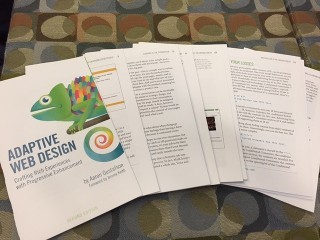 A photo of the folded & gathered pages of Adaptive Web Design���s Second Edition.
January 21, 2014
A Web For Everyone
I was an only child, so it shouldn't come as a surprise that I grew up thinking the world revolved around me. In fact, I'll be the first to admit that I was a pretty selfish kid. Well behaved, certainly, but not terribly concerned with how my actions affected others.
As an only child, the Golden Rule my grandparents insisted was so important—Do unto others as you would have them do unto you—didn't really resonate. But I was a kid, what did I know? I was sheltered. I was young. I was the sole beneficiary of my parents' love, time, and money. I had a pretty good life, but I lacked perspective.
I like to think I've grown immensely in the intervening years. Through my work, travel, and moving around a lot, I've experienced dozens of cultures, and I've met hundreds of new people, each with their own life experiences, needs, and desires. Exposure to their unique perspectives has broadened my own and helped me break down the psychological barriers I maintained between me and the “others.”
But it wasn't until I started working on the web that I came to a full understanding of the importance of the Golden Rule. Prior to becoming a developer, the ramifications of my decisions were fairly limited. But on the web, every decision I make can have a profound effect on hundreds of thousands (if not millions) of people's lives. I can make checking into a flight a breeze, or I can make it a living hell.
That's a lot of power. And to quote Stan Lee: “With great power comes great responsibility.”
My mom always told me that if you choose to do something, you should do it well, so I made it my mission to make the web an easy-to-use, friendly, and accessible place. I chose to make the Golden Rule central to my work.
As schmaltzy and self-aggrandizing as all that may sound, it's also pretty shrewd. The Golden Rule can do wonders for your business. After all, what is good customer service if not treating someone like a human being worthy of your time, consideration, and respect? If we spend every day looking for new ways to make our customers' lives better, we'll create a lasting legacy and build a strong base of customer advocates along the way.
A commitment to universal accessibility is the highest form of customer service. It recognizes that we all have one special need or another at one time or another in our lives, and that fact should not preclude us from experiencing all the web has to offer. It's about providing everyone with equal opportunity to engage with your brand experience, even though they may do so in different ways. It breaks down the barriers between “us” and “them” and recognizes the humanity in our customers.
And it's really not that hard.
In the pages that follow, Whitney and Sarah beautifully lay out the case for accessibility, show you what it looks like, and demonstrate just how simple it is to achieve. They introduce us to a series of personas—Trevor, Emily, Jacob, Lea, Vishnu, Steven, Maria, and Carol—and help us effortlessly slip into each of their shoes, to see the struggles they experience when using the web, and to recognize our own needs and desires in their own.
In a time when many of us are scrambling to keep up with technological advancements and the opportunities they create, this book grounds us in what really matters: people. This book is a roadmap to providing incredible customer service and realizing the Golden Rule in our work and—much like the code we write and experiences we design—the ripple effect it generates is sure to bring about a more equitable web.
What you have just read is the Foreword I wrote for A Web For Everyone: Designing Accessible User Experiences by Sarah Horton & Whitney Quesenbery. If you work on the web at all, you need this book. It’s an amazingly easy read that brings humanity to an often dry subject and I am very thankful to have been a part of it.


