
Harold Davis's Blog, page 183
April 29, 2014
Spirals at the Hotel D’Orsay
If you know me, you know that I am nuts about photographing spiral staircases. The Hotel D’Orsay in Paris has two, one with an elevator running up the middle, and the main stairs, which has five flights in a narrow spiral formation.
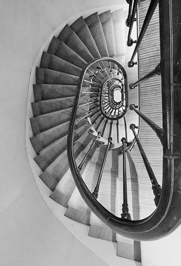
Stairs at the Hotel D’Orsay © Harold Davis
This kind of staircase tends to be harder to photograph than meets the eye. First, they are rarely well lit. This means a long exposure if you are stopping the lens down to get enough depth-of-field for most of the spiral to be in focus. The problem with a long exposure is that this kind of old staircase is usually they are rickety and transmit vibrations. If anyone comes up or down the stairs, they are likely to spoil your exposure just by walking past.
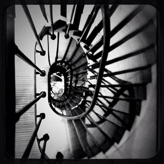
Spiral Stair at the D’Orsay via iPhone © Harold Davis
Another issue is holding the camera steadily above the stair for a straight shot down. You need a good tripod and steady nerve, but you can usually brace the tripod against the railing to make this possible. To make life easier and avoid all the trouble, simply shoot the spiral staircase with your iPhone!


April 27, 2014
Spoonerismo
Who says you can’t play with your food? Or at least your fork and spoon…
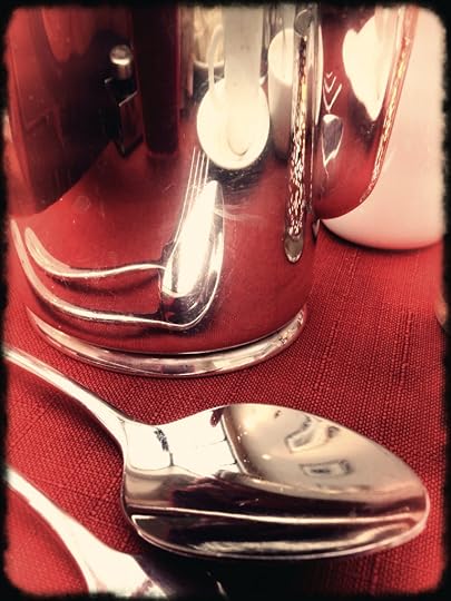
Spoonerismo © Harold Davis
A well-polished breakfast service at the hotel makes for iPhone fun when playing with my place setting!

April 26, 2014
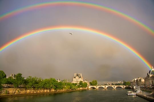
Double Rainbow over Paris
In the afternoon the rain started to come down hard, with a lush, almost tropical sound as it fell hard on the rooftops of Paris. I went upstairs because I had left my window open. I stuck my head out the window before I shut it. Around the corner was a hint of a rainbow.
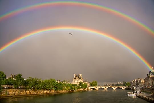
Double Rainbow over Paris © Harold Davis
I grabbed my camera, dashed downstairs in my t-shirt and jeans, took an umbrella from the bin next to the front desk, and ran the two blocks to the Seine River. A double rainbow was forming, upstream in the direction of the Louvre and the Musee D’Orsay. Precariously balancing my camera and using the umbrella to shelter it from the wind and rain I snapped a few photos.
Sometimes you get lucky.
Double Rainbow over Paris
In the afternoon the rain started to come down hard, with a lush, almost tropical sound as it fell hard on the rooftops of Paris. I went upstairs because I had left my window open. I stuck my head out the window before I shut it. Around the corner was a hint of a rainbow.
Double Rainbow over Paris © Harold Davis
I grabbed my camera, dashed downstairs in my t-shirt and jeans, took an umbrella from the bin next to the front desk, and ran the two blocks to the Seine River. A double rainbow was forming, upstream in the direction of the Louvre and the Musee D’Orsay. Precariously balancing my camera and using the umbrella to shelter it from the wind and rain I snapped a few photos.
Sometimes you get lucky.

Rain in Rodin’s Garden
One of my favorite places in Paris is the garden behind the Rodin Museum, where I went this morning. Of course, a Rodin garden would not be complete without Rodin’s sculpture. It was fun photographing the famous sculptures in the rain, which added to the textures and feeling of the place. The face of “The Thinker” is shown here, overexposed and processed for high-key.
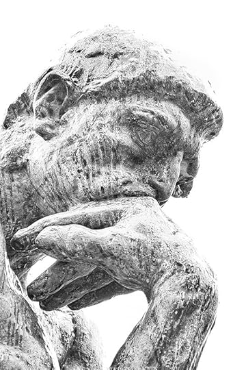
Thinker © Harold Davis

April 25, 2014
Pont Royal
Spring in Paris means that sometimes it rains, which can make it all the more romantic. I took advantage of the moody light today to photograph along the Seine River. From time to time rain squalls hit, and my camera and I went for cover under one of the bridges. I used a long exposure (two minutes) to flatten the moving water and give and old-fashioned appeal to this shot of the Pont Royal.
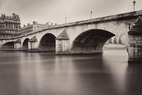
Pont Royal © Harold Davis
Exposure data: Nikon D800, 35mm Zeiss lens, circular polarizer, +4 ND filter, 120 seconds at f/13 and ISO 100, tripod mounted.

April 22, 2014
Recipe for a Refraction
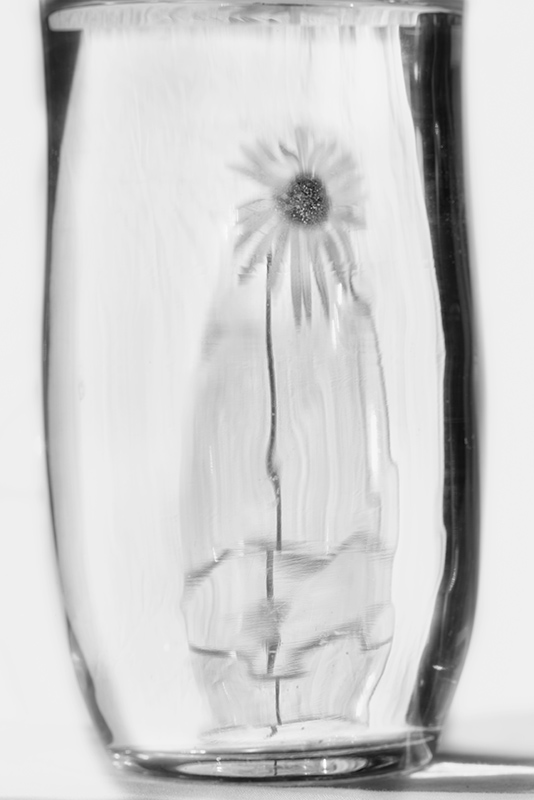
Message in a Bottle © Harold Davis
Ingredients:
1 DSLR (Nikon D800 or equivalent)
1 Moderate telephoto lens (135mm f/2 Zeiss or equivalent)
1 Extension tube (12mm)
1 Tripod
1 Remote release
1 White bed sheet
2 Vases partially filled with water
1 White daisy
1 Pedestal approximately 3″ X 12″ X 6″ (an old-style phone book will do)
Strong sunlight from the side
Directions:
Drape the white bed sheet so it forms a seamless background on a table. Put the daisy in one of the vases. Place the vases one behind the other, with the daisy in the rear vase. Place the pedestal under the sheet to raise the front vase.
Mount the camera on the tripod, and attach the remote release to the tripod. Attach the extension tube to the camera and the moderate telephoto lens to the extension tube. Using manual exposure, with the ISO set to 100, stop the lens all the way down (to f/16 or f/22).
Wait for the light to beam directly on the rear vase. Set the shutter speed to complete the exposure equation in relation to the incoming light in terms of the shutter speed. Hold the depth-of-field preview button down and wiggle the camera into position to best focus on the refraction of the daisy in the front vase. Expose the image with the remote release. Convert to monochrome.
Hint: It is all in the seeing.

April 21, 2014
Recipe for a Refraction
Message in a Bottle © Harold Davis
Ingredients:
1 DSLR (Nikon D800 or equivalent)
1 Moderate telephoto lens (135mm f/2 Zeiss or equivalent)
1 Extension tube (12mm)
1 Tripod
1 Remote release
1 White bed sheet
2 Vases filled to the 3/4 mark with water
1 White daisy
1 Pedestal approximately 3″ X 12″ X 6″ (an old-style phone book will do)
Strong sunlight from the side
Directions:
Drape the white bed sheet so it forms a seamless background on a table. Put the daisy in one of the vases. Place the vases one behind the other, with the daisy in the rear vase. Place the pedestal under the sheet to raise the front vase.
Mount the camera on the tripod, and attach the remote release to the tripod. Attach the extension tube to the camera and the moderate telephoto lens to the extension tube. Using manual exposure, with the ISO set to 100, stop the lens all the way down (to f/16 or f/22).
Wait for the light to beam directly on the rear vase. Set the shutter speed to complete the exposure equation in relation to the incoming light in terms of the shutter speed. Hold the depth-of-field preview button down and wiggle the camera into position to best focus on the refraction of the daisy in the front vase. Expose the image with the remote release. Convert to monochrome.
Hint: It is all in the seeing.
April 20, 2014
Painting in Transparency Using a High-Key Layer Stack Webinar with Harold Davis
Are you intrigued by transparent flower photos? Ever wanted to know how to make them? Well, here’s your chance!
With photography on a light box, once you photograph a bracketed high-key exposure sequence, then the the next step is to assemble a layer stack. As you build your layer stack, successively darker layers are masked and painted in to create the illusion of transparency. The results surprise and delight!
Digital artist and master photographer Harold Davis states, “My transparent botanical art has been greatly acclaimed and emulated. Flowers can create the most beautiful compositions. Photographers who are interested in photographing flowers should give this technique a try. Certainly, one of the most sensitive parts of the process is painting in the high-key layer stack.”
Learn this exciting technique from its creator! This webinar will be full of examples and have ample time for Q & A. Register for Painting in Transparency Using a High-Key Layer Stack Webinar with Harold Davis today (details below).

Special Tulips © Harold Davis
The Painting in Transparency Using a High-Key Layer Stack Webinar with Harold Davis covers:
Photographing a bracketed high-key sequence on a light box
Workflow considerations and options
Multi-RAW processing layers as needed
Creating the layer stack in Photoshop
Adding a layer mask
Using the Brush Tool
Using the Gradient Tool
Next steps after the layer stack has been created
When: The live webinar session will take place on Saturday, May 31, 2014, starting at 3PM PT. The webinar is scheduled for one hour, with additional time for Q&A. The session will be recorded, and you can review the recording at your convenience.
Prerequisite: Basic knowledge of Photoshop.
Where: At your computer, anywhere.
Cost: The registration fee for the live webinar is $29.95. This includes access to the recording of the webinar session. The cost for access to the webinar recording alone (this will be available after the session) is $19.95.
Registration: Registration for the Using Backgrounds and Textures with Harold Davis is limited to 20 participants. Click here to register for the webinar. Seats are very limited, so register now to avoid disappointment.
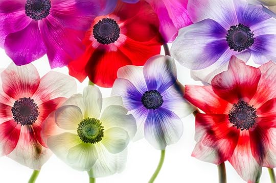
Anemones 1 © Harold Davis
Related webinars:
2014.05.24—Selective Sharpening with LAB Color Webinar with Harold Davis. Click here for information and here to register. There is a nominal charge.
2014.05.29—Using Backgrounds and Textures with Harold Davis. Click here for information and here to register. There is a nominal charge.
2014.05.31—Painting in Transparency Using a High-Key Layer Stack Webinar with Harold Davis. Click here for information and here to register.

Using Backgrounds and Textures with Harold Davis Webinar
Have you ever wanted to turn your photos into fine art design pieces? With a little bit of Photoshop know-how, a few inexpensive tools, and the techniques explained in this webinar, it’s easy to create unique art imagery, guided by your vision and creativity.
Placing a photo on a background creates an image that looks like a botanical illustration. Adding a texture to a photo is can be used for an impressionistic and/or painterly effect.
Digital artist and master photographer Harold Davis states, “The two primary techniques that I use to turn straightforward photos into art are to add a photo to a background, and to add a texture to photos. These two techniques have a very visual different impact, and can be particularly effective with my botanical art.”
It’s easy to add a whole set of techniques to your creative use of Photoshop! Register for Using Backgrounds and Textures with Harold Davis today (details below).
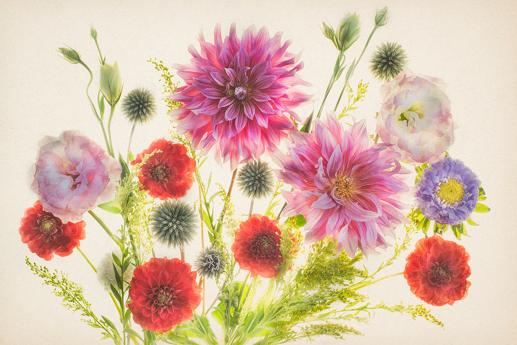
Flowers of Late Summer © Harold Davis
The Using Backgrounds and Textures with Harold Davis webinar covers:
Creative use of backgrounds and textures
The difference between a background and a texture
Making your own backgrounds
Making your own textures
Commercial libraries
How to apply an image to a background
Using textures and blending modes
Backgrounds and textures in botannicals
Using textures with people photography
Enhancing landscape photos with artistic effects
What to do, what not to do, and examples
When: The live webinar session will take place on Thursday, May 29, 2014, starting at 7PM PT. The webinar is scheduled for one hour, with additional time for Q&A. The session will be recorded, and you can review the recording at your convenience.
Prerequisite: Basic knowledge of Photoshop.
Where: At your computer, anywhere.
Cost: The registration fee for the live webinar is $29.95. This includes access to the recording of the webinar session. The cost for access to the webinar recording alone (this will be available after the session) is $19.95.
Registration: Registration for the Using Backgrounds and Textures with Harold Davis is limited to 20 participants. Click here to register for the webinar. Seats are very limited, so register now to avoid disappointment.
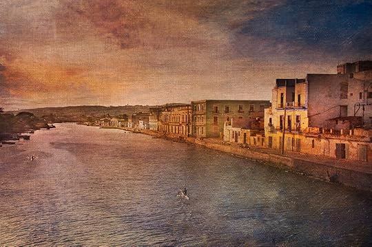
Venice of Cuba © Harold Davis
The landscape in Venice of Cuba (shown above) was enhanced with the addition of a canvas-based texture, creating a work of art with a painterly ambiance.
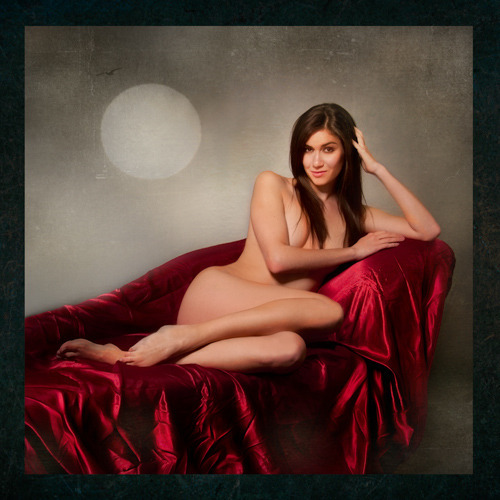
Kelly © Harold Davis
The photo of the model Kelly (shown above) was first placed on a background, then treated with a texture overlay.
Related webinars:
2014.05.24—Selective Sharpening with LAB Color Webinar with Harold Davis. Click here for information and here to register. There is a nominal charge.
2014.05.29—Using Backgrounds and Textures with Harold Davis. Click here for information and here to register. There is a nominal charge.
2014.05.31—Painting in Transparency Using a High-Key Layer Stack Webinar with Harold Davis. Click here for information and here to register.


