
Jeffrey Zeldman's Blog, page 67
August 18, 2011
Don't Be Evil (Wink).
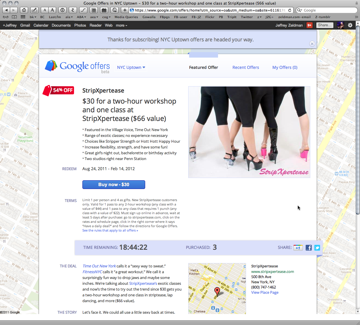
WHILE VIEWING STATS on TweetMeme, I noticed a banner ad that said, "New York—explore it again like you used to." Intrigued, I clicked the ad. It took me to the web page shown above. (Click to view full size.) At the top was a message thanking me for subscribing. Ouch! I had not subscribed, I had merely clicked a link. Opt-in subscription without notice or warning is about as dark as a user experience pattern can get and still be legal.
Beneath the notice was an ad for a women's strip tease class. I don't think I'm the intended demographic. Facebook would know that. Why doesn't Google?
The offer had a time limit; the script on the time limit froze my browser, prompting a force-quit and restart.
If "Don't Be Evil" is still Google's slogan, I wonder if folks who work there say it with a straight face.

[image error] [image error] [image error] [image error] [image error] [image error] [image error] [image error] [image error]


Advanced web design links
FROM MY TWITTER STREAM of late:
The Heads-Up Grid is an overlay grid for use during in-browser website development, built with HTML + CSS + JavaScript. http://t.co/EcgTkcD #
Golden Grid System – a folding grid for responsive design. h/t @malarkey http://j.mp/mZnVJi #
Nice responsive redesign! Well done, Meltmedia! http://t.co/tQQGW8J #
RT @jasonsantamaria: I'm writing a book about typography for @abookapart! Lucky number 7: http://t.co/7CkSz0l #
I love how everything Apple does, even slipping on a banana peel, is perceived as strategic. #
Paul draws a napkin map of London. http://t.co/p4co2ZM #
Okay, that last one isn't a web design link and the Apple comment could go either way, but that's how I roll. Follow me on Twitter for more snarkeractive funucation!

[image error][image error][image error][image error][image error][image error][image error][image error][image error]
August 16, 2011
Must-read: Switching the display of content and navigation based on browser size
JEREMY KEITH: "Right after I wrote about combining flexbox with responsive design—to switch the display of content and navigation based on browser size—I received an email from Raphaël Goetter. He pointed out a really elegant solution to the same use-case that makes use of display:table."
Elegant indeed! Follow the delightfully simple code and explanation at Adactio: Journal—Re-tabulate.

[image error][image error][image error][image error][image error][image error][image error][image error][image error]
August 10, 2011

An Event Apart Minneapolis 2011: The Flickr Photo Pool

Jared Spool Dances to Beyonce! Photo by John Morrison. As seen in An Event Apart Minneapolis 2011 Flickr group pool.

[image error] [image error] [image error] [image error] [image error] [image error] [image error] [image error] [image error]
An Event Apart: Design Principles
LUKE WROBLEWSKI: "In his Design Principles presentation at An Event Apart in Minneapolis, MN 2011, Jeremy Keith outlined the design principles behind the World Wide Web and how they continue to shape its future. Here are my notes from his talk:" LukeW | An Event Apart: Design Principles.

[image error] [image error] [image error] [image error] [image error] [image error] [image error] [image error] [image error]
Web Governance: Becoming an Agent of Change – A List Apart

SHIPPING IS EASY, making real change is hard. To do meaningful web work, we need to educate clients on how their websites influence their business and the legal, regulatory, brand, and financial risks they face without strong web governance. Learn why web governance is important to us as web professionals and how to influence your clients to think carefully about how to align their websites to their business strategy. A List Apart: Articles: Web Governance: Becoming an Agent of Change.
Illustration by Kevin Cornell for A List Apart.

[image error] [image error] [image error] [image error] [image error] [image error] [image error] [image error] [image error]
Designing Fun – A List Apart
HOW DO YOU DEFINE FUN on the web? Fun means different things to different people. Debra Levin Gelman says that to create fun, we need to allow users to create, play, and explore. Learn how to help your client define fun, rank its importance on their site, and user test it to create a delightful experience, regardless of whether you're designing for suits and ties or the sandbox crowd: A List Apart: Articles: Designing Fun.
Illustration by Kevin Cornell for A List Apart.

[image error] [image error] [image error] [image error] [image error] [image error] [image error] [image error] [image error]
CSS Best Practices – An Event Apart
LUKE WROBLEWSKI: "In her 'Our Best Practices Are Killing Us' presentation at An Event Apart in Minneapolis MN, Nicole Sullivan walked through common CSS best practices that have outlived their usefulness and what we can do instead to improve CSS performance and maintenance long term. Here's my notes from her talk:" LukeW | An Event Apart: CSS Best Practices.

[image error] [image error] [image error] [image error] [image error] [image error] [image error] [image error] [image error]
August 3, 2011
10K Apart – Responsive Edition
AS THE TITLE indicates, this year's 10K contest requires that your applications be "reasonably responsive" (yes, it's vague by design). The Responsive Design movement Ethan pioneered is still learning how to walk in the real world. We felt it best to leave some wiggle room to encourage new discoveries.
Visit the contest.
Read more about it.

[image error] [image error] [image error] [image error] [image error] [image error] [image error] [image error] [image error]


