
Jeffrey Zeldman's Blog, page 65
September 15, 2011
Boston Globe's Responsive Redesign. Discuss.

AS EVERY WEB DESIGNER not living under a rock hopefully already knows, The Boston Globe has had a responsive redesign at the hands of some of today's best designers and developers:
The spare Globe website has a responsive design that adapts to different window sizes, browsers and devices, and it has a built-in Instapaper-type feature that saves articles for reading off various devices on the subway. The overhaul has incorporated the talents of Boston design firms Filament Group, and Upstatement, as well as a large internal team, and pre-empts the need to build separate apps for each device.—New York Observer
As the first responsive redesign of a "real" website (i.e. a large, corporately financed, widely read newspaper site rather than some designer's blog), the site has the potential to raise public awareness of this flexible, standards-based, multi-platform and user-focused web design approach, and deepen perceptions of its legitimacy, much as Mike Davidson's standards-based redesign of ESPN.com in 2003 helped convince nonbelievers to take a second look at designing with web standards:
In a major step in the evolution of website design, the Boston Globe relaunched their site today using a Responsive Design approach. For a consistent experience across mobile and desktop browsers, they redesigned the site to add and remove columns to the layout based on the width of your browser window.
This marks the first major, high-traffic, content-heavy website to adopt a responsive design. The lead consultant behind the project is none other than Ethan Marcotte, the designer who wrote the book on responsive design. Much as ESPN changed the way we worked by being one of the first to launch a fully CSS driven site a decade ago, the Boston Globe's redesign has the potential to completely alter the way we approach web design.—Beaconfire Wire
More work remains to be done. Some sections of the paper have not yet converted, and some site architecture has yet to be refreshed, so it is too early to call the overhaul a complete success. But it is clear that Ethan Marcotte, author of Responsive Web Design and creator of responsive design, together with the geniuses at Filament Group, Upstatement, and the Globe's internal design/development team have managed to work beautifully together and to solve design problems some of us don't even know exist.
Congratulations to the Globe for its vision and these designers and developers for their brilliant work.

[image error] [image error] [image error] [image error] [image error] [image error] [image error] [image error] [image error]


September 11, 2011
Ten Years Ago Today
On 27th Street, a couple is passionately kissing. Behind them, the sky is filled with white smoke.
Everyone has left work. It's like the Fourth of July. And then again it's nothing like the Fourth of July.
At 33rd & Lex, a woman in an electric green dress squats down to take a snapshot of the Chrysler Building, standing tall and unaffected to the north. I catch myself thinking they haven't bombed that one yet.
Jeffrey Zeldman Presents: My Glamorous Life #54: 11 September, 2001. 12 September, 2001. 13 September, 2001. As my loved ones and I lived it in New York City.

[image error][image error][image error][image error][image error][image error][image error][image error][image error]
My Hero
EPIC BLOG POST from Blake Watson, a web designer with spinal muscular atrophy type 2, tremendous courage and faith, and an awesome mom:
We Still Have Our Dreams at ihatestairs.org

[image error][image error][image error][image error][image error][image error][image error][image error][image error]
The Multi-Size Web
HERE IS a fine collection of articles, frameworks, and other tools for a "mobile first" approach to (mainly responsive) web design. Well done, Mr Haidara. The Multi-Size Web: a Computing bag by Eric Haidara at Bagcheck.

[image error] [image error] [image error] [image error] [image error] [image error] [image error] [image error] [image error]
September 7, 2011
A List Apart 334
IN ISSUE NO. 334 of A List Apart, for people who make websites:
Marry Your Clients: Learn to keep the client/agency relationship warm and passionate over time.
Being Human is Good Business: Turn word of mouth into your strongest brand asset through genuine, personalized, compassionate customer service.
Illustration by Kevin Cornell for A List Apart Magazine.

[image error] [image error] [image error] [image error] [image error] [image error] [image error] [image error] [image error]
September 3, 2011
Ava's first comic strip
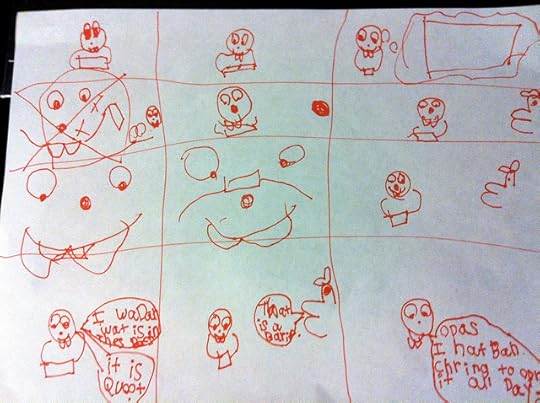
Bucktooth character: "I wonder what is in this box. It is cute."
Other character: "That is a brick."
Bucktooth character: "Oops, I've been trying to open it all day."
Ava's first comic strip | Flickr – Photo Sharing!.

[image error][image error][image error][image error][image error][image error][image error][image error][image error]

September 2, 2011
Happy Cog Web Designers Join Ganapati Kulam
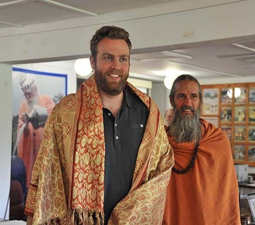
"YESTERDAY AND TODAY the Ganapati Kulam held a two-day intensive kick-off meeting with three members of Happy Cog, a leading web-design firm that the monastery hired for a complete, professional redesign of this Himalayan Academy/Kauai's Hindu Monastery website using funds raised during last year's Digital Dharma Drive."
Today at Kauai's Hindu Monastery, 9/01/2011: Happy Cog Web Designers Join Ganapati Kulam.

[image error][image error][image error][image error][image error][image error][image error][image error][image error]
Big Web Show No 55: Living with a hidden disability
MARISSA CHRISTINA joins Jeffrey Zeldman and Dan Benjamin to discuss her path as a web designer diagnosed with a debilitating vestibular disorder, and her blog Abledis.com, documenting living with a hidden disability.
The Big Web Show #55: Marissa Christina – 5by5.

[image error][image error][image error][image error][image error][image error][image error][image error][image error]
Fast Company on Adobe Muse
"DESIGN GURU Jeffrey Zeldman, says while he likes Muse for its ease of creating layouts, it still doesn't answer his plea for a better Internet. 'Software can't generate HTML that is search-engine friendly, accessibility-friendly, and portable between desktop and mobile,' he says. 'Only web design professionals who understand semantic markup, responsive and adaptive web layout, and mobile user interface can do that.'"
Adobes Muse Lets Designers Make Websites Without Knowing Code | Co. Design.

[image error][image error][image error][image error][image error][image error][image error][image error][image error]


