
Jeffrey Zeldman's Blog, page 58
February 7, 2012
Notes from An Event Apart Atlanta 2012

LUKE WROBLEWSKI'S notes on most of the sessions from An Event Apart Atlanta, 2012, Feb. 6–8, 2012. Thanks, buddy!
Properties of Intuitive Web Pages — February 7, 2012
An Event Apart: The Future of CSS — February 7, 2012
An Event Apart: CSS Best Practices — February 7, 2012
An Event Apart: Buttons are a Hack — February 7, 2012
An Event Apart: Content First — February 6, 2012
An Event Apart: Inclusive Design — February 6, 2012
An Event Apart: Handcrafted Patterns — February 6, 2012
An Event Apart: Hacking Users Brains — February 6, 2012
An Event Apart: Adaptive Web Content — February 6, 2012
An Event Apart: Rolling Up Our Responsive Sleeves — February 6, 2012

[image error] [image error] [image error] [image error] [image error] [image error] [image error]


Fluid grids, orientation & resolution independence
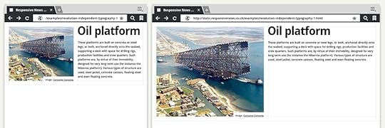
IF YOU'VE spent any time building responsive websites with fluid grids, you will have encountered the shock of seeing your beautiful portrait layout distort when viewed in landscape mode (or vice-versa.)
This happens because whilst the layout and embedded content (images, video etc) are sized in relation to the pixel width of the viewport, the typography is not. And whilst it isn't too difficult to design with enough affordance for the variation caused by the iPad's 4:3 aspect ratio – most (if not all) Android tablets have 16:9 displays. These screens make the orientation difference even more pronounced.
Responsive News – Fluid grids, orientation & resolution independence.

[image error][image error][image error][image error][image error][image error][image error]
February 1, 2012
My Glamorous Life: Lucy Ricardo, C'est Moi

TRYING A NEW breakfast place. I tell the cashier, "Extra crispy bacon."
"Extra bacon," she says.
"No, not extra bacon. Extra crispy bacon," I say.
A fast-paced volley of shouted Spanish follows, between the cook, the cashier, and the server. A customer in line behind me chimes in. He is either describing my order to the cashier or telling her about a dream he had involving velvet chickens. I've got to learn Spanish.
The cashier turns her green gaze back to me.
"Extra bacon," she says.
"Um, no," I say.
"No bacon," she says.
"Yes, bacon," I say. "Spinach mushroom omelette, bacon — no toast, no potatoes."
I will never be able to make it up to her, or to the other customers in line behind me. Or to the pig, quite frankly.
"Extra bacon," she announces.
I say, "Thank you" and leave a tip in the jar.

[image error] [image error] [image error] [image error] [image error] [image error] [image error]
January 31, 2012
A List Apart: a change is gonna come, I can feel it
TODAY, TWO invaluable contributors to A List Apart move on, and a new member joins our ranks:

Aaron Gustafson (@aarongustafson), author of Adaptive Web Design (the clearest, most beautiful explanation of progressive enhancement I've ever read) and nearly a dozen brilliant A List Apart articles, has been a technical editor at A List Apart for six exciting and formative years.

Daniel Mall (@danielmall) has written three great ALA articles and served as A List Apart technical editor almost as long as Aaron.
Both gentlemen have had a profound and lasting impact on the nature and quality of A List Apart's content. With the publication of today's ALA issue, both gentlemen move on.
Aaron is the founder of Web Standards Sherpa ("journeying towards best web practices") and Easy Designs LLC; co-founder of Retreats 4 Geeks; and manager of The Web Standards Project.
Dan is a former interactive designer for Happy Cog's Philadelphia studio, former design director at Big Spaceship in Brooklyn, co-founder of Typedia and swfIR, and singer/keyboard player for contemporary-Christian band Four24. I can't tell you what he is doing next — he has sworn me to secrecy — but trust me, it will be awesome.
Over a long career marked by extraordinary collaborators, Aaron and Dan are two of the smartest, and most talented people I've had the pleasure to work with. They are also friends. This isn't goodbye, fellas.
[image error]
JOINING US today as technical editor is Mat Marquis (@wilto). He marks his entrance into A List Apart's world via this morning's stunning article, Responsive Images: How They Almost Worked and What We Need.
Mat is a designer-slash-developer working at Filament Group in Boston. Mat is a member of the jQuery Mobile team, an active member of the open source community, and enjoys a complicated relationship with the now-defunct HTML5 "dialog" tag.
Welcome, Wilto!

[image error] [image error] [image error] [image error] [image error] [image error] [image error]
A List Apart: Pricing Strategy for Creatives
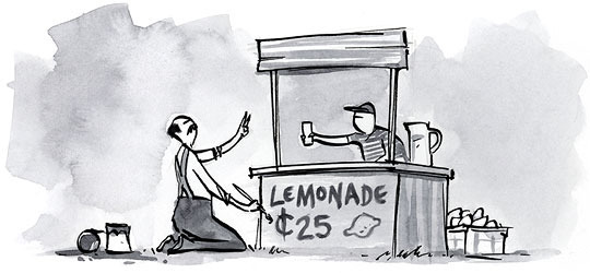
FREELANCERS AND STUDIO HEADS, learn what your rates say about your brand, and discover how to make more money by raising your rate strategically.
A List Apart: Pricing Strategy for Creatives by JASON BLUMER.
Illustration by Kevin Cornell for A List Apart Magazine.

[image error][image error][image error][image error][image error][image error][image error]
A List Apart: Responsive Images: How they Almost Worked and What We Need

RESPONSIVE WEB DESIGNERS, don't miss Mat Marquis' essential article in today's A LIST APART, for people who make websites: Responsive Images: How they Almost Worked and What We Need. Mat shows why responsive images as we currently use them don't quite cut it – and shares a way forward that involves the creation of a shiny new HTML element.
Illustration by Kevin Cornell for A List Apart Magazine.

[image error][image error][image error][image error][image error][image error][image error]
January 27, 2012
Dyson to NY: drop dead
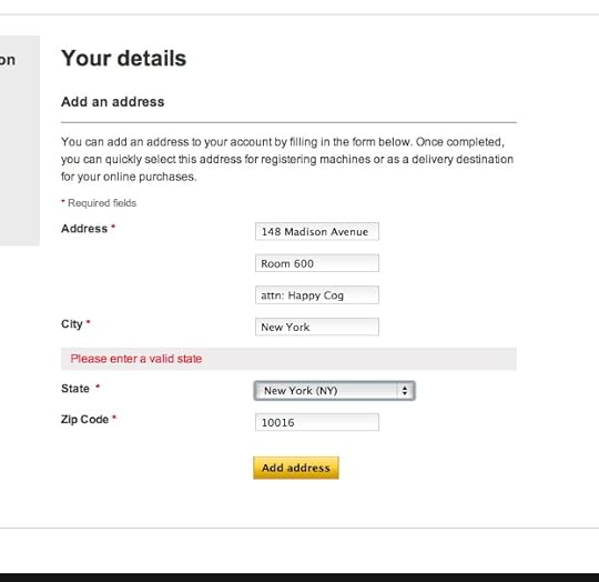
DYSON'S WEBSITE won't sell me a vacuum cleaner. It claims New York, a U.S. state it provides in its own drop-down menu, is "not a valid state." I have previously ordered Dyson products from the Dyson website and shipped them to a different address in New York. I have an account and everything. But the website won't let me ship products to my office. This is just one of about a dozen errors that wasted half an hour of my life today.

[image error] [image error] [image error] [image error] [image error] [image error] [image error]
January 23, 2012
Accident
CAR JUST HIT ME as I was crossing street. Van carrying old people. Driver didn't see me. Van struck my head. #
I punched door. Driver and passengers stared at me. Time slowed way down. I gestured for driver to pull over.#
Asked woman on street if I was bleeding. She said no. Told van driver to leave. He got out, walked over, insisted on seeing if I was ok. #
Black man, about 60. Told him I was good, merry Christmas. Shook his hand twice, nearly hugged him. Glad to be alive. #
Two hours later:
In ER with friend, getting checked after accident. #
No concussion, no spinal or brain injury, I'm very lucky. #
P.S. Having some back and arm pain today, nothing unexpected according to what the E.R. doc told me. Overwhelming feeling remains gratitude at being alive, although the feeling is more tempered now, not as giddy as it was immediately following the accident.

[image error][image error][image error][image error][image error][image error][image error]
January 17, 2012
A List Apart Issue No. 342: A Pixel Identity Crisis; An Important Time for Design; Building Twitter Bootstrap
In a triple issue of A List Apart for people who make websites, it's time for designers to seize the day! Transcend mobile platform differences, harness the power of an open-source front-end toolkit, and band together to change the world:
An Important Time for Design
by CAMERON KOCZON
Cameron Koczon says designers have now been given a blank check—one that lets us band together as a community to change the way design is perceived; change the way products are built; and quite possibly change the world.
Building Twitter Bootstrap

by MARK OTTO
Mark Otto, the co-creator of Bootstrap, sheds light on how and why Bootstrap was made, the processes used to create it, and how it has grown as a design system.
A Pixel Identity Crisis
by SCOTT KELLUM
The pixel has long been the atomic particle of screen based design: a knowable, concrete unit of measurement. But layouts based on the hardware pixel are fast becoming an endangered species. Scott Kellum shows how math and media queries can keep you sane and help you design consistently across platforms.
Thanks
This is Mandy Brown's last issue as an editor. Mandy has brought a lot of great thinking to ALA; she will be missed. Mandy will continue as editor of A Book Apart.
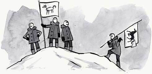
Illustrations by Kevin Cornell for A List Apart

[image error] [image error] [image error] [image error] [image error] [image error] [image error]
January 16, 2012
Ding dong, SOPA is dead.
DING DONG, THE WITCH IS DEAD. For now, at least, the "ill-conceived lobbyist-driven piece of legislation" known as the Stop Online Piracy Act (SOPA) is no more:
Misguided efforts to combat online privacy have been threatening to stifle innovation, suppress free speech, and even, in some cases, undermine national security. As of yesterday, though, there's a lot less to worry about.
…Though the administration did [not] issue a formal veto threat, the White House's opposition signaled the end of these bills, at least in their current form.
A few hours later, Congress shelved SOPA, putting off action on the bill indefinitely.
Political Animal – Putting SOPA on a shelf

[image error][image error][image error][image error][image error][image error][image error]


