
Jeffrey Zeldman's Blog, page 56
March 23, 2012
Web Type Will Save Us (Or, Who’s Afraid of the Big, Bad Retina Display?)
WITH RETINA DISPLAY technology on the verge of ubiquity and some of today’s best web design minds rightfully fretting about it (see PPK, Stephanie Rieger, Brad Frost, and Stuntbox if you’ve missed this latest Topic Of Concern), it seems to this old web slinger that web type is poised to replace photography as the dominant element of web design aesthetic appeal in the next few years.
After all, responsive web design already called upon us to create and swap multiple versions of the same image. And now Retina Displays reveal the lack of quality in all web images — compelling us, perhaps, to create high-resolution image versions which some users lack the bandwidth to download, and to lather our sites with yet more JavaScript as we try to detect whether or not each user’s device requires a higher-res image (shades of 1999!).
But type is type is type, and the higher the resolution of the device, the better that type will look, with no bandwidth overhead.
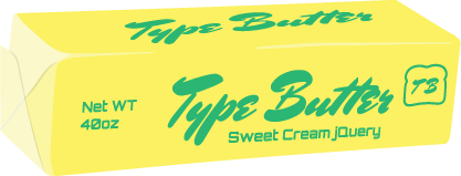
In that spirit, although we haven’t yet worked with it ourselves, we welcome the launch of TypeButter. Developed by David Hudson and designed by Joel Richardson, TypeButter is a plug-in that “allows you to set optical kerning for any font on your website.”
Soon, CSS and browsers will let us set type properly without the need for widgets and plug-ins. Until then, widgets and plug-ins fill the gap. Thank you, David and Joel, and all you beautiful web type designers and polyfill wizards.


Web Type Will Save Us (Or, Who's Afraid of the Big, Bad Retina Display?)
WITH RETINA DISPLAY technology on the verge of ubiquity and some of today's best web design minds rightfully fretting about it (see PPK, Stephanie Rieger, Brad Frost, and Stuntbox if you've missed this latest Topic Of Concern), it seems to this old web slinger that web type is poised to replace photography as the dominant element of web design aesthetic appeal in the next few years.
After all, responsive web design already called upon us to create and swap multiple versions of the same image. And now Retina Displays reveal the lack of quality in all web images — compelling us, perhaps, to create high-resolution image versions which some users lack the bandwidth to download, and to lather our sites with yet more JavaScript as we try to detect whether or not each user's device requires a higher-res image (shades of 1999!).
But type is type is type, and the higher the resolution of the device, the better that type will look, with no bandwidth overhead.
In that spirit, although we haven't yet worked with it ourselves, we welcome the launch of TypeButter. Developed by David Hudson and designed by Joel Richardson, TypeButter is a plug-in that "allows you to set optical kerning for any font on your website."
Soon, CSS and browsers will let us set type properly without the need for widgets and plug-ins. Until then, widgets and plug-ins fill the gap. Thank you, David and Joel, and all you beautiful web type designers and polyfill wizards.

[image error][image error][image error][image error][image error][image error][image error]
March 17, 2012
Post-Induction Party Pix by Annie Ray | SXSWi 2012

I THREW A PARTY on the last night of SXSW Interactive 2012 to celebrate my induction in the Hall of Fame. Photos © Annie Ray, annieray.net. The entire photo gallery is available for your viewing pleasure at http://cog.gd/3m0.

[image error] [image error] [image error] [image error] [image error] [image error] [image error]
March 15, 2012
Jeffrey Zeldman Inaugural Hall of Fame Testimonial Video (4:00)
Jeffrey Zeldman tribute video – on his induction into the SXSW Interactive Hall of Fame from Jeffrey Zeldman on Vimeo.
VIDEO: SOME MEMBERS of the web design and development community share thoughts about yours truly on the occasion of my induction into the SXSW Interactive Hall of Fame.
This video was played on the big screens at SXSW Interactive during the 2012 Awards Show preceding the inaugural Hall of Fame induction ceremony on March 13, 2012.
Shucks, folks.

[image error][image error][image error][image error][image error][image error][image error]
Behind The Music: The Jeffrey Zeldman Dolls


Jeffrey was looking for us to do a more tailored, short run of the doll we had initially designed of him-215 to be exact. They were to be given away as gifts at the Hall of Fame after party being held at South by Southwest (right about now is where you can hear our jaws drop to the floor).
Here was the opportunity to put handmade work into the hands of 215 web designers and industry gurus at one of the largest interactive design conferences in the world-South by Southwest. Are we interested? Hells, please! So, after hashing out the details and specifics we set into work on the very complicated and detailed project. Below are just a few of the pictures we took documenting the process…
Of Austin Fame and Marches | Dolls for Friends.

[image error] [image error] [image error] [image error] [image error] [image error] [image error]
March 14, 2012
The Impossible Year | Jeffrey Zeldman with Mini-Zeldman Doll Polaroid…

JOHN MORRISON:
Jeffrey Zeldman with Mini-Zeldman Doll
Polaroid SLR 680SE / Impossible PX-680 Color Shade
Jeffrey became the first person inducted into the SXSW Interactive Hall of Fame. Afterwards there was a party with mini-Zeldman dolls.
The Impossible Year | Jeffrey Zeldman with Mini-Zeldman Doll Polaroid…

[image error][image error][image error][image error][image error][image error][image error]
March 13, 2012
Massively Mobile Progressive Enhancement | Is Your Site Future-Friendly? | Brad Frost & Stephanie Rieger in A List Apart

ISSUE NO. 346 of A List Apart for people who make websites is all about massively mobile progressive enhancement. Are your site's content and design future friendly?
For a Future-Friendly Web
by BRAD FROST
It is time to move toward a future-friendly web. Our current device landscape is a plethora of desktops, laptops, netbooks, tablets, feature phones, smartphones, and more, but this is just the beginning. The rapid pace of technological change is accelerating, and our current processes, standards, and infrastructure are quickly reaching their breaking points. How can we deal with increasing device diversity and decreasing attention spans? Brad Frost of futurefriend.ly explains how, while this era of ubiquitous connectivity creates new challenges, it also creates tremendous opportunities to reach people wherever they may be.
The Best Browser is the One You Have with You
by STEPHANIE RIEGER
The web as we know and build it has primarily been accessed from the desktop. That is about to change. The ITU predicts that in the next 18–24 months, mobile devices will overtake PCs as the most popular way to access the web. If these predictions come true, very soon the web—and its users—will be mostly mobile. Even designers who embrace this change can find it confusing. One problem is that we still consider the mobile web a separate thing. Stephanie Rieger of futurefriend.ly and the W3C presents principles to understand and design for a new normal, in which users are channel agnostic, devices are plentiful, standards are fleeting, mobile use doesn't necessarily mean "hide the desktop version," and every byte counts.

[image error][image error][image error][image error][image error][image error][image error]
March 11, 2012
Today at 5PM | Go Forth & Make Awesomeness: Core Values & Action | SXSW Interactive 2012

LESLIE JENSEN-INMAN (@jenseninman), Assistant Professor, The University of Tennessee, created this panel and graciously invited me to be her guest. An alternate name for the panel could be Quit Bitching and Go Make Cool Shit. It's about personal creative empowerment via sweat, the internet, and the communities it engenders.
Discover how to: embrace your passion, define your purpose, foster your promise, and engage your pursuit. Find out how to do this in a creative environment that encourages collaboration.
HASH TAG
#GoForth
WHEN
Time 5:00pm–6:00pm CST
Date 11th March 2012
WHERE
Ballroom A, Austin Convention Center
Austin, TX
INTERVIEW
Happy Cog Interview
LANYRD LISTING
Go Forth & Make Awesomeness: Core Values & Action at SXSW Interactive 2012 | Lanyrd

[image error] [image error] [image error]
March 9, 2012
Big Web Show No. 66 | David Sleight on publishing, devices, and the web

IN BIG WEB SHOW Episode No. 66, Jeffrey Zeldman interviews veteran web designer and publishing creative director David Sleight about how traditional publishers can transition to creating successful digital experiences, and the (mostly conceptual) obstacles they will have to overcome to do so.
Topics discussed in this episode include: why publishers alternately blame technology and treat it as a savior; the downside for magazine publishers of Apple's new retina display; why content thieves may be your best customers in waiting; content-focused responsive design versus printed page emulation; and much more.
David Sleight is one of the few people at the intersection of publishing and digital technology who actually understands both worlds. He is a web designer, creative director, and the founder of Stuntbox, a boutique interactive design consultancy based in Brooklyn, New York. Before launching Stuntbox, David helped build web-based textbooks at Pearson Education, and then went on to lead the Interactive Design department at BusinessWeek during one of its largest audience growth periods.
Listen to The Big Web Show #66: David Sleight.
Show Links
Stuntbox
@stuntbox
Gridulator
ipad3′s retina display will wreak havoc on the web
optimizing web experiences for high resolution screens
I tried to watch Game of Thrones and this is what happened
BusinessWeek
Pearson Education
Subscribe to The Big Web Show
The Big Web Show features special guests and topics like web publishing, art direction, content strategy, typography, web technology, and more. Get episodes delivered to you automatically:
Audio RSS Feed
iTunes Audio

[image error] [image error] [image error] [image error] [image error] [image error] [image error]
March 5, 2012
Big Web Show No. 65 | Tim Brown of Typekit and Nice Web Type

IN EPISODE NO. 65 of The Big Web Show ("everything web that matters"), I interview Tim Brown of Typekit and Nice Web Type on where we are with web fonts, real web type in real web context, using Dribbble to develop a tone of voice, how saving small snippets of other people's content can turn you into a blogger, Samantha Warren's Style Tiles, molten leading orbital content, pages versus chunks, the type-driven design, web font fallbacks, the connection between leading and font family, transitioning from university work to Typekit, and much more.
Listen to The Big Web Show #65: Tim Brown.
Show Links
Links mentioned in this show are numerous, enlightening, and available for your pleasure.
Subscribe to The Big Web Show
The Big Web Show features special guests and topics like web publishing, art direction, content strategy, typography, web technology, and more. Get episodes delivered to you automatically:
Audio RSS Feed
iTunes Audio

[image error] [image error] [image error] [image error] [image error] [image error] [image error]


