
Jeffrey Zeldman's Blog, page 55
April 18, 2012
Redesigning in Public Again

I FINALLY GOT A COUPLE OF HOURS free, enabling me to do something I’ve been itching to try since I first saw the web on a modern mobile device: redesign this website.
First I cranked up the type size. With glorious web fonts and today’s displays, why not?
Then I ditched the sidebar. Multiple columns are so 1990s.
This site has always been about content first. But the layout was a holdover from the days when inverted L shapes dotted the cyber landscape; when men were men, and all websites bragged two columns, laid out with table cells as the Lord intended.
The previous redesign deliberately hearkened back to the old, old days of this site. It was fun (even if I was the only one who got the joke). But my journey down Retro Lane coincided unfortunately with the first big news in web design since the anchor tag (mobile-first, content-first, responsive, etc). Today’s little design exercise here redresses all that.
This is not a finished work. I may make some things squeeze-y that are now rock-hard. I might lock the viewport and play with padding and things. But the site is now much closer to where I’ve wanted it for the past two years.
Page backward, if you wish, to see how it rolls out so far.
Thanks to Tim Murtaugh, who helped me debug more than one maddening straggler.


April 17, 2012
Designing Apps With Web Standards (HTML is the API)

The Web OS is Already Here… Luke Wroblewski, November 8, 2011
Mobile First Responsive Web Design, Brad Frost, June, 2011
320 and up – prevents mobile devices from downloading desktop assets by using a tiny screen’s stylesheet as its starting point. Andy Clarke and Keith Clark.
Gridless, HTML5/CSS3 boilerplate for mobile-first, responsive designs “with beautiful typography”
HTML5 Boilerplate – 3.02, Feb. 19, 2012, Paul Irish ,Divya Manian, Shichuan, Matthias Bynens, Nicholas Gallagher
HTML5 Reset v 2, Tim Murtaugh, Mike Pick, 2011
CSS Reset, Eric Meyer, v 2.0b1, January 2011
Less Framework 4 – an adaptive CSS grid system, Joni Korpi (@lessframework)
Responsive Web Design by Ethan Marcotte, 2011
Adaptive Web Design by Aaron Gustafson, 2011
Web Standards Curriculum – Opera
Getting Started With Sass by David Demaree, 2011, A List Apart
Dive into Responsive Prototyping with Foundation by Jonathan Smiley, A List Apart, 2012
Future-Ready Content Sara Wachter-Boettcher, February 28, 2012, A List Apart
For a Future Friendly Web Brad Frost, March 13, 2012, A List Apart
Orbital Content Cameron Koczon, April 19, 2011, A List Apart
Web standards win, Windows whimpers in 2012, Neil McAllister, InfoWorld, December 29, 2011
Thoughts on Flash – Steve Jobs, April, 2010
Did We Just Win the Web Standards Battle? ppk, July 2006
The Web Standards Project: FAQ (updated), February 27, 2002
To Hell With Bad Browsers, A List Apart, 2001
The Web Standards Project: FAQ, 1998
The Web Standards Project: Mission, 1998
April 10, 2012
Mike Monteiro’s “Design Is A Job” is finally available to buy or preview.

CO-FOUNDER of Mule Design and raconteur Mike Monteiro wants to help you do your job better. From contracts to selling design, from working with clients to working with each other, his brief book Design Is A Job is packed with knowledge you can’t afford not to know. This is one of the most in-demand titles we at A Book Apart have yet published, and the long, long wait for its release (and yours) is finally over!
—Preview Design Is A Job in Issue No. 348 of A List Apart, for people who make websites.
—Buy Design Is A Job directly from the makers at A Book Apart.
Also of interest:
Watch F*ck you. Pay Me, a presentation by Mike Monteiro to San Francisco Creative Mornings, 25 March 2011. (Video, 38:40.)
Listen to Big Web Show No. 59: Jeffrey Zeldman talks with Mike Monteiro of Mule Design. (Audio, 54 minutes.)
Follow @mike_ftw on Twitter.
Pay attention to Mule Design Studio.
Mike Monteiro's "Design Is A Job" is finally available to buy or preview.
CO-FOUNDER of Mule Design and raconteur Mike Monteiro wants to help you do your job better. From contracts to selling design, from working with clients to working with each other, his brief book Design Is A Job is packed with knowledge you can't afford not to know. This is one of the most in-demand titles we at A Book Apart have yet published, and the long, long wait for its release (and yours) is finally over!
—Preview Design Is A Job in Issue No. 348 of A List Apart, for people who make websites.
—Buy Design Is A Job directly from the makers at A Book Apart.
Also of interest:
Watch F*ck you. Pay Me, a presentation by Mike Monteiro to San Francisco Creative Mornings, 25 March 2011. (Video, 38:40.)
Listen to Big Web Show No. 59: Jeffrey Zeldman talks with Mike Monteiro of Mule Design. (Audio, 54 minutes.)
Follow @mike_ftw on Twitter.
Pay attention to Mule Design Studio.

[image error] [image error] [image error] [image error] [image error] [image error] [image error]
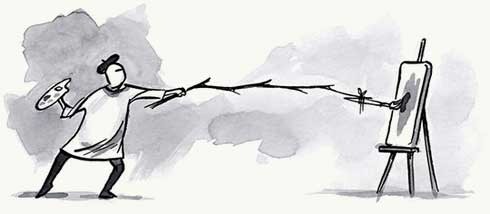
Responsive Prototyping with Foundation
IN ISSUE NO. 348 of A List Apart, for people who make websites:
Dive into Responsive Prototyping with Foundation
There are hundreds of devices out there right now that can access the full web, as Steve Jobs once put it. They come with different capabilities and constraints, things like input style or screen size, resolution, and form. With all these devices set to overtake traditional desktop computers for web traffic next year, we need tools to help us build responsively. Jonathan Smiley shows how to dive into responsive design using Foundation, a light front-end framework that helps you rapidly build prototypes and production sites.
Illustration by Kevin Cornell for A List Apart.

[image error][image error][image error][image error][image error][image error][image error]
April 4, 2012
Fico by Lensco.be | an icon font for responsive web designs, Retina display
FICO, by Lensco.be, is a font with 52 simple, commonly used icons and glyphs, served on the web via @font-face. Small (under 12K when gripped, in one HTTP request) and color-agnostic (you can even use gradients and shadows), it is perfect for responsive designs with media queries, and for creating a rich visual feel without the bandwidth and production overhead of JPG images in a Retina world.
[image error] [image error] [image error] [image error] [image error] [image error] [image error]
CSS & Mobile To The Future | Embrace Users, Constrain Design | An Event Apart Seattle 2012 Day II
TUESDAY, 3 APRIL 2012, was Day II of An Event Apart Seattle, a sold-out, three-day event for people who make websites. If you couldn't be among us, never fear. The amazing Luke Wroblewski (who leads a day-long seminar on mobile web design today) took excellent notes throughout the day, and shares them herewith:
The (CSS) Future is Now – Eric Meyer
In his The Future is Now talk at An Event Apart in Seattle, WA 2012 Eric Meyer talked about some of the visual effects we can achieve with CSS today. Create shiny new visual elements with no images using progressive enhancement and CSS that is available in all modern browsers.
A Philosophy of Restraint
- Simon Collison
In his A Philosophy of Restraint talk at An Event Apart in Seattle, WA 2012 Simon Collison outlined his design philosophy and how he applies it to web projects. Embrace constraints; simplicity and complexity; design aesthetic; design systems as foundations that prepare us for future projects and complexity; affordances and type; focus and content; audit and pause — prevent catastrophic failures and shine a new light on what you've learned with each project.
Touch Events – Peter-Paul Koch (PPK)
In his Touch Events talk at An Event Apart in Seattle, WA 2012 Peter-Paul Koch talked about touch support in mobile browsers and how to handle touch events in web development. Includes a ranking of current mobile browsers; interaction modes in mobile versus desktop (mouse) and keyboard — how do we adjust scripts to work with touch?; touch events; supporting modes; event cascade; and "stick with click."
Mobile to the Future – Luke Wroblewski
Alas, Luke could not take notes on his own presentation. Here's what it was about: When something new comes along, it's common for us to react with what we already know. Radio programming on TV, print design on web pages, and now web page design on mobile devices. But every medium ultimately needs unique thinking and design to reach its true potential. Through an in-depth look at several common web interactions, Luke outlined how to adapt existing desktop design solutions for mobile devices and how to use mobile to expand what's possible across all devices.Instead of thinking about how to reformat your websites to fit mobile screens, attendees learned to see mobile as way to rethink the future of the web.
What's Your Problem? – Whitney Hess
In her What's Your Problem? Putting Purpose Back into Your Projects talk at An Event Apart in Seattle, WA 2012 Whitney Hess outlined the value of learning about opportunities directly from customers. Understand the problem before designing the solution. Ask why before you figure out how. There is no universal solution for all our projects, we need to determine which practices are "best" through our understanding of problems. Our reliance on best practices is creating a world of uniform websites that solve no one's problem. Leave the desk and interact with people. Rather than the problem solver, be the person who can see the problem.
Properties of Intuitive Pages
- Jared Spool
At An Event Apart in Seattle WA 2012, Jared Spool walked through what makes a design intuitive, why some users need different treatment, and the role of design. Current versus acquired knowledge and how to bridge the gap (how to train users, thus making your site or app "intuitive"). Redesigns and how to avoid disaster. Design skills. The gap between current knowledge and target knowledge is where design happens. Why intuitive design is only possible in small, short iterations.
Day III begins in 90 minutes. See some of you there.
Photos: AEA Seattle Flickr pool or hashtags #aea and #aeasea on Instagram.

[image error] [image error] [image error] [image error] [image error] [image error] [image error]
April 3, 2012
Web, Mobile, Responsive, Content | Notes from An Event Apart Seattle Day 1
IF YOU couldn't be among us for An Event Apart Seattle 2012 Day 1 on Monday, 2 April 2012, these notes by the illustrious Luke Wroblewski will almost make you feel you were there:
Content First – Jeffrey Zeldman
In his opening keynote at An Event Apart in Seattle, WA 2012 Jeffrey Zeldman talked about the need to keep content front and center in websites and the web design process.
Big Type Little Type – Jon Tan
In his Big Type, Little Type talk at An Event Apart in Seattle, WA 2012 Jon Tan talked about important considerations for font setting and selection on the web.
Silo-Busting with Scenarios – Kim Goodwin
In her Silo-Busting with Scenarios talk at An Event Apart in Seattle, WA 2012 Kim Goodwin described the value of using scenarios as a design tool and walked through an example of how to do so.
Five Dangerous Ideas = Scott Berkun
In his Five Dangerous Ideas talk at An Event Apart in Seattle, WA 2012 Scott Berkun outlined truths about how the world works that creatives don't like to talk about.
Adaptive Web Content – Karen McGrane
In her presentation at An Event Apart in Seattle WA 2012 Karen McGrane discussed the need for structured content on the web.
Rolling Up Our Responsive Sleeves – Ethan Marcotte
In his Rolling Up Our Responsive Sleeves talk at An Event Apart in Seattle, WA 2012 Ethan Marcotte walked through ways to tackle thorny issues in responsive design layouts, media, advertising, and more.
Watch http://www.lukew.com/ff?tag=aeaseattle2012 for notes on Day II, beginning momentarily.
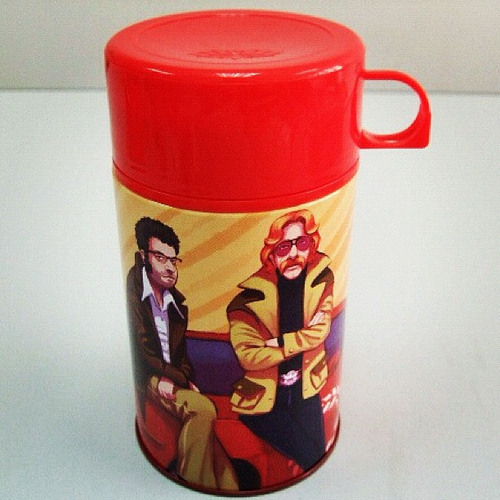
AEA swag thermos (part of the complete 2012 swag set) illustrated by the magnificent Kevin Cornell for An Event Apart.

[image error] [image error] [image error] [image error] [image error] [image error] [image error]
March 27, 2012
A List Apart No. 347 | Style Tiles & Self-Critique
DESIGN BETTER with Issue No. 347 of A List Apart for people who make websites:
Artistic Distance
by PAUL BURTON
Pimpin' ain't easy; neither is self-critique. If you are passionate about what you create, it is impossible to completely disassociate yourself from your work in order to objectively evaluate and then improve it. But the ability to achieve "artistic distance"—that is, to attain a place that allows you to contemplate your design on its own merits—will enable you to improve your own work immeasurably and, ultimately, to cast off the immature shackles of ego. Learn to let your work shine by letting go of it. Acquire the knack of achieving artistic distance.
Style Tiles and How They Work
by SAMANTHA WARREN
How do you involve your client in a successful design process? Many of our processes date back to print design and advertising. It's time we evolved our deliverables to make clients a more active participant in the process. The style tile is a design deliverable that references website interface elements through font, color, and style collections delivered alongside a site map, wireframes, and other user experience artifacts. Learn how style tiles can align client and designer expectations, expedite project timelines, involve stakeholders in the brainstorming process, and serve an essential role in responsive design.
A List Apart explores the design, development, and meaning of web content, with a special focus on web standards and best practices.
Illustration by Kevin Cornell for A List Apart.

[image error][image error][image error][image error][image error][image error][image error]
March 23, 2012
Why I am letting my Google IO invitation expire

Hi, [REDACTED]. Thanks for writing to express your concern about my failure to redeem my Google IO promo code. It's kind of a funny story.
I received a Google IO invitation (copied and pasted below) but didn't follow up on it because the invitation did not say anything about what Google IO is, who it is for, or why I would want to attend it (if it is an event) or use it (if it is software) or do something else with it (if it is something else).
The Google IO invitation merely gave me complicated directions to sign up for Google IO, no doubt on the assumption that I would gladly attend, download, or sign up for anything that comes from Google, even without knowing what it is; and that, as an unemployed millionaire, I would have plenty of free time to decipher and obey complicated sign-up directions without knowing anything about the product, service, or event.
One of the complexities Google mentions in their invitation letter which fails to explain anything about the product or service they want me to sign up for is that, to qualify for Google IO, I must start a Google+ account. They don't explain what Google+ is, either, but as it happens, I already have a Google+ account.
My Google+ account is assigned to my Gmail address. But instead of writing to me there, Google wrote to me at my zeldman.com address. My zeldman.com address is actually managed via Gmail, so I should be able to log into my Google+ account whether I am signed in as my Gmail identity or my zeldman.com identity, but Google+ doesn't work that way. Google+ only works for free Gmail accounts. It does not work for paid corporate accounts like mine. That has always seemed an odd decision to me: if you can only provide services to a subgroup of your users, why not choose the subgroup that pays? But I am not Google.
So Google wrote to my zeldman.com address, which they won't allow me to associate with my Google+ address, to invite me to start a Google+ account (which I already have) on my zeldman.com account, which they won't support. And if I do that (which I can't), and some other complicated stuff, they promise that I will then be able to participate in Google IO, whatever that is.
And now they have written to warn me that my Google IO, whatever it is, will stop being offered if I don't sign up (which I can't) right away. And they even convinced you, my friend, to send a personal note ensuring that I don't miss the opportunity to sign up for their unspecified product or service with the account they don't support before the unexplained offer is terminated.
While I should be curious about Google IO and what I will miss if I fail to take advantage of the cumbersome offer, what I'm actually far more curious about is how an organization that can't write an effective direct marketing email message has managed to become one of the most powerful corporations of the 21st century.
Hello,
We recently sent you an invitation to register for Google I/O 2012 and noticed that you have not redeemed your promo code, which will expire at midnight PDT on March 25.
[ How to register ]
1. Make sure you have a Google+ account as it is required to register. Get Google+ at http://www.google.com/+
2. Visit the registration page at
https://developers.google.com/events/...
3. Use Promo Code: [REDACTED]. This code can only be used once.
[ Tips to Ensure Successful Payment With Google Wallet ]
1. Make sure your Google Wallet account is tied to the same Google+ account you use to register.
2. In case your bank declines your purchase through Google Wallet, you may need to call the bank that issued your credit card and let them know that you want to make a large purchase. Some banks may decline large purchases that appear to be out of your normal purchase behavior.
3. If Google Wallet is not available in your country, please email googleio2012@google.com to have our support team process your payment.
[ Tips to Ensure Successful Registration With Google+ ]
1. Sign into your Google+ account before you try to redeem your code.
2. To ensure you have created a Google+ account, log into your Google account and go to https://plus.google.com/. If you land on a page asking you "To join, create a public Google profile." then you don't yet have a Google+ account and follow the instructions to create one.
3. If you have multiple Google accounts, be sure to sign out of all Google accounts and sign in with only your Google+ enabled account.
4. You can use a personal or company managed Google+ enabled account to complete your registration.
If you have any questions, please email googleio2012@google.com.
Sincerely,
The Google I/O Team

[image error] [image error] [image error] [image error] [image error] [image error] [image error]


