
Jeffrey Zeldman's Blog, page 54
May 17, 2012
The Unbearable Lightness of HTML5 – or, the priority of constituencies versus the great dictator

LET’S DIG A BIT DEEPER into the latest conflict between web developers who are passionate about the future of HTML, and the WHATWG. (See Mat Marquis in Tuesday’s A List Apart, Responsive Images and Web Standards at the Turning Point, for context, and Jeremy Keith, Secret Src in Wednesday’s adactio.com, for additional clarification.)
The WHATWG was created to serve browser makers, while its product, HTML5, was designed to serve users first, designers (authors) next, browser makers (implementors) last according to the priority of constituencies, which is one of its founding design principles.
There is a tension between this principle of HTML5 (to serve users above designers above browser makers) and the reality of who is the master: namely, browser makers – especially Google, which pays Hixie, the editor of HTML5, his salary. That’s not a knock on Hixie (or Google), it’s just the reality.
One way the tension between principle and reality plays out is in not uncommon incidents like the one we’re reacting to now. According to the priority of constituencies, designer/developer feedback should be welcomed, if not outright solicited. In principle, if there is conflict between what designer/developers advise and what browser makers advise, priority should be given to the advice of designer/developers. After all, their needs matter more according to the priority of constituencies — and designer/developers are closer to the end-user (whose needs matter most) than are browser makers.
Solicitiation of and respect for the ideas of people who actually make websites for a living is what would happen if the HTML5-making activity had been organized according to its own priority of constituencies principle; but that kind of organization (committee organization) echoes the structure of the W3C, and the WHATWG arose largely because browser makers had grown unhappy with some aspects of working within the W3C. In reality, there is one “decider” — the editor of HTML5, Ian Hickson. His decisions are final, he is under no obligation to explain his rationales, and he need not prioritize developer recommendations above a browser maker’s — nor above a sandwich maker’s, if it comes to that. By design, Hixie is a free agent according to the structure he himself created, and his browser maker end-users (masters?) like it that way.
They like it that way because stuff gets done. In a way, browser makers are not unlike web developers, eager to implement a list of requirements. We designer/developers don’t like waiting around while an indecisive client endlessly ponders project requirements, right? Well, neither do browser makers. Just like us, they have people on payroll, ready to implement what the client requires. They can’t afford to sit around twiddling their digits any more than we can. In 2007, the entire world economy nearly collapsed. It is still recovering. Don’t expect any surviving business to emulate a country club soon.
So, has this latest friction brought us to a tipping point? Will anything change?
In theory, if we are frustrated with Mr Hickson’s arbitrary dictates or feel that they are wrong, we can take our ideas and our grievances to the W3C, who work on HTML5 in parallel with the WHATWG. We should probably try that, although I tend to think things will continue to work as they do now. The only other way things could change is if Hixie wakes up one morning and decides benevolent dictator is no longer a role he wishes to play. If I were in charge of the future of the web’s markup language, with not just final cut but every cut, I’m not sure I’d have the courage to rethink my role or give some of my power away. But perhaps I underestimate myself. And perhaps Hixie will consider the experiment.


May 16, 2012
Wednesday Links
For your pleasure:
Jason Grigsby: The Immobile Web
Jason Grigsby (@grigs) discusses the next frontier: web-enabled televisions. Key points from this important BDConf speech transcribed by Brad Frost. With Slideshare video.
Jeremy Keith: Secret Src
As usual, Jeremy Keith is the cluefullest person in the room when it comes to the sexual politics of HTML5.
Context Free Patent Art
Just like it says.
Creative Bloq: Ten Questions for Jeffrey Zeldman
“If you’re complaining about IE in 2012, the problem isn’t Internet Explorer … it’s your job. But you can fix that.” One of several nuggets that emerge from my interview with the new design magazine.
Lea Verou: The top 8 web standards myths debunked
Just like it says.
Double Vision – Global Trends in Tablet and Smartphone Use while Watching TV
“Whether to check email or to look up program or product information, using a tablet or smartphone while watching TV is more common than not according to a Q4 2011 Nielsen survey of connected device owners in the U.S., U.K., Germany and Italy. In the U.S., 88 percent of tablet owners and 86 percent of smartphone owners said they used their device while watching TV at least once during a 30-day period. For 45 percent of tablet-tapping Americans, using their device while watching TV was a daily event, with 26 percent noting simultaneous TV and tablet use several times a day. U.S. smartphone owners showed similar dual usage of TV with their phones, with 41 percent saying their use their phone at least once a day while tuned in.”
How we use feature based development to give better quotes
Just like it says.
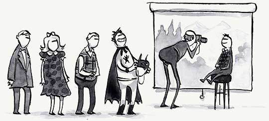
The Egotistical Puppet King & I
The latest CSSquirrel comic takes a jaded view of recent goings-on amidst the framers of HTML5. Alas, it’s even worse than he thinks.
LingsCars.com Gets a Makeover
Well done, Adaptive Path.
May 15, 2012
Responsive Images and Web Standards at the Turning Point – Mat Marquis in ALA
IN A SPECIAL ISSUE of A List Apart for people who make websites:
Responsible responsive design demands responsive images — images whose dimensions and file size suit the viewport and bandwidth of the receiving device. As HTML provides no standard element to achieve this purpose, serving responsive images has meant using JavaScript trickery, and accepting that your solution will fail for some users.
Then a few months ago, in response to an article at A List Apart, a W3C Responsive Images Community Group formed — and proposed a simple-to-understand HTML picture element capable of serving responsive images. The group even delivered picture functionality to older browsers via two polyfills: namely, Scott Jehl’s Picturefill and Abban Dunne’s jQuery Picture. The WHATWG has responded by ignoring the community’s work on the picture element, and proposing a more complicated img set element.
Which proposed standard is better, and for whom? Which will win? And what can you do to help avert an “us versus them” crisis that could hurt end-users and turn developers off to the standards process? ALA’s own Mat Marquis explains the ins and outs of responsive images and web standards at the turning point.
May 10, 2012
My Glamorous Life: The Power Compels You
I DREAMED that my friend Jason Santa Maria took a job at a popular new startup that had exploded onto the world scene seemingly overnight. A fascinating visual interface was largely responsible for the popularity of the company’s new social software product. It was like a Hypercard stack that came toward you. A post full of exciting social significance just for you would appear in a self-contained deck with rounded corners. The next post would pop up on top of the first. The next, on top of that one. And so on. In my dream, people found this back-to-front pop-up effect thrilling for some reason.
Having imagined the interface, I next dreamed that I went to visit the startup. There were so many cubicles, so many shiny people running around, holding morning standups and singing a strange company song, that I could not locate my friend Jason’s desk. Someone grabbed me and told me the founder wanted to see me.
THE FOUNDER was an ordinary looking white guy in his late twenties. I was surprised that he wore beige chinos with a permapress crease. With all the TV and newspaper hubub around his product, I guess I’d expected a more stylish and charismatic presence.
The founder told me he was concerned because his mother, apparently a cofounder or at least an officer of the company, was of the belief that I had contempt for their product and disliked her personally. I assured him that I liked the product. Further, I had never met his mother, never read or heard a word about her, and felt only goodwill toward her, as I bear toward all people in the abstract. I don’t hate people I don’t know.
“It would be cool if you told mom that yourself,” he said. And suddenly two assistants were whisking me off to speak to her directly.
THE AUDITORIUM-SIZED waiting room outside the founder’s mother’s office was filled with at least a thousand people who had come to talk to her before me. They seemed to have been waiting for hours. There was an air of boredom and rapidly thinning patience, mixed with excitement and the kind of carnival atmosphere that surrounds things that blow up suddenly in the press. It felt like the jury selection room for a celebrity murder case. Only much, much bigger.
The two assistants escorted me to the very front of the auditorium, to an empty row of seats abutting the door to the founder’s mother’s private office. “Special treatment,” I thought. I was thrilled to be cutting to the front of the line, apparently as a result of the founder’s directive to his assistants. The front row chairs were reversed, facing back to the rest of the auditorium, so I was put in the somewhat uneasy position of staring out at the mass of people who had been waiting to see the founder’s mother since long before I arrived.
After a while, Ian Jacobs of the W3C was brought to the front of the room and seated near me.
We waited as other people were shown into the founder’s mother’s presence.
AFTER FIVE or six hours of drowsy waiting, I realized that the room was set up to mirror the software’s interface: people from the very back of the auditorium were first in line, and were shown into the founder’s mother’s presence first. Gradually, the hall of applicants emptied from the back to the front. Those of us in the very front of the line were actually the last people of all who would be admitted to the holy presence. It was a smart marketing touch that apparently permeated the company: everything real people did in the building in some way echoed the characteristics of the software interface — from the end of the line coming first, to the way the rounded conference tables echoed the shapes of individual news posts in the software’s back-to-front news deck.
What a smart company, I thought. And what a good joke on me, as I continued to sit there forever, waiting to see someone I’d never met, who held a baseless grudge against me, which it would one day be my task to talk her out of.
May 8, 2012
Keep your site’s type right; let users work offline
IN ISSUE No. 350 of A List Apart for people who make websites: keep your web type looking right across browsers, platforms, and devices; let users do stuff on your site even when they’re offline.
Say No to Faux Bold
by ALAN STEARNS
Browsers can do terrible things to type. If text is styled as bold or italic and the typeface family does not include a bold or italic font, browsers will compensate by trying to create bold and italic styles themselves. The results are an awkward mimicry of real type design, and can be especially atrocious with web fonts. Adobe’s Alan Stearns shares quick tips and techniques to ensure that your @font-face rules match the weight and styles of the fonts, and that you have a @font-face rule for every style your content uses. If you’re taking the time to choose a beautiful web font for your site, you owe it to yourself and your users to make certain you’re actually using the web font — and only the web font — to display your site’s content in all its glory.
Application Cache is a Douchebag
by JAKE ARCHIBALD
We’re better connected than we’ve ever been, but we’re not always connected. ApplicationCache lets users interact with their data even when they’re offline, but with great power come great gotchas. For instance, files always come from the ApplicationCache, even when the user is online. Oh, and in certain circumstances, a browser won’t know that that the online content has changed — causing the user to keep getting old content. And, oh yes, depending on how you cache your resources, non-cached resources may not load even when the user is online. Lanyrd’s Jake Archibald illuminates the hazards of ApplicationCache and shares strategies, techniques, and code workarounds to maximize the pleasure and minimize the pain for user and developer alike. All this, plus a demo. Dig in.
Illustration by Kevin Cornell for A List Apart
May 7, 2012
A plane crash in slow-mo
I WAS SOBER SIX MONTHS when my Uncle George took me to lunch and told me he believed his sister, my mother, had Alzheimers. She was 60. Via frequent short visits to Pittsburgh and more phone calls than we’d shared in decades, I helped my dad accept that he needed to take her to the doctor for tests. Then I helped him accept the results.
She declined over ten years. It was like a plane crash in slow motion.
At my Aunt Ruth’s funeral, my mother cried and cried, with no clue who she was crying for. When I joined my parents at the grave site, my mother turned excitedly to my father and pointed at me. “I know that man!” she said.
When she couldn’t talk any longer; after all the in-home nurses had quit; after the cousin who’d come to care for her committed credit card fraud while my mother wandered the house unwashed and raving; after that, I helped my dad accept that mom could no longer live at home.
Oh, and I stayed sober.
The final two years she spent in a facility. It was like visiting a statue. My dad would get her an ice cream and wheel her around the nursing home garden. She ate the ice cream. I’m not sure she saw the trees.
She had a little CD player in her room, and when we visited, we would put on music she liked – that is, music she had liked when she liked anything. Once, I swear I saw her shiver at the melancholy sax riff on a Frank Sinatra ballad. As if someone was there.
Then there was the day her hair turned white. I suppose it had probably turned gradually during the few weeks since I’d last seen her. My career was taking off and I couldn’t visit Pittsburgh as often. For that matter, maybe her hair had turned white a decade before, and the attendants at the nursing facility had just one day decided it wasn’t worth coloring her hair any more.
Alzheimer’s can only be proved via autopsy; it can’t be diagnosed with 100% certainty while the patient lives. My dad’s insurance company used that loophole to avoid covering a dime of the cost of the last ten year’s of my mother’s care.
After she died, after months had elapsed and my dad was still living among all her old things, my then-girlfriend and I volunteered to weed through my mother’s possessions, giving nearly everything to charity. In my mother’s desk drawer, we discovered a note she had written to herself at the onset of the disease, acknowledging that her mind was going. She feared the passage into darkness.
April 24th would have been my mother’s birthday. I think of her with some regularity. Sometimes I wish my mother could have lived to know my daughter, who is now seven. And sometimes I indulge the thought that somewhere, somehow, she does.
May 3, 2012
Big Web Show 69: Chris Cashdollar on fonts.com

HAPPY COG Creative Director Christopher Cashdollar is my guest in Episode No. 69 of The Big Web Show, the weekly podcast on “everything web that matters.”
In 35 lively minutes, Chris and I discuss the joys and challenges of redesigning typography mega-site Fonts.com; nimble versus waterfall; process versus inspiration; running a creative department that is interactive in every sense of the word; the two sides of a design education (learning and teaching); fostering collaboration; and the transition from doodling eight-year-old to graphic design student to interactive creative director.
Chris is a multi-disciplinary graphic designer with twelve years of interaction design experience. He is currently the Creative Director for Happy Cog Philadelphia, and an adjunct instructor for Drexel University’s Westphal College of Media Arts and Design.
Listen to Episode No. 69 of The Big Web Show, featuring Chris Cashdollar.
Links
Fonts.com Beta
@ccashdollar
Christopher Cashdollar
Articles by Chris Cashdollar
Cash on Dribble
Happy Cog
PhilaMade
Subscribe to The Big Web Show
The Big Web Show features special guests and topics like web publishing, art direction, content strategy, typography, web technology, and more.
Get episodes delivered to you automatically:
Audio RSS Feed
iTunes Audio
Jeffrey Zeldman on tour

SEE ME SPEAK about web design, interaction design, publishing, and the future of web content. In the coming months, I’ll be visiting all sorts of nice cities, the better to meet and greet you:
Go Beyond Pixels St. John’s, Newfoundland, Canada
May 25, 2012
Reasons To Be Creative New York
June 14–15, 2012
An Event Apart Boston
June 18–20, 2012
An Event Apart Austin
July 9–11, 2012
An Event Apart DC
August 6–8, 2012
An Event Apart Chicago
August 27–29, 2012
Future of Web and Mobile – London
October 15-17, 2012
An Event Apart San Francisco
November 12–14, 2012
You can keep up with my comings and goings on Lanyrd; follow me on Twitter (@zeldman) and Facebook; and keep watching the skies at An Event Apart, the design conference for people who make websites.
April 26, 2012
Tantek Çelik on Mozilla & Microformats: Big Web Show

TANTEK ÇELIK is my guest on Episode No. 68 of The Big Web Show (“everything web that matters”).
Currently web standards lead at Mozilla, Tantek is one of the founders of both the microformats.org open standards community and the Global Multimedia Protocols Group, and an invited expert to the World Wide Web Consortium (W3C) Cascading Style Sheets working group.
Tantek has played a key role in the development and popularization of practical social network portability technologies such as the hCard and XFN microformats. In 2003, Tantek collaborated with Eric Meyer and Matt Mullenweg in the invention of the XHTML Friends Network (XFN), which has since become the most popular decentralized social relationship format in the history of the Web. In 2004 Tantek proposed hCard for representing people and organizations, which has since similarly become the most popular user profile format on the web.
During his years as Technorati’s Chief Technologist, Tantek played an active role in refining and evangelizing hCard, bringing it from a wiki proposal to one that’s endorsed and supported by individuals, numerous small organizations, major companies ranging from AOL to Yahoo, and implemented for over a hundred million user identities and business listings on the web.
At Microsoft, Tantek led the development of Internet Explorer 5 for Macintosh and its Tasman rendering engine, which was the most standards-compliant layout engine of its time. He was also an early member of The Web Standards Project, and is the creator of the Box Model Hack, the first IE hack that let developers work around the incorrect box model in old versions of Internet Explorer.
Listen to Episode 68: Tantek Çelik on Mozilla and Microformats.
Links
“Gangbang Interviews” and “Bikini Shots”: Silicon Valley’s Brogrammer Problem
Restyle W3C: Towards a More Usable Spec Template
hCard 1.0 Specification (rewritten to be human friendly)
The Vendor Prefix Predicament: ALA’s Eric Meyer Interviews Tantek Çelik
Responsive Images: How they Almost Worked and What We Need
Mozilla WIKI
CNET: Mozilla hires open-standards guru Celik
director at Mozilla
Why IE5/Mac Matters
April 24, 2012
Content Strategy Double Header: A List Apart 349

IN ISSUE NO. 349 of A List Apart for people who make websites, savor the content strategy sweetness as you dip into a double dose of Rachel Lovinger, a prime motivator behind the content strategy movement.
Tinker, Tailor, Content Strategist
by RACHEL LOVINGER
What does content strategy mastery look like? As in any field, it comes down to having master skills and knowing when to apply them. While there are different styles of content strategy (from an editorial and messaging focus to a technical and structural focus), the master content strategist must work with content from all angles: messaging architecture and messaging platforms; content missions and content management. Above all, she must advocate for multiple constituents, including end users, business users, stakeholders, and the content vision itself. Rachel Lovinger shares the skills that go into achieving CS mastery.
Content Modelling: A Master Skill
by RACHEL LOVINGER
The content model is one of the most important content strategy tools at your disposal. It allows you to represent content in a way that translates the intention, stakeholder needs, and functional requirements from the user experience design into something that can be built by developers implementing a CMS. A good content model helps ensure that your content vision will become a reality. Lovinger explains how to craft a strong content model and use it to foster communication and align efforts between the UX design, editorial, and technical team members on your project.
Illustration by Kevin Cornell for A List Apart.


