
Jeffrey Zeldman's Blog, page 27
September 29, 2015
Love. Listen. Learn.

NOTE: Below is a transcript of my aural contribution to Episode № 185 of The ShopTalk Show (“This Idea Must Die”):
AS A COMMUNITY, we have to stop demonizing those with whom we disagree.
Attacking the intelligence, moral fiber, and grip on sanity of those who hold opinions contrary to ours is nothing new on the internet. It’s as old as newsgroups. A minute after somebody started alt.opinions.design, a second person signed up just to tell the first person to screw off.
And of course it’s even older than that. Progressive groups that try to bring positive change to their community are always splitting into factions that despise each other. If you’ve seen Monty Python’s “The Life of Brian,” and remember the sequence where the zealots are sitting in an ancient square, attacking other zealot groups for being “splitters,” you have a good idea of how far back this goes.
To J. Edgar Hoover, there was no difference between Lenin, Stalin, and Trotsky—but, boy, did the Stalinists and Trotskyites disagree with that point of view. Ask two Communists a question and you’ll get three answers and four bullets. And, minus the bullets, the same is true for social-progress-minded web designers and developers. And equally true for reactionaries, who think the system is fair for everyone, since it’s always been good to them.
Until we are free to disagree on the most sensitive of subjects without maligning each other’s integrity, we will not be able to solve the biggest problems we face as a people and an industry.
I’m Jeffrey Zeldman. Thanks for listening.
I encourage you to listen to Episode № 185 of The ShopTalk Show (“This Idea Must Die”).
The post Love. Listen. Learn. appeared first on Zeldman on Web & Interaction Design.


September 23, 2015
Web Animation with Val Head
 VAL HEAD and I discuss how to create an animation style guide, the genius of user queries, the web animation API, frame by frame animation, animating with math in Flash, Disney animation and the illusion of life, animating for meaning, how to animate without triggering vestibular disorders, resources for accessible animations, and what to eat in Lawrenceville, PA.
BIG WEB SHOW № 135: How Does Your Brand Live in Motion? Web Animation with Val Head
The post Web Animation with Val Head appeared first on Zeldman on Web & Interaction Design.
September 18, 2015
Ad Blocking and the Future of the Web
YOUR site may soon be collateral damage in a war between Silicon Valley superpowers. By including ad blocking in iOS9, Apple isn’t trying to take down your site or mine—just like the drone program doesn’t deliberately target civilians and children. Apple is trying to hurt arch-rival Google while providing a more elegant (i.e. more Apple-like) web experience than user-hostile ad networks have previously allowed. This is a great example of acting in your own self-interest, yet smelling like a rose. Will independent sites that depend on advertising be hurt along with Google?
We have always been at war with Eastasia
We should be used to this war between digital super companies by now. iPhone and iPad users, consider your Amazon experience on the platform. Notice how you can’t buy books in your Kindle app in iOS? Apple supports Amazon to the extent of letting Amazon distribute Kindle software on the iOS platform. But if you want to buy a Kindle book for your phone, you have to go to a desktop browser (or open Safari on your phone and navigate to Amazon.com). Kind of encourages you to get your digital books in iBooks instead.
Same with Amazon’s video app on iOS. You can stream all the movies you want on your phone or iPad, but you can’t buy them in the Amazon Video app. You must use a desktop browser or navigate to amazon.com in the version of Safari that comes with iOS. Kind of encourages you to buy videos from iTunes instead.
You also can’t buy Kindle books or streaming Amazon videos in the Amazon shopping app for iOS, although you can use that app to shop for anything else.
See, Amazon doesn’t want to give Apple a cut of its media sales, so Apple won’t let Amazon sell products in its apps. In Apple’s reasoning, all other vendors pay Apple a cut; Amazon shouldn’t get a pass. And Amazon is serious about not sharing revenue, because Amazon is a ruthless competitor that has taken over nearly all retail sales in the U.S. by giving consumers the lowest possible price—a price that leaves them no margin to share with Apple. It’s also a price that strangles the companies that provides the goods Amazon sells. Oh, well.
Because Amazon is serious about not sharing sales revenue with Apple, and Apple is serious about blocking sales by any vendor that refuses to share revenue, Apple denies Amazon the right to sell products via its iOS apps. Who suffers? You, the consumer, as you put down your phone and toddle over to a desktop—or just shrug and do without. (Not that it’s the worst suffering in this world. But it is anti-consumer, and makes both Amazon and Apple look bad.)
Still, we’re used to this and don’t think about it.
Ad blocking is a different beast.
Certainly, at first, ad blocking seems like a different beast. After all, consumers may want to buy books in their Kindle app, but no consumer is clamoring for more ads. And media and advertising have only themselves to blame for the horrendous experience online advertising has become. We hate advertising so much, we’ve trained ourselves not to look at the top or right sidebar on most sites. In fact, it’s become a designer’s trick that if the client forces you to put the CEO’s pet link on the home page, you hide it in plain sight at the top of the sidebar, where no one but the CEO will see it. Popups and screen takeovers and every other kind of anti-user nightmare have made advertising a hated and largely ignored thing on the web.
There are tasteful ad networks, to be sure. The Deck, which Jim Coudal created with Jason Fried and me, serves one single, small, tasteful, well targeted ad per page. When we launched The Deck, I hoped other networks would take inspiration from it, and figure out how to increase engagement while minimizing clutter. But of course the ad networks have done the opposite—constantly interrupting content to force misleading, low-interest ads on you.
Hip web consumers have long used third-party ad blockers to unfug the web experience, and great applications like Readability explored alternate content revenue models while boosting type size and removing ad clutter from web content. I served on the Readability advisory board. And I used to go around the world warning designers that if we didn’t figure out a way to create readable, clutter-free layouts for our clients’ sites, apps like Readability would do it for us—putting us out of work, and removing advertising as a revenue stream for media companies. As it happens, in the intervening years, many smart sites have found a way to put content first and emphasize not just legibility but readability in their layouts. The best of those sites—I’m thinking of The New York Times here—have found a way to integrate advertising tastefully in those large-type, content-focused, readability-oriented modern layouts. (Medium.com, of course, does an amazing job with big type and readability, but it doesn’t need to integrate advertising—at least not yet—as it floats on a sea of VC bucks.)
But advertisers don’t want to be ignored, and they are drunk on our data, which is what Google and other large networks are really selling. The ads are almost a by-product; what companies really want to know is what antiperspirant is a woman of 25-34 most likely to purchase after watching House of Cards. Which gets us into issues of privacy and spying and government intrusion and don’t ask.
And in this environment of sites so cluttered with misleading ads they are almost unnavigable, Apple looks heroic, riding to the consumer’s rescue by providing all the content from newspapers without the ads, and by blocking ugly advertising on websites.
Consumer good vs. consumer good
What Apple’s doing wouldn’t matter so much if consumers were still sitting down at a desktop to get their news. But they’re not. Everyone does everything on mobile. Including browse the web.
Thus in The Verge today, Nilay Patel argues there’s a real risk that, in attacking Google’s revenue stream, Apple may hurt the web itself:
The collateral damage of that war — of Apple going after Google’s revenue platform — is going to include the web, and in particular any small publisher on the web that can’t invest in proprietary platform distribution, native advertising, and the type of media wining-and-dining it takes to secure favorable distribution deals on proprietary platforms. It is going to be a bloodbath of independent media. … Taking money and attention away from the web means that the pace of web innovation will slow to a crawl. —Welcome to hell: Apple vs. Google vs. Facebook and the slow death of the web
John Gruber thinks otherwise, at least for small indie sites like his:
Perhaps I am being smug. But I see the fact that Daring Fireball’s revenue streams should remain unaffected by Safari content-blocking as affirmation that my choices over the last decade have been correct: that I should put my readers’ interests first, and only publish the sort of ads and sponsorships that I myself would want to be served, even if that means leaving (significant) amounts of money on the table along the way. But I take no joy in the fact that a terrific publication like The Awl might be facing hard times. They’re smart; they will adapt.—Because of Apple
In Publishing Versus Performance, I looked at the conflict between advertising and content through the filter of performance. For those who didn’t read it (or don’t remember), I pointed out that most consumer interaction with the web happens on mobile, which means it happens on mobile networks, which, at times at least, may be severely bandwidth-constrained; so performance counts as it hasn’t in years. And while good designers and developers are working like never before to create performant websites, the junk ad networks spew interferes with their good work and slows websites to a crawl. This threatens the future of the web, as consumers will blame the web for poor performance, and stick to apps. But removing those ad networks isn’t an option, I pointed out, since, abhorrent or not, advertising dollars are the engine that drives digital media—no bucks, no content.
Well, now, Apple has decided for us. Removing those ad networks may not be an option, but it’s happening anyway. How will it affect your site?
The post Ad Blocking and the Future of the Web appeared first on Zeldman on Web & Interaction Design.
September 16, 2015
This Machine Kills Pixels: Khoi Vinh on Design & Design Tools
 KHOI VINH (@khoi) is my guest this week. Khoi is a a Principle Designer at Adobe, design chair at Wildcard, and former design director at NYTimes.com. He blogs at subtraction.com. Over a cordial hour, we discuss the surprising results of his recent design tools survey; how to watch TV; being creative on the iPad; the inspiration behind Adobe Comp CC; juggling multiple projects to stay fresh; choosing an extracurricular project; how design has changed in the past two years; and more. Enjoy Big Web Show Episode № 134: This Machine Kills Pixels.
Sponsored by Braintree, Casper, and DreamHost.
URLS
@khoi on Twitter
Subtraction.com
The Tools Designers Are Using Today
Sketch digital design software
Design Tools: What Are You Using
Khoi’s latest book
Wildcard
Kidpost – Photo Sharing for Families
The post This Machine Kills Pixels: Khoi Vinh on Design & Design Tools appeared first on Zeldman on Web & Interaction Design.
September 13, 2015
The independent content producer refuses to die!
2001 IS CALLING, and while it may not look fresh, its message still resonates:
We believe that the web is a remarkable medium for new forms of art, personal storytelling, and all manner of information and services whose rewards are not necessarily financial.
The independent content scene is alive and well, but is largely unknown by the general web-using public.
We seek to support each other as a community, and to increase, if possible, the general public’s awareness not only of existing independent sites, but of the fact that they can create their own.
INDEPENDENTS DAY is a wholly non-owned, non-commercial, non-subsidiary of nothing.
Independent content on the web: a declaration of principles from 2001, still relevant today, from Independents Day.
The post The independent content producer refuses to die! appeared first on Zeldman on Web & Interaction Design.
September 10, 2015
@font-face and Web Performance
Some time in 2009, Firefox and Opera began shipping @font-face support with the former behavior: text would render with fallback fonts until downloadable font resources became available. But this choice frustrated many users (see the Firefox bug report) and was quickly dubbed FOUT, the Flash of Unstyled Text . Articles were written about fighting the @font-face FOUT. It wasn’t long before most browsers were hiding text while fonts downloaded. Unfortunately, the main issue with @font-face now is what many wanted to avoid years ago: the FOIT, or Flash of Invisible Text.
Source: The @font-face dilemma | Viget
The post @font-face and Web Performance appeared first on Zeldman on Web & Interaction Design.
All Websites Look The Same

When was the last time you saw a website that didn’t have a huge image fitting to the screen with some giant text overlaid on it? … Design agencies are guilty too. [They] don’t need to use WordPress themes to create their websites. They don’t need to worry about technical capabilities and they are their own client when it comes to building their own website. They should be the very ones pushing things and taking a chance on something new.
Source: All Websites Look The Same – NoVolume, Web Design Blog
The post All Websites Look The Same appeared first on Zeldman on Web & Interaction Design.
Inclusion and Diversity at Slack
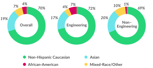
While 45% of all people managers at Slack are women, it’s noteworthy (and not shown above) that fully 41% of all people working at Slack have a woman as their manager. This means that 41% of our people report to a woman who helps set their priorities, measure their performance, mentor them in their work, and who make recommendations that will impact their compensation and career growth.
Source: Inclusion and Diversity at Slack
The post Inclusion and Diversity at Slack appeared first on Zeldman on Web & Interaction Design.
“Adaptive UI encourages us to be strategic.”
[M]ost things simply respond automatically, like content width responding to text size changes; some things need to be modified like the Profile header, which would take up half the screen on a large device if we didn’t modify the layout; only a few things need to be rethought, like Direct Messages, where the list of conversations can sit side-by-side with the conversations when you have a wide enough screen.
Mike Davidson on Building a more unified Twitter for iOS
The post “Adaptive UI encourages us to be strategic.” appeared first on Zeldman on Web & Interaction Design.
September 8, 2015
Happy birthday, Maurice

MY DAD is 88 today.
The post Happy birthday, Maurice appeared first on Zeldman on Web & Interaction Design.


