Jeffrey Zeldman's Blog, page 31
June 17, 2015
A List Apart № 422: So Emotional
ISSUE № 422 of A List Apart for people who make websites is all about working with the human element:
The Homepage Exception
By Johanna Bates
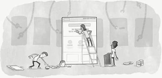
Structured, automatic systems are great at managing content efficiently—but not so great at accommodating humans changes in that content. On the other hand, free-for-all WYSIWYGs lead to inconsistency and breakdowns. Stakeholders and content administrators need flexibility and control, especially where the all-important homepage is concerned. What’s a website to do? Johanna Bates suggests embracing a people-friendly homepage solution within our robot-driven architectures.
Understanding the Emotional Response
By Kelsey Lynn Lundberg
Validating emotions isn’t a glorified psychological process; part of our work is to hear our colleagues and clients out. Kelsey Lynn Lundberg shows us how we can identify the underlying needs—security, freedom, identity, worth—that drive emotional responses, and how to translate those needs into productive discussions to keep our teams moving forward.
June 15, 2015
Typelab interview with Jeffrey Zeldman | Typetester
The interview was conducted by Nick Sherman at TypeLab on June 13, 2015. The website is part of Typographics TypeLab and is a demonstration of what can be done with web typography within 24 hours.
June 14, 2015
http://ift.tt/1KcMIId

Remember : the future will come whether you design for it or not. If your company charges $300,000 for a website that won’t work on next week’s most popular device, your company won’t be able to stay competitive in this business. It might not even be able to stay in the business, period. After all, clients who pay for sites that break too soon will look elsewhere next time—leaving your company perpetually hunting for new clients in a downward spiral of narrowing margins and diminishing expectations.
Your company’s survival is tied to the ability of the products it makes to work in situations you haven’t imagined, and on devices that don’t yet exist. This has always been the challenge of web design . It’s one A List Apart has taken seriously since we began publishing, and our archives are filled with advice and ideas you can boil down and present to your bosses.
Source: No Good Can Come of Bad Code
[green_message]Source: http://ift.tt/1KcMIId [/green_message] Follow me on Facebook at http://ift.tt/1GGemhf
http://ift.tt/1FSUuRi

Starting a personal Tumblr.
“Stuff @zeldman Says to Me Right Before I Speak”.
Today’s installment?
“You look like a quaker.”
— Sarah Parmenter (@sazzy) June 8, 2015
[green_message]Source: http://ift.tt/1FSUuRi [/green_message] Follow me on Facebook at http://ift.tt/1GGemhf
http://ift.tt/1IzalIM

Introducing Deque’s aXeDeque System’s aXe (The Accessibility Engine) open source library is a lightweight (~100 KB), fast, portable JavaScript library that executes automated accessibility testing inside your testing framework or browser of choice.Re-written from scratch over the last year, leveraging 15 years of accessibility experience, these rules represent the state of the art in automated accessibility testing.
Source: Introducing aXe by Deque!
[green_message]Source: http://ift.tt/1IzalIM [/green_message] Follow me on Facebook at http://ift.tt/1GGemhf
June 12, 2015
Open Source Accessibility Testing Library
Introducing Deque’s aXeDeque System’s aXe (The Accessibility Engine) open source library is a lightweight (~100 KB), fast, portable JavaScript library that executes automated accessibility testing inside your testing framework or browser of choice.Re-written from scratch over the last year, leveraging 15 years of accessibility experience, these rules represent the state of the art in automated accessibility testing.
Source: Introducing aXe by Deque!
June 10, 2015
No comment

Starting a personal Tumblr.
“Stuff @zeldman Says to Me Right Before I Speak”.
Today’s installment?
“You look like a quaker.”
— Sarah Parmenter (@sazzy) June 8, 2015
June 4, 2015
No Good Can Come of Bad Code: Ask Dr Web in A List Apart

Remember: the future will come whether you design for it or not. If your company charges $300,000 for a website that won’t work on next week’s most popular device, your company won’t be able to stay competitive in this business. It might not even be able to stay in the business, period. After all, clients who pay for sites that break too soon will look elsewhere next time—leaving your company perpetually hunting for new clients in a downward spiral of narrowing margins and diminishing expectations.
Your company’s survival is tied to the ability of the products it makes to work in situations you haven’t imagined, and on devices that don’t yet exist. This has alwaysbeen the challenge of web design. It’s one A List Apart has taken seriously since we began publishing, and our archives are filled with advice and ideas you can boil down and present to your bosses.
Source: No Good Can Come of Bad Code
June 3, 2015
The Way We Were: zeldman.com 10 Years Ago Today
Material Design: Why the Floating Action Button is bad UX design
I HIGHLIGHTED so many passages in this brief, well-focused design argument, it’s almost embarrassing. Read it (it takes about three minutes), and you’ll wear out your virtual highlighter, too:
Material Design is a design language introduced by Google a year ago, and represents the company’s bold attempt at creating a unified user experience across all devices and platforms. It’s marked with bold colours, a liberal but principled use of shadows to indicate UI layers, and smooth animations that provide a pretty pretty user experience on Android (and some Google apps on iOS).
One thing about Material Design, however, has bugged me ever since it was introduced last year: Floating Action Buttons.
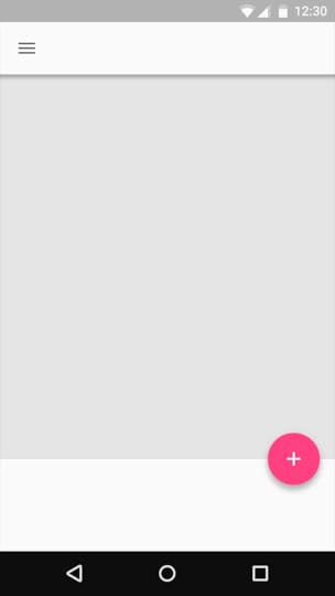
Floating Action Button | Image credit: GoogleFABs are circular buttons that float above the UI and are “used for a promoted action,” according to Google. They act as call to action buttons, meant to represent the single action users perform the most on that particular screen.
And because of the bold visual style of Material Design, FABs are strikingly hard to ignore and stand out — and herein lies the problem.
While FABs seem to provide good UX in ideal conditions, in actual practice, widespread adoption of FABs might be detrimental to the overall UX of the app. Here are some reasons why.
—Material Design: Why the Floating Action Button is bad UX design by Teo Yu Siang

