
Jeffrey Zeldman's Blog, page 26
November 13, 2015
An Infrastructure For Websites
 JOSH KOENIG of the Pantheon website management platform is my guest in Episode № 138 of The Big Web Show (“Everything Web That Matters.”)
Josh & I discuss how the industry is evolving, how smartphones are driving web growth, the connection of the web to real life (and the notion that there’s less and less of a meaningful distinction between the two), the idealism of the early web, why technology doesn’t solve human problems, why truly revolutionary change occurs only when new technologies fade into the background, and a future in which the back-end grunt work of website creation is automated.
Josh Koenig is a Co-Founder and Head of Product for Pantheon, the website management platform for WordPress and Drupal. Prior to that he was a founder at Chapter Three, a web consultancy based in San Francisco. Josh has been involved in building the internet with Open Source and Free software for nearly two decades.
Sponsored by Braintree.
URLS
https://pantheon.io – Pantheon
https://twitter.com/outlandishjosh – @outlandishjosh
https://www.outlandishjosh.com – outlandishjosh.com (Josh’s blog)
https://pantheon.io/team/josh-koenig – cringeworthy bio on Pantheon site
https://medium.com/swlh/the-nine-states-of-design-5bfe9b3d6d85 – The Nine States of Design
The post An Infrastructure For Websites appeared first on Zeldman on Web & Interaction Design.


October 30, 2015
Share Our Space (Apart)
 CALLING ALL small design and tech firms in NYC: get a private office from $2K/month in our shared design space.
A Space Apart at 148 Madison Avenue (the Remsen Building) has private offices to lease in beautiful NoMad. Rub elbows with your favorite web, interaction, and type designers and publishers in clean, well-equipped design space in historic building with fast internet. Includes shared conference area access plus one or more private offices for your company, starting at $2K/month.
A Space Apart is located in a chic (but not trendy) creative neighborhood, convenient to Madison Square Park, Chelsea, Flatiron, Koreatown, Gramercy, Murray Hill, Grand Central, Penn Station, Ace and Roger hotels, and all New York subways. Professionally appointed shared design space includes:
Furnished office space including ergonomic Herman Miller chairs, glossy desks; one room has a couch
High Speed Internet Access (our own wires & network)
Full use of large & small conference areas
Printer, Scanner
High-profile business address
Kitchen area with espresso machine and designer mini-fridge
Cleaning service
Immediate move-in
Share space with Happy Cog HQ, A List Apart, An Event Apart, A Book Apart, Monkey Do design studio, and Nick Sherman type designer. Past studio mates include Byte Dept, Danilo Black, Font Bureau, Been.com, and The Great Discontent.
Contact me @zeldman to schedule a tour.
The post Share Our Space (Apart) appeared first on Zeldman on Web & Interaction Design.
October 29, 2015
Designing For Touch
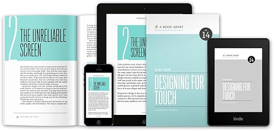
DESIGN’S future is in your hands. Designing For Touch by Josh Clark (foreword by Brad Frost) guides you through the new frontier in design.
I’ve been a fan of Josh Clark’s since before he was “Josh Clark”—back when he invented Couch to 5K, and gave it away with no strings (or copyrights or trademarks or patents, Lord help us) attached. And I’ve followed Josh’s career as an interaction design consultant, public speaker, and author. Guy’s got it all: intelligence, perspective, and the ability to not just communicate, but persuade. He’s a down-to-earth futurist with old-fashioned showmanship. And all that Josh Clark goodness has found its way into his new book.
Josh genuinely wants designers to not only keep up with the touchscreen but also to reimagine it. Designing For Touch will teach novice and seasoned designers alike about ergonomic demands (and rules of thumb), layout and sizing for all gadgets, an emerging gestural toolkit, and tactics to speed up interactions and keep gestures discoverable. You’ll get the know-how to design for interfaces that let your users touch—stretch, crumple, drag, flick—information itself. And the inspiration to take touch to the next level.
Our little publishing company proudly presents Designing For Touch by Mister Josh Clark. Go get your hands on it.
The post Designing For Touch appeared first on Zeldman on Web & Interaction Design.
October 25, 2015
We Remember Mama

It’s the 15th anniversary of our mother’s death from Alzheimer’s.
Hi, Mom.
The post We Remember Mama appeared first on Zeldman on Web & Interaction Design.
Zen & The Art of iTunes Failure

REBUILDING iTunes library from scratch over two days got app working again. Fine use of lazy weekend.
Had to sacrifice all custom playlists dating back to 2002, including An Event Apart playlists and delivery room mix from Ava’s birth.
Playlists still exist on old iPod but can’t be copied from it back to iTunes. (All software I’ve tried freezes & fails.)
Playlists still exist as code snippets inside .itl file in old iTunes folder, but numerous trials prove iTunes can’t launch from that folder any more. Thus I can’t temporarily launch from old folder, export playlists, switch back to safe new folder, and import them, thereby saving them.
And iTunes can’t import old .itl files. I Googled. I tried anyway.
13 years of custom playlists. From before, during, and after my marriage. Including one my daughter called “princess music” and danced to when she was three. Gone.
But, really, so what? Over time we lose everything. This loss is nothing. Attachment is futile. Always move forward, until you stop moving.
The post Zen & The Art of iTunes Failure appeared first on Zeldman on Web & Interaction Design.
October 23, 2015
The Law is an Ass: Digital Law & Web Design with Heather Burns
 DIGITAL LAW specialist Heather Burns is my guest on today’s Big Web Show. Heather is a “recovering web designer,” the author of The Web Designer’s Guide to the Consumer Rights Directive, and the founder of a monthly ebulletin with digital law and policy news you need to know.
She explains: “While I am not a lawyer, the legislators who create digital laws are not internet users, much less designers or developers. Therein lies the problem. I view my work on digital law and policy as an attempt to build a bridge between the two parties.”
Heather and I discuss laws governing transactions on the web, including the birth of the EU cookie law (all 27 versions of it); the slow pace of government versus the lightning speed of change on the web; and why web design and development a seat at the legislative table.
Enjoy Big Web Show № 137: The Law is an Ass—Digital Law & Web Design with Heather Burns.
The Big Web Show features special guests and topics like web publishing, art direction, content strategy, typography, web technology, and more. It’s everything web that matters.
The post The Law is an Ass: Digital Law & Web Design with Heather Burns appeared first on Zeldman on Web & Interaction Design.
October 22, 2015
Phonedrome
SOMETIME in the night, maybe around 4:00 AM, my new iPhone, which is my only alarm clock, and which was plugged into the wall and fully charged, powered itself down and went black. Maybe it just happened. Maybe Snow White, my restless night ghost cat, accidentally triggered the shutdown by stepping daintily on the phone.
Sometime in the night, maybe around 4:00 AM, I woke up. I’m no longer in the habit of waking in the middle of the night, and I don’t know what made me do it this morning. Maybe it was Snow White, silently walking on my chest, and fleeing just before her action produced the desired result of waking me, so that I thought I woke on my own. Maybe it was a preternatural connection between my central nervous system and the iPhone—like something out of Cronenberg—responding to the phone’s silent shutdown. (Wake up! I’ve died! the iPhone cried.)
Or maybe it was the anxieties of the day before catching up with me. A hugely important business meeting yesterday, yada yada. Something odd and unsettling my daughter’s teacher had said in school the day before (if my daughter’s report of what happened was accurate). An argument my daughter had yesterday with her best friend, and her conviction (voiced to me only) that they were drifting apart forever. Or maybe I just drank too much water before going to sleep. Whatever the cause, I lay there awake. And lay there. Giovanni, the tuxedo cat, on my arm. Snow White, who sleeps in my daughter’s room, suddenly in my room, standing on my chest.
After about an hour of anxious thoughts and idle fur stroking, I reached for the phone to see what time it was. And that’s how I discovered that the device was strangely cold, except around the lightning port, which felt unnaturally hot. The screen was black. My button pushing, which began desultorily and grew ever more urgent, had no effect. The device would not come on. It was cold. Off. Maybe dead!
And suddenly I was out of bed, because that’s what happens when your mobile device stops working. You spring into action like a firefighter at a burning building. Flicking on living room lights, brewing a Nespresso (sorry), plugging things in, pushing buttons with the methodical calm of an ER surgeon.
Never fear, O my friends of the internet, the device came back to life. Yes.
What’s strange is that, if I hadn’t woken up early, I would have slept right through, because the alarm would not have gone off, and without it (for instance on Saturdays) I sleep in hard.
And if I had slept right through, I would have missed my daughter’s “publishing party” at school today (that’s what the school calls it when the kids read stories aloud that they have written), and she would have been late to school one too many times this year. I would also have missed my appointment at the Apple store in Grand Central—the first Apple store appointment I’ve made in years, to fix an iPad Mini which mysteriously stopped taking a charge two weeks ago and is now, essentially, a large, awkward guitar pick.
Is my phone jealous of my iPad? Did it shut down so I’d sleep through my appointment at the Apple store?
Did I wake from family worries? Business concerns?
Was it because I knew my phone needed me?
Or was it just the cats?
The post Phonedrome appeared first on Zeldman on Web & Interaction Design.
October 21, 2015
Web Performance Today
WEB DESIGNERS have cared about web performance since the profession’s earliest days. When I started, we saved user bandwidth by employing GIF images that had the fewest possible colors—with no dithering, when possible, and by using actual web text instead of pictures of web text. (Kids, ask your parents about life before CSS enabled, type designers created formats for, browsers finally supported, and Typekit quickly popularized web fonts.)
Later, we learned to optimize JPEGs and blur their backgrounds: the blurrier large swathes of a JPEG image can be, the lower the bandwidth requirements for the image. We found the optimally performant size for repeating background tiles (32 x 32 and 64 x 64 were pretty good) and abandoned experiments like single-pixel-wide backgrounds, which seemed like a good idea but slowed browsers, servers, and computers to a crawl.
We developed other tricks, too. Like, when we discovered that GIF images optimized better if they possessed repeating patterns of diagonal lines, we worked diagonal background images into a design trend. It was the trend that preceded drop shadows, the wicked worn look, and skeuomorpic facades, which were themselves a retro recurrence of one of the earliest styles of commercial web design; that trend, which was always on the heavy side, performance-wise, eventually gave way to a far more performant grid-driven minimalism, which hearkened back to classic 1940s Swiss graphic design, but which our industry (sometimes with little knowledge of design history) called “flat design” and justified as being “born digital” despite its true origins going back to pixels, protractors, and a love of Greek mathematics.
All of this nostalgia is prelude to making the obvious comment that web design today is far more complex than it was in those golden years of experimentation; and because it is so much more complex, front-end performance is also far more complicated. You didn’t need an engineering degree to run DeBabelizer and remove needless elements from your markup, but, boy, does front-end design today feel more and more like serious coding.
All of which is to say, if you’re a front-end designer/developer, you should probably read and bookmark Nate Berkopec’s “Ludicrously Fast Page Loads – A Guide for Full-Stack Devs.” While you’re at it, save it to Pocket, and as a PDF you can read on your tablet.
I cannot verify every detail Nate provides, but it is all in line with recommendations I’ve heard over and over at top conferences, and read in articles and books by such performance mavens as Jake Archibald, Lara Hogan, Scott Jehl, and Yesenia Perez-Cruz.
You should also pick up these great books on performance:
Designing For Performance: Weighing Aesthetics and Speed by Lara Hogan (O’Reilly); also free to read online
Responsible Responsive Design by Scott Jehl (A Book Apart)
(It’s not why I wrote this post, but if you order Scott’s book today, you can save 10% when you enter discount code ABAHARVEST at checkout.)
Even the most complex site should work in any device that reads HTML. It should work if stylesheets fail to load or the device doesn’t recognize CSS. It should work if JavaScript fails to load or the device doesn’t recognize JavaScript. The principles of standards-based design will never change, no matter how complex our web becomes. And as it becomes more complex (and, arguably, much richer), it behooves us to squeeze every byte of performance we can.
Websites can never be too rich or too thin.
The post Web Performance Today appeared first on Zeldman on Web & Interaction Design.
October 15, 2015
A Helvetica For Readers

ACUMIN by Robert Slimbach is a new type family from Adobe that does for book (and ebook) designers what Helvetica has always done for graphic designers. Namely, it provides a robust yet water-neutral sans-serif, in a full suite of weights and widths. And unlike the classic pressing of Helvetica that comes on everyone’s computers—but like Helvetica Neue—Acumin contains real italics for every weight and width.
Reading about the design challenges Slimbach set himself (and met) helps you appreciate this new type system, whose virtues are initially all too easy to overlook, because Acumin so successfully avoids bringing a personality to the table. Enjoying Acumin is like developing a taste for exceptionally good water.
Nick Sherman designed the website for Adobe, and its subtly brilliant features are as easy to miss at first look as Acumin’s. For starters, the style grid on the intro page dynamically chooses words to fit the column based on the viewport size. Resize your browser and you’ll see how the words change to fill the space.
Heaps of behind-the-scenes calculation allow the page to load all 90 (!) fonts without breaking your pipes or the internet. Developer Bram Stein is the wizard behind the page’s performance.
Nick uses progressively enhanced CSS3 Columns to create his responsive multi-column layout, incorporating subtle tricks like switching to a condensed font when the multi-column layout shrinks below a certain size. (This is something A List Apart used to do as well; we stopped because of performance concerns.) In browsers like IE9 and earlier, which do not support CSS3 Multiple Column specification, the layout defaults to a quite readable single column. Nick adds:
It’s the first time I’ve used responsive CSS columns for a real-world project. This was both frustrating and fun because the CSS properties for controlling widows and orphans are very far behind what’s possible in InDesign, etc. It also required more thinking about vertical media queries to prevent a situation where the user would have to scroll up and down to get from the bottom of one column to the top of the next. If the viewport is too short to allow for easy reading across columns, it stays as a single column.
He describes the challenges of creating the site’s preview tool thusly:
We had to do some behind the scenes trickery in order to get the sliders to work for changing widths and weights. It’s a good way to allow people to type their own text and get a feeling for how the family can be used as a system for body text and headlines (unlike Helvetica, which is more limited to the middle range of sizes). Chris Lewis helped out a lot with getting this to work. It even works on a phone!
Book designers have long had access to great serif fonts dripping with character that were ideal for setting long passages of text. Now they have a well-made sans serif that’s as sturdy yet self-effacing as a waiter at a great restaurant. Congratulations to Robert Slimbach, Adobe, and the designers and developers mentioned or interviewed here. I look forward to seeing if Acumin makes it into new website designs (perhaps sharing some of Proxima Nova‘s lunch), especially among mature designers focused on creating readable experiences. And I pray Acumin makes its way into the next generation of ebook readers.
(Just me? In both iBooks and Kindle, I’m continually changing typefaces after reading any book for any period of time. All the current faces just call too much attention to themselves, making me aware that I am scanning text—which is rather like making filmgoers aware that they are watching projected images just when they should be losing themselves in the story.)
The post A Helvetica For Readers appeared first on Zeldman on Web & Interaction Design.
October 9, 2015
USA: Designed With Web Standards
 MY BIG WEB SHOW guest today is front-end designer Maya Benari, a leading contributor to the U.S. Web Design Standards.
Recently launched, and deservedly much lauded, the U.S. Web Design Standards consist of open source UI components plus a visual style guide, and are designed to create consistency and beautiful user experiences across U.S. federal government websites. Accessibility, semantics, and mobile-first responsive web design are baked in, right out of the box.
Maya and Jeffrey discuss the genesis of the project, the teams behind the scenes, and why improving people’s lives is sexier than building sandwich rating apps.
✩ ✩ ✩ ✩ ✩ ✩ Listen to Big Web Show № 136—USA: Designed With Web Standards, featuring Maya Benari.
RELATED LINKS FOR YOUR EXPLORING PLEASURE
U.S. Web Design Standards – https://playbook.cio.gov/designstandards/
Introducing the U.S. Web Design Standards – https://18f.gsa.gov/2015/09/28/web-design-standards/
Maya Benari’s website – http://maya-benari.com
Maya Benari: Front End Designer – https://18f.gsa.gov/team/maya/
18F Guides – https://pages.18f.gov/guides/
18F – https://18f.gsa.gov
Maya Benari on Github – https://github.com/maya
Getting Started with U.S. Web Design Standards – https://playbook.cio.gov/designstandards/getting-started/
Bourbon – http://neat.bourbon.io
The post USA: Designed With Web Standards appeared first on Zeldman on Web & Interaction Design.


