
Emily B. Martin's Blog, page 7
May 2, 2016
Paperback Release is Set!
 We have a date for Woodwalker's paperback release!
 TUESDAY, JUNE 14, 2016! This is so epic, because the e-book is being released on May 17, which is my mom's birthday, and the paperback is being released on June 14, which is the day after my dad's birthday. It's like I'm gifting my parents a successful adult-y milestone!


April 23, 2016
"Close Call" Excerpt
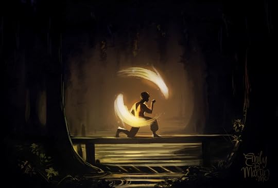
We had our first truly close call a few days later. We had just scrambled over a bulge of rock ribbing the mountainside, pocketed with patches of moss and fringed with dense azalea thickets. I was correcting my bearing; the siblings were behind me, holding some discussion. I found my landmark and was slipping my compass back into its pouch when the slightest noise filtered up the rock face.Woodwalker releases in 24 days! I am developing a lot of new illustrations for the website, which will go live after the e-book launches on May 17. I wanted to put something up in the meantime, though, so I finished this piece I started a while ago. It quickly became both overworked and lazy (somehow), and no closer to achieving the loose, dynamic style I keep aiming for, but here it is nonetheless.
“Hush, all of you,” I said sharply.
Mona and her brothers quieted. It was a sign of how much progress we had made that they followed my instruction, willing to assess my concern before jumping in with questions. In another moment, my fears were confirmed. I beckoned frantically to the three of them, pulling them into the closest tangle of azaleas.
“Pull your cloaks over you,” I whispered, stuffing them into the bushes. “Hold still. Don’t make a sound.”
April 13, 2016
The Evolution of a Cover
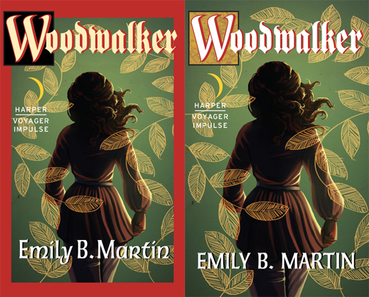
It's here!
In just the past few weeks, Woodwalker has gone from a word document still undergoing edits to a finalized product. The final copyedits are done, the text has been formatted, and the thing has a COVER!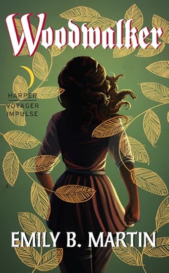 Let’s be honest—people judge books by their covers. We can’t help it. A good cover draws us in, piques our curiosity. A bad cover makes us pass it over for something else. It’s a critical part of any book, and one I hoped would turn out right for Woodwalker.
Several months ago, when I began telling people that my book had been picked up for publication, the most frequent question I got was, “are you going to do the cover?” At that early stage, I could truthfully say, “I don’t know”—I wasn’t sure how involved I was going to be in the process. And, in a way, I didn’t mind if I wasn’t allowed to work on the cover. Like most artists, I have a delicate relationship with my artwork. I’ll finish a piece with immense satisfaction, sure it’s going to be the crown jewel of my portfolio, only to come back to it a few days later and realize with dismay it’s nothing but the same crap I produce week after week. There’s one storybook I wrote and illustrated for my girls that I try to avoid reading at all costs, because the illustrations nag me so much.
In that respect, I didn’t want to illustrate the cover and then have it hanging over me for the rest of my life, knowing at this point next year I might barely be able to look at it. I looked forward to what another artist might dream up for the design. And because it’s such an important part of a book’s appeal, I felt more comfortable leaving it up to industry professionals.
One of the first things my editor asked me to do upon signing our contract was put together a Pinterest board of book covers I liked, so the art department could have some starting points (you can find that board here , if you’re interested). I did some research and a whole lot of pinning, and I realized I was drawn to artistic covers with stylized elements, rather than photos or ultra-bold graphic designs. Here were some of my favorites:
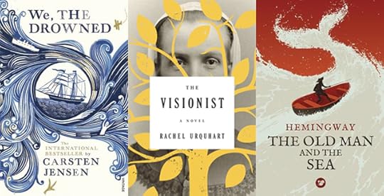 I loved the cover for WE, THE DROWNED so much, I placed a hold on it at our library without even really knowing what the book is about (boats and drowning?). That's what a good cover does. But then, me being me, I couldn’t just leave it at that. I sketched up a few drafts of what Woodwalker might look like with some of these elements.
 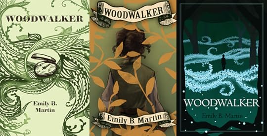 My mom said my version of WE, THE DROWNED looked like an octopus, though. I sent the pin board and my sketches to my editor and the art director, thinking they would either take my designs and run with them, or they’d discard them for something else. I wasn’t too beat up about it. The only thing I knew for sure I wanted to avoid was a Photoshopped image of a white girl in a prom dress staring into space.
 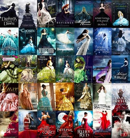 Exhibit A To my surprise, they sent me back one of my sketches and said they’d like to see another draft. It was the cover inspired by The Visionist and featured a shot of Mae marching away from the reader, overlaid with a foliage design. Their suggestions were altering the colors to make Mae stand out a little more, and to be sure she came across as a woman by changing her hair and clothes.
So I got back to work.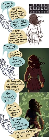 When I illustrate Mae, I almost always put her in green or brown and put her hair up in a knot (she hates having it loose). But I made myself stretch her design a bit to meet the recommendations of my art director (if there’s one thing I’m learning about writing, editing, and publishing, it’s that industry professionals are usually right). After a little more back and forth, we ended up with this draft:
 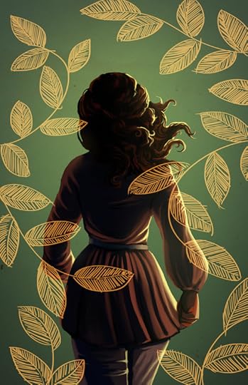 My art director emailed me back saying it was great and he would take it from there in terms of adding the text and other elements to the front and back covers. Several weeks later, I received two drafts from my editor with the title and additional elements added.
 I have to say, I was caught off guard at first. Cherry red accent color? Heavy, gothic font? On a book about an unpretentious treehugger and her Lothlorien-meets-Appalachian homeland? It was... not entirely what I had expected. It felt a little out of date to me, like it belonged in between my ‘90s copy of The Lost World and my ‘70s copy of The Hobbit.
 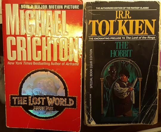 *electric guitar riff* But I made myself wait, live with them for a day—like I said, industry professionals are usually right about things like this. By the next day, I had decided I could maybe live with the second, but it hurt me a little inside. It just didn’t have the organic, artistic feel I wanted, and it wasn’t something that would capture my interest in a bookstore. But I also didn’t want to be needy or demanding or, worst of all, make a decision that would negatively impact my book.
Compounding my angst was my own experience on the artist’s end of these types of projects. I’ve had clients who commission a design or illustration, only to hate whatever I come up with and request changes that I think are detrimental to the design—ultra-detailed logos that don’t read at a small size, abysmal color choices, fonts that induce vertigo. I’ve reworked products to create something much less visually appealing and usually try to scour them from my portfolio afterwards. I didn’t want to do anything like that here—project my own preferences onto the book cover to the point of negating the expertise of my editor.
At the eleventh hour, I also realized another thing that was bothering me—Mae didn’t look like Mae. This was my own fault—in trying to make sure Mae read as a woman, I somehow lost some of her character. At the time, I think I dismissed this as me being too closely tied to my own character design—what cover ever really manages to capture the protagonist? I have three different cover suites on my copies of Megan Whalen Turner’s Queen’s Thief series—one makes Gen look like a Mediterranean twenty-something, one makes him look like my dad, and one makes him look like a white twelve-year old. None of them impacted my enjoyment of the books. No big deal, I thought.
But ack, now it was a big deal, especially with the uneasiness I felt with the rest of the design. Hastily I pulled up my original illustration and began reworking some of it (by this point I was losing sleep and the patience of my husband). I took away Mae’s billowy sleeves and replaced them with a design I often use when drawing her—a separate shirt under her tunic, with the sleeves rolled up. I felt much happier with that look—to me it conveyed a sense of readiness and action. This was also well after midnight, so I was probably approaching delirium anyway.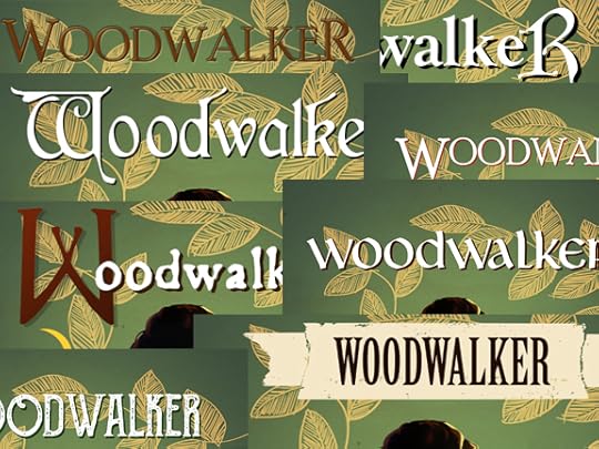 So much delirium. At the advice of my agent (and my husband, who was getting irritated with my drama), I told my editor the cover designs didn’t feel quite right to me, and I asked if we could do a few variations with other fonts and colors. I sent him the revised illustration and some examples of other books I liked. After some back-and-forth, he sent me an updated set with some different variations. While the font and red drop shadow didn’t change, other elements did, and ultimately they felt a lot better to me than before.
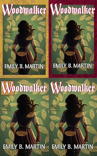 After another day of waffling and polling my agent, beta readers, and daughters (“Which one do you like?” “Oh, a moon!”), I settled on the fourth one. I was drawn to the simple design, and the title font didn’t feel quite so out of place to me.
And so we have the final product.
 The good thing about revising the illustration at the last minute is that it resolved some of my original fears—that a few months down the line, there would be things I couldn’t stand about it. In the months since I first drafted it, I’ve learned a lot about bounce light and color balance, and I was able to improve some of that with the revision. Lesson learned—I’m going to illustrate the cover for the second book now, so I can revisit it in a few months and make it better.
Ultimately, I’m happy with how it turned out, and in the end, I’m so, so thankful I got to do the illustration myself. I’m grateful to my editor and the art department for working with me, and to everyone who gave me feedback during the process. I’ve had time to get to know the font and color and make friends with them. I love Mae’s purposeful forward march, which I think communicates her confidence and drive. I think the leaf overlay lends an eye-catching graphic feel that will be recognizable on the shelf or as an online thumbnail. And the design lends itself well to the rest of the trilogy—each book can have its own variation, making it nice and cohesive.
So! That’s that. Woodwalker has a cover. It has a title page, a dedication, acknowledgements. It has a summary on retailer websites and a variety of genre categories. It has a publication date.
All it needs now are readers. Preorder WOODWALKER!
In just the past few weeks, Woodwalker has gone from a word document still undergoing edits to a finalized product. The final copyedits are done, the text has been formatted, and the thing has a COVER!
Let’s be honest—people judge books by their covers. We can’t help it. A good cover draws us in, piques our curiosity. A bad cover makes us pass it over for something else. It’s a critical part of any book, and one I hoped would turn out right for Woodwalker. Several months ago, when I began telling people that my book had been picked up for publication, the most frequent question I got was, “are you going to do the cover?” At that early stage, I could truthfully say, “I don’t know”—I wasn’t sure how involved I was going to be in the process. And, in a way, I didn’t mind if I wasn’t allowed to work on the cover. Like most artists, I have a delicate relationship with my artwork. I’ll finish a piece with immense satisfaction, sure it’s going to be the crown jewel of my portfolio, only to come back to it a few days later and realize with dismay it’s nothing but the same crap I produce week after week. There’s one storybook I wrote and illustrated for my girls that I try to avoid reading at all costs, because the illustrations nag me so much.
In that respect, I didn’t want to illustrate the cover and then have it hanging over me for the rest of my life, knowing at this point next year I might barely be able to look at it. I looked forward to what another artist might dream up for the design. And because it’s such an important part of a book’s appeal, I felt more comfortable leaving it up to industry professionals.
One of the first things my editor asked me to do upon signing our contract was put together a Pinterest board of book covers I liked, so the art department could have some starting points (you can find that board here , if you’re interested). I did some research and a whole lot of pinning, and I realized I was drawn to artistic covers with stylized elements, rather than photos or ultra-bold graphic designs. Here were some of my favorites:
I loved the cover for WE, THE DROWNED so much, I placed a hold on it at our library without even really knowing what the book is about (boats and drowning?). That's what a good cover does. But then, me being me, I couldn’t just leave it at that. I sketched up a few drafts of what Woodwalker might look like with some of these elements. My mom said my version of WE, THE DROWNED looked like an octopus, though. I sent the pin board and my sketches to my editor and the art director, thinking they would either take my designs and run with them, or they’d discard them for something else. I wasn’t too beat up about it. The only thing I knew for sure I wanted to avoid was a Photoshopped image of a white girl in a prom dress staring into space. Exhibit A To my surprise, they sent me back one of my sketches and said they’d like to see another draft. It was the cover inspired by The Visionist and featured a shot of Mae marching away from the reader, overlaid with a foliage design. Their suggestions were altering the colors to make Mae stand out a little more, and to be sure she came across as a woman by changing her hair and clothes.
So I got back to work.
When I illustrate Mae, I almost always put her in green or brown and put her hair up in a knot (she hates having it loose). But I made myself stretch her design a bit to meet the recommendations of my art director (if there’s one thing I’m learning about writing, editing, and publishing, it’s that industry professionals are usually right). After a little more back and forth, we ended up with this draft: My art director emailed me back saying it was great and he would take it from there in terms of adding the text and other elements to the front and back covers. Several weeks later, I received two drafts from my editor with the title and additional elements added. I have to say, I was caught off guard at first. Cherry red accent color? Heavy, gothic font? On a book about an unpretentious treehugger and her Lothlorien-meets-Appalachian homeland? It was... not entirely what I had expected. It felt a little out of date to me, like it belonged in between my ‘90s copy of The Lost World and my ‘70s copy of The Hobbit. *electric guitar riff* But I made myself wait, live with them for a day—like I said, industry professionals are usually right about things like this. By the next day, I had decided I could maybe live with the second, but it hurt me a little inside. It just didn’t have the organic, artistic feel I wanted, and it wasn’t something that would capture my interest in a bookstore. But I also didn’t want to be needy or demanding or, worst of all, make a decision that would negatively impact my book.Compounding my angst was my own experience on the artist’s end of these types of projects. I’ve had clients who commission a design or illustration, only to hate whatever I come up with and request changes that I think are detrimental to the design—ultra-detailed logos that don’t read at a small size, abysmal color choices, fonts that induce vertigo. I’ve reworked products to create something much less visually appealing and usually try to scour them from my portfolio afterwards. I didn’t want to do anything like that here—project my own preferences onto the book cover to the point of negating the expertise of my editor.
At the eleventh hour, I also realized another thing that was bothering me—Mae didn’t look like Mae. This was my own fault—in trying to make sure Mae read as a woman, I somehow lost some of her character. At the time, I think I dismissed this as me being too closely tied to my own character design—what cover ever really manages to capture the protagonist? I have three different cover suites on my copies of Megan Whalen Turner’s Queen’s Thief series—one makes Gen look like a Mediterranean twenty-something, one makes him look like my dad, and one makes him look like a white twelve-year old. None of them impacted my enjoyment of the books. No big deal, I thought.
But ack, now it was a big deal, especially with the uneasiness I felt with the rest of the design. Hastily I pulled up my original illustration and began reworking some of it (by this point I was losing sleep and the patience of my husband). I took away Mae’s billowy sleeves and replaced them with a design I often use when drawing her—a separate shirt under her tunic, with the sleeves rolled up. I felt much happier with that look—to me it conveyed a sense of readiness and action. This was also well after midnight, so I was probably approaching delirium anyway.
So much delirium. At the advice of my agent (and my husband, who was getting irritated with my drama), I told my editor the cover designs didn’t feel quite right to me, and I asked if we could do a few variations with other fonts and colors. I sent him the revised illustration and some examples of other books I liked. After some back-and-forth, he sent me an updated set with some different variations. While the font and red drop shadow didn’t change, other elements did, and ultimately they felt a lot better to me than before. After another day of waffling and polling my agent, beta readers, and daughters (“Which one do you like?” “Oh, a moon!”), I settled on the fourth one. I was drawn to the simple design, and the title font didn’t feel quite so out of place to me.
And so we have the final product.
The good thing about revising the illustration at the last minute is that it resolved some of my original fears—that a few months down the line, there would be things I couldn’t stand about it. In the months since I first drafted it, I’ve learned a lot about bounce light and color balance, and I was able to improve some of that with the revision. Lesson learned—I’m going to illustrate the cover for the second book now, so I can revisit it in a few months and make it better.Ultimately, I’m happy with how it turned out, and in the end, I’m so, so thankful I got to do the illustration myself. I’m grateful to my editor and the art department for working with me, and to everyone who gave me feedback during the process. I’ve had time to get to know the font and color and make friends with them. I love Mae’s purposeful forward march, which I think communicates her confidence and drive. I think the leaf overlay lends an eye-catching graphic feel that will be recognizable on the shelf or as an online thumbnail. And the design lends itself well to the rest of the trilogy—each book can have its own variation, making it nice and cohesive.
So! That’s that. Woodwalker has a cover. It has a title page, a dedication, acknowledgements. It has a summary on retailer websites and a variety of genre categories. It has a publication date.
All it needs now are readers. Preorder WOODWALKER!
April 12, 2016
Tomorrow!
 Even when trying to make my art better reflect the epic fantasy feel of Woodwalker, it still ends up looking like middle-grade unicorn giggles. If anybody has Alan Lee's phone number, tell him we need to talk.
I also don't think Mae would actually have books with her, since she has to carry her whole life on her back. Maybe she uses the pages she's read as firestarters.
(Literary professionals screaming in the distance.)
April 10, 2016
The Truth about Woodwalker
I realized I’ve been a little misleading about Woodwalker. This occurred to me after about the tenth person asked when they could buy the book for their child. I’ve also been asked if my illustrations will be in the e-book version, and in a recent article I was referred to as a “children’s author.”
This is totally understandable, based on my frequent posting of scene illustrations and inane cartoons (though I admit it’s hard to look past the book blurb available on all retailer websites, which includes the word damn and multiple references to execution).
So I’m here to set the record straight: Woodwalker isn’t a children’s book.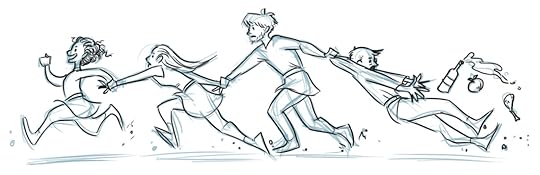 What, this doesn’t scream “mature audience” to you? It’s not graphic or even terribly violent, but it’s not really aimed at readers younger than high school or so. HarperCollins has placed Woodwalker in the “epic fantasy” category, which I have trouble with—epic fantasy to me means dragons and sorcery and probably talking plant life. But really, it’s just a way of saying “adult fantasy” without sounding questionably erotic (no sex in this book—it’s going to take several more novels before I get comfortable writing that kind of thing in something my in-laws will probably read).
Another classification HarperCollins has given Woodwalker is “Coming of Age”—I have issues with this, too. I can’t speak for my editor or publicist, but the audience I envision for Woodwalker are twenty-something readers who are looking for stories similar to their Young Adult favorites (like Tamora Pierce’s heroine novels), but starring characters closer to their own age and life stage. This audience is often referred to as “New Adult,” though that categorization usually means steamy romance novels (again with the eroticism). The reason I have trouble with the “Coming of Age” classification is because Mae isn’t struggling to master a skillset or figure out who she is. She knows her strengths and her role, and she uses them to meet the challenges she’s presented with. 75% of which involve snappish comebacks. There aren’t any illustrations in the book. I drew the cover, which will debut this coming Wednesday, and I drew the map inside that shows the protagonists’ journey. But that’s it. Everything I post—all the paintings and sketches and goofy comics—those are partially for my own enjoyment and partially because that’s how I organize my thoughts. The best example of this is my old Keepers of the Orb blog, which some of you probably remember, where I drew comics of my adventures in parenting. I stopped posting on that blog right around the time I started querying agents for Woodwalker, because I didn’t have time to do both. But the point remains—drawing is how I make sense of the world.
  Pictured: Making sense. Sketching and illustrating has also played a big part in planning and writing this novel and its companions. In fact, once I started writing Woodwalker, my art production literally tripled—prior to writing it, I was filling up maybe one sketchbook every year and a half. But since starting the story, I’ve filled up three sketchbooks in that amount of time, and I’ve produced much more finished art. Sketching has helped me determine how my characters look, what they’re wearing, and how they interact. I've also storyboarded certain scenes, like the one below, which eventually morphed into the prologue for book two.
 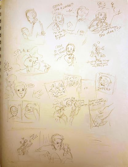 Starring Rou and a catfish and a lot of lazy "etc"s. Promotion for Woodwalker, too, has started to ramp up in preparation for the May 17 e-book release. So I’ve been creating and posting more publicity art to help reach interested readers and introduce my characters, plot, and setting. I’ve also been working on a lot of new illustrated content for my website, which I plan to debut after the e-book release. Maybe my distorted Disney/children's storybook illustration style is sending the wrong impression about the book. Maybe I should stick to photomanipulation or fine art. But I'm useless at fine art, and quality photos cost money. At any rate, I have nothing better to do with these 6 gigs of digital illustrations.
So. There it is. Woodwalker is not a storybook for children, or even a middle-grade novel. It's an epic fantasy written for college-esque “new adults.” It has adult themes and complex issues. But it also has adventure, and humor, and a secret plot, and a character who’s perhaps not quite what s/he seems. I hope it has elements that will appeal to a wide variety of readers.
But maybe hold off reading it to your second-grader, at least until they’re prepared to discuss the intricacies of political revolution. Three. Three references to execution in the back cover blurb.
This is totally understandable, based on my frequent posting of scene illustrations and inane cartoons (though I admit it’s hard to look past the book blurb available on all retailer websites, which includes the word damn and multiple references to execution).
So I’m here to set the record straight: Woodwalker isn’t a children’s book.
What, this doesn’t scream “mature audience” to you? It’s not graphic or even terribly violent, but it’s not really aimed at readers younger than high school or so. HarperCollins has placed Woodwalker in the “epic fantasy” category, which I have trouble with—epic fantasy to me means dragons and sorcery and probably talking plant life. But really, it’s just a way of saying “adult fantasy” without sounding questionably erotic (no sex in this book—it’s going to take several more novels before I get comfortable writing that kind of thing in something my in-laws will probably read).
Another classification HarperCollins has given Woodwalker is “Coming of Age”—I have issues with this, too. I can’t speak for my editor or publicist, but the audience I envision for Woodwalker are twenty-something readers who are looking for stories similar to their Young Adult favorites (like Tamora Pierce’s heroine novels), but starring characters closer to their own age and life stage. This audience is often referred to as “New Adult,” though that categorization usually means steamy romance novels (again with the eroticism). The reason I have trouble with the “Coming of Age” classification is because Mae isn’t struggling to master a skillset or figure out who she is. She knows her strengths and her role, and she uses them to meet the challenges she’s presented with.
75% of which involve snappish comebacks. There aren’t any illustrations in the book. I drew the cover, which will debut this coming Wednesday, and I drew the map inside that shows the protagonists’ journey. But that’s it. Everything I post—all the paintings and sketches and goofy comics—those are partially for my own enjoyment and partially because that’s how I organize my thoughts. The best example of this is my old Keepers of the Orb blog, which some of you probably remember, where I drew comics of my adventures in parenting. I stopped posting on that blog right around the time I started querying agents for Woodwalker, because I didn’t have time to do both. But the point remains—drawing is how I make sense of the world. Pictured: Making sense. Sketching and illustrating has also played a big part in planning and writing this novel and its companions. In fact, once I started writing Woodwalker, my art production literally tripled—prior to writing it, I was filling up maybe one sketchbook every year and a half. But since starting the story, I’ve filled up three sketchbooks in that amount of time, and I’ve produced much more finished art. Sketching has helped me determine how my characters look, what they’re wearing, and how they interact. I've also storyboarded certain scenes, like the one below, which eventually morphed into the prologue for book two. Starring Rou and a catfish and a lot of lazy "etc"s. Promotion for Woodwalker, too, has started to ramp up in preparation for the May 17 e-book release. So I’ve been creating and posting more publicity art to help reach interested readers and introduce my characters, plot, and setting. I’ve also been working on a lot of new illustrated content for my website, which I plan to debut after the e-book release. Maybe my distorted Disney/children's storybook illustration style is sending the wrong impression about the book. Maybe I should stick to photomanipulation or fine art. But I'm useless at fine art, and quality photos cost money. At any rate, I have nothing better to do with these 6 gigs of digital illustrations.So. There it is. Woodwalker is not a storybook for children, or even a middle-grade novel. It's an epic fantasy written for college-esque “new adults.” It has adult themes and complex issues. But it also has adventure, and humor, and a secret plot, and a character who’s perhaps not quite what s/he seems. I hope it has elements that will appeal to a wide variety of readers.
But maybe hold off reading it to your second-grader, at least until they’re prepared to discuss the intricacies of political revolution.
Three. Three references to execution in the back cover blurb.
April 7, 2016
Cover Reveal!
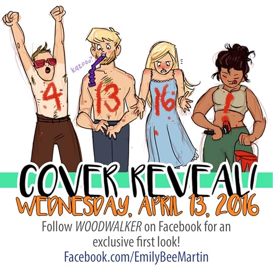 Here it comes! I am an extremely visual person by nature, so I am so stoked to finally be able to share Woodwalker's book cover with you! Keep an eye on my Facebook page and this blog on Wednesday for your first look!
I will be posting a special blog post about the process the art department and I went through to design and illustrate the cover. It was a process not without surprises and setbacks, but ultimately it led to the great result I will be sharing with you SIX DAYS FROM NOW!
March 27, 2016
How I Got My Agent
 Sometimes husbands are jerks. The "how I got my agent" post is a traditional rite-of-passage for any aspiring author, and I’m about eight months late with it. When I first heard from my agent, I was a ranger at Yellowstone for the summer, focusing mainly on telling people when Old Faithful was going to erupt and trying not to be murdered by the most murder-y park in the NPS [citation needed]. Since then, I’ve moved back to South Carolina for the off-season, landed a publishing deal, illustrated my cover, drafted two companion books, and am anxiously awaiting my publication date of May 17. But signing with an agent was my first huge step forward. The first, and potentially most significant.
The story about how I got my agent is, perhaps, no more intriguing than anybody else’s, except there were probably more bison involved than most. Here’s more or less how it went, written inexplicably in second-person.
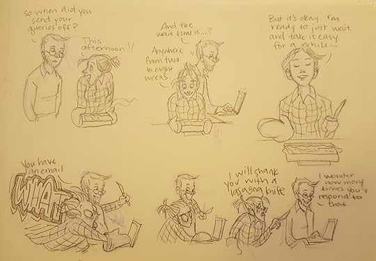
You write the thing. This is a step that many people never make it past. Writing a book is hard. It’s great when it’s all a perfect story arc laid out in your head, but once you start putting it on paper, you realize that your characters aren’t who you thought they were and refuse to do what you thought they’d do. They create side plots and auxiliary drama like they’re working at daggum summer camp. But you struggle through it, and you end up with the ugliest, nastiest piece of writing ever known to humankind.You edit. Edit and polish and revise and discard, until you have something halfway passable. Now you send that tottering, drooling fledgling novel out to your dearest friends who won’t abandon you even if you’ve written the worst book ever penned. They take two months to get back to you. You sit rocking in the fetal position and desperately try to think of something else.They reply! They have suggestions and edits. They are generally optimistic, but you’re not sure if that’s because what you’ve written is actually good, or if they’re just being nice.Repeat steps 2, 3, and 4. During this time, you also research agents and read eleven thousand blogs on writing a query letter.Finally, you decide your story is ready. Maybe not fully mature, but at least past that gawky, pimply stage, enough to pass as a legitimate story. Getting to this stage alone took me about eight months.Now you take that Pinterest board full of potential agents and narrow it down to a handful. You write your query letter. This is much, much harder than it seems, because you must somehow hook an agent with only 300 words, introducing your story, characters, and stakes without giving away your ending. This alone can take weeks of revision and editing. You query agents. This is an intensely long and emotionally taxing process. Many people outside the literary world don’t realize most authors need to find an agent to be published. Publishers, especially big, reputable ones, rarely take unsolicited manuscripts. An agent is sort of the publisher’s front-line defense. They sift through thousands of queried manuscripts, pulling out the tiny percentage that resonate with them (and they think they can sell).
But every agent is different, and every agency has different submission guidelines. Some want your query letter and first ten pages. Some want no pages at all. Some want a synopsis. Some want the first five chapters. Some say they’ll respond within two weeks, others in eight, others never. So you have to tailor everything exactly right, making sure you don’t make the grave mistake of misspelling an agent’s name in your salutation. You email out your queries. See step 4.You get your first rejection! It burns. You weep, continue with step 4.You continue to get rejections! They’re not as bad as the first, but they still hurt.You hear back from about half the agents you queried, and they’re all rejections. You wait out the remaining waiting period with no word from the others.You wipe your nose. You pick yourself up. Maybe one or two agents took pity and gave you a little bit of feedback. You follow their advice and the additional insights you’ve gained over the last eight weeks of heartbreak. You revise some more until your manuscript is better than it was.You query again. Repeat steps 10-15 for an indeterminate amount of time. Perhaps it will be all eternity, perhaps it will just be one more round. Some people get hundreds of rejections before they find the right agent (or before their manuscript is ready for publishing).
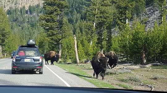
I was one of the lucky ones. Halfway through my second round of queries, I had two agents request my manuscript. Now, this is still a preliminary stage. They could very well get part way into your novel and decide it’s not for them. In fact, that’s exactly what happened with one agent. But then…You get THE EMAIL. The email from the agent saying she loved your work. That she wants to talk about representing you. You run around screaming like a madwoman (probably at work, since it’s during working hours). You text/call all your friends and family. You maybe do something slightly illegal in your giddy state, like doing a victory dance on the cone of Old Faithful (okay, so all I did was send personal emails from a government computer, but let’s face it—we all did that anyway, since it was 45 minutes to the nearest wifi signal. UP YOURS, NSA). You calm yourself down, remind yourself that nobody’s said yes yet, that you still have to talk on the phone. You politely email back saying you’re thrilled she’s interested in your work. You set up a time to talk.There’s a goddAMN BISON JAM when you try to bike home from work, leading you, in full ranger uniform, to stand shouting at this stupid tankbeast to get its idiot bulk off the crosswalk so you can get home to your family!!!!! All the Europeans take pictures of the park ranger losing her mind in front of said bison.Bison moves on in its own time; you get home without being gored.You get THE CALL. The agent wants to know a little bit more about you, what your plans are for this book and the next. Your main goal is to remain coherent. You ask for her clients’ contact info so you can get her references.You talk to her clients. They recommend her a thousand times over.You contact the other agents you’ve queried. You tell them you’re signing with another agent and try not to do the Wicked Witch cackle while you type those words.And so, seven months and fifteen rejections into the querying process, I signed with Valerie Noble of Donaghy Literary Group. She has since navigated me into a two-book deal with Harper Voyager, an imprint of HarperCollins. She’s strengthened my storytelling and talked me away from multiple proverbial cliffs. I'm so grateful to her for her expertise, her encouragement, and her willingness to bear the brunt of my literary drama.
To everyone still in the grips of querying—there’s no advice I can give you that you haven’t already read a hundred times over. Keep at it. Keep writing. Make a point of connecting with people going through the same journey. Vent (but not unprofessionally). Cry (long and hard). Rejoice (longer and harder).
And stay the hell away from bison, because seriously, all they want is to see you suffer.
 Twatbags.
March 5, 2016
A Few Artworks
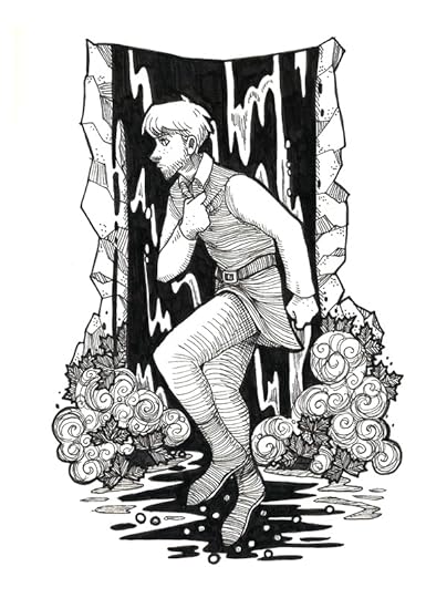
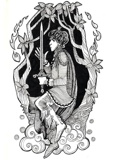
Here are a few pieces I've posted in various other places over the past few weeks. The first are the rest of the pen-and-inks, starring Arlen, Colm, and Valien (see Mae and Mona here). 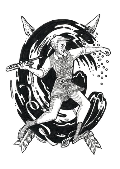
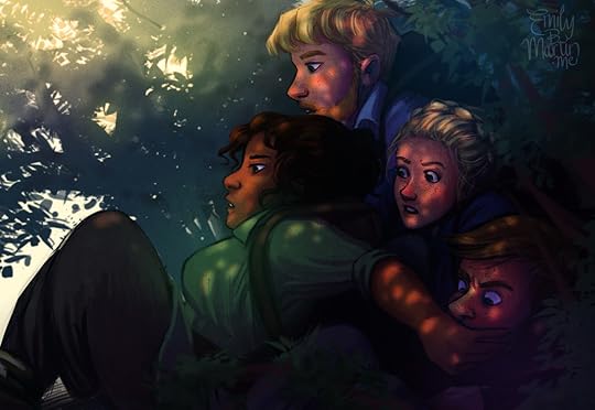
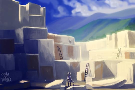
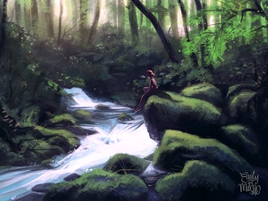
 The next are several speedpaints--I've been unhappy with the stiffness of my work lately, so I've been practicing speedpainting to try to loosen up my style. The first is the four protagonists heading through the hills to the Silverwood Mountains, based on photos of Cades Cove in Great Smoky Mountains National Park. The second is Mae working a job in a quarry to earn some money during her exile. The last is actually from the sequel to Woodwalker, which has been my main focus lately as I work on edits to the manuscript.
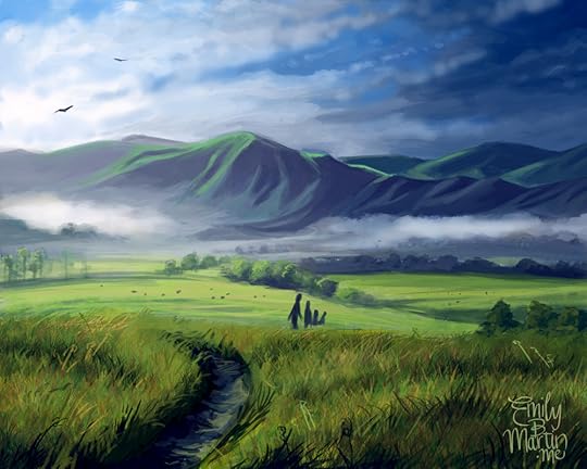
 Woodwalker is in the final stages of publication now. Final copyedits are done--that means no more edits to the manuscript. The text is formatted to turn it from a word document into a book. And best of all, the cover design has been finalized! My editor and the art department had me do the artwork for it, which was a lot of fun and very rewarding. Soon we should have a cover reveal. Stay tuned!
The next are several speedpaints--I've been unhappy with the stiffness of my work lately, so I've been practicing speedpainting to try to loosen up my style. The first is the four protagonists heading through the hills to the Silverwood Mountains, based on photos of Cades Cove in Great Smoky Mountains National Park. The second is Mae working a job in a quarry to earn some money during her exile. The last is actually from the sequel to Woodwalker, which has been my main focus lately as I work on edits to the manuscript. Woodwalker is in the final stages of publication now. Final copyedits are done--that means no more edits to the manuscript. The text is formatted to turn it from a word document into a book. And best of all, the cover design has been finalized! My editor and the art department had me do the artwork for it, which was a lot of fun and very rewarding. Soon we should have a cover reveal. Stay tuned!
February 17, 2016
Three Months Away!
 "Rest," a speed paint of Mae in the Silverwood We are three months out from the publication of Woodwalker on May 17! I have been doing a lot of artwork and planning in preparation. This whole process has been so wild and exciting--- on publication day, it will be almost exactly two years since I started typing the first few paragraphs of Woodwalker. So much has happened! My characters and world have grown and changed so much! I have an agent, a publishing house, a sequel! And I couldn't have done it without so many of you. Whether you're close family or an online follower, your support and interest mean so much to me.
If you'd like to help me spread the word about Mae, Mona, and their adventures, here are a few ways you can help:Pre-order the e-book through HarperCollins.
I know many people are waiting for the paperback, and unfortunately I won't have the official release date for that until the e-book is published. But in the meantime, the e-book is available for pre-order, dirt cheap! $2.99!
Share my posts.
Whether you follow me here or on Facebook, Twitter, or DeviantArt, please share my posts with your own followers. More eyeballs mean more people who might connect with the story.
Mention the book to people you know!
If you have friends or family who enjoy fantasy and adventure stories, please let them know about the upcoming release! If they seem interested, point them in the direction of my website or the pre-order page on HarperCollins.
Keep in touch!
If you have questions about the book, plot, writing, drawing, how I got my agent and publisher, why the Silverwood palace is named after a subfamily of fireflies, whatever--- let me know! I love interacting with other writers, artists, and people interested in my work, and it helps me know what people are interested in seeing with regards to my posts.
Keep watching!
Over the next few months I will be sharing the cover design with you, as well as more illustrations and excerpts!
Thanks as always for your support, even through shameless self-serving posts like this one. I am so excited to be nearing publication day!
February 2, 2016
A Few Inks
I always carry around a little notebook for story thoughts and sketches, and I just got through the one I started for Woodwalker. My notebook-in-waiting is a little bigger, just the right size for pen-and-ink illustrations (unlike my sketchbook, which is too big-- it's a fine line). So I kicked off the first few pages with some ink. 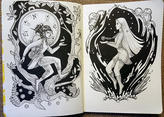 Mae and Mona, each with quite a bit of symbolism attached.
 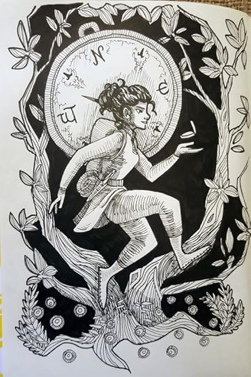 For Mae, significant details include the rhododendrons, alluding to the Appalachian-esque setting of the Silverwood Mountains, and the blue fireflies and foxfire (i.e. glowing mushrooms) at the base of the trees, which are sacred to the Wood-folk. Both of these are real things in our world--the blue ghost fireflies (Phausis reticulata) are confined to a small portion of southern Appalachia and are, in my opinion, pretty much the closest thing to magic in our world. Foxfire, or bioluminescent fungi, is found worldwide and called many other names, but it's also a common sight in Appalachia.
Perhaps the biggest symbolism here, though, is Mae's compass, her main tool and last link to her former life as a Woodwalker. It gets her out of more scrapes than one, beyond just wayfinding.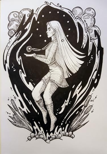 Mona's symbolism is mostly pearls, pearls, pearls, her country's primary resource and her folk's livelihood. Mussel shells, like the ones at the bottom of the picture, and mother-of-pearl are also common materials in Lumen Lake-- Mona's palace is called Blackshell and is tiled with mother-of-pearl. The flag of Lumen Lake is two crossed bulrushes and twelve pearls, representing the twelve islands in her country, so that's what's going on at her feet and around her head. Her pearl pendant is an heirloom of her throne, the one she's now trying to reclaim.
Things are moving forward-- I just received the copy for the back page of the book and my author bio, so it's neat to see it coming together as an actual book! So far still on track for May 17, 2016 for the e-book, which you can pre-order on Amazon or HarperCollins! I'll let you know when I find out about the paperback release.
Mae and Mona, each with quite a bit of symbolism attached. For Mae, significant details include the rhododendrons, alluding to the Appalachian-esque setting of the Silverwood Mountains, and the blue fireflies and foxfire (i.e. glowing mushrooms) at the base of the trees, which are sacred to the Wood-folk. Both of these are real things in our world--the blue ghost fireflies (Phausis reticulata) are confined to a small portion of southern Appalachia and are, in my opinion, pretty much the closest thing to magic in our world. Foxfire, or bioluminescent fungi, is found worldwide and called many other names, but it's also a common sight in Appalachia. Perhaps the biggest symbolism here, though, is Mae's compass, her main tool and last link to her former life as a Woodwalker. It gets her out of more scrapes than one, beyond just wayfinding.
Mona's symbolism is mostly pearls, pearls, pearls, her country's primary resource and her folk's livelihood. Mussel shells, like the ones at the bottom of the picture, and mother-of-pearl are also common materials in Lumen Lake-- Mona's palace is called Blackshell and is tiled with mother-of-pearl. The flag of Lumen Lake is two crossed bulrushes and twelve pearls, representing the twelve islands in her country, so that's what's going on at her feet and around her head. Her pearl pendant is an heirloom of her throne, the one she's now trying to reclaim.Things are moving forward-- I just received the copy for the back page of the book and my author bio, so it's neat to see it coming together as an actual book! So far still on track for May 17, 2016 for the e-book, which you can pre-order on Amazon or HarperCollins! I'll let you know when I find out about the paperback release.
Emily B. Martin's Blog

- Emily B. Martin's profile
- 145 followers
Emily B. Martin isn't a Goodreads Author
(yet),
but they
do have a blog,
so here are some recent posts imported from
their feed.

