
Nancy Duarte's Blog, page 26
December 7, 2012
The Night 8 People Stole 50 Hearts

Sometimes you can feel an experience being etched on your heart. From the moment it begins, the tiny metalworker inside your chest flips down his welding mask, sparks fly, and a short while later, the experience is part of you.
I was lucky enough to experience this phenomenon alongside 50 dear friends–who happen to be my co-workers–during Duarte’s first-ever SpeakUp! event last month.
The format was simple. 8 speakers, 8 stories, 8 minutes each. The stories were all tied together under a theme: Almost.

At Duarte, we eat, sleep, and breathe stories, but this event served to take our breath away, as well as teach and re-teach us a few things:
Practice, practice, practice makes perfect.
In the final weeks of preparation, each speaker performed their story a lot. Revision rounds with their peers, once-overs with their content mentors, dry runs with the designers creating their visuals, and a dress rehearsal with the entire production team. Each time a speaker told his or her story, it got better. Dramatically better. Both the delivery and the story itself improved with each performance. We practiced what we preach, and it only made us want to preach louder.
Stories bring us together.
An e-mail from Nancy sums it up quite elegantly:
As a person who travels and speaks about story, I tell people that your heart races, eyes dilate, you get the chills, you laugh, you cry. I had all that happen to me. BUT, my big revelation from last night is just how much it knits your heart to one another and binds you together. The vulnerability and authenticity last night was astounding. My heart has become completely intertwined with the presenters, and as an audience, we share a common bond having experienced it together.
Story > Slides
Duarte’s designers build some of the best visual stories in the world. So what happened when it came time to build their own? They focused on stories, not slides. There were visual aids – bands of colored light, subtly teasing video clips, a baseball bat, and even a surprise appearance by a biker dude with a bottle of whiskey – but traditional slides were few and far between. Stepping outside of the presentation application may allow you to find a more creative solution for your visual story.
The evening’s presentations inspired us personally, and also pushed us to keep wondering about what else is possible for our clients. We’re more energized than ever about the future, and how it will be affected by the power of storytelling.
Thank you to our incredibly brave speakers, our enthusiastic production team, and the ever-generous Mark and Nancy Duarte for creating this community of storytellers, and providing a forum for us to share our stories with each other.


November 27, 2012
Make Art, Drink Wine, Stay Inspired

In a place where half the staff is paid to “be creative,” it’s especially important to maintain an environment of inspiration, exploration, and just plain fun. There are lots of ways to do that. One of our favorite ways is to throw a party.
Every year, our Art Direction team hosts Make Art: Drink Wine, a party at which we do both of those things, profusely. The party serves as a creative recharge, allowing us to forget deadlines and create art for art’s sake.
It also gives us a chance to raise money and awareness for causes we believe in. This year, money-raisin’ motivation came from Drawbridge Art Group, an organization offering art as therapy for homeless children.
Coming together to create and appreciate art brings us together, reveals hidden talents, keeps inspiration alive, and finds its way back to the work we do everyday.
Check out the video to see what keeps our inspiration afloat:


November 20, 2012
An interview with Nilofer Merchant: The “Jane Bond of Innovation”

As businesses try to scale and innovate, sometimes using counter-intuitive moves are the best strategy. When Nilofer and I hike together, she does a great job asking critical questions, and then questioning my answers, forcing me to think through a more bold strategic play.
As authors, we’ve worked hard to support each other. So, I interviewed Nilofer about the concepts in her latest book, “11 Rules for Creating Value in the #SocialEra”.
Nilofer’s book is available as an e-book on Amazon, and also at hbr.org. Her book changes your mindset about what it takes to be successful in business today.


November 16, 2012
PowerPoint 2013: New and (Mostly) Improved

When 2012 closes and the Mayans have been proven wrong, we’ll all have something to celebrate other than the fact that the world hasn’t ended – a new version of PowerPoint.
Sometime in January, Microsoft is expected to release Office 2013, and with it, the latest and greatest version of PowerPoint. Our team at the Duarte Labs has picked the software apart from end to end and came up with a great review of how it has improved, and how it hasn’t.
Online Sharing
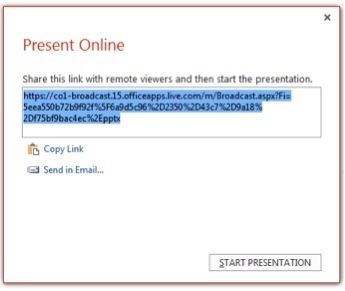
Probably the most exciting new feature is the ability to share a presentation online without the end user having to sign up or log in – they simply click on a link. Once online, the audience is guided through the presentation based on the clicks of the presenter, who can be thousands of miles away.
We successfully tested a variety of platforms and saw widespread success. Our presentation artists, by the way, were ecstatic to discover that even complicated animations are preserved on most devices, with the exception of iPhone. Although the platform is not perfect, the ease of use and quality of performance is leaps and bounds ahead of alternatives such as WebEx and we think that, when the dust settles, this will be the feature people consider to be the game-changer.
Presenter Mode
With PowerPoint 2013, Presenter Mode has been upgraded with a clean new aesthetic. Functionally, a couple of new features have been added that we think our customers will love. First, there’s a slick new slide sorter built in that will allow the presenter to jump to slides without first exiting the slideshow. This will allow presenters to maintain the flexibility required when presenting the same deck to different groups without “breaking the spell” of the presentation by showing the slides in the less-than-elegant editor mode.

In addition to the new slide sorter that’s available in Presenter Mode, Microsoft has also added the new ability to zoom into a portion of the slide and pan around to give a closer look at any details which may be on the slide surface. This feature has the potential to provide a more engaging Prezi-style presentation, although there is only one zoom level available so the potential is constricted somewhat.
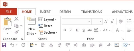
Interface
PowerPoint 2013 will leverage the new Metro interface that carries across the rest of the Office 2013 suite. It’s very clean and web-looking, signaling Microsoft’s move towards a more cloud-friendly application. There’s also “Touch Mode”, which spreads the buttons out to be more conducive to use by our chubby little fingers as we work from tablet devices. This is no doubt a response to Apple’s success in creating what we consider to be a fantastic interface for Keynote for iPad.
Overall, there are also several cosmetic “upgrades” that simply mean the interface animates a bit more smoothly when zooming in and out and while typing. This is cute, but realistically, power users would most likely prefer to save the extra processing power this requires for elements within the presentation itself. The average user, however, will find the overall experience incrementally more engaging when designing and editing their presentations.
Editing
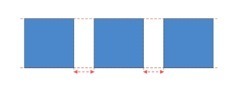
Taking a cue from Keynote, PowerPoint now has a robust set of smart guides which include markers that show when a group of shapes are evenly spaced. This is the type of feature that helps the Average Joe take one extra step toward being a designer.
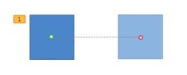
Motion paths now show a ghosted end-position, which is useful for making an animation seamless. Unlike in Keynote, however, the user is unable to copy and ghost to become a new object, so its usefulness is limited.
Summary
For users of PowerPoint 2010, the new version won’t seem too different on the surface. What has changed however, is that Microsoft has taken a couple more steps towards adapting their line of products towards the new cloud-based world (including the new preference towards the web-friendly MP4 video format rather than their own WMV).
In our opinion, this version isn’t quite there yet in that regard, but the web-sharing ability is bound to change the landscape of how presentations are delivered industry-wide. That is to say, it will be once companies make the sometimes difficult decision to upgrade software that is so integral to their day-to-day operations.


November 14, 2012
A Perfect Persuasive Story: Nehru’s ‘Tryst With Destiny’

When I deliver presentations internationally, I like to use examples of great speeches from the countries I’m visiting. When traveling to India, it was only natural to analyze the beloved speech “Tryst with Destiny” delivered by India’s prime minister, Jawaharlal Nehru.
Today would have been Nehru’s 123rd birthday. I wanted to honor his memory by sharing one of his greatest pieces of communication.
This speech was delivered On August 14, 1947, the night before India was going to be freed from British rule. Nehru was very popular in India, and led the country with a global context. He was determined to make India a leader in science and technology.
Nehru’s speech follows an almost perfect frequency as it moves along a persuasive story structure.
Now you know that Nehru is famous for more than just his jacket!


November 7, 2012
Back to the Future: Slides Before PowerPoint

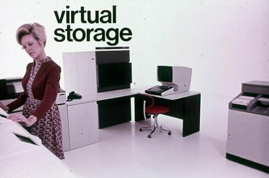
Before there was PowerPoint, there were slides. Real ones. They were tiny, and tactile, and delicate, and kind of delightful.
Making slides was a trained profession for highly skilled designers and technicians. In fact, while researching speeches at the Stanford library, we came across several sets of slides for GE from the mid 1950’s. They were simple, clear, visual, and highly conceptual. Back then, speeches were so well crafted that they were saved for archival purposes.
Vintage Slides from GE from Duarte, Inc.
These slides are built by a trained craftsman who knew what it took to make an effective visual aide.
The following collection of slides was created for IBM over thirty years ago, before PowerPoint was even a glint in Microsoft’s eye.


Here’s what we can learn from our slide-design forefathers:
Slides were treated like they were valuable because they were expensive.
In the 1950’s each element on the slide was crafted by hand, using an array of papers and tapes and a whole heck of a lot of White Out. If you had to pay money for every word and chart you put on your slide, you’d make some very different choices about what information you’d include. Just because our slides are free, doesn’t mean we should fill ‘em to the brim.
These slides were created by a person whose only job was to create slides.
Slide creation was once an art, typically practiced by specialized artists. Flash forward to today, you are responsible for three roles in developing a presentation: the content, slides, and delivering the presentation. you’ve got to contend with the content and delivery of the presentation, too. That leaves little time or energy to dedicate to your slides. We know all too well, good design takes time.
Each slide had to be final days before the presentation.
Frightening, right? Imagine being forced to finish your final deck a week before your presentation. Among other things, like giving you a heart attack, it would allow you time to rehearse. If you had an entire week to think about what to say during your presentation, you may not need to include so much information on the slides themselves. Also, all your valuable up-to-the-minute data would have to be relegated to a handout, where it should be. Hint hint.
Those slide designers toiling away in the olden days were probably dreaming about a tool like PowerPoint, after commuting to work via jetpack. Let’s do ‘em proud by appreciating PowerPoint as an incredible tool, and using it like they would. One idea per slide, plenty of whitespace, and keep (most of) that data in a document.


November 1, 2012
Happy Halloween!

The polls are closed, the votes are in, and we’ve got the winners for this year’s pumpkin contest:

And of course, we held the annual Duarte costume parade, complete with singers and dancers and comedians, oh my!

Mona Lisa

Princess Leia

Ms Pac Man

Photobombing Stingray
‘Til next year, Happy Halloween!


October 19, 2012
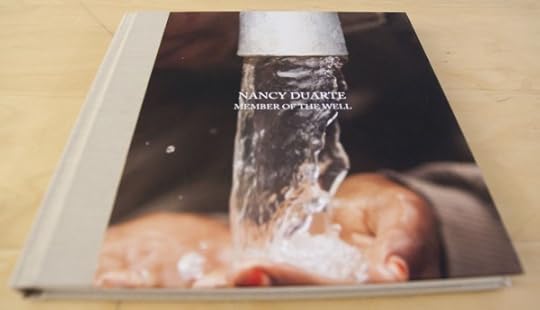
How charity:water is Changing the World

Duarte is passionate about good people, good causes, and good design. charity:water meets all those criteria in spades. Today, they paid a visit to our office to update us on how our donations been helping. (Who does that?)
Throughout the presentation, they shared relevant, easily share-able facts (e.g. $1 invested in water sanitation equals $12 in economic returns,) beautiful imagery and infographics, heartwarming stories, and lastly, a video of the exact well that was built with our contributions.
Mark + Nancy Duarte’s well in Chibchibit, Ethiopia. from charity: water (special donors) on Vimeo.
There are several things that set charity:water apart from other charities, but the most striking are:
The 100% model. 100% of public donations go directly to water projects.
Relentless transparency. You are given precise information, including the exact GPS coordinates of where your money is being spent.
Good design. They have cultivated a beautiful brand and provide well-designed and effective tools to help you spread the good word.
We are proud to be part of charity:water’s story of success, and we hope you will consider it, too. Find out more about how you can help here: http://www.charitywater.org/getinvolved/

The world needs clean water.
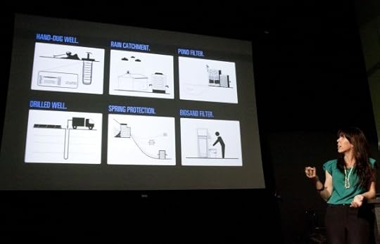
The six different types of water projects.
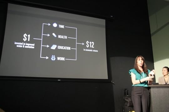
$1 donation is worth $12 return. Pretty good ROI if you ask us.
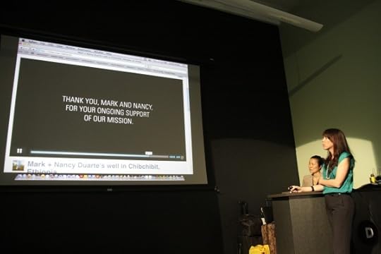
A personalized video showing how Duarte's contributions were used.
A keepsake book with photos taken in the village where Duarte's well is located.
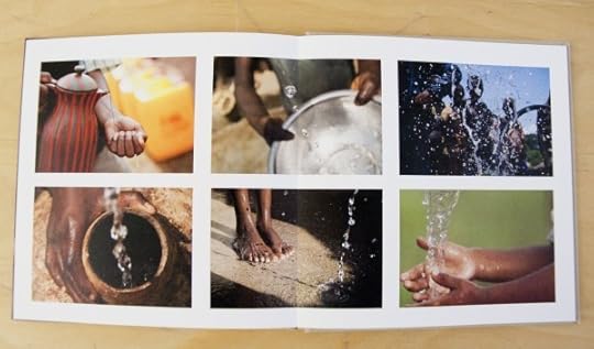
All these photos were taken in the village where Duarte's well is located.
Thanks again, Jaclyn and Yukari!


October 17, 2012
Get Noticed in a Noisy World

Michael Hyatt will try to tell you he’s just like you and me. I’ve read his book, Platform: Get Noticed in a Noisy World, and I can tell you he’s not. He’s an incredibly ambitious super-human with a Twitter following to which Lady Gaga would tip her (ridiculous) hat.
Good news, he was once one of us. Michael Hyatt has worked hard to build his platform over the past eight years, and has compiled insights from his most popular and effective blogs into a book designed to help people sell their ideas.
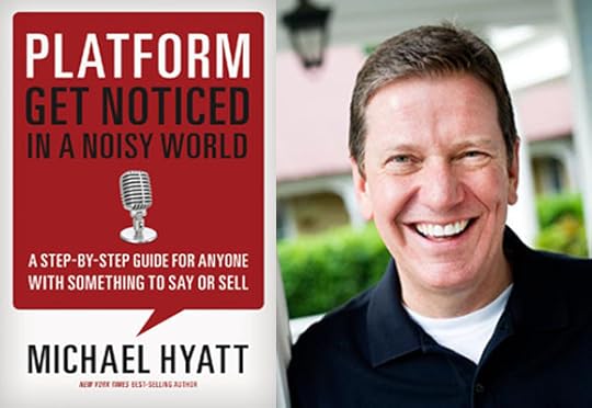
There are many books of its kind, but Michael Hyatt offers practical advice that stands out from the rest. I’ve chosen one insight from each section of the book that I found to be the most helpful:
Part 1: Start With Wow
You’ve gotta start with a stellar product. The book won’t let you proceed without making sure you’ve got something to say or sell that will exceed your audience’s expectations. Some books are more than ready to help you start getting the word out, no matter what the word may be. Michael Hyatt is aiming for your long-term success.
Part 2: Prepare to Launch
Get your plans out of your head and on paper. Seems simple, but writing down your goals is good for several reasons. Committing your goals to paper can help:
Clarify what you want
Motivate you to take action
Provide a filter for other opportunities
Overcome resistance
Enable you to see—and celebrate—your progress
Part 3: Build Your Home Base
Be online, but not every line. Facebook, Twitter, LinkedIn, Instagram… new sites and services are being created every day, and you may feel pressure to join them all. Don’t. Find the outlet that makes the most sense for you, and stick to it. A reliable platform is built with care and consistency.
Part 4: Expand Your Reach
Tribe-building is the new marketing. Duarte spent over 20 years gaining business solely through word of mouth. No marketing, save the announcements we sent about our Annual Pumpkin Contest. When times got tough, the phone kept ringing because we had a tribe of loyal supporters.
Part 5: Engage Your Tribe
Keep your ear to the ground. Keep tabs on how you and your brand are being perceived, and don’t be afraid of feedback—good or bad. You rely on your audience, so listen to them and show them you value their opinion. When you make a mistake, admit it, and then fix it.
I especially connected with Chapter 7, “Wrap the Wow in Style,” because that’s Duarte’s forte. We strive to create “wow” moments for an array of industries and audiences, and we know just how important it is to make things look good. Both Michael Hyatt and Duarte know that looking good can mean something different for every audience. There were four main points I found especially relevant:
Know your audience. If you’re at all familiar with Duarte, you know this is our credo. But there’s a reason: it’s true. You’re the mentor, they are the hero. Be sure you are helping guide them on their journey.
Know your brand. Pay close attention to fonts, colors, patterns, and any elements that may help or dilute your brand. Pick a visual story, and stick to it.
Know your industry. The night before Nancy had to submit artwork for the cover of Resonate , we discovered the design looked incredibly similar to the cover of Seth Godin’s Tribes. How did we discover this? Read the next bullet point.
Ask your fans. Nancy posted a sneak peek of the Resonate book cover and received comments about the unmistakable similarity to Tribes. After countless comments and suggestions from our tribe, we had a new book cover design we felt sure was nothing like its competition. Check out Nancy’s blog about the experience here.
Platform offers advice everyone wishes they’d known at the beginning of their career, including Duarte. The book is a dream for people who are just getting started on their journey, and hoping to be heard.


October 12, 2012
The French (Presentation) Revolution

Guest blog post submitted by Annabelle Roberts @abelleroberts
 When I moved to France almost seven years ago, it didn’t take me long to realize that this country left America in the dust for so many things. Cheese? Far superior. Pastries? No contest. Public transport? Again, us North Americans were beat and I couldn’t do anything but admit it the first time I took the ultra-fast TGV train from Paris to Lille.
It wasn’t until I started working in a French company as a communications coach that I felt better, like maybe there was a bit of justice in the world. Clients would come in needing help with high stakes presentations and they would whip out a set of slides that could only be classified as PowerPoint 1.0. At first I thought they were isolated incidents, but I was seeing it again and again and again. So, I officially knocked the French off the pedestal they had been on in my mind as they had serious work to do when it came to presenting, speaking to an audience and getting a message across to a crowd. On this one, the Americans 1, the French, 0.
From what I’ve observed, French businesses are at the beginning of what could be called a “Presentations Renaissance” so I sought out hubs of activity where this enlightenment was particularly apparent. I found one such hub when I mentored at Paris’s best known start-up incubator Le Camping.
It was while I was working with my little Campers, as they’re called, that I noticed a difference in their presentations and those of my corporate clients. Their pitches were shorter, more to the point, more personal, interactive and sometimes even funny. Regardless of how many times they’d pitched their business to press and investors, they would always take the time to adjust the tone/language to the public that they had in front of them.
They would still do very “French” things like spend three slides on their degrees and internships and try and jam their projections for the next five years into a seven-minute pitch which is where I would come in, but there was definitely a difference between what I was seeing from these bright-eyed engineers and developers and the executives and middle managers I was getting paid to coach at work. As was the case in the USA, the realization that “There is a better way” was rising up from this start-up community and working its way up from the bottom of the business pyramid to Fortune 500 companies.
In big business, the French don’t have many exemplary cases that are really embodying what will hopefully become the new norm. Partly because when someone is CEO of a company, discretion reigns, and partly because a “show” for a product launch or another big event that will involve a presentation is still considered “very American” (even if it works).
We do however have one recent example of someone who is daring to do things differently. He is getting results and it made waves here in France. Xavier Niel is the CEO of a huge telecommunications group called Iliad/Free. In January 2012, he announced that they would launch a mobile service that would undercut all other players in the Mobile market by half.
In front of 200 journalists, as well as a substantial public watching online, he did what is not done in France: He was the mascot of his message and his passion was apparent. He spoke to the public like peers and started off his presentation with a quirky, amusing video as opposed to the all-so-French Table of Contents that is at the beginning of so many presentations here. His slides were much more visual than we’re used to in the Hexagon and refreshingly bare bones for France.
He dared to be himself and people talked about this launch for this reason. Although he went on for way too long if you ask me, it’s an encouraging start for the French! Watch Mr. Niel below and contribute your two cents in the comments. I’ll make sure they’re heard this side of the Atlantic. XavierNiel_Free_Keynote_HD by Annie83
Note from Nancy: The French renamed Resonate. The French translation is called Vibrations.


