
Nancy Duarte's Blog, page 24
April 16, 2013
Duarte Workshops Are Coming to London

Duarte is excited to announce that we’ll be hosting our first international workshops in London!
We’ll be conducting two consecutive sessions of our 1Day VisualStory workshop:
Wednesday, May 15 and Thursday, May 16 – at the beautiful Hoxton Shoreditch Hotel in East London.
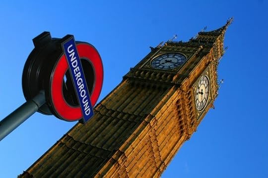
If you live in or near London, and have been unable to take the time or budget to travel to the U.S., this is your chance. Or perhaps you just want an excuse to take a trip to London…
No matter where you live, we’d love to see you there. Join us, and spend the day learning to design presentations that will change your world.
Workshop: 1Day VisualStory
This one-day workshop delivers insights into the basics of story content from Resonate and visual design principles from Slide:ology. Learn to create content that connects with an audience, and how to display information beautifully and meaningfully.
Dates: Wednesday, May 15 or Thursday, May 16
Time: 9:00 – 17:00
Location: Hoxton Shoreditch Hotel
81 Great Eastern Street, London EC2A 3HU
If you have any questions, please contact Amanda Vogan at avogan@duarte.com
Hope you can join us!


April 11, 2013
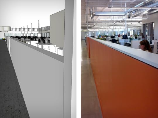
Best Tool for Building a New Space: Google SketchUp

As a designer, some of the most challenging clients are the ones with a design background—they catch everything. So it was with great empathy that I jumped in to help the wonderful architects who had been asked to visualize our new office for two of perhaps the most challenging clients of all—our CEO, Nancy Duarte, and our Creative Director, Diandra Macias.
To give some perspective, designers like Nancy and Diandra are very visual people. You can describe what something will look like, and show all the fancy engineering drawings you want, but until they see the finished piece with their own eyes, it’s meaningless.
So how do you truly show them what the finished project will look like even before it’s built?
My tool of choice for projects like this is Google SketchUp. It’s easy to use and helps communicate the feel of a proposed space better than anything, short of walking through the real thing.
Fortunately, our architect had been working in SketchUp, and in an exquisite act of trust toward a complete stranger, she sent me her file. (And I’m sure she regretted the decision more than once during the process.)
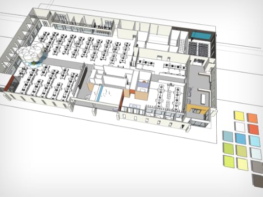
The entire floor plan in SketchUp.
As soon as I had the file, Nancy came over to my desk to check it out. I manned the model while she did a bit of back-seat driving. Within about five minutes, we noticed that not only was the space designed to account for nearly zero headcount growth, but that there were also a whole lot of opportunities around the new facility for us to execute some beautiful installation art. It was like dodging a bullet and finding a pot of gold at the same time – all thanks to our virtual walkthrough.
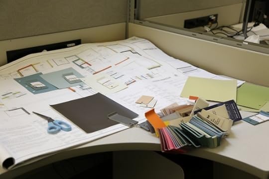
Over the next couple of weeks, the 3D model became instrumental in getting people throughout the company engaged and invested in the hundreds of decisions needed to design our new place. We had department heads provide feedback and signoff on how their teams’ spaces were laid out, we had the chance to see how different color choices flowed through the space, we had an epic late-night brainstorm to solve all the opportunities for installation art, and we conducted a company-wide virtual tour of the new space to open-source anything we might have missed.

The evidence of a five-hour brainstorm. We voted for our favorite stuff with orange stickers.
So how’d it turn out? We’re finally in the new facility and it looks amazing! It feels like a spaceship.
Of course there were some frustrations on both sides and few things needed to be redone along the way, as would be expected in a project of this scale – but we were able to avoid most of the design-related disasters. And because we had so much buy-in during the process from employees throughout the organization, there has been minimal grumbling about the decisions that were made.
So we at Duarte would like to extend an extra special thanks to Google for putting a powerful 3D modeling tool into a package even a layman can use. Hats off.
Check out some photos of our new space along with their SketchUp siblings here:

The main hallway, looking left from the entrance.
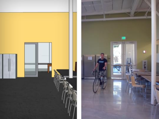
The kitchen that's so big you can ride your bike in it. (And Jack, riding his bike in it.)
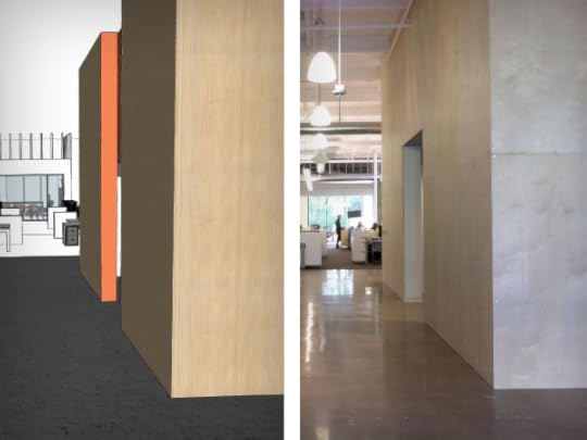
The entry hallway, and the edge of the bathroom core.
The hallway from the kitchen.


April 8, 2013
Losing the Iron Lady: A Tribute to Margaret Thatcher

Margaret Thatcher, who served as Britain’s first and only female prime minister from 1975 to 1990, died of a stroke today at the age of 87. Whatever your opinions are of the “Iron Lady,” her speeches are great examples of rhetorical and argumentative skill.
To honor her, we’ve analyzed the “Britain Awake” speech, delivered at Kensington Hall in 1976 to warn British officials of the rising threat of Russia, whose leaders, she said, were “bent on world dominance.” This speech prompted the Soviet Defense Ministry newspaper Red Star to pejoratively call her “The Iron Lady.” Instead of being offended, she took on the nickname as a point of pride.

Thatcher uses her characteristic wit that helped her operate in a government largely dominated by men who used humor for political influence every day:
“Perhaps some people in the Labour Party think we are on the same side as the Russians!”
Parliamentary leaders are typically less concerned about being polite and would rather dismantle their political foes with statements that make people laugh but also give a little dig at their opponents. Thatcher does this throughout this speech.
When she came to power, Thatcher had many vocal critics who could remark on her policies, toughness and even her screechy voice. In order to further establish her credibility with such critics and to show she wasn’t afraid to face opposition, she addresses contrarian arguments directly:
“I would be the first to welcome any evidence that the Russians are ready to enter into a genuine detente. But I am afraid that the evidence points the other way.”
After further describing the evidence stacked against Russia, she rallies Britain to stand up to its role in the world and in history.
“We in Britain cannot opt out of the world. If we cannot understand why the Russians are rapidly becoming the greatest naval and military power the world has ever seen…then we are destined—in their words—to end up on ‘the scrap heap of history.’”
She then launches into a “What Is”/“What Could Be” schema, arguing that the audience should move from accepting the current defense spending cuts and towards upending the status quo:
“What has this Government been doing with our defences? Under the last defence review, the Government said it would cut defence spending by £4,700 million over the next nine years. Then they said they would cut a further £110 million. It now seems that we will see further cuts.”
And she doesn’t forget to insert more of her acerbic wit and use of irony to make a point:
“If there are further cuts, perhaps the Defence Secretary should change his title, for the sake of accuracy, to the Secretary for Insecurity.”
At the end of the speech, she raises the conversation once again to the nobility of Britain and the new bliss, where the nation has played a decisive role to secure the world’s future:
“We are under no illusions about the limits of British influence. We are often told how this country that once ruled a quarter of the world is today just a group of offshore islands. Well, we in the Conservative Party believe that Britain is still great…”
“…The Conservative Party must now sound the warning. There are moments in our history when we have to make a fundamental choice. This is one such moment—a moment when our choice will determine the life or death of our kind of society,—and the future of our children. Let’s ensure that our children will have cause to rejoice that we did not forsake their freedom.”
Our hearts go out to her family and friends today.


April 4, 2013
When Reinventing Your Environment, Color Can Make All the Difference

When Duarte asked me to help pick colors for our new office in Sunnyvale, I was thrilled to lend my expertise. Before joining Duarte, I worked as an architectural color consultant for more than six years. In that time, I learned the many principles behind color theory and color for specific environments.
The vision for the new space was described to me as “mostly crisp white, pops of color, and a feeling of calm or serenity.” This may not seem like a lot of direction, but this was just the right amount of information for me.
The power of color can be witnessed in the way we respond to it. Often, we approach choosing color for our environment in the same way we approach choosing a significant other. We are naturally drawn to specific “characteristics” of colors; we form strong bonds; we have definitive dislikes; we even fall in love.
“Color is a powerful physical, biological, and psychological force.”
– John Paul Caponigro
That quote really resonates with me – I met my soul mate on the day I met the color red. Not just any red… cherry red. The cherry red of my first tricycle, my radio flyer wagon, the overalls that I wore for the entire year I was eight years old, and the ’66 Ford Mustang I drove in high school. Cherry red holds powerful memories for me, I respond to it psychologically, and it’s safe to say it makes me happy. Does this mean I should paint all of the rooms in my house a striking red?! My sources say, “No.”
That being said, how do we approach choosing color for our environment? How do we approach choosing color for the environment of more than 120 people? We use science.
THE APPROACH
The new Duarte office is a large open space with offices and conference rooms along the outside core walls. The conference rooms and offices were designed to be virtually transparent with big sheets of glass where walls would normally be. I immediately wondered how employees would react to a mostly white space.
When a person sits in a white space for too long, their eyes become tired and they look around for visual stimulation. Knowing this, I allowed the inside core of the large open space to remain mostly white, but made sure to use pops of color inside the conference rooms and offices so people could look up from their desks and adjust their eyes.
THE PALLETE
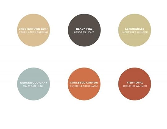
Nancy Duarte loves the color blue. I knew blue had to be included in the new space. This was the jumping off point for the palette. I looked for a blue that emanated serenity. What I found was Wedgewood Gray, a blue gray from the Benjamin Moore historic collection.
To maintain harmony within the palette, I looked for analogous/adjacent and complimentary colors that fell within the same chroma as Wedgewood Gray. This brings pops of beautiful colors such as orange, red, gold, gray, charcoal, and green that move you from one space to the next. While each color delivers a unique amount of interest, they all carry a certain familiarity by maintaining a similar chroma.
THE PLACEMENT
Placement was one of the most challenging and important aspects of this project. I evaluated color placement by considering the layout of the space, the location and type of light source (natural vs. fluorescent), as well as the proven biological response created by each color.
For example, I chose green for the kitchen because green is proven to increase hunger and encourage eating. It’s a wonderful kitchen color! Our Auditorium is a combination of charcoal on both the front wall and the ceiling, and soft gold on the side walls. Yellow is known to stimulate learning, and the charcoal on the ceiling helps to reduce the glare on the projection screen. Thinking about placement may be one of the last steps in color application, but it should be given the most thought.

THE RESULT
The office is gorgeous! We’re still settling into the new space, and currently sharing it with a few construction workers – so it’s not quite ready for its close-up. There are a few photos of the building on our Facebook page, and there will be more to come on the blog, along with more insights into the planning and execution of the renovation. Stay tuned to learn more about the process of building and designing our new space!


March 25, 2013
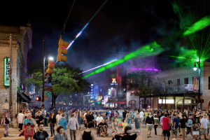
SXSW Interactive: Amazing from Every Perspective

When we came home from SXSW Interactive last year, we vowed to return. So, this year we came back in full force to soak up Austin’s creative energy, learn from all the brilliant people around us, and, of course, spread the word about creating compelling presentations. The thing with SXSW is that there’s no one way to see it.
No one person could attend all the panels, go to all the surrounding events and exhibits, or meet all the interesting people who flock to the area every year. So, we sent a team. A group of Duartians from almost every area within the company traveled to Austin to take in SXSW. And while we might not have done everything there was to do, we came pretty darn close. Here are our thoughts from five different perspectives, and a video that captures them all.
Mark Heaps, Senior Development Specialist
What was your biggest takeaway from SXSW?
The social media movement, still in its infancy, is finding ways to be more measurable. People want demographics and metrics around a variety of user groups (followers, likes, etc.). We saw lots of technology around this.
In 2012, the buzz for industry was still focused on “storytelling,” and that umbrella shaded a wide variety of services. This year that was still a running theme, but more and more groups were moving into persuasion as a metaphor for their work.
Another insight that was huge for me was that people love SXSW because they get to interact with people, in real life! I think there has been lots of evidence to support the fact our lifestyles are more digital. But when you come to SXSW, it’s a giant mixing pot of people who like to be social, interact, and connect.
What was your favorite talk and why?
Bassem Youssef’s talk was the most inspirational one for me. To see someone have such rapidly growing success in only two years was inspiring. And to top that off with the circumstances under which he and his team built that success was impressive.
Outside of the panels, what was the coolest thing you saw?
I most loved seeing all the design and art around the city and companies being progressive — like HGTVs mural wall or Microsoft’s party, where they had a live artist painting a graffiti piece while the DJ mixed for the crowd.
There were also some great technologies on display this year. The Aurasma plug-in creates a really interesting format for interacting with mobile devices and print media. There was a powerless mini-mixer for portable audio devices like iPods. And there were a lot of maker, craft, and 3D printer demos going on. That technology is clearly going to be the way of the future once it’s scaled up and refined.
Ashley Faus, Marketing Manager
What was your biggest takeaway from SXSW?
I think my biggest insight is that people are using technology to make real-life connections. It’s about using your online experience to create a more robust offline experience.
What was your favorite talk and why?
My favorite talk was a 15-minute talk on productivity by Scott Hanselman. He gave actionable tips to increase productivity, and his blunt speaking style really hit home for me. Everyone in the session appreciated his to-the-point delivery and tips. And he saved us time, which supported his message on increasing productivity.
Outside of the panels, what was the coolest thing you saw?
I think the coolest thing I saw was the myriad of vendors offering 3D printing. It reminded me of Alastair Parvin’s TED talk about how we are in an age where we are all designers and manufacturers. You can literally make your own items in your home, and the cost and size restrictions are decreasing quickly. It’s amazing how far we’ve come with technology.
Joe Perez, Video Director and Designer
What was your biggest takeaway from SXSW?
My biggest takeaway was that there are more cameras doing video than I thought. I felt like one out of five people were toting a camera and filming.
What was your favorite talk and why?
I was filming during a lot of SXSW, so a lot of the programming that I went to happened outside of the actual event. One of my favorites was 20×2, an event where 20 people each tell 2-minute stories. Another was a Pecha Kucha outside of design firm Pentagram’s offices. I loved hearing people share their stories in an innovative format.
Outside of the panels, what was the coolest thing you saw?
Two of the coolest things I saw were the see-through, glass DJ mix board at the Microsoft party. That same night we also wandered to nearby party where The Joy Formidable was playing. We hadn’t planned on going, but we all became instant fans.
Oscar Chacon, Senior Designer
What was your biggest takeaway from SXSW?
I learned that people are obviously looking for and yearning for better, more efficient, and more entertaining ways to tell their stories. So, the presentation industry needs to be way more pronounced at the event.
What was your favorite talk and why?
My favorite talk was called Idea Orphans, with This American Life writer and producer Starlee Kine and author and illustrator Arthur Jones. It was about what to do with all your ideas that have yet to find a home. I felt the most entertained in this talk and was engaged the entire way through. I even felt a little inspired to write, draw, and animate my own short stories.
Outside of the panels, what was the coolest thing you saw?
Definitely the music studio. On our last night in Austin, we went over to our colleague Mark’s friend’s house and he had an awesome studio with all kinds of instruments, and I was allowed to touch them. We put together a little impromptu Duarte jam session. It was great.
Amanda Dyer, Content Developer
What was your biggest takeaway from SXSW?
My biggest takeaway from SXSW was the feeling that if you have an idea or something that you’re passionate about, you need to believe in it and find a way to make it happen. I saw so many different forms of creativity at SXSW — from innovative products like the Breathometer (a breathalyzer that hooks up to your smartphone) to awesome posters, stickers, and even building wraps to performances of all kinds —music, storytelling, and, yes, even formal presentations. It seemed like around every corner there was another presenter, another attendee, another someone putting something amazing out there and taking their creativity to the limit.
What was your favorite talk and why?
My favorite talk was called Metalearning with 4-Hour Workweek author and lifestyle-design guru Tim Ferriss. It was about how to learn things you’ve always wanted to learn quickly by taking alternative approaches. Ferriss is a master at taking a skill, boiling it down into parts, and figuring the best way to learn those parts. One of the things he said that really stuck with me was the idea that genetic determinism is negotiable. It’s the perfect antidote to the voices in your head that say you can’t accomplish your goals because of A, B, or C.
Outside of the panels, what was the coolest thing you saw?
One of the coolest things that I saw outside of the panels was a couple of blocks away from the convention center on Sixth Street, Austin’s entertainment district. Friskies had turned one of the buildings into a giant advertisement by projecting a video of Grumpy Cat (who was arguably the most talked about celebrity at SXSW Interactive) onto the building’s windows from the inside. From the outside, it looked like there was a giant Grumpy Cat staring at you from inside the structure. It was an amazing way to draw attention to the Friskies brand.


March 1, 2013
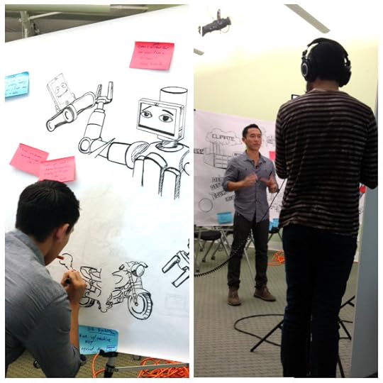
TED 2013 | An #illustraTED Gallery

The last TED 2013 speaker has spoken! We’ve officially put down our markers and closed our notebooks. But not before we scanned ‘em all and put them in a Slideshare presentation for you to peruse.
We had so much fun listening to the brilliant artists, inventors, and entrepreneurs, and visualizing their ideas. Throughout the week, we made a giant graphic recording (and recorded the process start to finish), more than twenty visualizations, and a Twitter feed full of quotes and #TEDin10words.
Take a look at some of our graphic creations from the week, and get inspired to pick up a marker or pen or pencil, turn on a TED Talk, and give it a try!
Huge thanks to the team of artists and writers to participated, and all the wonderful folks at TED. We are inspired, and eagerly awaiting next year!


February 27, 2013
Graphic Recording at #illustraTED | Progress Enigma

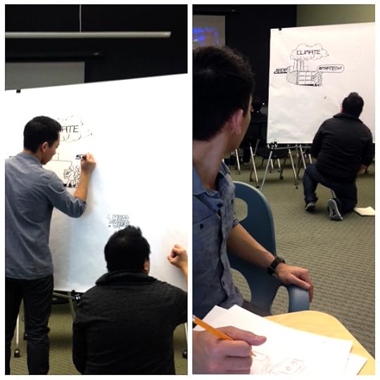
The first day of TED brought twenty talented speakers and performers, and three thought provoking themes: Progress Enigma, Beautiful Imperfection, and The Spark.
For us, TED isn’t just about listening to the talks, it’s about synthesizing the information, recording it graphically, and uncovering a visual story. Our dynamic duo of illustrators–Dave Nguyen and Jonathan Valiente–transformed the first seven TED Talks into one cohesive visual about Process Enigma.
More than any other year, the speakers acknowledged those who had been onstage before them, referencing their ideas and incorporating bits of language that made the group of speeches feel all the more connected.
The general idea is that we’re up against a lot of obstacles on the road to progress, but we are on track to overcome them, with the help of each other, and a few robots.
Check out the video and photos below to see our whole process from start to finish.
 See you back here for Day 2!


February 25, 2013
#illustraTED | Duarte is Visualizing TED Talks All Week

Another TED Conference means another #illustraTED event at Duarte!
As the world’s best and brightest are converging in Long Beach for the 23rd annual TED Conference, we’re hunkering down here at Duarte, getting our pens and papers and devices ready to visualize, summarize, and share their brilliant speeches.
Last year, we assembled a team of writers and designers, and spent an afternoon live-tweeting, churning out visual notes, iconic graphics, quotes, ten-word summaries, some haiku poetry, and even a limerick.
This year, we’re doing it all again. Except it won’t be just one day, it’ll be all week! And this time, we won’t shut down Twitter. (We hope.)
Follow the action starting tomorrow, February 26.
Twitter: @duarte and @nancyduarte (search for #illustraTED)
Facebook: Duarte, Inc.
And, every day, we’ll post a summary right here on this very blog.
Check out the video and photos below, and get excited to see this year’s talks, #illustraTED!
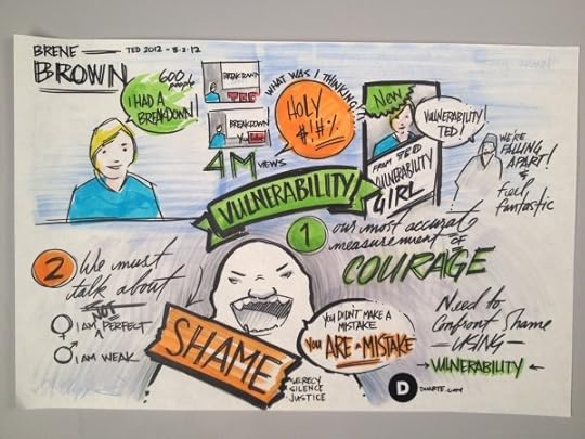
Inspired by Brene Brown (Artist: Erik Chappins)
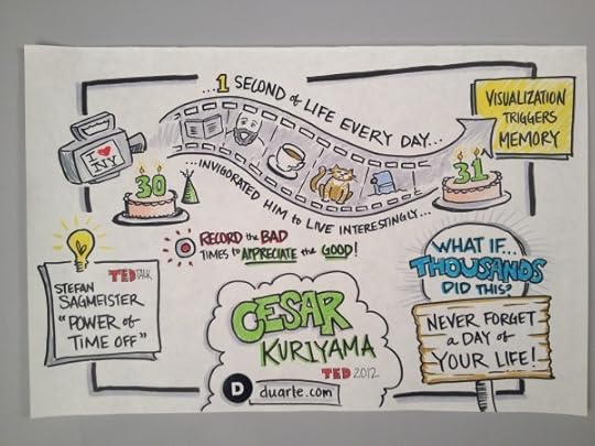
Inspired by Cesar Kuriyama (Artist: Diandra Macias)
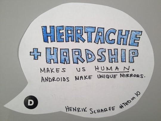
Henrik Scharfe's TED in Ten Words


I KNEW Argo Would Win Best Picture Before You Did

More than an hour before Argo was announced as the winner for Best Picture, I declared to my husband that it would win.
How did I know? Because the film had won for Best Film Editing. Since 1981, every film selected as Best Picture has also been nominated for the Film Editing Oscar, and about two thirds of the Best Picture winners have also won for Film Editing.
The magic of editing is the difference between a good movie and a great movie. If you’re unclear as to what value an editor brings, here’s a clip that’ll make it clear.
Jodie Foster, who has been behind the camera for years, said that she didn’t even know what editing really was until she was in the editing suite herself.
Great editing improves movies, and it can improve your next presentation. Editing and filtering your idea is very important. If you don’t edit your presentation, the audience will respond negatively—because you’re making them work too hard to discern the most important pieces.
Use these three tips when developing your next presentation:
1. Prepare great content, and a lot of it.
You need a great story and fantastic, original raw material to work with. Create much more than you need so you have plenty of content to shape well.
2. Have someone else edit your work.
Sometimes we get too close to our own material to edit deeply enough. Ask someone who is unfamiliar with your subject matter to help make sense of it, and decide what needs to be cut.
3. Make edits with the audience in mind.
You’ll probably never have an audience clamber for your talk to be longer. So cut out everything that’s there for you, and amplify the parts that will transform your audience.
For more information on the power of editing, Garr Reynolds has been studying story for his latest book project and talks about the power of great editing here and here.


February 22, 2013
SXSW | Meet us in Austin!

For the second year in a row, a group of Duartians — along with about a million other tech, music, and film enthusiasts — will be descending on Austin, TX for SXSW, and we want to share it with you. If you’ll be there, we want to meet you. And if you’re not there but wish you could be, we want you to live vicariously through us via Twitter, Facebook, Instagram, interpretive dance, smoke signals, and, of course, a presentation. Well, at least some of that is true.
You can follow our journey on Twitter at @duarte and @nancyduarte. We’ll be using hashtags #whatsyourstory, #sxsw, and #DuarteSXSW.
You can see the very best of what we see on Instagram at @duarteinc.
And we’ll be sharing our experiences on our Duarte Facebook page.
Check out these channels for links to video and possibly other surprises, too (sorry, no interpretative dance … probably).
If you’re going to be at SXSW from March 8-12, we’d love to meet you, hear the story behind your experience and share it with the world, and share intel on where the best food is. Of course, we’ll have some cool swag to hand out (well, as much of it as we can carry), but more than that we’d love to see your face. One of the best places to see us will be the Agency Speed Dating events on March 10-13 in the Austin Convention Center.
So, send us a shout out, and let’s meet. And if not, check us out on Twitter, Facebook, and Instagram. Sound like a plan? Good.
See you soon.


