
Rebecca Green's Blog, page 3
October 1, 2022
APPLE CIDER, SWEET AND TART, PUMPKINS, TREATS, AND ALSO ART

It. Is. OCTOBER.
Truly my favorite time of year: the wind gets crisp, sweaters come out, and woodsmoke is in the air. Fall means all things cozy - spicy chilis, apple crisps, cider, pumpkin patches and donuts. And - all things scary, except I’m kind of a softie and stick to playful spooky things. Not only is this is best month, but to me, October kicks off the whole season - from now to New Years, it’s a time for magic and friends and all the good things in life.
And….FOOD! Which we’re digging into today.
I can’t write this post without sharing wise thoughts from Yuko Shimizu. I can’t find the exact words, but during a podcast interview, she spoke of how important it was to love things outside of art - to have something to make your art about. Whenever I feel like an imposter with food, since I really didn’t grow up in the kitchen, I think of this quote and assure myself - this is a thing I can really love…and learn…outside of illustration. I’ve talked about this before - I’ve drawn food and chefs my whole life! But it took me until my late twenties to really feel confident cooking. And it’s taken even longer to understand just how much the culinary world inspires my work - even though it’s been there all along.

While I’m obviously not a culinary scholar, I thought it’d be fun to instead look back through old work and find the culinary themes. I’ll also share a couple lovely links to magazines and such, a few of my fave food podcasts, and also links for learning, should you be interested in food from an art history lens. AND - this will be a great post to get your comments - share your best recipe, favorite restaurants, food illustrations, or tips in the kitchen.
MY WORKWhen I first graduated, before working in editorial illustration, I did a ton of gallery shows. The work looks so different than what I make today but somehow the themes feel similar. Lots of food! Lots of cake. A whole wall, even - a cake gallery! Back then I was working in acrylic on panel, with oil glazes.
View fullsize
View fullsize

View fullsize

Looking back, I have a host of celebratory food pieces that I’ve done over the years. Most of these were personal pieces, or for clients who gave me ultimate creative freedom (worth all the gold in the world.)
Penfield Children’s Center Croquet poster
FOODIES for Light Grey Art Lab
Bakeanoid
Wooden Dessert
Agatha from Grand Budapest Hotel
Fancy Apple
Hirakata Feast (process post)
Thunderstorm Feast (with a poem!)
Little Sprinkle Packaging for The Dessert Club
Confetti Cake for The Dessert Club
Cooking Class from Studio Kura
A Birthday Card from 2011!

Fire Roasted Veggies! Created for the FOODIES exhibition at Light Grey Art Lab in 2018" data-lightbox-theme="light" href="https://images.squarespace-cdn.com/content/v1/507477a584ae87aa2d96202b/1664504451162-H0850TFHVO8J8T09REF7/Foodie_Finalws.jpg" role="button" class=" image-slide-anchor js-gallery-lightbox-opener content-fill " > View fullsize

Created for the Quaranoid project. " data-lightbox-theme="light" href="https://images.squarespace-cdn.com/content/v1/507477a584ae87aa2d96202b/1664504709402-UT42T5BZ6DYSL20RIYBT/Bakenoid.jpg" role="button" class=" image-slide-anchor js-gallery-lightbox-opener content-fill " > View fullsize

Created for the Wooden September Exhibition at Kawachi in Osaka, Japan " data-lightbox-theme="light" href="https://images.squarespace-cdn.com/content/v1/507477a584ae87aa2d96202b/1664504635093-2NSH17ZK7XWA5AA8SSI2/WoodenDessert_ws.jpg" role="button" class=" image-slide-anchor js-gallery-lightbox-opener content-fill " > View fullsize

‘Agatha’ with Mendl’s Courtesan au Chocolat, created for the Bad Dads exhibition at Spoke Art, 2015
AVAILABLE HERE" data-lightbox-theme="light" href="https://images.squarespace-cdn.com/content/v1/507477a584ae87aa2d96202b/1664503885129-A9R7S2T7JRFDYDUAEQI7/Agatha.Spokeart.jpg" role="button" class=" image-slide-anchor js-gallery-lightbox-opener content-fill " > View fullsize

Created for the Wooden September Exhibition at Kawachi in Osaka, Japan " data-lightbox-theme="light" href="https://images.squarespace-cdn.com/content/v1/507477a584ae87aa2d96202b/1664504959503-V06L0IXKJPS571V7WJ4H/FancyApple.jpeg" role="button" class=" image-slide-anchor js-gallery-lightbox-opener content-fill " > View fullsize

Inspired by a day cooking with two lovely friends in Japan, in the fall of 2020. " data-lightbox-theme="light" href="https://images.squarespace-cdn.com/content/v1/507477a584ae87aa2d96202b/1664504978591-QMOCTPD53CITC20Y8L6Y/hirakatafeastws.jpg" role="button" class=" image-slide-anchor js-gallery-lightbox-opener content-fill " > View fullsize

Personal Project " data-lightbox-theme="light" href="https://images.squarespace-cdn.com/content/v1/507477a584ae87aa2d96202b/1664505077829-BFL9BG6RNKGD4XLOFSZO/thunderstormfeastws.jpg" role="button" class=" image-slide-anchor js-gallery-lightbox-opener content-fill " > View fullsize [image error]
Personal Project for The Dessert Club" data-lightbox-theme="light" href="https://images.squarespace-cdn.com/content/v1/507477a584ae87aa2d96202b/1664505324679-VGT3N2IFSUYEWF6UVGS6/SPRINKLES_PHOTO_1.jpg" role="button" class=" image-slide-anchor js-gallery-lightbox-opener content-fill " > View fullsize

Personal Work " data-lightbox-theme="light" href="https://images.squarespace-cdn.com/content/v1/507477a584ae87aa2d96202b/1664505386061-IC9QS1SNNCPE1ESYNID4/sprinklesconfeeticakews.jpg" role="button" class=" image-slide-anchor js-gallery-lightbox-opener content-fill " > View fullsize

Personal work from Saori’s Cooking Class!" data-lightbox-theme="light" href="https://images.squarespace-cdn.com/content/v1/507477a584ae87aa2d96202b/1664506521026-CZT80UHU3IGDXXI8C8Q3/3.19.jpg" role="button" class=" image-slide-anchor js-gallery-lightbox-opener content-fill " > View fullsize [image error]
A greeting card from 2011! So very long ago, from beginner baby Becca" data-lightbox-theme="light" href="https://images.squarespace-cdn.com/content/v1/507477a584ae87aa2d96202b/1664506846217-EH98SVD5RXHXADF418WF/birtdaycardws.jpg" role="button" class=" image-slide-anchor js-gallery-lightbox-opener content-fill " > View fullsize

I also thoroughly enjoy making food that isn’t edible. I made this cake as part of the Seven Celebrations project with my pals Meera and Danielle. We highlighted seven different reasons to celebrate when the world was deep in the throws of Covid and all looked dim. I made the cake out of a piece of packaging - the candle was a red colored pencil. I honestly could make fake cakes ALL DAY.
View fullsize
View fullsize

View fullsize

View fullsize

View fullsize

View fullsize [image error]
I’ve also long kept (though not in the past year - yikes!) a visual journal and mostly it’s FOOD. What I’m cooking or restaurants I’ve visited, meals I’ve loved. It’s such a joy looking back through these so I really need to get back on the journaling train!
View fullsize [image error]View fullsize [image error]
View fullsize

View fullsize

View fullsize

View fullsize

We also definitely can’t forget the role that food plays in How To Make Friends With A Ghost! It’s there that you’ll learn what ghosts love to eat (spiderweb sushi and biscuits with toe jam) and also how to make Floating Spaghetti and Meatballs - one of their favorite dinners.

And my next big endeavor - Henri & Miko - has a TON of food in it - lots of maple syrup and hot cocoa and soups and breads. I can’t wait for you to see it! The endpapers might just be all food :) Look for the first in the two book series Autumn 2024.

Today, I’m happy to say I’m diving deeper into my love for food. I started The Dessert Club Patreon - which isn’t technically about food - it’s more about my process and illustration - but! I do talk a lot about baking and even share a recipe of the month with an illustrated printable recipe card. Last month’s recipe was Cast Iron Apple Crumble! This month, it’ll be something with pumpkin….
[image error]And… I couldn’t end without showing proof of cooking IRL. Okay so these donuts below are NOT mine - my husband made them but I coated them in cinnamon sugar and took the photo so basically I made them. ;) We have my cast iron crumble, cin sugar donuts, the best oatmeal chocolate chip cookie and a lemon pistachio loaf.
View fullsize
View fullsize

View fullsize [image error]
View fullsize

[image error]
I’ve also thoroughly enjoyed cooking more with my mom since moving back to Michigan. She’s from rural Tennessee and grew up on a farm, but with four kids and a small income, we mostly ate boxed stuff, maruchan ramen, hamburger helper, mac n cheese etc. The thing my mom does slay are fried potatoes. Damn this Southern woman can cook a fried potato. And now, I’m learning how to make them too, and we learn together in the kitchen. We’re planning on tackling her grandmother’s chicken dressing for the holidays this year too, though I think I’ll opt for a tofu version (which I’ll share!)

And now…I’ll just continue working on my pie crust recipe. I think it’ll be a lifelong endeavor.
It wouldn’t be an October food post without a celebratory illustration, so I painted the dreamiest gathering I could think of. Cider and donuts and candies and leaves. It’s called ‘GOLDEN OCTOBER’.
[image error]

If you’re interested in watching the painting come to life, I did a process painting video for The Dessert Club! You can watch how I loosely planned out the colors, painted with watery gouache, and inked in the details.
[image error]This illustration was created using the Autumn Palette from Holbein’s Irodori Traditional Colors of Japan Gouache. As an extra little treat, I put together a color testing video of all the season’s palettes. You can buy the sets or singular tubes. The Art Store in Syracuse carries them (and ships for online purchases) and they were so gracious to me when visited, so I’m sharing the love. Super thanks to Holbein for sending these my way. They’re so lovely.
 FUN FOOD & ART LINKS
PAPER READS
Life & Thyme Thanks to my friends at Harless & Hugh for recommending it!
Chickpea An amazing high quality indie vegan magazine
Cherry Bombe Celebrating women in food & drink
Drift If you're into coffee
ONLINE
A Brief History of Graphic Cookbooks
They Draw & Cook (of course!!)
The Secret Meaning of Food in Art - Smithsonian
A Bite Sized History of Food in Art - Google Arts & Culture
Waffles and Mochi (esp if you have kids!)
Taste of Streep (if you know this movie, we’d prob be friends!)
Best Food-on-Film Moments
20 Most Iconic Film Scenes
Delicious - loved this movie - especially for the colors/food scenes
Mastering the Art of Cookbook Illustrations
LISTEN
Play Me A Recipe Love this one from Hetty McKinnon
The Kitchen Counter Podcast
Home Cooking (so sad this one’s over!!)
The Splendid Table
Would love to hear from you all - if you have favorite food/art books, artists, chefs, podcasts, movies - throw them at me. I’m sure we’d all love to hear.
Ok! I’m off to roast some veggies for the week! Matt’s making bagels as I type this - wish him luck - that’s even too ambitious for me! The weather is dreamy, so I’ll be working with the windows open as long as I can, drinking loads of coffee, working on Henri & Miko this week in my studio, and testing out some apple fritter recipes. And maybe a soup! Always gotta have a soup.
Thanks, as always, for being here.
xo,
Becca


September 1, 2022
A Bear Far From Home - Picture Book Process

Hello plum cakes! It’s officially SEPTEMBER which is wild! Where did the year go?! It seems like just yesterday it was New Years and I was eating ramen and pistachio desserts (my fam’s little tradition).
You know what doesn’t feel like yesterday though? Reading the manuscript for A Bear Far From Home for the first time. It was December 2019 and I received the MS in my inbox with an invitation to illustrate it. Picture books can take so very long, and when they do come out, it feels like the cultivation of so much time, especially for the writer, but also the editor, designer, and whole publishing team. After almost three years (since reading it) it’s out in the world this month!

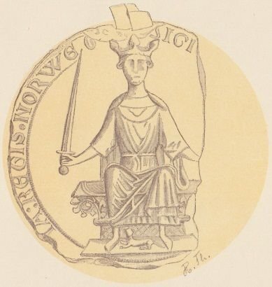
THE PICTURE BOOK PROCESS“Long ago, when kings and queens ruled much of the world, the king of Norway gave the king of England a bear.
Imagine a polar bear at ease in her natural arctic world, her only home–until trappers capture her and take her to the king of England.
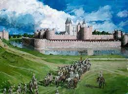
Imagine a polar bear in her lonely new world, stuck in a cage. This small, enclosed space is her only home–until King Henry III decrees that she be brought to the Thames River every day to swim and fish.
Imagine now this same polar bear dipping a curious paw in the river water, then leaping in with a joyful splash. And it is here, in this unfamiliar, faraway land, in one small way, that she finds home once again.”
When I first read A BEAR FAR FROM HOME, I was struck by the emotional aspect of Susan’s account of the bear’s journey. Opening in a snowy den in Norway, the cub ventures out with her mother to swim in the fresh blue water, to smell the air, and to experience her world. Once she’s grown, a ship full of men arrives on her shores, capturing the bear to give her as a gift to the king of England (as though she were their gift to give.) Throughout the story, we follow the bear up close, sensing her confusion, fear, and ultimate sorrow at being carried across the ocean and stowed away in the Tower of London. A glimpse of hope is offered in the end when the king allows her to swim for fish in the River Thames, and once again, however slightly, she feels a sense of home in the cool green waters.
Going through the process of the each book allows me to sort of relive it all and pay homage to the time it took to make. By now, many of you are probably familiar with my picture book process posts - We’ve looked into many books: Iqbal and His Ingenious Idea, Madame Saqui (my most popular post!), Becoming A Good Creature, Kafka and The Doll, and most recently, Loujain Dreams of Sunflowers. I love to share the process piece by piece (as much as possible) beginning with research, stumbling through studies and sketches, painting the finals, and then pre-production, design etc. Shall we dive in?
RESEARCHPart of my initial enchantment with this book was the time period - a totally unfamiliar landscape for me. I had to explore 13th century Norwegian nautical culture from clothing to ships. I had to capture a parade through the streets, from the sea to the Tower of London. Actually…don’t even get me started on the Tower of London! I had to visually comprehend a complex structure I’ve never laid eyes on, but draw it 700 years ago and from a specific angle. Where did the bridge enter? How did the moat work? What was original to the building and what was post 13th century? Suffice to say I’m glad it’s done - I’m getting a headache just thinking about it.
,_1263.JPG)
.jpg)
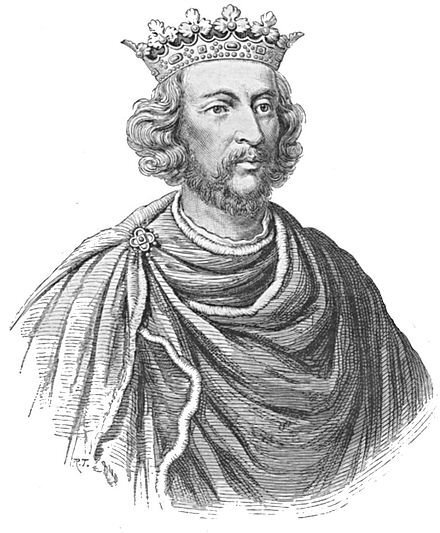

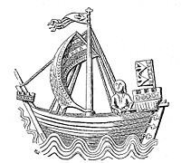


There were Kings to research. There was the crane to lift the giant crate off the ship, and the cart to haul the bear through streets of wood and plaster houses. Musical instruments to lead the parade, other animals kept in the tower etc. Lots to dig into for this book. I did start though, with the polar bear. I watched a ton of documentaries on polar bears and also an incredible peek into little cubs leaving their dens for the first time. SO CUTE. (This is a sweet look inside the den!) And below, a different clip of a new polar bear family wandering out.
Another part of the research for me, is always about stylistic approaches I’m drawn to for each book. I’ve never done two books the same, and that’s because each one has different needs - whether that’s in terms of history or texture or color palette. I usually dig through books and online to find work that I think fits the aesthetic I’m going for. In this book, I not only wanted to portray the bear’s world, but also fold in rich decorative details of the medieval illustrations of the time. Below are some inspirations for the book.


TESTS & STUDIES

This was the very first little study I did of the polar bear when I’d just read the manuscript. This one and the studies that follow plague me, as is the case in every other picture book I’ve done. Yes the seeking and testing is great, but everytime I go back to look at my initial impulses, a huge part of me always wishes I’d just dove in, straight out the gate. There’s always something so fresh about the beginning studies.

Here I tested different blues - a color I was excited to work with. In these studies, I didn’t have lines first, but just laid down paint. That was going to be difficult to bring to final bc the linework in the book is so intense (as we’ll see!) I played around with these and the AD was excited about them so I launched into sketches.
SKETCHESThe AD and I decided to go with a horizontal book - something I’d been wanting to do since none of my other books were in landscape format. I did all the preliminary storyboarding/sketching in procreate. Some of these made it to final and for those that needed reworking per the AD’s request, you can see I had to revise. I focused hard on shape, design, and detail while also trying to make the world feel real.


I was really quite keen to bust out of my rut of drawing everything literally and put a focus on the flat shapes, design, and potentially poetic images for the book, since the text was itself, so very poetic. It was requested that it be a little truer to life since it was a historical text so I went back in and reworked some of the sketches as you can see above.
After the sketches were approved, I went to final on a couple of the spreads. It took a couple attempts but I finally settled on a look. Below are some of the tests that I scratched for various reasons.


Why didn’t I have the confidence to stick to this style? *face palm*

Before I could really go to final on everything, some of the sketches had to be flushed out super tight and approved by the publisher. I also needed a tight sketch on everything so I could easily transfer the images (via lightbox) to the final paper. Below are some of those (drawn on a roll of architectural paper bc it erases and grabs detail quite easily)


Once the lines were in I went over them in sharpie so I could trace them. Glutton for punishment.
FINALSThe final paintings were done in gouache and colored pencil on bristol paper (with digital edits on some of the pages - the light coming in through the surface of the water for example). The beginning of the book is done in teals and blues with navy colored pencil lines - a fresh winter palette. When she’s on the ship crossing the ocean, the entire color palette changes from blues to greens, and the lines become black on subsequent pages. A couple examples so you can see the shift are below (except the first image which is an illustrated manuscript style, differing from all other interiors!) These are just details from the illustrations - can’t give everything away before the book comes out!


Once the finals were finished, they were sent over to the Art Department where the team laid in text, colored corrected and set up files for print. Once the proofs are printed, I’m usually sent a batch to double check the colors. It’s here where the publisher usually tests a couple of papers and I’m allowed to choose. I always go for a matte stock - even though it dulls the color slightly, it feels more sophisticated to me. We did have a tough time on getting some of the spread juuust right but in the end, the colors looked great. Below are some of the proofs where, perhaps, you can see some slight variation in color.
View fullsize
View fullsize

View fullsize

Now all I have to do is wait to see the book, which should land on my doorstep anyday - and yours too if you pre-ordered it. It comes out Sept 27 and I’m so looking forward to it being out in the world. It’s such a sweet book. While the story is true, and exceptionally sad, the reason I said yes to it was that I think it’s important to understand the lives of other creatures and what we as humans put them through for our own (often useless and selfish) reasons. It’s important to have conversations with young people about animals in captivity and whether or not it’s for conservation or exploitation. Also, the words Susan wrote are so poetic and tender. I feel very lucky to have been asked to illustrate it. So - a huge congrats to Susan, to Anne Schwartz and Nicole, and the whole team at Anne Schwartz Books - what a beautiful and poignant book to bring to life.
★ "A beautiful package that puts a beating heart into history." —Booklist, starred reviewIN BOOKSTORES SEPTEMBER 27! PREORDER YOUR COPY
If you’re eager to dive a little deeper, I recorded a picture book process video for The Dessert Club Patreon. I’m sharing a look at studies (including a favorite of mine that you won’t find here on the blog) sketches (with a few procreate timelapses) linears, finals, proofs, and the cover that didn’t make it! All of this and more (a whole year’s worth of posts to be exact, my patreon turns one this month!) Only on The Dessert Club. Hope to see you there!
In other life news, I’ve just arrived home from Milkwood (Sophie Blackall’s retreat for the picture book community in the Catskills) where I attended a workshop with Doug Salati and Cecilia Ruiz with nine other illustrators. I am still in awe from the whole experience - it doesn’t feel real! I’m convinced it never will - it’ll always sit in my mind like a dream that was too good to be true and couldn’t have possibly happened. I’ll share more about it soon - for now, I’m still letting it soak sweetly into my bones like aged syrup.

And in the kitchen, I’ve gotten back into baking and cooking. Fall is upon us and I’m determined to perfect my pie crust (still) so I can make more apple hand pies. Also all the stews! And the white bean soups and chilis! I did recently make this pistachio lemon loaf TWICE in one week because it was perfect in every way.

Thanks for being here friends - I love chatting and sharing each and every month… but especially this month and the ones to follow throughout the year. In my world, these months reign supreme and magic settles in exactly on September 1. Can you feel it?
Until next time, stay spicy and golden,
xo,
Becca
August 1, 2022
THE ANNUAL SELF PORTRAIT
Happy August little kebobs.
Are you busy soaking up Summer? Tell me you’ve been eating fresh strawberries in your skivvies or floating downriver on a lazy canoe ride or digging your toes into wet sand? The Summer’s been a blur for me but as I write this, the weather is glorious and tonight we’re having a bonfire for fire pies (we always make pizza ones!). That’s Summer for me.
Other than that, I’ve been busy working in my studio - prepping and planning for some in-person markets this Holiday season, and working tirelessly on Henri & Miko, a beast of a series I’m knee deep in.
A couple months ago, a friend of mine asked if I ever just went up to my studio to paint for fun. The idea of a studio space is romantic to her (and it is to me too, when it’s not my own) and she assumed I’d have a sweet little ritual of carrying coffee up the steps and walking into my space and just painting whatever I wanted. While I count myself very lucky to have a room all my own, when I step into that space, I usually feel the pressure to produce or ‘work.’ The idea of letting myself just paint for the hell of it has been rattling around in my brain since, and last week that thought crashed into another one I’ve been having: I have to make a self-portrait for 2022.
 The Annual Self Portrait
 In 2020, I did a small self portrait and planned to make it an annual occurrence. 2021 rolled around. The world was wild still. We moved back to the states. I could go on with a million excuses but I didn’t do a self portrait and I regret that. It’s now half way through 2022 and my little project has been plaguing me, so last week, I decided it was time.

I set an old mirror on my drawing desk and leaned it against the window. I found a piece of paper that was cut and leftover from another project - some fabriano hot press. I drew in the lines with a warm colored pencil and painted the piece in traditional gouache - something I haven’t used in years. While 2020’s portrait centered around playfulness and stylizing (I can see the inspiration from Japan, where we were living at the time), for this self portrait, I just wanted to paint me. Myself in my world, with the wind turbines in the window and the blue walls of my studio, through the doors into my bedroom, the screen on the window, the art supplies on my drawing table, the fiddle plant I bought to remember recent life events. I wanted to paint with a medium I’ve long loved but am out of practice with (regular gouache) - not overthinking it, just putting paint on paper.

I can’t tell you how refreshing this painting was for me. Each time my doubtful inner critic voice came through my mind (she never shuts up!) my response to her was that I didn’t really care. Didn’t care if it looked like me. Or that it was half way between stylized and realistic. Or that the colors were dull or….and so on. I just kept painting and painting and painting, not wanting to stop. That’s a good feeling.
Below are some pics of the process and a couple of details too.


There’s something special about a self portrait. Indeed we feel it when we look at other artist’s representation of themselves, but to capture your own as an artist is an intimate personal process. You can capture emotions, details, or feelings that you might not be able to put into words or into work about another subject matter. I’m 100% convinced and determined to make this an annual practice. When I’m 80 (if I can be so lucky) I can look back and have over forty years of a visual record of me - by me.
Who wants to join?
If you raised your hand, I’d say it’s the simplest long-haul project if there ever was one. ONE a year? You can do that! Brownie points if you’re super young - please start now. Peanut butter brownies points if you’re not young at all but you still join because it’s never too late to do anything!

Smoking girl (Self-portrait, Rökande flicka), Tove Jansson, 1940
The lovely Tove Jansson - who did quite a few self portraits, though the sentiment goes farther still -
“Every still-life, every landscape, every canvas is a self-portrait!!”

Le Désespéré, (The Desperate Man) Gustave Courbet, 1843-1845
Gustave Courbet is 24 here! A fresh faced, handsome young thing.

Self Portrait in the costume of Pierrot, Zinaida Serebriakova, 1911
I found Zinaida Serebriakova in the book Seeing Ourselves, Women’s Self Portraits (see below post) and then came across this one online and I cannot get over the shapes in her face.

Ntozakhe II, Parktown, Zanele Muholi, 2016, Image via Art Basel
Such a stunning self portrait from Zanele Muholi. This one stopped me in my tracks, especially the framing of her face.

Paula Modersohn-Becker, Self-Portrait Nude with Amber Necklace, 1906, (Museen Böttcherstraße, Paula Modersohn-Becker Museum, Bremen)
Fascinating artist I just learned about - Paula Modersohn-Becker. I love this!

Helene Schjerfbeck: Self-Portrait with Black Background, 1915
Thanks to one of the artists at the Visual Journaling Retreat, Cecelie, I learned about Finnish painter Helene Schjerfbeck. AND this is the very painting on the cover of the Women’s Self Portrait book I’m posting below!
More to read if you’re interested in self-portraits:

Seeing Ourselves, Women’s Self Portraits by Frances Borzello. I cannot put this book down. Super fascinating read about the history of Women’s Self Portraits and how they’ve shifted from the 16th century to today.
Online Reads:
Looking Good Is Not the Point: What Artists Bare in Self-Portraits
These Famous Women Artists Changed the World With Their Self-Portraits
Do you have any favorites Self Portraits? Share in the comments - I’d love to see them! I’d also love to hear about your experience creating them if they’re a part of your practice. And of course - let me know if you plan to do an annual self portrait project of your own.
If you want to see more behind the scenes pics of the self-portrait, I’m sharing some this month on The Dessert Club Patreon. I also did a painting video this month demonstrating the difference between Acrylic and Regular Gouache. It’s a question I get asked often, and since I’m getting back into regular gouache after years of not using it, I thought it’d be interesting to work with them side by side.

Thanks so much for reading and being here each month. It means the world!
Enjoy the rest of August loves - I’ll see you next month with another picture book process post!
Until then - keep your toes in the sand and hold onto Summer as fiercely as you can. She goes by quick!
xo,
Becca
July 1, 2022
VISUAL JOURNALING
Happy July little puff pastries! How are you?


Today we're talking all things VISUAL JOURNALING - a fancy name for drawing and writing your days.

Page from my visual journal 2017 (which made me laugh reading it this morning!)
Do you keep a sketchbook, travel journal, or visual journal? I used to keep visual journals religiously. For years, I'd document my days - even when things didn't seem interesting, the ordinary became a spectacle. Mostly I drew food, places I went, conversations I had, visits with friends. Simple things. I worked in Micron pen - sometimes adding marker. I'm not sure if it was covid, or that I was just bored of drawing, but the practice became quite sparse after moving to Japan. (In hindsight I'm furious with myself for not making it a daily practice there - so many little moments lost to time). Visually journaling helped keep me grounded and connected to myself and to fill that void, I started meditating and writing morning pages - which has been huge in my mental health - but I miss drawing my days! I miss connecting to my thoughts in a creative and visual way. What’s better is now going through them and recounting all the details of my life I would have undoubtedly lost. Here are a couple pages from my journals of yesteryear.

Mostly food and friends, who can blame me?

I have limited entries from my time in Japan which I kick myself for.

Drawings of people from memory…

More food and a friend who also happens to be a dog in a diaper named Fuku.

One of my last serious entries in Oct 2021. Yikes it’s been so long!
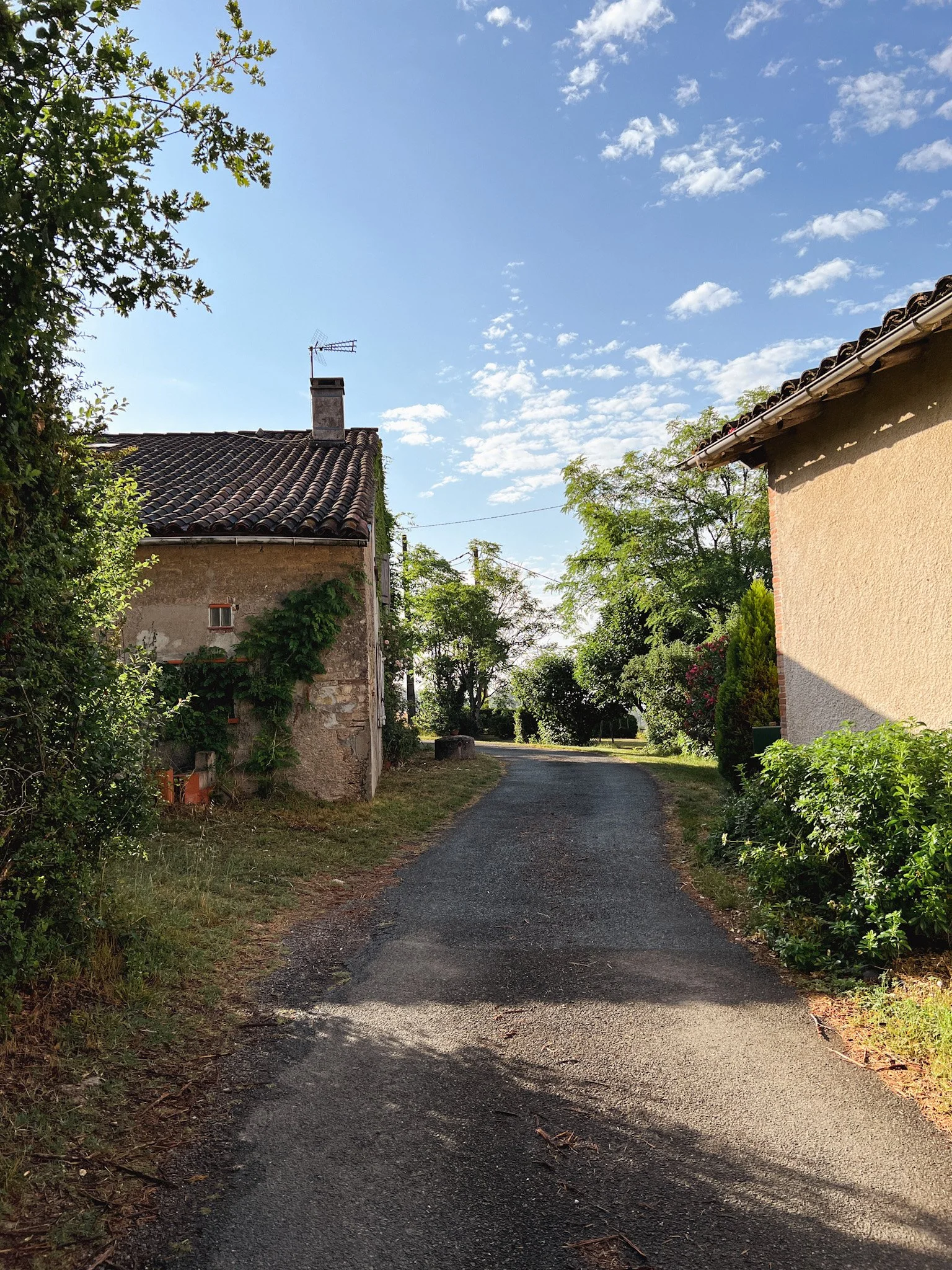
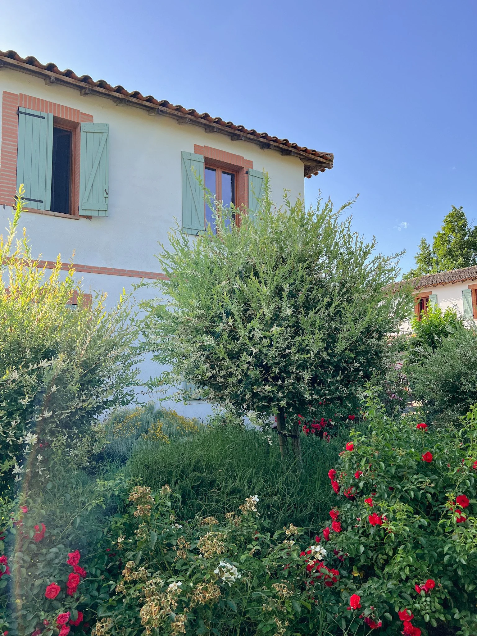
When Meera and I were presented with the opportunity to teach a retreat abroad - it wasn't a tough decision to focus on visual journaling. She's the author of many journals and someone who reflects deeply in image and word. With all the major projects she's working on - including bringing a bright star of a human into the world - she doesn't have much time to give her to own personal drawing and writing practice. On my part, I know how enlightening visual journaling was for me and I wanted so badly to make it a part of my practice again. We decided to teach in France to a group of 18 students and after a year and a half of waiting, we jumped on a plane to Toulouse! Today, I’m excited to share a bit about the retreat but also some tips if you’d like to start visual journaling yourself. The students taught me so much, and there's no way I could discuss today's topic without their insight and brilliance.
THE RETREAT
I’ve never wanted to paint a landscape so badly!
In the rolling countryside about an hour outside of Toulouse, we stayed at La Salamandra. The place was welcoming, and lovely - a perfect place to spend eight days together drawing, painting, and talking shop. The first night everyone arrived, we had a welcome BBQ and each met, sharing where we were from, what brought us to the retreat, and what we hoped to gain. It was a varied group, each coming from a different background of life and art, but honestly, it couldn't have been a better fit of over a dozen strangers coming together. Everyone was thoughtful, earnest, creative and kind. We lucked OUT! I truly miss each and every one of them already and wish I could have scooped them up and brought them home with me.
[image error]Literally surrounded by the best humans on the planet here.
View fullsize
View fullsize

View fullsize

View fullsize

View fullsize
View fullsize
The week was filled with visual journaling lessons, prompts, an amazing zine workshop from Meera, an acrylic gouache demo, trips to Rabastens, Albi, and Lisle-Sur-Tarn. We visited the Toulouse Lautrec Museum and ate ratatouille and wandered tiny streets, collecting what I estimate to be 2,087 photos of doors and windows. While Meera and I half expected most of the students to lounge by the pool and relax, many hours were spent in the art building working away on their visual journals. A studious and earnest group of artists to say the least. Below is a slide show of just some of the highlights of the trip and the students working.


Photo by Ginger Williams Cook

Photo by Chanamon Ratanalert


[image error]


Photo by Jamilla Beukema

Can I be super honest? I haven’t felt this alive and like myself in SO long. I saw the pic (below left) and wanted to post it because it captures the joy I think we all felt. I was in my element and I think the others really loved being in such a thoughtful group of artists too. I’ve missed teaching and being around people and exploring and having deep conversations and crying to strangers. I can’t thank Meera enough for being such an incredible teaching and travel partner. She kept me grounded through some tiny bumps and also always found the best restaurants to eat at. <3
I’m itching to plan another retreat - some abroad but also some in the US so keep your eyes peeled! I’ll announce anything that comes up first on Patreon, and soon after in my newsletter. I know Meera and I will be teaching this visual journaling retreat again as well!

View fullsize

VISUAL JOURNALING TIPS
This could go by other names - it could be a sketchbook, a travel journal, a collage journal - anything that has you recording visually. I wouldn't get caught up on the details of doing anything 'right' or working within any sort of boundaries but for the sake of organizing my thoughts - I usually work in one of three ways.
ON LOCATION
This is sadly rare for me, but it's lovely when I make the time. I usually keep it simple on location - a couple of markers or colored pencils and a micron or other black pen. It's also fun to draw with larger pencils or chunky crayons to get some gestures of location. When you sit down to draw in person - pay attention to way you're paying attention to. Is it the details of brick? Is it the sky and the way a building fits into the landscape? Perhaps it's the people that you end up drawing. I personally love to draw old buildings and people in person - I rarely get jazzed about drawing trees or plants because they overwhelm me.
I pasted a small drawing of the chateau in Rabastens into my larger sketchbook. The tea bags I drew from life during one of Meera’s lessons.

One of my fave drawings from the trip - from Lisle-Sur-Tarn. Really trying to be free and exaggerated with my line work here and get more wild!

Doing an impromptu sunset drawing demo and Salem came out onto the balcony, waving hello! My drawings always come to life when there are characters.

Collaged this together from drawings on other pages. The art room and the cypress trees I drew on location. The color emotions were from an exercise Meera led!
FROM MEMORY
If you're new to drawing, working from memory might be intimidating for you. But it can also be really fun! The point is making a recording of the memory - the feeling or event of the experience - maybe what caught your eye. The basic shapes and happenings of the situation. It's not to record every detail correctly, it's to just mark the memory. Sometimes my memory drawings are of the things I saw, but often they are drawings of myself and other people, experiencing time together, or food I ate, etc.
Drawing from memory also sharpens your observational skills because you have to really see things to imprint them in your memory to draw later.

Our first day in Toulouse on the right. I collaged this from the tram ticket and old paper, and also used previous drawings I didn’t love, to create new ones. I’ve actually never worked in a visual journal this way - creating such detailed work after a trip but it was really fun and helped me process my time away.

This was fun and also new - I rarely put this much color into a visual journal. Just proof that we can keep changing and growing!
FROM PHOTOS
I don't love drawing from photos because everything has a certain flatness to it. It's best if you're drawing from photos you took so you can remember (however slightly) the actual feeling of being there. That said, it's not always possible to sit and draw for hours, so snapping pics to bring home and draw in your studio is a wonderful way to work. One of the students in the retreat, Ginger, had a great way of working that I'd never considered - she started drawing quickly on location but then snapped a pic to finish the piece back in the studio where she'd have more time. I think it's so smart! You get the energy of drawing in person but the finesse of the final piece unrushed.

I drew these from the photos I took - I still have to do the details that I loved. Maybe I’ll share it finished next month! I rarely draw from photos when I get home but it was a nice way to process everything.
View fullsize
View fullsize [image error]
View fullsize

I truly can’t thank everyone enough - from Uptrek who put the retreat together, to Marléne and Mart who were our gracious hosts to all the students - friends - who trekked all the way to France to spend 8 days with total strangers. I miss all of you already!

If you want to see more, I posted a bunch of other visual journal peeks on last months post on The Dessert Club Patreon. This month, I’m sharing the time lapse video of this little memory drawing page. I also have a poll running for the next painting process video - I’m either painting something with French pastries, an old window or building, or……the most EPIC sailor that ever was! Painting goes up mid July so hop onto Patreon and cast your vote!
Ok friends, take care of yourself and one another. And eat lots of blueberries and strawberries and tip your toes into water if you can. It’s SUMMER!! It always just flies by way too fast doesn’t it??
xoxoxo,
B
June 1, 2022
The Flow State

Happy June my raspberry strudels!
It’s nearly Summer in the Northern Hemisphere and I. AM. EXCITED. It feels like winter lasted three years this time around. I’m not sure if it was the long void of covid or that it’s been freezing in my studio, but I’m ready to shake off layers of cold and burst forth into full on Summer. Summer is when I’m the least creatively productive so it’s a weird way to start a post about focus and flow but here we are. What prompted this month’s topic is that I’ve recently been spending less time online and on social media. Instead, I’m reading novels (and actually finishing them!), spending time in my garden, and letting my mind breathe a bit. This has led to more mental clarity, ideas come easier - and for the first time in a while, I painted for like ten hours straight without wanting to stop which never happens anymore.

The tulips in my garden were so VIBRANT.
This pause is timely as I’m currently reading Stolen Focus by Johann Hari (thanks Matt!) The book shares 12 causes behind our inability to focus, due largely to tech companies, but also surprising ones like our degradation of sustained reading. The book is unsettling and relatable, and the second chapter really hit home for me as an artist: The Crippling of Our Flow States.
Hari begins with the background of Mihaly Csikszentmihalyi who coined the term ‘Flow State’ after witnessing painters (and later adults who took part in other activities - rock climbing, music, chess) become so entranced in the process - so immersed that they almost became the task. (My words! From experience!) Most of us have felt this - we slip so deep in-the-zone that we forget to eat, time disappears, and the process unfolds seamlessly as if the task were solving itself.
The Flow State is an interesting one. There are clear indicators for when it’s happening, and also ‘rules’ for what needs to be in place for a flow state to take hold.
What I’m most interested in is creative flow. I have a ton more research to do, but I did find this article super interesting - especially the part about having an objective or clear goal. Often when we are in flow, there is a goal we’re working towards but in creative forms of flow, the end goal is often unknown, and there isn’t always a sense of control.
“Among the domains for which a flow experience has been described are those in the creative arts—writing (Perry, 2009), painting (Banfield and Burgess, 2013), and musical composition (Csikszentmihalyi, 1975). Evidence is emerging that the flow experienced by those creating in domains of the arts (creative flow), while sharing most of the properties Csikszentmihalyi wrote about, also has a few properties that distinguish it from flow in other domains. Interviews with visual artists suggested that in this domain, goals, which are part of problem representations, are not clear (Mace, 1997). One artist told her, “You really don't know where you are going” (p. 274). In another interview study, Cseh (2017) concluded that clear goals, sense of control, and unambiguous feedback were not typically part of fine artists' flow experiences.” - Charlotte L. Doyle

I’ve shared thoughts on intuition and more on the blog but I’ve never talked about the Flow State. Recently, as I’ve had some mental space, I’m able to work for longer stretches. The visual puzzles that seemed insurmountable in terms of planning and sketching are now buoyed by ease and self trust. There’s one other major factor at play - I’m no longer working on client projects and am only writing/illustrating my own work. It’s been interesting to look back at how I’ve been working for the last 12 years, trying to balance my own creative needs with the needs of others.

Slowly solving the puzzle of my next book - Henri & Miko!
Getting to a flow state in art is an amazing feeling - no doubt - but do you think it’s as easy to get into that state of mind when you’re making art for other people and getting paid for it? The following thoughts are from my own experience and don’t necessarily answer this question (I’m genuinely interesting to hear what you think!) but more so me pondering the creative process.

When we’re in the flow state, we’re focused on something we’re skilled at. But, there has to be a certain leveling up - a small amount of challenge. It can’t be so difficult that we feel defeated but it also can’t be so familiar that we fall into autopilot. (That’s the worst way to make compelling work!) Personally I think there's such a huge focus on style in this career that growth can be frightening once we’ve honed a visual identity. If a client hires me based on something I’ve already made, I tend to feel trapped from the start. It’s always a balance to make clients happy but also do something new, where I'm not totally bored. The good news is, I think the solution can be as simple as adding a new color to a tried and true palette, or using a similar but new material. A tiny challenge to keep us off auto pilot but not so drastic of a change that we have a meltdown. (I’m the queen of meltdowns!)

In a Flow State, we feel immediate intuitive feedback to hone our craft, not to prove ourselves to others. Self criticizing is something I do often while working on projects for clients, but also when working on anything since art is my career and a huge part of my identity. I’m rarely in a flow state with work perhaps because I have a running dialogue of judgement. ‘The client will want this so I have to cater, or this is what a picture book should look like, or why can you make work like that other illustrator, or of course you’d make something this saccharine, you’re so uncool! Why aren’t you making reels? You’re already washed up!’ It’s literally no wonder I can’t get into this magical bliss of flow, I’m way too judgemental of my ideas before they even get legs. Lately though, it’s been easier to achieve clarity and focus because I’m off social media - the endless fountain of comparison. Instagram has been a huge help in my career and I know we need it to compete in a creative industry but there’s a also a line we have to step back from in order to protect our own creative impulses.

While we’re on the subject of social media, we have to talk about the elephant in the room that’s sat itself upon your flow state, squashing it to a thin fragile pulp. Distraction. We’re SO distracted by notifications and everything that is the internet and twitter and tiktok and instagram that it can’t take a genius to see why flow states are hard to achieve. You need uninterrupted time to get into a task, though with every distraction, we lose nearly a half hour of focus. Imagine just a couple emails, a couple texts, a quick instagram check - our flow state is out the window. I don’t even have to be that old to remember illustrating before social media and smart phones (which I did get into late) and I have an inkling that I was much more productive then. The good thing is that while a ten hour painting session that flies by blissfully is great and all, you can also just set a timer for an hour and get a ton done! It’s more about setting boundaries and giving yourself uninterrupted time.
CONSIDER THOUGH…
If social media, comparison, and creative confusion are getting in the way of your focused flow state, those are easy enough areas to work on. There are much bigger issues at play for many people - stress from living in impoverished conditions, hunger, fear, and a lack of safety nets, particularly for BIPOC communities. While low level stress (challenge) is good for reaching the Flow State, “…long-term stress (chronic) impinges on reaching the flow state and disrupts the immunoprotective effects on various physiological functions.” (Dhabhar, 2014). National Library of Medicine. Always best to keep everything in perspective and work towards a more equitable future so we can all feel the wonder of play, flow states, and creativity.


For me, I usually get sucked into projects that have nothing to do with painting. Usually it’s baking (I’m recently into quiche!) or something tactile. Actually once I literally spent hours taking apart a piece of cardboard. I can find something derelict in a salvage yard and get so lost cleaning and repairing it. I’m not doing that for a job, and maybe that’s why it’s so fun for me. I’m curious as many of you are illustrators, designers, artists, etc - what’s your experience with Flow States? Are you able to achieve them while doing your job or is it often something different? What do you get lost in? Do you feel like the rise of social media has inhibited your ability to focus long term on things you love? I’m planning to read FLOW next from Mihaly Csikszentmihalyi but let me know if you have any recs as well! Drop a comment below - I’d love to hear everyone’s experience.

On The Dessert Club Patreon this month, I’m sharing a process video of the painting for the Flow State banner. You’ll see the entire painting completed, typography drawn out, and also follow along with the editing process in Photoshop, including cleaning/prepping an illustration for presentation and laying in text. You can also catch the most recent video I shared on Patreon where I dove into portrait studies and warm ups!
 JOIN THE DESSERT CLUB!
 I hope you’re all doing ok, hugging loved ones, taking time for yourself, and jumping into the season you’re in. May you find yourself wonderfully lost and totally immersed in something you love. I’ll see you all next month!
Until next time,
xo, Becca
May 1, 2022
BUILDING AN ILLUSTRATION PORTFOLIO

Hello sweet blackberry cakes! Happy May!
Today's post is all about building a portfolio, and it's a timely one for me. Even though I've had a working portfolio for over a decade, I'm in the middle of a career shift so I'm currently doing all the things I'm sharing with you today - planning, building, editing and soon, presenting. Whether you're just dipping your toes into illustration, or firming up a nearly solid launch into this career, or revamping your portfolio to better represent your true passions, I hope today's post will be helpful. It’s a broad overview of creating a portfolio, for one could talk at length on any of these stages, from planning your business, to making powerful illustrations, editing , and of course, making a meaningful presence online to share your work.
There's a lot to cover so let's jump in!

As I said, I'm currently in the midst of changing my website, branding, portfolio, and direction. If I'd written this 10 years ago, I'd have been more interested in showing work to reel in agents or clients. Today though, I'm considering my audience in a totally different way. For one, my audience is YOU (thank you!) so I'm putting more time into sharing and connecting here and on my Patreon. I'm also writing my own books again, so I'm building a solid part of my site that will support those books when they come out. And third, I'm working on a shop with prints, originals, and one of kind items. This is very different than trying to cater to companies and get hired by art directors, and it took me some sifting to realize who I was trying to reach with my portfolio. To be honest, I've been preparing for this change for nearly three years.
Understanding what you want to offer/create as an artist is key. Not what you'd be willing to offer, but what feels so indulgent and joyful that you'd do the job for free (even though you should always get paid!) A lot of illustrators make work they think they should be making, but deep below the surface is their 'true love' and bringing that to light takes time and excavation. This is not always the case, of course, for others, the goal is clear and bright in front of them, and they just simply need time to put pen to paper. If you have an industry in mind, say editorial or picture books, it's helpful to consider your niche within this industry.
Let’s say you'd like to illustrate picture books.
That's great but what kind of picture books? Board books? Non fiction picture books? Magical ones? Books about food? About climate change or nature, or historical biographies? While it's likely you'd be willing to take the first book that comes your way (I definitely did) it's more efficient in terms of personal portfolio building to focus on what you're truly interested in. You still have to have range and represent different people, places, etc but think thoroughly about where you shine, what you care about, what you'd love to spend 6 months to a year (or more) digging into. You have to communicate to potential art directors what you're amazing at delivering, and it'll be way more fun getting a job for something you actually like, I promise. Maybe you're looking to do editorial jobs, or packaging design, or writing your own stories, maybe licensing your art. There's a huge range of potential projects in all of these categories. Zeroing in on what you enjoy most leads to a more intuitive and true portfolio and if you get hired for work like this - AHHH there's nothing better!
What if though, you're like so many of us and you want to do everything! Licensing and cards, murals, picture books, toys, magazines, you might want it all! I'd never say you couldn't - there are artists that have built such a career to do just that - Oliver Jeffers comes to mind. But I also think it's human to want more than we could realistically have time for. Maybe making all these things sounds enjoyable but they might not all have to be a facet of your career. My advice would be to choose 1-2 things to really focus on and then when opportunities pop up in personal projects or from a client to work in a different area - then you say yes and try them out too.
If you're not sure what sort of projects you'd like to to, I recommend doing visualization exercises. Also, this post might be helpful to take small steps to begin. I'll link to some other classes, options at the end of this post for further learning as well.
To PLAN for your portfolio:Think about your portfolio's target audience. Is it an Editorial Art Director? A Publisher? A Design Agency? Or maybe direct buyers or wholesale. Maybe it's parents or librarians.
Consider your timeline. When are you planning to launch? Break down your calendar to schedule in time to develop what you need.
Build contact lists of agents, publishers, or art directors you're interested in working with. (More on this in presenting.)

Now it's time to make the work. What exactly should you have in your portfolio? What's adequate to prove your skill? What if you have a couple different portfolios or directions? The brilliant and confusing part about all of this is of course there's no one way to have a portfolio. I'll talk a more about organizing and presenting below but this is the part where we get our hands dirty and actually make work we love. If you feel paralyzed by the thought of making great work for your portfolio, you have a friend in me. I'm always overthinking!
Here are some helpful tips on building a fresh portfolio that shines.
Quantity over quality. I SAID IT! When you're making work for your portfolio, it might be helpful to loosen up and make a lot of work if you can swing the time. We'll edit later, but don't get so uptight about making the perfect pieces that you avoid making anything at all. You might fall into a stride on a quick piece that pushes you towards a really kick ass illustration. In fact, I find that all my greatest ideas happen when I'm already working - not when I prematurely overthink them to death.
You'll want a variation of compositions - full pages, spreads, and spots. This will depend on your industry + preference but this shows your ability to work within perimeters, creating interest in your layouts.
The body of work should feel cohesive but not monotonous. It could be connected by theme, or color, or general style, but it should feel like it's coming (even loosely) from one artist. I hate to put anyone in a box, so take liberties here and explore. Even if you have 2-3 ways of working, you have to organize them that way (more later) but within those categories, work should feel like it matches. The AD has to trust that on some level they won't be totally blindsided by what you make for them.
Think about text. If you're doing design or picture books (not to mention a host of other industries) consider adding in text to show how you can create an illustration with other elements in mind. It doesn't have to be text you designed, just something to showcase how you'd work with it/around it.
It's important to show consistent characters and settings so doing something sequential great. Even if it's just 3-4 images of from a longer story. (To make my characters consistent, I have to draw them SO many times, until I 'find' them.)
Think about your life and personal story when creating this body of work. What seems second nature to you is probably fascinating to someone else - and often this is where the specialness lies in a portfolio. Making it 'yours' helps it to stand out and that comes from celebrating our stories and our lives - those things that matter most to us.
Truly - have fun here. If you're dragging through images you don't really want to make because you think it's industry standard, it'll be even less fun to make them for a picky client. Go full force into play, bring us some life and freshness into the illustration world.
Research illustration in other countries, in other time periods - avoid getting all your inspiration from current artists on instagram - it'll help broaden what's possible.
And lastly - intuition and confidence go a long way in building a meaningful body of work. Often we seek out answers to do it 'right' but deep down we know what we want and are too afraid that it might be wrong. When you feel like you're getting away with something because it feels too joyful, that's usually the gold.
(In art terms of course - please be an honest person!)
If you're not sure exactly what pieces to make, I'm sharing a huge list of potential projects to jumpstart ideas for you on my Patreon this month. Or, you could use a little creative compass jar - that's always helpful for me.
These could be launching pads or actual finished pieces.
A few ideas from that list include:
A series (2-3) of illustrated poems (you can find public domain poems here)
Three Images of the same character at breakfast, lunch, and dinner
Illustrate a weather report (sounds boring but could be so cool!)
Create illustrations for a local farmers market
Paint a map of your town and list your favorite off-the-beaten-path places
Illustrate a brochure for a children's play gym
Draw a character super close up, regular size, and very far away
Illustrate your favorite book cover, complete with Title/Text
Illustrate a pattern to be used for a child's birthday party
Create graphics for a social cause, racial equity, fighting climate change, etc.

By now you should have a pretty good selection of illustrations. It's time to put a keen eye towards editing them. The biggest question here is probably, How many pieces should I have in my portfolio? There's no hard and fast rule, but I'd say 10-15 pieces of work if you're just starting out. As you develop, you may have enough pieces to break them into categories. I'd personally avoid having a site with 30+ main images, but I've also seen professional artists do that, so really, your call.
Deciding what makes the cut can be confusing but there's a couple tools I use when fine tuning my portfolio.
Ask yourself, "Do I want to get hired for this?" If you're not looking to illustrate that classic Edwardian book cover again because you really want to be drawing tacos in leotards, LET IT GO.
Proving your skill is just a piece of the puzzle, but don't keep work in your portfolio just for bragging rights. I've made plenty of paintings I've loved but my style changed and I had to omit them from my portfolio. In fact, probably only 5% of everything I've ever made in is on my site.
Don't keep work for filler. If you can't make ten solid pieces, you might just need more time in the building phase.
If you keep going back and forth on a piece because it stands out in a terrible way, cut it. You could make more work to compliment it, adding it back in later. If you don't want to spend time making more work like that...there's your answer! Get rid of it.
Think of your portfolio as a menu. Would you run a gelato shop and have a random offering of enchiladas on there because you're good at making them? NO. Or maybe, that'd be really funny actually but still, no. Be clear on what you offer.
Get feedback - find 5 other artists to do a portfolio or artwork critique swap with. Always great to have an outside creative perspective.
If you've done client work and feel obligated to share it even though you hate it, don't share it. List them on your client list, and take the work out of your portfolio. It's better to fill your portfolio with solid personal projects than risk the next AD assuming that's what you want to offer.

Ok - we're nearing the finish line here. You've got a great selection of illustrations. You've given a grateful boot to all the not so useful pieces, and now it's time to figure out what to do with it all. Should you send loose images to a company? Or make a PDF? Or is just a link to your website ok? Should you send it to an agent? Or an art director? Wait back up - how do you even make a website? This can all be super overwhelming, but there's a lot of keys to a lot of different doors in illustration. It's not one size fits all.
I think Instagram took over for a bit and it seemed like websites and blogs were old school, but we're kind of seeing now just how solid of a foundation they can build. I'm not going to cover social media because it's a beast (and one I'm not loving lately), but I will share tips on a website.
WEBSITESI've used squarespace for over 12 years, I love it, I'm used to it, I think it's easy - AND if you're just starting out, you can build off of their 7.1 Version which I think could be better than the 7.0 I'm stuck on. Anoosha Syed did a brilliant dive into websites so check that out if you're not sure to start or which platform you should choose. There are some free options if it’s not in your budget to pay monthly.
Regarding the design, your website can be super basic, I think the cleaner the better. It should include:
A header, logo, your name
One page of your illustrations (cropped or full image)
If you do children's books AND prints, you can do these in two categories or two different pages
An ABOUT page. Tell us about you! Your experience, any awards, educations, clients, etc.
A photo is lovely - I always really appreciate seeing the artist as a real person.
Contact - this can be your email on your ABOUT page or you can make a separate CONTACT page for readers to fill in.
Other options are a blog, newsletter sign up, etc but don't get overwhelmed with those if you're just starting out.
Here's a couple websites I love - you can see there's such a range of possibility.
Ping Zhu - clean, minimal, and client focused
Penelope Dullaghan - very personal and playful - clear categories
JooHee Yoon - lots of images, clean, great book layouts
Becca Stadtlander - clear organization, categories
Rose Jaffe - movement, colorful, animation
Gia Graham - colors, feeling, and clear organization
Louise Lockhart of The Printed Peanut (two website for portfolio & shop!)
WHERE TO SEND YOUR PORTFOLIO
You can choose one or choose all three and see what sticks! (Some agencies or publishers ask that you give them a certain amount of time to respond and that they prefer an exclusive submission, so think about that)
ART DIRECTORS - this would be in jobs like magazines, newspapers, licensing, and a host of other industries. (Publishers have ADs but I'll do that separately.) Best idea is to build a contact list to keep you from sending a mass 'to whom it may concern' batch of emails. You can often find art director info in the front of a magazine, or on the about/contact section of a company's website. This is a bit older, but still a helpful read for building a contact list. Again, Anoosha Syed does some amazing videos about freelance illustrating and she also shares how to contact Art Directors.
PUBLISHERS - If you're looking to write or illustrate picture books, start on the publisher's website - they almost always post submissions guidelines (though some will say they aren't accepting unsolicited manuscripts (which means you are unagented). Even a couple google searches brought me to these submissions page from Clavis, and this page from Candlewick. If you want a massive list, I recommend the Children's Writers and Illustrators Market Book, which comes out every year. Was super useful when I was starting out. And lastly, joining a organization like the SCBWI can be majorly beneficial with all the resources they offer for portfolio reviews, submissions, etc.
AGENTS - If you're a writer, you'd be looking for a literary agent. If you're an author/illustrator, you'd be looking for either a lit agent or an illustration agent and if you're only doing illustration, you'd go for an illustration agent (though most specialize in publishing/advertising/editorial/etc). Every agency should have their submissions guidelines posts on their site and you’ll want to consider whether or not your work fits with the agent’s aesthetic. It has to fit In but also be different enough that you’d stand out amongst the group. When I started, I submitted to 20 agents and heard nothing back! So I poured my energy into sharing a ton of work online and an agent reached out to me. If you don't hear back, don't give up - just keep forging ahead!
WHAT TO SENDThis largely depends on whomever you're approaching so do your homework. I'm finding that a lot of ADs request a website link and a few low res images. As Magnet Reps puts it, "Email a link to your website and up to five low-res jpegs or pdfs. The link to your website is important, it displays both your creative-vision and your commitment."
LOW RES JPGS
Don't blow up the art director's email - they don't have time to download massive files or click on an expired wetransfer links. If they're asking for images, send them at 72 dpi, as attachments.
A PDF
Personally, I think a PDF could be so fun because you can play up your presentation. You can add your logo, a line or two about yourself and a clean beautiful layout of your work. (I do this for my books bc I'm super into presentation!)
A LINK TO YOUR WEBSITE - easy peasy! Just make sure it's hyperlinked so they don't have to copy and paste it.
POSTCARDS - I'd focus on this last, sadly, because a lot of art directors are still working from home and aren't in the offices full time yet. That said, I'm sure they love to see actual postcards so if it's something you're really keen to do, I won't stop you!
IN CLOSINGWell that was a novel! But before I go, just a couple more little bits I want to share with you....
Finding your place in illustration can take time. It took me three years to get into real client work and another 4 years to find my niche in picture books. And truly another three years to realize what I actually cared about and wanted to make.
Building a portfolio is never one and done. It’ll continue to change, morph, and grow, so don't feel like your portfolio is concrete. Always thinking of it as a living breathing collection of pieces.
If you spend all this energy making and sharing a portfolio and you hear crickets, don't be let down. It's a career that demands tenacity and resilience, a lot of trial and error, hours at the drawing table. It will pay off, even in a small way at first, but tiny seeds grow in time.
If you’re already working but you’d like to push your portfolio to the next level, it might just mean making time to personal projects - even if that’s a morning a week. I find that a little goes a long way, and making time for even a personal project every couple of months keeps me fresh. Also - signing up for a gallery show or something always pushes me because then I HAVE to create personal work. Like these!
A couple other helpful links: Here’s what Art Directors want with Magoz, SCBWI submitting to publishers, a Domestika Course, and a Skillshare Course (not ads, haven’t taken them but they might be good?)

In other news, I’ve been making my home homier by putting up all my little thrift finds. I’ve also been cooking a lot, clearing out my garden, and working a TON on my upcoming picture book series, which I can’t wait to share with you.
I hope you’re all doing lovely, soaking up the good in the world and finding the sun when the clouds part.
Best of luck on all your portfolio adventures, and do share with us in the comments where you are in your portfolio building venture. Just starting out? Just finished a killer portfolio? Would love to hear about them.
Take care friends, and see you next month!
xo,
Becca
April 1, 2022
LE LOUP WALLPAPER DESIGN

Happy April little spuds!
I’m thrilled Spring is here - the birds have been singing and frantically hopping around the waking garden. The snowdrops have pushed their way through the dead leaves, delicate and sturdy all at once.
(Wouldn’t that be the best epitaph? Delicate and sturdy all at once.)
The months are flying and this post makes the years feel like they’ve flown as well. Back in Spring 2018, I was asked by the design team at Ford Fry to design a wallpaper for their Spirits & Sea Creatures Lounge, Le Loup - located upstairs at The Optimist in Germantown, Nashville. (do yourself a favor and click that link on a desktop - the bar video is a DREAM!) Fast forward to today - Le Loup has finally opened, and it was worth the wait.
You know I love process - so please accept two process posts in a row! (Last month we dove into picture books, and this month we’re digging in to see what it’s like designing a wallpaper.)
Shall we dive in then? Get it? Because we’re going underwater? 🙃
THE BRIEFThe art director and I met in Nashville and she shared stunning moodboards of the proposed interior with lush green velvet and striking burgundies. She also shared some of my work that she felt would be a good fit and direction - and since it was all personal work that I liked, I felt very confident moving forward. After we met, I went back to my studio and put this moodboard together. I envisioned something classic and muted and they approved!

I’ve only designed one other wallpaper and that was a large illustration blown up to fill a wall. Le Loup would prove to be much more difficult as it had be designed with the specific space in mind. I suggested three design options for them. The first was to create individual vignettes, which would all be unique. The second was to do an entire running narrative illustration which would be immersive and close to human scale. The third was to do a repeating pattern.
Using the architectural layouts they gave me, I photoshopped existing artwork on there and also added inspirations from wallpapers I’d found.

View fullsize

View fullsize

THE RESEARCH
The client chose the second option - to illustrate an image spanning the room in one continuous sweep. Next it was time for researching, digging through inspiration, and pulling the threads on what felt interesting. This is a part of the process I love - before I have to do compositional sketches, I can be free and indulge in all the shapes and details and potential. It also usually means a field trip - a reason to take myself on a date! This time, I went to the aquarium.

Yes I got a flat tire and my trip was postponed but I eventually went and drew all the studies below! Fish are SO hard to draw IRL!


Below were inspirations and sketches I sent to the team - mostly composites pieced together my favorite parts of the studies. These were done in ink, graphite, acrylic gouache, water soluble crayons and digital.
 View fullsize
View fullsize

View fullsize

View fullsize

THE WORK
Once the playful tests were approved, it was time to get to it. Notice I call this WORK and not simply ‘drawing.’ I usually do small scale stuff - picture books - and I work to size. But this was a whole new beast which challenged every fiber of my math-hating muscles. I basically took the ratio of 1’ of wall to 1” of drawing. Taking the layouts they gave me, I sketched out how the illustration would flow on the wall. (Four years later I now look back at this and pat myself on the back - look at all those numbers!)

I did the illustrations on 18x24” arches paper with acrylic gouache and colored pencil and had them scanned in professionally so the interior design company (Reunion) could work with the wallpaper printer. (I also edited a good amount digitally.) Here are some of my favorite parts of the illustrations.
View fullsize
View fullsize

View fullsize

View fullsize

View fullsize

View fullsize

View fullsize

View fullsize

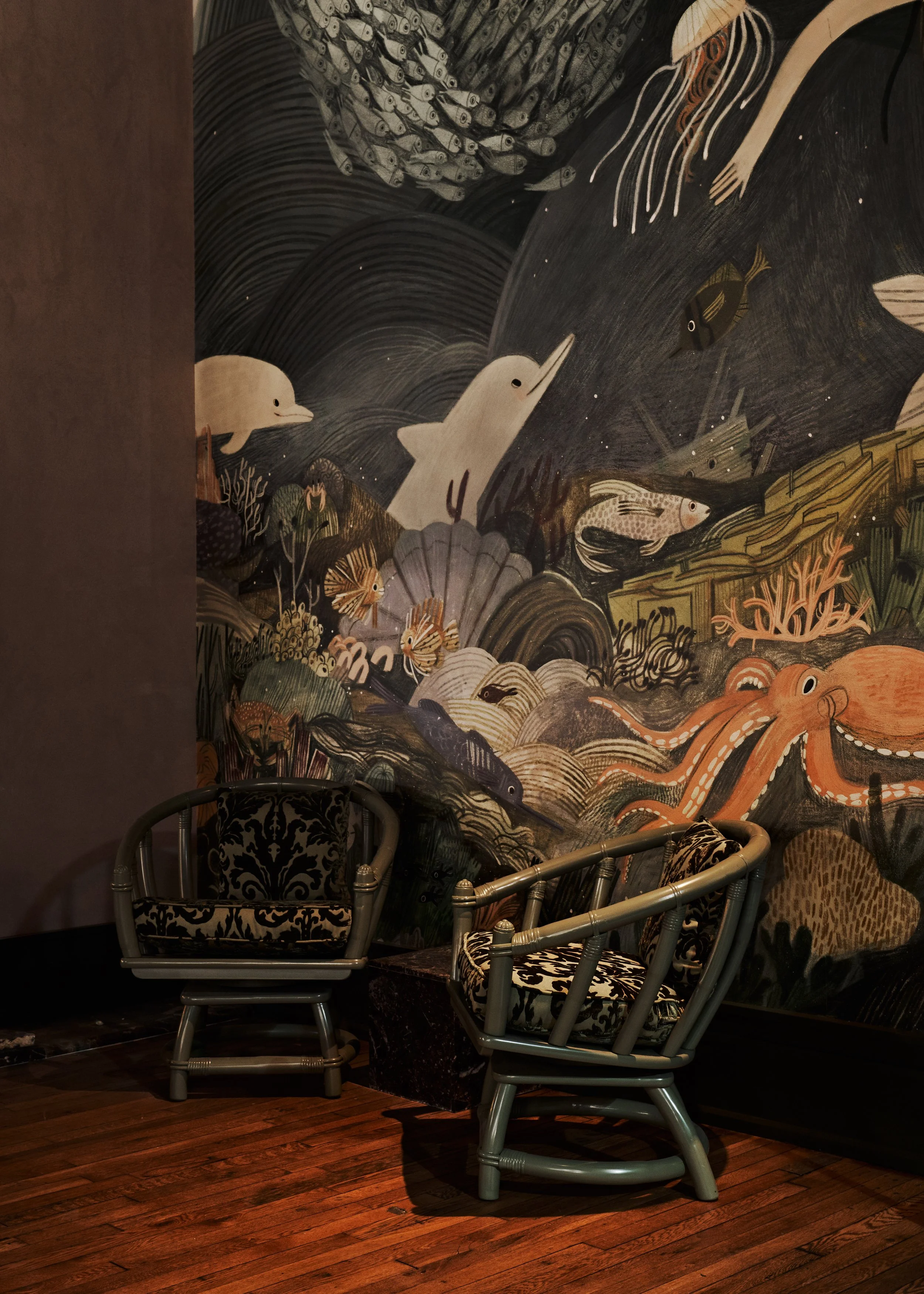
It starts in the entrance of the lounge - with a girl in a boat, floating near the marina. A pelican flies overhead, fishing houses sit in the hills beyond. Next we dive underwater which is brimming with coral reef, fish, a diving bell, and overhead we see a ship in the distance - The Ghost! From The Sea Wolf. Around it are flying fish. Further down the wall, we’re completely underwater, with a swirling school of fish, waving dolphins, sea horses - a treasure chest, and more. There are mermaids glittering, before we get deeper and the rocks drop off into to the deep ocean. A dumbo octopus and deep sea vents give way to total darkness, where we only see the lights of the angler fish and its electric cronies. More was added onto the wall after this initial sketch which allowed us to go all the way back up to the water’s surface - the sun shines through and we come up to a whale, more fish, and again, brightly colored coral. There are so many little hidden details - and while it’s definitely more fun to find them in person, I’ll share my favorite tiny moments for those of you who can’t visit Nashville.
View fullsize
View fullsize

View fullsize [image error]
View fullsize

View fullsize

View fullsize

View fullsize

View fullsize

View fullsize

View fullsize

Below are the placement files the company sent me as they were setting up to print (I was probably such a headache to work with - I had a hard time wrapping my head around a lot of the measurement stuff!) But you get an idea of how it all lays out on the wall.

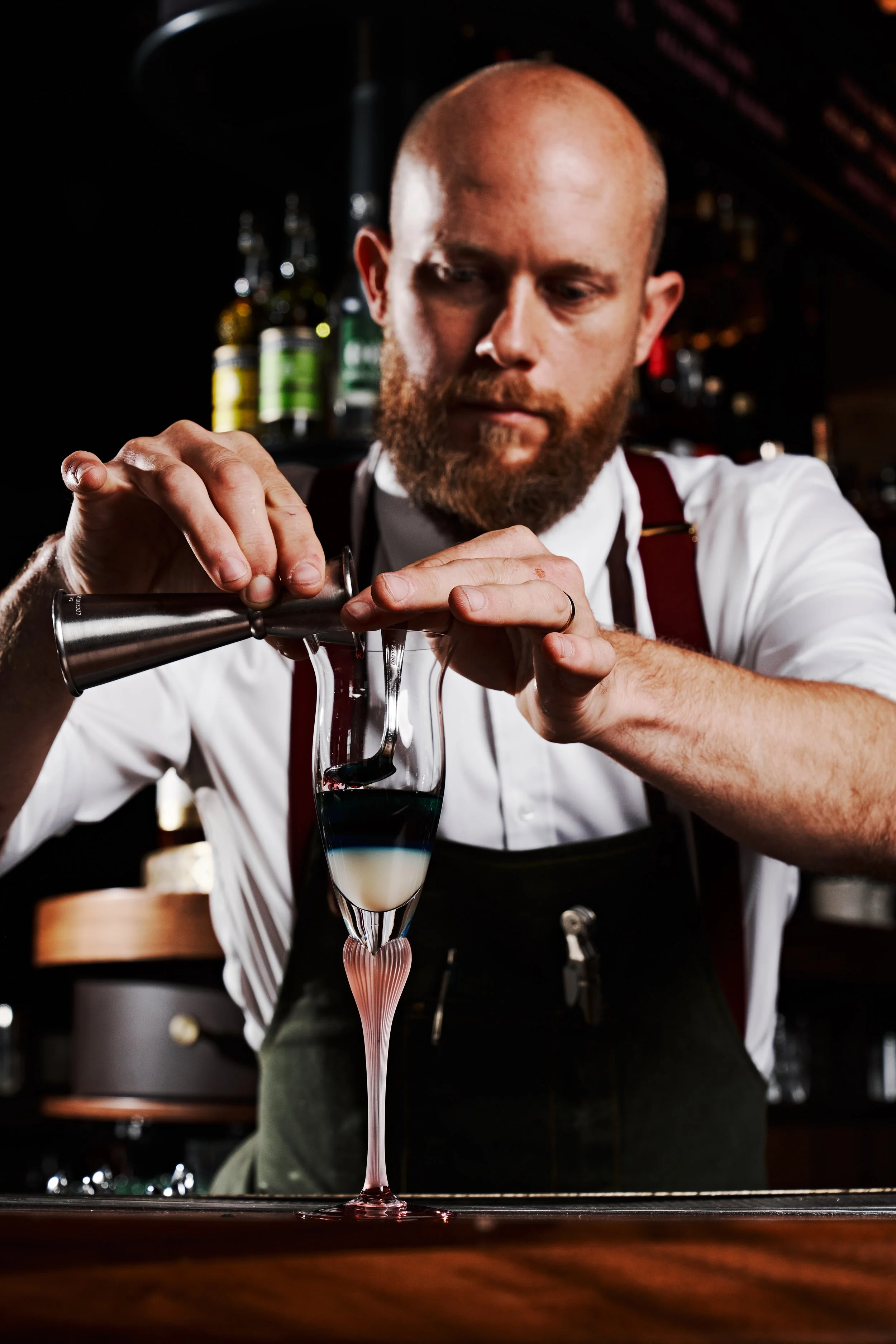
AND NOW, Can we get a drumroll for this freaking gorgeous interior and final!!?? The space is so dreamy, elegant, playful, and sophisticated. If you’re in Nashville, you have to stop in and have a cocktail. They were generous enough to let me share photos - isn’t this place a gem?

Photo © Andrew Thomas Lee

Photo © Andrew Thomas Lee
View fullsize
View fullsize

View fullsize
View fullsize
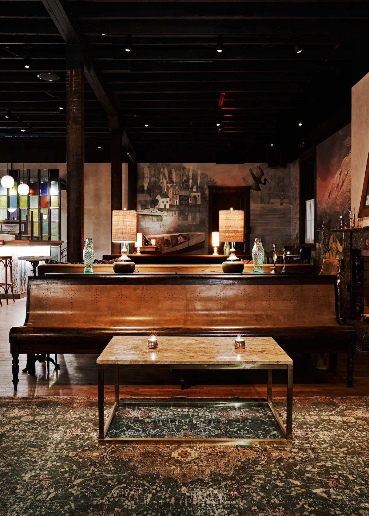
View fullsize
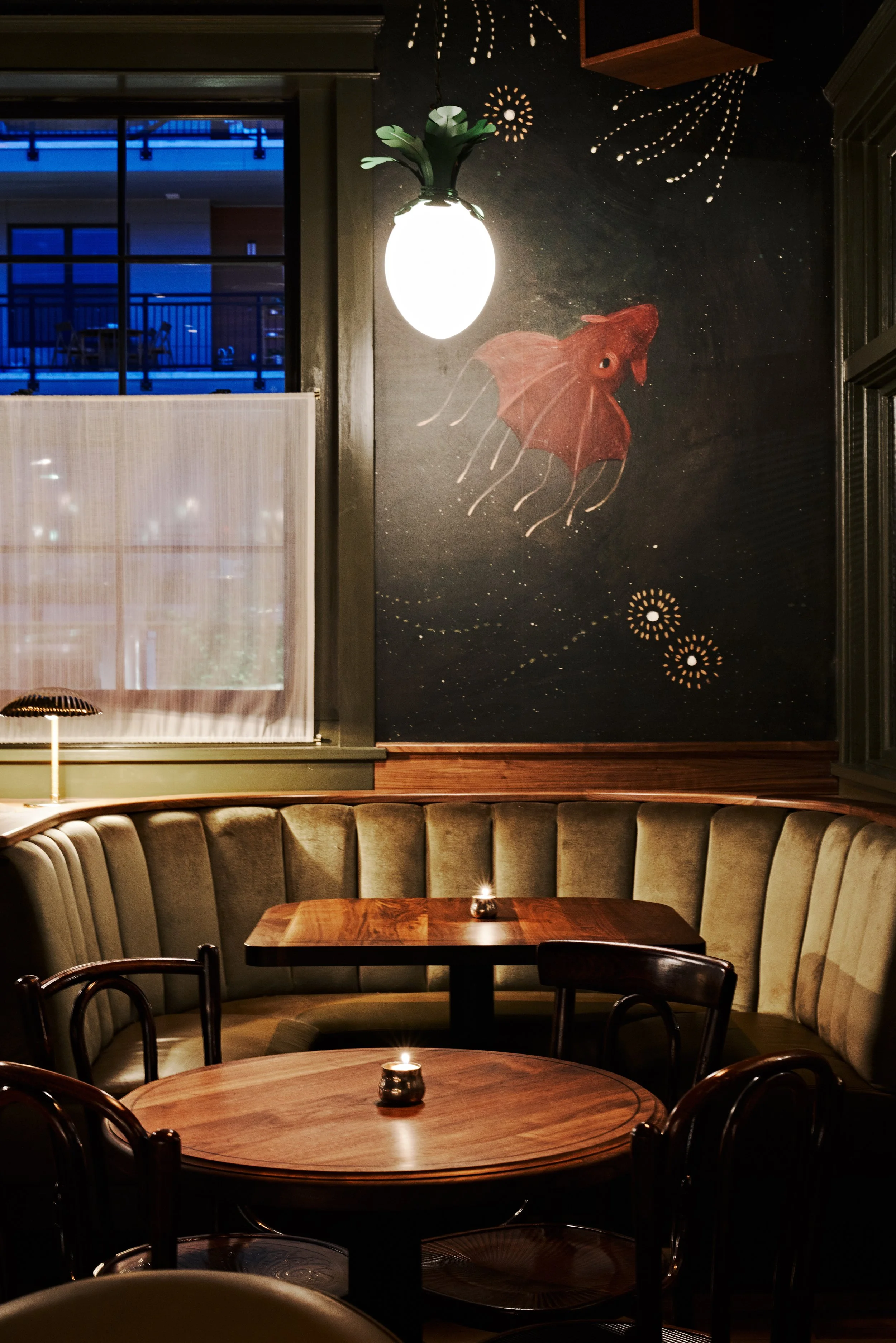
View fullsize
View fullsize
View fullsize
View fullsize

Before the bar opened, I was lucky enough to get a peek inside while visiting my friend Meera last year. We had drinks and apps downstairs at The Optimist (there was a vegan chef that night and they were kind enough to whip us up a dish!) and we got to see Le Loup before it all came together. To see the wallpaper in person was so cool - and I got to sign it right by the entrance. The manager and team were so welcoming - truly a dream job that I’m thrilled I could be part of. If you’re in Nashville, make sure to stop by and see it!
And take a pic with your favorite fish!
Find more at
Le Loup
Reunion
The Optimist

Super excited to be joining Orange Beak Studio April 7th - I’ll be talking about my work’s progression, changing industries and agents, my inspirations, and things I’ve learned in my career. The LIVE event will be recorded and available 72 hours afterwards, in case you’re in a different time zone or can’t make it at that time. After the talk, we’ll be doing a Q+A (bring your burning questions!) and a creative exercise focused on play.
GET YOUR TICKET
THE BRAW AMAZING BOOKSHELF
So honored that Kafka and the Doll was chosen among 100 Books (out of 2200, from 62 countries!) ) to be on display for the BRAW Amazing Bookshelf, a special exhibition at the recent Bologna Children’s Book Fair.
Do yourself a favor and flip through these gems! Congrats to Larissa, Opal, Tamar, and the team at Viking!
I’m revamping my blog & website and one of the directions I’m leaning into is sharing more of who I am as a person. I’ve been less active on social media which has been good for me - I’m able to be more in my own world, focusing on my interactions, thoughts, and relationships. And baking! And being outside! If you get my newsletter, you know I like to share things I’m loving, like new recipes, music, or books - and while this won’t replace that, I’ll also start sharing little life things here again, like I did way back in the blogging days of old.
This last month, warm weather burst through, bringing snowdrops and dog smiles. I made lots of baked goods and we visited our good friend’s farm (where we got married). They make maple syrup and it was so nice to be there, see the process, and of course, see them! I’m also hard at work on a new picture book series - and am sharing little peeks on my Patreon if you want to see more!


Thanks for reading!
Means so much to connect and share every month.
If you want to be notified every time a new post comes out, be sure to sign up for my newsletter (at the bottom of my site). As always, thanks for being here and supporting my work.
Have a fresh and warm and easy April, friends.
xo,
Becca
PS - I dove into some little fish drawings and a sea turtle study this month on The Dessert Club Patreon! I show you how I mix neocolor crayons and colored pencil, as well as a couple ink drawings. You can also see one of the originals of the wallpaper ❤️

March 1, 2022
LOUJAIN DREAMS OF SUNFLOWERS | Picture Book Process

Today is the Book Birthday of LOUJAIN DREAMS OF SUNFLOWERS! A powerful book from Lina AlHathloul and Uma Mishra-Newbery, inspired by the true story of Lina’s sister, Loujain AlHathloul, who bravely fought for a woman's right to drive in Saudi Arabia. The book is a magical narrative based on Loujain’s fight for equality, and one that will connect with children everywhere.
“Loujain watches her beloved baba attach his feather wings and fly each morning, but her own dreams of flying face a big obstacle: only boys, not girls, are allowed to fly in her country. Yet despite the taunts of her classmates, she is determined to do it—especially because Loujain loves colors, and only by flying can she see the color-filled field of sunflowers her baba has told her about. Eventually, he agrees to teach her, and Loujain’s impossible dream becomes reality—and soon other girls dare to learn to fly.
Based on the experiences of co-author Lina AlHathloul’s sister, Nobel Peace Prize nominee Loujain AlHathloul, who led the successful campaign to lift Saudi Arabia’s ban on women driving, this moving and gorgeously illustrated story reminds us to strive for the changes we want to see—and to never take for granted women’s and girls’ freedoms.”
I was first approached about this book from Uma, one of the book’s authors, and a good friend of mine from my time living in Grand Rapids. I met her around 2009 at my first exhibition at Sparrows Coffee (where I also worked as a barista!) She bought a painting and we became friends, hosting a fundraiser in my studio that year, and staying connected despite us both moving to different parts of the world. Fast forward to 2020 and we were embarking on a collaboration for her and Lina’s debut picture book.
Because of Uma’s work with human rights and women's rights, I took the responsibility of illustrating this book very seriously, especially given the fact that it’s not my story to tell - I’ve never been to Saudi Arabia or had experiences like Loujain’s. But, they needed someone they could trust with sensitive information and references, and they also needed to have involvement in the creative and sketch process, which is usually not the case in picture books. It was also a super fast timeline. I said yes, honored to be part of such a project. And here we are! PUB DATE!
You know I like to celebrate book birthdays by diving into the process…so let’s dig in, shall we?

RESEARCH
I started by researching Saudi patterns, colors, and landscapes. I found images rich with gridded patterns and vivid colors amidst a backdrop of sandy and earthy hues. I also watched the 2012 film Wadjda by Haifaa al-Mansour to get a sense of home/location/environment/character. Because the book is inspired by Loujain's story and not a direct biography, I had a bit of freedom in my interpretation of the environment as well. I pulled inspiration from a range of artists from Yoshiro Tachibana to Mary Feddin to Károly Reich. I was in search of blocky/graphic images that also portrayed emotion and play. (My two favorite things to mash together!)
EXPLORATION
Next, I started to play with imagery. I used cut beige paper to build off of - working in acrylic gouache, colored pencil, and water soluble crayon. I also did a couple studies digitally. I showed these to the editor and she loved the little details and the direction.


Knowing I needed to nail down lines and compositions, however, felt very different than this style of free play and I struggled to find a balance after these initial sketches. Trying to nail down the character was tricky, but one night I was sitting, drawing in bed and large broad shapes began to take over. I loved the simplicity of these lines so I put together a visual ‘pitch’ to the team and they loved it! They just requested to soften/round her features, and make her eyes more almond shaped.

STORYBOARD
Next up, I worked with the editor to paginate the text and began laying out the storyboard. I usually have 3-6 months to do a storyboard but I finished this one in like three days! This was the shortest timeline I've had for a book but something about that freed me up so I didn't overthink it. I did the studies very small so I wouldn't get too sucked into the details. They were only about 2” wide, and I colored some of them in procreate. Here are some of the storyboard thumbnails below.

After sending this to the publisher, the whole team met virtually to discuss the layout and composition. There were a couple of spreads to be adjusted, but overall, I was in good shape to start laying out some finals. Usually for a picture book, I’m asked to complete 3 illustrations for the publisher to use at book fairs and such, to sell rights to foreign publishers. Below are some of the first attempts at those finals, as well as some more fleshed out sketches.


I did a number of attempts on the finals in the beginning - it took me a while to find my groove, which is pretty normal. I often get tripped up thinking ‘this has to look like a picture book…’ but what does that even mean? Here’s a couple more that didn’t end up making the final cut.


FINALS
This last one above was getting close. But I had the timeline to take into account. I had to have finals painted within a couple months, and to do so much coloring in pencil wasn’t smart. I decided to give it another go - this time, painting fast and intuitively. I used blues in a new way, and made the paint super loose - going back in with black pencil to hastily give clarification and movement. That was it!! It's always one piece (below) that jumpstarts the rest of the book. It was here too, I nailed down the plants, realizing I could use them in a narrative way. Here the shapes are spiky and angular, void of vibrancy…


But when Loujain finally flies, the shapes unfold into colorful swirls, organic and dreamlike. I was SO excited by this piece - it’s still my fave from the book. Because I did the details in colored pencil, it kept the life in the linework, something I always struggle with. And it allowed me to be more free with the paint! Here’s another favorite - Loujain with her camera and all the photos she’s taken - along with the photo her Baba had given her, of the carpet of a million sunflowers. When she touches the photo, she feels like she’s floating in a sea of color!


COVER
For the cover, I gave the editor three options. The team chose the last one - which I thought was lovely - it’s a playful and sweet cover with hints of details from the story. I did the first attempt in colored pencil (pretty early on for promotion purposes.)


[image error]

Once I’d found my groove with the new style, I had to redo the cover - and I’m so glad I did!
ALSO I just found this image below so thought I’d add it. I was doing this book literally in the middle of moving home from Japan - I didn’t have a solid working space with good light so I set up a tiny table to make the best of our one window! ha. Whatever it takes!!


PRODUCTION
Once the finals were done, I worked with the designer to lay out the pages - or rather - they did all the fabulous work! They designed the perfect typeface to use in the book too. Proofs were printed and once those were approved and finalized, the book went off to final printing! We worked with SALT to create the loveliest trailer, Uma worked to create an epic teacher guide, and the team worked with The Conscious Kid to do an incredible pre-order campaign - one that coincided with Loujain’s release from prison, one year ago this February. While Loujain is released from prison, she still is not able to leave the country and is currently on probation. You can learn more about Loujain, Lina, and Uma here at loujaindreamsofsunflowers.com. The authors also put out a blog post about their experience writing the book!
The book comes out TODAY and to celebrate, Uma and I are doing a book launch party in Grand Rapids at - you guessed it - Sparrows - where our friendship began. On Saturday, March 5th at 5 pm, we’re teaming up with Marvelous Me Books and Sparrows Coffee House to do a book reading & signing, plus there will be kids activities and sunflower themed treats! Admission is free! We only wish Lina and the rest of the team could be there too!

So grateful to be a part of this inspiring picture book. And a huge congrats to Uma and Lina on their powerful debut book! You can get your copy wherever books are sold - but my favorite place online is Bookshop.org!

ALSO - if you want to nerd out even more on picture books, the design, layout, you’re in luck! I made a little video showcasing some of my favorite picture books, and what I love about their designs. AND I made downloadable storyboard pages so you can make you OWN book! Find that on The Dessert Club Patreon!
Congrats again, to the LDOS team for the incredible book! And thanks to all of you who join me every month in celebrating books, illustration, process and community.
Take care of one another - we need it more than ever.
xo,
Becca
February 1, 2022
THE SKETCH!

Happy February snowstars!
I think it's safe to say that we're officially in 2022. I’m finally writing the accurate year on things and I’ve found myself planning trips - and feeling like they’ll actually happen!
Since we’re just starting the year, it’s fitting to talk about sketches. The bones - the research - the planning. Do you love it? Or do you operate by the seat of your pants - propelled by instinct and risk? With creative endeavors, I'm more of the latter so I've had to find ways to rein myself in to make artwork for other people. I'm also a recovering people pleaser and I tend to oversell because I want people to get on board, only I resent them for expecting things! (A whole other layer of human-ness!)
Sometimes the process goes swimmingly. Other times I'm fighting and kicking the whole way home, struggling to reclaim my need for exploration. All of this is muddled by the fact that there there is no 'right' way to sketch or plan - it depends on varying factors - timeline, project, art director, editor, author, budget, material, or...the dreaded committee.
Because there are many ways to skin a carrot (❤️🐱) it doesn't make sense to share the best way to do preliminary processes. I can't even show you my way because it changes all the time. What I can offer are tips and thoughts on sketches - things I've learned to simplify the process, ease client stress, and keep the life in your finished work (an ever distant goal). Get ready to nerd out with some art talk!

We all know the rule of working big to little - but the simplest trick of doing that big picture stuff - is doing it on a small scale. Are you confused yet? What I’m saying is… working on a tiny scale helps us put shapes and composition into place without the overwhelm of too much detail. It’s best to start with thumbnails. I heard Christian Robinson talk about doing this process with sticky notes and it bowled me over, how simple, how genius (which is his work in a nutshell!) He mentioned laying out book spreads on sticky notes so he could see the whole book and move spreads around if needed. For a number of books, I’ve made little dummies so I could draw the layouts but I think drawing them out separately would be beneficial.
It’s helpful to try different layouts and working small lets us to get straight to the point without adding too many details. Sometimes I use pencil but other times pen or even sharpie, to avoid overworking. If I sketch digitally, I make sure to not zoom in. We want confident big shapes - we can break down the details later. Make sure to keep the final dimension in mind (drawing a border helps). If you have a tall image but your final is horizontal, the whole thing will be off. If you want to dive further into thumbnails, Art Prof has an in-depth explanation and some live demos.
Here are some of my thumbnails which turned into full illustrations. These are usually around 2-3” in size. First, we have the thumbnails from this blog’s cover illustration. The second is an example from a picture book and the last one is from a piece I just finished for a show this month at Gallery Nucleus (more about it at the end of the post!)
[image error]
One of my latest illustrated books - the storyboard had to be done on short notice so the thumbnails were sent as the storyboard - with text placement suggested. I did do more in depth sketches for a lot of the spreads before moving to final.

This painting was the second of two tries - the first painting failed so I needed to recalibrate and simplify my shapes - thus doing another small thumbnail to lay out the direction. I then drew a larger version in sharpie and traced it onto my paper over a lightbox.
[image error]If a full size sketch is needed after thumbnails, there are a handful of options.
Here are a couple I use:
Draw the sketch directly on the final paper, as an underdrawing to the painting. This is my favorite way to work. There's something so un-precious about it, allowing me to 'find' an image and search for the best shapes. Once it's ready, I don't have the stress of starting on clean paper. Instead, I throw paint down and work into the drawing. Most of the time, I have ten thousand searching lines but they don't bother or deter me, as they get covered up with paint. This is the best way I’ve found to keep some life in the final too!
A couple helpful tips - I draw with warm colored pencil as graphite will smear. It’s harder to erase and your paper has to be able to handle it. Use a vinyl/plastic eraser here for best results. Drawing directly works best if your final paint is thick as you’ll be painting over the lines. And finally - this technique might be frustrating if you’re not super experienced or confident with drawing - but give it a try!
Here are a couple examples - the first is from Madame Saqui (huge post if you want to really nerd out on process), colored pencil on bristol and the second is from the upcoming show at Gallery Nucleus, colored pencil on arches.

View fullsize


[image error]
Transfer the sketch onto your final paper using a lightbox. I do this technique less but it’s helpful if I have a ton of details and the layout is extremely tight, or if I want a thinner paint application and I don’t want to see a bunch of lines. I find that it’s helpful again, to draw to size so I don’t have to worry about scaling something up or down to the fit the final. Often too, I’ll draw the full sketch on transparent paper bc it can be easier to erase and I can layer images if need be. If you want your painting to look really spontaneous and beautiful, you can even paint on the paper straight on your lightbox with no lines! I don’t personally like this though as I feel like I can’t see what I’m painting.
If you don’t have a lightbox, a window will work, though your arm might get tired if there’s a lot of detail! Just tape up your drawings, layered to a window - has to be light outside and dark inside! Other options include doing a graphite transfer, sketching digitally and tracing from the screen (I’m guilty!) or obviously doing everything digitally, you lucky dogs! I also know of some artists who sketch digitally and then print final lines right onto their paper if they have a nice enough printer. Whatever gets the job done!

Here is the transferred linework from the blog illo! I wanted it to be watery and transparent so I couldn’t risk a ton of ‘searching’ lines.

This spread had SO much detail - no way I was going to figure that out on the final paper. Instead, I needed planned crisp lines to transfer. I drew the whole spread on tracing paper and used the lightbox to transfer the lines.

When I started working for clients, I worried that I wouldn’t delivery the right sketches. PDFs of JPGS? How many sketches? How detailed do I have to be? Every industry is going to be different, but if you aren’t sure, just ask your art director, they’ll tell you what they need. Usually in editorial, you’ll be expected to give 2-3 options. In picture books, it’s usually one draft, though you’ll have to explore options for the cover. It also depends on the job - if it’s a quick fussy job with a low fee, I don’t bend over backwards to deliver - but if the client is thoughtful with the brief and project, I’ll do extra and put together a beautiful pitch for them. I used to be SUPER detailed with my sketches but now I try to hold back so it gives me more room to explore in the final.
DELIVERY - obviously check with the client but usually for one offs, I just send low-res jpgs to their email. For bigger sketches like picture books, I combine all the pages in a PDF and send that so they can easily flip through it and add notes to send back to me.
Here’s a recent illo I did for a lovely client, Literati. They were trusting and expressed their openness to creative freedom so I took them up on it! I did the sketches and loved how fresh and free they were but when I went to final, I couldn’t get that freshness without redrawing it completely. So I did! This print (along with other illustrated goodies) will be part of their February book box. Literati is a monthly picture book box subscription where you receive five books based on that month’s theme - you then just purchase the books you want to keep! The final illustration here was done in acrylic gouache & colored pencil on Arches.

Here was the second round of sketches I gave them - complete with a color palette, which I don’t always do. They’d requested to get an idea of color so I sent this along.

Here’s the final! The theme for the month is ‘Together We Grow’. Perfect for the floral theme I had happening.
[image error]Finally, the age old dilemma…how to keep the life of the sketch when moving to final? There's something raw and emotional about sketches that a lot of us can’t seem to impart into the final piece. I’m not sure if it’s the ‘beautiful clean paper’ that stresses us, or simply the weight of having to create something polished. This is still a struggle for me but I’ve found some ways to attempt freshness.
+ Don’t draw every detail. Leave areas for yourself to figure out later - patterns or tiny details.
+ If you're beating your head against the wall trying to get ONE area right - take a break, or try drawing it on scrap paper - get away from all those previous attempts.
+ Working FAST is a great way to loosen up and keep it fresh.
+ Use bigger brushes and tools so you can't get too finicky.
I wanted to keep the life in the final for this post’s illustration so I simplified color and worked fast! You can watch the whole process, from sketch transfer to signature on my Patreon!

Do you have a preferred way to sketch? Do you always do the same process or do you find that you change depending on the project? I’d love to hear it - maybe there’s a life changing method I haven’t even tried!
View fullsize [image error]View fullsize

ALSO! As promised, a little bit about the upcoming exhibition at Gallery Nucleus this month. I’m joining a host of incredible artists for Flora & Fauna V, which opens Feb 12. The theme of the show was mushroom and fungi and since I’m not really one to draw plants, I decided to combine my love of 20th century theater posters to create mushroom themed performances - all to take place at the dazzling and completely fabricated Blue Clover Theatre. Oh how I wish these were actual shows I could attend…sigh
The work will be available through the gallery, and I’ll have prints later this Spring, so keep your eyes peeled. To learn more about the show - visit Gallery Nucleus!
ALRIGHT! I hope you have the zaniest or most relaxing Feb ever depending on what you’re after.
Can you believe next month this blog/bulletin series will be TWO?! I’m shocked I’ve done a post every month for 24 months. That seems like something special to me! Maybe a little gift is in order…😉
OK thanks as always for being here, my sketchy friends.
Enjoy the little things. Pet a dog, go for a walk, eat an extra brownie or five. Whatever you gotta do.
I’m right there with ya.
xo,
Becca
January 1, 2022
A New Year & A Love Letter

Happy New Year Poppies!
Are you anxiously excited for a new year to begin? Or are you, like me, living in a new normal of weird slow motion? I'm not sure if it's the lack of travel, or the pandemic, or maybe it's moving out into the middle of a bean field - but the future seems a bit unreal to me. Like I can't even fathom that 2022 will actually arrive. Anyone else feel this way? In any case, 2022 is here, and with it might come thoughts on what we want to change, who we want to become, etc etc.
But in my soft quietness, I'm feeling extra nostalgic for what has been, in this past year, but also in my life. A lot of these monthly bulletins are about how to move forward, tackling new creative endeavors, moving past creative obstacles, and dreaming of projects. Perfect for the NEW year right? I'm generally on the move, and if that's you today, those posts might be helpful.

But this year I'm starting off with reverence.
And, with a love letter.
It's addressed to the one I spend copious amounts of time thinking about. The one who drives me to tears - in anger and joy. The one who makes me feel like anything is possible, and simultaneously crushes me in anguish. I'm writing a love letter to Art - Creativity - The Toe Tingle - Whatever You Want To Call It. It's a feeling so to name it falls short. I will call it a Tiny Fire. I've had a lifelong and sometimes complicated relationship with my tiny fire. By now, I know the importance of falling in love with it again and again and again.
This is a letter to myself in a way. I'm not a mystical or spiritual person who sees creativity as an external entity, though many do, and that's great. In any case, let this serve as an open template should you choose to write your own love letter - maybe to a passion, a feeling, or an intangible impulse.

It felt silly to write this, but also cathartic and emotional - the same feelings I have when I'm my most creative self, so I'm trusting that and bypassing the ego part of my brain that feels too vulnerable to share this. If one person reads this and falls in love again with their creative self, then it was worth it. And just in case this is a little too sappy for you and it seems a waste of time to communicate with the creative part of yourself, let me explain how cultivating this relationship can be helpful.
When you fall in love with your creative self, the finished product of your craft doesn't hold as much weight. There is room for change and growth in the finished 'product,' but the impulse and drive might feel very much the same. This is like...the antithesis of 'finding your style.' It's more like finding yourself and understanding your process, style be damned. If it's coming from that pure place, it'll always be you, and then it will be recognizable because it's you - not because it looks the same again and again. I've experienced so much frustration, trapped in what others thought my style was or is, but the more I love my process, the less I care about fitting everything into one neat box.
When we fall in love, we understand that it’s usually not Happily Ever After. There will be pain and fights and laundry and mundane days. In the same way, falling in love with our creative selves helps us accept that we will never 'arrive.' Creative happiness is not a fixed point. It's alluring to assume once we 'land that project or client' that the rest of our creative path will just fall into place and we'll never have to 'work again' but just like anything else - there will be hard days where you feel you can't keep up, or you're bored, or stuck. Allowing for this as part of the process makes getting through the struggles much easier.
Falling in love with our creative self means trusting our intuition. Something VERY important if you want to make work that you love and feel connected to. If you're making work that you think others will love but you're miserable, you may be disconnected somehow from your creativity. I've felt this many times and it's a confusing and sometimes painful predicament. Good news is, it's just art! Finding a little time to devote to our creative selves is sometimes all we need - just to know that it's still there and it's still interested in helping us explore life.
If writing a love letter is not your thing - perhaps just taking a moment for a simple reflection will be helpful as we move into a new year. Or, you can celebrate your creativity however it wishes to be celebrated! Bake a cake because you love baking. Or sing a show tune in the shower. Or dance in your room a bit to feel alive. However your creativity expresses itself, show it a little gratitude and reverence, and it might just stick around to make 2022 a magical one.
Happy New Year my sweet friends.
Thanks to all of you who've been here with me every month, and welcome if you're new.
Sending my snowiest and merriest love to you all for an amazing 2022.
xo, Becca
PS - after I wrote this post, it dawned on me how many times I’ve alluded to this tiny fire in my work. Thought it might be fun to go down a little rabbit hole and remember some of them!
View fullsize
View fullsize

View fullsize

View fullsize

View fullsize

View fullsize

PPS: My Love Letter in text, just in case you’re translating from English! 😘
Dear Tiny Fire,
You've always been with me haven't you?
Even as a small thing when I drew my first pictures.
That mermaid - she was something special.
I didn't always understand your intentions.
Why do we keep drawing strawberries?
My friends are asking, they think it's weird. But you go on loving strawberries so I do too.
In school, adults started giving me rules about you. I let them - I had to.
I tried to prove I could control you but it changed the way I felt about you.
As a teenager, I found you on the wheel. I crinkled paper which delighted you.
I saw the tiny fires of others and wanted to love my art like they did theirs.
Some art was impossible to understand. I felt jealous at the secret language.
Do you have a secret language? Sometimes I hear you whisper.
Later I paid money to learn more rules. Techniques so dull it angered me.
I often wonder if that carried me farther away from you.
But you remained, however buried, an eerie quiet singing.
I'm now a grown woman.
People give me money to use you, celebrate you.
How do you feel about this?
Sometimes I ignore you completely to channel someone else's fire.
Other times, we are alone and you are so vibrant and pulsing with life.
I weep at the heart of you - how a simple line can ring with joy.
Together, we overcome fear. We won't be scared of blue this year.
Maybe you've never been afraid of blue. Is it just me?
Sometimes we make nothing at all.
Instead, we marvel at the pink dawn framing the trees outside my window.
You are a familiar mystery, always there, veiled but burning.
I know I haven't uncovered you yet but I'm trying.
And even if I never see you fully, I feel your warmth.
Maybe all along, that's what keeps me coming back.
With all my wildest love,
Rebecca Green
Rebecca Green's Blog
- Rebecca Green's profile
- 79 followers


![View fullsize [image error]](https://images.squarespace-cdn.com/content/v1/507477a584ae87aa2d96202b/1664507005139-S2VOO9L09OYU1Z065COG/2020-04-15+18.49.20.jpg)
![View fullsize [image error]](https://images.squarespace-cdn.com/content/v1/507477a584ae87aa2d96202b/1664736612281-62HEPB3GSJM7AWSWFTRG/sketch2WS.jpg)
![View fullsize [image error]](https://images.squarespace-cdn.com/content/v1/507477a584ae87aa2d96202b/1664736597482-K1X97XQ9AUTL3MZWT58N/Sk_1.jpg)
![View fullsize [image error]](https://images.squarespace-cdn.com/content/v1/507477a584ae87aa2d96202b/1664507312111-NT9CZCFMKDTC9YJLN0TA/IMG_7120+2.jpg)
![View fullsize [image error]](https://images.squarespace-cdn.com/content/v1/507477a584ae87aa2d96202b/1656176474937-8KB04XVX1WUAJ7WSRUDP/IMG_8717.JPG)
![View fullsize [image error]](https://images.squarespace-cdn.com/content/v1/507477a584ae87aa2d96202b/1648156005398-J2JVV0BMWHWH221S18MV/Wall_Final_det3.jpg)
![View fullsize [image error]](https://images.squarespace-cdn.com/content/v1/507477a584ae87aa2d96202b/1643297204109-7BHRM1LYPE7ZE2JI3ZP9/MoonlitOyster_300ws.jpg)