
Rebecca Green's Blog, page 7
July 9, 2019
Hello from a perpetual starter!
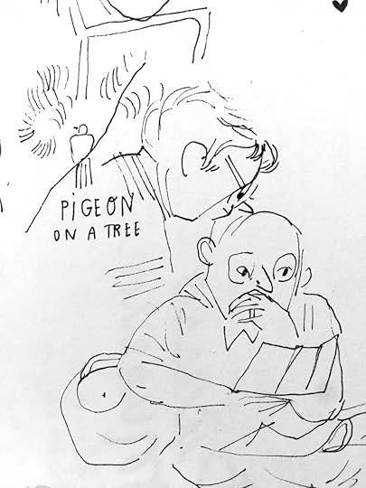
“WHERE’S PART FIVE?” You may be asking. Where are these drawings of Japanese moms on bikes with their mindblowingly adorable babies in the baskets?
I gotta be real. This series has fizzled in my brain. Maybe not forever, for I do want to bring you part five. But in time, my friends, in time. For now, I’ll leave you with a poem I wrote about all my false starts because I have a lot of them and I’m trying to figure out why and how I can avoid them in the future.
Projects that fizzle
Perpetual false starts that begin, only just
I resentfully finish (but just if I must)
Projects start with a bang, end with a fizzle
They dry up and fade out and woefully shrivel
It’s tough to keep making at maximum speed
No time to listen, to wonder, to heed
We know it’s there hiding, the quiet and small
That idea that’s lurking so deep in us all.
What’s on the surface? What can I share?
How can I know my audience is there?
How can I make sure they know that I care?
We’re heading to Tokyo tomorrow to the Art Book Fair - I can’t wait to see loads of new inspiration. I’m needin’ it. More soon!
Until next, time,
xo


July 4, 2019
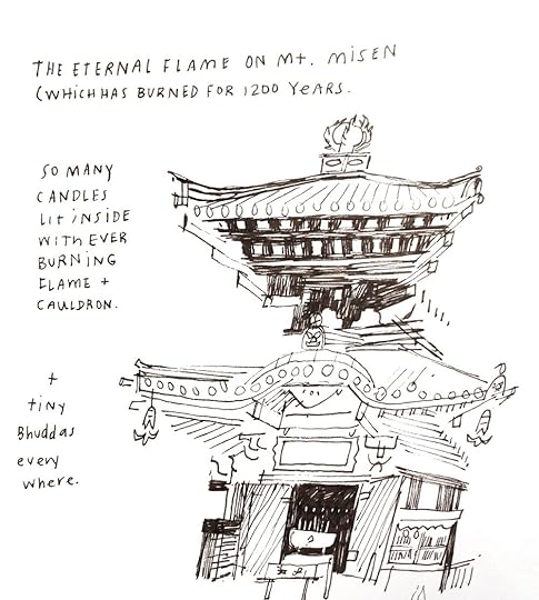
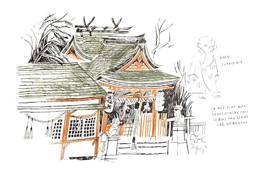
JAPAN | PART FOUR | LITTLE THINGS
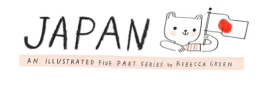
PART FOUR: LITTLE THINGS!
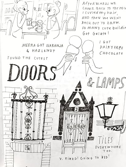
As promised, here are a few journal pages of some little things I’ve seen and fallen in love with here in Japan. I realized after I drew these that I’m finding more and more stuff to add, but alas, I will continue to draw and share as time unfolds.
Also, I realize these are so random!! But I like what I like. Some are from past journal pages and some are more recent.
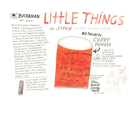
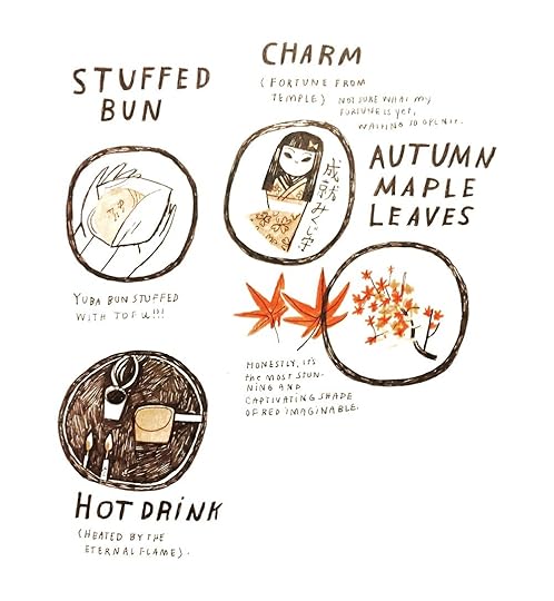
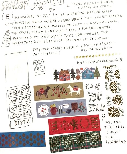
Washi Tape!! (Do you know the artist? I would love to credit…)


Next week, I’ll be wrapping things up with PEOPLE! I’ve seen moms carry multiple kids on a bike at once, incredible fashion, and the cutest kids in uniforms (their hats!!) Tune in next week!
Until then,
xo,
Becca
June 26, 2019
JAPAN | PART THREE | ARCHITECTURE
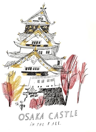
PART 3: ARCHITECTURE
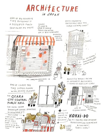
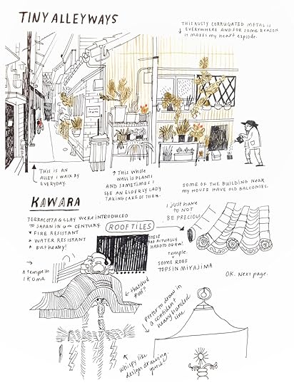
Before moving to Japan, I often dreamily fantasized about wandering around, sitting alone and drawing all of the old buildings. Turns out, I’m a bit too shy to sit and draw in public, especially in a place where I feel so new. (Though I did draw all the temples in this post from life!) I’m also too lazy to take photos SO basically what happens is that I’m constantly trying to sear images in my brain and hope I can draw them later. Doesn’t often work with architecture.
I truly love the buildings here though. Vertical slats of aged wood and corrugated steel. It melts me. Every stone/wood building that looks condemned would qualify instantly for my dream home. I’ve also visited quite a few temples and shrines and am bowled over every time.
So, in honor of this weeks theme, ARCHITECTURE, I bring you some journal pages where I explore some of my favorite parts of Japanese buildings.
Putting this blog post together reminded just me how much I need to be drawing from life while I’m here. Sort of rekindled that old dream of me wandering around with a sketchbook and pencil in hand. I know if I don’t, I’ll regret it after returning home to the US, so this is me saying I WILL be a drawing wanderer. I will I will I will.
OK FRIENDS! Next week, I’m sharing: DETAILS. This is a super vague topic but it’s a way for me to celebrate and share all of the random tiny odds and ends and bits. That’s the good stuff in life anyway (besides friends and animals. And brownies.) See you next time!
xo, Becca
June 18, 2019
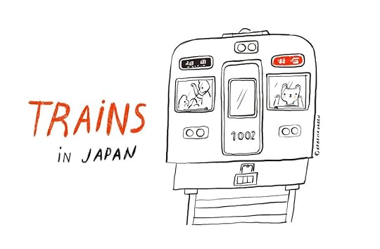
JAPAN | PART TWO | TRAINS
Have you ever seen a cassette carrying case? They’re cute little things, like tiny pieces of luggage or business briefcases, but with slots to hold about 30 cassette tapes. When you take the cassettes out and fill your ‘luggage’ with clothes, a ring pop, and a stuffed animal or two, it can really feel like you’re going places. Going where exactly, I never found out, as ‘waiting for the train’ was more fun to me than actually pretending the train arrived. I’d sit for what felt like hours on the top of my stairs - my train station, and happily wait.

As a young adult, however, things shifted and I actually had a lot of anxiety about public transportation. I grew up in a small town where everyone drove and I didn’t take a bus or a train until long into my adulthood. Leading up to our move to Japan, I stayed awake at night playing the worst case scenarios in my head. I was determined that I would take the wrong train and end up in the middle of a rice field 6 hours away without a phone or a way to communicate. To write now seems ridiculous but you know how night time thoughts are.
Of course, the opposite turned out to be true. The trains in Japan are a dream. They’re efficient, clean, quiet, and accessible. I actually dread the thought of coming back to the US and having a car again (though I know we’re very lucky to have one.) Since I’m not well traveled, I won’t begin to compare Japanese public transportation with that of others countries, nor will I dive into the engineering, but I will share with you the things I love about the trains here like…

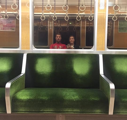
VELVET SEATS
Since eating and drinking on the streets and on public transit is considered rude here, you’ll be hard pressed to find a crumb or a spill on the train. The seats are basically pristine. Though I’ve seen lots of colors from blue to burgundy to orange, the dark green ones are my favorite. I find them on my local Hankyu Line.
THEY’RE ON TIME
Except for the few instances where the trains were significantly delayed, the trains are always on time. When arriving, I was a little intimidated by the difference between the local and express trains but I got the hang of it quickly. The local trains stop at every station while the semi-express, limited express, rapid express, etc. stop at fewer stops making the trip much faster.
QUIET
Most often, the trains are completely silent. Everyone is on their phone or they read. This is especially welcome during rush hour when people are squeezed in like sardines. Even though the space can get super tight, I’ve never witnessed frustration, terse words or tension. It seems to just be expected that everyone squeezes in and minds to themselves. It’s also quite easy to fall asleep on the trains and often I revert to standing so that I’m not tempted to doze off.
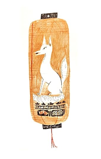
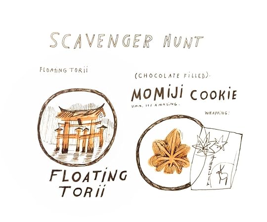
THE SHINKANSEN Of course we can’t have a train post without talking about the Shinkansen, or Bullet Train. The Shinkansen is a network of high-speed railways, connecting major cities, but also acting as a commuter train in large metropolitan areas (such as Tokyo). I’ve taken the Shinkansen from Osaka to Hiroshima, (which I highly recommend. Visiting the Hiroshima Peace Memorial Museum is absolutely heartbreaking and informative. You can also take a ferry to Miyajima Island, where you can hang out with deer, eat maple cookies and see the floating Great Torii Gate of Itsukushima Shrine). I’ve also taken the Shinkansen to Tokyo a couple of times and it’s a breeze. Unlike local trains, it’s acceptable to eat on the Shinkansen, so there are plenty of places to buy bento boxes and snacks in the train station!

A pickled plum onigiri on my last Shinkansen ride!
CABLE CARS An expert might tell me these aren’t ‘trains’ but I don’t care! I still love them. On many of the mountains here, you can hike to the top, or you can take a cable car. We’ve taken them in Ikoma, Mt. Rokko, Kurama-Dera, and Nunobiki Herb Garden. They’re a great way to get a little adventure in and save time hiking. We usually take the cars up and then walk down if we’re short on time.
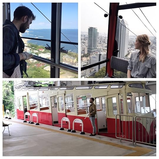
Some cable car adventures!
I’m beyond thankful to have spent time here learning and navigating these systems of transportation. I sort of feel like If I can make sense of the rail lines in Tokyo, I can probably figure out other systems too. Noticing and honoring this sense of independence and navigation is just all kinds of freeing as you can imagine.
And that’s it for TRAINS! If you want to learn from a source that actually knows about trains (aka not Rebecca Green) I found some sites with more info:
http://factsanddetails.com/japan/cat23/sub153/item853.html
https://en.wikipedia.org/wiki/History_of_rail_transport_in_Japan
https://www.britannica.com/place/Japan/Railways
Next week I’m sharing what I love about the Architecture!
** And since I actually don’t like planning and I don’t want these to feel tour-guidey, I’ve decided to make the last three posts heavily visual, as though you’re peeking into my journal. It’s a great motivator for me to draw the things I’m seeing daily and be able to share my findings with you.
xoxox, Becca
June 12, 2019
JAPAN | PART ONE | FOOD
If you told my small town eight year old self she’d be living in Japan someday, I don’t think she’d believe it, even if you pinky swore. She couldn’t fathom traveling so far away, crossing the ocean, eating anything but grilled cheese and pizza rolls. Twenty five years later, that now grown woman (me - hi!) eats sticks of fried pickled ginger and rice balls with seaweed and everyday there is something new to see or hear or taste.
Truly I can’t take credit for ending up here. Matt and I wanted to move overseas before settling and he had always dreamt of visiting Japan. He worked hard applying for teaching positions before landing a job in Osaka. I’m beyond lucky to be able to experience living here and though there are bouts of loneliness and adapting, I do my best (though I sometimes need reminding) not to take it for granted.
So, in celebrating my time here, (which has already been 7 months!) I’m sharing what I love about this inspiring country. I’m breaking this post down into five parts starting with the most important:

Before we all get too excited, I’ll preface this by saying, if you’re looking for an extensive list of the best in Japanese Cuisine, you’ll find this post lacking. The main reason is that we’re vegan. Soon after arriving, we realized how difficult (though not impossible) it is to eat a plant based diet. Most things have meat, fish stock or eggs, and we’ve chosen to be an ounce less strict when it comes to things like baked goods and such. I wish I could experience Japanese cuisine in it’s fullest form, trying things like Sashimi, Takoyaki and Okonomiyaki, (though I have tried decent vegan versions of okonomiyaki!), but eating this way is a long standing choice and it works for us, so we eat what we can and cook at home often.
OK - let’s dive in!
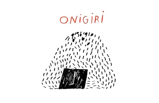
ONIGIRI
These rice balls are a staple here, and you can find them in every ‘konbini’ or convenient store. They are pressed rice balls in a circular or triangle shape stuffed with things like seafood and pickled vegetables and wrapped with nori (seaweed sheets). My favorites are the pickled plum and seaweed. Note that if you get these from a convenient store, there’s a special way to open the packaging that keeps the nori separated from the rice until you eat it. It’s a 1,2,3 system and it took me like 6 months to get it right.
RAMEN
Although another quick peek at eight year old Becca would no doubt show her eating ramen, the cheapo Maruchan chicken flavor noodles, it’s not even a comparison to what ramen actually can be, as most of you experienced people already know. Though not all places have vegan ramen (most use bone broth) I have found some that make me want to cry. Here’s a couple of my favorites:
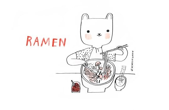
Towzen or Mamezen in Kyoto has some of the best ramen I’ve ever had. Its all vegan menu consists of a few types of soy milk ramen. You can choose your noodle type and even add things like chlorella and charcoal. I go for the spicy tantanmen.
T’s Tantan in Tokyo Station has this golden sesame ramen and it’s what my dreams are made of. If you like tahini or sesame mixed with creamy noodle-ness, this one is for you. Their whole menu is vegan, and you’ll find a couple locations in Tokyo. The one in the station is a great meal after riding the Shinkansen but note you’ll need to be ‘in’ the station to find it.
WASHO Cooking Class While I haven’t really found the vegan ramen in Osaka, I did have an awesome experience learning how to make my own at a cooking class. We made ramen noodles from scratch and learned how to create the broth, the toppings and seasoning. Highly recommend it. The teacher was knowledgeable and kind and teaches everything from vegan ramen to dim sum, tofu from scratch, traditional Japanese meals, udon noodles and sake (most of the options are meat or veg!)
TOFU
In the US, our general options for tofu are silken, firm & extra firm, but in Japan, it seems like every time I go to the grocery store, I see a new kind of tofu. (And it’s SO cheap! Our little discount grocery sells blocks for what translates to $0.30!) The world of tofu is so nuanced and complex, I could (well I couldn’t, but some expert could) do a whole post on it. For now, I’m just going to share some of the types that I’ve tried and loved.
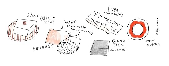
KINU (Silken Tofu): This has a custard like texture and is best for raw dishes, or meals where the tofu is added at the end, like in miso soup. Often, when eaten raw, soy sauce or other toppings are added before eating.
ABURAGE: Thin slices of tofu that are deep fried and often used for INARIZUSHI, where the tofu is wrapped around sweetened rice. These are eaten cold and are a great portable meal. I’ve actually just sautéed aburage and added it to salads. I also told my friend Chihiro that I was going to put it on a sandwich and she couldn’t stop laughing, for it’s such an ‘American thing to do.’
YUBA: Tofu skin! I loooove yuba. It’s like a really moist cold lunch meat which, yeah, seems gross but it’s so delicious. You can eat it plain with a bit of soy sauce or add it to soups or nabe.
GOMATOFU: This tofu is actually not made of soybeans but from sesame paste and kuzu flour. I’ve only eaten it raw and cold and the texture to me is similar to kinu tofu, though it has the flavor of sesame. Ahhhhh sesame.
TOFU DONUT: Before moving here, I found tofu donuts online and couldn’t wait to try one. Tofu pulp, Okara, is a byproduct of the soymilk process and is kneaded into the dough. I really can’t taste the tofu at all, and the donuts are similar to cake donuts in the US but less sweet. (Just about every dessert I’ve had here is less sweet than our very rich desserts back home. )
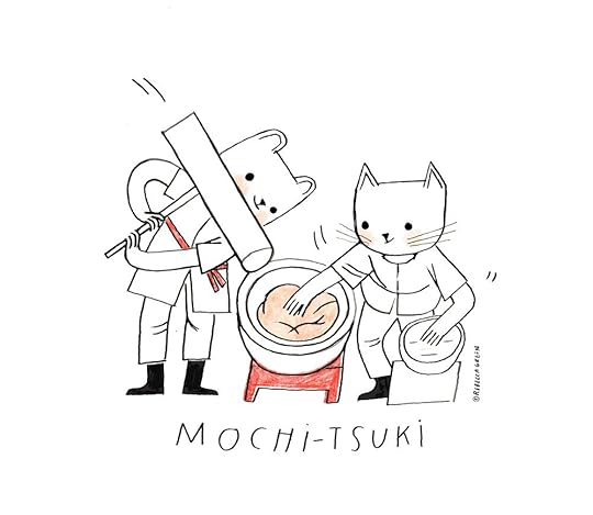
MOCHI
I’m already heartbroken about not having mochi on every corner when I come back to the US. It’s something I’ve fallen in love with. Mochi is a Japanese rice cake made from a short grain glutinous rice. Traditionally, its pounded into a paste in a process called Mochi-tsuki. While you’ll find some staple variations all year round, others are seasonal.
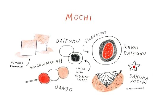
Some of my favorites include:
DAIFUKU - Small round confection in which mochi contains a sweet filling - usually anko, or sweetred bean paste. These are usually white, pink, or light green.
ICHIGO DAIFUKU - A daifuku with a strawberry in it! Ichigo is the Japanese word for strawberry and these are usually found in the springtime. It also contains a filling like anko or cream.
SAKURA MOCHI - A pickled cherry leaf encloses these red bean filled rice cakes. In Tokyo, I hear these confections are smooth, but in the Kansai region where Osaka is, the rice cakes look more lumpy. These are interesting because the rice cake itself is sweet but the picked leaf adds a whole new bite.
WARABI MOCHI - This confection, as I understand it, is not technically mochi because it’s not made from glutinous rice, but from bracken starch. The jelly like texture (chewier though than what I would call the consistency of jello) is coated in Kinako, a roasted soybean powder. (To me the powder tastes like the mild, more boring distant cousin, once removed, from peanut butter powder.)
DANGO - There are many types of dango but essentially it’s a Japanese dumpling made from rice flour. The tri-colored (pink, white, and green) dango is called Hanami Dango and is usually eaten during cherry blossom season. Another notable dango treat that I see quite often is Mitarashi Dango, which has a sweetened thick soy sauce syrup on top.
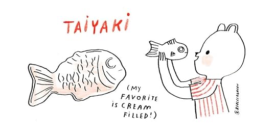
TAIYAKI
These Japanese fish-shaped cakes are named after the Japanese red seabream, or Tai fish. They are made of pancake batter and are cooked in a fish shaped mold and filled with sweets like red beans, custard, chocolate or sweet potato. You can find them often at food stalls and festivals!
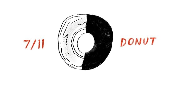
THE GRAND FINALE: THE 7/11 DONUT
Don’t hate me but one of my favorite things to eat in Japan is a donut from 7/11. If you’ve been here, you’ll know the convenient stores (or konbini) are a world away from what we think of as convenient stores/gas stations in the west. They’re on every corner, they’re clean, they’re reliable, they have printers and fax machines, they have nice bathrooms, they have meals (remember our Onigiri!) While they’re all quite lovely, 7/11 is the home of my donut. It’s an old fashioned plain donut, fried to perfection and half of it is dipped in chocolate. When I realized how difficult it was going to be to get decent vegan desserts here, I tried one of these and instantly felt at home. Growing up in Michigan, cold seasons were a big part of my life, and this donut is like fall and winter in one little dessert. The plain half is everything I love about donuts in Autumn - fresh and light and ready to be dipped in cider. The chocolate half is like nestling into winter, with the richness of baked goods and feel good sweetness. If you’re visiting Japan, I recommend this gem. But! Take note, take heed, take warning: not all chocolate old fashioned donuts are the same. I’ve taken it on as my personal mission to test each one I find, and so far the only one worth crying over is from the almighty 7/11.
And, though this might not be helpful for everyone, if you’re planning a trip to Osaka and want some vegetarian recommendations, these are some of my standby’s:
AJU - I was intimidated by the website but we stumbled into this place one evening and it’s super charming and not pretentious. There’s an English menu, and for lunch they have two options to choose from. For dinner, a more extensive list opens up and you can try things like yakitori and okonomiyaki.
PAPRIKA - They have great veggie and rice bowls, good falafel, and vegan soft serve!
CAFE ATL - This place is so sweet and cute - The menu is limited but the food is great. They make their own seitan which is out of this world and the curry has lentils and an Indian flavor which is nice since I don’t particularly love Japanese curry and lentils are like gold here.
BASE ISLAND This Jamaican influenced restaurant is one of my favorites. The owner is cool, and there are both meat and veg options. It feels like a respite, a little less stuffy than many places. Vibrant, colorful, and the food is flavorful. I recommend the vegan burger in a charcoal bun. And the avocado nuggets omg.
OK FRIENDS I literally can’t talk about food anymore because now all I want to do is EAT.
And truly one could go on and on about the food here, vegan or not. Osaka in particular is known as Japan’s Kitchen, where the Japanese word Kuidaore means to ‘eat oneself into bankruptcy’ or ‘eat oneself into ruin’. I could spend all week diving into different foods, but alas, in this life I’m not a food writer but just an illustrator who likes to eat and share.
Thanks for reading, and I’ll see you next week for Part Two: TRAINS!
November 5, 2018
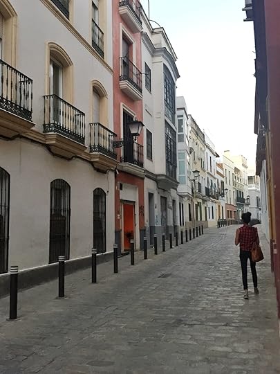
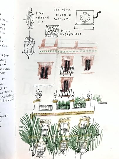
Narrative Illustration Workshop at La Galeria Roja!
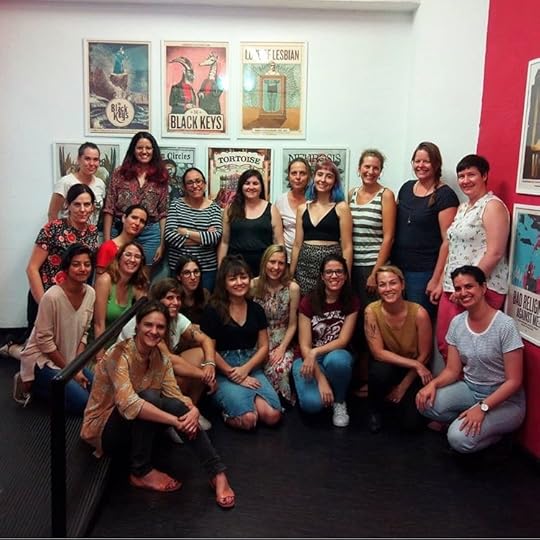
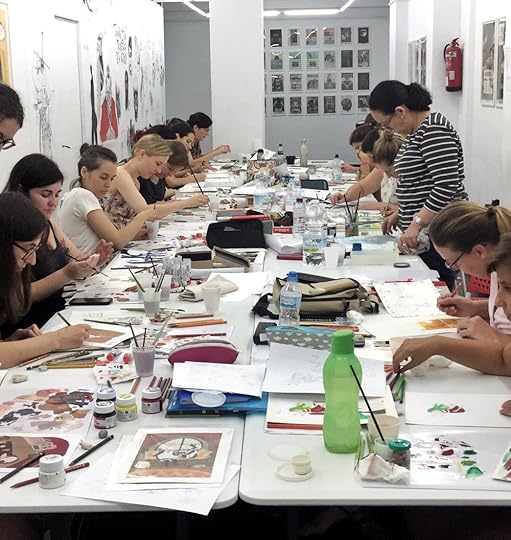
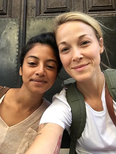
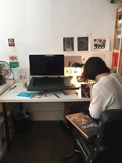
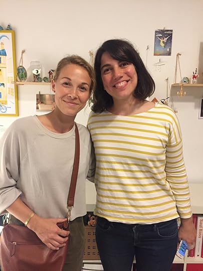
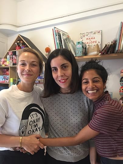
Earlier this month, I taught an illustration workshop at La Galeria Roja in Seville, Spain and it was a dream. A dream! Spain was beautiful, old, inspiring, and lovely, but I have to be honest...the thing that made the whole experience unforgettable was the students. I hit the freaking student jackpot. I was also joined by my pal, Meera Lee Patel to assist the class, and our lovely translator, Carmen who is also a rockstar person and incredible artist.
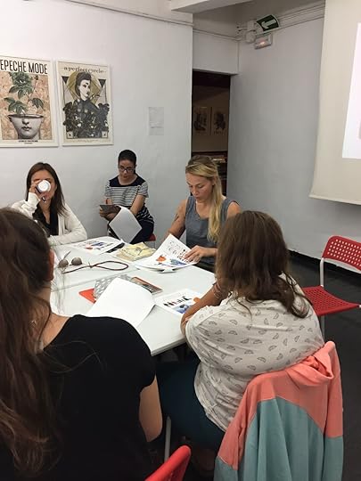
Before the workshop, I emailed a survey to see where the students were in their level of experience with illustration, materials, and publishing. The range was wide, some of the students just stepping into illustration. Others had worked in the industry for years, all while simultaneously managing families and the like. (Which is a workshop I’ll need to take someday). To compensate for the range of experience, I created a workshop which would give the students a basic foundation of narrative illustration while also introducing a material component, which was working with gouache and colored pencil.
The assignment was to create an interior illustration from a book. I chose to do the demo based on Roald Dahl’s The Witches. After beginning the class with a presentation on the evolution of my work over the last ten years, we warmed up with a drawing exercise and then launched into the project. I outlined scene selection, character development, page layout and design, and color palettes.
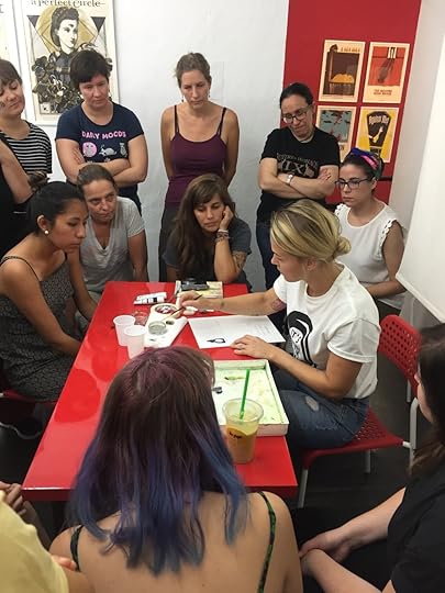
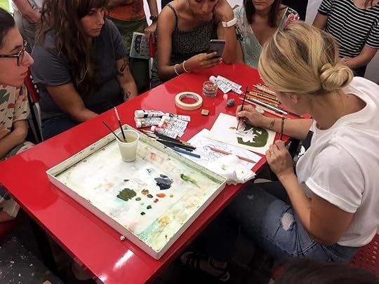
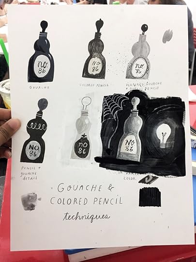
The second day started with a gouache and colored pencil demonstration, where I painted six of the same objects in black and white, showcasing how many different variations the materials can produce together. Afterwards, I had the students do the same to familiarize themselves with the materials. I then launched into a painting demo where I spent two hours attempting to complete a painting (yikes!). I was also challenged to drawing cotton candy (challenge accepted!) and thanks to Marieke and Julie and their candy finger trick, I did just that. (Then I think Meera spent the next hour just painting cotton candy! Ha) Where’s my photo of the cotton candy drawing when I need it?
Students then spent the second half of the class planning and sketching their own artwork for the assignment. I have to say, the varied and creative approaches were incredible to see. Each student not only had a sense of their own style and direction, but each also had a goal in mind . They all left their comfort zones to create something new for the class, and we all know how scary it is to create something out of your usual realm. The third and final day was a full workday, where students painted their illustrations. I walked around giving feedback and it was so rewarding to see the students pushing themselves, eager for direction and suggestions. The last hour of the class we all shared our work and I was able to give each student feedback on their process and final.
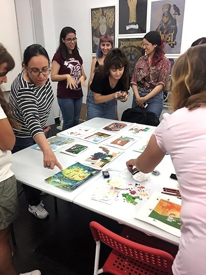
GUYS. Their work! We had so many unique styles and directions and perspectives. Every artist had their voice just shine. It was a highlight of my career for sure. I really can’t thank the gallery enough, or the students who attended, or my friend Meera for all her hard work, or Carmen, for translating the magic. Dream dream dream.
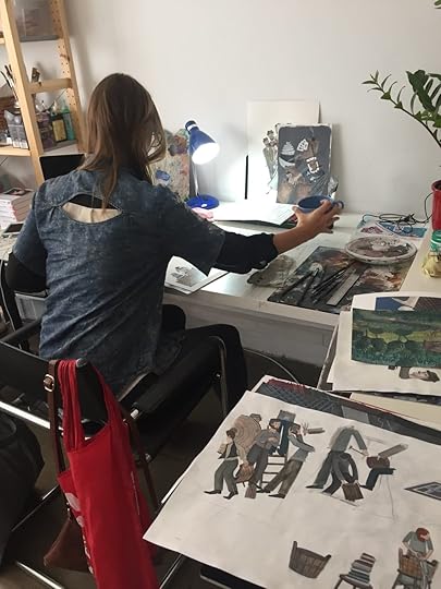
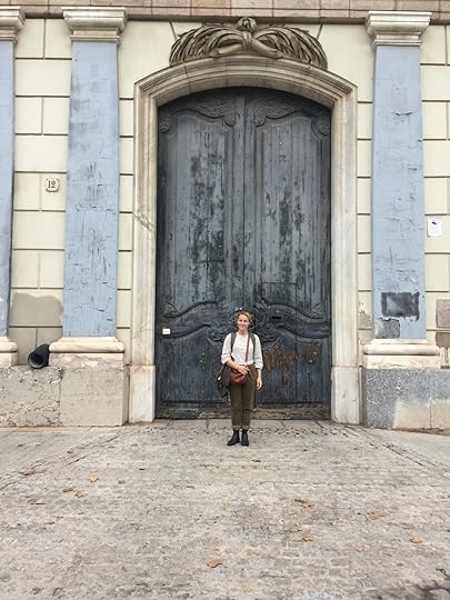
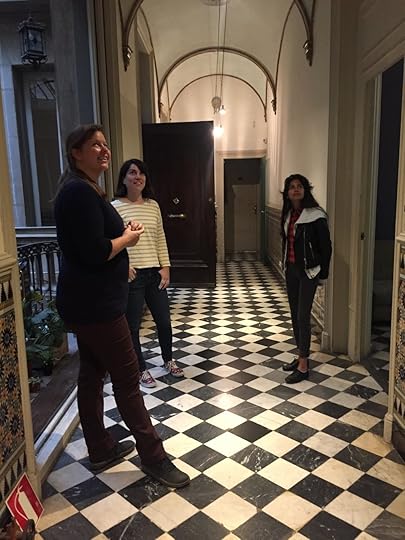
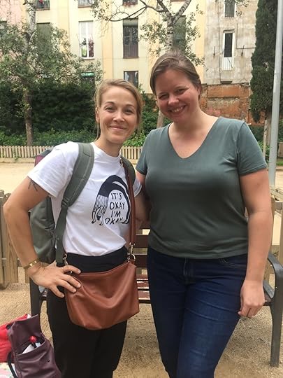
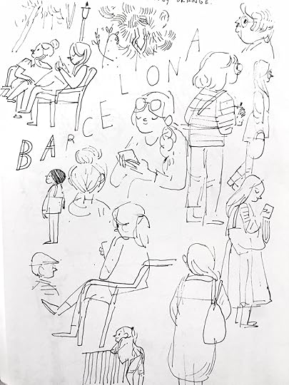
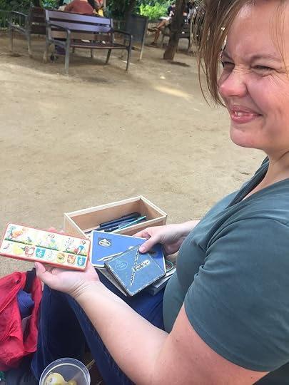
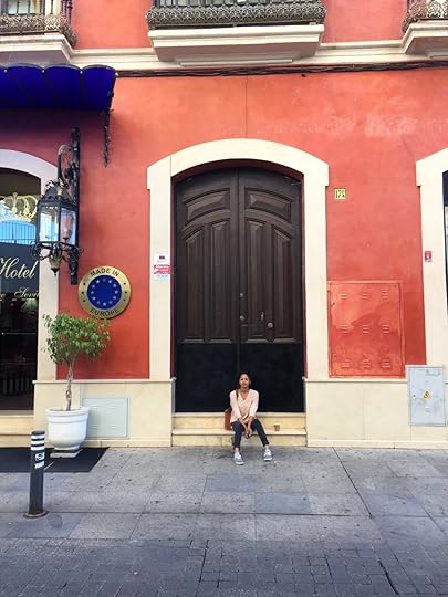
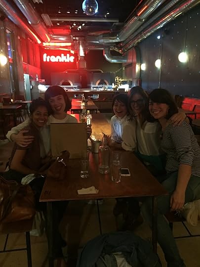
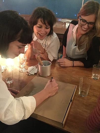
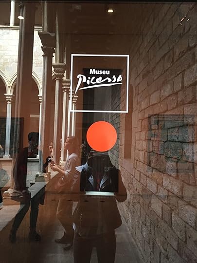
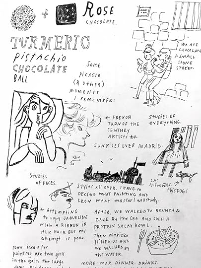
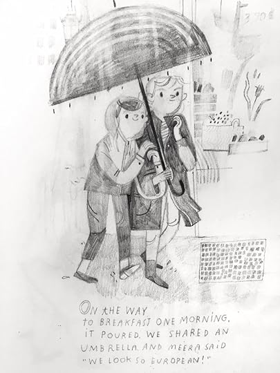
After Seville, we took the train to Barcelona and stayed with one of my long time favorite illustrators, Julia Sarda, who graciously gave us a place to stay. Julia is a fiercely talented, hard working and passionate person. I’m so inspired by her work. Meera and I spent our days wandering in and out of bookstores, eating amazing food (we ate at Flax & Kale like three thousand times) and went to the Picasso Museum, which ignited my artist heart. I also walked into the cutest children’s store, kmfamily, in Barcelona, and the gal there knew me and my work which just sent me over the moon!! She said her stepdaughter and her practice drawing with my art and I melted.
We met Julia’s studio mates, who are a warm and talented bunch and were so inviting when we came to visit their studio. I also met a longtime favorite paper artist and illustrator, Mar (LAST NAME). She is a stunning and compassionate human and I’m so glad we met. We also got to hang out with our new pal, Marieke who now lives in Barcelona and met up with us each day. We saw the ocean and drew together on a park bench by Sagrada Familia. It was tough to say goodbye to such a magical place, so I’ll just say see you later.
Scroll down for a boatload of photos!
+++++++++++++++++++++++++++++++++++++++++++
Also: A note on travel anxiety.
“Fear knows who I want to be and what keeps me from being that person.” - Meera Lee Patel
I couldn’t figure out how best to integrate this into the post, but I feel it’s worth sharing because I’m all about airing the lowlights with the highs. Traveling has long been one of my biggest desires, though it’s always been coupled with paralyzing fear. When the trip to Spain was planned, I stayed awake at night foreseeing my own untimely death by the worst case scenarios. When the plane ticket was actually booked, I thought I was going to faint, I was dizzy with anxiety. I got lucky as I had a good friend to travel with, and Meera and I made it to every bus, train and plane we needed. I found that I’m actually not terrible with directions or traveling and that the worst case scenario doesn’t usually happen. A couple of days after returning from our trip, I boarded another plane to Japan, and I’m sitting in a coffee shop in Osaka and guess what! I’m not dead! And I’m sleeping at night! The biggest takeaway of all of this is honestly my compassion and my trust for myself. I’m kinder to myself and I allow myself things I need to make traveling easy, like getting to the airport seven hours early. (I wish I was kidding). Anyway! Just wanted to be honest about being a human and if you’re out there and you’re scared to make a jump...just close your eyes and make it. Xo, Becca

September 9, 2018
Penfield Children's Center, Croquet Ball Poster
I was recently invited to create a poster for the Penfield Children's Center Annual Croquet Ball, which took place this past weekend. Penfield Children's Center, in Milwaukee, provides early education, health services, and family programming to infants and children in need.
Creating this poster was a rewarding opportunity for two reasons: First, it's always been important that I give back to communities in need, using my work to perpetuate compassion, education, and understanding. Second, donating illustration generally means absolute freedom.

This freedom, of course, means the direction is wide open, and it's therefore my responsibility to understand what I truly want to make. Quite a daunting task. If you've ever stared blankly at an empty piece of paper, you understand. I'm trying to know my creativity better, narrowing in on cues - indulgence vs work, my strengths vs strengths perceived by others, etc. Lately I'm discovering that I love to mix worlds. So, I combined my love of combining with something else I adore: FOOD!
I've long had an obsession with drawing chefs. Possibly because in another life, I'd like to be one, but I've always loved drawing food and people working with it. I'd spend hours as a child drawing fruit and vegetables on MS Paint, and I sculpted chef after chef in clay. One look at my portfolio won't tell you this, but I never actually execute these drawings in a way that makes sense for my professional portfolio. Being an idiot is the only explanation I can offer for this.
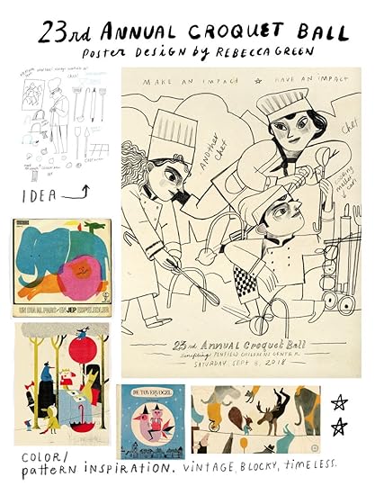
Work from Unknown, CIAO DA ISRAELE, Catarina Sobral, & Ted Schaap.
For the concept of the poster, mixing in chefs was easy - they'd simply play croquet! I decided to have them use food for the croquet balls, bent utensils for the ground thingies and kitchen tools for the mallets. I pulled some work for color and visual inspiration and after approval from the client, I went to work.
The poster was quite large (26x40") and in order to transfer the drawing onto my paper, I had to redraw the illustration on a large piece of tracing paper (that I taped together). I then put pink chalk on the backside of the tracing paper and transferred the lines onto the paper. (I forgot to take images!) I then created the final in pan pastel, gouache, colored pencil and water soluble crayon. I limited my palette to olive greens, ochre, salmon, and some rusty coral colors and worked on a fawn colored 22x30" sheet of Arches paper.


To create the poster, I had the illustration professionally scanned (because of the large size) and then I photoshopped more room on the top and bottom for the text. I created most of the text by hand, scanned it in and edited everything in PS. And the poster was complete! Here are some closeup images of the illustration finished.
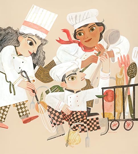

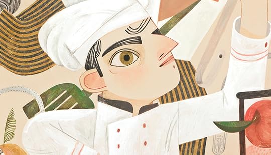
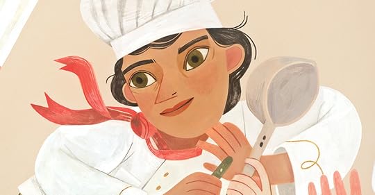
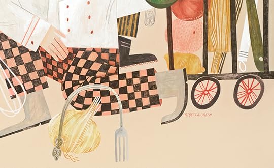
And the finished poster (which the client printed) It's almost as big as me!!

Thanks again to the folks at Cramer-Krasselt for bringing me onto this project to Penfield Children's Center for providing invaluable services to your community. What an all around win!
xoxo
June 8, 2018
Smithereens, Post No. 8: Expressions!

Smithereens: [smith -uh-reenz] Plural Noun. 1. Small pieces, bits.
Smithereens are tiny pieces, fragments of a larger thing. In this series of blog posts, I share small slivers of my process, thoughts on materials, and insights into the larger world of illustration.
A couple of years ago when I dove into the publishing world, I learned quickly how little I knew about character development. Not only did I have to draw a character consistently, but also to individualize and understand their range of emotions. This is unfortunately not something I learned in school so it’s been an interesting journey to find a way to convey expressions in my characters. Because the lines are so simple and sparse, every little nuance or tick can drastically change the entire mood and emotion of the situation. For this reason, it usually takes drawing the characters 6 million times before I start to see their personalities come out. Once that’s done, I can play more with their emotions.
The most valuable tool I can use to understand and convey emotion, is to feel it myself.
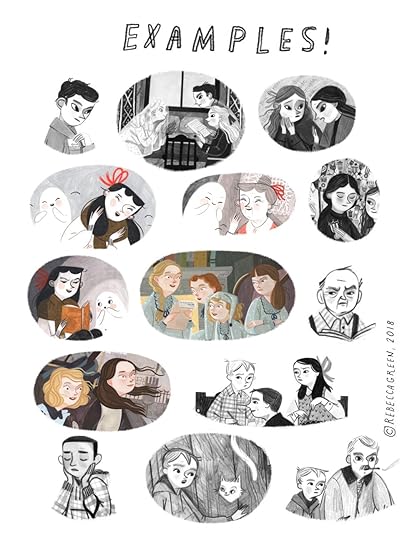
I think we all tend to do this when drawing emotion. It really helps to 'act it out'. (Good thing we spend a lot of time drawing alone, since we'd look rather odd weeping or looking vengeful while working (although now that I'm thinking of it, those are emotions that come up while making art too!) When I need to find the best stance, facial expression, etc. for an illustration, I literally just act it out while paying attention to my own body's instinctive actions. When proud, my chin goes up. When nervous, I shrink. When eager, my eyes open and my body moves forward.
Last night when I was drawing these next studies, I asked my husband to act out these emotions and he almost exactly copied my postures! Now, we're two in billions, and all humans have different ways of feeling emotions. For some, proudness might be quieter, fear might be running instead of freezing, eager might still look timid. It's our responsibility as illustrators to understand the characters enough to be able to accurately portray not how we would feel, but how they would feel.
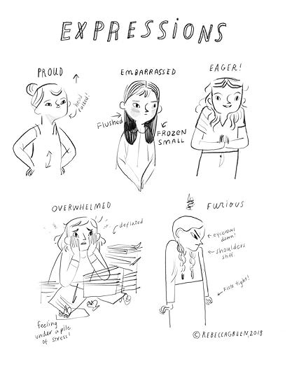
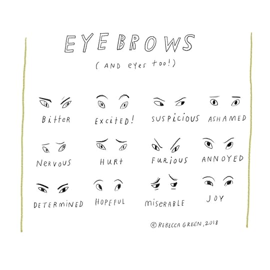
Besides body posture and color, one of my favorite ways to portray expressions is in the eyes and eyebrows. You can have the simplest lines and still put so much emotion into a face. Below are some examples of what can be down in just a few strokes!
Now that I have the hang of creating basic characters and emotions, my goals have shifted and expanded. In the future, I'd love to vary my character shapes, adding personality into their build. I'd also love to add more movement in my work, showing emotion through lines and layout, rather than having all of the focus be inside the character. I want people to literally get swept up in the emotion. I don't want to make you weep, but I want to make you weep! Make sense?
What tools have you found helpful in creating dynamic characters and expressions? What's the hardest part of portraying emotion in your work?
Alright guys! I hope this weekend is filled with all the best emotions and expressions.
Happy Friday and Happy Expressing!
June 1, 2018
Smithereens, Post No. 7: Picture Book Illustration

Smithereens: [smith -uh-reenz] Plural Noun. 1. Small pieces, bits.
Smithereens are tiny pieces, fragments of a larger thing. In this series of blog posts, I share small slivers of my process, thoughts on materials, and insights into the larger world of illustration.
What goes on behind the illustrations in a picture book? (I'll give you a hint...way more work than I ever imagined!) I'm just skimming the surface, having only finished three, but each one gives me a new light into what I know, what I definitely don't know, and how I can improve.
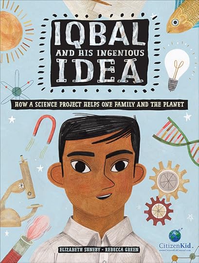
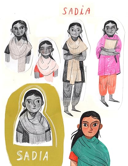
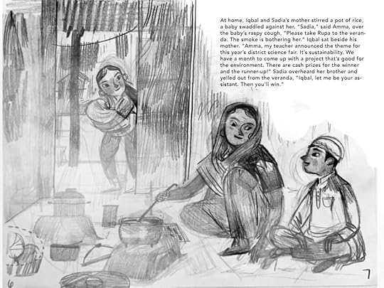
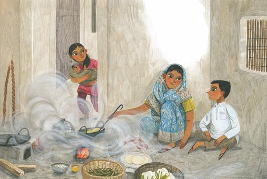
Today I'm sharing a behind the scenes look at Iqbal and His Ingenious Idea, which is a Citizen Kid book written by Elizabeth Suneby and published by Kids Can Press. An excerpt from the publisher:
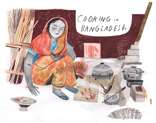
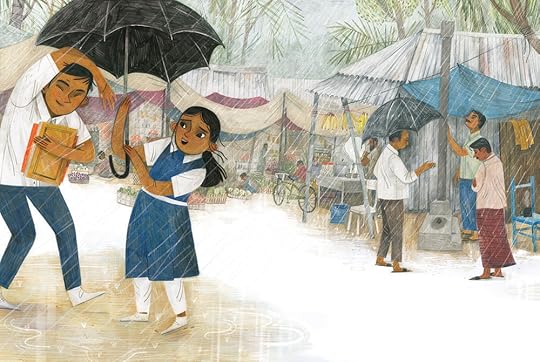
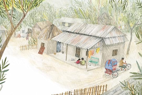
"It's monsoon season in Bangladesh, which means Iqbal's mother must cook the family's meals indoors, over an open fire. The smoke from the fire makes breathing difficult for his mother and baby sister, and it's even making them sick. Hearing them coughing at night worries Iqbal. So when he learns that his school's upcoming science fair has the theme of sustainability, Iqbal comes up with the perfect idea for his entry: he'll design a stove that doesn't produce smoke! With help from his teacher, Iqbal learns all about solar energy cooking, which uses heat from the sun to cook --- ingenious! Has Iqbal found a way to win first prize in the science fair while providing cleaner air and better health for his family at the same time?"
This book proved most challenging in the area of research, though the publisher was quite generous in providing reference materials which are always incredibly helpful. I began the project was by first testing what style would capture the characters and setting in a realistic but interesting and playful manner. I also tested materials to see what worked best, and decided ultimately to do the entire book in colored pencil. (Which later turned out to be a short-sighted decision - more on that later.)
*** These reference drawings are drawn from photos, and since I no longer have the original reference materials, I'm not sure who to credit for the originals, though these drawings are for study only.***
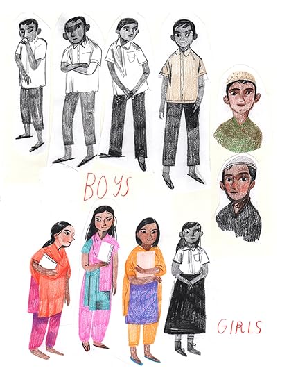
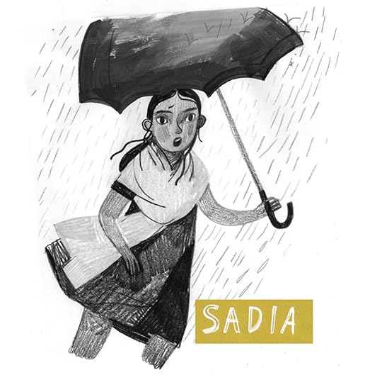
Once the publisher had approved the initial hand drawn look of the first sketches, I developed the main characters, Iqbal and his sister Sadia.
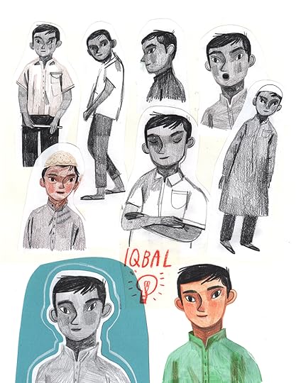
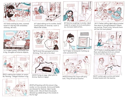
I then drew thumbnails to share an idea of the layouts and concepts. I find it best to work this simple from the beginning so if there are any major changes, they can be addressed at this stage.
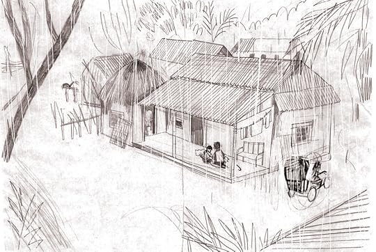
The Art Director made suggestions on adding more white space and varying the perspectives of the illustrations. I tend to draw everything from eye level, but I'm trying to challenge myself to add interest in the from of perspective (worm's or bird's eye view) or adding the ground in at an angle. These drawings are only about 3-4".
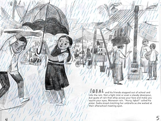
Once we finalized the layout and design, I sketched the drawings at full size, which was around 9x18" (I draw them in spreads, meaning both pages at once). I draw most sketches in blue or black colored pencil.

At this stage the art director and I went back and forth, making subtle changes to layout, setting and characters to prepare for the next stage, which were the linears, or final lines before colors. I should say at this point - I'm sharing this as an experience, but not as a complete instruction for what you should do, because I, as always, overcomplicated the process by doing the final linears on tracing paper, which only meant the final lines had to 'finally' be drawn once again on the actual paper. *face palm*
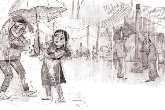

I used a lightbox to transfer the linears onto bristol paper, and created the finals in colored pencil. Here's where the poor medium choice comes in - while I love the look of colored pencil, I didn't realize I had so many full bleed illustrations at 9x18". For colored pencils working one little line at a time, that's quite the undertaking! While it's not the biggest book in the industry, for someone like me who is quite new to picture books, it felt monumental! In the beginning I planned to be a purist and only use traditional media without digitally editing but either my fear or smarts saved me and I added all the rain digitally. I did do the smoke traditionally with gouache and neocolor crayons and I gotta say I was proud of that. (!)
There you have it! A simplified behind the scene version of a picture book. What did I learn from this process? A couple of things...
1. Make it simple. I did too many drawings here - between the sketches and linears and finals, I was essentially drawing the same thing three times and that's where I start to lose my spark and spontaneity.
2. Check the size before finalizing your material. I would have saved lots of time had I allowed myself to use gouache or watercolor as a base layer. Alas, I'm happy with the colored pencil look, but it added lots of extra hours.
3. Add variation and white space. This is a hard one for me. For some reason, I always plan for illustrations to be rectangles with full bleed. I'm trying to loosen up and not cover every square inch of paper.
Have you worked on a picture book? What are some of the lessons you've learned? I'd love to hear them!
ALSO.
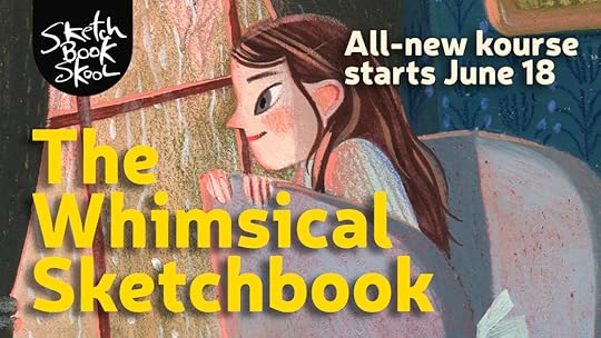
Interested in more behind the scenes? I recently joined up with Sketchbook Skool to teach a class where I invite you into my studio. I share insights on the creative process, I walk you through my sketchbooks, dive into materials and of course, provide you with a painting demonstration. (and...there will be homework!!)
The Whimsical Sketchbook:
"This kourse is designed to inspire your creativity as well, by immersing you in the lives and the studios of five brilliant artists who use their sketchbooks as incubators of stories, emotions, and vivid new worlds.
We’ll learn by sharing their step-by-step process in a 12 different demos using everything from gouache, markers, ink, crayons, collage, iPads, colored pencils, watercolors, pastels, and more.
Their passion and invention is sure to rub off on you every week, and inject creativity and whimsy into the pages of your sketchbook too."
Instructors include: Mike Lowery, Vanessa Brantley Newton, Miriam Bos, Anna Denise Floor, and myself!
If you're interested in signing up, the class begins June 18!
Register Now!
That's it for now friends, have an absolute lovely weekend. xoxo
May 4, 2018
Smithereens, Post No. 6: Drawing from Life

Smithereens: [smith -uh-reenz] Plural Noun. 1. Small pieces, bits.
Smithereens are tiny pieces, fragments of a larger thing. In this series of blog posts, I share small slivers of my process, thoughts on materials, and insights into the larger world of illustration.
What's the first thing you do when tasked to draw something new? Google! Me too, me too. But while the magic of a plethora of images at our finger tips is unprecedented and completely beneficial, it does leave a bit to be desired. And this missing bit is...
YOU (and your life and your perspective!)
What comes to mind when I say drawing from life? Those stuffy still life classes where you're realistically rendering a bowl of dusty fruit, a glass bottle and a wrinkled up sheet? Not quite. (YES those classes are valuable and we should take them seriously and it's monumental to set up basic and skilled foundations in drawing - drawing professors, don't hate me!) While these set ups are important, they can be uninspiring to think about revisiting, so this is not what I'm talking about when I say 'drawing from life'. I'm talking about looking at the world with your own eyes and choosing which way you are going to represent it.
This all came to mind when I was choosing how to represent fish.
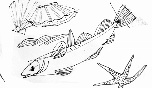
Now to be fair, I wasn't only using online images as a starting point. I went to the library to scour books featuring underwater illustrations, photography and painting as I began to draw. (The drawing above is not the first round - remember Post No. 4 about Stylizing realistic images?) The thing I realized after my first drafts though, was that all of my fish were coming out quite two dimensionally. They were all drawn from the side, and not only that - it was hard for me to get a grasp on the scale of some fish since they are often photographed alone and out of context.
SO I took a trip to the Aquarium and do you know what I learned? It's freaking hard to draw fish from life!! They don't hold still very long, and they're actually quite three dimensional - not too flat at all.
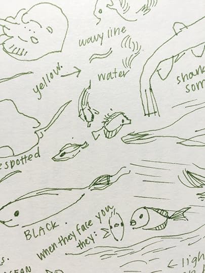
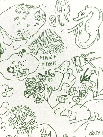
I saw them from a whole new perspective - my perspective. And this isn't a narcissistic statement - I mean, they're their own precious selves, but I realized the problem with drawing from photos, is that you're literally drawing through someone else's eyes. There is a whole other human in between you and the object and they decide what you capture - you can't truly find all possible angles of an object or creature unless you see it with your own eyes.
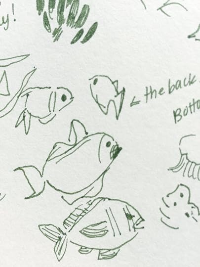
Why I hadn't considered it, I'm not sure, but I never even thought about drawing a fish from the backside until I saw them swim away from me. And then the lights starting exploding in my head - all these opportunities I hadn't realized I was missing. Fish butts! But seriously, I was able to draw them in shapes that challenged my brain instead of using muscle memory to draw what I thought a fish should look like. I also saw other details I'd have missed in images - shadows the animals cast over the ocean floor - the way the water reflects the light and the movement which is constant in the water, swaying strands of leaf and coral. It's really just breathtaking. In regards to materials, I just used a green ink pen, which let me make bold intuitive marks, instead of trying to 'sketch'.
A couple thoughts to follow up - I know we can't all afford to go to Aquariums nor do all of us have access. On the other end of the spectrum, some of us might be able to take a drive right into the ocean and witness what the actual ocean looks like! And what about things we literally can't witness in person? That's where we have to be thankful for the incredible and dedicated photographers who spend their lives recording the majesty of this Earth. It's all relative, but know that when the option does come up for you to see with your own eyes and record the world from your own point of view, it will always, always be worth it.
Happy Friday, and Happy Drawing from Life!
PS. These fish are part of a large project that will be revealed this Fall in Nashville! I can't wait to share more with you!
NON SMITHEREEN ART NEWS!
Last week I visited the Cleveland Institute of Art during their Spring Show and had a memorable and fantastic time. The faculty, building and the students honestly made me want to go back to school and I was blown away by the level of talent I saw from the illustration and animation students. The morning of my presentation started off with an hour demonstration, where I worked on a personal piece in gouache, colored pencil, and neocolor crayons. Afterwards, I gave an artist talk in their lovely theatre, sharing my journey as an illustrator, from gallery work to editorial work - and eventually how I ended up in the publishing world. My agent, Nicole, was there to introduce me for the presentation, and that along with the wonderful questions the students asked just made it a dream talk. (For me anyway, hope the students enjoyed it! ha)
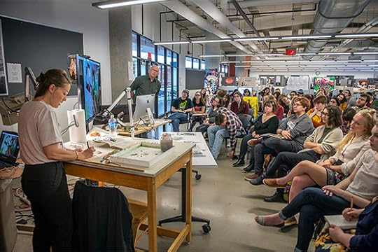
Photo by Robert Muller/CIA.
Unfinished Demo Study! (An hour goes by fast!)
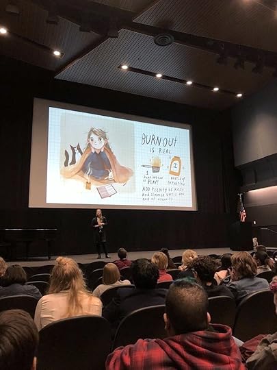
Photo by Greg Wilson at gregorywilsonphoto.com
If you want to learn more about the visit or my illustration practice, the school did an interview which you can read here!
Thank you again to the kind folks at CIA for hosting me, and to the students who are sure to have amazing careers ahead of them.
Rebecca Green's Blog

- Rebecca Green's profile
- 79 followers

