
Rebecca Green's Blog, page 2
July 1, 2023
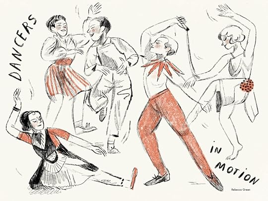
JULY | MOVEMENT

Happy Summer loves. We’re in it - full steam Summertime with hot afternoons and bare feet and campfires and swims in the lake (as many as we can fit in). Winter here is hard but Summer always lures me back into loving Michigan.
This past month, I’ve been putting together a weeklong workshop to teach in Spain which begins July 5th. I’m over the moon excited to meet other artists, explore a new area, and nerd out over materials. As much as I don’t feel like a teacher, I love sharing information - especially in person - and the older I get, the more sure I am that teaching workshops should be part of my regular gig. That is of course, after a new baby wrangles my life into a new normal come October.

Exploring limited color palettes for my upcoming workshop.
I’ve also been painting for the Winter Book of Henri and Miko - the four book series that hums along in the background of my internet presence, but has a very solid role in my studio day to day. I’ve painted countless renditions of these finals, trying to nail down a subtle palette, keep the energy and movement of the characters, and do so in a way that will allow me to do an extraordinary amount of tiny paintings. I’m so excited for you to see these when they do come out…
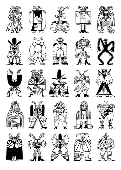
Speaking of energy and movement in work - that’s what we’re talking about today for the 7th (!) installment of my Yearlong Celebration of Things I Love about Art. MOVEMENT is what we’re discussing today. All of the artists I’m sharing are picture book illustrators and I’m not mad about it. It was actually really indulgent to get to share these works which have given me so much inspiration throughout my career. Whether it’s movement in line or paint, I hope this brings you lots of inspiration as well…
Let’s dive in!
“I'm interested in the movement of the eyes across the painting.”
- Guido Molinari
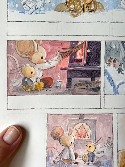
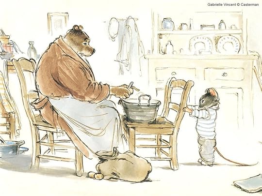
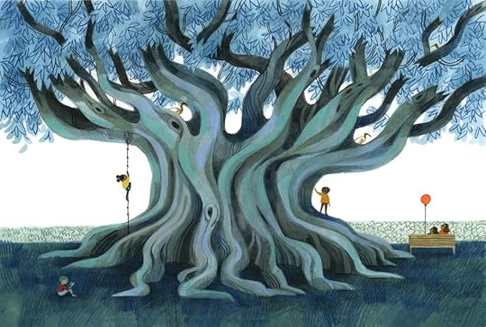
GABRIELLE VINCENT
Gabrielle Vincent (1928 - 2000) was the pseudonym of Belgian painter Monique Martin. Martin was a successful fine artist and had shown in galleries exhibiting paintings, black and white ink/charcoal drawings and more. In 1980, she began to illustrate, though changed her name for illustrating because it was seen as a lower art in the eyes of her fine artist peers. In 1981, she created Ernest et Célestine, and went on to make 26 books in the series. I seriously can’t get enough of these drawings, I swoon and melt everytime I see the character in her lines and colors. The way she moves your eye right to the point of the scene is so masterful. To keep the freshness in the drafts of the finals, she did each illustration 20 times and then picked the best one which makes me want to give up entirely. hah.
“Ernest et Célestine”, Gabrielle Vincent/Monique Martin. Duculot/Casterman. Courtesy of Fondation Monique Martin
“Ernest et Célestine”, Gabrielle Vincent/Monique Martin
“Ernest et Célestine”, Gabrielle Vincent/Monique Martin
“Ernest et Célestine”, Gabrielle Vincent/Monique Martin
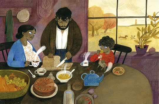
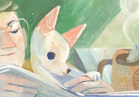
YES - that Doug Salati who won the Caldecott this year for his wildly endearing book HOT DOG. His work moves - whirls, whips, and soars but is also jagged and restrained. It’s a great example of gestural work without getting too art school if that makes sense. I had the pleasure of meeting Doug as he co-led an illustration workshop that I attended last Summer at Milkwood and it was so cool to hear his process - the line work is all done by hand in pencil. Also he’s literally one of the funniest and most charming humans I’ve met.
© Doug Salati
© Doug Salati
© Doug Salati, interior spread from HOT DOG
Sydney Smith is such a brilliant picture book illustrator. Each book feels a bit different in terms of line and painting technique but the movement (and attention to lighting) is stunning. In his awarding winning book, I Talk Like a River, the movement is portrayed through confident brushstrokes, splashes, and the loveliest dapples of light in the water. Water is so hard for me to paint and he seems to do it with such skill. His book Town Is by the Sea deals with movement in a more linear fashion with energetic black lines. Each book is lovely and I can’t wait to put some of these on little one’s bookshelf.
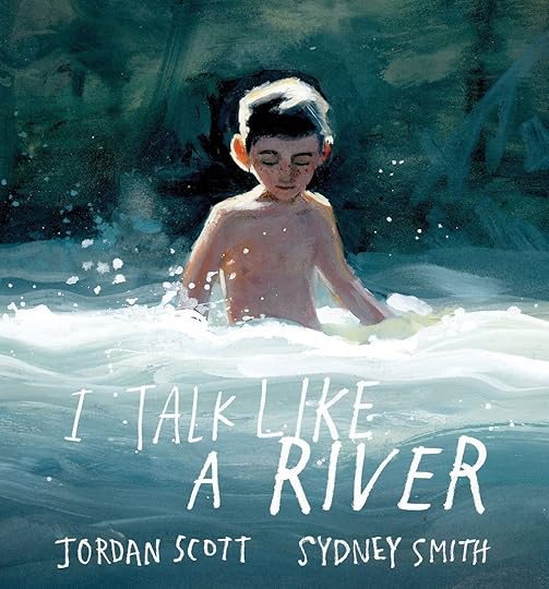
Cover for I Talk Like A River by Jordan Scott & Sydney Smith
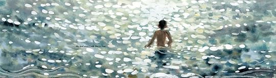
Interior from I Talk Like a River, © Sydney Smith
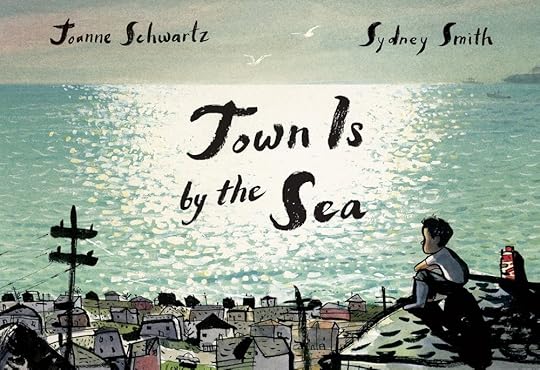
Cover for Town Is by the Sea by Joanne Schwartz and Sydney Smith
Interior from Town Is by the Sea ©Sydney Smith
FELICITA SALA
I’ve been a fan of Italian illustrator Felicita Sala’s work since the beginning of my career when I found the animated music video she collaborated on with her husband. Since, I’ve loved seeing her work in the picture book world. I’m always delighted by her line work and how every part of the image seems to sway. She works in colored pencil and paint and has really lovely snippets of her process tests and sketchbooks on Instagram too. Her characters are always recognizably hers but not in a static way - just in a very pure way. Also she just seems like a super kind human!
Interior from Green on Green by Dianne White, Image © Felicita Sala
Be a Tree!, written by Maria Gianferrari, published by Abrams Books for Young Readers, 2021
Interior from Green on Green by Dianne White, Image © Felicita Sala
Cover Illustration for Andersen Magazine, Italy, June 2020
British illustrator Katie Harnett’s work has long been an inspiration for me. I love the way she portrays figures and spaces, but I especially adore all the movement she imparts in her painted textures. Using just the lines needed, they have this masterfully childlike quality to them that I’m envious of. Everything shakes a little in her illustrations! She is also part of Orange Break Studio, an amazing resource for picture book authors and illustrators. They host a range of events and workshops, one on one tutorials and more.
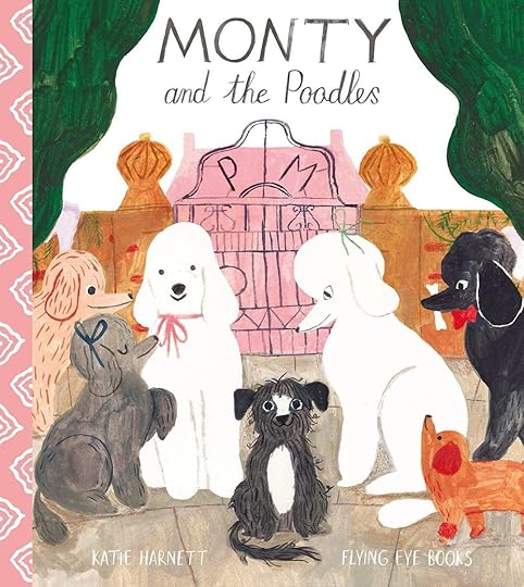
Monty and the Poodles by Katie Harnett
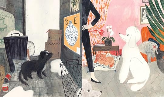
Interior from Monty and the Poodles ©Katie Harnett
Illustration from Moon Cat © Katie Harnett
If you want a little more, you can see this month’s Blog Painting come together in a timelapse on The Dessert Club! I also do a little digital warm up in procreate using vintage dance photos.
I hope your month is filled to the brim with strawberries and porch hangs and late sunsets and fireflies. I’ll see you back here next month with another post, as well as a little peek into the Spain retreat!
And of course, if you have any artists you love whose work celebrate movement, I’d love to hear about them! I always love reading your suggestions.
Stay sweet!
xo,
Becca


June 1, 2023
JUNE | EXPLORING SHAPE
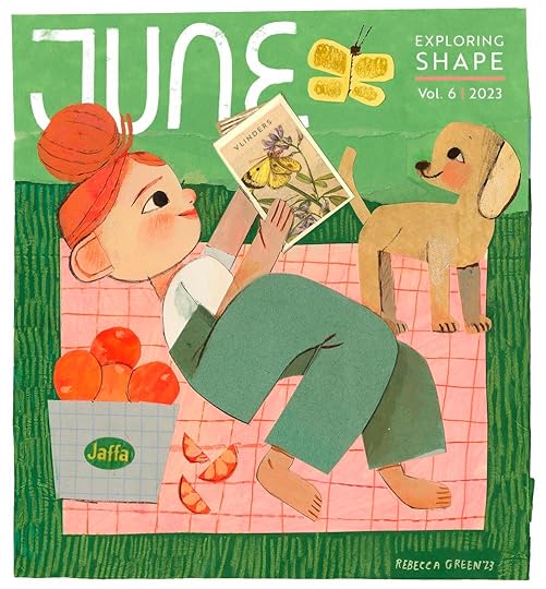
Hi Summer babies!
We made it! Over the course of the last month, my yard exploded with tulips, lilacs, irises and greens..lots of greens. Entering Summer feels like a totally new existence in Michigan, which is why I love this region so much - each season feels like a new life. June also officially marks the halfway mark of the Yearlong Celebration of Things I Love About Art! It’s been an inspiring change of pace digging into to and sharing new artists with you everything month and this month is no different. In fact - this was the easiest month to put together. We are celebrating SHAPE - and many artists came to mind for this one.
What is SHAPE? A shape is created when a line is enclosed. It can be organic or geometric, and can also be a two-dimensional area that is defined by a change in value or some other form of contrast. (The Virtual Instructor)
When I consider shape in my own work, I think of simplifying an image, which is not actually that simple at all given that I’m prone to drawing realistically or putting in every detail. Thinking in shapes helps me balance a piece of artwork though. I’m better able to set boundaries between foreground, middle, & background, especially with lots of moving pieces and details. Breaking an image down into shapes also helps me harmonize color when I’m not using the addition of line.
Here are a few examples of where I think shape really helped me simplify a scene.


SHAPE INSPIRATIONS
“Talent consists not in inventing shapes but in causing those that were invisible to emerge.”
- Muriel Barbery
GOSIA HERBA
I’ve long loved the work of Polish illustrator Gosia Herba. When I first came across her work, I was drawn to her seemingly effortless ability to lay out an image in a stark and alluring composition - with the most incredible shapes!! I often look to her work as inspiration when trying to simplify my own - she has a way of dropping the useless details. She’s worked for publishers, magazines, ad agencies, and has written & illustrated picture books and graphic novels. Honestly it’s hard to choose just a few of her pieces to share.
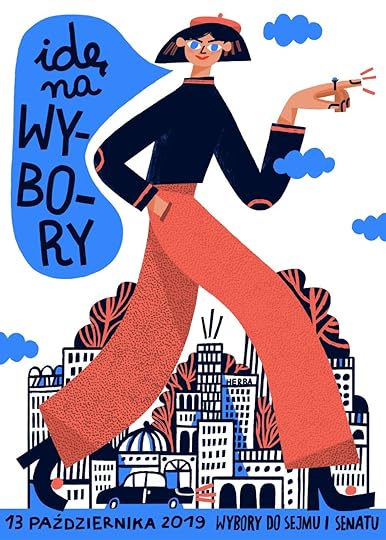
© Gosia Herba, Vote! 2019, Created as a part of the action curated by Pogotowie Graficzne.
Caterpillars, @ Gosia Herba
Omg the shapes on the one below!! Now this is serious shape celebration.
Kingdom, © Gosia Herba
This Italian illustrator has been a long time favorite - not only do I adore her subtle palettes and textures, it’s her shapes!! They’re clever and calming and she seems to add just enough detail to retain clarity. She’s done work for picture books and magazines, and even on site installations. What I especially love is that her work is analogue - she gets the most velvety textures in gouache, colored pencil, and other traditional materials.
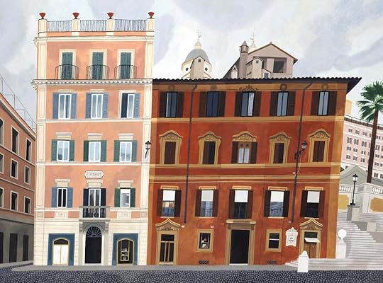
Piazza di Spagna, Roma, Gouache on paper, 38,5x28,5cm, January 2023 © Beatrice Cerocchi
This is a lovely video to see her process for the piece above! And below left - see how simple two different color doors represents lighting in such a subtle way… swoon
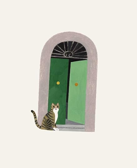
Illustrations for 'PASTA!' written by Felice Arena - Affirm press, March 2023 ©Beatrice Cerocchi

Illustrations for 'PASTA!' written by Felice Arena - Affirm press, March 2023 ©Beatrice Cerocchi
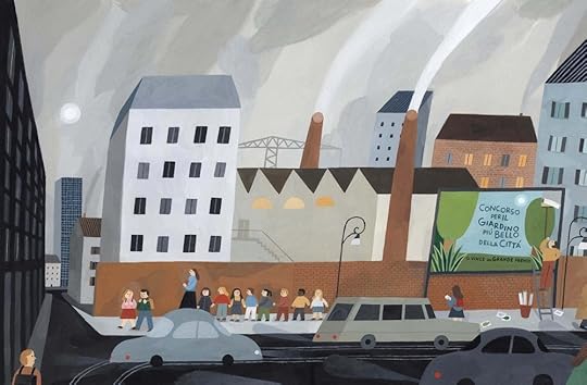
'Il giardino più bello' written by Luca Tortolini - Editrice Il Castoro, 2020 ©Beatrice Cerrochi
Mizuki Goto is a Japanese artist whose work is brimming with interesting shapes. Her work is so playful and bold - definitely inspiring in terms of simplification (yet of source, not simple at all…) She works in torn paper collage, and while I can’t find specifics, it does seems like the paper has painting textures before it’s cut (I could be wrong!) After graduating from design school, she worked in a children’s specialty store where she was inspired to pursue illustration. Her work can be found in picture books, newspapers, magazines, and more. Isn’t it seriously so fun? Was almost impossible to only choose a few to share.
"I live with this"Yoko Mun / Written by Kadokawa Shoten, Binding: Kanae Sakazume ©Mizuki Goto
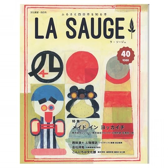
“LA SAUGE 40” ©Mizuki Goto
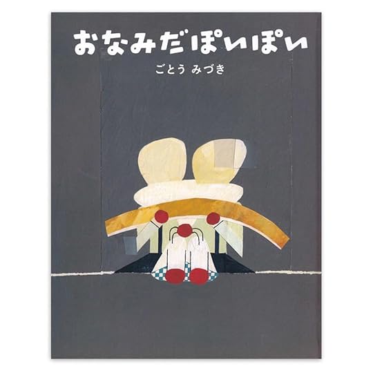
Written and Illustrated by Mizuki Goto, "Onamida Poi Poi" Mishima Publishing 2017, Binding: Yuichi Urushibara (tento)
Jacob Lawrence (1917-2000) was a painter and educator whose work can be found in museums across the country from MOMA to the Whitney Museum. His work has such brilliant shapes inspired by the sights and colors of Harlem, where he was active in the beginning of his career, “All these people on the street, various colors, so much pattern, so much movement, so much color, so much vitality, so much energy.” He gained national recognition for a 60 panel Migration Series which depicted the great migration of African Americans from the rural South to the urban North - something he himself experienced after moving as a child, being placed into foster care, and reuniting with his mother in NY.
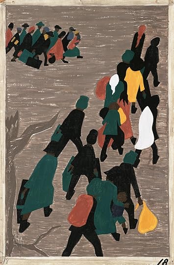
©Jacob Lawrence, The Migration Gained in Momentum, 1940-41, via MOMA
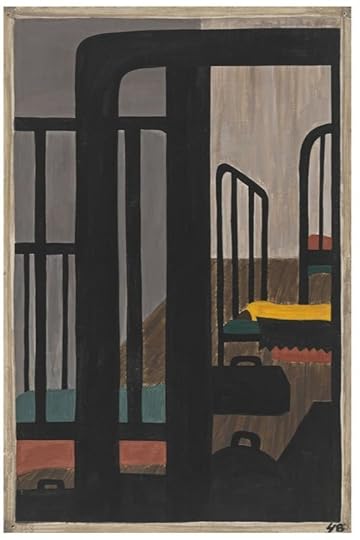
© Jacob Lawrence, Housing for the Negroes was a very Difficult Problem, 1940-41, via MOMA
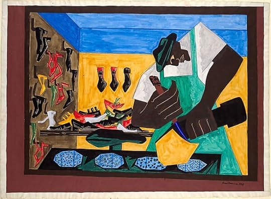
The Shoemaker, Jacob Lawrence, 1945 via The MET
I first found the work of Swedish artist Camilla Engman a decade ago when I found her Suitcase Series Vol 1 Book with Uppercase. I fell immediately in love with her work and have continued to admire it. At times, it has a sweet innocence about it, but at other times, her work is haunting and eerie, quiet with muted colors and sparse shapes. Her characters are also quite interesting - sometimes they are clearly human. In some of her work, they look more like dogs, dolls, or empty eyed organic shapes. She works as a multidisciplinary artist, doing three dimensional work as well as paintings and collaborations.
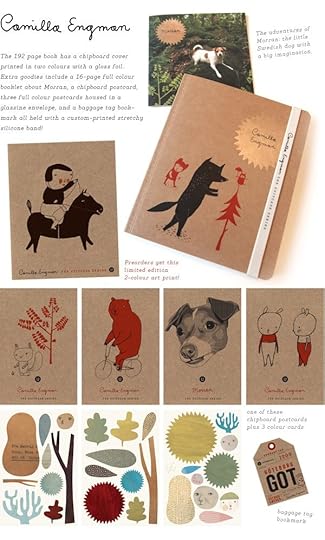
Uppercase Suitcase Series Vol 1. with Camilla Engman
“I sent a letter once, I don't know to whom” Acrylic on board 80x60 cm, ©Camilla Engman
“Omgruppering” Part of a commissioned installation at a library in Sweden, ©Camilla Engman
There probably aren’t many illustrators who haven’t heard of Miroslav Sasek but he’s a must on this shape loving list so we’re celebrating him anyway! He of course is the Czech artist behind the This is… series, which began with This is Paris in 1959. He was prolific with these successful books, creating This is London, Rome, New York, Edinburgh, Munich, Venice, San Francisco, Israel, Ireland, Hong Kong, and more. Sasek had trained as an architect, finishing studies not only from the school of architecture but also the school of drawing and painting at the Czech Technical University in Prague before doing a host of creative endeavors in illustration, puppet making, and radio broadcasting. His works brilliantly lay out architectural details but they human capture something alive and human.
“This is Rome”, 1960. (Photo: Ondrej Pribyl/Šašek Foundation)

© Miroslav Sasek
© Miroslav Sasek
Most of you I’m sure will be familiar with Louise Lockhart - the powerhouse behind The Printed Peanut. I have mega respect for her ability to have a unified brand and and body of work (also she has the most adorable studio and house!) But she’s also a great artist to talk about in regards to shape! Louise works in cut paper and print, bringing her work to books and magazines, but mostly her incredible products which range from cards to soap to textiles. I love the way she portrays places, packaging and people in playful geometric shapes.

A Collection of Work, all ©theprintedpeanut
(detail from) Along The Pier, Concertina Booklet, ©theprintedpeanut

Cut Paper Process, via InkyGoodness Interview, ©theprintedpeanut
What about you, do you get excited about shapes, either in your own work or in the work of others? As always, I’d love to hear your suggestions about artists - it’s so fun to learn from you on these posts too.

If you want a deeper dive into shapes, this month on The Dessert Club Patreon, I’m sharing some examples of simplifying shapes and using cut paper to build an illustration. We use neocolor crayons, acrylic gouache, and vintage paper to make this month’s Blog Illo! (I did edit a bit in post - can you spot the differences?)
On The Dessert Club, you’ll also find a recent behind the scenes post from last month’s recipe (strawberry shortcake!) where I experiment with printing linocut - something I hadn’t done in so long!

OK! Thanks as always for reading - such a joy to connect with all of you every month. Have the wildest and most refreshing month of June - it’s the only one in 2023 we’re gonna get!
xoxo,
Becca
May 1, 2023
MAY: FLOURISHES, DECORATIONS, & BORDERS

It’s the beginning of a new week, a new month, a new blog post!
This past month was a bit of a blur for me but I’m thrilled to be here chatting with you again - these first of the month posts ground me and help me feel motivated, even when the ebbs of creativity seem to dip (as they inevitably do!) Today, of course, we’re diving into another chapter of my Yearlong Celebration of Things I Love About Art.
This month, we’re highlighting flourishes and decorations - something we don’t see a ton of in contemporary illustrations - the exceptions of course being book covers, and I suspect a good amount of fantasy art, which I know next to nothing about. In my own work, decorative borders show up in a few of my books and other personal pieces..

Appleseed, Acrylic Gouache on Bristol, 2021

The cover border for Madame Saqui was created using a graphite transfer on tracing paper, so that both sides of the design could be mirrored but painted separately so it’d keep an organic quality. There is a border in the back of the book as well which was scanned and mirrored digitally.
The picture book which focuses the most on flourishes and borders was A Bear Far From Home. This direction was influenced by the story’s historical context. Taking place in the 13th century, it made perfect sense to draw on the work from medieval art and illuminated manuscripts, which were ornate and decorated.

The borders in the interiors also helped me tell the development of the story - the flourishes shift from soft and organic to spiky and unfriendly.


The page which most directly pulls from Medieval art in the first spread of the story, which looks as though it were drawn on an ancient scroll. I loved detailing in all these little embellishments!

Probably my favorite border/decoration of the book was created for the title page - this took me forever to figure out but I was quite proud of this opener. If you want to see a bit of behind the scenes with this one, I’m sharing that in today’s video on Patreon - you can see the tracing paper sketch and how the sketches were traced by folding the pages in half.

Looking for inspirations for today’s post really made me want to incorporate more flourish elements into future work. It’s such a great way to get out of narrative thinking and dip my head into stylizing and design a bit more.
DECORATIVE INSPIRATIONS
“Art is the expression of man's pleasure in labour.”
―
William Morris

Walter Crane, The Norseman, 1893
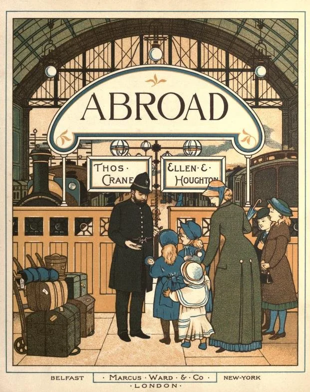
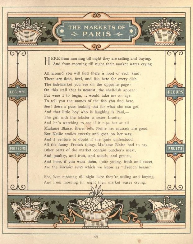
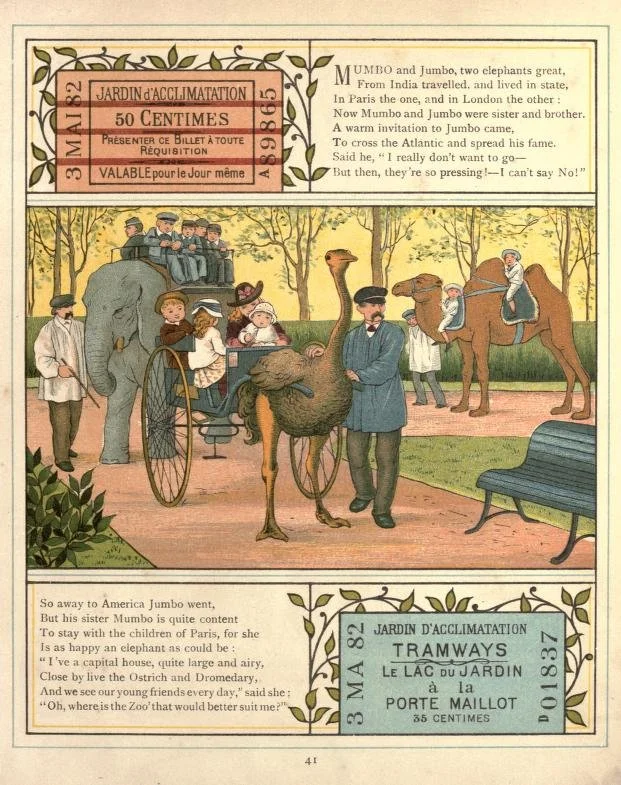
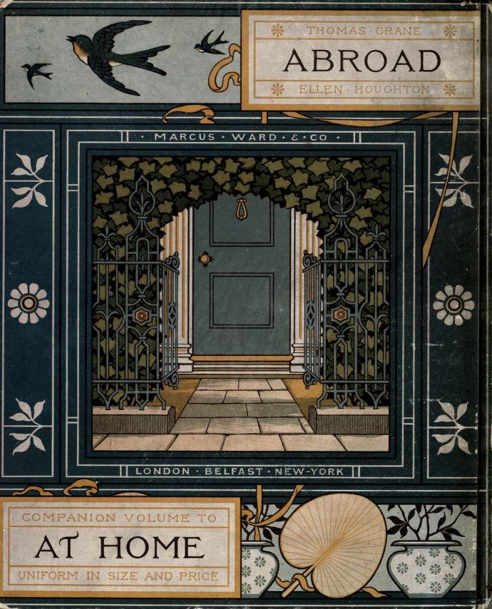
WALTER CRANE, THOMAS CRANE, ELIZABETH ELLEN HOUGHTON
If you’re an illustrator, I feel like there’s a good chance you’ve heard of Walter Crane - but if you haven’t, don’t worry - we’re in the same boat. I only came across his work while researching decorative arts in Illustration. And really, I came across the work of his brother first, Thomas Crane, and their cousin, Elizabeth Ellen Houghton. Walter Crane was an artist of the Arts and Craft Movement, and committed socialist, creating paintings, illustrations, ceramic tiles, wallpapers, and other decorative arts. He illustrated over 35 children’s books and wrote The Claim of Decorative Arts, as well as Line and Form.

Walter Crane, 1887, Baby's Own Aesop's Fables, Wood engraving printed in colors (!!)

Walter Crane, Baby's Own Aesop's Fables
I love the above illustration especially, which was inspired from traditional Japanese woodblock printing.
Walter’s brother, Thomas illustrated Christmas cards and books. The pages below are from a series called Abroad - Thomas did the decorations and Ellen did the figures. (There was another artist who later worked on these too). I LOVE the framing, the borders, the small world-building of objects/details that are laid into the margins of the poems. I want to make a book like this now, wouldn’t that be so fun to do?
View fullsize

View fullsize
View fullsize

View fullsize
View fullsize

London Town, Thomas Crane & Ellen Houghton (isn’t Thomas shortened to Thos. so cute?!)
I’ve been a fan of Melissa’s work since seeing If I had a little dream in a bookstore years ago. She’s an English and Colombian illustrator with over ten books under her belt, three of which she also wrote. To me, she’s the queen of organic flourishes and framing. Nothing too static, everything flowy and dreamy and lush. Every little bit has movement and texture, hidden characters and details, and the compositions are framed in really interesting ways. Also, aside from flourishes, I love her use of limited colors - the palettes are so vivid and balanced.

If I had a little dream, 2017, ©Melissa Castrillon, Scholastic/Alison Green books


CHE BELLO! Written by Antonella Capetti and published by Topipittori, 2017. Illustration ©Melissa Castrillon
ALPHONSE MUCHA
I debated listing Mucha because he’s so well known, but when I went back to look through his work and learn more about his process, I decided it’d be ridiculous to talk about flourishes & borders without him! His work of course was a large contribution to the Art Nouveau movement (which is more globally complex than I had realized). He hit his big break when he was asked to create a poster for the famous Sarah Bernhardt - it was such a sensation that she contracted him for not only more posters but stage and costume designs as well. Over the course of his career, he would create “paintings, posters, advertisements, and book illustrations, as well as designs for jewellery, carpets, wallpaper, and theatre sets.”

Gismonda, Alphonse Mucha

Moët & Chandon White Star, Alphonse Mucha

The Times of Day, Alphonse Mucha
ALICE RUSSELL GLENNY
Women were decoratively at the center of Mucha’s work but I had to dig to find females actually creating work as a part of this movement. I was happy to find American artist, Alice Russell Glenny. Born in Detroit, she later moved to Buffalo where she found success as a sculptor, muralist, and illustrator. She was best known for her covers of the Women’s Edition. These posters are certainly Art Nouveau style but the women she depicts are not soft or come-hither. They are strong and solid, facing the viewer head on. Aside from her work, she was also an Art Director for a local magazine called Hobbies, and championed other female artists of her time, such as Ethel Reed (who had wild success but a short and tragic life.)


Ethel Reed, Folly or Saintliness, 1895 Poster House Collection
Louis Saugy was a Swiss artist born in 1871. His work celebrated the method of Scherenschnitte or paper cutting, which was developed in Germany and Switzerland in the 16th century. Born near Château-d’Œx, his work beautifully depicted the seasons and daily life of his surroundings. While he started making work when he was young, he began selling his piece at age 40 and became quickly successful, showing his work in Geneva. At age 57, he retired from his job as a Postman and worked full time on his art. His work is so endearing - all the tiniest details to pour over, the different trees and flowers, and organic sense of design. There is a really adorable video from 1950 where he’s interviewed and shares the process of his work, and even though I can’t speak French, just seeing the teeniest animals he cuts….and his stately eyebrows!

Louis David Saugy, via Musée du Pays-d'Enhaut & Centre Suisse du Papier

Louis David Saugy, via Musée du Pays-d'Enhaut & Centre Suisse du Papier

LOUIS DAVID SAUGY, Montée à l'alpage fleurie, Scherenschnitt auf Papier 30,5 x 45 cm, via Christie’s

Louis David Saugy, L'inalpe, découpage couleur, signé et daté 1948, 26,5x52,5 cm

If you want a little extra, I’m sharing the behind the scenes process for this month’s Blog Illustration on The Dessert Club Patreon. I discuss a bit about ideation, sketching, building an illustration little by little, and then finish with a timelapse of the painting/inking.
JOIN THE DESSERT CLUBAs always, I love to hear your suggestions - do you have any favorite artists or illustrators who incorporate decorative elements into their work? Let me know in the comments!
I hope you have a delicious May, filled with blooms and robins and lemon desserts. Truly, I hope you flourish this month!
Until next time,
xo,
Becca
April 1, 2023
APRIL | FOR THE LOVE OF COLOR

Happy April little quiches! It’s Spring!
Can you feel it? Almost? Here in Michigan, the weather is confused but there are days of Sun and I’m ready to bloom into a new season.
Soon, the white, grey, misty palette of Winter will blossom into a display of a hundred fresh greens, pinks and yellows. A perfect month, in my humblest opinion, to celebrate COLOR in art.
You know the drill - we’re here again for the fourth installment of my Yearlong Celebration of Things I Love About Art. (If you’re new here, you can check out line, texture, and simplicity.) This month though, we’re swimmin’ in color. From limited palettes to full spectrums and everything in between. Color is the thing I feel most intuitive with as an illustrator (even though I can’t for the life of me pick out house paint colors or colors on a screen.)
I’ve talked about color on the blog before - in this lengthy Color Palette Q+A post, which is more of a technical peek into my process vs today’s more inspirational post. That said, I will share some of my work here which showcase an array of color approaches.

Around this time (2014) I went through a big ‘dusk’ phase, turning everything into a purple evening sort of palette. " data-lightbox-theme="light" href="https://images.squarespace-cdn.com/content/v1/507477a584ae87aa2d96202b/1678826586286-YSOBD2OU9U1AYN1LBM36/TPL1.jpg" role="button" class=" image-slide-anchor js-gallery-lightbox-opener content-fill " > View fullsize

Around 2016, I was hired for my first chapter book, The Unicorn in the Barn. I learned a ton about working in black and white, and it really helped me pare back on limited color palettes in the future." data-lightbox-theme="light" href="https://images.squarespace-cdn.com/content/v1/507477a584ae87aa2d96202b/1678826609671-KVJTW9WVZSV9T774QOPK/image-asset.jpg" role="button" class=" image-slide-anchor js-gallery-lightbox-opener content-fill " > View fullsize

A limited palette of black, coral and green (though I probably added a little white for the shirt - with a touch of coral and black.) Around this time, 2019, I really started to hone in on limited palettes in my paintings. " data-lightbox-theme="light" href="https://images.squarespace-cdn.com/content/v1/507477a584ae87aa2d96202b/1678826912293-NYHYBBUJCT6FARCJVUN9/WoodenSummerFINALws.jpg" role="button" class=" image-slide-anchor js-gallery-lightbox-opener content-fill " > View fullsize

This is one of my favorite paintings I’ve done - in a wild couple hour flow, this painting was born. I share it because I’m not using black or sepia in this palette, which keeps it light and alive in a glowy sort of morning theme. " data-lightbox-theme="light" href="https://images.squarespace-cdn.com/content/v1/507477a584ae87aa2d96202b/1678827086768-48DCKUVKYO49O2Z5NI5X/morningtinypawws.jpg" role="button" class=" image-slide-anchor js-gallery-lightbox-opener content-fill " > View fullsize

The colors in this book (and all my books) are really important - pulling on cultural, historical, and emotional cues. I work for a long time and often test many color palettes to make sure it’s a good fit. " data-lightbox-theme="light" href="https://images.squarespace-cdn.com/content/v1/507477a584ae87aa2d96202b/1678827348985-9M7BPS22D7ERHPSJD1WC/ABFFH_12_13_FINAL2.jpg" role="button" class=" image-slide-anchor js-gallery-lightbox-opener content-fill " > View fullsize

Also I just have to put this here because I’m not sure how I feel about it….
The Pantone Color of the Year is….MAGENTA. VIVA MAGENTA to be exact. Does this mean it’s finally time for me to embrace it? We’ll see. I doubt it!
“It is the eye of ignorance that assigns a fixed and unchangeable color to every object; beware of this stumbling block.” Paul Gauguin
COLOR PALETTES IN CINEMA
I’d be completely ammiss to not include color palettes in films. I’m not knowledgeable enough to list specific directors/creators (who even decides really, a color palette in a film? Is it the director?) But I am someone who pays attention to the colors - whether they are really in the forefront, or sort of hidden in the details. I’m always like…LOOK how many blues are in this scene! Or everything in that person’s house is yellow and green! Once you start looking, it’s hard to stop. Colors in film represent story and emotion but I often think of them as a screen or atmosphere - which is how I think about my own paintings. It often starts with the question - what does my atmosphere feel like? In some film scenes - see below, it’s almost completely monochromatic, like everything is bathed in a wash or blue or purple. This is what I love to channel while painting - bringing everything into the same atmosphere.
Find lots of movie color palettes at @colorpalette.cinema
Extra: This is sort of a different topic in color films, but super interesting!

Little Women, Directed by Greta Gerwig. Color Palette via @colorpalette.cinema

Little Women, Directed by Greta Gerwig. Color Palette via @colorpalette.cinema

Moonlight Directed by Barry Jenkins, Color Palette via House Beautiful

Lost in Translation Directed by Sofia Coppola. Color Palette via @colorpalette.cinema
MARY FEDDEN
Mary Fedden (1915-2012) was a portrait painter, stage and set painter for theatres, a gallery still life artist, and also a driver for the Navy, Army, and Air Force during the war. I stumbled upon this British painter’s work online years ago and am a huge fan of the way she handled colors. I especially love her still lifes. The way she used black is quite clever - black paint can often muddy colors but she used it wisely and specifically. Also the color/tonal variations in her paintings are so subtle and natural. I have to guess she understood color on an intuitive level.

Striped Lilies (1978) by Mary Fedden

Red Jug (1968) by Mary Fedden

By Mary Fedden
WALTER PEREGOY - COLORIST FOR WALT DISNEY’S 101 DALMATIONS
I had to search for who was responsible for the colorist and background art in 101 Dalmations. All I knew, was that the color always struck me as genius - along with the background work for Sleeping Beauty (these are my two fave Disney movies). Turns out, he was involved in both films! The colors are so vivid and play a huge part in the story telling. There’s just this…worldbuilding, where the scenes feel cohesive, classic, and under the same lighting/atmosphere. Swoon. They don’t make movies like this anymore.
If you want a deep dive of the colors/scenes in 101 Dalmations, holy cow, here’s one.


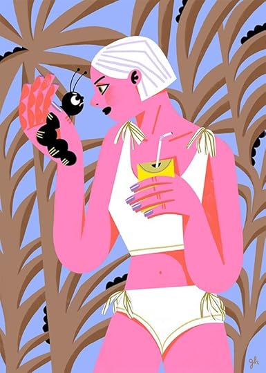
I don’t remember exactly where I discovered this German artist’s work, but it was around a decade ago. He is brilliant with detail and texture, but the colors have always really drawn my attention. Most of his paintings have a complex amount of detail, and without using line to separate competing objects, the colors have to balance out and he does this with such skill. So good! And his greens! He uses this sort of…old kelly green that I love.

Montblanc, Book 2, © Olaf Hajek via commarts

Film Festival France, environment, © Olaf Hajek, via commarts

Glow, © Olaf Hajek
I found Maira Kalman’s work when I was gifted The Principles of Uncertainty after I graduated college. It was the first time I remember falling slowly in love with artwork. I wasn’t naturally drawn to the style (my taste was immature!) but the writing & sentiment were deeply touching. I read it again and again, slowly appreciating the colors, the textures, the world she paints. I think that makes me love it more in a way - she’s now one of my favorite artists. It’s inspiring that some of her work seems to be painted from life or from photos - but it’s totally hers. The colors are vivid and striking and aren’t beholden to actual colors in the world, something I have to remind myself. She also seems to be able to use any color in the paint box. Other favorite books are Girls Standing on Lawns and My Favorite Things

Women Holding Things, ©Maira Kalman

From her book, Women Holding Things, ©Maira Kalman. (PS look at that magenta!!)

Marie-Laure de Noailles in Her Paris Salon, 2019 ©Maira Kalman
I love JooHee’s work! Everytime I look at her website I wonder what I’m doing with my life - it looks like she’s having way more fun than me, but with such playful skill and precision! Endlessly impressed with many facets of her work, one thing that always sticks out to me are the colors. Hearing ‘limited palette’ can seem boring but her work is proof of the opposite. It’s cohesive, yet wild and interesting, inspired by her experience of traditional printmaking. Of course, not all of work is limited color, much of it is full color, yet she always seems to know exactly how much colors to add to her rich compositions.
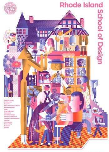
Poster for RISD, ©JooHeeYoon

University of Oregon Music Dept. Poster, ©JooHeeYoon

The New York Times Sunday Review, ©Joohee Yoon

Chobani + AA&PI Heritage Month, ©JooHeeYoon

If you want a more, I’m sharing an acrylic gouache painting video today on The Dessert Club. You can watch this painting comes to life, while I share tips for mixing and muting colors, as well as keeping a palette harmonious.
+++
As always, if there’s an artist, printmaker, filmmaker, etc that uses inspiring color in their work, leave it in the comments below! I love learning about more artists from your suggestions.
I hope your April is filled with much inspiration and joy. I’m off for a week to visit Vancouver, BC with a friend - my first non-work vacation in a while! I’m in desperate need of good food, art museums, music, people watching, and visual stimulation. Have a favorite place there I should visit? I’d love to hear it!
Ok - I’ll see you back here in May with another round of art celebration. Thanks, as always for being here!
xo, Becca
March 1, 2023
MARCH | Celebrating Simplicity

Happy March my sweet loves!
Here in Michigan, that means dirty snow, rain and sleet, maybe a few days of sunshine. Once the snowdrops pop up though, everything will begin to feel promising.
Today I’m happy to be back with you for another installment of my Yearlong Celebration of Things I Love About Art (I’m keeping the name!) This time, I’m breaking free of the elements of art and sharing a facet I’m drawn to but can hardly ever achieve in my work: simplicity. We could get technical and talk about the artistic element of space, which I almost did, but space is so complex/varied that I thought it best to focus on negative space, or, you can think of it as room to breathe. I do think space is a really important consideration - NYT/KQED Art School has a helpful video on all the ways space can be used in art and it’s actually pretty fascinating! Opened my eyes to all the tools available to us, from object placement in a painting to physical space, to focus/blurring in photography to flatten or create depth. Like I said, it’s varied!
Today though, we’re celebrating simplicity in art.
In my own work, I can achieve this when I’m working with line on a white background. But when I’m painting or considering layouts for picture books, my impulse is to fill every square inch. It’s counterintuitive, but simplifying is more difficult than adding everything but the kitchen sink, because it requires us to pair back and focus on only the essential. Not only do I delight in details and extras, but keeping things really simple makes me feel like I’m not proving myself or providing enough to the project. I just think…is this enough? I’m sure that feeling is shared by many.
Here are some simple pieces! You can click on them to learn more about them.

An ink drawing on an envelope for a group exhibition at Giant Robot in LA. " data-lightbox-theme="light" href="https://images.squarespace-cdn.com/content/v1/507477a584ae87aa2d96202b/1677240744055-K73H46Y4T0C0BY12TQM5/mousestrawberry.jpg" role="button" class=" image-slide-anchor js-gallery-lightbox-opener content-fill " > View fullsize

I did this small line drawing after visiting a salt factory in Japan and eating salted chocolate pudding. I had plans for this character that never developed but every time I see her.. I think…ah! I need to revisit this! Micron in a sketchbook. " data-lightbox-theme="light" href="https://images.squarespace-cdn.com/content/v1/507477a584ae87aa2d96202b/1677239805233-NP3HATESA9R94KTM82IQ/KURA_kitchen1.jpg" role="button" class=" image-slide-anchor js-gallery-lightbox-opener content-fill " > View fullsize

A tiny neocolor crayon drawing on newsprint for a larger illustration celebrating a collaborative project I was doing with a couple other artists. " data-lightbox-theme="light" href="https://images.squarespace-cdn.com/content/v1/507477a584ae87aa2d96202b/1677241175850-89QWAT0NTY7QS5E77SQU/plantsketch.jpg" role="button" class=" image-slide-anchor js-gallery-lightbox-opener content-fill " > View fullsize
Created for a series of blog posts I did about Japan when we lived there. Ink and Colored Pencil on Paper. " data-lightbox-theme="light" href="https://images.squarespace-cdn.com/content/v1/507477a584ae87aa2d96202b/1677241175730-ZP3J1OSIH8SSPW73IKKK/Mochi.jpg" role="button" class=" image-slide-anchor js-gallery-lightbox-opener content-fill " > View fullsize

Created for 3 Point Perspective Podcast. Cut paper, neocolor crayons, and yarn on vintage paper. This was a fun one to put together. I find that using large shapes of cut paper helps me to simplify and cut out superfluous details. " data-lightbox-theme="light" href="https://images.squarespace-cdn.com/content/v1/507477a584ae87aa2d96202b/1677240971362-H1B971FGDIFZJ2D041K0/RedScarf_3PP.jpg" role="button" class=" image-slide-anchor js-gallery-lightbox-opener content-fill " > View fullsize
All in all though, it was actually tough to find simple work in my portfolio. Maybe that’s why I love other’s simplicity in their work - it doesn’t mean I have to always achieve it to appreciate it. I definitely learn from others in their use of white/negative space, especially in books. Gotta love some well intentioned breathing room!
SIMPLICITY: INSPIRATIONS“Simplicity is the ultimate sophistication” - Leonardo da Vinci
JUNGHO LEE
Jungho Lee is a Korean artist based in Seoul, who works on a variety of media and publishing. While I’m new to finding his work, it immediately stopped me. There is so much sophistication and restraint in his work, not to mention calming colors and textures. Really beautiful stuff. Also his logo/signature! Books include Eighteen Bookshops and Promenade.

“Ark” ©Jungho Lee, 2015

“Dona Eis Requiem” © Jungho Lee, 2013
I actually found his work by hunting down the artist responsible for this piece above. It’s so charming. Looked for a print but it seems impossible to find!

“Heritage” © Jungho Lee, 2015
LISA D’ANDREA
I found this Italian artist’s work through the Enchanted Lion edition of A Most Mysterious Mouse, written by Giovanna Zoboli. I love the book’s design and use of negative space, and while I can’t find a ton about the artist online, I wanted to share some spreads from the book. It looks as though it’s rendered in colored pencil. The layouts and use of space are so clever! *Book photos from Enchanted Lion.

A Most Mysterious Mouse, Written by Giovanna Zoboli, Illustrated by Lisa D’Andrea, Translated by Antony Shugaar
View fullsize
View fullsize

View fullsize

JULIE MORSTAD
Surely a staple on your bookshelf if you’re into picture books. Julie Morstad has been illustrating for quite some time and has a host of books under her belt, the latest of which TIME IS A FLOWER is brilliant. It’s in that book, as well as IT BEGAN WITH A PAGE: How Gyo Fujikawa Drew the Way, that I really tuned into the use of layouts and negative space within her books. It pulls you into certain details while maintaining a sense of order and calm, something I think is much harder than it looks.

Time Is A Flower © JulieMorstad

Time Is A Flower, ©Julie Morstad

It Began With A Page, ©Julie Morstad, Written by Kyo Maclear

It Began With A Page, ©Julie Morstad, Written by Kyo Maclear
JILLIAN TAMAKI
In my mind, Jillian Tamaki can draw anything in the world and with such emotion, flow, and finesse. And somehow…somehow!…she also has the magnifect skill of restraint and order. Her layouts are varied, interesting and masterful, and her use of negative space only enhances her brilliant drawings. I sound like a fan girl. But I am! I wanted to share My Best Friend (written by Julie Fogliano) a stunning picture book with great negative space/layouts, as well as another editorial piece from The New Yorker.
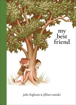


My Best Friend, written by Julie Fogliano, illustrated by Jillian Tamaki.

©JillianTamaki
I found German painter, Michael Sowa’s work online and instantly fell in love with the cover of Esterhazy and The Rabbit Prince by Irene Dische and Hans Enzensberger. I haven’t found the book in person, but the illustrations I have pinned online are always a welcome inspiration. These tiny rabbits in a big human world! The space around them creates such a surreal and vulnerable atmosphere. Also an interesting fact - Sowa’s paintings were on set of Jean Pierre Jeunet’s Amélie!

Esterhazy and The Rabbit Prince: Irene Dische, Hans Enzensberger, Michael Sowa.

Esterhazy and The Rabbit Prince: Irene Dische, Hans Enzensberger, Michael Sowa.

Esterhazy and The Rabbit Prince: Irene Dische, Hans Enzensberger, Michael Sowa.
Oh okayyyy one more below because I just really love this painting. This one has simplicity but is also quite complex in terms of space.

HORACE PIPPIN
Horace Pippin was a self taught artist, who started painting after his return home from WWI, where he was shot in the shoulder by a sniper. He said of this experience, that WWI "brought out all the art in me”. He illustrated and painted scenes of war, African American genre paintings - scenes from everyday life, as well as biblical paintings. I love his work because while they are rich and textured (and many of them complex) they also have a clear and direct simplicity about them. He remarked that he would see a painting in his head and if it seemed worthwhile to paint it, then he would. I feel that matter of factness translates directly into the final paintings.

©Horace Pippin, Floral Still Life, ca. 1944, oil on board, 10⅛” x 14⅛”.

©Horrace Pippin, Self-Portrait II, Oil on canvas, adhered to cardboard, 8 1/2 × 6 1/2 in. (21.6 × 16.5 cm) via MET

©Horace Pippin, Domino Players, 1943, Oil on composition board, 12 3/4 x 22 in.
Another staple in the picture book world, Geneviève Godbout has carved a singular magical world of soft pastel and colored pencil. The textures are velvety and dreamlike, the layouts are masterful, and the characters are always so full of charm. I almost placed her work in my celebration of shape (to come!) but I think the atmosphere she creates with the texture and layouts give the viewer room to breathe - a warm and comforting sigh to boot. Check out her books here.

What’s Up Maloo? By Geneviève Godbout

©Geneviève Godbout
Below, one of her latest pieces from the DUO exhibition at Gallery Nucleus this past month. It’s so charming!! I can’t even.

Mama Bears, ©Geneviève Godbout
*Sigh*
Isn’t it comforting to see work with so much simplicity? One would think it’d be effortless to make, but it’s such a refined skill to pair down to the essential and leave room for the subject and viewer alike. I’m curious if you have any artists or works that you feel highlight simplicity? I love to see all your suggestions, so be sure to leave them in the comments below.
If you want a little extra…

This month on The Dessert Club Patreon, I share four books from my bookshelf and discuss the use of negative space. I also do a painting demo of this month’s Blog illustration and share three helpful insights on simplifying your work.
In other news….
I never shared with you the new painting I did for the DUO Exhibition at Gallery Nucleus last month. We were paired with a partner (mine was Joey Mason) and we were to both illustrate the same word (ours was Migration) and work from the same color palette.
My piece, titled My Great Expedition was done in gouache and ink on Arches. At first, I did many sketches of actual animals migrating but none felt natural to me. Instead I turned back to a piece I had started at Milkwood last summer, in which a girl leads a caravan of animal characters to safety by the light of a candle (thanks to Cecilia Ruiz who had the suggestion of making the candle huge!) I restarted the piece and this time set it in the theatre, paying homage to Degas and Lautrec (my highschool art inspirations) by adding the orchestra at the bottom.

This was actually quite an emotional piece for me to make - it’s about my childhood, and is one of the first paintings I’ve done where I place myself amongst the animals I paint. (I even had that red velvet dress as a child!) I hope to work on more like this in the coming months.


The piece is sold but I’m considering a limited run of prints on this one. Keeps your eyes peeled!
Okay! Thanks for being here, for reading, and for all of you who’ve been sharing your suggestions for artists you love. It’s been inspiring to share/find new work!
Stay warm, and I will see you next month!
xo,
Becca
February 1, 2023
FEBRUARY | A Love for Texture
 A LOVE FOR TEXTURE
Texture is the most enduring and ubiquitous underpinning of form... certainly a calming, meditative and appealing world for both the eye and mind.
- Lynda Lehmann
Happy February loves!
It’s the last month of Winter in Michigan…technically…though it won’t feel like Spring for months. This past week it snowed a TON and it’s beautiful and glittery. The snow, in all its glorious forms, is a lovely way to think about today’s topic: TEXTURE. In a basic sense, a snowflake is water frozen into ice crystals, surrounded by air. Depending on conditions of moisture or temperature though, we can get giant fluffy snowflakes the size of quarters or we can get a mist of tiny sparkling flakes. We have blizzards, sleet, snow that fluffs into dust, and snow that packs into dense snowballs. The same is true with paint - and a host of other materials - from just one tube, so many textures are born!
As part of our Yearlong Celebration of Things I Love about Art (Should I come up with a snappier title?!) this month we’re talking about texture. I adore texture. Texture in art refers to the surface quality of a painting or sculpture, but it also relates to a feeling that that surface imparts (since we can’t go around touching paintings in a museum - we can see with our eyes what a texture might feel like.) Think of words like bumpy, soft, sharp, slippery, rough, or sticky. Learn more about the technical definition of texture.
Below are some of my paintings from various book projects. You can click on each one and learn a little bit about the texture in that piece. I love adding interest through paint strokes, mark making, even what paper I’m printing/painting on.
I really found my groove with textured painting in this book. If you look closely, however, you’ll see that the turtle was painted in digitally. I used procreate to edit some of the pages but it was important to try and keep the texture consistent. It’s more work for me to digitally paint than to actually work with paint, so it’s never my preference. " data-lightbox-theme="light" href="https://images.squarespace-cdn.com/content/v1/507477a584ae87aa2d96202b/1674834615675-QOR1S4XJT48O6NF1TKD7/bagc_2_3_finalspot+copy.jpg" role="button" class=" image-slide-anchor js-gallery-lightbox-opener content-fill " > View fullsize
Here, I pulled into the linework of a green colored pencil atop of a textured paint surface. This helped keep the line work very rough and added to the playful texture. This was painted on arches paper which made the colored pencil even more rough. " data-lightbox-theme="light" href="https://images.squarespace-cdn.com/content/v1/507477a584ae87aa2d96202b/1674834615294-9P9PU4DOUSUTB6ZN1OT2/LITERATI_Fullws_det3+copy.jpg" role="button" class=" image-slide-anchor js-gallery-lightbox-opener content-fill " > View fullsize

This book was created digitally, but it was important to me that there was still texture, in the lines but also the colors. I wanted it to feel printed and old, rather than flat. " data-lightbox-theme="light" href="https://images.squarespace-cdn.com/content/v1/507477a584ae87aa2d96202b/1674834647932-S26NG973I6LW3XE305Y2/12+copy.jpg" role="button" class=" image-slide-anchor js-gallery-lightbox-opener content-fill " > View fullsize
This was a test for the book, but I love the texture and wildness of this little painting. This was done in acrylic gouache, colored pencil and water soluble crayons on vintage construction paper. " data-lightbox-theme="light" href="https://images.squarespace-cdn.com/content/v1/507477a584ae87aa2d96202b/1674834616656-VLUR660KKIRXFF47ELFY/LOUJAIN_Storyboard_2+copy.jpg" role="button" class=" image-slide-anchor js-gallery-lightbox-opener content-fill " > View fullsize

A personal painting of a random person and my dog Mori who I love so very much. The texture here was created by fast painting on arches paper. This painting was created in 2-3 hours - which never happens! Was just a fluke flow painting. Wish they happened more!" data-lightbox-theme="light" href="https://images.squarespace-cdn.com/content/v1/507477a584ae87aa2d96202b/1674834739630-XLBWPLSBG7VJPFFQOZJK/morningtinypawws_det1+copy.jpg" role="button" class=" image-slide-anchor js-gallery-lightbox-opener content-fill " > View fullsize
TEXTURE INSPIRATIONS
Károly Reich
I found Hungarian artist, Károly Reich’s work a couple year’s ago while searching for inspiration and he’s one I go back to again and again. The way he lets the materials just do their thing - almost like a child would, is so joyous. I return to his work again and again. Jama Rattigan has a ton of his works on one of her posts.
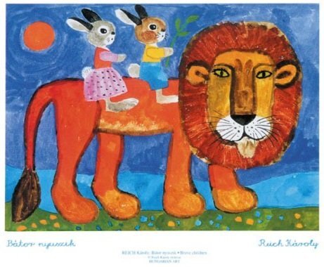


Károly Reich, Eternal Spring, Acrylic on wood panel
Jockum Nordström
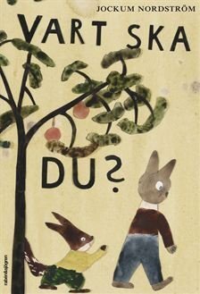
I found Swedish artist Jockum Nordström’s work while searching for book covers, and I stumbled upon Vart Ska Du? (below right) The painting was so watery and creamy (I won’t get into how much I love the naive nature) but I also love his collage work. A lovely way to add depth and feel is to work in collage.

Galleri Magnus Karlsson, Jockum Nordström. Europa, 2010, Collage on paper
Zinaida Serebriakova
I share this Russian painter’s work when I talked about Self Portraits last Summer. There is something so…akin to drawing and mark-making in the texture of her paintings which feel intuitive and purposeful to me. The textures in the dancer’s headpieces below are especially delightful - they almost feel like pastel.

Zinaida Serebriakova, Girl with a Candle (Self-Portrait), 1911 via Daily Art Magazine

Zinaida Serebriakova, Ballet Dressing Room. Snowflakes, 1923 via Daily Art Magazine
Gary Bunt
I love this series from British artist Gary Bunt. The man and dog’s shapes, the layouts, and the simple…I don’t know, stockiness of the paintings always stop me, but really…the texture! The stippled rough surface, the direction of the paint, mixed with a carving-in of details and lines. Ah! Aren’t they so sweet?

©GaryBunt, “Toast” 10 x 12”, 2022

©GaryBunt, “The Storm” 40x48”, 2022

©GaryBunt, “Each Little Flower” 40x48”, 2022
Komako Sakai
I first found Komako Sakai’s work in a MOE exhibition when we lived in Japan. Now everytime I see it, I feel nostalgic - not only for that time, but also because the images themselves are so classic. The dry brushing and thick layers of paint are palpable and lend to a somber but playful, timeless quality.

Komako Sakai, from The Fox Wish, 2017

Komako Sakai, from The Velveteen Rabbit (reminaged), 2012 (originally by Margery Williams)
Matthew Stone
My husband was recently listening to the Magdalene record by FKA Twigs and while I do love the music, I could not get over the album art from artist Matthew Stone. It feels so painterly, but in a way I’ve never experienced. “Stone’s multilayered process, which oscillates between analog and digital, begins by painting on glass and translating images of his compositions onto the computer. “I make individual bust gestures, photograph them in high resolution, carve them out digitally, and work with various 3D modeling software to combine those images of paint in a way that suggests form,” he says.” Read more here.

Matthew Stone: FKA Twigs, Magdalene

Matthew Stone: FKA Twigs, Magdalene
Seohyun J. Nam
You may know this artist by the name Joanne Nam, or @inlander on Instagram. I’ve been following her work since the beginning of my career and it never ceases to astound me. It keeps getting better and better (if that’s possible). I’ve always loved the see the closeups of her texture - the paint strokes, and was lucky enough to see it in person once. Her latest painting on her site, Reverie, is bursting with textures - below, I’m sharing details but the whole painting is stunning.

Seohyun J Nam, The Lover and The Fighter, Oil on wood, 5”x7”, 2020

Seohyun J Nam, Reverie (detail) Oil on wood, 16”x20”, 2021

Seohyun J Nam, Reverie (detail) Oil on wood, 16”x20”, 2021
Last month, you all very much delivered on your suggestions for LINE inspirations. The comment section was full of great artists - lots were new to me. If you have artists your love who really play up texture in their work, feel free to leave them in the comments below.
If you want a little more, this month I’m sharing an in-depth painting video of this month’s blog illustration, January Bloom. This was painted in traditional gouache on Arches, and on Patreon you’ll find a in-depth process, a peek into the inspiration, as well as the color list, paintbrush info, etc. Find it all on The Dessert Club!


Ok! Thanks for being here as always! I hope you all have the loveliest start to February! See you next month!
xo, Becca
January 20, 2023
ACRYLIC GOUACHE RETREAT in SPAIN

Hi sweet friends!
I wanted to share with you a retreat I’ll be teaching July 5-12th this Summer!
I'm leading an Acrylic Gouache Workshop in the South of Spain. We'll stay at a private estate in Sierra de Grazalema, located in Spain's first UNESCO Biosphere Reserve, eating lots of fruits and vegetables and and painting them too! I co-taught a retreat last Summer with my friend Meera and we had the loveliest time so I can’t wait to teach in person again!

I would love to see you there! For more info or to book your spot, visit Uptrek. For any questions, contact contact@uptrek.com.
JOIN US IN SPAIN!January 1, 2023
JANUARY | A Nod to Line

"...the drawn line, more than the outline of shapes, can express rhythm, movement, light, space, and much more, as the artist grows an understanding of its handling and potential."
From Martin Salisbury’s new book,
Drawing for Illustration
, which I highly recommend
This year, I’m paying homage to everything I love about visual art.
Now that I have a bit of space from publishing deadlines, I’m falling back in love with art and the reasons I pursued it as a career. Each month I’m pick an element, theme, or asset of visual art to explore. Academically, you can study the elements of art and principles of design, and though mine will pull from those lists, it’s not my goal to cover all of them or even consult them. This is a purely indulgent adventure - choosing what I love, celebrating it, and finding work that accentuates it.
A NOD TO LINEI just love a good line drawing.
I recently listened to Doug Salati's Stimola Live event about Hot Dog (which should be on your list if you love line work or dogs or both yes please!) and he was talking about his decision to leave some of the characters in his book as outlines. He mentions (at the 50 min mark) Maurice Sendak’s books with Ruth Krause (I share one below) “They were just beautiful ink line drawings on the page with text, and that’s enough for me.” That sentiment about loving line and having it be totally fulfilling just resonated so deeply.
There is an implied line which can be made using color or shape or even eye contact between characters but I'm celebrating the visible line - the slow and steady pull of the hand - the quick and furtive stroke of a paintbrush. Mild and calm, energetic and wild - and everything in between.
I’ve been sinking my teeth (and hand) into line drawings lately - here are a couple from my sketchbook. A feast from Thanksgiving, and also a page of feelings all wrapped up into a line drawing.

View fullsize

View fullsize

View fullsize

One of the coolest parts about these posts, will for me, be seeking out and sharing inspiring work - a way for me to expand my visual library and seek out artists unbeknownst to me before. Here are some from contemporary artists that I love - and some historical pieces too.
LINE INSPIRATIONS
“Line art is one of the oldest art types out there, with first line art cave drawings dating 73,000 years backs. Needless to say, line art has drastically evolved since. Some of the world’s most prominent artists experimented with line art such as Leonardo da Vinci, Pablo Picasso, or in more recent years Keith Haring.”
-
Milica Jovic from Artacacia

©RomanMuradov

©RomanMuradov
ROMAN MURADOV - talk about a master at line work. And humor.
"I tend to draw everything 3-4 times in a row, and then spend hours delibrating between the versions, occasionally editing them together to get the perfect crappiness of line".

RDNL 2017/QUENTIN BLAKE via BBC

©QUENTIN BLAKE via Christie’s
SIR QUENTIN BLAKE
This can’t be an illustration blog post about line without the work of Quentin Blake. His hand is immediately recognizable and his drawings have wild amounts of energy and wit.
Watch him draw a Hornswoggler!

Mary Cassatt, Woman Bathing, 1890-1891
MARY CASSATT
Usually known for her paintings, I find her prints quite lovely - this one above is from a series of ten prints she did (in color) but this line work can definitely stand on its own (in my humble opinion!) Degas didn’t think so - or - rather he didn’t think a woman could pull this off. Upon viewing these, he said, "I do not admit that a woman can draw like that."
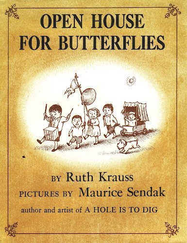
Open House for Butterflies, Ruth Krauss and Maurice Sendak
Harper & Row, 1960
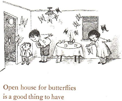
Open House for Butterflies, Ruth Krauss and Maurice Sendak, Harper & Row, 1960
MAURICE SENDAK
My friend Meera first introduced me to the books Sendak did with Ruth Krause and I fell in love with the line work - so simple, yet alive and believable.
Planning to see this show this month for my birthday!

©EdwardGorey
I don’t know if I can technically call this a line drawing? Who makes the rules?! All I know is that this is a drawing and it’s made of like a thousand lines so I think it qualifies!
Have you visited the Edward Gorey House?!

© Ben Shahn, Boy on Tricycle via MOMA

© Ben Shahn, Untitled Drawing Series, (1948)
BEN SHAHN
There’s a reason Ben Shahn’s work is so influential. I could seriously look at his drawings all day, frame them, wallpaper my studio…
The second, solemn image is from an Untitled Series created for Harpers regarding the Hickman trial in Chicago.

©SanaeSugimoto

©SanaeSugimoto
SANAE SUGIMOTO
I was introduced to her work from my friend Ginnie and every time I see it, it stops me in my tracks. While yeah it’s probably more than a line drawing, no one can stop me from putting it on the list! The way she handles delicate line work with large tonal red and black shapes. *chefs kiss*
AND one more for good measure!

Santo Sospir, with it’s "tattoos" by jean cocteau, Filippo Bamberghi via Town & Country

Weisweiller designed the interior with her friend and decorator, Madeleine Castaing, Marina Melia via Town & Country
The line work on the walls of Santo Sospir Villa from artist Jean Cocteau. (The story of how the villa came to be is also quite interesting!)

If you want a little more…
I created a video for The Dessert Club Patreon sharing ways in which I work with line - flowing, graphic, and energetic. I also did a timelapse of the banner illustration!
Was this fun? I think this was fun - looking at so many different works and giving a good nod to line.
In the coming months I can’t wait to discover more, share more, and explore the wonderful ways in which art moves us. Do you have any favorite line drawings, or artists who have a particular good use of line in their work? Share in the comments if so!
Happy New Year to you all - may it begin with the freshness of mint in a good chocolate cake.
Thanks for being here - today and every month!
xo,
Becca
December 1, 2022
Getting Through A Creative Lull so You Can SHINE.


Happy December loves!
This is a bit of a personal post but I hope you find comfort in it all the same. I wanted to share ways to feel more confident in our work but there are so many factors at play with each individual, so instead I thought I’d share a couple things helping me through a creative lull. Perhaps you can relate.
Just last week, snow fell here in great plumes. It piled high around the house and our porch was windswept with white. The back roads were iced over and street lights illuminated swirls of snowflakes. It was magical. The weather has since warmed again, the snow melted, and a recent gloomy fall rain saturated everything in soggy grey. It feels like a setback - we were really getting into winter!
I can though, appreciate the grey lapse and what it offers even as I anticipate the return of snow. This is something I've come to accept in the process of making art. The lull - the empty, uncomfortable phase of the creative process where you wait for something magical to appear. It's one of the questions I get most often: how do you create work when you just don't feel like it? I'll be honest, I've been feeling pretty insecure about art the last couple of months. I show up because it's my job and I am committed to my work. I'm inspired, I guess, but not confident and I have so many doubts. I thought it'd be helpful to share them today but I realized I did that last December! Anyway, it’s not helpful for me to wallow too long.
Instead, I'm going to focus on moving through the discomfort, sharing three mental shifts - ways I’ve reframed how I think about myself and art. First - I understand, partly, where my lack of confidence is coming from and taking the time to articulate it is key. I think it’s a growing pain - and we’re always growing into new versions of ourselves. Second, I can shift my perspective and understand my work from a different lens. And third, I can appreciate the big open space that I've carved out for myself, filling it slowly, with purpose. All of these tools help ensure that I keep making art even when I don't want to (and believe me, sometimes I don't want to!)

Change is always hard. Moving is no exception. We've moved a lot and every time we show up in a new place, I'm knocked off my feet. Returning to my home state of Michigan, I thought, would surely be stabilizing. A sense of home and foundation I'd longed for. Turns out, moving home has somehow thwarted my confidence and I feel like my whole career has been a dream I was almost too busy to appreciate. The potential for creativity is here...I can feel it humming beneath the surface, but something unwelcome is here too. It's my childhood self, poised on the outside, but forever feeling fraudulent below. Coming home can do that to you. Painful memories, family drama, all the reasons it felt so freeing to flee - dulled by time but still present.
This coincides with a shift in my career. I left my agent in 2020, and have since been trying to reconfigure my work. I've turned down projects to make space for my own work, and luckily, I've found a way to do just that (I couldn't do it without you or my Patrons on The Dessert Club so thank you.) Even though I've arrived at the big open space I'd been moving towards, it's quiet and daunting. I rarely get emails or commissions. Even if we don't want to go to the party, we want to be invited right? It's ridiculous! Some days in my rural home studio, I feel lonely, washed up, like old news. The ways in which I've garnered my worth - being so busy I could hardly think, those days are behind me for now. I'm growing into something softer, something older. It feels strange to grow up...I still feel twenty some days, and then I see a nearly 37 year old woman in the mirror. What feels right, is taking time to let everything settle, and to see what blossoms from there. Just a simple growing pain.
Being in a lull sucks - it really does! But it usually means growth and change if you can see it through to the other side. Most of my breakthroughs come after a moment of creative despair, so hold tight and push through!
Growing as an illustrator is hard because we’re always in this middle ground - what we’ve done before - what someone is hiring us for - and what we want to do next.
I talk about moving into new territory here!

One of the ever present notions that gnaws at me is the fact that I don't often have fun while I'm making work. Or let's just say, it's rare, to be so wildly enamored by the process. I shared this recently in a post on The Dessert Club and one of the Patrons shared her perspective and I can't stop thinking about it. Essentially she said she'd given up on the notion that making art should be fun. The enjoyable part to her, was the sharing of the work itself, not the process of making it. Which totally makes sense! We all make art for different purposes and while the process is rewarding, it's not without struggle. Making art (especially for money) is not always going to feel euphoric.
Gratitude is essential and it's something I focus on. It can though, be the first thing to go out the window when our perspective is skewed. Scrolling through feeds of others traveling the world, cuddling babies, joining art collectives, living in cities with museums, having perfect houses, getting dream jobs and on and on. My gratitude disappears in these moments and I'm left feeling jealous and bitter. When I stay mostly off social media, my immediate surroundings become brighter and my voice seems more clear. This is an easy fix but yet I still fall into the scroll when I’m lonely or feeling less than, which, newsflash, makes everything worse.
Sometimes the lack of confidence we feel has nothing to do with the work at all but how we're approaching it. It helps to consider what we do love about the job or task, and focus on that. (More on motivation next month!)
If we spend endless hours comparing our lives and work to others, we're going to come up short. But take time to think about where you are and how you got here, not just how far you get to go. I have SO much to be thankful for - just to be making art for a living - is something I don’t take for granted.

Not death! Not the Universe! I'm talking about that blank paper feelin! You know it. When everything is possible and simultaneously terrifying so instead you rewatch Steel Magnolias (Oh Shelby!) or bake a wildly ambitious cake - anything but facing the BIG EMPTY SPACE. For years, I've worked to check off commitments so I could let my work flourish in a way that felt more true to me. I've been lucky working in children's publishing but have always felt something was missing. It was never my truest passion to illustrate other author's words for kids. But since everything has shifted and the last two contracted books are out in the world, and I'm technically free, it's kinda scary! I have so much to do that I almost don't know where to begin so I procrastinate and feel even less confident about tackling everything. I'm motivated by external pressure (hence me showing up here on the first of every month.) When no one is expecting anything from me, I wallow and overthink everything.
When my days are wide open - I am my client. I have to schedule out things, put learning in the calendar, be very focused about my deadlines and when I want to put things out in the world. And to really kick myself into gear, I’ll make commitments like shows and such that I know I’ll have to make work for.
You might not have a whole big empty space ahead of you. It might be a little residency, or a Summer off, or a week to create something you want. My advice would be to make something little by little and watch it grow instead of getting overwhelmed with the void.
If you’re trying to organize/plan/schedule new projects, this post might be helpful!
If you find yourself in a similar lully boat, just know it’ll pass. But it will pass with determination, and quite frankly, a little bravery. You have to show up anyway - it’s too easy to avoid making work because you’re scared of it. Hop back in the ring, put pen to paper and before long, I know you will SHINE.

Want a little extra shine? I put together a painting video of this month’s illustration. I worked with traditional gouache, a bit of acrylic gouache, and…a christmas ribbon! Find it on The Dessert Club!
OTHER NEWS
Huge thank you to everyone who bought a print!! Makes me very excited to be able to offer more products/prints/paintings. I love seeing them all framed up in your homes too! If you missed the sale, there’s just one day left to place an order. My shop will be closing tomorrow, Friday Dec 2 at midnight!
 SHOP PRINTS!
 Ok loves - thank you SO much for being here every month. It means the world. I hope wherever you are, your week is winding down into a magical beginning of December. Drink lots of cocoa for me!
I’ll see you again soon. Until next time,
xo,
Becca
November 1, 2022
MILKWOOD

A hand painted duck. A row of miniature houses and dressers. Old picture book treasures, chocolate pudding, and original art on the wall of my whale themed room. The candle lit dinner. A toast bar with handmade jam. Hundreds of sumi ink drawings on the floor, ducks feasting on cherry tomatoes, and chinese lanterns in the dark. Morning conversations, midday critiques and night time presentations.
I would think it’d been a dream if I hadn’t taken photos.

View fullsize

View fullsize

View fullsize

View fullsize

View fullsize

View fullsize

View fullsize

View fullsize

View fullsize

View fullsize

View fullsize

This past August, I was wildy lucky to visit MILKWOOD - Sophie Blackall’s Creative Retreat for the picture book community, which she runs with her husband Ed, and their family. The four day retreat included a workshop from Cecilia Ruiz and Doug Salati, and in total, there were ten of us in the group of students. I can’t tell you how much I enjoyed getting to know each and every person - I still feel like I could pinch myself. Back in my studio, I’m missing these gems! The sense of care and intention and community I experienced there is of a special kind. Can I live there? Can Milkwood adopt me? Hopefully…

Until then, I’ll hold onto fond memories - and some I’d like to share with you! Here are some highlights and inspiring bits from the trip.
THE PLACE
Photo: Milkwood
The farm is set in the Catskill Mountains in Upstate NY - a stunning area I’d never been to but had heard so much about. My friend Ginnie lives in Syracuse so I visited her and we rode together, as we both attended the workshop. The barn was built in the 1850’s and was a working dairy barn until 2006 which is wild. Sophie gave us a presentation so we could see the before and after, and it’s mind blowing. Here’s a little peek on their Instagram if you’re interested…
I could have spent every waking minute snapping photos of the charm but I wanted to appear somewhat composed and we had drawings to make! Below are some of my favorite details of the place. I don’t think a square inch of this place escaped Sophie’s vision and it’s all the more magical for it.

View fullsize

View fullsize

View fullsize

View fullsize

View fullsize

View fullsize

View fullsize

View fullsize

View fullsize

View fullsize

View fullsize

View fullsize

View fullsize

View fullsize

View fullsize

THE PEOPLE
If you’re into picture books, you know Sophie’s work. She has a huge amount of titles under her belt - mostly for children (where she’s earned two Caldecott Medals) but she’s also done adult books and collaborations. She’s also, I’ve learned, very funny, hospitable, humble - and - a duck whisperer and incredible cook. Her newest book, Farmhouse is mind blowing - the amount of painstaking detail. We were lucky enough to see the originals when we visited!
View fullsize
View fullsize

View fullsize

The Workshop we did (more on that in a bit) was taught by two of the coolest and funniest people currently living: Doug Salati and Cecilia Ruiz. Not only are they both skilled and passionate about their work, but they’re great teachers. I wish I could share a studio with them - I’d be simultaneously inspired to work but also laughing so hard that I get nothing accomplished.

Doug and Cecilia! Photo from Sophie
I was so happy to meet the other incredible students - each so talented and curious and warm. It was a huge array of work and styles - made me miss being in classes with others. I’d love for you to meet them and see their work:
Brooke Smart
Suzanne Kaufman
Grace LaPrade
Ginnie Hsu
Jenny Dupont
Meghan Carey
Veronica Jamison
Kate Meldau Cummings
Nicole Michels

Look at this crew! Photo from Sophie
THE WORKSHOPPOINTS OF DEPARTURE - The Workshop! We did three full days of a workshop - SO many drawings! We each brought pads of paper that could be easily torn out as we were working with sumi ink. We’d each written words out the night we arrived and those words were used as jumping off points for quick drawings. If I remember correctly, we had one minute each to do these drawings - whatever came to mind first, no time to overthink (which was very nice for me!) The second exercise, we did quick drawings based off images that the instructors presented, and the third was that we did memory lists and writings and made drawings based off of those. In the end, we made (or started) a final image and had a group critique. OH how I love a good crit!
View fullsize
View fullsize

View fullsize

View fullsize

View fullsize

View fullsize

The final day, we did text & image, where we paired a seemingly unrelated text with an image to see how far you could stretch a story - which was really cool. It’s so important to say something in the image that you’re not saying with your word - it adds humor and a potential space for unspoken curiosity or understanding. We also warmed up that day by drawing each other which was so fun!
 GRATEFUL
There was much to love about my time there - from the camaraderie to the environment, from the food to the conversations. A highlight of my whole career for sure. If you get the opportunity to go - GO!
A couple more little moments and memories…

View fullsize

View fullsize

View fullsize

View fullsize

View fullsize

View fullsize
View fullsize

View fullsize

Thank you to Sophie, Ed, and the whole team at Milkwood for making such a place exist in the world. And thanks for Doug and Cecilia for leading the best workshop!
To learn more about Milkwood and their upcoming retreats, you can sign up for their newsletter here!
For a limited time, I’m opening my shop with Mushroom Theatre Prints!
Signed Giclée Prints available in 8x10” & 11x14”, shipped worldwide.


SHOP NOW
I hope everyone has the loveliest November!
I’ll be here (hopefully) busy shipping prints, visiting Syracuse University for a lecture & workshop, and visiting my sister-in-law in Chicago for Thanksgiving weekend - she’s ordering a vegan roast and scarlet pie!
Thanks for being here every month - means the world to me.
xo,
Becca
Rebecca Green's Blog

- Rebecca Green's profile
- 79 followers

