
APRIL | FOR THE LOVE OF COLOR

Happy April little quiches! It’s Spring!
Can you feel it? Almost? Here in Michigan, the weather is confused but there are days of Sun and I’m ready to bloom into a new season.
Soon, the white, grey, misty palette of Winter will blossom into a display of a hundred fresh greens, pinks and yellows. A perfect month, in my humblest opinion, to celebrate COLOR in art.
You know the drill - we’re here again for the fourth installment of my Yearlong Celebration of Things I Love About Art. (If you’re new here, you can check out line, texture, and simplicity.) This month though, we’re swimmin’ in color. From limited palettes to full spectrums and everything in between. Color is the thing I feel most intuitive with as an illustrator (even though I can’t for the life of me pick out house paint colors or colors on a screen.)
I’ve talked about color on the blog before - in this lengthy Color Palette Q+A post, which is more of a technical peek into my process vs today’s more inspirational post. That said, I will share some of my work here which showcase an array of color approaches.

Around this time (2014) I went through a big ‘dusk’ phase, turning everything into a purple evening sort of palette. " data-lightbox-theme="light" href="https://images.squarespace-cdn.com/content/v1/507477a584ae87aa2d96202b/1678826586286-YSOBD2OU9U1AYN1LBM36/TPL1.jpg" role="button" class=" image-slide-anchor js-gallery-lightbox-opener content-fill " > View fullsize

Around 2016, I was hired for my first chapter book, The Unicorn in the Barn. I learned a ton about working in black and white, and it really helped me pare back on limited color palettes in the future." data-lightbox-theme="light" href="https://images.squarespace-cdn.com/content/v1/507477a584ae87aa2d96202b/1678826609671-KVJTW9WVZSV9T774QOPK/image-asset.jpg" role="button" class=" image-slide-anchor js-gallery-lightbox-opener content-fill " > View fullsize

A limited palette of black, coral and green (though I probably added a little white for the shirt - with a touch of coral and black.) Around this time, 2019, I really started to hone in on limited palettes in my paintings. " data-lightbox-theme="light" href="https://images.squarespace-cdn.com/content/v1/507477a584ae87aa2d96202b/1678826912293-NYHYBBUJCT6FARCJVUN9/WoodenSummerFINALws.jpg" role="button" class=" image-slide-anchor js-gallery-lightbox-opener content-fill " > View fullsize

This is one of my favorite paintings I’ve done - in a wild couple hour flow, this painting was born. I share it because I’m not using black or sepia in this palette, which keeps it light and alive in a glowy sort of morning theme. " data-lightbox-theme="light" href="https://images.squarespace-cdn.com/content/v1/507477a584ae87aa2d96202b/1678827086768-48DCKUVKYO49O2Z5NI5X/morningtinypawws.jpg" role="button" class=" image-slide-anchor js-gallery-lightbox-opener content-fill " > View fullsize

The colors in this book (and all my books) are really important - pulling on cultural, historical, and emotional cues. I work for a long time and often test many color palettes to make sure it’s a good fit. " data-lightbox-theme="light" href="https://images.squarespace-cdn.com/content/v1/507477a584ae87aa2d96202b/1678827348985-9M7BPS22D7ERHPSJD1WC/ABFFH_12_13_FINAL2.jpg" role="button" class=" image-slide-anchor js-gallery-lightbox-opener content-fill " > View fullsize

Also I just have to put this here because I’m not sure how I feel about it….
The Pantone Color of the Year is….MAGENTA. VIVA MAGENTA to be exact. Does this mean it’s finally time for me to embrace it? We’ll see. I doubt it!
“It is the eye of ignorance that assigns a fixed and unchangeable color to every object; beware of this stumbling block.” Paul Gauguin
COLOR PALETTES IN CINEMA
I’d be completely ammiss to not include color palettes in films. I’m not knowledgeable enough to list specific directors/creators (who even decides really, a color palette in a film? Is it the director?) But I am someone who pays attention to the colors - whether they are really in the forefront, or sort of hidden in the details. I’m always like…LOOK how many blues are in this scene! Or everything in that person’s house is yellow and green! Once you start looking, it’s hard to stop. Colors in film represent story and emotion but I often think of them as a screen or atmosphere - which is how I think about my own paintings. It often starts with the question - what does my atmosphere feel like? In some film scenes - see below, it’s almost completely monochromatic, like everything is bathed in a wash or blue or purple. This is what I love to channel while painting - bringing everything into the same atmosphere.
Find lots of movie color palettes at @colorpalette.cinema
Extra: This is sort of a different topic in color films, but super interesting!

Little Women, Directed by Greta Gerwig. Color Palette via @colorpalette.cinema

Little Women, Directed by Greta Gerwig. Color Palette via @colorpalette.cinema

Moonlight Directed by Barry Jenkins, Color Palette via House Beautiful

Lost in Translation Directed by Sofia Coppola. Color Palette via @colorpalette.cinema
MARY FEDDEN
Mary Fedden (1915-2012) was a portrait painter, stage and set painter for theatres, a gallery still life artist, and also a driver for the Navy, Army, and Air Force during the war. I stumbled upon this British painter’s work online years ago and am a huge fan of the way she handled colors. I especially love her still lifes. The way she used black is quite clever - black paint can often muddy colors but she used it wisely and specifically. Also the color/tonal variations in her paintings are so subtle and natural. I have to guess she understood color on an intuitive level.

Striped Lilies (1978) by Mary Fedden

Red Jug (1968) by Mary Fedden

By Mary Fedden
WALTER PEREGOY - COLORIST FOR WALT DISNEY’S 101 DALMATIONS
I had to search for who was responsible for the colorist and background art in 101 Dalmations. All I knew, was that the color always struck me as genius - along with the background work for Sleeping Beauty (these are my two fave Disney movies). Turns out, he was involved in both films! The colors are so vivid and play a huge part in the story telling. There’s just this…worldbuilding, where the scenes feel cohesive, classic, and under the same lighting/atmosphere. Swoon. They don’t make movies like this anymore.
If you want a deep dive of the colors/scenes in 101 Dalmations, holy cow, here’s one.


I don’t remember exactly where I discovered this German artist’s work, but it was around a decade ago. He is brilliant with detail and texture, but the colors have always really drawn my attention. Most of his paintings have a complex amount of detail, and without using line to separate competing objects, the colors have to balance out and he does this with such skill. So good! And his greens! He uses this sort of…old kelly green that I love.

Montblanc, Book 2, © Olaf Hajek via commarts

Film Festival France, environment, © Olaf Hajek, via commarts

Glow, © Olaf Hajek
I found Maira Kalman’s work when I was gifted The Principles of Uncertainty after I graduated college. It was the first time I remember falling slowly in love with artwork. I wasn’t naturally drawn to the style (my taste was immature!) but the writing & sentiment were deeply touching. I read it again and again, slowly appreciating the colors, the textures, the world she paints. I think that makes me love it more in a way - she’s now one of my favorite artists. It’s inspiring that some of her work seems to be painted from life or from photos - but it’s totally hers. The colors are vivid and striking and aren’t beholden to actual colors in the world, something I have to remind myself. She also seems to be able to use any color in the paint box. Other favorite books are Girls Standing on Lawns and My Favorite Things

Women Holding Things, ©Maira Kalman

From her book, Women Holding Things, ©Maira Kalman. (PS look at that magenta!!)

Marie-Laure de Noailles in Her Paris Salon, 2019 ©Maira Kalman
I love JooHee’s work! Everytime I look at her website I wonder what I’m doing with my life - it looks like she’s having way more fun than me, but with such playful skill and precision! Endlessly impressed with many facets of her work, one thing that always sticks out to me are the colors. Hearing ‘limited palette’ can seem boring but her work is proof of the opposite. It’s cohesive, yet wild and interesting, inspired by her experience of traditional printmaking. Of course, not all of work is limited color, much of it is full color, yet she always seems to know exactly how much colors to add to her rich compositions.
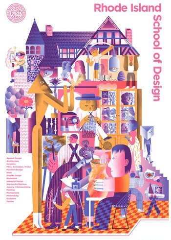
Poster for RISD, ©JooHeeYoon

University of Oregon Music Dept. Poster, ©JooHeeYoon

The New York Times Sunday Review, ©Joohee Yoon

Chobani + AA&PI Heritage Month, ©JooHeeYoon

If you want a more, I’m sharing an acrylic gouache painting video today on The Dessert Club. You can watch this painting comes to life, while I share tips for mixing and muting colors, as well as keeping a palette harmonious.
+++
As always, if there’s an artist, printmaker, filmmaker, etc that uses inspiring color in their work, leave it in the comments below! I love learning about more artists from your suggestions.
I hope your April is filled with much inspiration and joy. I’m off for a week to visit Vancouver, BC with a friend - my first non-work vacation in a while! I’m in desperate need of good food, art museums, music, people watching, and visual stimulation. Have a favorite place there I should visit? I’d love to hear it!
Ok - I’ll see you back here in May with another round of art celebration. Thanks, as always for being here!
xo, Becca


Rebecca Green's Blog

- Rebecca Green's profile
- 80 followers

