
Rudy Rucker's Blog, page 42
May 28, 2012
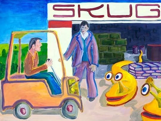
“Garden of Eden,” Mark Pauline, InDesign

I finished a new painting today, Garden of Eden.
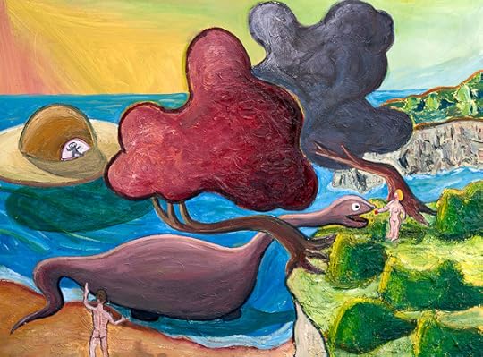
“Garden of Eden,” oil on canvas, May, 2012, 40” x 30”. Click for a larger version of the image.
I started this picture over six weeks ago, on April 9, 2012. My usual partner in crime, Vernon Head, went out for an en plein air painting session with me on the bank of a stream that runs into the south end of Lexington Reservoir . It was a pretty spring day, and we daubed away. The one thing that caught my attention the most was a particular bend in the trunk of a tree overhanging the creek.

So that made it into my painting, but not all that much else about the actual scene. As I’ve mentioned before, Vernon (see his lovely and realistic paintings) always kids me, “Why do you even go look at anything outside, when you’re just going to end up painting a dinosaur and a UFO?”
Well, it’s fun. I worked on this painting much longer than usual—but there’s no rush. Now I just have to start another one. It’s soothing to be out in my back yard smearing around the colors. So non-digital.

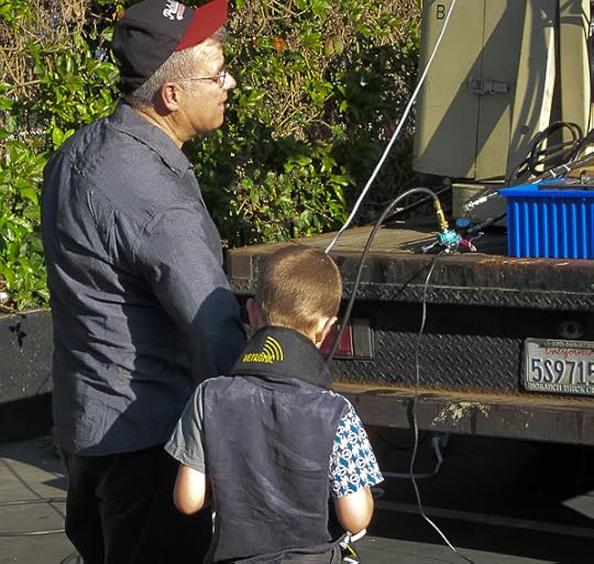
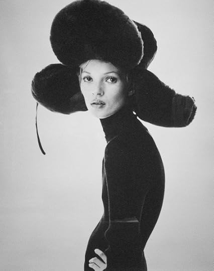
Speaking of artists, I saw the legendary SRL artist, Mark Pauline last week, demonstrating his latest creation in a parking lot outside the funky Tenderloin Phoenix Hotel, where an art show was taking place. (That’s not the Phoenix in the background, that’s the Federal Building with the IRS and the FBI, cowed (one hopes) by Mark’s claw.)

A few of the old hipster faithful were there: Karen Marcelo, V. Vale, and the artist Kal Spelletich. (Karen and Vale shown above.) Mark spoke on a panel before the demo, and talked about “quasi-criminal art”—an inspiring phrase. Then we went outside and Mark did a demo of his new “Spine Robot,” accompanied by his young son, who was eager to play with the controls as well. Here’s a photo of them.
Otherwise I’ve been busy getting my Transreal Books into POD (print on demand) paperback editions as well as in ebook format. I’m almost there. I decided that a Word file doesn’t really look nice enough to be sold as a print book, so I took a big jump and began using Adobe InDesign typographer design ware.
I found InDesign to be the hardest program I’ve had to learn since tackling the Microsoft C++ debugger about fifteen years ago. A learning curve like the face of Half Dome. And the official documentation, as is so often the case, is rather cryptic or even, to put it bluntly, sucks. Googling my questions helped a little.
My basic problem with InDesign—which I still haven’t resolved—is that I don’t have a mental model of the logical space that the program is “thinking” in. It makes a distinction between the “pages” (like of your book) and the “text” (which is what you’re putting on the pages) and to spice things up it has “threads” (which connect some, but not all, of the pages to each other) and “spreads” of, ideally two facing pages (but when you add pages, the new pages sometimes end up being a toilet-paper roll of right-hand pages all stuck together). Here’s the Adobe help page that “explains” it. I’ve read this page, like, fifteen times, and still no joy. The catch, I’ve been learning, is that some of the statements made on this page seem to be untrue or in some way misleading, and if I act on these particular statements, I freeze up my machine.
Never mind. I’m working around the dodgy bits. And with experience the mysteries will slowly clear away like morning mist in the summer sun.
The bottom line, in any case, is the InDesign does really beautiful text layout with clean justification (straight right margin) achieved by varying the spaces between the words, the spaces between the letters (kerning), and even (if you like) a two-percent variation in the actual sizes of the letters. So when you’re done—shaking with fatigue, desperate with confusion, your eyes glazed from scanning obscure screens and Googled-up help pages, your back a knot of pain—when you’re done, the layout looks really slick.
I’ve laid out three books now, and I trust that, as I move forward, it’s gonna be easier.
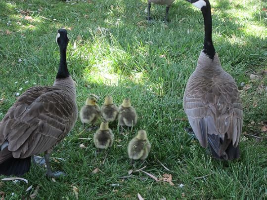
Sylvia and I took an afternoon off to walk in a park near us where a lot of Canada geese live. Five goslings!


May 22, 2012
Eclipse, Publishing Transition, Transreal Books
There was a cool partial annular eclipse of the sun here in the SF Bay Area last week. It was about 6:30 pm, and the sun was going behind the hill that I live on, so I walked up the street to get a better view. I’d been using the safe method of studying tiny crescents via a pin hole punched sheet of paper projecting them onto a black back of a book. But, wearing shades and walking up the tree-crowned hill, I could suddenly see the eclipsed sun directly with my naked eyes.

And, yes, I know you’re not supposed to stare at it, and I didn’t. But I could see it, via quick, raking side-long glances, the suddenly huge-seeming sun a strange crescent just above the horizon, filtered through the scrim of live-oak trees, archaic, mythical, the horned sun.
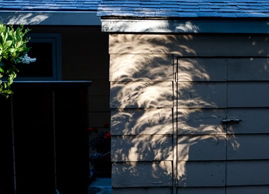
The patches of shadow-light cast by the trees and bushes were strangely warped, with each dapple-blog cast into a crescent, with an overall effect like taffy.
It felt like a weird sign, a signal from on high.
Moving on, this is strange time in my chosen field of writing and publishing.
Firstly, it seems like there’s hardly any bookstores anymore. The big chains like Walden, Borders and B&N forced out the older small independent bookstores. Then Amazon ate the business of the chains. And now it seems like Barnes and Noble is the only chain left. So far as I know, the only generalized bookstores fair city of San Jose (urban area population of two million) are three Barnes and Noble outlets. Yes, we have a few textbook, foreign language, Christian, children’s, and used book stores too. But those aren’t stores that would stock any books I would write. Even in San Francisco there’s weirdly few bookstores—none at all near Union Square anymore: Borders, Rizzoli, Cody’s have all vanished. Nothing left to do but “shop.”

[A collage of photos of a model in a Jean Paul Gaultier “ant-dress,” on display at the show of his fashion currently running at the DeYoung Museum in SF.]
Secondly, the publishers seem to be on the skids, at least for me. The once-welcoming Tor Books published eight of my books from 1999 – 2011. But now they’re telling me they can’t afford to publish me anymore. My old fall-back publisher Four Walls Eight Windows was bought out by Avalon, who were bought out by Perseus, and their line of books has been essentially closed down. My new fall-back publisher Night Shade Books took six months to pay me my on-publication advance for my last novel, Jim and the Flims, and who knows when they’ll put out a trade pb edition. Night Shade’s finances are so shaky that they don’t want to buy my new books either.
I think publishers are looking more for the narrow, hard-core genre kinds of things. And that’s never been my style – even when I think I’m going that route. Really, Jim and the Flims was meant to come across as supernatural fantasy, but it hasn’t gotten the traction I’d hoped.
Thirdly, ebooks are starting to matter. One of the complicating things here is that the big publishers have been so greedy about the ebooks. For one thing, they’ve been keeping the prices of ebooks artificially high—I mean, come on, all you’re selling with an ebook is an electronic file. For another, they’ve been offering their authors an unfairly low cut of the ebook profits. It’s hard to even figure out what the publisher’s offer is for many of my books that have been ebook-ified, but these days the standard seems to be 25% of whatever money the publishers actually get. A lot of authors’ think they should be betting 50% or even 75% (which is typical for foreign book sales). See this impassioned rant by thriller-author Joe Konrath.
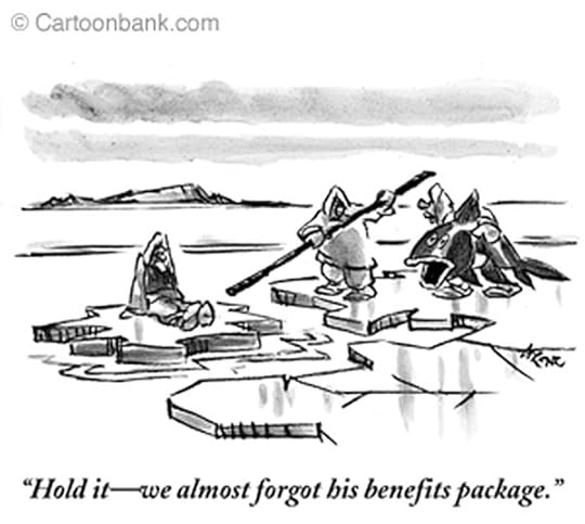
[Typical New Yorker ice-floe cartoon I found reprinted by the Native American site Blue Corn Comics as an example of ethnic stereotyping which, come to think of it, it is. By the way, in 2012, the cartoon would be closer to current trends if the "benefits" fish were a skeleton!]
So, fourthly, I have an ongoing fear of losing all my publishers. There’s a folk myth that, in hard times, the Eskimos, more properly called Inuit, used to set aging tribe members onto ice-floes and let them drift off towards the midnight sun. You imagine the old person getting a piece of blubber or a fish to take on the floe with them. It’s not clear that this ever actually happened, but there’s an odd resonance to the tale, and I think about it a lot these days.
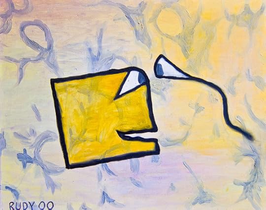
“Turing and the Skugs”, 40″ x 30″ inches, Oct 2010, Oil on canvas.” Click for larger version.
Adrift like this, and still waiting to sell my latest novel, The Turing Chronicles (but with a couple of prospects still pending), I’ve been unable to get motivated to continue working on my next novel, The Big Aha.
So meanwhile, in limbo, I’ve been building up my new publishing venture, Transreal Books. Sort of like a guy digging a fall-out shelter—just in case. The direct, unmediated access to readers via Transreal Books is nice. Turns out I can sell ebooks myself, and I can even sell printed books online as well.
If the biz really bottoms out for me, I’ll probably be using Transreal Books rather than going around to the truly tiny publishers—not always a pleasant process in any case. As a general (but not invariable) rule, the less someone pays you, the worse they treat you.

The catch with setting up Transreal Books is that I’ve had to put in hundreds of hours learning to use the programs Calibre, Sigil, Dreamweaver and, this week, InDesign. Whew.
In a certain way, I enjoy the programming aspects of this. I used to program a lot when I was working as a CS professor and as a software engineer, back in the ‘90s. It’s kind of like a computer game, really. Addictive, self-destructive, hypnotic. You keep Googling for help, trying things, breaking things, doing rebuilds, and slowly you converge upon the upload and then some sales. Fresh-caught fish on my ice floe.
[My old painting A Square and His Wife, recently unearthed at the offices of Monkeybrains.net, San Francisco’s only independent ISP, now blanketing the Mission with wireless access.]
Drifting towards the great horned sun.
May 13, 2012
William Craddock’s BE NOT CONTENT Now Out As Ebook and Paperback!
I’m proud to announce that my Transreal Books publishing company has scored the coup of bringing William J. Craddock’s classic psychedelic novel back into availability. I reached an agreement with Craddock’s widow, and Be Not Content is now available as EPUB and MOBI Kindle format.
And… as of June 15, 2012, available as a quality paperback from Transreal Books as well!
Go to the Transreal Books page and you can get Craddock’s book at $6 for the ebook and $16 for the paperback. Note that used paperback copies of Be Not Content start at $90 and go rapidly upwards from there, with hardbacks in the $500 range. This book is one of the most important documents of the Sixties.
By way of explaining about the book, I’ll print my full introduction to it below. See also my blog post “William Craddock and BE NOT CONTENT” of April, 27, 2007, for more material (some overlapping with today’s post), and for numerous comments by Craddock’s friends.

Be Not Content is a coming-of-age novel set in San Jose, California, in the mid 1960s—describing William Craddock’s experiences as a young acidhead.
This is a deep and well-written book, a unique chronicle of the earliest days of the great psychedelic upheaval. It’s filled with warmth and empathy, tragic at times, and very funny in spots—reminding me of William Burroughs’s Yage Letters and Philip K. Dick’s A Scanner Darkly, two other wastrel masterpieces where laughter plays counterpoint against the sad oboes of doom.
Billy Craddock was born July 16, 1946, and grew up in Los Gatos, California, the son of William and Camille Craddock. The family was well-off, with William Sr. an executive. As a teenager, Billy said he expected to die at twenty-two, but that he wanted to be a Hells Angel and a published author by the time he was twenty-one.
At nineteen he was in fact a prospect for the Hell’s Angels, and he rode his chopper up to Oakland for a party in a bar. A vicious fight broke out, with knives and chains. Billy escaped out the bathroom window and decided not to be in the Angels after all. Instead he joined the equally outlaw Night Riders motorcycle club of San Jose for a few years.
During his biker and acidhead times, Craddock was also an on-and-off student at San Jose State, an English major. Early on, he managed to sell an article about motorcycle gangs to the magazine Easyriders—under the pen-name William James. And he wrote some columns for a local paper, the Los Gatos Times Observer.

But that was just a warm-up. Billy finished writing his classic psychedelic novel three months after turning twenty-one. Be Not Content reads as if written by a mature professional. It’s as if all those trips aged Craddock by dozens of years, and he mentions this possibility:
So much “lived-time” used up in so little “clock-time” and the world still pretty much the same and us still pretty much the same except for having grown even farther away from the straight-world and its children, having grown hairier on the outside and older-younger on the inside because of the passage of so much lived-time…
“Decrepit, old, tired minds,” said [the narrator’s friend] Baxtor, “being carried around in twenty-year-old bodies. A ludicrous spectacle. People have been conditioned to expect some sort of body-mind correlation. How will they react to the sight of a drooling, senile twenty-five-year-old being wheeled into the park by attendants? What excuse would you give? You couldn’t say, ‘Well, there’s nothing really wrong with him. He’s just old.’”
While we waited for senility we made treks back and forth, from San Jose to Sur, to San Francisco, to Berkeley, to L.A. and into Mexico … back to San Jose where we sometimes went to school or got jobs and then quit or got fired.
We talked for whole nights far into the next day, about experiences and religion, Zen, Tibet and the Tao, prison and our friends in it, philosophy and the stars, insanity and music, new drugs and ancient drugs rediscovered, love and cops, bullshit and its universal appeal, poets and dictators, power and the cosmos, and it was all so real and new.
Be Not Content appeared in a Doubleday Projections edition in 1970. What would Craddock write next?
In a note written for Gale Contemporary Authors, he reported, “Doubleday tentatively accepted Be Not Content in 1968. While waiting for the anticipated wild joy of actual publication I wrote a second and much longer novel (intended as a sequel and wrap-up of Be Not Content) entitled Backtrack, which followed the first book’s main characters through the disillusioning reentry years immediately after the winter of 1967 and the death of hippie-hope. This grand opus was rejected after due consideration.”
In 1972, Doubleday instead published Craddock’s downbeat Twilight Candelabra, a novel involving coke, Satanism and a murder. Craddock may have been trying to write a novel more in tune with what his editors imagined the commercial market to be. His next novel was The Fall of Because, “a satire overlaying a serious allegorical treatment of ‘modern magick.’” This one was rejected by Doubleday.
Craddock finished the first draft of Be Not Content in September, 1967, and two months later he married Carole Anne Bronzich for a year and a half. In 1975 he married for the second time, to Teresa Lynne Thorne, a native of San Jose. Thorne’s father was a lawyer who’d represented George Jackson, the Soledad brothers, and the Hell’s Angels. Her parents took Billy’s hippie/biker looks in stride.
Billy had dated Teresa for awhile, checking out if she’d be someone he could live with. Teresa tells a story of Billy accompanying her to shopping mall. “He told me he wanted to wait in the parking lot,” says Teresa. “So I left him there in the car with a glass of water and the window open and when I got back from my shopping, he told me he was on acid. You could never tell when Billy was high. He didn’t show it.”
Craddock found a novel way to get engaged. He gave Teresa a copy of Be Not Content, and when she asked for an autograph, he wrote his marriage proposal on the fly-leaf.
In 1975 the newlyweds spent some time as the caretakers of an empty mansion above Los Gatos. Billy wrote a somewhat autobiographical California novel, The Fading Grass. For whatever reason it too was deemed unpublishable. Finally, in 1976, aged thirty, Billy wrote one more novel, A Passage of Shadows, and that one also failed to sell.
At this point he abandoned his career as a novelist. He drifted away from psychedelics. He made a little money writing for the Santa Cruz Good Times, a column a week.
“It’s not the publishing that matters,” Billy would gamely tell Teresa. “It’s the writing.”

I got my first copy of Be Not Content in 1972, shortly after taking a job as an assistant professor of mathematics at a small college in upstate New York. I think I may have found the novel in a hip bookshop at Dupont Circle, Washington, DC. I quickly began to idolize Craddock. I had my own memories of the psychedelic revolution, and when reading Be Not Content I felt—“Yes. This is the way it was. This guy got it right.”
I wrote Craddock a fan letter, enclosing what was at that time my sole publication, a technical math paper on higher infinities. As if. Billy wrote a friendly note back, saying that he’d only passed his high-school geometry class by cheating wildly off the girl in front of him, but that he was happy to know someone was reading him “over on the other side of the island.”
The years went by. In 1986, my wife, three kids and I moved to Los Gatos, California. I had a job as a professor of math and computer science at San Jose State. Soon after arriving I saw one of Craddock’s columns in the Good Times free weekly paper.
I learned that Craddock had grown up in my new town, had attended the same high school where my children were going, that he’d gone to the very same San Jose State college were I now worked, and that we’d been born within a few months of each other. My mystic double! I thought of seeking him out, but I wasn’t sure how to start—and I had the feeling that, as writers, we’d inevitably meet without having to plan it.
More years went by. I’d lent out my original copy of Be Not Content without getting it back, and in 2003 I decided I couldn’t live without it any longer. I bought a used copy online for the exorbitant price of $140.
The fee hurt, but it was pure joy to reread this rewarding volume. I recognized numerous teachings that by now I’d totally integrated into my worldview, and multiple headtricks that I’d used in the transreal science-fiction novels I myself had published.
And still I had some hope of meeting Billy Craddock. But then it was too late. Here’s a note I made in my journals on September 25, 2005.
A fan who’d bought Craddock’s old motorcycle emailed that Billy had died over a year ago, on March 16, 2004. Today I went to the all-new San Jose State library to look up his obit. It’s on microfilm, from the San Jose Mercury News. It’s eerie searching out the microfilm, in a graphically uncluttered basement room that vaguely resembles a mausoleum — I feel like a reporter in Citizen Kane.
I pull open a huge flat metal drawer with ranks and ranks of microfilm boxes, my hand reaches in, plucks out the box with Billy’s obit. I go to the microfilm reader, the same big clunky kind of machine as ever, and grind forward past March 16, 2004. I’m looking for a big article, but it’s just a little tiny thing on March 20, with a picture of Billy looking tired and sad, his eyes hidden in dark sockets, the obit written by, I think, his widow Teresa. How little recognition my hero received.
And how bum, how alien, how weird it would have been for Billy to see this microfilm room in a flash-forward vision while walking careless and high around this San Jose campus forty years ago—what if he’d suddenly seen, whoah, a hand pulling out this very box of microfilm with its image of his weary, suffering future-shocked face.
I leave the library, and the bell on SJSU’s Tower Hall is ringing to mark an hour, tolling deep and reverberant, the sounds overlapping and forming beats.
We really die, nobody escapes, all of us on the one big trip.

The fan who’d bought Billy’s bike gave me Teresa Craddock’s phone number, and I talked to her about me trying to find a publisher for Be Not Content. She encouraged me to try. Nothing came of it—the publishers I talked to weren’t interested in Sixties acid books, they seemed to think the story had already been told. I lost track of Teresa, posted some thoughts about Craddock and Be Not Content on my blog, and early in 2012, a reader of my blog put me in touch with Teresa again.
By this point, I’d started up my own small publishing venture, Transreal Books. I went ahead and made an agreement with Teresa Craddock that I’d republish Be Not Content myself. I feel it’s a very important book that needs to be remembered. Nobody ever wrote about the psychedelic revolution as well as William Craddock.
A key point that he makes is that taking psychedelic trips was never, or at least not for very long, fun, in the usual sense of the word. There were three problematic areas: freak-outs, seeing God, and coming down.
In the harrowing final chapters of Be Not Content, our hero Abel Egregore becomes obsessed with the seeing-God and the coming-down issues. He goes further and further on his peak trip experiences, and he does in fact talk to God, but it’s not enough. Coming down becomes insufferable, and he begins going on nightmarish trips that last for days and days.
Acid, Abel imagines, has changed the rules to the extent that he should be able to obtain complete enlightenment and a fundamental understanding of the nature of reality. But he’s not getting there. In a turning-point scene, Abel’s sage friend Baxtor describes his own end of the road.
We’re going to grow old and die. That’s all. That’s all there is. The enlightenment-game is just that . . . another game. It’s a variation manufactured to occupy the minds of those mortals foolish enough to overindulge in mental exercises directed toward seeing through the illusion. Beyond the illusion there’s nothing. Now, I know that you maintain that the nothing behind the illusion is the ‘Void’ and a perfect state of wise Buddha-being; but Abel, that’s only a more sophisticated variation on the old bullshit heaven concept. You’ve simply eliminated all the things that you can’t accept, can’t believe in—the harps and streets of gold and winged angels and benevolent old daddy God and all the rest—after which you had nothing, which is uncomfortable, so you ripped off some validation from the Tibetans and called your nothing ‘The Perfect, Empty Void.’ But it’s nothing, Abel. When you get right down to it, it’s nothing.
Yet our hero isn’t willing to view the Void or the One or the Absolute as an empty nothing. The ultimate nothing is, if you will, filled with light and with a hum. Craddock puts it thus:
It’s the sound of the miraculous space between eternity—between paradise. You only have to listen to hear it. And beyond the music of the earth is the music of deep within you. It’s the magic you once knew existed. It does exist.
Everything is perfect—OM—endlessly—OM—infinity is ours—peace, my friends. I love you. I am you. We are simply IT. There’s nothing else to know.
And, knowing this, ordinary life is enough. A classic mystic illumination. And all of this was written by a man of twenty-one. Incredible.
Nobody I’ve talked to seems able to locate Backtrack—Craddock’s sequel to Be Not Content. One hypothesis is that the single typed manuscript was lost in a fire that destroyed the house where Craddock was living with his first wife Carole around 1969. Or conceivably someone in Billy’s circle still has possession of the manuscript. Or, who knows, Mindless Eddie ate it, just like in the final chapter of Be Not Content.
In any case three other unpublished novels by Craddock survive—The Fall of Because, The Fading Grass, and A Passage of Shadows. These are still in the hands of his widow Teresa—I’ve seen one of them—and they may yet appear in print someday, if not from Transreal Books, then from some other publisher.
My guess is that Be Not Content will remain Craddock’s lucky strike, the outstanding early success that overshadows the rest of a writer’s career. My friend Nick Herbert of Boulder Creek, an aging hippie writer himself, puts it like this:
Be Not Content is a little-appreciated masterpiece. Craddock truly captures the idealistic intensity of those days when we all felt that enlightenment, wisdom, telepathy, alien contact and/or Childhood’s End was so close you could almost smell it. Where anything seemed possible and every encounter felt like it could be the door to another world. Where did all that wildness go?
Ah, Nick, the wildness is still here, if only we look.

Let’s close with my favorite teaching from the good book of Be Not Content:
“But don’t you feel like you’re wasting time?”
“How can you waste time? Man, that’s ridiculous.”
Relax and enjoy this wonderful work. Read it slowly. You have time.
William Craddock’s BE NOT CONTENT Now Out As Ebook!
I’m proud to announce that my Transreal Books publishing company has scored the coup of bringing William J. Craddock’s classic psychedelic novel back into availability. I reached an agreement with Craddock’s widow, and Be Not Content is now available as EPUB and MOBI Kindle format. Go to the Transreal Books page and you can get Craddock’s book directly from us, or via Amazon Kindle. Price is $6.50 for now, but it may go up soon. Note that used paperback copies of Be Not Content start at $90 and go rapidly upwards from there, with hardbacks in the $500 range. This book is one of the most important documents of the Sixties.
By way of explaining about the book, I’ll print my full introduction to it below. See also my blog post “William Craddock and BE NOT CONTENT” of April, 27, 2007, for more material (some overlapping with today’s post), and for numerous comments by Craddock’s friends.
Be Not Content is a coming-of-age novel set in San Jose, California, in the mid 1960s—describing William Craddock’s experiences as a young acidhead.
This is a deep and well-written book, a unique chronicle of the earliest days of the great psychedelic upheaval. It’s filled with warmth and empathy, tragic at times, and very funny in spots—reminding me of William Burroughs’s Yage Letters and Philip K. Dick’s A Scanner Darkly, two other wastrel masterpieces where laughter plays counterpoint against the sad oboes of doom.
Billy Craddock was born July 16, 1946, and grew up in Los Gatos, California, the son of William and Camille Craddock. The family was well-off, with William Sr. an executive. As a teenager, Billy said he expected to die at twenty-two, but that he wanted to be a Hells Angel and a published author by the time he was twenty-one.
At nineteen he was in fact a prospect for the Hell’s Angels, and he rode his chopper up to Oakland for a party in a bar. A vicious fight broke out, with knives and chains. Billy escaped out the bathroom window and decided not to be in the Angels after all. Instead he joined the equally outlaw Night Riders motorcycle club of San Jose for a few years.
During his biker and acidhead times, Craddock was also an on-and-off student at San Jose State, an English major. Early on, he managed to sell an article about motorcycle gangs to the magazine Easyriders—under the pen-name William James. And he wrote some columns for a local paper, the Los Gatos Times Observer.
But that was just a warm-up. Billy finished writing his classic psychedelic novel three months after turning twenty-one. Be Not Content reads as if written by a mature professional. It’s as if all those trips aged Craddock by dozens of years, and he mentions this possibility:
So much “lived-time” used up in so little “clock-time” and the world still pretty much the same and us still pretty much the same except for having grown even farther away from the straight-world and its children, having grown hairier on the outside and older-younger on the inside because of the passage of so much lived-time…
“Decrepit, old, tired minds,” said [the narrator’s friend] Baxtor, “being carried around in twenty-year-old bodies. A ludicrous spectacle. People have been conditioned to expect some sort of body-mind correlation. How will they react to the sight of a drooling, senile twenty-five-year-old being wheeled into the park by attendants? What excuse would you give? You couldn’t say, ‘Well, there’s nothing really wrong with him. He’s just old.’”
While we waited for senility we made treks back and forth, from San Jose to Sur, to San Francisco, to Berkeley, to L.A. and into Mexico … back to San Jose where we sometimes went to school or got jobs and then quit or got fired.
We talked for whole nights far into the next day, about experiences and religion, Zen, Tibet and the Tao, prison and our friends in it, philosophy and the stars, insanity and music, new drugs and ancient drugs rediscovered, love and cops, bullshit and its universal appeal, poets and dictators, power and the cosmos, and it was all so real and new.
Be Not Content appeared in a Doubleday Projections edition in 1970. What would Craddock write next?
In a note written for Gale Contemporary Authors, he reported, “Doubleday tentatively accepted Be Not Content in 1968. While waiting for the anticipated wild joy of actual publication I wrote a second and much longer novel (intended as a sequel and wrap-up of Be Not Content) entitled Backtrack, which followed the first book’s main characters through the disillusioning reentry years immediately after the winter of 1967 and the death of hippie-hope. This grand opus was rejected after due consideration.”
In 1972, Doubleday instead published Craddock’s downbeat Twilight Candelabra, a novel involving coke, Satanism and a murder. Craddock may have been trying to write a novel more in tune with what his editors imagined the commercial market to be. His next novel was The Fall of Because, “a satire overlaying a serious allegorical treatment of ‘modern magick.’” This one was rejected by Doubleday.
Craddock finished the first draft of Be Not Content in September, 1967, and two months later he married Carole Anne Bronzich for a year and a half. In 1975 he married for the second time, to Teresa Lynne Thorne, a native of San Jose. Thorne’s father was a lawyer who’d represented George Jackson, the Soledad brothers, and the Hell’s Angels. Her parents took Billy’s hippie/biker looks in stride.
Billy had dated Teresa for awhile, checking out if she’d be someone he could live with. Teresa tells a story of Billy accompanying her to shopping mall. “He told me he wanted to wait in the parking lot,” says Teresa. “So I left him there in the car with a glass of water and the window open—like a dog?—and when I got back from my shopping, he told me he was on acid. You could never tell when Billy was high. He didn’t show it.”
Craddock found a novel way to get engaged. He gave Teresa a copy of Be Not Content, and when she asked for an autograph, he wrote his marriage proposal on the fly-leaf.
In 1975 the newlyweds spent some time as the caretakers of an empty mansion above Los Gatos. Billy wrote a somewhat autobiographical California novel, The Fading Grass. For whatever reason it too was deemed unpublishable. Finally, in 1976, aged thirty, Billy wrote one more novel, A Passage of Shadows, and that one also failed to sell.
At this point he abandoned his career as a novelist. He drifted away from psychedelics and eventually became involved with hard drugs. He made a little money writing for the Santa Cruz Good Times, a column a week, at $100 a column.
“It’s not the publishing that matters,” Billy would gamely tell Teresa. “It’s the writing.”
I got my first copy of Be Not Content in 1972, shortly after taking a job as an assistant professor of mathematics at a small college in upstate New York. I think I may have found the novel in a hip bookshop at Dupont Circle, Washington, DC. I quickly began to idolize Craddock. I had my own memories of the psychedelic revolution, and when reading Be Not Content I felt—“Yes. This is the way it was. This guy got it right.”
I wrote Craddock a fan letter, enclosing what was at that time my sole publication, a technical math paper on higher infinities. As if. Billy wrote a friendly note back, saying that he’d only passed his high-school geometry class by cheating wildly off the girl in front of him, but that he was happy to know someone was reading him “over on the other side of the island.”
The years went by. In 1986, my wife, three kids and I moved to Los Gatos, California. I had a job as a professor of math and computer science at San Jose State. Soon after arriving I saw one of Craddock’s columns in the Good Times free weekly paper.
I learned that Craddock had grown up in my new town, had attended the same high school where my children were going, that he’d gone to the very same San Jose State college were I now worked, and that we’d been born within a few months of each other. My mystic double! I thought of seeking him out, but I wasn’t sure how to start—and I had the feeling that, as writers, we’d inevitably meet without having to plan it.
More years went by. I’d lent out my original copy of Be Not Content without getting it back, and in 2003 I decided I couldn’t live without it any longer. I bought a used copy online for the exorbitant price of $140.
The fee hurt, but it was pure joy to reread this rewarding volume. I recognized numerous teachings that by now I’d totally integrated into my worldview, and multiple headtricks that I’d used in the transreal science-fiction novels I myself had published.
And still I had some hope of meeting Billy Craddock. But then it was too late. Here’s a note I made in my journals on September 25, 2005.
A fan who’d bought Craddock’s old motorcycle emailed that Billy had died over a year ago, on March 16, 2004. Today I went to the all-new San Jose State library to look up his obit. It’s on microfilm, from the San Jose Mercury News. It’s eerie searching out the microfilm, in a graphically uncluttered basement room that vaguely resembles a mausoleum — I feel like a reporter in Citizen Kane.
I pull open a huge flat metal drawer with ranks and ranks of microfilm boxes, my hand reaches in, plucks out the box with Billy’s obit. I go to the microfilm reader, the same big clunky kind of machine as ever, and grind forward past March 16, 2004. I’m looking for a big article, but it’s just a little tiny thing on March 20, with a picture of Billy looking tired and sad, his eyes hidden in dark sockets, the obit written by, I think, his widow Teresa. How little recognition my hero received.
And how bum, how alien, how weird it would have been for Billy to see this microfilm room in a flash-forward vision while walking careless and high around this San Jose campus forty years ago—what if he’d suddenly seen, whoah, a hand pulling out this very box of microfilm with its image of his weary, suffering future-shocked face.
I leave the library, and the bell on SJSU’s Tower Hall is ringing to mark an hour, tolling deep and reverberant, the sounds overlapping and forming beats.
We really die, nobody escapes, all of us on the one big trip.
The fan who’d bought Billy’s bike gave me Teresa Craddock’s phone number, and I talked to her about me trying to find a publisher for Be Not Content. She encouraged me to try. Nothing came of it—the publishers I talked to weren’t interested in Sixties acid books, they seemed to think the story had already been told. I lost track of Teresa, posted some thoughts about Craddock and Be Not Content on my blog, and early in 2012, a reader of my blog put me in touch with Teresa again.
By this point, I’d started up my own small publishing venture, Transreal Books. I went ahead and made an agreement with Teresa Craddock that I’d republish Be Not Content myself. I feel it’s a very important book that needs to be remembered. Nobody ever wrote about the psychedelic revolution as well as William Craddock.
A key point that he makes is that taking psychedelic trips was never, or at least not for very long, fun, in the usual sense of the word. There were three problematic areas: freak-outs, seeing God, and coming down.
In the harrowing final chapters of Be Not Content, our hero Abel Egregore becomes obsessed with the seeing-God and the coming-down issues. He goes further and further on his peak trip experiences, and he does in fact talk to God, but it’s not enough. Coming down becomes insufferable, and he begins going on nightmarish trips that last for days and days.
Acid, Abel imagines, has changed the rules to the extent that he should be able to obtain complete enlightenment and a fundamental understanding of the nature of reality. But he’s not getting there. In a turning-point scene, Abel’s sage friend Baxtor describes his own end of the road.
We’re going to grow old and die. That’s all. That’s all there is. The enlightenment-game is just that . . . another game. It’s a variation manufactured to occupy the minds of those mortals foolish enough to overindulge in mental exercises directed toward seeing through the illusion. Beyond the illusion there’s nothing. Now, I know that you maintain that the nothing behind the illusion is the ‘Void’ and a perfect state of wise Buddha-being; but Abel, that’s only a more sophisticated variation on the old bullshit heaven concept. You’ve simply eliminated all the things that you can’t accept, can’t believe in—the harps and streets of gold and winged angels and benevolent old daddy God and all the rest—after which you had nothing, which is uncomfortable, so you ripped off some validation from the Tibetans and called your nothing ‘The Perfect, Empty Void.’ But it’s nothing, Abel. When you get right down to it, it’s nothing.
Yet our hero isn’t willing to view the Void or the One or the Absolute as an empty nothing. The ultimate nothing is, if you will, filled with light and with a hum. Craddock puts it thus:
It’s the sound of the miraculous space between eternity—between paradise. You only have to listen to hear it. And beyond the music of the earth is the music of deep within you. It’s the magic you once knew existed. It does exist.
Everything is perfect—OM—endlessly—OM—infinity is ours—peace, my friends. I love you. I am you. We are simply IT. There’s nothing else to know.
And, knowing this, ordinary life is enough. A classic mystic illumination. And all of this was written by a man of twenty-one. Incredible.
Nobody I’ve talked to seems able to locate Backtrack—Craddock’s sequel to Be Not Content. One hypothesis is that the single typed manuscript was lost in a fire that destroyed the house where Craddock was living with his first wife Carole around 1969. Or conceivably someone in Billy’s circle still has possession of the manuscript. Or, who knows, Mindless Eddie ate it, just like in the final chapter of Be Not Content.
In any case three other unpublished novels by Craddock survive—The Fall of Because, The Fading Grass, and A Passage of Shadows. These are still in the hands of his widow Teresa—I’ve seen one of them—and they may yet appear in print someday, if not from Transreal Books, then from some other publisher.
My guess is that Be Not Content will remain Craddock’s lucky strike, the outstanding early success that overshadows the rest of a writer’s career. My friend Nick Herbert of Boulder Creek, an aging hippie writer himself, puts it like this:
Be Not Content is a little-appreciated masterpiece. Craddock truly captures the idealistic intensity of those days when we all felt that enlightenment, wisdom, telepathy, alien contact and/or Childhood’s End was so close you could almost smell it. Where anything seemed possible and every encounter felt like it could be the door to another world. Where did all that wildness go?
Ah, Nick, the wildness is still here, if only we look.
Let’s close with my favorite teaching from the good book of Be Not Content:
“But don’t you feel like you’re wasting time?”
“How can you waste time? Man, that’s ridiculous.”
Relax and enjoy this wonderful work. Read it slowly. You have time.
May 10, 2012
How to Make an Ebook #4. PLUS Full Ebook GUIDE
This is the last of four blog posts on the topic of how to make your own ebooks. I have combined, expanded and revised these entries to make, fittingly, an ebook called How to Make An Ebook, available from Transreal Books.

My How to Make An Ebook includes quite a bit of additional material, it’s more tightly organized, and it doesn’t include the perhaps too distracting photos that tend to clutter my blog posts!
The EPUB and MOBI versions of How to Make An Ebook will be free on my Transreal Books site until May 17, 2012. After that I’ll be selling it for $1.95. But, like I say, for this week it’s free. So go git it. And if you find problems you can post corrections or queries down at the bottom of today’s post.
And now let’s get down to the last of my “draft” installments, complete with the usual distracting illos.

How to Make Ebooks #4. Advanced Level: Dreamweaver & HTML
For full control, our workflow is to go from DOC or RTF to HTML, and then from HTML to EPUB. We’ll edit the HTML extensively. As I mentioned before, I myself use Dreamweaver, which is a commercial product from Adobe, but it’s possible that you could do a lot of this with some free HTML editor.
Converting DOC to HTML. Preliminary cleanup.
For full control, our workflow is to go from DOC or RTF to HTML, and then from HTML to EPUB.
In “Do-It-Yourself Ebooks #2. The Simpler Paths” I talked about ways to clean up your Word file before using it for an EPUB. But now there’s another thing you want to do. You want to stop using the Word Normal style, and get rid of as many other Word styles as you can.
The first thing you want to do about your Word styles is to ditch as many of htem as you can, as otherwise they’ll show up as extra crap at the top of your HTML. For this, go to Developer | Templates | Organizer, and look at the list of styles in your document in the left pane of the Organizer dialog. Most of them are styles you aren’t using in your document, and you ought to delete them. You can select them all by clicking at the top, holding down the shift key and scrolling down. Before pressing delete look over the list and see if there are any special styles you defined and that you love and don’t want to lose. Then press Delete. Word won’t actually delete the most essential styles like Normal, Heading 1, and a few others. But most of them go away. Note, by the way, that if you delete a style and it was in fact applied to some text in your document, the text stays in place, but its style reverts to Normal. If you do in fact erase some style that was doing something useful, you can redfine it.
An optional second step is make a new Style called, let’s say, epubtext. To do this, select a normal block of text, right click and select Styles | Save selection as a new Quick Style, and name the new style epubtext. Now use Find and Replace | More | Format | Styles to set the Find what box to be empty but with the Normal Style, and the Replace with box to be empty but with the epubtext style. You might also make up other special styles for things like epubextendedquote, or epubtextnoindent, and so on. If this seems to weird and complicated you can do it later over in the HTML file, replacing MsoNormal by epubtext in the class specifications on the p tags for starters.
There are two ways to turn your DOC into an HTML.
(MAKE THE HTML YOURSELF) Use File | New to make a new HTML document in Dreamweaver, specifying that the Doc Type be XHTML. And then I select my whole DOC, copy the text of the full book to the clipboard, and paste it into the the Design View. Before doing this, go to Edit | Preferences | Copy/Paste and (a) set your Edit>Paste radio-buttons to the last option, “Text with structure plus full formatting (bold, italic, styles)”. For sure you want to keep your italic and bold formats. And you want to bring along your DOC styles, although you will now need to edit them a bit in the HTML doc. Also check the “Retain line breaks” box, otherwise the file will come through as one single giant paragraph.
Okay, fine, but now when you go to paste your DOC into Dreamweaver it may object and says the file is too big. So you have to teach Dreamweaver a lesson. This link describes a way to alter the default size of a file that Dreamweaver is willing to accept. To use this trick, close Dreamweaver, go to find InsertOfficeDoc.js, open it in the Text Pad editor, and add zeroes to the ends of the WarnThreshold and MaxThreshold numbers. Then open Dreamweaver again, and it’ll let you paste in a big book-sized file. Save your newly made HTML or XHTML (either file extension is okay) file in the directory where you’re keeping your files for this book. Now start cleaning up the file.
Note that pasting text into the Code view instead of the Design view is much trickier, and isn’t recommented, as pasting into Code view is likely to strip away all your formatting, especially your vital italics and, for that matter, your paragraph breaks.
(USE WORD TO MAKE THE HTML) In Word, save the Word file of your book as a “Web Page, Filtered” or filtered HTML file. Filtered means there’s less Word crap in the file. And I open this file in Dreamweaver and use Commands | Clean Up Word HTML… to get rid of more Word crap. By the way, when you saved the “Filtered HTML” file, Word made a directory of extra files in my directory, but there’s actually nothing in that directory that matters, and you can delete it. Word will put a lot of extra crap into your HTML file itself, and you will probably want to run the Dreamweave Commands | Clean up Word HTML tool. To remove more Microsoft crap, do a search and replace and delete all the style attributes from your paragraph p tags. Word will have jammed a bunch of unnecessary style specifictions into that attribute, and all the style you need is going to be in your class="epubtext" attribute.
So okay, at this point, whichever method you used, you’ve got an HTML file of your book. Now you’re going to edit this file so you can make a nice EPUB out of it.
Tip: Stick to the Code view as much as possible. Dreamweaver lags and reacts slowly if you use the Design or the Split view. Now and then you’ll want to see the WYSIWYG views, yes, but stick to Code view most of the time and the program runs much smoother. And, oh yeah, Dreamweaver also runs faster in Code view if you close the Properties window.
Now we need a few more tweaks so that the HTML can be used to build an EPUB.
* Fill in the Title field for your HTML in Dreamweaver.
*Delete the body attributes link and vlink if they’re present.
*Remove all the align attributes of the p tags
*Remove all the clear attributes of the br tags
*You will have some anchor tags that make your Word-built Table of contents and in-document links work. The EPUB standard likes the id attribute but not the name attribute, and either one works. If your anchors have both name and id attributes, remove all the name attributes. If your anchors have only the name attributes, change them to id attributes doing a search and replace to change every occurrence of to
*Look at your span tags. Many of them are doing much for you, they’ll be things like span style=“font-family:’Georgia’,’serif’; font-size:12.0pt; color:black; “. It’s pretty safe just to search for all span tags with a style attribute and remove the tags (but not the contents of the tags). If you want to style your text you’ll do it with a class attribute on your p tag or, if necessary, a class tag on a span tag.
And now you want to work on your styles some more, which deserves a separate subsection.

Styles
You will see some code like this in between the and tags at the top of your HTML file. The contents of the style definitions will be different, but you’ll see something like the following, which is called an “internal style sheet.” (We will soon switch to an “external style sheet”.)
p.epubtext
{ text-align: justified;
text-indent: 1.5em;
margin-top: 0px;
margin-bottom: 0px;
font-family:"Georgia", serif; }
h1 {
text-align: left;
font-size: 1.5em;
font-weight: normal;
font-family:"Georgia", serif;
margin-bottom: 0.67em;
margin-top: 0.67em;
page-break-before: always;
}
As I mentioned above, you might have erased most of the Word file styles, but if you didn’t you’ll see a lot of them here as part of the inernal style sheet. You can simply delete most of these, although you can use a Search command to check if they’re being used in your document. Many of them have “Mso” at the start of their name. You can eleminate them from your HTML document now.
If you haven’t yet changed from the Word Normal style will be called MsoNormal in your HTML. Search and replace to change “MsoNormal” to “epubtext” everywhere.
At this point you can also the Commands | Clean Up Word HTML, but if you made your HTML by cutting and pasting rather than letting Word save as HTML, you don’t really need this tool.
By now you’ll see that most of your paragraphs start with the tag
When you converted the Word DOC to HTML, the Heading 1 styles automatically changed to h1. You can simply change the style of h1, as in the sample code above, or you can define an epubh1 style and apply that to the h1 tags as a class attribute.
At this point you really want to switch to an external style sheet.
To make an external style sheet, put a line like this into in between the and tags at the top of your HTML file.
And now make a new file called epubstyles.css in the Styles directory. Just a text file, you can ask Dreamweaver to make a new CSS file if you like, it might have a @namespace or info line at the top, but this doesn’t much matter.
And now you put style definitions into the epubstyles.css file. The general rule is that styles start with a . in the style sheet, but you don’t use the . in the code.
Here’s a really good "cheatsheet" link about CSS.

HTML for EPUB and MOBI
There’s a lot of specialized things about tweaking HTML so it looks good on an ereader. I’ll just mention a couple of things here.
Never set margin-left to anything but 0. Otherwise you can, for obscure reasions, end up with an indent that shoves your text halfway across the reader screen.
If you want to set off your text, use blockquote, which is a really great HTML tag. It indents your text a little on the left and and right and skips a half-line or so before and after your block of text. You can put
tags inside a blockquote block. Some advise against this practice but it works well for me.
I like to format my extended-quote or blockquote text a little differently. I like to make the font a little smaller, and to use a left alignment with a ragged right edge instead of the default justified alignment that goes for even left and right edges. I have to put in the class="epub_extended_quote" attribute by hand on the
tags inside my blockquote.
Here’s what I do in my epubstyle.CSS to define epub_extended_quote. I include four styles here, epubtext, epubtext_noindent, epub_extended_quote, and epub_centered. A nice thing in a CSS file is that you can get styles to share some attritube properies by listing them separated by commas in an initial group definition. And add modifications to the attributes in separate blocks. I’ll print some code here, and just for fun I’ll format with the tag like I’ve been doing, and I’ll put it inside a
tag as well, although I’ll leave the text style as epubtext for now.
.epubtext, .epubtext_noindent, .epub_extended_quote, .epub_centered {
display: block;
font-family: Georgia, Times, "Times New Roman", serif;
margin-bottom: 0;
margin-left: 0;
margin-right: 0;
margin-top: 0;
text-align: justify;
text-indent: 1.75em
}.epubtext_noindent {
text-indent: 0in
}.epub_extended_quote {
text-align: left;
font-size:0.9em;
}.epub_centered {
text-align: center;
}And here’s a paragraph inside a blockquote tag and with the text in epub_extended_quote style.
And that’s all I have for you right now. But I found out a lot about HTML for EPUB and MOBI from this great link.
Synching your EPUB with your HTML and CSS “Source Code”You want to save your big big HTML file and your epubstyle.CSS as a kind of source code. Once you have your HTML in a reasonable state, you can open it in Sigil and it will drag the Images and the CSS along, making copies of them within the container EPUB file.
Sigil will not save a file as HTML or XHTML, so you have to use a trick to move your “source code” HTML file back and forth. When you have it open in a code window Sigil, you can use Ctrl+A to select all of the HTML file code contents, then Ctrl+C to copy it to the clipboard, then go over to Dreamweaver with your source code HTML open in a window there and then do a Ctrl+A to select the contents of the source code file and then to Ctrl+V to paste the clipboarded code from Sigil onto your Dreamweaver file. You can edit the file for awhile in Dreamweaver, then bring it back into Sigil by reversing the procedure. Select the whoel file in Dreamweaver, copy to clipbaord with Ctrl+C, go over to Sigil, select the whole main HTML code and use a Ctrl+V to overwrite it with the source code HTML from Dreamweaver.
By the same token you will have a source code epubstyle.CSS file and one that’s inside the EPUB file in Sigil, and you can edit this file either in Sigil or in Dreamweaver, making sure to use Ctrl+C and Ctrl+V to move it back and forth, keeping the EPUB in synch with your “source code” HTML and CSS.
You can either edit your file in Sigil, or you can copy the file back into Dreamweaver and edit it there. Editing a lot in Sigil is a little bit flaky. Two issues. As of the May, 2012, release of Sigil if you do a big Search and Replace in Sigil it sometimes crashes. Not all that often, but often enough to matter. It’s safer to do those big mass replace moves in Dreamweaver. Another flaw in Sigil is that it’s an imperfect WYSIWYG editor. Editing the code view window in Sigil is fine, but if you try and edit in the Book View window, you’ll get “turd-bit” characters in the code view after deleting characters in the book view. So: (a) always save your EPUB before doing a big Search and Replace in Sigil, (b) only edit in the Code View window of Sigil, and (c) if you want to do a whole lot of editing, copy your Sigil EPUB HTML or XHTML file over to your “source code” file in Dreamweaver.
ImagesWhile you’re in HTML, look at the image links, and make sure they all point to file-names to the images subdirectory that you made. You may need to use the Edit | Find and Replace dialog to get things set.
You’ll have at least one image, your cover. It’s better not have the size of the images hardcoded. That way you’re free to force in larger images if you want. Use the Edit | Find and Replace dialog and for the Search: field select Specific Tag and set to img, then for the Action: field select Remove Attribute and set to width. Then do the same for height. Then do the same for border.
Regarding the images you want to include, even if you inserted them into your Word DOC from somewhere else on your hard drive, put copies of all the images that in a subdirectory of your project directory and name the subdirectory Images. Use some photo editing software to adjust the sizes of these images to be, let’s say, 700 pixels across so they can fill up an iPad reader page. This way you have control of what images get used. The thing to keep in balance is, on the one hand the size of your EPUB file and, on the other hand, the quality of your images. Maybe 600 pixels across is enough. A 700-pixel image uses forty-percent as much memory as a 600-pixel image. On the other hand, people don’t mind big files these days, so maybe 10 Megabytes instead of 6 Megabytes is okay.
One crucial thing to keep in mind. I mentioned it before but I need to say it again: DON’T let any width or height attributes sneak into your image tags, or the image may not resize well. Your tag should be clean and simple like.
This assumes that you are using the directory structure I mentioned before, with three directories, HTML Text, Images, and Styles, with your source HTML in HTML Text, the jpg files in Images, and your CSS file in Styles.
Breaking up the HTMLI mentioned before that you ought to put hard page breaks into your DOC after each chapter. When you convert the DOC into an HTML web page, these page breaks will show up as a break or br tag like this
What you want to do in the HTML file now is to replace these tags by “horizontal rule” or hr tags like this:
Sigil can read these tags and convert them into Sigil chapter breaks for shattering your monolithic HTML file into small files. But postpone shattering in Sigil at the last minute, as you want to keep a single big HTML or XHTML file as your EPUB “source code”.
A hard page break in a Word file becomes the following code when you transform the DOC into an HTML
So you can do a search and replace, changing the Word-generated page break code with the Sigil “shatter here” code
An alternate approach is the following: To make a separator, insert the symbol where hr stands for horizontal rule and you get a nice looking line like below.
You can use an attributes to make the horizontal rule take up only some percent of the page, have it be centered or on the left or on the right.
Validate with EPUBcheck & Build MOBI.Install the EPUBcheck ware on your computer, it probably ends up in Program Files\EPUBcheck. Make a sample subdirectory of the EPUBcheck directory and put a copy of your current EPUB file there. Suppose it’s called betterworlds.epub.
Then go to the Command Line interface for your computer, navigate into the directory where epubcheck lives, like to Program Files\EPUBcheck. Now run a command like this:
java -jar epubcheck-3.0b2.jar sample/betterworlds1.epub
Of course the letters and numbers after epubcheck depend on which version of the software you have. And the name of the epub file depends on what file you’re checking.
If all goes well, epubcheck will either print a “No Errors Found” message, or it will spew out a lot of error messages. You can scroll up and down to see them all. Most common causes of errors are (1) you forgot to build a table of contents using the Sigil Table of Contents window, or (2) you didn’t fill in the Name, Title and Language fields using Sigil Meta tool, or (3) the EPUB ware is confused because you gave your epub file a name with spaces in it. If you see an error you can’t understand, try copying into the Google search bar to see what other people say about it.
As before, do the fixes in Dreamweaver, save the fixed HTML, reload in Sigil, save off a fresh EPUB and try epubcheck again. Then save your perfect EPUB.
And now you can use Calibre to turn your EPUB into a MOBI, or use the Kindle Previewer, as I discussed in “The Simpler Paths.” When you use Calibre for a conversion of your EPUB file, be sure to put the contents of your CSS file into the Convert Books | Look and Feel | Extra CSS box so that Calibre keeps your styles. (Remove the very first line of the CSS file, but keep the style definitions).
Back to DOCIf you load a shattered EPUB into Calibre and save as HTMLZ you’ll get a kind of ZIP file that has a single merged HTML or XHTML file in it plus the images, and the CSS stylesheet The zip file has the extensions HTMLZ, which most unzippers don’t recognize. In Windows you can open it with a free program called 7-zip that you can find on the web.
Word won’t open an XHTML file, but it will open an HTML file that you can then save as a DOC or as a PDF. You can change an XHTML file to an HTML just by changing first line. Look at a pair of HTML and XHTML files to see what you need to change.
One reason you’d want to get Word to open you final EPUB text is that then you save it as…a DOC file whose appearance you can tweak so as to save the book as PDF and publish it in paper as well. I won’t get into the whole paper thing here, but for now, I’ll just say that from what I’m reading online, it seems Createspace (yeat another Amazon subsidiary, it’s a bit sad to say) let you sell print-on-demand paper books at the lowest price per book to you.


May 3, 2012
How to Make Ebooks #3. Medium Level: Calibre & Sigil.
[Note: I have combined, expanded and revised these four entries to make, fittingly, an ebook called How to Make An Ebook, available from Transreal Books.]
Start Playing With Calibre
I worked as a professor of computer science at San Jose State for about twenty years. I often taught software engineering classes in which I’d have my students carry out large programming projects. I liked to break the class into small teams and have each group create a videogame. One of the principles I tried to teach was this: “Don’t worry too much about making mistakes. To learn software engineering, you have to try things out and make a lot of mistakes. The trick is learning how to make mistakes faster.”
When you’re testing out ways to make your document into an attractive EPUB and MOBI ebook, you’ll need to try out a number of options and you’ll make a bunch of mistakes. But you don’t want to keep trashing whatever progress you’ve made. So you need to set up a directory structure that gives you both an archive and an area in which to play.

Suppose your book is called Mybook. So you’ve got a directory called Mybook with, let’s say, your Mybook.doc file in it. Make a subdirectory called DOCS and copy Mybook.doc into there, only change the file name to something like Mybook_april_29_2012.doc, so it’s easy to tell which version it is. Now make a subdirectory called PLAYPEN and save a Rich Text Format Mybook.rtf into PLAYPEN.
And now fire up Calibre. Before going any further you might as well tweak the Calibre Preferences to make the program easier to use. Be default, the Preferences icon is off to the right of the toolbar, you need to click a little double arrow to see it. Open the Preferences go to Interface | Toolbar | Main Toolbar and get rid of most of the toolbar icons. It’s confusing to have so many. You need to keep Add Books, Edit Metadata, Convert Books, View, Help, Save to Disk, and Preferences.
Now, use the Preferences Import/Export | Save to Disk dialog to simplify how your converted ebooks are shared. Turn off all the checkboxes except for “Show files in browser after saving to disk” and change the Save Template’s Template Editor field to just say {title}. So now if you make an EPUB and save it, it’ll show up as a single file in the directory where you pick to save it, and not in some weird subdirectory.

Okay, now let’s retrace some of the steps I described in How to Make Ebooks #2. Simpler Paths—and then go a bit further. Use the Calibre Add Books button to add your Mybook.rtf as a project. Then try setting some Metadata fields for your ebook with the Metadata dialog. And then click on the Convert Options button, select EPUB as the output as described in my earlier section, tweak some of the settings, close the Convert Options, let Calibre whirl a symbol in the lower right of the window until it’s built an EPUB.
Click on the “EPUB” word in the right window of the Calibre screen and Calibre opens a viewer where you can see how your EPUB looks. If you don’t like what you see, try changing some of the settings in the Convert Books dialog and rebuilding the EPUB. Maybe cycle through this a few times.
Controlling Your Format With Sigil
Some things you might not be able to change within Calibre alone. And the Calibre viewer is going to be deceptive about some things—in particular it will make it look as if your EPUB is formatted in a nice serif font (like Georgia or Times), when in fact the EPUB will show up in a less readable (in my opinion) sans-serif font (like Arial) in other ereaders. By default, Calibre doesn’t in fact specify the font style of your book at all, and it will be up the whim of the individual ereading device or program to pick the style. In some ereaders, the user can pick the font, but in some, the author needs to specify the font themselves.
So now let’s find out how to control the font, the spacing between paragraphs, and the size of the paragraph indents.
Use the Save to Disk option to save the MyBook.EPUB into your PLAYPEN directory. Maybe try viewing the EPUB in some other ereaders to see how it looks in them. And then open it up in Sigil to see if you can tweak the format.
As I mentioned before, Calibre will have shattered your text into a number of small XHTML files, typically it makes one such file for each hard page break in your document, which is why it’s a good idea to put these breaks into your original document—so as to tell Calibre where you’d like the breaks. If you don’t have hard page breaks, Calibre may split the document at the Heading 1 formatted lines.
It’s fine if your book is split into a bunch of little XHTML files. The reason for this is, as I also mentioned earlier, so that ereaders can rapidly open successive chapters of the book without having to load the entire document into memory.
Click on one of the text-filled XHTML sections of your book, visible in the Text section of the Book Browser window on the left side of the Sigils screen. A view of the file opens in the center window. Sigil lets you view it in “book view,” in “code view,” or in a “split view” with both.

Take a look at the code in particular. It’s somewhat ungainly HTML that was automatically generated by algorithms within the Calibre program. You’ll see cryptically named styles like calibre4 or s2. The styles appear in CSS-style class statements such as or
or .
The HTML div and span tags are container tags simply used to apply class styles to whatever is inside them. You use span for just a few words and you can use div to hold several paragraphs. I dislike div and span, I think they’re ugly and confusing and they suck and I try never to use them in my HTML code.
In any case, the p tag is a good, honest tag with a real meaning. It’s used to mark a paragraph. And even if the p is inside a div, the class assigned to the p takes precedence over any class properties assigned to the div. So lets not worry about any crappy div or, for that matter, the span tags.
Looking into your book’s XHTML files you’ll probably find that most or all of your text paragraphs have the same class applied to them, that is, each paragraph has a form like:
Blah blah …. blah.
Of course it might specifically be calibre4, it might be some other name that Calibre generated. But, just for the sake of discussion, I’ll keep saying calibre4. In this case, the definition of the calibre4 style is a key control-point for you.
That is, if you want to tweak the appearance of your text, you want to look at changing the calibre4 style.
Looking through your XHTML files some more, you’ll also find that the Word Heading 1 styles have become h1 in HTML, all of your chapter titles have a single style class to them, perhaps a class called something like calibre2. So a chapter title looks something like the following (possibly with a superfluous unnecessary span tag robotically nested in there).
Chapter Seven
So let’s talk about how we can do some quick tweaks to the these kinds of style class attributes like what we’re calling calibre4 and calibre2 in order to make the text and the chapter titles of your ebook to look the way you want.
Font Family, Paragraph Spacing, and Paragraph Indent
Where do the Calibre-defined styles live?
Look at the Sigil Book Browser window again. Under the Styles heading is a file called stylesheet.css. Double click and it opens in a code window-sheet in the central window. Scroll through it, noticing all the weird random style names. (The names appear with a . in front of them when defined in a CSS stylesheet file, but when they’re used over in the XHTML or HTML file, you don’t have the . in front.)
Find the styles that seem to be attached to your paragraphs and your headers in your XHTML files, the styles that I’ve been calling, just to call them something, calibre4 and calibre2. Now try editing these styles in Sigil, and flip over to the pane showing the appearance of your text as the CSS styles change.
Keep in mind here, that Sigil is very responsive software, and whenever you change one component of your EPUB file, the changes immediately percolate out into all the other parts. The style changes are visible right away. And, on a different front, if you change one of XHTML file names, this name change is taken into account in the manifest OPF file and in the TOC table of contents file.
Okay, I’m getting tired of working this post so I’ll be brief here.
Some of the main style things you want to get control of in your text and headers are the following.
*The font family for text and for headers. Go with a serif font. You list fonts in so-called font stacks, and the reader picks the first if it can, then the second, then the third and so on. “serif” just means any old serif font.
font-family: Georgia, Times, serif;
*The font size for headers. The size is measured in “em” which means the default size of a letter m.
font-size: 1.5em;
*The skipped-line or no-skipped-line between paragraphs of text. For no skipped line use the following two lines saying not to skip space before or after your paragraph. If you want space, put in some number as an em value, like 0.5em or 0.75em, meaning to skip that big a percentage of the size of a letter.
margin-bottom: 0;
margin-top: 0;
*The size of the indent in the first line of a text paragraph. Put zero indents for a header style. The following is a good indent for text paragraphs. Again we measure in “em”.
text-indent: 1.75em;
*The alignment of your text or header (left or centered or justified). For headers you want left or centered, for text, justified is better, as it looks more natural in ereaders, and people expect it.
text-align: justify;
So fool with these in Sigil, flipping between your style.css pane and a pane showing your text, until you see what you like. Then Verify your epub file one more time and save it and it’s done.
In my fourth and I hope final post on these topics, I’ll get into building your HTML file outside of Calibre and getting good control over any images you want to include.
Do-It-Yourself Ebooks #3. Medium Level: HTML Styles.
Start Playing With Calibre
I worked as a professor of computer science at San Jose State for about twenty years. I often taught software engineering classes in which I’d have my students carry out large programming projects. I liked to break the class into small teams and have each group create a videogame. One of the principles I tried to teach was this: “Don’t worry too much about making mistakes. To learn software engineering, you have to try things out and make a lot of mistakes. The trick is learning how to make mistakes faster.”
When you’re testing out ways to make your document into an attractive EPUB and MOBI ebook, you’ll need to try out a number of options and you’ll make a bunch of mistakes. But you don’t want to keep trashing whatever progress you’ve made. So you need to set up a directory structure that gives you both an archive and an area in which to play.
Suppose your book is called Mybook. So you’ve got a directory called Mybook with, let’s say, your Mybook.doc file in it. Make a subdirectory called DOCS and copy Mybook.doc into there, only change the file name to something like Mybook_april_29_2012.doc, so it’s easy to tell which version it is. Now make a subdirectory called PLAYPEN and save a Rich Text Format Mybook.rtf into PLAYPEN.
And now fire up Calibre. Before going any further you might as well tweak the Calibre Preferences to make the program easier to use. Be default, the Preferences icon is off to the right of the toolbar, you need to click a little double arrow to see it. Open the Preferences go to Interface | Toolbar | Main Toolbar and get rid of most of the toolbar icons. It’s confusing to have so many. You need to keep Add Books, Edit Metadata, Convert Books, View, Help, Save to Disk, and Preferences.
Now, use the Preferences Import/Export | Save to Disk dialog to simplify how your converted ebooks are shared. Turn off all the checkboxes except for “Show files in browser after saving to disk” and change the Save Template’s Template Editor field to just say {title}. So now if you make an EPUB and save it, it’ll show up as a single file in the directory where you pick to save it, and not in some weird subdirectory.
Okay, now let’s retrace some of the steps I described in Do-It-Yourself Ebooks #2. The Simpler Paths—and then go a bit further. Use the Calibre Add Books button to add your Mybook.rtf as a project. Then try setting some Metadata fields for your ebook with the Metadata dialog. And then click on the Convert Options button, select EPUB as the output as described in my earlier section, tweak some of the settings, close the Convert Options, let Calibre whirl a symbol in the lower right of the window until it’s built an EPUB.
Click on the “EPUB” word in the right window of the Calibre screen and Calibre opens a viewer where you can see how your EPUB looks. If you don’t like what you see, try changing some of the settings in the Convert Books dialog and rebuilding the EPUB. Maybe cycle through this a few times.
Controlling Your Format With Sigil
Some things you might not be able to change within Calibre alone. And the Calibre viewer is going to be deceptive about some things—in particular it will make it look as if your EPUB is formatted in a nice serif font (like Georgia or Times), when in fact the EPUB will show up in a less readable (in my opinion) sans-serif font (like Arial) in other ereaders. By default, Calibre doesn’t in fact specify the font style of your book at all, and it will be up the whim of the individual ereading device or program to pick the style. In some ereaders, the user can pick the font, but in some, the author needs to specify the font themselves.
So now let’s find out how to control the font, the spacing between paragraphs, and the size of the paragraph indents.
Use the Save to Disk option to save the MyBook.EPUB into your PLAYPEN directory. Maybe try viewing the EPUB in some other ereaders to see how it looks in them. And then open it up in Sigil to see if you can tweak the format.
As I mentioned before, Calibre will have shattered your text into a number of small XHTML files, typically it makes one such file for each hard page break in your document, which is why it’s a good idea to put these breaks into your original document—so as to tell Calibre where you’d like the breaks. If you don’t have hard page breaks, Calibre may split the document at the Heading 1 formatted lines.
It’s fine if your book is split into a bunch of little XHTML files. The reason for this is, as I also mentioned earlier, so that ereaders can rapidly open successive chapters of the book without having to load the entire document into memory.
Click on one of the text-filled XHTML sections of your book, visible in the Text section of the Book Browser window on the left side of the Sigils screen. A view of the file opens in the center window. Sigil lets you view it in “book view,” in “code view,” or in a “split view” with both.
Take a look at the code in particular. It’s somewhat ungainly HTML that was automatically generated by algorithms within the Calibre program. You’ll see cryptically named styles like calibre4 or s2. The styles appear in CSS-style class statements such as or
or .
The HTML div and span tags are container tags simply used to apply class styles to whatever is inside them. You use span for just a few words and you can use div to hold several paragraphs. I dislike div and span, I think they’re ugly and confusing and they suck and I try never to use them in my HTML code.
In any case, the p tag is a good, honest tag with a real meaning. It’s used to mark a paragraph. And even if the p is inside a div, the class assigned to the p takes precedence over any class properties assigned to the div. So lets not worry about any crappy div or, for that matter, the span tags.
Looking into your book’s XHTML files you’ll probably find that most or all of your text paragraphs have the same class applied to them, that is, each paragraph has a form like:
Blah blah …. blah.
Of course it might specifically be calibre4, it might be some other name that Calibre generated. But, just for the sake of discussion, I’ll keep saying calibre4. In this case, the definition of the calibre4 style is a key control-point for you.
That is, if you want to tweak the appearance of your text, you want to look at changing the calibre4 style.
Looking through your XHTML files some more, you’ll also find that the Word Heading 1 styles have become h1 in HTML, all of your chapter titles have a single style class to them, perhaps a class called something like calibre2. So a chapter title looks something like the following (possibly with a superfluous unnecessary span tag robotically nested in there).
Chapter Seven
So let’s talk about how we can do some quick tweaks to the these kinds of style class attributes like what we’re calling calibre4 and calibre2 in order to make the text and the chapter titles of your ebook to look the way you want.
Font Family, Paragraph Spacing, and Paragraph Indent
Where do the Calibre-defined styles live?
Look at the Sigil Book Browser window again. Under the Styles heading is a file called stylesheet.css. Double click and it opens in a code window-sheet in the central window. Scroll through it, noticing all the weird random style names. (The names appear with a . in front of them when defined in a CSS stylesheet file, but when they’re used over in the XHTML or HTML file, you don’t have the . in front.)
Find the styles that seem to be attached to your paragraphs and your headers in your XHTML files, the styles that I’ve been calling, just to call them something, calibre4 and calibre2. Now try editing these styles in Sigil, and flip over to the pane showing the appearance of your text as the CSS styles change.
Keep in mind here, that Sigil is very responsive software, and whenever you change one component of your EPUB file, the changes immediately percolate out into all the other parts. The style changes are visible right away. And, on a different front, if you change one of XHTML file names, this name change is taken into account in the manifest OPF file and in the TOC table of contents file.
Okay, I’m getting tired of working this post so I’ll be brief here.
Some of the main style things you want to get control of in your text and headers are the following.
*The font family for text and for headers. Go with a serif font. You list fonts in so-called font stacks, and the reader picks the first if it can, then the second, then the third and so on. “serif” just means any old serif font.
font-family: Georgia, Times, serif;
*The font size for headers. The size is measured in “em” which means the default size of a letter m.
font-size: 1.5em;
*The skipped-line or no-skipped-line between paragraphs of text. For no skipped line use the following two lines saying not to skip space before or after your paragraph. If you want space, put in some number as an em value, like 0.5em or 0.75em, meaning to skip that big a percentage of the size of a letter.
margin-bottom: 0;
margin-top: 0;
*The size of the indent in the first line of a text paragraph. Put zero indents for a header style. The following is a good indent for text paragraphs. Again we measure in “em”.
text-indent: 1.75em;
*The alignment of your text or header (left or centered or justified). For headers you want left or centered, for text, justified is better, as it looks more natural in ereaders, and people expect it.
text-align: justify;
So fool with these in Sigil, flipping between your style.css pane and a pane showing your text, until you see what you like. Then Verify your epub file one more time and save it and it’s done.
In my fourth and I hope final post on these topics, I’ll get into building your HTML file outside of Calibre and getting good control over any images you want to include.
April 23, 2012
How to Make Ebooks #2. The Simpler Paths.
[Note: I have combined, expanded and revised these four entries to make, fittingly, an ebook called How to Make An Ebook, available from Transreal Books.]
In my previous post, How to Make Ebooks #1: Getting Started, I talked about four levels of workflow for making your own ebooks, Simplest, Simple, Medium, and Advanced. Today I’ll talk about the Simplest and Simple levels. Much of this material carries over to the other levels as well.
This is a lot of material for a blog post. Oh well. I’ll break it up with some photos. When I’m done with these posts, I’ll combine them into a single page with no illos, and maybe make them into an ebook pamphlet as well.
Cleaning Your Text File
I happen to use Microsoft Word, but these remarks should apply to other word processors as well. Before you start epublishing your book, you want to get it into a reasonable format. To start with, I do a series of Search and Replace All calls.
*Replace double spaces by single spaces—do this several times to squeeze out the triple and quadruple space.
*Make sure your word processor is set to use smart or curly quotes—if not, set it that way, then replace all quote marks by quote marks (they’ll become curly), and do the same for apostrophes.
*Replace all triple hyphens — by the em dash symbol. Then replace any double hyphens — by the em dash as well. In the same vein, replace any triple periods by the ellipsis symbol.
* Get rid of any tabs. In Word this means replacing ^t by nothing. Epub and Mobi won’t show tabs. If you want paragraph indents, change the paragraph format style to do this. An indent of 0.3 inches looks good in epub format—you tend to want a little less of an indent in an epub than you’d want in a normal text printout.
*While you’re at it, get rid of all skipped lines between paragraphs. In Word, this means replacing ^p^p with ^p. If you want skipped lines after paragraphs, the HTML can do that automatically at a later point. If you want to use skipped lines for section breaks, it’s probably better to replace them by a typographic symbol like “***”.
*Use a web-page friendly font. Remember that an Epub or a Mobi is bascially a compact website. I prefer serif fonts as opposed to start sans-serif fonts like Arial. Georgia is a good serif font that you will work for most ereaders.
*What about paragraph alignment: Left or Justified? You’re probably used to working with Left, as otherwise the text jumps around weirdly while you write. But generally Justified looks better on ereaders—it makes it easier to see the paragraph indents. It’s a design decision, and you can try it out both ways.
*You can try putting in page breaks after your title page, after your table of contents, and after each chapter. These may or may not stick to the format when you convert to Epub.
Keep in mind, by the way that you’ll probably want to to multiple builds of your Epub and Mobi, trying out different looks. So the design decisions you make at the start aren’t necessarily irreversible.

Internal Table of Contents.
You might as well autogenerate a TOC or table of contents in your word processor before loading your document to an Epub. The first, crucial step is to make sure that your chapter headings are formatted in what Word calls the Heading 1 style as opposed to a paragraph style. That way when your document is munged into an HTML on the way to becoming an Epub and Mobi, your chapter headers will get a native HTML style called h1.
Word and other processors let you insert an auto-generated TOC into your doc, based on the Heading styles. Typically, you only want the Heading 1 entries in the TOC, so it’s not too cluttered. Or if you have Heading 2 entries, you don’t want more than one or two per chapter.
Anyway, put a simple autogenerated TOC into the start of the word processor doc. And then—crucial step for later use, go to the line before the start of the Table of Contents and ask your word processor to add a so-called Bookmark (or Anchor) with the name “toc.” And then the Kindle reader can use that to find your TOC.
One more thing, the very first page of your document should be a title page, rather than the cover, and the title itself should be given the Heading 1 format. It seems dumb to have the book title in the Table of Contents, but that’s what iBooks wants.
Later we’ll learn that you don’t totally need the internal table of contents, as the Epub format generates its own TOC, and the Mobi can too, but it doesn’t hurt to throw the reader a frikkin’ bone in terms of finding their way around your book.
Cover
For the cover of your Ebook, use an external photo editor to create a cover.jpg file which is about 600 pixels by 800 pixels high. The cover obviously should show your name and the title of the book. Save it in your images mages subdirectory. In World use Insert | Picture to insert this image near the very start of your DOC. Format the paragraph holding the cover image as Left or Centered, rather than Justified.
If you have more images, you can insert them too, although we’ll have more to say about this.
As I mentioned before, the cover should be near the start, but the very first page of your document should be a title page.
If you want you can save a bigger version of your cover as well. When you upload to Amazon or B&N, they’ll as for a cover image, and you can upload the same one you use in the book or you can upload the bigger one.
Simplest of All: Upload a Doc. And Preview It.
Upload your DOC or RTF to Amazon KDP and to Barnes and Noble PubIt. You’ll need to upload a cover image JPG file as well. And Amazon KDP will let you download the MOBI file and Barnes and Noble PubIt will let you download the EPUB. And then you can look at them.
And remember you can view the Mobi in the Kindle Previewer, which can be set to match various types of Kindles. One thing to remember about the Kindle Previewer is that its images look a little screwed-up on Windows if you’ve set your Display to make the screen text larger than the default 100%. You can temporarily rest your screen text to 100%, or you can download a Kindle app and view the Mobi in that instead.
For Epub, here are some options:
*Multiplatform Desktop: Firefox EpubReader Add-on or Adobe Digital Editions.
* Android: The FBReader and Aldiko apps are recommended.
* iPhone/iPad/Mac: The free iBooks app is one of very best ebook readers around.
You’ll probably notice that your Epub looks different in the different ereaders and the Mobi looks different in different kinds of Kindles. Kindle tends to put a large paragraph indent, doesn’t skip a line between paragraphs. Kindle Fire does no indent, skips a line between paragraphs. iPhone does a small indent if you asked for that, doesn’t skip a line. NOOK doesn’t resize images below a certain size. Etc.
There’s not a huge amount you can do about this, although I will talk about formatting in section #3 of these posts. Creating Ebooks is one of those “write once, debug everywhere” software things. Rather than going crazy over this, you need to accept a certain lack of control.

Make An Epub and a Mobi with Calibre
Suppose you want to get a little further in. Let’s move from the simplest level to the simple level. Try building Epub and Mobi on your own machine.
Save your document file into the RTF format. Then open Calibre, and use the Add Books button to add your RTF file. Click on the Convert Books button, set the output format in the upper right to EPUB, and fill in some of the info in the Convert Books dialog.
One thing you want to do is fill in some of the Metadata fields. If you have a cover graphic for your book you can add it now, it might as well be color. It can be 600 by 800 pixels, although certain sizes fit better with certain readers.
Looking down along the left margin of the Convert Books dialog you’ll see other subdialogs to play with. Look and Feel gives you some leeway, but not all that much—to really change your appearance you’ll need to take the Medium level workflow and play with some HTML. For now, you might as well leave Look and Feel at its default values.
The Page Setup subdialog is kind of important. The main thing it affects is whether or not Calibre is going to resize any images in your document. If you set Kindle for the output, it’ll crush the images down to about 500 pixels across. I like to change the Output profile to Tablet, which allows images to be up to 1000 pixels across without being resized. Default Input Profile is fine.
We’ll talk about the Table of Contents options below.
So now click the OK button at the bottom of the Convert Books dialog and whirl-whirl-whirl, a little graphic wheel turns at the lower right of the Calibre window and your RTF is converted to an Epub.
Now you can go back to Convert Book sand set the Output to Mobi and make a Mobi too. Another way to get from Epub to Mobi is to open the Epub in the Kindle Previewer, it does a version as well.
You can preview your Epub and your Mobi by clicking on the file format name beneath the image of your book in the right side of the Calibre window. Note that the Calibre previewer doesn’t preserve the proportions of images like your cover, it distorts them as you change the viewer size—don’t worry about this, you won’t see this bad effect in other ereaders
And you can use the other previewers I mentioned above.
Examine and Verify the Epub with Sigil
Now try opening your Epub with the Sigil tool. Here we’re just opening but note that Sigil can open an HTML and convert it to Epub on the spot. But now just open your new Epub.
Use the Sigil menu item View to put check marks on Book Browser and Table of Contents so you see those windows.
The Book Browser shows all the different components that are hidden inside your EPUB file. Two special weird files are CONTENT.OPF and TOC.NCX. You can click on them to see what’s inside them…computer-code type text.
The other files are under headerings like Text, Images, and Styles. You will probably see quite a few HTML files in the Text section, or more properly they’ll be XHTML (almost the same as HTML). Not just one of them. Where did so many of them come from?
Well, the average ereader has limited computational resources, and it doesn’t like to bite off the whole big book at once. So Calibre, or any online “meatgrinder” conversion program such as the one used by Kindle — when converting your RTF to EPUB, they’ll break your document into a buttload of small XHTML files. That’s why you see so many of these files. By the way you can split up HTML files inside Sigil by hand, and we’ll discuss that later.
Also note that you’re free to rename some of the XHTML files if you want, and the changes will instant percolate out into the other parts of the EPUB build. Sigil is a smart and responsive program, and it constantly updates the whole EPUB to match any changes you make in any part.
The Sigil Table of Contents window should show a Table of Contents. If it’s not there, you can automatically create a Table of Contents by clicking Generate TOC from Headings, and then clicking OK in the Heading Selector. You can see if it worked by double clicking on some of the items in the Table of Contents box.
If you didn’t format your book title as a header in Word, you can still do that here in Sigil. Select the title and use the drop-down menu on the upper left corner of the Sigil window and apply a format such as Heading1.
Use the menu item Tools | MetaEditor… to fill in names for the Title, Author, and Language of your EPUB file, if you didn’t do that before.
In the Book Browser window in the left hand side of your Sigil window, find the Images directory and look for contents.jpg in there. Right click on it, select Add Semantics, and check Cover Image…this helps the readers know where your cover is.
Now use the Sigil Tools | Validate EPUB selection to see if you get errors. If you click on the error messages, you’ll see source code for the HTML, showing where the error lies. Often you can get rid of many errors by asking Sigil to rebuild the Tabel of Contents.
For future reference, if you don’t understand a Sigil error message paste it into the Google search box. You can fix them in the HTML files that you see in Sigil, as it allows you to edit the component XHTML files. But I’ll talk about this later.
For now save the Epub. If you made any changes, add the new version to Calibre as a fresh book and generate a Mobi again. Or load the Epub into Kindle Previewer to get a Mobi.

The Mobi TOC Problem
On my first Epub and Mobi builds, the TOC, or Table of Contents, gave me a huge amount of trouble. The weird thing is, your ebook is going to have two tables of contents. One of them will be an ordinary table of contents that’s inside your text.
The other will be a hidden file called TOC.NCX that’s part of the Epub package.
You can see the TOC.NCX if you open your Epub file in Sigil, and you can ask Sigil to generate this TOC.NCX, which is often a good idea, in case the TOC.NCX hasn’t yet been properly filled out.
Regarding the in-text TOC, the easiest way to get one might be to let Calibre make one for you when you covert your Epub to Mobi. To tell Calibre to make a TOC at all, you need to open the Convert Books dialog, set Output to MOBI in the upper right corner, click on the Table of Contents icon on the left. I like to check the “Do not add detected Table of Contents” box, and put these six symbols into the Level 1 TOC (Path Expression) box:
//h:h1
And I leave the Level 2 TOC and Level 3 TOC boxes blank. This tells the Calibre TOC generator only to make listings for the Heading 1 or h1 titles…as opposed to putting in an entry for every dippy little Heading 2 or Heading 3. I could also check the “Force use of auto-generated Table of Contents” box, I suppose, but I tend to leave it unchecked in case I have a hand-made TOC in my file.
Calibre actually puts this TOC into your Mobi file by default at the end. If you want the Calibre generated TOC at the start, you can tweak a setting in the Mobi Output section of the Convert Books dialog.
The other way to get a Mobi TOC is to do it yourself. I mentioned before that you might as well put a simple autogenerated TOC into the start of the word processor doc. And I said you ought to go to the line before the start of the Table of Contents and ask your word processor to add a so-called Bookmark (or Anchor) with the name “toc.” While you’red at it, put a hard pagebreak before and after your internal TOC, which will probably force it into a separate little XHTML document of its own when Calibre shatteres your document into numerous small HTML files.
The Kindle reader can use the bookmark or the separate XHTML fragment to find your in-document TOC, but you have to feed it a so-called guide reference that you edit into place using Sigil on the Epub file.
The so-called guide references live near the end of an Epub component file called CONTENT.OPF. You can browse and edit this file if you open your Epub inside Sigil. Just click on CONTENT.OPF. Typically Kindle only pays attention to three entries with these types: “toc” “cover” and “text.” The “toc” link goes to the Table of Contents. The “cover” link goes to your cover image. The “text” link goes to where you want the beginning of the book to be. You title these references “Table of Contents”, “Cover,” and “Text” or “Beginning.”
The links that you give for these references are either bookmarks within pages or they are individual component XHTML “web pages” of the web site encapsulated in the Epub.
Here are two examples.
Example 1 uses bookmarks within pages, where you’ve also added a “start” bookmark for where you want the reader to begin with your book. The cover reference will probably be autogenerated and the file holding the cover renamed cover.xhtml. See the image below of the code in CONTENT.OPF.
Example 2 is for when your files are shattered into little ones and your in-text table of contents ended up in its own page. You might as well rename this page “toc.html” and while you’re at it, rename the page holding the cover “cover.html” and the initial introductory part of your book “intro.html.” Then the guide material looks like the second part of the image from CONTENT.OPF below.
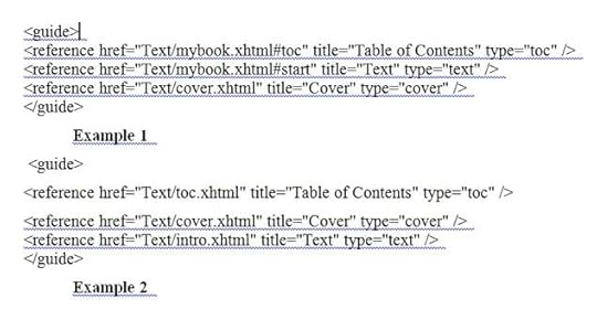
Complicated! That sodding TOC! But the difficulty isn’t not insuperable. Tweak around for a bit, and you’ll have a working Mobi table of contents.
To summarize, there are three different ways to fix the Mobi TOC problem. (1) Use Calibre to convert to Mobi, and tell Calibre to generate a TOC in the Mobi output. (2) Generate an internal TOC in your document, put a bookmark on it, and use Sigil to set the Epub CONTENT.OPF guide to reference to this bookmark. (3) Generate an internal TOC in your document, and use Sigil see that it ends up in its own XHTML fragment that you name toc.xhtml, and set the Epub CONTENT.OPF guide to reference to the toc.xhtml file.
Any of these is easier than it sounds. Don’t be afraid to get in there and tinker.
In the next installment we’ll get into text and image formatting issues.
Do-It-Yourself Ebooks #2. The Simpler Paths.
In my previous post, Do-It-Yourself Ebooks #1: Getting Started, I talked about four levels of workflow for making your own ebooks, Simplest, Simple, Medium, and Advanced. Today I’ll talk about the Simplest and Simple levels. Much of this material carries over to the other levels as well.
This is a lot of material for a blog post. Oh well. I’ll break it up with some photos. When I’m done with these posts, I’ll combine them into a single page with no illos, and maybe make them into an ebook pamphlet as well.
Cleaning Your Text File
I happen to use Microsoft Word, but these remarks should apply to other word processors as well. Before you start epublishing your book, you want to get it into a reasonable format. To start with, I do a series of Search and Replace All calls.
*Replace double spaces by single spaces—do this several times to squeeze out the triple and quadruple space.
*Make sure your word processor is set to use smart or curly quotes—if not, set it that way, then replace all quote marks by quote marks (they’ll become curly), and do the same for apostrophes.
*Replace all triple hyphens — by the em dash symbol. Then replace any double hyphens — by the em dash as well. In the same vein, replace any triple periods by the ellipsis symbol.
* Get rid of any tabs. In Word this means replacing ^t by nothing. Epub and Mobi won’t show tabs. If you want paragraph indents, change the paragraph format style to do this. An indent of 0.3 inches looks good in epub format—you tend to want a little less of an indent in an epub than you’d want in a normal text printout.
*While you’re at it, get rid of all skipped lines between paragraphs. In Word, this means replacing ^p^p with ^p. If you want skipped lines after paragraphs, the HTML can do that automatically at a later point. If you want to use skipped lines for section breaks, it’s probably better to replace them by a typographic symbol like “***”.
*Use a web-page friendly font. Remember that an Epub or a Mobi is bascially a compact website. I prefer serif fonts as opposed to start sans-serif fonts like Arial. Georgia is a good serif font that you will work for most ereaders.
*What about paragraph alignment: Left or Justified? You’re probably used to working with Left, as otherwise the text jumps around weirdly while you write. But generally Justified looks better on ereaders—it makes it easier to see the paragraph indents. It’s a design decision, and you can try it out both ways.
*You can try putting in page breaks after your title page, after your table of contents, and after each chapter. These may or may not stick to the format when you convert to Epub.
Keep in mind, by the way that you’ll probably want to to multiple builds of your Epub and Mobi, trying out different looks. So the design decisions you make at the start aren’t necessarily irreversible.
Internal Table of Contents.
You might as well autogenerate a TOC or table of contents in your word processor before loading your document to an Epub. The first, crucial step is to make sure that your chapter headings are formatted in what Word calls the Heading 1 style as opposed to a paragraph style. That way when your document is munged into an HTML on the way to becoming an Epub and Mobi, your chapter headers will get a native HTML style called h1.
Word and other processors let you insert an auto-generated TOC into your doc, based on the Heading styles. Typically, you only want the Heading 1 entries in the TOC, so it’s not too cluttered. Or if you have Heading 2 entries, you don’t want more than one or two per chapter.
Anyway, put a simple autogenerated TOC into the start of the word processor doc. And then—crucial step for later use, go to the line before the start of the Table of Contents and ask your word processor to add a so-called Bookmark (or Anchor) with the name “toc.” And then the Kindle reader can use that to find your TOC.
One more thing, the very first page of your document should be a title page, rather than the cover, and the title itself should be given the Heading 1 format. It seems dumb to have the book title in the Table of Contents, but that’s what iBooks wants.
Later we’ll learn that you don’t totally need the internal table of contents, as the Epub format generates its own TOC, and the Mobi can too, but it doesn’t hurt to throw the reader a frikkin’ bone in terms of finding their way around your book.
Cover
For the cover of your Ebook, use an external photo editor to create a cover.jpg file which is about 600 pixels by 800 pixels high. The cover obviously should show your name and the title of the book. Save it in your images mages subdirectory. In World use Insert | Picture to insert this image near the very start of your DOC. Format the paragraph holding the cover image as Left or Centered, rather than Justified.
If you have more images, you can insert them too, although we’ll have more to say about this.
As I mentioned before, the cover should be near the start, but the very first page of your document should be a title page.
If you want you can save a bigger version of your cover as well. When you upload to Amazon or B&N, they’ll as for a cover image, and you can upload the same one you use in the book or you can upload the bigger one.
Simplest of All: Upload a Doc. And Preview It.
Upload your DOC or RTF to Amazon KDP and to Barnes and Noble PubIt. You’ll need to upload a cover image JPG file as well. And Amazon KDP will let you download the MOBI file and Barnes and Noble PubIt will let you download the EPUB. And then you can look at them.
And remember you can view the Mobi in the Kindle Previewer, which can be set to match various types of Kindles. One thing to remember about the Kindle Previewer is that its images look a little screwed-up on Windows if you’ve set your Display to make the screen text larger than the default 100%. You can temporarily rest your screen text to 100%, or you can download a Kindle app and view the Mobi in that instead.
For Epub, here are some options:
*Multiplatform Desktop: Firefox EpubReader Add-on or Adobe Digital Editions.
* Android: The FBReader and Aldiko apps are recommended.
* iPhone/iPad/Mac: The free iBooks app is one of very best ebook readers around.
You’ll probably notice that your Epub looks different in the different ereaders and the Mobi looks different in different kinds of Kindles. Kindle tends to put a large paragraph indent, doesn’t skip a line between paragraphs. Kindle Fire does no indent, skips a line between paragraphs. iPhone does a small indent if you asked for that, doesn’t skip a line. NOOK doesn’t resize images below a certain size. Etc.
There’s not a huge amount you can do about this, although I will talk about formatting in section #3 of these posts. Creating Ebooks is one of those “write once, debug everywhere” software things. Rather than going crazy over this, you need to accept a certain lack of control.
Make An Epub and a Mobi with Calibre
Suppose you want to get a little further in. Let’s move from the simplest level to the simple level. Try building Epub and Mobi on your own machine.
Save your document file into the RTF format. Then open Calibre, and use the Add Books button to add your RTF file. Click on the Convert Books button, set the output format in the upper right to EPUB, and fill in some of the info in the Convert Books dialog.
One thing you want to do is fill in some of the Metadata fields. If you have a cover graphic for your book you can add it now, it might as well be color. It can be 600 by 800 pixels, although certain sizes fit better with certain readers.
Looking down along the left margin of the Convert Books dialog you’ll see other subdialogs to play with. Look and Feel gives you some leeway, but not all that much—to really change your appearance you’ll need to take the Medium level workflow and play with some HTML. For now, you might as well leave Look and Feel at its default values.
The Page Setup subdialog is kind of important. The main thing it affects is whether or not Calibre is going to resize any images in your document. If you set Kindle for the output, it’ll crush the images down to about 500 pixels across. I like to change the Output profile to Tablet, which allows images to be up to 1000 pixels across without being resized. Default Input Profile is fine.
We’ll talk about the Table of Contents options below.
So now click the OK button at the bottom of the Convert Books dialog and whirl-whirl-whirl, a little graphic wheel turns at the lower right of the Calibre window and your RTF is converted to an Epub.
Now you can go back to Convert Book sand set the Output to Mobi and make a Mobi too. Another way to get from Epub to Mobi is to open the Epub in the Kindle Previewer, it does a version as well.
You can preview your Epub and your Mobi by clicking on the file format name beneath the image of your book in the right side of the Calibre window. Note that the Calibre previewer doesn’t preserve the proportions of images like your cover, it distorts them as you change the viewer size—don’t worry about this, you won’t see this bad effect in other ereaders
And you can use the other previewers I mentioned above.
Examine and Verify the Epub with Sigil
Now try opening your Epub with the Sigil tool. Here we’re just opening but note that Sigil can open an HTML and convert it to Epub on the spot. But now just open your new Epub.
Use the Sigil menu item View to put check marks on Book Browser and Table of Contents so you see those windows.
The Book Browser shows all the different components that are hidden inside your EPUB file. Two special weird files are CONTENT.OPF and TOC.NCX. You can click on them to see what’s inside them…computer-code type text.
The other files are under headerings like Text, Images, and Styles. You will probably see quite a few HTML files in the Text section, or more properly they’ll be XHTML (almost the same as HTML). Not just one of them. Where did so many of them come from?
Well, the average ereader has limited computational resources, and it doesn’t like to bite off the whole big book at once. So Calibre, or any online “meatgrinder” conversion program such as the one used by Kindle — when converting your RTF to EPUB, they’ll break your document into a buttload of small XHTML files. That’s why you see so many of these files. By the way you can split up HTML files inside Sigil by hand, and we’ll discuss that later.
Also note that you’re free to rename some of the XHTML files if you want, and the changes will instant percolate out into the other parts of the EPUB build. Sigil is a smart and responsive program, and it constantly updates the whole EPUB to match any changes you make in any part.
The Sigil Table of Contents window should show a Table of Contents. If it’s not there, you can automatically create a Table of Contents by clicking Generate TOC from Headings, and then clicking OK in the Heading Selector. You can see if it worked by double clicking on some of the items in the Table of Contents box.
If you didn’t format your book title as a header in Word, you can still do that here in Sigil. Select the title and use the drop-down menu on the upper left corner of the Sigil window and apply a format such as Heading1.
Use the menu item Tools | MetaEditor… to fill in names for the Title, Author, and Language of your EPUB file, if you didn’t do that before.
In the Book Browser window in the left hand side of your Sigil window, find the Images directory and look for contents.jpg in there. Right click on it, select Add Semantics, and check Cover Image…this helps the readers know where your cover is.
Now use the Sigil Tools | Validate EPUB selection to see if you get errors. If you click on the error messages, you’ll see source code for the HTML, showing where the error lies. Often you can get rid of many errors by asking Sigil to rebuild the Tabel of Contents.
For future reference, if you don’t understand a Sigil error message paste it into the Google search box. You can fix them in the HTML files that you see in Sigil, as it allows you to edit the component XHTML files. But I’ll talk about this later.
For now save the Epub. If you made any changes, add the new version to Calibre as a fresh book and generate a Mobi again. Or load the Epub into Kindle Previewer to get a Mobi.
The Mobi TOC Problem
On my first Epub and Mobi builds, the TOC, or Table of Contents, gave me a huge amount of trouble. The weird thing is, your ebook is going to have two tables of contents. One of them will be an ordinary table of contents that’s inside your text.
The other will be a hidden file called TOC.NCX that’s part of the Epub package.
You can see the TOC.NCX if you open your Epub file in Sigil, and you can ask Sigil to generate this TOC.NCX, which is often a good idea, in case the TOC.NCX hasn’t yet been properly filled out.
Regarding the in-text TOC, the easiest way to get one might be to let Calibre make one for you when you covert your Epub to Mobi. To tell Calibre to make a TOC at all, you need to open the Convert Books dialog, set Output to MOBI in the upper right corner, click on the Table of Contents icon on the left. I like to check the “Do not add detected Table of Contents” box, and put these six symbols into the Level 1 TOC (Path Expression) box:
//h:h1
And I leave the Level 2 TOC and Level 3 TOC boxes blank. This tells the Calibre TOC generator only to make listings for the Heading 1 or h1 titles…as opposed to putting in an entry for every dippy little Heading 2 or Heading 3. I could also check the “Force use of auto-generated Table of Contents” box, I suppose, but I tend to leave it unchecked in case I have a hand-made TOC in my file.
Calibre actually puts this TOC into your Mobi file by default at the end. If you want the Calibre generated TOC at the start, you can tweak a setting in the Mobi Output section of the Convert Books dialog.
The other way to get a Mobi TOC is to do it yourself. I mentioned before that you might as well put a simple autogenerated TOC into the start of the word processor doc. And I said you ought to go to the line before the start of the Table of Contents and ask your word processor to add a so-called Bookmark (or Anchor) with the name “toc.” While you’red at it, put a hard pagebreak before and after your internal TOC, which will probably force it into a separate little XHTML document of its own when Calibre shatteres your document into numerous small HTML files.
The Kindle reader can use the bookmark or the separate XHTML fragment to find your in-document TOC, but you have to feed it a so-called guide reference that you edit into place using Sigil on the Epub file.
The so-called guide references live near the end of an Epub component file called CONTENT.OPF. You can browse and edit this file if you open your Epub inside Sigil. Just click on CONTENT.OPF. Typically Kindle only pays attention to three entries with these types: “toc” “cover” and “text.” The “toc” link goes to the Table of Contents. The “cover” link goes to your cover image. The “text” link goes to where you want the beginning of the book to be. You title these references “Table of Contents”, “Cover,” and “Text” or “Beginning.”
The links that you give for these references are either bookmarks within pages or they are individual component XHTML “web pages” of the web site encapsulated in the Epub.
Here are two examples.
Example 1 uses bookmarks within pages, where you’ve also added a “start” bookmark for where you want the reader to begin with your book. The cover reference will probably be autogenerated and the file holding the cover renamed cover.xhtml. See the image below of the code in CONTENT.OPF.
Example 2 is for when your files are shattered into little ones and your in-text table of contents ended up in its own page. You might as well rename this page “toc.html” and while you’re at it, rename the page holding the cover “cover.html” and the initial introductory part of your book “intro.html.” Then the guide material looks like the second part of the image from CONTENT.OPF below.
Complicated! That sodding TOC! But the difficulty isn’t not insuperable. Tweak around for a bit, and you’ll have a working Mobi table of contents.
To summarize, there are three different ways to fix the Mobi TOC problem. (1) Use Calibre to convert to Mobi, and tell Calibre to generate a TOC in the Mobi output. (2) Generate an internal TOC in your document, put a bookmark on it, and use Sigil to set the Epub CONTENT.OPF guide to reference to this bookmark. (3) Generate an internal TOC in your document, and use Sigil see that it ends up in its own XHTML fragment that you name toc.xhtml, and set the Epub CONTENT.OPF guide to reference to the toc.xhtml file.
Any of these is easier than it sounds. Don’t be afraid to get in there and tinker.
In the next installment we’ll get into text and image formatting issues.
April 20, 2012
How to Make Ebooks #1. Getting Started.
[Note: I have combined, expanded and revised these four entries to make, fittingly, an ebook called How to Make An Ebook, available from Transreal Books.]
I plan to put up a series of four posts about the topic of how to epublish books on your own. In these posts I’ll focus on doing it all yourself. I’m going to describe the specific series of steps that I’m taking to epublish my Transreal Books.
Don’t take everything I say for gospel. There are many paths through the thickets of epub, and I’m only now beginning to find my way. I posted on this topic last fall, and revised that post in February, 2012, and by now I’ve expanding my understanding about many of the things in the old post. So it’s time to try again.
Posting the information seems worthwhile as I’ve really had quite a bit of trouble in learning it. Epublishing abounds with gotchas. But clearly its time has come.

Distribution: Kindle, NOOK, iBook, Direct
So suppose I have a document and I want to make it into an ebook. Let’s start by describing the steps you can use to distribute your ebook once it’s done.
There are four main channels for distributing ebooks:
(1) Amazon Kindle,
(2) Barnes and Noble NOOK,
(3) the Apple iBook store.
(4) Your own website. You can create MOBI and EPUB format books so as to reach all existing ereaders.
Regarding the corporate channels, the ebook market share figures are constantly being debated, revised, and spun. As of 2012, it may be that Amazon sells close to 70% of ebooks, B&N close to 20%, and iBook around 7%, with a variety of smaller channels picking up the crumbs.
One thing to keep in mind from the start is that you can distribute through all of these channels for free—provided you have a certain amount of patience and a good tolerance for pain. You can pay various intermediaries to set up distribution for you, but don’t make the mistake of paying a large up-front fee for this service and/or the mistake of cutting them in for the lion’s share of your royalties.
Set-Up
You need to set up your corporate distribution accounts. Search for “Amazon KDP” (Kindle Direct Publishing) to get an account for distributing Kindle ebooks. Search for “Barnes and Noble PubIt” to get set up for distributing NOOK. Search for “Lulu ebook” to get an account that will distribute to Apple iBooks.
I know there are alternate paths to the iBook market, as well as to the crumb-level channels. But to keep things simple, I’m going to stick to KDP, PubIt, Lulu, and your own indie website.
Another initial step (not absolutely necessary) is to invent a name for your publishing enterprise, and to purchase an ISBN (International Standard Book Number) for your book. You do this by seraching for “Bowker ISBN” and buying one or several ISBNs—they’re not hugely expensive. The gain with having your own ISBN is that it makes it easier to get your distributors to attribute your book to your personal publisher name. Note that some people say that you need a different ISBN for each distribution channel. My preference is to quietly use one particular ISBN for all of a given ebook’s channels.
Now a bit about distributing your ebooks from your own website.
First you want to get a PayPal account so people can easily pay you. Note that PayPal is set up to accept credit card charges from customers who don’t have a PayPal account of their own.
Second you need a service to handle the process of collecting money from the customers and getting copies of the ebook to them. I’m finding that the relatively inexpensive ($5 per month with no extra per-book charges) service E-Junkie works well for me. Be careful here, there are some rip-off services that do the same thing, but who charge you a very high monthly fee and who take something like 10% of all your sales.
Third you’ll need to set up a webpage describing your ebook or ebooks, complete with purchase links (which will redirect them to, let us say, E-Junkie, who’ll collect customer info, chage them via PayPal and email the customers a download link).

EPUB and MOBI Formats
Ebooks are distributed in two main formats: EPUB and MOBI. What are they?
EPUB is the richer and more universal format. Basically, an EPUB file is like a compressed website. It’s a package file that holds all the elements of a website. Specifically, an EPUB holds a Text directory with one or more HTML files with your text in it, a Styles directory with a CSS style sheet to control the styles used in your text, an Images directory with JPG image files for each image in your text, a TOC file with a table of contents, and a funky OPF “manifest” file that describes how the pieces fit together. It’s a website wrapped in a package.
The Barnes and Noble NOOK reads EPUB, as does the iBook app.
There are various ways to turn your DOC or RTF text file into an EPUB file—I’ll discuss both an easy way and a harder way of doing this.
MOBI is the Kindle ebook file format, it’s a more primitive kind of package file that, like EPUB, holds text, images, table of contents, and a “manifest.” Amazon changes the name of this format to AZW. You can’t make AZW files at home, but it’s rather easy to convert an EPUB file into a MOBI. We’ll talk about this in a bit. The thing to remember is that first you need to make an EPUB, and making the MOBI after that is practically effortless (modulo a bit of screwing around with some tags).
Keep in mind that if you want to give away or to sell your book from your own website, you’ll need to make EPUB and MOBI versions of it at home. And, once again, if you have these two formats, then you can reach all the ereading devices or apps in existence.
But—if you can’t face the tweaking ordeal of making EPUB and MOBI, you can simply sell your book via the three big channels.
Amazon KDP will accept MOBI, EPUB, HTML, DOC or RTF.
Barnes and Noble PubIt will accept EPUB, HTML, DOC, or RTF.
Lulu will accept EPUB or DOC.
So…if you don’t want to do indie distribution, you can just clean up your DOC or RTF and upload it to Amazon and to Barnes & Noble. And upload a clean DOC to Lulu for the iBook market as well.

Making your own EPUB and MOBI: Why and How?
There are two main reasons to make your own EPUB and MOBI.
First of all, it gives you better control over how your ebook will actually look. In particular, making your own epub allows you to put nice-looking illustrations into your book.
Secondly, as I keep saying, if you want to distribute indie ebooks on your own, you need to get them into EPUB and MOBI—and really this just means getting them into EPUB, as the EPUB to MOBI conversion is so simple.
So now lets talk about how you make an EPUB and a MOBI.
You’re going to use three very good free software tools Calibre and Sigil , and the Kindle Previewer. These tools do different things, and you need both of them. They’re constantly being updated, so check for updates every so often.
Calibre converts files from one format to another. And can use Calibre to edit the so-called metadata (title, author’s name, ISBN, publisher name, etc.) in your files.
Typically you use Calibre to convert RTF or HTML into EPUB and then into MOBI. That is, you shoot for getting the EPUB the way you want it first, and only then do you convert to MOBI.
The Calibre conversion process is automatic, although there are a rather large number of Conversion settings you can tweak to affect the outputs. It usually takes multiple iterations until you get the settings and the outputs just right. Calibre also has a primitive ereader window that lets you look at the current states of your EPUB and your MOBI. When you’re happy you can save your EPUB and MOBI files to disk, and try them out in other ereaders. And you’re free to return to Calibre and change the files some more.
Sigil allows you to tweak your EPUB file in various ways: you can edit or wholly replace the text, add or remove images, alter the Table of Contents, and more. Sigil also has the ability to verify if your current EPUB has any format errors in it, and it helps you fix them.
Kindle Previewer autoconverts an EPUB into a MOBI and lets you preview how the MOBI will look on the various kinds of Kindle devices.

Three Work Flows
I’ve used three different work flows in making your EPUB and MOBI: a simple level, an medium level, and an advanced level. (I won’t be talking about pro-level use of Quark or InDesign for making EPUB files, as I’ve never used these tools.)
Simple Level
* Clean up your DOC or RTF file.
* If you’ve been using DOC, now save it as an RTF.
* Use Calibre to convert your RTF into an EPUB.
* Use the Sigil software to verify the EPUB and to do minor edits on it.
* Use Calibre or the Kindle Previewer to convert the EPUB into a MOBI.
Medium Level
* Clean up your DOC or RTF file.
* Convert your DOC or RTF into an HTML file, then tweak the HTML
* Use Calibre to convert your HTML into an EPUB.
* Use the Sigil software to verify and to correct problems in the EPUB.
* Use Calibre or the Kindle Previewer to convert the EPUB into a MOBI.
Advanced Level
* Clean up your DOC file.
* Use Dreamweaver to convert your DOC into an HTML file, then use Dreamweaver to clean and tweak the HTML. Create a CSS stylesheet for the HTML.
* Use Sigil to directly create an EPUB from your HTML, from an associated CSS stylesheet you’ve created, and from images that you’ve properly sized.
* Bounce back and forth between Dreamweaver and Sigil, finding and correcting problems in the EPUB.
* Use Calibre or the Kindle Previewer to convert the EPUB into a MOBI.
In the later posts in this series, I’ll talk about the steps of these workflows, and about such issues as how to handle covers, internal images, tables, styles and tables of contents.
But if you’re eager to start experimenting, you could give the simple workflow level a try right now, just to see what your EPUB might look like. Make a copy of some document you like, put it into a Playpen directory, and let Calibre munge on it. One thing worth stressing: always keep an Archive directory where you keep the best forms of your DOC, EPUB, HTML or whatever files for your ebook. Calibre has a way of screwing with the files that you load into it, and you don’t want to overwrite your archived files with the screwed-with files.
For getting started, there’s an online Calibre user manual to help you along. The MobileRead forums have a huge amount of info if you use the Search box. And simply Googling your questions often leads to good answers—although there’s a lot of inaccurate jabbering as well.
Rudy Rucker's Blog

- Rudy Rucker's profile
- 583 followers


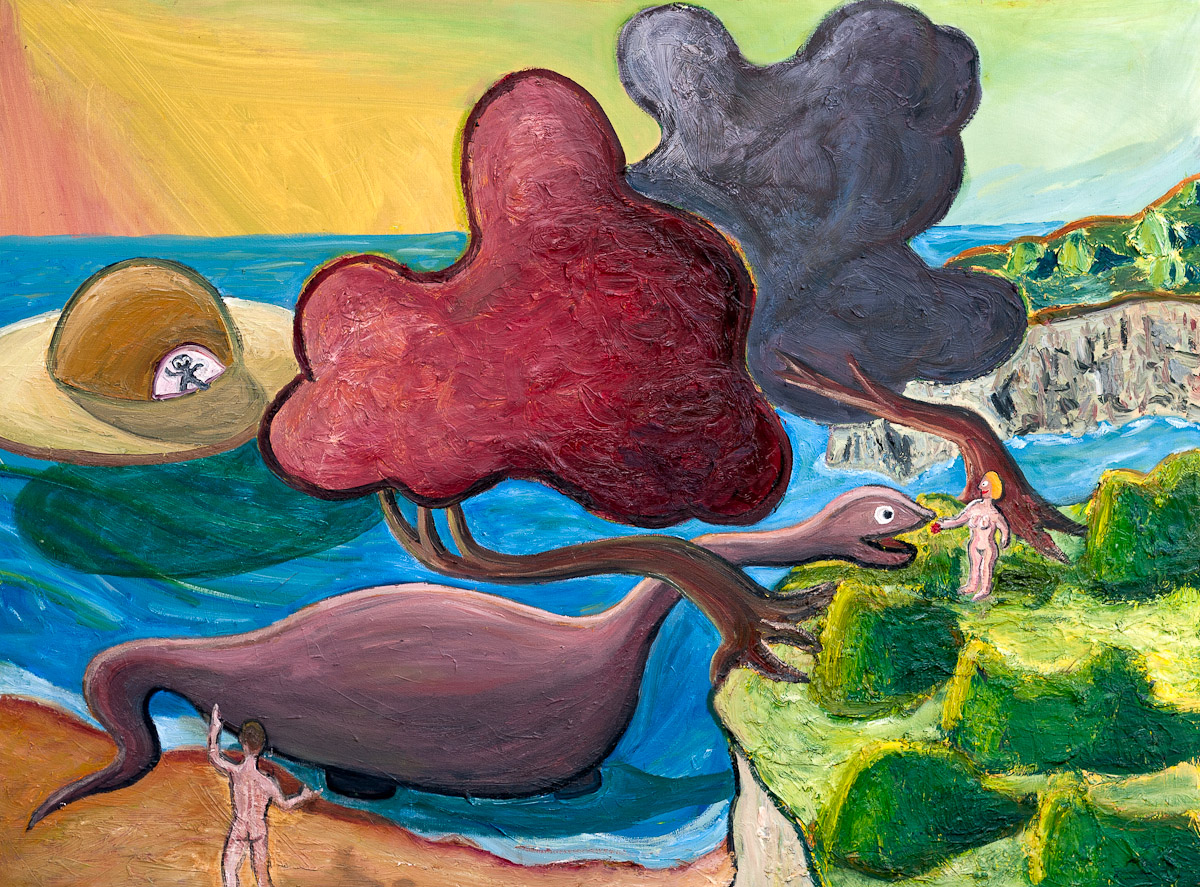
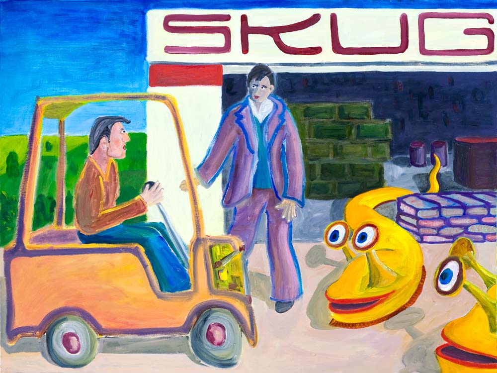