
Rated YA-MA discussion
Book Chat
>
Book Covers - The Good, The Bad and The WTF?
 I like the covers, Imma go check out the descriptions...
 Yeah, I just saw the covers and didn't even check the descriptions...LOL. Let me know if they seem good.
I liked the cover for Kindom of Gods better, but the description didn't really interest me. Its the last book of a trilogy, and they all sounded ok to me.
Yeah, I just saw the covers and didn't even check the descriptions...LOL. Let me know if they seem good.
I liked the cover for Kindom of Gods better, but the description didn't really interest me. Its the last book of a trilogy, and they all sounded ok to me.Now Tyme's End...wow. Its sounds REALLY GOOD. I'm gonna have to get ahold of this one and read it soon! Thanks Jen!
 I really like both of those covers, but the second one looks more unique.

 I've read the first in Jemisin's trilogy, it's fantasy, but not in the typical way. Definitely a different voice in the genre, but not for everyone.
 Carina, let me know how Tyme's End is!
 I am so excited for City of Lost Souls!!!!! Eeee!
message 311:
by
Stacia (the 2010 club), groupaholic, YA-MA founder
(last edited Jan 06, 2012 02:21PM)
(new)
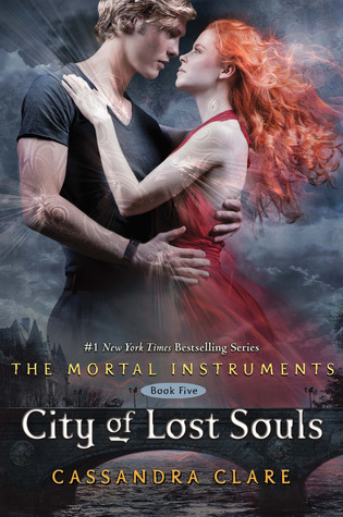
My first thought was : Jace got a haircut. Nice cover! It's great to start seeing characters instead of cut-off heads. Clary's pose looks very awkward though, as did her expression on the last book.
I love the style of all of the MI and ID covers (the metallic accents on the hardcovers are beautiful), but I'm starting to favor the ID ones more.
I hate the look of clary
but I do like the style of her covers but I agree I like it ID covers more
and I kinda liked them better with no faces I hate changes lol pick a type a stick to it!
at least jaces hair looks nice enough to want to touch
but I do like the style of her covers but I agree I like it ID covers more
and I kinda liked them better with no faces I hate changes lol pick a type a stick to it!
at least jaces hair looks nice enough to want to touch
 oh.! its perfect..and it is my favourite of all the covers so far...
message 315:
by
Stacia (the 2010 club), groupaholic, YA-MA founder
(last edited Jan 12, 2012 05:28PM)
(new)
New look for BRR and the Dustlands series, plus book 2 cover reveal :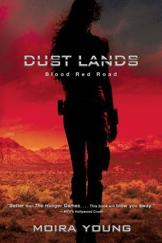

message 317:
by
Stacia (the 2010 club), groupaholic, YA-MA founder
(last edited Jan 12, 2012 05:43PM)
(new)
Are we thinking Jack?
Ok, my first reaction is: Aaaaaaaaaahhhh!!!And second: Yes! Definetly Jack! I love it!
 I HATE when they change cover formats. FFS is it too damn much for me to want all my books in a fucking series to MATCH?! The shade series changed the third books style, the nightshade series started good then went slutty pole were stripper, and now my BRR wont match.
 Okay...rant off for now. BUT IM NOT HAPPY!!!
 I really, really liked the original cover for Blood Red Road. But yeah, Jack is hot.
 It does seem like an abrupt change but I do love the look.
 I preferred the original Blood red Road cover too.
 I just like that model.
message 325:
by
Stacia (the 2010 club), groupaholic, YA-MA founder
(last edited Jan 15, 2012 02:22PM)
(new)
Is it just me, or does the ghost in the background look off? Almost as if he were (was?) squished into a skinnier form. It looks very strange to me.Although, I actually think there's a chance I might read the book after reading the summary because it might be interesting, but what's up with the word gonzo? Did I miss a new trend? If so, I think I'll pass on using the word.
 - click for gr book page/larger view
 You're right, LOL! That ghosts looks weird.
message 327:
by
Stacia (the 2010 club), groupaholic, YA-MA founder
(last edited Jan 15, 2012 10:25PM)
(new)
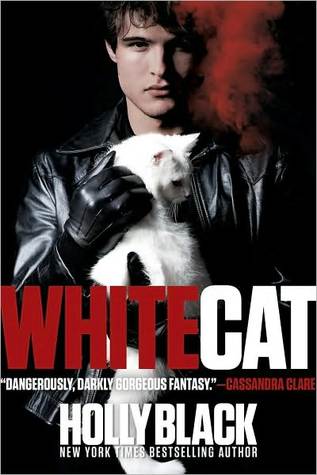
They changed the covers for the Curseworkers series. I don't get it. The old covers were great.Old
New
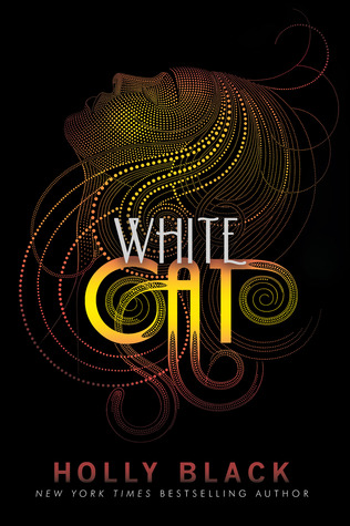
Old
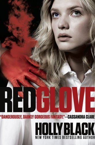
New
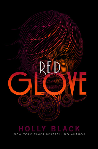
Old
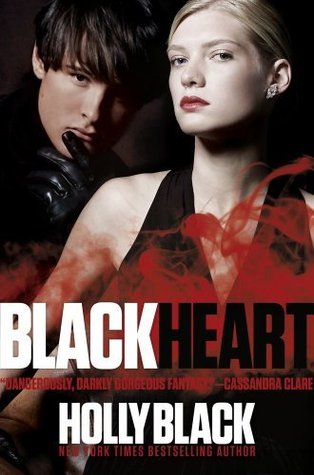
New
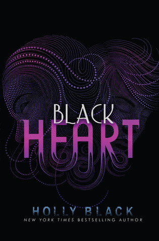 To the new?
Yeah, personally. They're fine on their own, but I don't know that it exactly reflects the story. Mobsters, illicit activities, interesting supernatural abilities...not seeing it.
The new ones almost look art deco to me. Either that, or a bad 60's acid trip. Either way, not really the right style for this series.
Yeah I haven't been able to figure out what in the world they were thinking with this cover change. It's bizarre.
Ha....I don't like the new covers either =/
Oh for fuck sake. I am not allowed in this thread anymore. I come in here and leave wanting to punch cute things. The brainiacs in the art departments of the publishing houses need to be shit canned. Quit fucking changing things in the middle of a fucking series. Especially ones I like and have signed copies of that MATCH.
To the new?
Yeah, personally. They're fine on their own, but I don't know that it exactly reflects the story. Mobsters, illicit activities, interesting supernatural abilities...not seeing it.
The new ones almost look art deco to me. Either that, or a bad 60's acid trip. Either way, not really the right style for this series.
Yeah I haven't been able to figure out what in the world they were thinking with this cover change. It's bizarre.
Ha....I don't like the new covers either =/
Oh for fuck sake. I am not allowed in this thread anymore. I come in here and leave wanting to punch cute things. The brainiacs in the art departments of the publishing houses need to be shit canned. Quit fucking changing things in the middle of a fucking series. Especially ones I like and have signed copies of that MATCH.Argh.
 As art, the new book covers are pretty. BUT as far as representing the books...they make them look more girl and feminine than the books are.
Yup, I agree with you Cassi.
As art, the new book covers are pretty. BUT as far as representing the books...they make them look more girl and feminine than the books are.
Yup, I agree with you Cassi.If they were covers for another series I would actually like them, but they already had GREAT covers for the Curse Worker series that matched with the them of the books, so why go mess with it?
Carina wrote: "Yup, I agree with you Cassi.If they were covers for another series I would actually like them, but they already had GREAT covers for the Curse Worker series that matched with the them of the book..."
I think the reason they change covers is to try to entice a new audience. I'm guessing they are going for more romance/women readers. Maybe? However I just don't see how these jive with the content of the book. Curse Workers has a male narrator. These covers would lead me to expect a more female voice.
That's too bad if this is what's going on. The books aren't meant to be specifically about romance. I'd prefer it if the trilogy was marketed toward both males and females because I think the books would appeal to both males and females.Although, I guess in the pnr/uf genre, most (not all) of the purchasers are female.
I've never even heard of that series but I can tell you that the first covers (although great) does not give a PNR/UF vibe, while the second ones do. If I were to take a guess, the series is not selling as the publishers expected and they decided to change the covers to see if sales improve.
message 340:
by
Stacia (the 2010 club), groupaholic, YA-MA founder
(last edited Jan 16, 2012 04:52PM)
(new)
The books aren't really a traditional pnr. They're about a mafia type family who are involved in some shady dealings/crimes. The only thing that qualifies them as UF is that the characters have abilities to work curses on people through touch, but it harms their body and mind to do so.In that sense, I think the original covers fit the series vibe better, but I understand what you're saying. It's all about marketing.
I'm with Hillary though, that it messes with all of us who own books with the other covers. This in one of the few series I have in print, and I'd prefer my covers to match.
Oddly enough the covers remind me of the edition of Their Eyes Were Watching God that I read in high school...random.
I like this one.
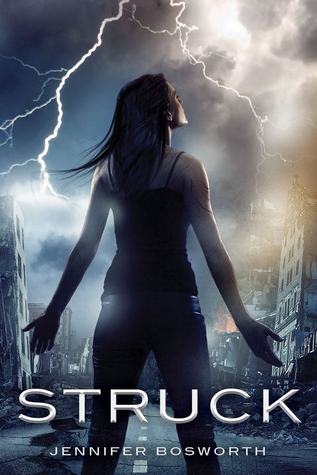
The summary's first sentence : Mia Price is a lightning addict.
 That certainly catches your attention.
Another series cover change, this time between the 1st and 2nd book.
That certainly catches your attention.
Another series cover change, this time between the 1st and 2nd book.First
 changed to

and then the 2nd in the series

I actually like this cover change more than I've liked some of the examples above. Does anyone else here read this series?
I actually like this cover change as well. Haven't read it, though.
I added topic for the series Samantha, in case you were interested.I've been looking at this cover trying to figure out what's going on.
 Stacia ~ resolute wrote: "I added topic for the series Samantha, in case you were interested.
I've been looking at this cover trying to figure out what's going on.
"
Weird, really weird!
 I love that cover... I wonder if that's the same girl on the top picture and bottom? Unless the tops a guy with long hair?
Samantha wrote: "Another series cover change, this time between the 1st and 2nd book.
I love that cover... I wonder if that's the same girl on the top picture and bottom? Unless the tops a guy with long hair?
Samantha wrote: "Another series cover change, this time between the 1st and 2nd book.First
changed to and then the 2nd in the series [bo..."
I read and loved the first book. It was quite different from the typical YA paranormal romances out there. I've yet to read Darkness Falls. I prefer the original cover art b/c it doesn't give you any preconceived notions.

Rated YA-MA
Books mentioned in this topic
Feuerhimmel, Sternennacht (other topics)Of Fire and Stars (other topics)
The Wrath and the Dawn (other topics)
Ink and Bone (other topics)
Paper and Fire (other topics)
More...
Authors mentioned in this topic
Cinda Williams Chima (other topics)Cinda Williams Chima (other topics)

This, one, too!