Rated YA-MA discussion
Book Chat
>
Book Covers - The Good, The Bad and The WTF?
message 701:
by
Cassi aka Snow White
(new)
Jun 15, 2012 03:23PM
 It's interesting. I'm always glad when somebody does something different.
reply
|
flag
message 702:
by
Stacia (the 2010 club), groupaholic, YA-MA founder
(last edited Jun 15, 2012 03:58PM)
(new)
 The all white color scheme (or I guess red and white and gray/blue in this case) makes me think futuristic every time.
 Have you heard of the video game Portal? The style reminds me of that.
Spaceship and hospital would be good comparisons though.
 And what's sad is if someone did that, I'd recognize what they were trying to do right away.
The game though...talk about depressing. The music doesn't help either.
 Her shoulder kinda bugs me though. Now that I'm looking at it more. It's obviously just a model shot with a very cool effect on top of it.
 Not sure about this one. I like it, but at the same time, I feel like its more of the same, ya know?
 File it away on one of the lists.
http://www.goodreads.com/list/show/14...
http://www.goodreads.com/list/show/10...
 Haha! You beat me to it Jenny!
Anyone else a little underwhelmed?
I mean its nice, and it goes well with the series. But... I don't know.
 I don't think they are great covers for a computer screen, and I'm generally over the whole pretty dress cover. BUT, they look pretty on the actual hardcover book. I like the shiny parts too, like Jenny, and it's beautiful on my book shelf.
Oh and, I can't WAIT for this book!
 I'm wondering what yall think of the cover changes for Shatter Me. They did that thing where they change all the fucking covers when the paperback for book one comes out.
Before:
 typical girl in dress, with some really cool effects on it and some shiny bling
After:
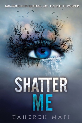
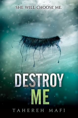

I think I like this change because I am SO SICK of the girls in dresses. Maybe this is why they wanted to do something different in the first place. Also, the eyelashes are crazy which makes it kinda cool even though giant eyes in the sky are pretty freaking weird.
 The eyes look creepy to me but I agree that it's good to see anything other than dresses these days.
 I haven't read the book (still on the fence if I want to) but from what I've heard it sounds like the dress cover wasn't fitting at all with the female lead. It sounds like she was a bit more run down.
 I haven't read it either. Though I'm not sure how eyeballs with trees and water and ice for lashes is more accurate lol.
 I haven't read the books but these covers are much more graphically interesting. Isn't she in a prison in a dystopian world? A giant eye seems more fitting than a prom.
I'm so tired of prom dressed dystopian novels. It doesn't even make sense!
 Hunger Games shot in prom dresses might have been interesting. No one would be able to kill anyone because they'd be tripping over their hems.
 The original cover does not match the book AT ALL. The only thing I like about that cover is the sparkly background, since the model's pose is super awkward.
I don't like the new covers at all though. They certainly are different, but I just don't like them. The bird in the eye of the first one actually does go with the story, so that's good.
 I like them this way. They seem much more imaginative. The first thing I thought too was the Hunger Games butterfly eyelashes.
 I like the new covers for Shater Me. I'm not really planning on reading them, but they look much better now.
BTW, Hunger Games lashes are epic!
 The new Shatter Me covers are definitely eye catching! No pun intended. :P I like covers that make me stop and stare. I'm leery of smashing covers, though, b/c they can be crap books in sheep's clothing.
I am SO OVER the prom dress theme...
 Jenny wrote: "lol. Hunger Games in high heels."
Okay, now I'm picturing Katniss in some killer CFM dominatrix strappy sandals. Whole other story. :)
 I sort of like those eye covers but I don't think they got a really good eye for that. If you look at the eye on its own, without the trees and whatever, it looks sort of limp and pining. But maybe that's the point of the book? I haven't read it either.
 Wow! I think the new covers for Shatter Me are much better. I would actually pick it up now. And the fonts is so much better now too.
 I don't like it , it looks too staged with the props. It is like something you could see from a photo studio. I do like the orange circles and lines over the image though.
 I agree with you Diane.
 I don't think the circles go with the rest of the image. Circles tells you 'futuristic' while the images and the dress tell you 'old world'.
I haven't read the series so I have no clue what it is about.
message 737:
by
Stacia (the 2010 club), groupaholic, YA-MA founder
(last edited Jun 26, 2012 02:01PM)
(new)
 D.G. You're actually sort of close with that description. The time period is somewhere in the future but the women are treated like women from a time when females were made to act subservient. So maybe that's what they're going for with the cover.
Not really a big fan though. I agree that it looks like a bad portrait studio pic where the photographer decided to pull out all of the props and set them up.
 Maybe it's the background? Because the other covers were very similar but look less hinky. I like green but maybe they should've chosen a darker or even a lighter green because this one looks too 'green screen'. Which could be why it seems a little studio/unfinished.
I do like that the ring is off her finger and the bird is free of its cage, though.
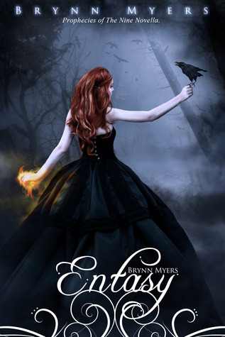
 I want to share this cover
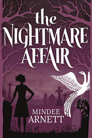
I like it! Very simple, but not ordinary IMO. PLUS the description sounds like an original idea too!
Won't be out till March 2013 though...
 That does look like a cool book. I noticed it the other day and thought...hey, I might like that one.
 Stacia ~ mistress of mediocrity wrote: "That does look like a cool book. I noticed it the other day and thought...hey, I might like that one."
One of the reasons I like to log into Twitter once in a while. I usually find cool books I hadn't seen before/yet.
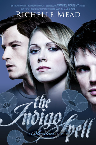
 I just don't understand the person who comes up with these covers for VA or Bloodlines. I do like the color but WTF is the rest of it? I am going to have to get those on Kindle otherwise I think I'd find myself drawing on their faces.
 I actually like the VA covers. Now the Bloodlines covers have been AWFULL so far. Just like the Georgina Kincaid covers. Hideous!
But as long as the book is good right? lol
 Bloodlines and Georgia Kincaid are definitely the least awesome. I just... What the hell are those expressions?!
I think the guy on the left is like, "I'm going to pee on that over there." And the girl is all, "He did not just say he's going to pee on that." And the guy on the right is, "I peed on that earlier."
 Jenny wrote: "I think the guy on the left is like, "I'm going to pee on that over there." And the girl is all, "He did not just say he's going to pee on that." And the guy on the right is, "I peed on that earlier."
O.o
WTF? Haha! You crack me up! You just made my night that much better Jenny, LMAO!
 My friend calls her lizard girl because she pinches her lips in every expression.
 She is probably very pretty but it's hard to see it because she looks constipated and pissed off.
 Dude I swear the publishing house Mead has her deal with...their art department HATES HER WITH THE FIRE OF A THOUSAND SUNS. They give her books some of the UGLIEST covers. VA had okay covers. Bloodlines has awesome script but ugh covers. Georgina original covers for the trade pb are wtf yo gag. Georgina mass market pb are decent, great color scheme decent model and poses. Dark Swan covers...for the love of all that is holy...they are just as bad as the georgie trade pb and dark swan only came out in mass market pb. All I can say is..at least I only have to look at the bindings on my bookcases, and what is contained within the ugliest covers on my shelves is made of awesome.
 I don't know if there are other Ally Carter fans out there, but the cover for her third Heist Society book was released yesterday. I don't know how to paste a photo but here's a link to see it:
http://hollywoodcrush.mtv.com/2012/06...
Books mentioned in this topic
Feuerhimmel, Sternennacht (other topics)Of Fire and Stars (other topics)
The Wrath and the Dawn (other topics)
Ink and Bone (other topics)
Paper and Fire (other topics)
More...
Authors mentioned in this topic
Cinda Williams Chima (other topics)Cinda Williams Chima (other topics)


