
Did You Notice Something a Little Different?
UPDATE: Thanks for all the feedback! For those of you who were having issues with blurriness, we have good news: we pushed out an update this afternoon that improves the sharpness of the font for users who were affected. We’re monitoring all the comments and will keep you posted on any further updates.
If you’re a frequent visitor to Goodreads, you've probably noticed a few tweaks we’ve made to the fonts and colors on the desktop site today. Our goal with these small-but-important changes was to consolidate and refresh our visual styles and lay the groundwork for some design improvements that we’re planning in the future.
What’s different?
To enhance the readability of text on Goodreads, we’ve adopted two new open-source fonts. Lato, our sans-serif font, was designed by Warsaw-based designer Łukasz Dziedzic (“Lato” means “Summer” in Polish). Merriweather, our serif font, was created by Eben Sorkin and was designed to be pleasant to read on screens.
To make it easier to scan the page for information you need, we’ve touched up and modernized the design of common page layout elements like section headers, tabs and links.
To simplify and modernize our visual design, we’ve reduced the number of link colors we use, removed gradients from buttons and the site navigation, and applied a more harmonious color palette to interactive elements such as buttons, stars, and links.
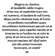
Before:


Comments Showing 2,251-2,300 of 3,113 (3113 new)
message 2251:
by
Jenny
(new)
Dec 17, 2015 05:44PM
 I don't care either way but this new font is a little harder to read. Some of the letters are a little blurry at the top of them.
flag
 While I appreciate having a printmaker artisan design a whole new font, choosing a Sans Serif, (and a small size), for the body of text makes the reading of the actual reviews difficult.
Suggestion: Switch the fonts. Prepare the Layout of Heads and Sub-heads with the Sans Serif and the wonderful Serif font(s) for the body of reviews.
GR then still creates a "new look," without sacrificing readability.
"Much Thanks" for listening / reading.
 I downloaded the chrome plugin stylish and changed the background color. Ugh, everything is so much better, but users shouldn't have to go through lengths like this to visit a site they /used/ to like. I'm gonna check out booklikes and if that, indeed, seems better, I'll be switching.

 Can someone who understands coding/website technology explain why each page jumps around and appears in a nonfancy font until the fancy font gels? It's like the site can't erase its original font, whether Arial or Trebuchet or whatever and has to be reminded. It is unbelievably annoying.
It happens with all the headers at Talking Points Memo and it happens with all the fonts here.
 Goodreads no longer has books! Where did the line of books at the top of the screen go? *plays sad funeral dirge music*
 I've installed Font Changer with Google Web Fonts for Chrome and I've set the font as Verdana. Heaven.
Kris wrote: "Goodreads no longer has books! Where did the line of books at the top of the screen go? *plays sad funeral dirge music*"
I've installed Font Changer with Google Web Fonts for Chrome and I've set the font as Verdana. Heaven.
Kris wrote: "Goodreads no longer has books! Where did the line of books at the top of the screen go? *plays sad funeral dirge music*"Books and reading are now uncool.
What is the new name of Goodreads going to be? It can't have reads in it because we can't read the site anymore.
 Please please please bring back the old font. :(
 The blue print in this font is harder for 'older' eyes to read.

 Sympathy wrote: "I downloaded the chrome plugin stylish and changed the background color. Ugh, everything is so much better, but users shouldn't have to go through lengths like this to visit a site they /used/ to l..."
Whats book likes?
This relates to the same listopia bug I've been posting about. On the page listing the listopias a user has voted on, e.g.https://www.goodreads.com/list/user_v...
there is no direct way to get to each listopia from that page. Clicking on either the book cover or the list title both take you to the user vote, but not the listopia. One link should go to the listopia, the other to the user vote.
 This font is causing a lot of eye strain for me, although it is thankfully keeping me from visiting the site so much. I've only come on when friends specifically ask for me to look at a recommendation since the change. So that's a plus for me, although perhaps not for Goodreads. I like some of the feature updates, although can't explore them for fear that I will end up with a migraine as I did last night while trying to look at a book I wanted to review.

 Erin wrote: "What was even the point of making the profile picture a circle?"
And how long will it be before our reviews look like this.
 Lobstergirl wrote: "Erin wrote: "What was even the point of making the profile picture a circle?"
And how long will it be before our reviews look like this.
" Visually quite attractive, and that's the main point on a reading site, right?
Is the new absence of gender on author profiles a bug, or a new thing?
message 2270:
by
☯ DαякєηRнαℓ ❛ ᶜʳᵒᵘᶜʰᶤᶰᵍ ʰᵘᵐᵃᶰ ; ʰᶤᵈᵈᵉᶰ ᵗᶤᵗᵃᶰ ❜
(last edited Dec 17, 2015 06:57PM)
(new)

Dear Goodreads;
Please fire your online decorator. Please.
That is the first thing I think about seeing the new GR look. Every single time GR has TRIED to redecorate they've only managed to do one thing -> EPIC FAILURE ALERT
Here's my list of like, don't mind / don't care about and hate.
LIKE
) That my profile pic is larger.
DON'T MIND / DON'T CARE
) The font (Though template makers in particular are VERY displeased about this since it ruins their templates and it is a bit crap)
) I can still see fancy text & symbols
) The round profile pic (though it is stupid)
WHAT I HATE
) The screen glares at me
) The colour (gr is green not this jade / turquoise thing)
) I hate the square features
) My profile doesn't say if I'm male or female anymore and it also says the last time I logged in was November. Well obviously that is untrue
) I can't invite my friends from my groups
) The way the post box works now. People have complained they can't enlarge it and I've found that the text is all squished together while typing and such. Plus its smaller. What about vision impaired folks?
) I've always loved the muted colours and old feeling to GR. Like an antique, like a great older book friend
) I hate how each time updating the site ends in a disaster
) I don't actually see a difference between the old and new version.
) I hate that people actually LIKE this disaster.
I can continue but ah well. Please GR, you're so perfect already, you don't need looks! We love you as you are dammit!
Also the spacing works weird now...
 The only thing I miss is the 3D-ness of the "Want to Read" button
The eye strain is unreal.

A few weeks of this and I may need a cornea transplant.
I literally had to turn down my screen brightness!
I've already turned down my brightness (yesterday) but I still have eye strain.
Its this damn jade / turquoise colour. I swear they went for a 'glare' theme.
 ☯ DαякєηRнαℓ ❛ ᴰᵃʳᵏ ᴴᵘᶰᵗᵉʳ ❜ wrote: "Its this damn jade / turquoise colour. I swear they went for a 'glare' theme."
It changes color when you scroll up and down. Acts like a strobe light. Not good.
Just had an awesome friend fix that for me, so no more green, hello brown.
Susan wrote: "☯ DαякєηRнαℓ ❛ ᴰᵃʳᵏ ᴴᵘᶰᵗᵉʳ ❜ wrote: "Its this damn jade / turquoise colour. I swear they went for a 'glare' theme."It changes color when you scroll up and down. Acts like a strobe light. Not good..."
Lucky :(
I also just checked a random book page, the font is fattier and blurry to me. How is that 'improving' it again? So scratch not caring about the font.
My books won't open either -.-
 The tops of the letters are still INCREDIBLY BLURRY for me, especially at the tops of the letters. It's especially noticeable when my laptop screen is at an angle or when I'm on my phone.
I don't suppose there's any chance of you just converting the entire site to a sans-serif font instead of using Garamond's unpopular younger sister?
 I really like it! It's awesome. The font you used before was too... I don't know. Simple... ish? I really don't know why, but this is far better
 The font is grey instead of black and tiny. Very difficult to read.
☯ DαякєηRнαℓ ❛ ᴰᵃʳᵏ ᴴᵘᶰᵗᵉʳ ❜ wrote: "My books won't open either -.-"
The font is grey instead of black and tiny. Very difficult to read.
☯ DαякєηRнαℓ ❛ ᴰᵃʳᵏ ᴴᵘᶰᵗᵉʳ ❜ wrote: "My books won't open either -.-"You mean your "my books" won't open when you click it?
Susan wrote: "☯ DαякєηRнαℓ ❛ ᴰᵃʳᵏ ᴴᵘᶰᵗᵉʳ ❜ wrote: "My books won't open either -.-"You mean your "my books" won't open when you click it?"
Exactamundo
Yup.
FFS! Hopefully a GR customer care person is reading this and will help with your issue.
 I HOPE that LisaN who created the Stylish plug-in "Goodreads fix" will see my message. THANK YOU THANK YOU for creating this. I've never used Stylish before, but I installed it purely so I could continue to use Goodreads, since it seems the glaringly awful changes are going to be permanent. Your restoring the ivory background has saved my eyes. Also thanks for taking the time to make another update that reverts more of the new serif font back to my beloved, non-blurry Georgia and fixes many of the font sizing issues! THANK YOU!
(And I should note here that my eyesight is pretty close to 20/20, and I still can't look at the site for more than 10-15 minutes without this plug-in.)
 It's going to take some time for me to get accustomed to it, but I like it.
 Sometimes, change is good.
Susan wrote: "FFS! Hopefully a GR customer care person is reading this and will help with your issue."Thank you but I'm not too worried. I think its glitches with the update which GR will have to fix since I can't invite my friends from any of my groups nor does my profile say whether I am male or female anymore. And I think everyone will see they last logged into GR in November. Since it shows that on my profile and on my friends' profile and I'm betting five bucks yours will show it too.
Amanda wrote: "I HOPE that LisaN who created the Stylish plug-in "Goodreads fix" will see my message. THANK YOU THANK YOU for creating this. I've never used Stylish before, but I installed it purely so I could co..."I'm too technically stupid to do this.
 Not that anyone @ goodreads HQ cares but:
 I am still having some problems with nausea and dizziness but it's not as bad as it was. Why? In part because I have (1) compromised and reduced the brightness of the screen to the lowest point that is functional for everything else I do on the computer just to make goodreads functional for me; (2) have to now close my left eye while typing [as I'm doing now] while on goodreads [I'm thinking about changing my name to Pirate Riq or PiRiq for short]; (3) increased the magnification of my screen to the max that doesn't force me to constantly scroll left & right. By doing all this I think I can live with still using goodreads. But I am still looking for another site that I can switch to. Shelfari is a waste of space. There was one (the name escapes me at the moment) that let you put in 200 books before having to pay. I've read over 300 books this year alone. I'm considering just signing in under a different username for every year, but that will just annoying. Leafmarks looks like it might have potential. Still investigating.

 I appreciate that you are looking to design a whole new font, but the small text is really small and hard to read. I love browsing GR, but I spend less time looking since the change, because reviews and descriptions are more difficult to read.
 When I first loaded the page with the new changes, I thought my computer update had reverted to a different font, and I went in to those settings to be able to choose a friendlier font, only to realize that it was the site - not the setting. I dislike the idea of having to make text for all my other sites bigger (increasing the amount of scrolling required) to be able to read text comfortably here.
The sans serif font is something I can get used to. The tiny font isn't. Please increase the size, the spacing, or both, or change the design.
 The update hasn't worked, the fonts are still blurry and killing my eyes?!?!
Ellie wrote: "The font is just not very readable, even for someone with normal eyesight. I can't really focus on it the way I could with the old font. Overall? I'd rather just have the old site--there's nothing ..."
The update hasn't worked, the fonts are still blurry and killing my eyes?!?!
Ellie wrote: "The font is just not very readable, even for someone with normal eyesight. I can't really focus on it the way I could with the old font. Overall? I'd rather just have the old site--there's nothing ..."omfg it does look carroty...................
☯ DαякєηRнαℓ ❛ ᴰᵃʳᵏ ᴴᵘᶰᵗᵉʳ ❜ wrote: "Susan wrote: "FFS! Hopefully a GR customer care person is reading this and will help with your issue."Thank you but I'm not too worried. I think its glitches with the update which GR will have to..."
Says active this month. No gender though.
Okay I owe you a fiver then. But yeah, gender missing and for me it says that.
 ☯ DαякєηRнαℓ ❛ ᴰᵃʳᵏ ᴴᵘᶰᵗᵉʳ ❜ wrote: "Dear Goodreads;
Please fire your online decorator. Please.
That is the first thing I think about seeing the new GR look. Every single time GR has TRIED to redecorate they've only managed to do o..."
Amen! Seriously, you summed up practically everything I have issues with, except the font. Had to install an add-on to change that horrendous disaster. I got a headache after 2 minutes of reading, and I rarely ever do get headaches.
 "Did You Notice Something a Little Different?"
 This had me laughing. Did I notice something? Yeah. Hard to miss it. I like GR and I like reading reviews on it but I don't like the font and color changes and it makes it difficult to focus on the site for more than a few minutes at time without it hurting my eyes. The fix doesn't really do it for me either.
I'm more concerned with the functionality of the site not so much the aesthetics of it.
