Reading the signs
 No matter how many times you hear “Readability matters,” it’s easy to forget that it does. Maybe in your line of work you don’t hear ever that. Consider it one of those things you might need to know someday.
Perhaps you’ll need to post a sign in the break room at work. Instructions for using the coffee maker. Maybe a warning for co-workers not to eat your lunch or leave dirty dishes in the sink. Remember … the rules for readability in printed text also apply to signs. And if your sign is posted on a street, to be viewed from a moving vehicle, take the readability tips and multiply them by ten.
I live in a high-visibility, desirable location for posting signs. Real estate signs. Garage sale signs. Lost pet signs. The pet signs always make me sad, especially because many of them are nearly unreadable. If you feel the need to post a sign and it’s important to you that people read it, remember these tips:
WRITING SOMETHING IN ALL CAPITAL LETTERS DOES NOT MAKE IT MORE READABLE.
The most readable text (for more than a couple of words) is called sentence case. That means the first letter is capitalized, but the others are not. Just like a sentence.
The fewer words, the better.
Ask yourself if the person reading your sign is going to stand there and endure a long explanation … of anything. Especially an inventory of the great stuff you’re unloading at your garage sale.
If you misspell words or use incorrect apostrophes, some people will laugh at your sign.
They might even take a photo of it and publish it on a website dedicated to funny signs. Or correct the mistake (with a comment) on your sign. Or write about it in a blog.
Use appropriate materials if you want readers to take your message seriously.
In the break room at work, don’t use a paper towel. Recently someone left an enormous garage sale sign, leaning against a street lamp post, in front of my house. It was illegibly scrawled on a piece of oddly-shaped drywall and weighed more than I do. And for your Open House sign, don’t use the side of a cardboard box. Those are for begging at freeway on-ramps.
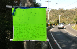
Neon-colored poster board might get attention, but it fights with your message.
It’s difficult to achieve good, readable contrast with neon magenta, acid green, or cosmic orange. People see your sign but forget what it said. Use a plain white or light neutral background.
Use bold, clear lettering you can easily read from several feet away.
Who would hand-letter a sign with a ballpoint pen, on neon cardboard, then post it beside a road with a 60 mph speed limit? More people than you would think. The result is a waste of time and a blight on the landscape.
“Honey, stop the car. I want to read that ugly, verbose, faintly lettered sign over there,” said no one, ever. If you’re going to all the trouble to drive around and put up signs, you can at least make them readable and effective. Otherwise, it’s just called littering.
I hope you find your cat, make a bundle at your garage sale, and attract lots of visitors to your Open House. Go forth and spread your message with well written, readable, attractive signs.
Just don’t post them in my front yard.
OK, you can post the cat sign.
Like TextCPR on Facebook!


