
4 Killer Tricks to Creating Lasting Mobile Moments

I was sitting in a Starbucks recently when I noticed that almost everyone was sitting alone with their laptops propped open with their coffee nearby.
Except, no one was actually working on their laptops. They were on their phones, swiping, typing, or just reading.
It then dawned on me that I was doing the same thing. It happens so frequently, we don’t even notice. In fact, people check their phones 150 times per day, starting with minutes after waking up. All this means that people aren’t sitting down with your app or mobile site for an extended period of time.
But, that doesn’t mean they are not engaged. In fact, according to Forrester’s “Mobile Moments Transform Commerce and Service Experiences,” 30% of US online adults have used an interactive map on their phones, while 22% are banking and 20% are shopping monthly on their phones. Consumers turn to their phones to reserve meals, cabs, and flights, as well as researching in-person purchases in brick-and-mortar stores. They complete their task quickly and then go about their day.
Such intermittent mobile moments call for intelligent microinteractions. This is so common-place that Google recently released a guide aimed primarily at marketers titled “Micro-Moments: Your Guide to Winning the Shift to Mobile.”
The guide focuses on three main tenets:
Be There
When someone picks up their phone, they most likely want to learn, do, find, or buy something right now. Your app or brand will only be useful if the user accomplishes what they set out to do quickly, easily and intuitively. Showing up in the right moment gets you a seat at the table.
Be Useful
Now that you have someone’s attention, be sure that you meet the correct need at the correct time, with just enough detail to allow a specific task to be accomplished. Context is the lynchpin to their mobile experience.
Be Quick
While many users are browsing their phones during off-time, being in a hurry is a large reason why they reach for their phones on the go. In fact, 29% of smartphone users will switch to another site or app if it doesn’t satisfy their needs – quickly. Execute user tasks in as fewest steps as possible.
As UX designers and practitioners, perfecting these mobile micromoments means distilling our design best practices down to the essential. We know that the most successful apps do one thing well. They’re focused, and they execute the fundamentals flawlessly.
Simplicity is key, yet simplicity to the user means an underlying complexity for us as designers and developers. So how do we deliver relevant, contextual, and simple interactions in bite-size chunks exactly when the user needs them?
Grab design ebooks created by best designers
All for free
 Download
 Download
 Download
 DownloadDo you want to know more about UI Design?
Download 'Mobile UI Design Patterns' FOR FREE!
Download e-book for freeClose1. Examine the User Journey
In order to anticipate your users’ needs, you first need to understand them.
Whether you are designing a new mobile experience or refining an existing one, deconstruct your users’ journey on and offline. In order to design a good mobile experience, you need to know your user’s offline behavior and when they are interacting with your app.
For example, in the midst of getting directions on Google Maps, if the phone happens to shake, a message pops up asking for feedback. [show graphic] The implication here is that the user is frustrated. By expressing a physical motion in their offline world, the app responds to this mobile moment with an appropriate microinteraction – a modal offering assistance.
To make your own micro-moments relevant, start by creating an experience map of your users’ journey from start to finish. Note where the touch-points exist with your app or website. As you start to home in on your users’ needs and their context on- and offline, you can better understand how you can meet those needs quicker with fewer but more efficient interactions.
Now is a good time to talk to your users, as well. If you have time to conduct an ethnographic study, you can transform your users’ input to plot into pain points along the consumer journey. As you examine when and where each pain point pops up, you better understand how mobile moments arise.
For example, while I was working on the Cars.com mobile apps, we discovered that users were using their phones on the dealership lots as a rescue device to verify what the salesperson was telling them. We created a set of features with shortcuts to the precise information users needed and surfaced them up automatically once their device detected they were on the dealer lot. We only discovered this opportunity after following actual users on their car shopping journey from start to finish.
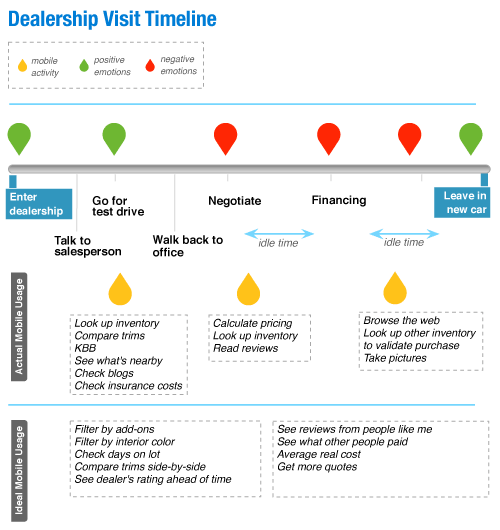
Photo credit: Marina Lin. Smashing Magazine.
2. Streamline Your User Flow
Once you know what your mobile moments are, examine the steps in your user flow and cut them down to the basics. Then, cut them down some more.
You don’t have to look much farther than Amazon’s 1-click to buy button and the effectiveness of eliminating an entire checkout flow. Rue La La followed suit with a Google Wallet Instant Buy button after discovering that 40% of their sales were coming from their mobile apps.
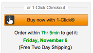
Photo credit: Amazon
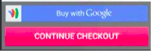
Photo credit: Rue La La
Start by creating your ideal user flow from start to finish. Then, take a step back to highlight only the most essential interactions. Can you anticipate your users’ needs a few steps down the road in order to eliminate them? Use cues such as time of day and location in order to fill in the blanks for your users and be there when they need you.
You’ll need to be judicial with the features in your app.
For example, Trulia displays listings nearby as soon as the app is opened. You can start viewing properties without much further interaction unless you choose to customize or save the search. Both of these secondary features are also available right on the same screen. Tertiary features such as mortgage calculators were de-prioritized and are now part of their own separate app.

Photo Credit: Trulia
3. Leverage the OS in Your Favor
The main lynchpin of a mobile moment, however, is to not open the app at all –at least not for the simple information-based tasks.
Leverage the device operating system in order to eliminate interactions for your users. Figure out where you can offload interactions to the notification screen, or even in the lock screen. Sometimes, the best interactions with your app doesn’t originate in the app at all.
iOS includes two types of notifications – local and remote. Local notifications are scheduled by the app and can inform users that a message has arrived, an event is about to occur, or the status of something has changed. For example, a calendar reminder that you have an upcoming meeting is a notification originating in the app itself. Remote notifications (also known as push notifications) come from the app’s remote server. Android also has widgets which you can show right on the home screen with information such as latest events, a music playlist, or message previews that are visible without the user ever opening the app.

Photo credit: The Next Web
Some apps, such as Uber, aso leverage other apps contextually to minimize the users’ need to specifically open their app (illustratating the Google Guide’s tenet of “Be There”). If the user looks up directions in Google Maps and chooses the Public Transportation option, the last item option on the list after, say, buses or trains is UberX with a cost estimate. The context and information for the user is set and all they have to do is tap the option to arrange an Uber pickup.

Photo credit: Google Maps
4. Talk to Your Users
Once you finalize your mobile moments, continue the conversation with your users. Never stop improving.
Optimize your app or mobile site continuously via A/B testing. Although A/B testing wasn’t possible before without releasing an update through the app store, many third party vendors in all price ranges now make it simple to install an SDK on your app that allows even a non-technical person to continuously run UX experiments. You can test call-to-action labels, placement, and icons, as well the type of notifications that work best for your users.
You can also conduct usability testing, either in person or remotely via services like UserTesting. Set up a few tasks and observe how your users accomplish them. When you watch how users complete core tasks, you’re better able to streamline the experience even more without losing context or clarity. Additionally, read and heed user reviews in the app store as you can glean and prioritize how you can improve your app more.
In conjunction to user testing, pay attention to analytics because what users say and what they do will vary. You can observe drop-off points and further improve on the user experience by trying alternative ways to let your users complete their tasks. You can also track time on task and engagement, though with micromoments, the less time a user is engaged with your app the better, provided that their tasks are being accomplished.
Conclusion
A famous quote attests, “If I had more time, I would have written a shorter letter.”
It’s not always simple to make something minimal, but we as designers can find ways to offload complexity for our very engaged but intermittent users.
If you found this article useful, check out our free e-book on Mobile Design Trends 2015-2016. You’ll find over 79 examples from Slack, Nike, Apple and many more.

The post 4 Killer Tricks to Creating Lasting Mobile Moments appeared first on Studio by UXPin.


UXpin's Blog

- UXpin's profile
- 68 followers

