Mobile UI Design Trend: Build the Perfect Ghost Button

“Ghost buttons” simplify calls to action by removing their backgrounds in favor of a thin line. Trendy and effective, when done well, they attract attention with high contrast while putting a new spin on the “flat” look.
Here’s how you can boost your mobile site designs with a ghost buttons, which you can create in UXPin.
Ghost buttons easily blend into the environment of your design. They are buttons that don’t look like your average “let’s just tap that” button. They’re simply an outline of a button — a transparent pane — that’s usually white or black with some text in the middle. And they create a bit of visual interest to your mobile site or app.
With that, log in to your UXPin account (or start a free trial) and let’s get started.
1. Create a button
Drag a button from UXPin’s elem ent library onto the canvas. In this case, we’ll stick with a white background, but many ghosts use white on a colored canvas.
2. Change its colors
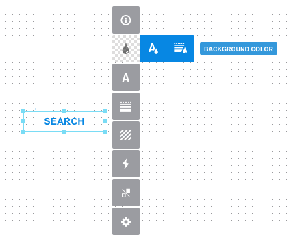
You’ll need to change the button’s text, border and background colors. Luckily all three are available in the same row of the options panel, second option from the top.
Choose a color for the border and text that contrasts well against the background. In this case, we’re choosing bright blue against white. The button’s background, however, needs to be transparent.
3. Turn on the line
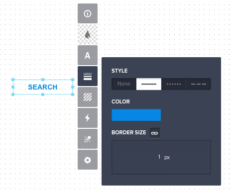
Make sure that the button’s border is set to one pixel — fourth button from the top in the options panel.
4. Turn off the shadow
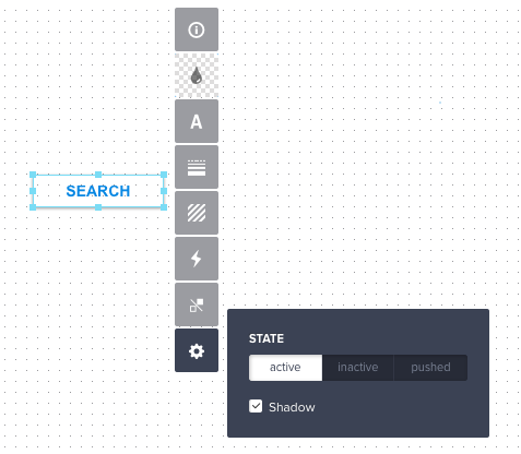
UXPin’s buttons come with an automatic drop shadow. Turn it off under the gear icon at the bottom of the options panel.
See the process in action
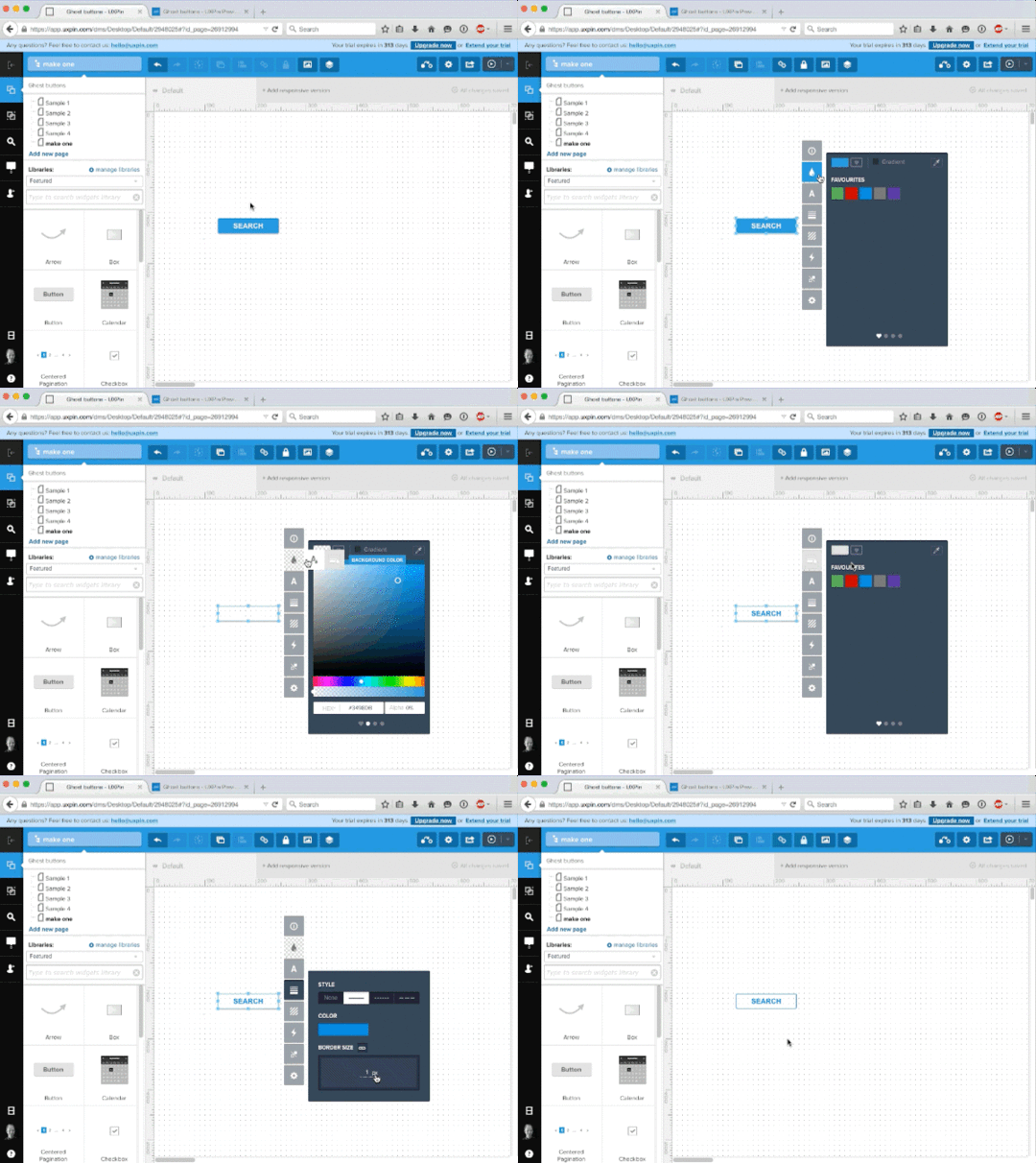
All together now: This visualization takes you through the steps to create a ghost button. Try it yourself with this prototype in UXPin.
Take what you learned and build your own ghost buttons with a free account to UXPin.
UXpin's Blog
- UXpin's profile
- 68 followers


