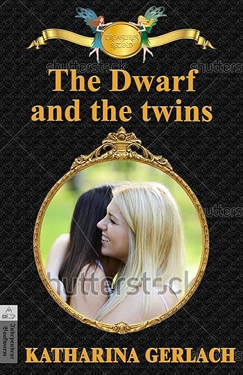
From the feedback I got I realized that the fairies are a matter of taste. Half of the commenters liked them the other half didn’t. I like them, so they’ll stay (for now, I might still change my mind). Also, I’m aware of the fact that “Treasues Retold” is only readable when the cover is full size, but I don’t mind. It’s a logo and easily recognizable as such even if the writing isn’t clear at thumbnail size. Thank you all for helping me come to these conclusions.
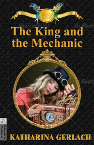
However, there are a few more issues, and I think you might need to know at least a little bit about my stories. The first one is a retelling of “Snow White and Rose Red” with the dwarf as the main character (he’s not the villain in this tale), the second a retelling of “The Beauty and the Beast” in a steampunk setting. I incorporated as many of the suggestions as I could. Since it seemed that the cover for volume two was universally liked, I mostly worked on the cover for volume one.

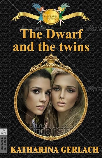
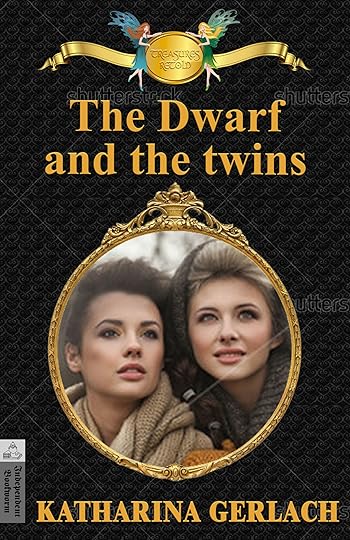
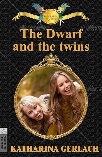
My biggest problem at the moment is what to put into the big medallion. I found a wonderful picture of a man in a leather jerkin resembling a dwarf. Unfortunately, he’s much too old to be the dwarf in my story. So I started looking for two girls, one blond the other brown and close to each other to fit in the frame. One problem was that the clothing often was too modern. These are some I found. Do you think one of them would work?


I could try to find some fans of medieval clothing to pose for a picture (Oops, I just realized that I forgot to capitalize “twins”). Ideally, they would be having fun like the two girls on the left in the bottom row but look a little bit older.
Please give me some more feedback. I appreciate it a lot.
Published on June 28, 2014 00:38
 newest »
 newest »
 I like 2, 1, 3 and then 4. 2 was my first choice, because of the expression and the contrast of color. The blonde's expression lightens, while the dark one's expression is speculative or reflective.

