
Don't Make Me Think! Have a Series? Make Sure Your Fans Know in a Single Glance
Recently I was reading a self-pubbed writer bemoaning that her series (and she has multiple series!) don’t sell well, despite good reviews, and the fact that she has been traditionally published in the past and has industry cred.
Series are usually the bread-and-butter of a self-published authors. I was curious, so I went to her author’s page on Amazon. I couldn’t find which of her 20 or so books were part of a series, and which were one-offs. I wondered, how many of her readers couldn’t find the next book in their favorite series either? How many clicked away in dismay, and how many sales were lost?
So here’s three tips—two easy—one hard, to make sure your fans know your series has continued.
1. Put the series name in the title—not just on your cover—in the actual metadata when you enter the title on Amazon. Your book cover is going to be postage stamped sized in the browser window until someone clicks on it. No one can read “Diary of a Wimpy Teenage Vampire Part II” on a postage stamp!
Make sure the title next to your book cover reads, “Life Sucks (Diary of a Wimpy Teenage Vampire Part I)”
2. Put the sequential number in the metadata. Don’t just put “A Diary of a Wimpy Teenage Vampire Story”—it’s frustrating to readers. Make sure it’s “Diary of a Wimpy Teenage Vampire Part 4.5”. You don’t want to frustrate readers, they’re your customers. Love them. Make things easy for them. Their lives hard, and they worked hard to spend the money and time to read your story.
3. Make your covers match! Anyone who has followed me for a while knows that this is something I, ahem, struggled with. (For a hilarious peek at my cover attempts check out my Goodreads page and the old editions there).
It can be hard to make covers match—and expensive! When I first started out, I did something as quickly and cheaply as I could. Was unhappy, so did something that took several days worth of work to produce.
When I hit Monsters, Part II in my series, I realized making an artistic masterpiece for all of my covers was going to bankrupt me in either time or money. So I simplified. I went to iStock and picked out some lovely background textures, and then used photoshop to superimpose images and Viking-themed patterns on top of those textures. What you see here is the result:
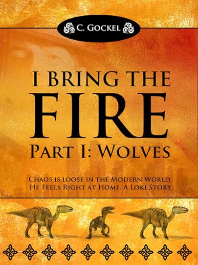


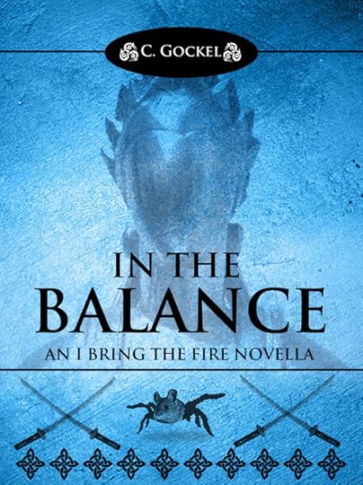
It’s obvious they all belong to the same series (though In the Balance is a novella, a story that had to be written, but wasn’t part of the original plan. I tried to use the slight variation in the theme to reflect that.)
To be honest, I could probably make the covers even simpler and cheaper and sell as well. But I’m pleased with them, and will continue the theme.
In the web design business we have a saying, “Don’t make me think!” Basically, it means that all interfaces should be as easy to use and intuitive as possible. Web designers who try to be “too cool” are really saying, “This is all about MY VISION of DESIGN and I don’t care about you!” I wonder, if when we make things difficult for readers, we are inadvertently saying, “My ART is so wonderful, it’s worth struggling to discover!”
…and that’s kind of horrible and narcissistic. It really should be the other way around. I am honored when anyone spends time and/or money to read my books, and I think I need to make sure it shows.
Stay tuned, in the future I’ll write a post on simple covers that sell.


