
Self-Publishing 101 Episode #3 ebook Formatting
Welcome to the third episode of Self-Publishing 101. Today, K.B. is going to give you a lesson on eBook formatting. Below this video, there are links to style guides, images of a fake document showing some of the tricks that she talks about in the video, and a few links for eBook formatters.
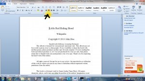
The yellow arrow shows the button at the top of your word document that should be using to center your title, chapter headings, and anything else.
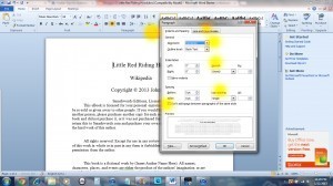
The highlighted areas show you the items that I spoke about in the video, on how to set up your document for Smashwords.
The area to the top left of the page shows you where to find the button for page breaks needed for Amazon Formatting.
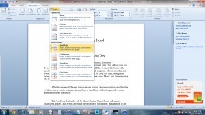
This image depicts the location of the section breaks button that is necessary for the Barnes and Noble Pub It formatting.
NEVER USE TABS!!!!
Always use the centering tool at the top of the page!!!!
Font Sizes
Title font size -18 point
Author’s name font size – 16 point
Chapter Header font size – 14 point
The rest of your book – 12 point
Links for style guides
Barnes and Noble Formatting Guide
Amazon Formatting Guide
Smashwords Style Guide
Links of eBook Formatters for hire
Creative Services by Chris Moyer
e-Solutions Consulting
Ebook Launch
Jennifer Malone Wright: Website/ Facebook/Twitter/Goodreads/Amazon
K.B. Miller: Website/Facebook/Twitter/Goodreads/Amazon


