Beware dodgy axes (on graphs, not chopping wood)
Every now and then I feel the need to remind people that whenever you see a graph you should take a look at the axes (I'm thinking of the plural of axis here, not of axe - though it probably is wise to keep an eye on axes too). If you want to make some data look far more dramatic than it really is, it is possible to do this very easily by only using a small part of the available vertical axis.
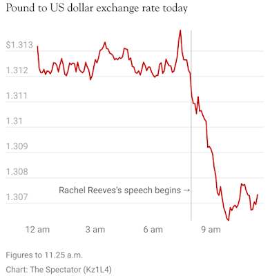
Today, I noticed a graph published by the Spectator magazine. I have nothing against the Spectator - I don't always agree with its politics, but it is a good read. However, this particular graph was egregious in its axis mangling. The intent was to demonstrate the impact that the speech given by Rachel Reeves (UK chancellor at the time of writing) on 4 November had on the pound/dollar exchange rate. It looked like this:

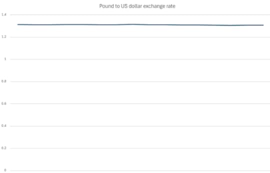
Wow. That's a dramatic fall. But look at that horizontal axis. For a comparison I plotted roughly the same data (roughly as it's just read off the graph by eye) with an axis that starts at zero. It looks like this:

(The vertical axis markers are missing as I was simply taking equal left to right measurements by eye, rather than pinning down to a specific time). There is still a drop. But you do need a magnifying glass to notice it.
Sometimes it can be helpful to only take part of the range from the vertical axis, but it shouldn't be done in such a way to make a change seem dramatic when, frankly, it isn't.
These articles will always be free - but if you'd like to support my online work, consider buying a virtual coffee or taking out a membership: See all Brian's online articles or subscribe to a weekly email free here


