
IPDW2025—Natural Realism in Production Design Through the Lens of ‘Watching You’ (2025–)
When audiences think about production design, they often imagine the elegance of period pieces or futuristic science-fiction. But in contemporary drama, design succeeds by doing the opposite — disappearing. The goal is not to create spectacle but to persuade; to build spaces so truthful that viewers forget they were ever designed.
As Production Designer on the Stan Original series Watching You (2025 – ), this creative paradox was at the heart of the work: the more authentic a world appears, the less audiences notice it. Yet achieving that invisibility requires an extraordinary amount of visible labour — research, experimentation, collaboration, and sensitivity to story. The show has been described as “elevated Australian noir — sexy, stylish and suspenseful” (The Conversation, 2025). For me, it was an opportunity to explore how the language of natural realism can heighten psychological tension while staying grounded in emotional truth.
Watching You is a contemporary thriller built around the themes of surveillance, intimacy, and power. The story follows Lina, a paramedic whose one-night stand is secretly recorded, spiralling her life into paranoia and danger as she hunts for the voyeur while questioning everyone she trusts. From early script meetings, it was clear that voyeurism wasn’t just part of the plot — it was a design philosophy. Sydney’s oppressive summer became an agitator, a force that pushed our characters to the edge.
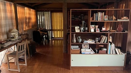
We embedded these themes into the visual language building it around reflection and concealment; exposing for harsh sunlight, embracing deep shadows combined with Hitcockian framing. Urban environments featured glass facades, open-plan layouts, and visible sightlines that could both reveal and obscure. We used fluted and mottled glass in key locations to distort visibility, blurring what's seen and unseen. In contrast, our rural setting — an old bush house belonging to Lina’s Grandfather — worn timber, aged metal, heavy drapery — was the opposite: concealment, protection, and memory. It provided refuge yet carried an unease through its isolation.
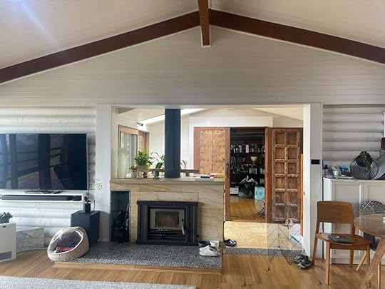
Location photo, pre art department work
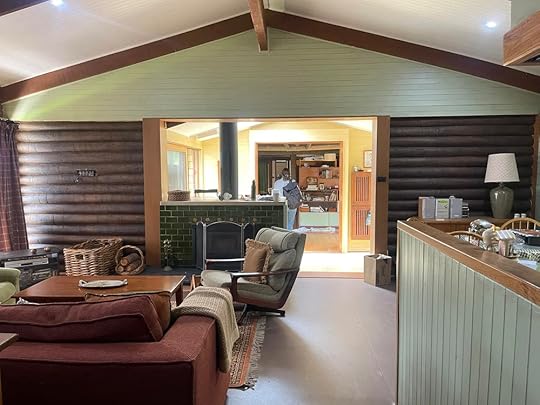
Pa's House location with set dressing and painted throughout
This environmental contrast operates on multiple levels—urban versus rural, modern versus aged, transparent versus opaque—all reinforcing the story's themes without announcing themselves. Rather than dressing sets to look “pretty,” we designed environments that were sun-bleached, tactile, and alive with atmospheric heat, letting natural elements like fire and wind shape the emotional landscape.
Every character’s environment reflected their psychological arc. Lina’s home felt warm but constraining, echoing her move from security to vulnerability. Low ceilings and vertical blinds foreshadowed her eventual sense of entrapment. Clare and Axel’s aspirational home embodied femineity through curves and archways, its palatial scale contrasted with Lina and Cain’s modest townhouse, reinforcing themes of desire, duplicity, and power. Pa’s House became almost a character itself — a space layered with memory, decay, and transformation.
The way a person lives tells us everything: clutter versus order, material choice, colour temperature, or the wear on a chair arm. Cultural identity was also integral. Characters’ mixed backgrounds were represented subtly through heirlooms, design motifs, or pattern that reflected layered heritage without cliché. Similarly, their occupations as first responders informed practicality: furniture placement, accessible storage, lived-in functionality.
We personalised environments with small, authentic touches drawn from collaborative conversations. During pre-production, Aisha Dee, who plays Lina recalled a set of childhood toys she’d collected. We sourced those exact items and placed them in Pa’s House on the shelf beside a photograph of Lina’s Mother. They never needed to be referenced, or have a close-up, we dressed them into the set to support her performance and trigger an emotional connection to a real childhood memory for the scene.
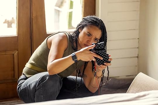
Lina discovers the hidden camera concealed in a textured lamp base designed so the lens fit inside a single embossed bump. Stills: Lisa Tomasetti.
Pa’s House, set dressed with heavy drapes and curtains responding the themes of concealment.
Production design thrives on collaboration. My Design Bible — a visual compendium of mood, palette, materials, lighting and spatial reference — became a shared language for our second block director and cinematographer as well as the whole art department team. Design thinking often happens collectively and physically. For one major set build, we taped out dimensions on the office floor so the director and DOP could walk it and lens up on it, feeling proportions viscerally before construction. Practical limitations inevitably shaped creative choices. A dream location might collapse due to permissions or scheduling; budgets stretch only so far. But constraint breeds authenticity. When our ideal setting fell through, we adapted an industrial space instead — and it felt more truthful than the original concept.
Naturalistic design doesn’t mean neutral design. Every colour choice, material, and line carried meaning. Orange emerged as a key accent. Through the last-minute location change mentioned earlier, we were gifted a bright orange door — an unmissable visual warning. Vanessa Loh (Costume Designer) dressed Lina in an orange dress as she entered for the first time. That repetition of the orange dress against the orange door amplified the danger like a subliminal message: don’t go in. Orange became a warning associated with specific characters and props foreshadowing danger. These decisions aren’t decorative — they’re narrative.
Natural realism extends beyond walls and furniture. It lives in the brands, logos, and artefacts that populate the world. We designed fictional companies like NestShare and ForgeFit with the same care real branding demands. Hundreds of names, logos, and applications were tested until they felt authentic. These details, a phone App logo, a promotional LED screen video, may pass unnoticed, but they cement the believability of the universe.
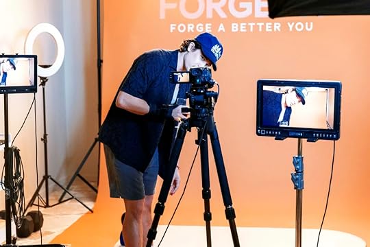
Chai Hansen as Cain, looking down the lens and seen through playback screens against the ForgeFit backdrop. Stills Lisa Tomasetti.
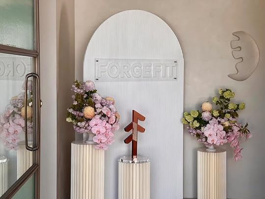
ForgeFit Launch Party entrance dressed with branding and decadent flower arrangements. Vertical line and glass motifs reoccurring throughout the series.
As production designers working in contemporary drama, we face unique professional challenges. We must advocate for resources and creative vision while deliberately creating work that shouldn't draw attention. The irony of natural realism being the more invisible our work, the stronger its impact. What looks effortless on screen is, in truth, the result of intense collaboration between departments; costume, cinematography, direction, and the entire art team. Every seemingly intuitive choice reflects careful consideration of narrative function and authentic representation. Our work may remain largely invisible, but it profoundly shapes how audiences experience and emotionally engage with screen narratives. Production design is not just about choosing the right couch or wall colour, it’s the architecture of emotion — the invisible scaffolding that holds story together.
This article is adapted from her chapter in Perspectives on Production Design: Practice, Education and Analysis (UoW Press).
BiographyVirginia Mesiti is a visual storyteller who is drawn to character driven drama and projects she can build worlds within. Her passion for colour, research and developing a rich backstory drive her creatively. Her Production Design credits include some of our most loved Australian TV such as After the Verdict, Diary of an Uber Driver, The Moodys, A Moody Christmas, No Activity and the Seachange reboot. She also Production Designed AFTRS Alumni Craig Boreham’s debut feature film, Teenage Kicks with fellow Alumni Bonnie Elliott as Cinematographer. Her most recent credit was as Assistant Set Decorator on George Miller’s Three Thousand Years of Longing. Virginia is Senior Lecturer in Production Design at the Australian Film Television and Radio School.


Henry Jenkins's Blog

- Henry Jenkins's profile
- 184 followers

