Graphics are great - but don't let them obscure the message
 As a writer I have (unsurprisingly) something of a bias towards the written word. I hate getting information from videos because they are so slow at putting stuff across - when I've had to do an online course with videos, I always use the transcript instead if available and get through it in half the time. I'm just not very visually oriented. But that said, I can of course see the benefit of graphics as a way of putting across a piece of information where words can be clumsy.
When I help students and academics with their papers I always ask them to ensure that a figure, or diagram or chart adds something to the text. They should never be there simply because they feel they need one. However, when it comes to packaging it seems that graphic designers sometimes rule the roost and the result can be a mangling of the message.
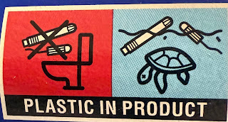
Take the graphic above. We've got two boxes - one red with a slash through it. That's obviously the 'don't do this' box. And the other is blue with no slash through - obviously the 'do this instead box'. It's a visual convention. Don't flush this down the toilet, throw it into the sea instead.
Only that's not what it means at all. The right hand box is intended to put across 'if you do what's in the red box, this is what will happen.' Because there are no words, we're in a mess, potentially confused by the visual messaging. I can see packaging design is a visual activity - but designers need to bear in mind how important words are too.
These articles will always be free - but if you'd like to support my online work, consider buying a virtual coffee or taking out a membership: See all Brian's online articles or subscribe to a weekly email free here


