How My Cover Came to Be
When it came time to design Memory Lane’s cover, I knew two things.
I knew I wanted to go with an “illustrated” style. Not only do I personally love this style, but market trends support the popularity of illustrated covers. There are a large number of readers out there who’ve never read my books but might enjoy them if they did. I believed that lots of those readers would be more likely to try Memory Lane if I gave the novel an illustrated cover design.I knew who I wanted to hire to design the cover. Courtney Walsh. Follow her if you don’t already! You’ll find her HERE on Facebook and HERE on Instagram.
Courtney is a terrific author. She also owns and runs a childrens’ theater with her husband. She also happens to be very gifted at cover design. AND she’s one of my closest friends.  Courtney designed the cover for my Christmas novella You and Me. Collaborating on that cover with her was fun and easy and I was very happy with how it turned out. So asking her to design Memory Lane was a no-brainer.
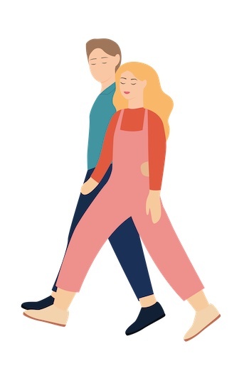
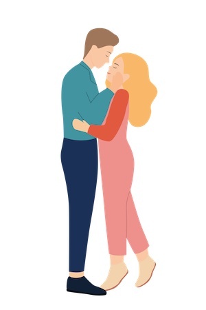
Courtney will tell you that she’s a designer, but not an illustrator. In other words, she can take elements (photos, illustrations, etc) that someone else has created and then build a cover with those. So my first step was to commission a freelance artist to draw custom illustrations of the hero and heroine of my novel. I gave her information on what they looked like and what type of clothing they’d be likely to wear. I sent this photo along as color pallette inspiration….
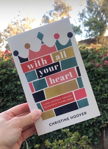 I LOVE these colors!
The artist came up with the following designs. The heroine is wearing overalls, just like Remy often does in the book! I used the middle one on the cover and made stickers out of the middle one and the one on the right.

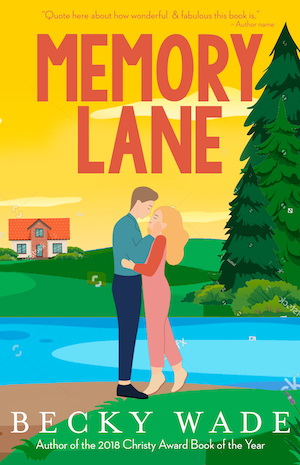
My initial vision for the cover was to place the characters ON a lane in order to represent the title Memory Lane. Courtney did just that and gave them an oceanside Maine setting in these mock-ups. (Mock-ups aren’t at all final. They’re quick “rough drafts” used to get a visual sense of what my idea would look like in actuality.)
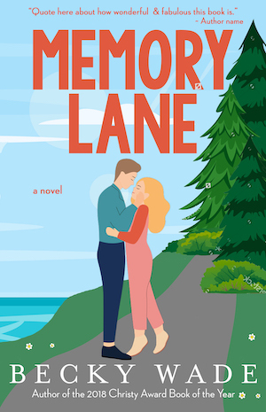
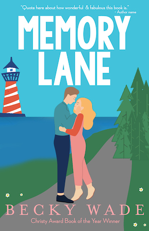
Once I saw my idea, I realized this wasn’t the direction I wanted to go in, after all. Courtney and I discussed other options. In recent years, there’s been a trend toward making the title itself the star of book covers. She and I are both fans of that trend and wondered if we could make that work here. She showed me the most beautiful teal background with vertical lines running down it, and I was immediately enamored.
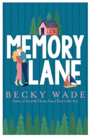
At that point, she created this mock-up.
I loved it. But I wondered if it would be possible to see the couple and the boat at the top of the image.
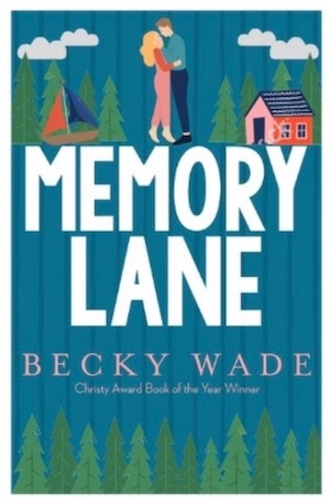
I really loved this version, too. (Those cute clouds!) But after living with both of these for several days, I decided to go with the first version–which was Courtney’s favorite, too. Initially, she’d used the above font for my name because this is the font used for my name on several of my backlist books. At the end of the day, though, it was too skinny to hold its own against such a big, blocky title font. Which is how we arrived at the final version of the cover.
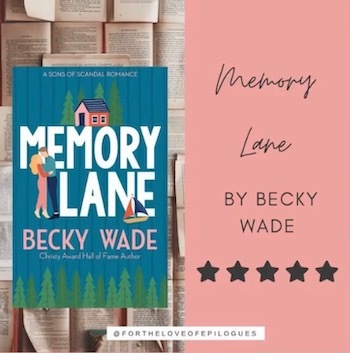
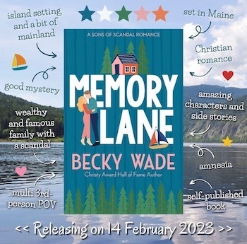
To close, I thought I’d share some of the fun encouragement, graphics, and comments that I’ve received since Memory Lane’s release, a week and a half ago. It’s been a busy, exciting, and wonderful time!
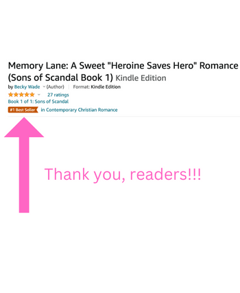


 Thank you, readers, for supporting Memory Lane! Do you have any questions/comments about the cover?