Art Unboxed – In Search Of Red
My favorite color is blue, which is an odd way to begin a post on the color red, but it is relevant. For some reason it’s not been difficult to find my favorite version of it, Prussian blue in watercolor. My choice of yellow ochre, brown, and olive green were easy too, but finding a true red has proved difficult.
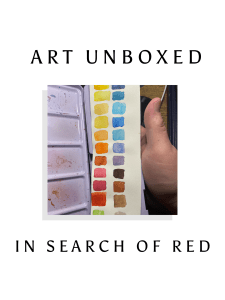
As a child my favorite reds were Christmas red, and Brick red, which they still are. I should mention that I’m a pan watercolorist, for a few reasons. Ease of use and cleanup, they fit nicely in a drawer or backpack, and we have a toddler. These factors make pan watercolors, specifically half pan sets, my favorites.
Over a number of years using them, I realized I’ve not really been happy with a red. Yes, you can mix a world of options, but I would like to have a primary I didn’t have to adjust, for quick use. I don’t mind mixing Brick red, but I wanted a true red, not a rose, not a vermilion, and not a red orange.
What surprised me was how challenging this proved. Most of the sets I had purchased, if quality but not the top brands did not include what I call a true red. Most were cool reds, or so warm they were a red orange. I even bought a Van Gough red that looked true red on Amazon. It turned out to be a warm red orange.
Interestingly enough when I mixed my strawberry red and red orange from Van Gough they combined to a light cool red, but still not what I was searching for. Have I found it yet, we will see. I’m expecting two new reds, one of which I believe will be exactly what I’m hoping for, but I’m less confident after the other attempts.
What does this have to do with art unboxed? Because it has unboxed some options for me that I would not have looked at earlier. It’s caused me to take a deeper look at values and tones than I would have previously. It has helped me in crafting my own color palette. I have a 24 half pan set that I’ve pushed to hold 26 half pans. Adding blues, removing purples, adjusting the number of browns and greens.
If this is the red I’m looking for, am I finished? Most artists know the answer to that, it’s a hearty no. I have a warm gray, but need a cooler gray. I’m considering a Payne’s gray, and eliminating my purple for a moonglow. I need to replace my olive green as well. Why are the colors on your palette important, it depends on who you ask.
For me, I like the idea of using my favorite colors. The idea of having a color scheme that can be identified with your art is both a pro and con personally. I like the idea of a signature style in one way, but in another I enjoy the feeling my art has variety, a limited palette by design is not meant to hamper the artist, but to equip them to paint better.
Granted twenty six colors are not a limited palette in the regular sense, but it is all the colors I care to carry. The way I paint it allows me a world of options, even when I have little time. It also gives me a similar sense as to Christmas morning when I opened a brand new box of Crayola with blue, red, and Brick red!