
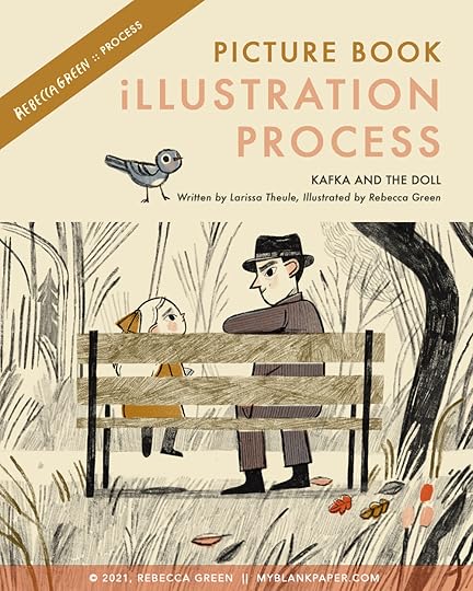
KAFKA AND THE DOLL | PICTURE BOOK PROCESS
FRIENDS! We made it to March. We made it, we made it, we made it. Anyone else feel like making it through another day, another month, is something worth noting? Just me?
Either way, this is something to celebrate - a book birthday! KAFKA AND THE DOLL comes out March 9th!
KAFKA AND THE DOLL by Larissa Theule
“Inspired by a true story, Kafka and the Doll recounts a remarkable gesture of kindness from one of the world’s most bewildering and iconic writers. In the fall of 1923, Franz Kafka encountered a distraught little girl on a walk in the park. She’d lost her doll and was inconsolable. Kafka told her the doll wasn’t lost, but instead, traveling the world and having grand adventures! And to reassure her, Kafka began delivering letters from the doll to the girl for weeks.
The legend of Kafka and the doll has captivated imaginations for decades as it reveals the playful and compassionate side of a man known for his dark and brooding tales. Kafka and the Doll is a testament to living life to the fullest and to the life-changing power of storytelling.”
My favorite way to celebrate a book is by sharing the illustration process. Not only do I think it’s an interesting insight, but it helps me remember all the decisions I made to get from manuscript to final. For the illustrations in Kafka and the Doll, I feel proud of the simplicity. The process of achieving that simplicity was easy, natural, and took almost no effort. JUST KIDDING. It was agony! This was a tough book for me to illustrate - nearly as impossible as Madame Saqui, which makes sense because I illustrated them at the same time!
Today, I’m sharing a look at the research, style testing, storyboards, and finals. I’ll also end with a note about what I’m learning as I illustrate more books (hint - I’m getting more efficient, so hopefully this is the last of these long agonizing picture book posts!)
OK are you ready? Get your coffee - let’s dig in!
I research most book projects in two areas - subject matter and aesthetic.
Usually I make a pinterest board for every project (find Kafka’s here!) but I also dig through books, documentaries, etc.
The subject matter for this one was of course, Kafka. I also needed photos of Dora and the parks in Berlin, where the story takes place. I researched suits, dresses, and dolls from the time period, and also places where the doll has adventures - Egypt, Barcelona, a den of Peter Rabbit’s, and a Pâtisserie in Paris, just to name a few.

The aesthetic research for a picture book is more subjective. To begin, I explore artwork from the specific place and time. I was in luck here because I’ve long been inspired by German Expressionism. I also make note of contemporary art, colors, line work, textures, and anything that intuitively feels like it might fit in this world. It’s interesting now that the book is finished, to look back at the mood board. I was clearly pulling from the bold black lines, the autumnal color palette, and the aged yellow paper.

STYLE TESTING
I test different styles or looks to see which one captures the essence of the subject matter the best. Sometimes it takes many attempts…
What is style testing? I suppose it’s something I realized I was doing without knowing it.
A couple thoughts on the idea of testing different styles just to clarify my thoughts on them:
These tests are a part of my visualization process - I rarely show these tests to the publisher, they are just for me (and now you!) Style tests aren’t something I learned in school or in the industry so if you don’t do them, that’s totally normal, you don’t have to. Your art director will probably never ask for anything like this!
These are time consuming! That’s a question I get a lot - how do I spend so much time doing these tests when they ultimately don’t get used? Great point! I’m learning that a tight deadline is a blessing and a long deadline is a curse, so I’m finding ways to be more efficient (more on that at the end of the post.)
When I’m exploring character and style, I begin with images I know I’ll need in the final, like Irma sitting on the park bench. It allows me to get a feel for the setting before doing the storyboards. The first tests were pure exploration. I thought Irma might have short hair, I tried a more animation-y style, and I even thought for a second, I’d do the book three-dimensionally. While that last one is a dream I hope to make happen someday, it was impossible for this project.

As I fleshed out ideas, I realized I wanted limited color and heavy line work. I digitally tested out line drawings and did studies in colored pencil. I sent these to the art director and editor and they liked them! But I felt like it needed something.


I felt like the tests were missing warmth and emotion so I used an autumnal color palette and delicate lines. Here (below), I tried colored pencil on oiled paper, neocolor II crayons, and straight colored pencil. I liked the looseness of it all and the warmth but for some reason I wasn’t happy with them. I look at these today, over a year later, and I think they look just fine! I could have stuck with them…
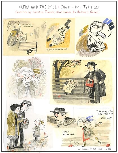

In any case, frustrated for reasons I can’t even remember, 😂 I decided I’d paint the book in a more colorful palette. These were painted in gouache on paper.
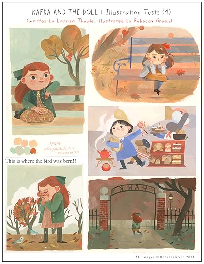
I liked how these turned out but I lost my lines! That dilemma again - it plagues me. How to have the juiciness of the paint, but keep the expressiveness of the lines. I’m still trying to figure it out.
I went back to the drawing board AGAIN. Early in the testing, I had drawn something extremely loose, hung it on my studio wall and kept coming back to it. (It’s the loose drawing at the upper left) It was so full of life! I decided to jump back in with the line work and follow that. That’s when the final Irma was born! I tested her out in colored pencil but ultimately decided to do the finals digitally so I could add in the textured colors under the line work.
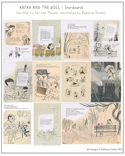
 STORYBOARDS
The storyboard, oh the storyboard, my sweet nemesis.
Doing the storyboard is my least favorite part! I haven’t been able to nail down a single storyboard process in all the books I’ve worked on. I’ll make tiny booklets with thumbnails, print the manuscript and cut out all the text and try and tape it into a paper booklet, or I’ll do part of it digitally with bits and pieces on scrap papers. It’s a mess! But listen…I just figured out how to make the process ridiculously simple - I’ll share with you at the end of the post!
For Kafka and the Doll, I did a couple tighter versions of the sketches for the storyboard before finding my groove with looser studies. Below are some of the pages I sent to the publisher. I drew on 4x6” ish paper with oil pastel and colored pencil. The drawings were scanned, put together in photoshop, and sent as a PDF.
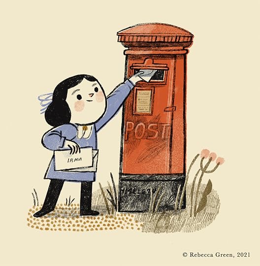
 FINALS
The finals were all done in Procreate! Here are a couple of my favorites and a little time lapse video of the doll putting mail in the mailbox.


 AND JUST FOR FUN…
Here are some sketches of the cover along with the final!


And there you have it! I haven’t seen the actual book in person yet but I’m looking forward to it. It never gets old, holding the freshly printed book in my hands.
If you’d like to pre-order the book, you can find it here! Huge thanks to Tamar, Nancy, Opal, Larissa, and the rest of the team at Viking Press. It was a huge honor, as always, to bring this book to life.
As promised, I also want to share a couple things I’ve been learning as I work on more and more picture books.
Every picture book is different.
The publishers, editors, art directors, authors, and books themselves can warrant different approaches. In the beginning, this was confusing because I felt I needed to learn a ‘secret code’ to the picture book process. Now I’ve come to appreciate that each book has its own unique process. Now I revel in the changing process, knowing that I can learn, adapt, and become more efficient with every book I illustrate.
Visual storyboarding is much easier if the text is paginated in words first.
Sometimes the publisher will provide a paginated manuscript where they’ve already laid out the text for each page. It’s more common for me now to get a block of text and decide with the publisher how many pages it should be. I then break up the text - keeping pace and suspense in mind. For the longest time, I tried to paginate the text in drawings, doing the visual layouts before I really knew how the story would be paced. Now (and this is the genius idea you’re probably already doing) I plan the entire pagination process in words. I don’t even start drawing ideas until I’ve broken down the entire manuscript into a paginated form. I also write down the illustration notes, and then once that plan is approved by the editor, I draw the storyboard. I don’t know why it took me almost 8 years to figure that out!
Okay friends! That was a long read - if you’re still with me, thank you! I hope it’s helpful to see these process posts, if only to understand that there are many ways to illustrate a book. If you found this helpful and want more behind the scenes, you can check out Madame Saqui, Revolutionary Rope Dancer, Iqbal and His Ingenious Idea, and Becoming A Good Creature.
Lots more to share in the upcoming months, but for now, Happy March! Happy almost Spring. Enjoy the warm sun on your shoulders or the breeze in your hair when you need it the most.
xo,
Becca


Rebecca Green's Blog

- Rebecca Green's profile
- 79 followers

