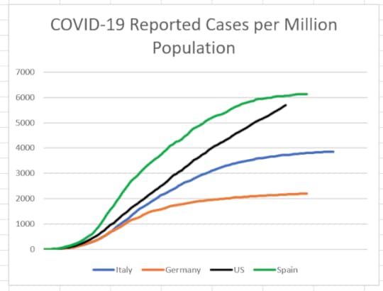
A few weeks ago, I published a series of blogs regarding COVID-19 infections and deaths in the U.S. correctly suggesting that the projections the federal government used to inform the public were optimistic about the number of expected deaths. A chart I have found helpful compares the growth of U.S. cases to Spain, Italy, and Germany, adjusting for population size and recognizing that Italy started about two weeks before us and Germany and Spain a week after that.

[Note: the horizontal axis is...
Published on June 03, 2020 14:46
